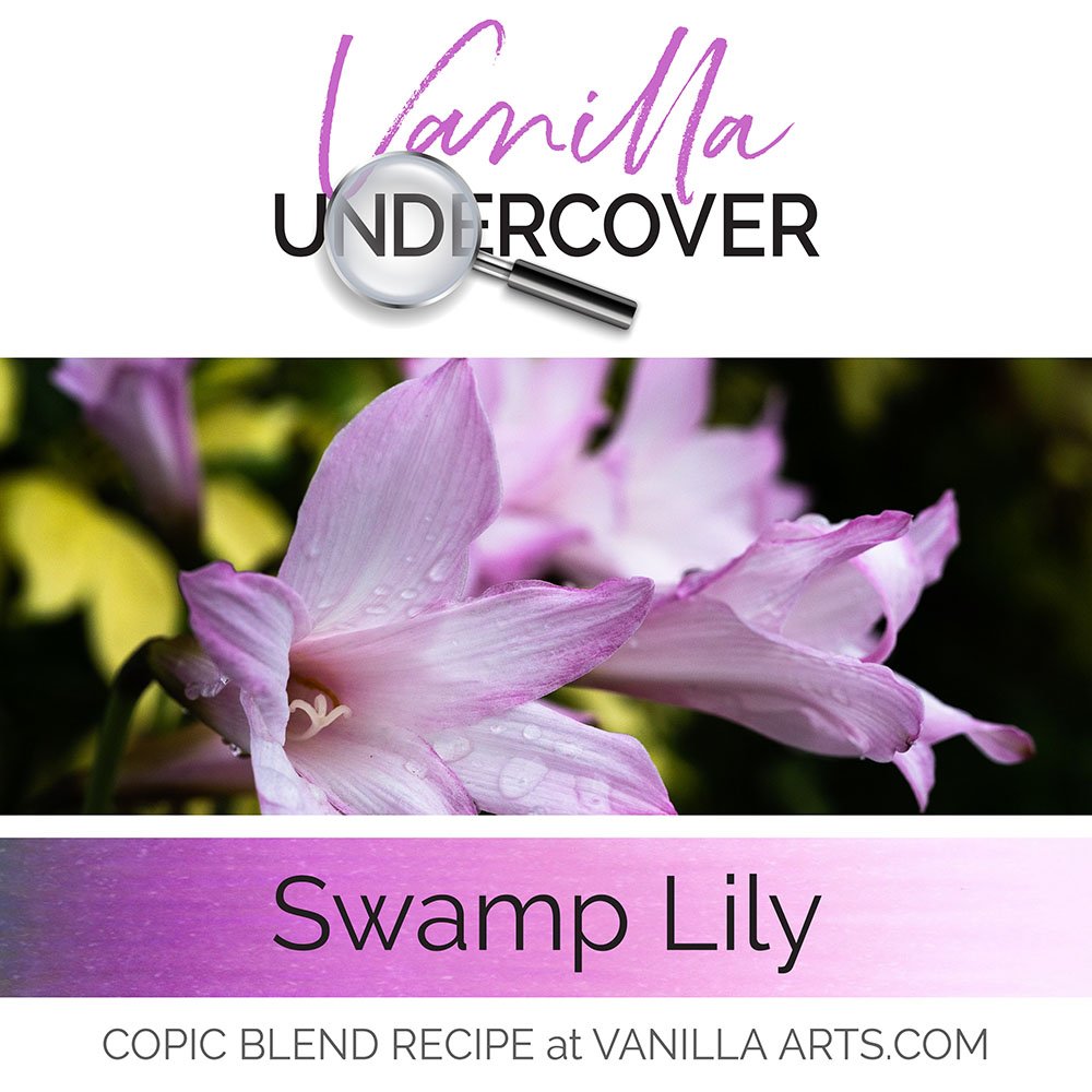
Don’t be afraid of color!

"Timeless Rose" by Stampendous
My Copic Marker and colored pencils students know we’re going to use a lot of deep colors in class.
We use a lot of color.
Heavy color.
Dark color.
And we lay it on thick.
Are your flowers flat? The secret to depth & dimension with Copic Markers and colored pencils is realistic contrast. It’s easy to see the highlight areas but are you making your darks dark enough? Let’s look at the real color found in real flowers and compare that to the markers we tend to use.
Improve your coloring by improving your sense of light and dark
It takes a brave soul to see the color as it really is. The highlights AND the shadows.
This past Copic Club Class was about coloring red roses.
With no pants on. Because I wanted to frighten them to death first.
The trick to coloring anything, but especially floral images is that you have to ride the teeter-totter. Color a dark patch, adjust your light area. Color a light patch, adjust your dark area.
It's a constant see-saw motion, back and forth because color is relative. Until you have your darks in place, you can't judge how light your lights should be. And if you darken a light, you have to go back and darken a dark to restore the correct balance.

Rosa Roja by Dani3D via bestphotsworld.com
You've got to do the Yoda thing and find balance.
And that's hard, because most colorers are afraid of any Copic marker that ends in a number greater than 7.
A 7+ marker is dark. They're potent and some of them bleed. And if you make a mistake, they're not going to budge, not even with a colorless blender.
If you're timid about color, if you always stick with with comfortable and easy colors, you'll never get dark enough to balance your see-saw.
So here's a red rose image using the same red color I'll be teaching this weekend. It's one of my photo references for the project.
What markers would YOU pull out to color this image?

A lot of Copic people would use their R20 family. It's a nice, sturdy, reliable set of true reds. R20s do not feel too blue and not too orange. They are the go-to family when you want to go red.
But here's the problem: R29 is a gorgeous red, but it isn't a highly shaded and deep red. If you start with R29 as your darkest dark, you're going to end up with a pink rose; because there's no where to go but lighter - and that means a rose with a definite pink shift.
Let's look at what's really going on in that rose image:
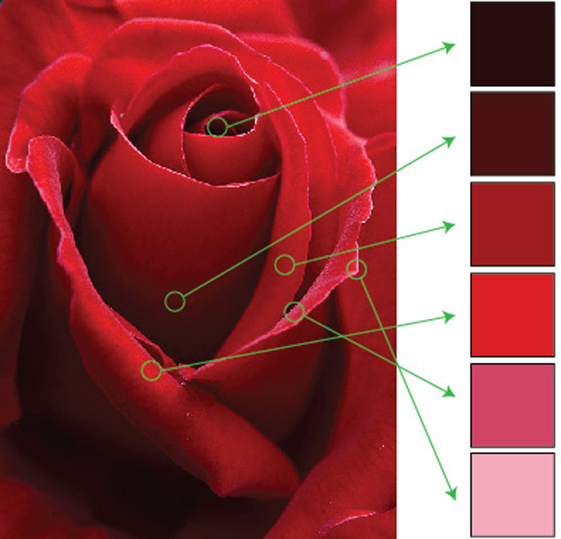
I've used Adobe Illustrator here to sample colors from 6 major areas of this photograph. The eye dropper tool doesn't lie, what you're seeing in the color box is exactly what's going on in the photograph.
Look at the stark difference between the color values. Our real life colors #1 - #4 are all darker than our darkest R29 marker.

Here's the dirty little secret about Copic markers:
They don't make Copics dark enough!
The dark point on our rose is about a 100. Yes, it's that black.
The second darkest color (and there's a ton of it in this image) is a definite red but it's far darker than the most potent shaded red that Copic makes (R89).
There is no way to accurately color this rose using only Copic R markers.

Remember, it's not about what colors you use, it's about the color your viewer sees.

What my color sample comparison shows is that anyone who sticks with R29 is about 4 shades short of the dark they need for a red rose.
You know in your heart that you used the darkest reds that Copic makes but the viewer doesn't know this. You may think it's a red rose because you used a red marker but the rest of humanity is looking at a pink rose.
This is why I teach underpainting. This is why I teach overpainting. This is why my students are asked to bring Prismacolor pencils to class. Because this simple red rose image taxes the limit of the Copic red spectrum. You have to blend colors in uncomfortable ways in order to color this rose accurately.
I force my students to cross over to the Dark Side. You have to channel your inner villain if you're going to find balance
R29 isn't mean enough to get you there.
Here's the class image, fully colored. Even now, I could go back and darken some of those darks.
I'm not done riding the teeter totter.
The secret to a red rose that looks red? You have to go all Sith Lord on it.
Come over to the Dark Side. Pants here are optional.