
Improve your Copic Marker Coloring Today: Size Matters

There are no magic shortcuts to better coloring...
But there are small and simple things that you can do TODAY to immediately improve the quality of your finished coloring projects.
Is your coloring flat?
I know, I write about flat coloring a lot.
But that's because I hear about it. A lot.
Copic beginners are always pretty worried about getting the blends nice and smooth. But once they've nailed down the blending process, they start to wonder...
Where is the depth and dimension?
Don't worry, you are not alone. It's a common problem.
There are very few colorers who achieve the kind of depth and realism they want from their projects. Every colorer I know is on constant look-out for the magic bullet that will solve their flat coloring problems once and for all.
There are a lot of tutorials and videos out there which talk about how to add dimension to your Copic projects.
But there's one simple key that I never, ever, no-never hear or see mentioned.

Image size matters
When you walk into a museum, do they hand you a magnifying glass?
When you visit an art gallery, do they warn you to bring your reading glasses?
Heck, in the Pottery Barn catalog, do they show you big long couches with itty bitty wallet sized art over it?
That's because most artists work large.
Yes, you can purchase a pretty postcard with the Sistine Chapel ceiling on it but Michelangelo didn't paint the real ceiling that small.
Realism requires space

Let's face it, most stamps are tiny. The average stamp image was designed to fit on an A5 or quarter-fold card front and many stamp sets give you the ability to fit several objects plus a sentiment on that card front.
That leaves colorers struggling to fit several marker colors into itsy-bitsy spaces.
With big giant brush nibs, by the way.
To paint or color with realism, you are essentially creating a trompe l'oeil effect (that's French for "fool the eye"). Depth and dimension are a matter of getting the right shade of the right hue into just the right spot to fool the brain into thinking a two dimensional item is actually three dimensional. It's not only about the colors you use, it's also about placing those colors into just the right spots.
When a face is the size of a postage stamp, it's pretty darned hard to color it accurately. Depth and dimension, getting that shade into just the right areas to feel real... that's next to impossible when the head on the stamped character is pocket-change sized.
Miniature painters have unique skills
Once upon a time, back before the days of photography, you had to hire a painter to make a portrait or to capture a landscape. And if you wanted a portrait to carry around in your pocket or in a locket, you had to find an artist who specialized in miniatures.
Painting in miniature is a very specific skill and frankly, it's a rather rare talent. Working small requires lots of study and practice and a whole slew of specialized tools and supplies. The smaller you get, the more talent required.
And yet you expect to master this kind of thing instantly using big fat juicy markers and a $5.99 tiny stamp?
Be kind to yourself, use large stamps
I shock and startle my newbies all the time. When a new student takes my class for the first time, they're always amazed at the project size. That's because as an artist, I understand that your best chance to color with depth and dimension... all of that good realism stuff is highly unlikely to happen if I don't provide large stamp images.

Now granted, I draw the class images for 90% of my classes but I do use some commercial stamps. Rubber and silicone stamps are governed by the rules and regulations set by the issuing company. And some manufacturers are sticklers about enlarging their images, even if you're coloring them for personal use.
So the solution is easy. If the stamp image is too small, don't buy it.
Don't waste your money on teeny tiny stamps that are completely inappropriate for coloring with markers.
Companies are gradually learning that serious colorers want larger images. I support only those companies who produce appropriately sized coloring images, not just for legal reasons but because we want the sales statistics to show that there's a healthy market for large coloring images.
Or you can stick with digital stamps. When you purchase a digi stamp, you are not locked into using the stamp at one particular size. Digital stamps are scalable and that means you can squinch them small for a quarter-fold card front but also enlarge them when you want to practice coloring with realism.
Check out our Digi Stamps in the Vanilla Stamp Shop:
The Goldilocks Rule
Bigger is not always better; there is such a thing as too large.
Smooth blending gets harder as the stamp size increases. That's because the smoothest blends happen with fresher, wetter ink. So if the space you're coloring is so large that the ink has fully dried before you even get the whole thing base coated, then that's a blend that will require more nursing to make it happen.
And larger spaces usually require more markers in the blending combination. I save my two-color combo coloring for areas under .75 inch square.
Every colorer has an ideal size to work at. Not so large that the blend is choppy but not so small that you can't add shaded detail.
As you learn and practice your coloring skills, you can work smaller and smaller with more confidence. But just like when you were learning to write out the alphabet on wide lined kindergarten paper, it's definitely easier to learn a skill when you have room to see what you're doing (or doing wrong).
Quarter and Half-size images
When I draw stamps for classes, my beginner images are quarter sheet sized (a sheet being US 8.5x11 inches).
I don't mean that my Digis fit comfortably onto a quarter-fold with lots of extra space. I mean that my images ARE the size of a quarter sheet.
So for my classes, a single object in the stamp is usually anywhere from 4 to 5 1/2 inches wide. For intermediate students, I move them up to images that may fill the entire page.
I know, you can not fit large class projects onto a standard card. But you need the extra size to learn how to shade properly. When you get better, you can gradually begin to work smaller until you're back at standard card size.
Or maybe you'll stop producing everything for cards and start making framable art, hint hint.
Like day-old cola...

If your coloring continues to be flat, no matter how much you practice, no matter how closely you're following the tutorials, stop to consider the size of your stamped images.
Coloring isn't a clown car experience. The goal isn't to impress us with how much you can fit in. If you're trying to squeeze shade, highlights, and local color all into a teensy tiny space, it's no wonder things don't look dimensional.
Real artists rarely work itty-bitty because we understand that realism requires some elbow room. Working in miniature is a specialty skill which requires customized tools to do it right. Artists know better than to force themselves into working abnormally small.
Purchase larger images. Color larger images. Learn and practice on larger images.
It's one tiny thing you can do today to begin improving your coloring.

Want More Tiny Thing Tips?
Read the Entire Series:


Is Your Copic Coloring Flat? Learn to Color with Depth & Dimension

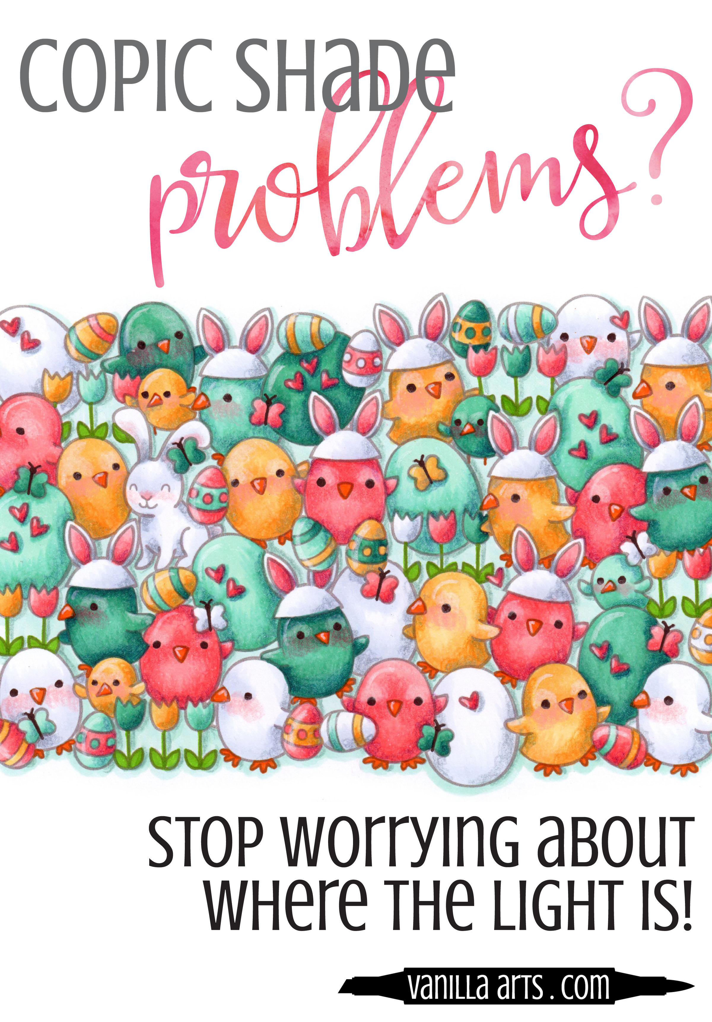
Do you draw arrows?
Are you one of those people that starts every coloring project with a little tiny arrow in the upper corner of your paper?
Why?
No really. I sincerely want to know.
Why?
Because someone told you to.
Correct?
Because that's supposed to remind you which direction the light is coming from and somehow if you just remember that key fact, your coloring will be full of depth and dimension.
And yet you still have shading problems, right?
Yep. Drawing an arrow in the top right hand corner of your paper doesn't solve much if you don't understand what it means. And frankly, I'll bet the person who told you to draw that arrow doesn't really understand what it means.
Look, I don't know who started this idiotic idea of arrows and directional light charts. I've seen 'em all. Clear acetate versions, penetrating line versions, even one that involved the earth with a little pink equator going around it.
If those things actually worked, I could have saved myself four years of art school tuition and fees.
Sunlight charts and arrows are snake oil. They don't teach you diddly-squat about how to shade objects for depth and realism.
Yep, it's no wonder that you're confused about shade and shadow. You basically bought the Brooklyn Bridge. Instead of teaching you how to shade, all that tutorial gave you was a headache.
The secret to depth & dimension...

The secret to shade has nothing to do with which direction the sun is coming from.
I know that sounds strange, but that's because you've been brainwashed.
When the sun goes down, do you suddenly turn into a pancake?
Does your dog flatten out at the stroke of midnight ?
Oh... so you're still three dimensional when the lights go off?
That's because the shape of an object is completely unrelated to the lighting conditions around it.
I teach beginners, people who have never picked up a marker before in their whole entire lives, I teach them to color with depth and dimension and we do it all without a single arrow or sunlight chart.
You can learn it too. No advanced degree necessary. No mathematics, no rulers, and most especially- no arrows... just you, me, and a few Copic Markers.
End the confusion about shade. Join one of my Push & Pull classes. It will change the way you color forever.
Three live sessions in april:

Remember When Scrapbooking in Macomb, Michigan:
Wednesday, April 12th from 1 to 3:30pm
Thursday, April 13th from 6 to 8:30pm
Lesson: Push & Pull Technique for Depth
Stamp Sets: a collage of Chirpy Chirp Chirp and Happy Easter by Lawn Fawn
Medium: Copic Marker & Prismacolor Premier Pencils
Skill Level: Absolute beginners through intermediate colorers. No drawing skills necessary.
RSVP: Call 586.598.1810 to reserve your space or to order the class stamps or Copic Markers.
Bee Creative Retreat in Oxford, Michigan:
Wednesday, April 26th from 6:30 to 9:00pm
Lesson: Push & Pull Technique for Depth
Stamp Sets: a collage of Chirpy Chirp Chirp and Happy Easter by Lawn Fawn
Medium: Copic Marker & Prismacolor Premier Pencils
Skill Level: Absolute beginners through intermediate colorers. No drawing skills necessary.
RSVP: Purchase your space here. Sorry, no walk-ins.
Want the Online Version?
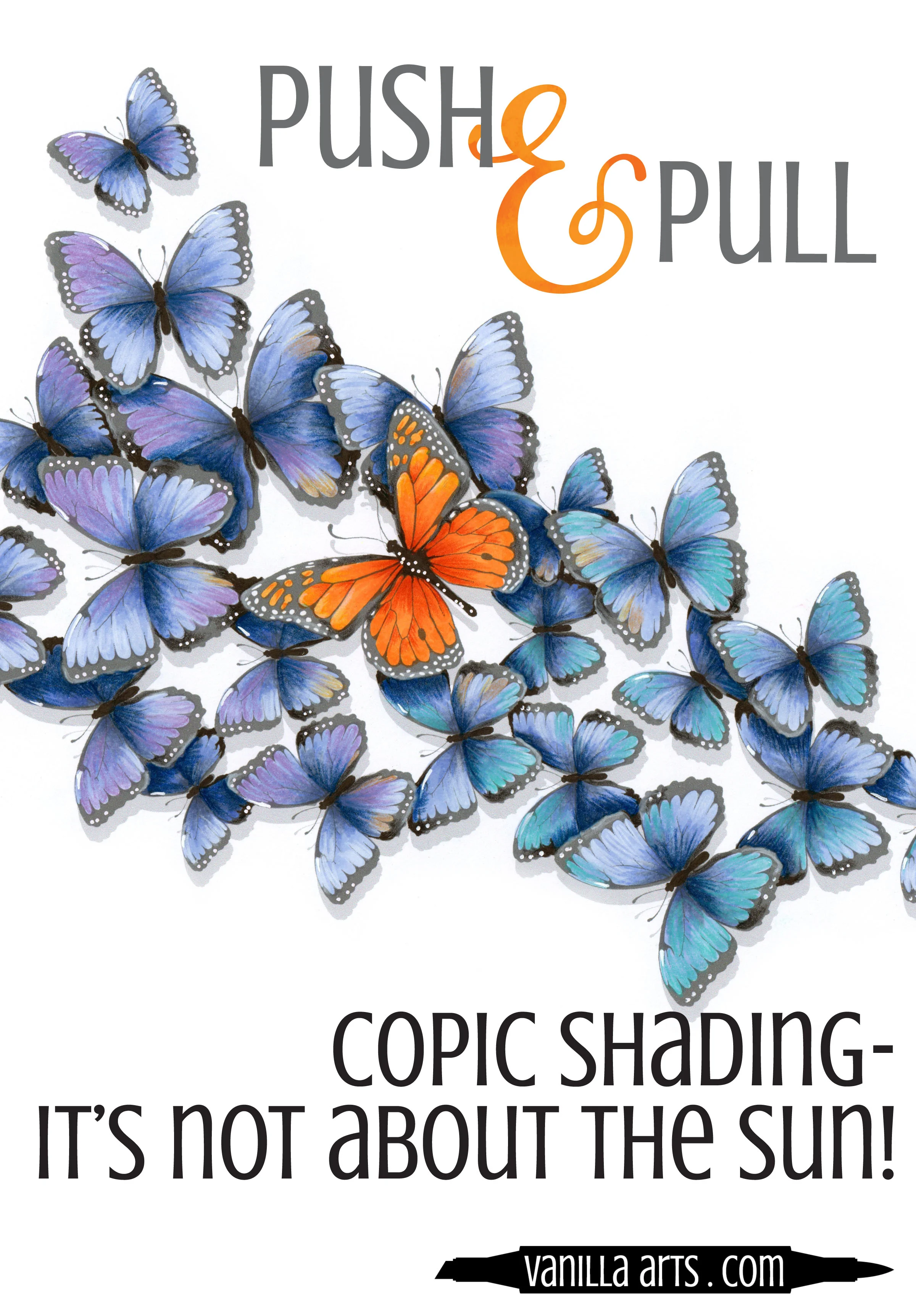
I teach the same Push & Pull technique in my online workshop called "Flutterby".
Flutterby is 1.25 hours of fully narrated video instruction plus learning aids and printables. Flutterby uses my original digital stamp, designed especially to help you learn and practice Pushing and Pulling.
My classes are thorough! I don't do "watch me color" videos. Instead, I break down the techniques and explain what we're doing every step of the way.
My goal isn't to teach you how to color butterflies. I want you to leave the course knowing how to layer and shape objects for maximum depth. That's not just a butterfly lesson it's an every-stamp-you-own lesson!
Forever access, instructor feedback, work at your own pace.
Join me for a class that clarifies the shading process
We'll burn the arrow charts in a bonfire afterwards.


Improve your Copic Marker projects: Balance your colors

After you've blended an area, do you call it finished?
A lot of Copic Marker colorers work that way- color - blend - finished. New area- color - blend - finished.
Hmmm... and a lot of you suffer from depth problems in your coloring.
Hmmm... have you ever thought those two things might be related?
The color you use is not the color we see

We all enjoy those optical illusion color tests... "Which square is darker, the answer will amaze you!"
But how many of you have stopped to think about how these little quizzes affect your coloring?
Not many, if the variety of coloring projects posted on the internet are representative. I see a lot of pale and flat projects on Pinterest and Instagram.
"But wait a minute! I used a lot of really colorful markers and I followed all the tutorials for shading! Why do some objects in my image still look flat?"
It's because you're not going back to adjust your coloring at the end of the project
Nobody but you looks at your project and says "that's B32 right there!". In fact, even really experienced Copic professionals would be hard-pressed to identify the specific markers you've used in any one area.
That's because humans do not see color in an isolated way.
An area of B32 will look like a very light blue when it's sitting next to an area that's been colored with V09. That same B32 will look dark and cool if it's sitting next to an area colored with YR82. It's the exact same blue marker but it looks totally different because the human brain always judges color in context.
Neighboring colors change our perception...

...of whether a color is light or dark, warm or cool. Value and temperature change based on what colors are nearby.
So the very first thing you color on a project- that first item, whether its the face or the cherry on an ice cream sundae... the very first thing you color goes down onto white paper. You judge how the coloring looks based on how it looks against stark white.
Meanwhile the last areas that you color are being judged against large areas of intensive marker-work. It's subtle, but the next time you color, take note of the changes in the way you use your markers from start to finish. People tend to color darker and shade more as the project progresses. That's because you're evaluating these newer areas based on the colors that are already on the paper- you are not making decisions based on white anymore.
But your viewers can't tell by looking, which areas you colored first and which areas came last. All we see are inconsistent color values across your project, with zones that are noticeably lighter, washed out, or lacking depth.

Decisions based on white will always look washed out later
This is why there are so many terrible Copic recipes on the internet for skin. Colorers tend to color the skin first which means that against the white paper, YR000 looks like a perfectly reasonable color. But once you've added vibrant hair, a bright background, and beautiful clothing colors... well, that character now looks as if they just got off a rollercoaster and are about to loose their lunch all over the sidewalk. YR000 only looks dark compared to white. Against real color, YR000 is deathly pale.
What's the solution?
It's rather easy. In fact, the fix to this problem is so stupid-simple that I'm amazed that it's rare to see instructors or tutorials mention it.
It is absolutely essential to go back and adjust your coloring!
After you've finished laying in the color on the very last item in the image, you need to re-evaluate all the areas that you colored first.

Are all your objects in the image still generally dark enough?
Did you loose some of the sense of depth because the shade is now too light?
Are the temperatures still correct?
Have recent additions led you to an image that feels temperature imbalanced because the palette skews warm or cool?
Have you over highlighted the project?
Now I know. Some of you are groaning.
You work hard to get blends nice and smooth. Once you get them silky and flawless, the last thing you want to do is go back and mess with them.
But if you want to take your coloring to the next level, if you want to amp up the realism in your projects and to get your depth and dimension feeling natural... you have to learn to ride the teeter totter.
If you add something dark, go back and adjust your lights. If you add something light, go back and adjust your darks.
It's a matter of balance.
Good coloring involves constant evaluation and adjustments. It's a process, not a do it once and you're done forever kind of thing.
SORRY, MARKER PAINTING FOUNDATIONS WAS RETIRED AFTER RUNNING FOR 10 YEARS. SEE CLASSES TAB ABOVE FOR A CURRENT SELECTION.