Improve Your Coloring: Add Zest to Neutral Copic Colors

 
Neutral color palettes do not have to be boring. Learn how to add artistic touches to improve your Copic Marker and colored pencil projects. | VanillaArts.com


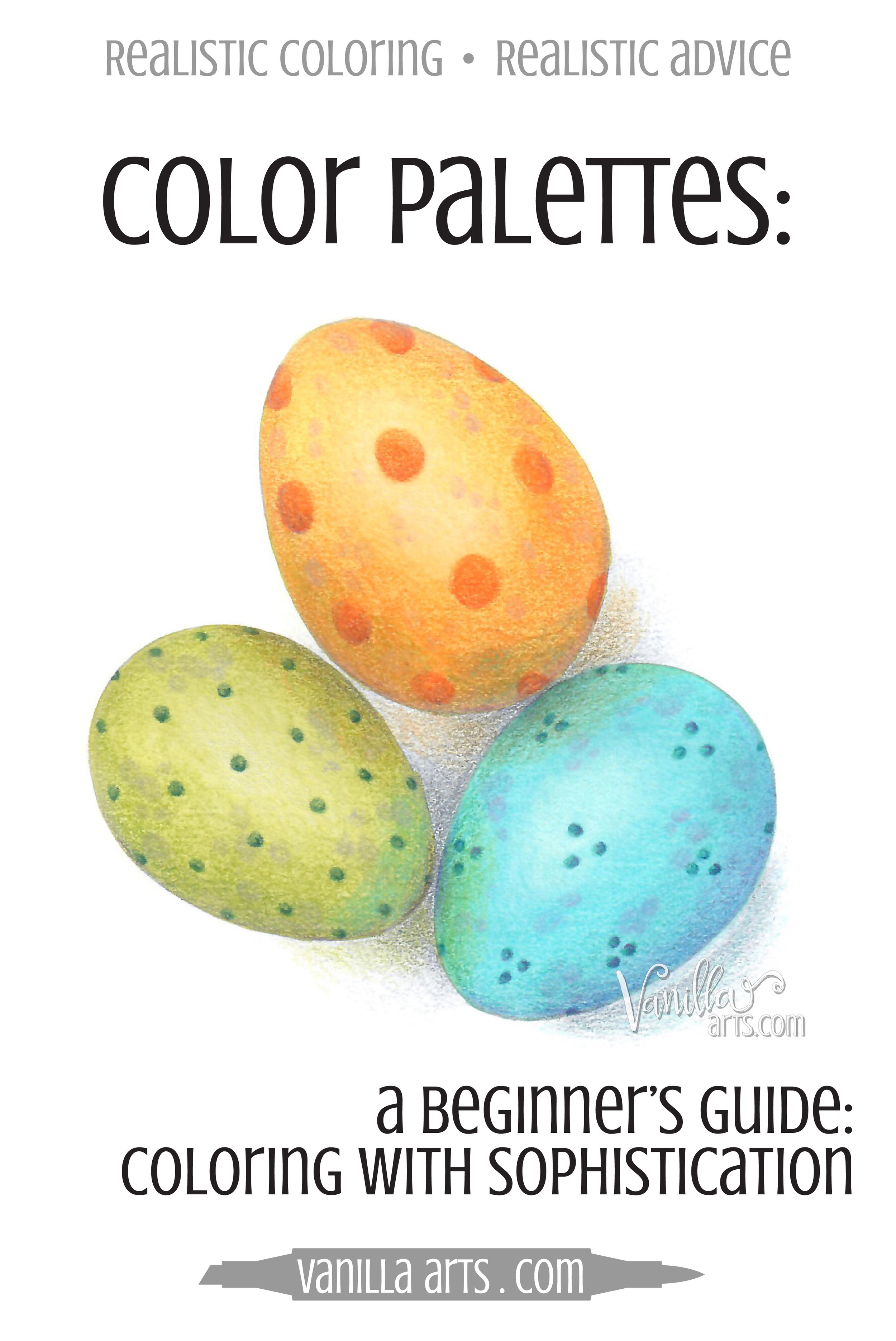
Are Neutral Colors Bland?

Copic Marker fans love color. Colored pencil people love color.

That's why you color, right?

For most of you, it's rainbow, rainbow, rainbow all the time.

Bright reds, brilliant blues, verdant greens... bring on the color, baby!

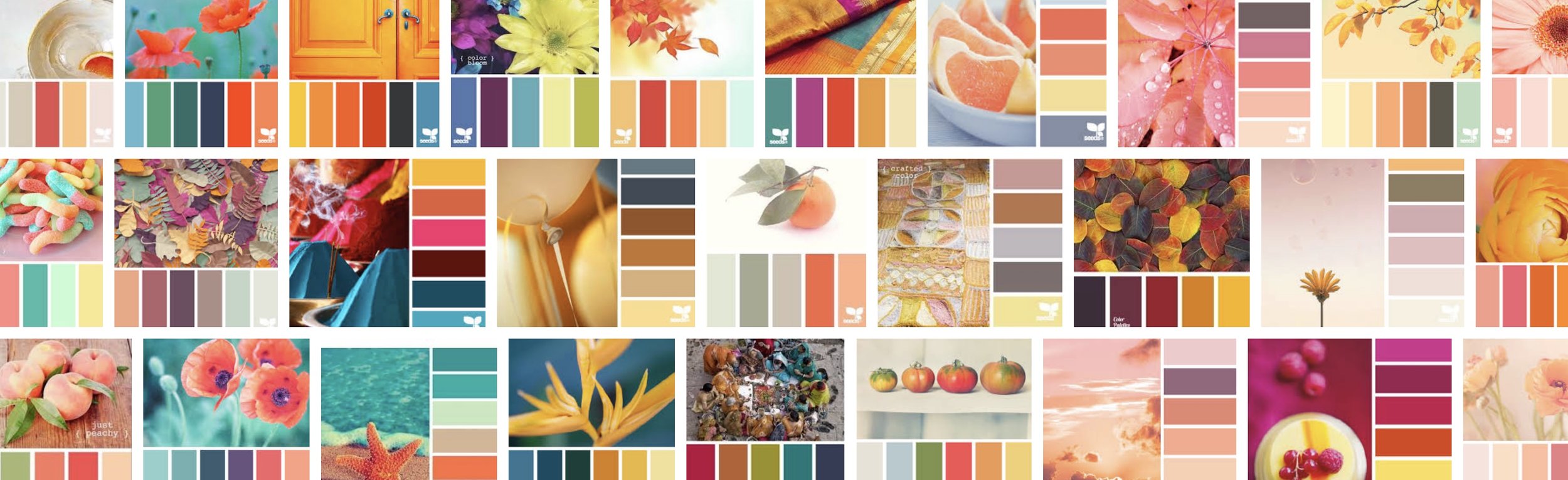
Because I teach a lot of classes and I want my presentations to be unique, I do a lot of internet surfing; looking at other project photos and tutorials so that I'm not repeating tired concepts and techniques that have been done to death.

Beige or gray doesn't have to be boring! 4 tips for adding life and zest to neutral coloring palettes with Copic Markers or colored pencils. | VanillaArts.com

In that research, I see a lot of bold and vivid colors being used.

But not a lot of neutrals.

It seems that many colorers are afraid of the toned down and slightly muddy colors.

So you write them off as unimportant.

Bland and boring. Browns and beiges and foggy grays.

Zzzzzzzzzzz

What a snoozefest!

I think that's really sad.

Neutral colors are only boring when you treat them that way!

Neutrals are some of the most interesting and complex colors available to artists. Many artists spend years, even decades learning to hand mix perfect neutral colors. If a whole bunch of artists are spending that much time studying one specific thing? Well, that's a sign. There must be something pretty darned important about neutrals.

So why aren't you using them in your coloring projects?

It's not that neutral color palettes are boring, it's that you're using them wrong!


Are you sick of Kiddie Color Palettes?

Do you want to improve the look of your coloring projects?

Are you searching for that polished professional look?

Are you tired of coloring like a circus clown or a 12 year old Disney Princess wanna-be?

Do your coloring projects have a childish look? Learn to add maturity and sophistication to Copic Marker or colored pencil projects with the use of neutral colors. | VanillaArts.com

Neutrals!

Neutrals are the solution!

Neutral colors can add the sophistication you are looking for.

Adding more neutrals to your projects is not hard.

Don't build it up to be more taxing than it ought to be.

Four simple keys...

Just four? Yep.

I have four little tricks that I use to add life and zest to my neutral color palettes!

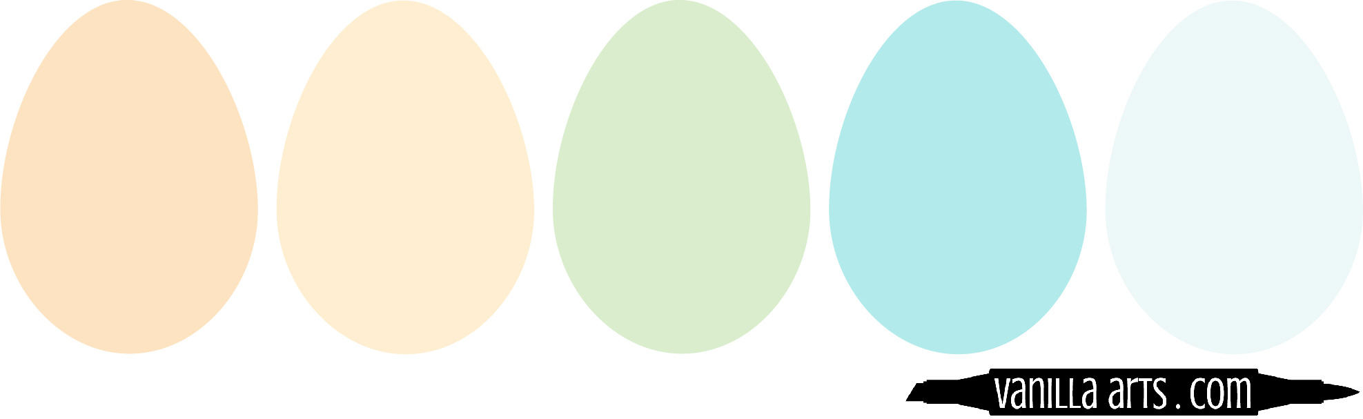
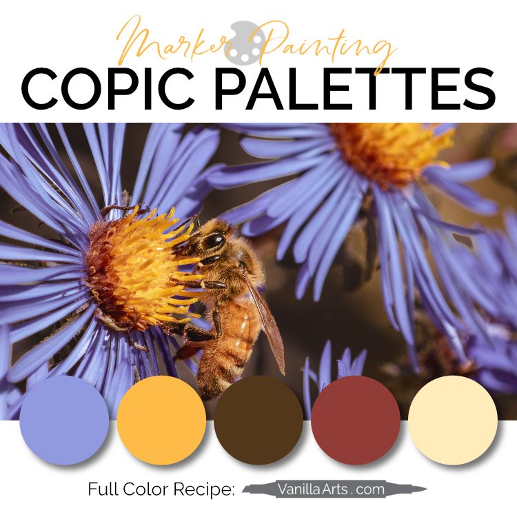
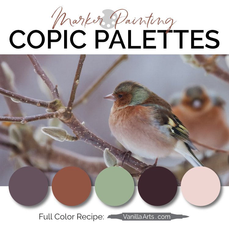
  1. Expand your definition of neutral - supplement the palette with near-neutrals like violet grays and dusty yellows.

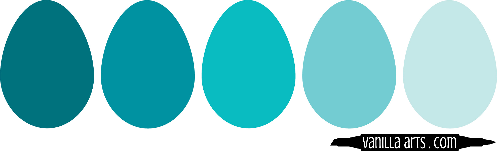
  2. Use a full range of color values - don't get stuck at the zero end of the Copic color set!

  3. Don't skip texture and pattern - smooth & plain is boring no matter what color you use!

  4. Add some spice - find pop colors to provide some kicky interest


Happy Coloring!

2 Signature Teal.jpg
 

Supplies used in "Cup of Columbine":

(partial list, contains affiliate links to Amazon and Dick Blick)


Color Palettes: A Beginner's Guide to Coloring with Maturity & Sophistication

 
Learn how to develop and use color palettes to improve the style & sophistication of your coloring. Works for Copic Markers, colored pencil, watercolor, or other mediums! | VanillaArts.com


Do You Have Color Instinct?

Some people have a knack for color palettes. They decorate their home with unique style rather than copying decor ideas from Pinterest. They make bold fashion statements rather than buying what's on the mannequin. Even their coloring projects look polished and professional.

Don't feel bad, most people are not born with an awesome sense of color.

For many colorers, a cohesive color palette is the hardest piece of the puzzle. You can blend like a pro and you're top-notch at the techniques...

And yet most of your projects feel juvenile or just plain loud due to color confusion.

Will it always be this way? Are you doomed to mediocre, unprofessional looking projects?


The Grab-Bag

Most colorers work their way through an image object by object.

First we color one egg, then the other, then the basket, then the rabbit, then the grass, then the sky. We grab completely new blending combinations for every item as we need them, without thinking about the larger composition or how the colors interact with each other.

Learn to create artistic color palettes for sophisticated and professional looking coloring projects. Improve the look of your Copic, colored pencil, or watercolor projects. | VanillaArts.com

Color grabbing leads to a circus or a color-riot. Disjointed coloring robs your project of a focal point. Your viewers can't tell what to look at because the eye keeps getting dragged from color to color.

It's sad to see great coloring get overshadowed by distracting color combinations.

But making cohesive color palettes can be hard!

Relax. You are not doomed. You can learn to work with color.

Introducing a new series for colorers:

You can learn to create and use artistic color palettes.

Let me show you how I approach color palettes as an artist.

Today, let's look at the easiest way to get your feet wet.


Behold, the Miracle!

Back in the stone-age before the internet tubes got to flowing, we had sit down at a desk style classes in color theory. Color theory is essential to art training because painting and drawing are visual mediums. Artists want you to want to look at our work.

Yes, color attracts your attention but it also guides your eye to key areas in the painting and color helps transmit a message or feeling.

Learn to create artistic color palettes for sophisticated and professional looking coloring projects. Improve the look of your Copic, colored pencil, or watercolor projects. | VanillaArts.com

Bad color usage drives people away. And not to be ignored: unappealing art doesn't sell well!

Color theory helps clarify the mood or theme of your art.

Sounds big, eh?

Sounds like more than a casual colorer wants to tackle, right?

Relax, I'm not about to recommend that every crafter enroll in a color theory class and I won't make you check out big confusing books from the library!

The internet has simplified the learning process for you. We now have entire websites devoted to collecting and cataloging color palettes. For free!

Websites like Design-Seeds, Sarah Renae Clark, and COLOURlovers offer color theory newbies a chance to learn by playing rather than sitting through lectures.

I heartily recommend color palette sites to students who want to improve the maturity of their projects. The thinking and the planning... all the brainy stuff about what matches and what coordinates... it's all been done for you.

The key is learning to use these sites effectively!

 
design seeds orange.jpeg

Start with a Plan

When you first go to a palette website, it's easy to get blown away. For anyone who loves color, these sites are mezmerizing. Hours can zip by while I'm drooling over rainbows.

The key is to enter the website knowing what you want BEFORE opening the door to temptation.

"I'm coloring an Easter stamp and I want to use a pale orange!"

That's your mission. Stick to it! Don't get sucked into looking at autumnal purple color palettes, right?

Right? Hey, stop looking at all the pretty color palettes up there.

You back with me now? Okay.

Start with a roadmap and you won't get lost.


Next Tip: Skip the Circus

Most color palette websites offer 4, 5, or 6 colors per palette. And what I"m about to say might sound a little crazy, but here goes:

Avoid all the color palettes with 4, 5, or 6 different colors!

Learn to find and color with artistic color palettes. Improve the look of your Copic, colored pencil, or watercolor projects. | VanillaArts.com 

Look, I know this kind of variety palette is really, really tempting. When it comes to color, the more color the better, eh?

But how is this palette any different than blindly grabbing five of your favorite Copics?

The color circus method isn't working for you already, so don't keep doing it!

Here's the problem, many palette websites feature a beautiful photograph. Below it, they'll give you five gorgeous colors found in the photo. But if you put your hand over the photograph and look at the palette all by itself, suddenly the palette makes no sense.

What does the tangerine color have to do with spring green or bright yellow? They don't have any relationship; there's no sense of purpose. These could have been five random crayons found in your kitchen junk drawer.

Colors in a palette need to make sense as a group.

Otherwise, they're not really a palette.


Avoid the Paint Chips

The second most common type of palette you'll find is a Value Grouping.

Here we have the same blue shown in a range of strengths. Each blue has a little more white in it but the hue never changes.

Learn to find and color with artistic color palettes. Improve the look of your Copic, colored pencil, or watercolor projects. | VanillaArts.com

Value Groups are hard to work with

... because they don't offer many options. 

This palette would work for an ocean but what color would you use for the sandy beach or the starfish that washed ashore?

It's a pretty collection of colors but it's not very useful. 

And frankly, it's not all that exciting.

Learn to find and color with artistic color palettes. Improve the look of your Copic, colored pencil, or watercolor projects. | VanillaArts.com

Sometimes you'll find Value Groupings with a pop at the end. A "pop" is a color that stands out and contrasts with the larger group. Pops add zing or interest to an otherwise ho-hum collection.

These palettes are a lot better than a straight grouping but they're almost as limiting as the original range.

If you can find a use for the Value with a Pop style palette, they can be quite striking in art... but finding the right kind of image to use them on?  That's quite a challenge.


The Best of Both Worlds

What happens when you combine the joy of the color circus with a few value groups AND a pop?

Learn to find and color with artistic color palettes. Improve the look of your Copic, colored pencil, or watercolor projects. | VanillaArts.com

This is the holy graille!

Let's call this Mixed Assets. These are the color palettes I search for and the kind I use in my projects.

And when I create my own palettes, they look a lot like this.

Here we have two major colors (tangerine and aqua) plus value versions of each and a little pop of green to spice it up.

Learn to find and color with artistic color palettes. Improve the look of your Copic, colored pencil, or watercolor projects. | VanillaArts.com

We have lots of options here!

A floral bouquet could feature large tiger lily blossoms with tiny aqua florets and greenery. I can see a gold fish swimming in a tank with a green sentiment stamp. How about a stack of duckies?

Or wouldn't this make for the most mature and sophisticated group of bubblegum balls in an orange machine?

If you need more colors, say for a background, you can always find a third or fourth value for any of the original colors. We can add a darker aqua or a yellowy-orange so pale, that it almost reads as white. These new colors aren't shown in the original palette but because they relate, they'll fit right in.

The potential of the Mixed Asset palette is endless!

This is how you avoid the childish "I just grabbed a bunch of random colors" look. Your project won't look random because viewers can sense your color plan.


Speaking of Values...

Notice anything else about my Mixed Assets palette?

Don't fall into the Pit of Pointless Pale Pastels.

Learn to find and color with artistic color palettes. Improve the look of your Copic, colored pencil, or watercolor projects. | VanillaArts.com

Remember how we used to decorate baby nurseries in pale pastels but that has that fallen out of fashion recently?

It's because pastels are not the least bit mentally stimulating. 

There's no there there.

Do you want that card to say "HAPPY BIRTHDAY TO MY BEST FRIEND AND THE MOST AWESOMEST PERSON ON EARTH!!!!"

Or do you want it to say "Ho hum, have a pretty good day... if you feel like it, but don't go out of your way... zzzzzzz"

A lively and stimulating color palette will have a range of values. Some bold and bright, some light and airy. Find a balance of values.

Yin and yang. Salt and pepper. Sweet and sour. The bold colors help you appreciate the softs and the softies keep the bold ones in check. It's a zen thing.

If you're using Copic Markers and all your markers end in a number smaller than 3, you have a snoozer on your hands!


Adding Neutrals

Many colorers are hesitant to use pre-planned color palettes because they feel locked down and constrained.

Learn to find and color with artistic color palettes. Improve the look of your Copic, colored pencil, or watercolor projects. | VanillaArts.com

What if you need more colors than you find in the original palette?

That's where experimentation and artistry come into play. Color palettes are a bit of guidance keeping you from that schizophrenic, disjointed look but you're not locked into coloring a sandy beach with a green pencil just because there's nothing else left in the palette!

I add neutrals to my images all the time! Sandy beiges or taupes work really well. For my egg illustration, I added soft dove grays and even some muted violet and lavender.

This isn't your kindergartener's crayon box anymore! Adding neutrals amplifies the maturity of any color palette.


Experiment and Play!

Pre-made color palettes are a great way to dabble in color theory and to learn about color by physically using it.

Learn to create artistic color palettes for sophisticated and professional looking coloring projects. Improve the look of your Copic, colored pencil, or watercolor projects. | VanillaArts.com

I don't know about you but I'm a visual learner. Tell me something and I'll forget. Show me and I'm more likely to remember. But let me do it with my own hands and that knowledge is cemented for life!

Experimentation is the best way for most artistic people to learn.

And trust me, playing is a lot more fun than sitting through professorial slide shows or painting an endless series of 1" swatch tiles.

What absolutely floors me about our modern color palette websites is the endless selection available! My textbooks had about 20 samples in the back index. If I recall, there were a few books of nothing but color palettes... but as a poor art student, they were beyond my pocketbook.

Technology is a wonderful thing!

Set up a Pinterest board for color palettes which appeal to you and use them in a few upcoming projects. I guarantee they will help you add order, cohesiveness, and a sense of professionalism to your coloring.


Hang on, we're not done yet!

Join me for Part Two, where I show you how to begin creating your own custom color palettes without using the websites.

Let the play time begin!

2 Signature Teal.jpg


Copic Markers: 6 Ways to Overwork your Coloring

 
Are you killing your Copic Coloring with too much love and attention? 6 ways you are damaging your project and how to prevent overcoloring. | VanillaArts.com


Are you killing your coloring?

I'd like to think that as we learn and grow, we stop making stupid mistakes.

But there's one common trait I see in all in my coloring classes and my art classes. Unfortunately it's a problem that many students never outgrow.

Artists call it "overworking"

And you know darned well, if a bunch of contrarian artists all use the same exact word for something, then it must be a serious problem!

Overworking.

It's a real battle for many people.

Overworking kills the beauty of your projects.

It kills them with love.


What is overworking?

Are you killing your Copic Coloring with too much love and attention? 6 ways you are damaging your project and how to prevent overcoloring. | VanillaArts.com

Overworking is what you do at the end of the project.

You're sitting there with something gorgeous. You've colored it with all the skill you could muster.

And it looks great!

But...

You keep on going.

Adding more.

And more on top of the more.

You should call it quits but your brain hasn't gotten the message yet. You're still going.

And going, and going.

In every project, you get to a point of diminishing returns.

When everything more that you do, everything new that you add-- it subtracts from the beauty, simplicity, and perfection of your project.

Overworking is everything you color AFTER you should be done.


How do you prevent overwork?

Well, that's a tough question.

Think about it, if Leonardo Da Vinci and his friends were worried about overworking way back in the 15th century...

...and I'm still talking about it today?

Then there aren't going to be any easy answers.

There are no magic spells, no handy apps, and no life hacks which will stop you from overworking the heck out of your project.

"Am I done?" is one of the hardest calls to make.

But you know me, I wouldn't write an article telling you all about a serious problem without offering some insight, solutions, or a class if it can't be explained in a blog post.

So let's take a look at the things I watch for as an art instructor.

Let me tell you what I see students doing- signs that they're done but don't know it yet.


6 signs you are overworking:

Hopefully you can catch yourself before you do them too!

1. The 43rd Fix

Copic loves to brag that you can go back and re-blend. Pencil companies boast that you can add 20 kajillion layers. Even watercolor manufacturers have started talking-up the ability to lift color for a second shot at perfection.

But paper is finite. It won't stand up to a ton of abuse. Every fix takes a toll on your paper.

It's okay to double back and try again but you can't do that forever.

Are you killing your Copic Coloring with too much love and attention? 6 ways you are damaging your project and how to prevent overcoloring. | VanillaArts.com

And here's the thing-

Usually, the flaw isn't noticeable to anyone but you.

You're the one who made the mistake. You're the one with your nose hovering 2 inches away from the mistake. You're the only one obsessing about the mistake.

We're all standing 4 feet back wondering what the heck you're fussing about.

But guess what we can see?

We can easily see the area you re-blended so many times that it's now dark and sticky. We can spot the places you scrubbed raw with an eraser. And that glittery butterfly sticker isn't fooling anyone. We know you're trying hide the fix of a fix of a fix.

Look, I know you don't want to admit it, but after a certain point, it's not going to get any better. You can not fix everything.

Some mistakes are better left alone.

If you've fixed it three times and it's still not right, make your peace with it.

Don't kill your whole project over a tiny flaw.


2. Outlining

Colorers have a very nasty habit.

When they run out of stuff to color, they go back and outline it all.

There's something that feels weirdly satisfying about tracing over an area you totally rocked the first time. It's like you're reliving the glory.

Are you killing your Copic Coloring with too much love and attention? 6 ways you are damaging your project and how to prevent overcoloring. | VanillaArts.com

Think about what you do with a doodle pad when talking on the phone. Most people draw a square and then trace that square nine million times. It feels good.

People do that with their coloring projects all the freekin' time. They sit there with an odd smile on their face, running the pencil or marker over the area repeatedly.

Hey, snap out of it! Stop!!!

What's the quickest way to make something look fake?

Put a big ol' outline around it.

The Mona Lisa wouldn't look quite so hot if her nose and both nostrils were outlined in heavy black scribbles, eh?

If you're sitting there tracing the original line drawing, you're done.

Get up and walk away before you damage it further.


3. Air Flourishes

I joke with students about "Jaques" the stereotype artist. He's the starving artist guy who wears a beret, red neckerchief, and a handlebar mustache.

When Jaques paints, he waves his paintbrush around in the air, drawing lots of attention. He makes fancy swishes as if he's conducting the orchestra at the Kennedy Center.

Are you killing your Copic Coloring with too much love and attention? 6 ways you are damaging your project and how to prevent overcoloring. | VanillaArts.com

Swish, swish and ooh la la!

Artists don't really work that way.

But colorers do. When I see a student making air flourishes, I zoom over to stop them.

You can't color well if you're approaching the paper with flailing arms.

The marks you make will be sloppy and out of control.

If you're waving your hands in the air, you are not coloring well.

For some reason, colorers like to go all Beethoven with their final strokes. Mad jabs and a few swoops feel like an artistic way to end the project.

But that's not joie de vivre. you're making big bold mistakes.

On purpose!

Stop. Just stop before you mess it up more.


4. Doodles

Are you killing your Copic Coloring with too much love and attention? 6 ways you are damaging your project and how to prevent overcoloring. | VanillaArts.com

Knock-knock!

Who's there?

Elephant!

Elephant who?

Elephant with daisies and stars and little pink hearts floating around in the background!

That joke doesn't make sense, does it?

Neither does the card you just made.

Pointless decoration detracts from your coloring.

If you're doodling confetti dots, adding speckles and freckles, or if you are drawing motion lines behind your characters like you see in the comics... stop!

You are ruining your project. 

Don't do that!


5. Extreme Highlighting

Are you killing your Copic Coloring with too much love and attention? 6 ways you are damaging your project and how to prevent overcoloring. | VanillaArts.com

A lot of colorers end every project with a white gel pen.

A lot of white gel pen.

Look, you could spend weeks adding little white comma shapes to everything in your image. You could highlight the toes on a ladybug and each of her eyelashes too.

But you're not adding realism, depth, or dimension.

Over-highlighting is like scoring an own-goal. You're hurting the cause.

Not everything in life has a highlight on it.

And nothing in life has a white comma on it!

I'm thinking of starting a 12 step program for folks who love their gel pens just a little tooooooo much.

That stuff is getting out of control.


6. Day Dreaming

Are you killing your Copic Coloring with too much love and attention? 6 ways you are damaging your project and how to prevent overcoloring. | VanillaArts.com

I'm going to give this unicorn card to sweet little Justin and he will love it so much! He'll sleep with the card under his pillow every night until he's 27 years old knowing that his Nana loves him...

or

Janet will be so touched that I was "Thinking of Ewe". She'll show this card to all our co-workers. Then the staff will cheer and carry me on their shoulders to the Chairman's office and they'll loudly demand that I be promoted to the head of a new Coloring Department where I'll make sheep themed cards for all the major holidays...

Uhm, yeah. If you're thinking about all that stuff, you're not thinking about what you're doing with the marker in your hand.

Distracted coloring is bad coloring.

People tend to hold off on grand plans for their artwork until they're sure that it's turning out well. We wait to see if it stinks before deciding to give it away.

So if you're thinking about what will happen after the project is finished, that's a big clue you're in the final stages.

But big dreams sap the brain power and concentration you need to finish strong.

So move away from the table.

Don't touch the project until you're back on earth.


Are you killing your Copic Coloring with too much love and attention? 6 ways you are damaging your project and how to prevent overcoloring. | VanillaArts.com

There you go!

Six major signs that you're overworking the project.

You are damaging your awesome coloring by your inability to call it quits.

Knowing when to say when is a tough decision; but if you're obsessively reblending, outlining, waving your hands around, doodling, daydreaming, or highlighting the heck out of it, it's a pretty safe bet that you're done.

You've probably been done for a while. 

While we can't rid the world of the overworking habit, you can learn to spot the signs in yourself. As you get to the end of a project, be aware of how your thoughts and movements change.

Don't let the cooling-off period be your downfall.

Watch for those little quirks and stop them before they kill your coloring.


Jellybeans has been updated and is now available as a Marker Painting Workshop!

JellyBeans

Join me for a fun a lesson on reading the form of an object and adding realism by interpreting photo references.

Jellybeans is an advanced Copic and colored pencil class.

The best thing about Marker Painting Workshops?

Workshops are NON-SEQUENTIAL!

Learn to incorporate real artistry into your coloring projects, one concept at a time. Every Workshop details a new method for enhancing realism, depth, and dimension.

Each class stands on its own as independent learning. You don't have to take six of my other classes to understand this lesson.

All of my Workshop classes have anytime access, allowing you to work at your own pace and repeat the project as many times as you'd like.

Come color with me. It's a ton of fun!

Class Printable Pack Includes: 

  • Class syllabus with detailed recipe guide

  • Full color project sample

  • Guide to Copic base

  • Detailed color map

  • Project inspiration references

2 Signature Teal.jpg
 

Over the Top: 2018 Retreat for Colored Pencil Art

 
Join Amy Shulke of Vanilla Arts Company for a relaxing colored pencil art retreat for intermediate and advanced colorers. | VanillaArts.com
 

Life gets in the way

You want to color better but wow, you are busy!

There's the job, the family, and that looming pile of dirty laundry that's about the size of New Jersey.

And even when you do find a quiet moment to squeeze in a coloring project, you're still mentally adding potatoes and bandaids to tomorrow's grocery list.

Life doesn't stop and the world doesn't slow down.

Busy is not ideal for learning

Deck View.jpg

I don't mean to question your lifestyle, I'm just saying that it's really hard to focus on skill and technique when your mind is pin-balling around.

To really learn something- to make sure that you totally understand the concept and to insure that your muscles are memorizing the feel of good technique, that requires whole brain concentration.

And if you're curious how much milk is left in the fridge or if out-of-the-blue you suddenly wonder why you didn't see the last electric bill on your bank statement, then you aren't concentrating enough to create long term memories and true learning.

The value of a retreat

Now just wait.

Most people read the word "retreat" and they think private islands in the Caribbean or a ritzy spa in southern California.

But honestly, a coloring retreat could be a room at the Motel 6.

It's not about the scenery or the surroundings that makes for an effective retreat.

It's pulling yourself out of your normal life and breaking your brain away from your usual routine. You don't need scenic alpine sunsets,  just the raw difference of being in a new place without your old responsibilities prepares your mind to absorb the lessons.

Staycation, schmay-cation!

white caps.jpg

We all try it, at least once.

I've got this video workshop that I've always wanted to do. So I'll take the week off work and watch all the lessons while everyone else is at work and school...

Fourteen loads of laundry and a three day marathon of Fixer Upper reruns and ack! That plan got shot to bits, eh?

If you're sitting at home, you're going to think home thoughts. Even sitting in your mother-in-law's coat closet would be better than sitting at home.

That's also why you get more coloring done in class and more scrapping done at crops... because no one is asking you where their other pink sock is.

When you vacate the house, you declare an intention to focus on the project, the online workshop, or the tutorials in the book you just bought. It's not just removing yourself from your normal duties, it's also setting up the mindset that "this is a new thing and I'm doing it now".

Why am I talking about retreats today?

beach 2.jpg

Because that's my latest project. A destination workshop for Vanilla Arts students who want to really focus on their colored pencils.

Online lessons are great and once a month local classes are very helpful but it's also good to get away from the world and focus on just the one special thing we love to do - coloring.

It's a private cottage right on Lake Michigan. Surrounded by woods and wildlife.

We're getting away from it all and you can join us!


Missed the Retreat?

2018 Harbor Springs Digital Retreat Bundle is Now Available in The Vanilla Stamp Shop!

Almost Like You Were There!

Except for all of the fun of meeting like-minded people and all the great stories that go along with it.

The 2018 Summer Retreat Complete Digital Package includes all three images combined in one bundle: Dahlia, Tangerine Basket and Pocket Watch.

Looking for just one package? You can check out Dahlia here, Tangerine Basket here and Pocket Watch here.


trillium exterior.jpg
 

Over the top...

Join Amy Shulke of Vanilla Arts Company for a relaxing colored pencil art retreat for intermediate and advanced colorers. | VanillaArts.com

... and slightly beyond.

Large scale projects with a colored pencil focus

Level: Intermediate to advanced colored pencil colorers. Must have taken Colored Pencil Plus or art-based C.P. classes from an art instructor.

Art Supplies Included: Bring your own pencil set(s), sharpener, and watermedia but everything else is provided! Five 11x14" line drawings plus guides and learning aids, and tons of tools.

Lessons: Instruction tailored to your needs. Retreat size limited to 10 to insure that you get lots of individualized help and guidance.

Goal: Learn to color large sized projects independently and with confidence; finding your own color palettes and unique sources of inspiration to move past copy-catting the instructor samples. We'll discuss and demonstrate the typical way that artists develop their own unique works and modify the processes to better fit the way colorers work. Lots of tools and books will also be available for you to sample and try, saving money as you build your own studio.

Food & Lodging: Included in the price!


Join me for coloring in the Northwoods

It's a whole new adventure!

2 Signature Teal.jpg