This is not a tutorial
What I really want to do today is to spark a conversation. A conversation that you're going to have with YOURSELF before you stamp out your next image for coloring.
Because if you're not asking yourself "what are my goals with this image?" then you're doing yourself a disservice.
What'dya mean "what are my goals"? I'm making a card, that's my goal!
Yeah. I thought so.
Look, handmade cards are an investment. You spent:
maybe about $10 for the stamp or stamp set
at least $50 in Copic markers to color the stamp
$5 in decorative paper and cardstock
$6,742.29 on the various tools and templates you use to make cardmaking easier
Stop and look around your craft room. Start mentally calculating all the dollars you've spent to get yourself to this point of functionality. And think of the dollars you'd spend tonight if you hit the lottery.
Cardmaking, scrapbooking, and coloring in general is not a cheap hobby.
And that's just the monetary investment. Let's think about the time investment you've put into this craft.
Not just the time you spend on projects. Add to that the time you spend thinking about projets. Or going to shows. Or Make n' Takes. And lessons.
So hey, if you've got this much of your life invested in this hobby, why do you always grab the black stamp ink to start your images?
Got'cha there, didn't I.
I'll bet you put a lot of thought into colors before you started the project. You picked out the prettiest of patterned papers, you matched them to the perfect cardstock, and you thought a lot about marker or colored pencil colors.
And you spent zero time thinking about stamp ink.
Can we work on changing that?
Stamp ink makes a difference in your presentation
And good presentations require some planning.
You don't leave on vacation without knowing how you're getting to Hawaii, do you?
So that conversation I talked about? I want you to think about the message you're trying to send with your coloring.
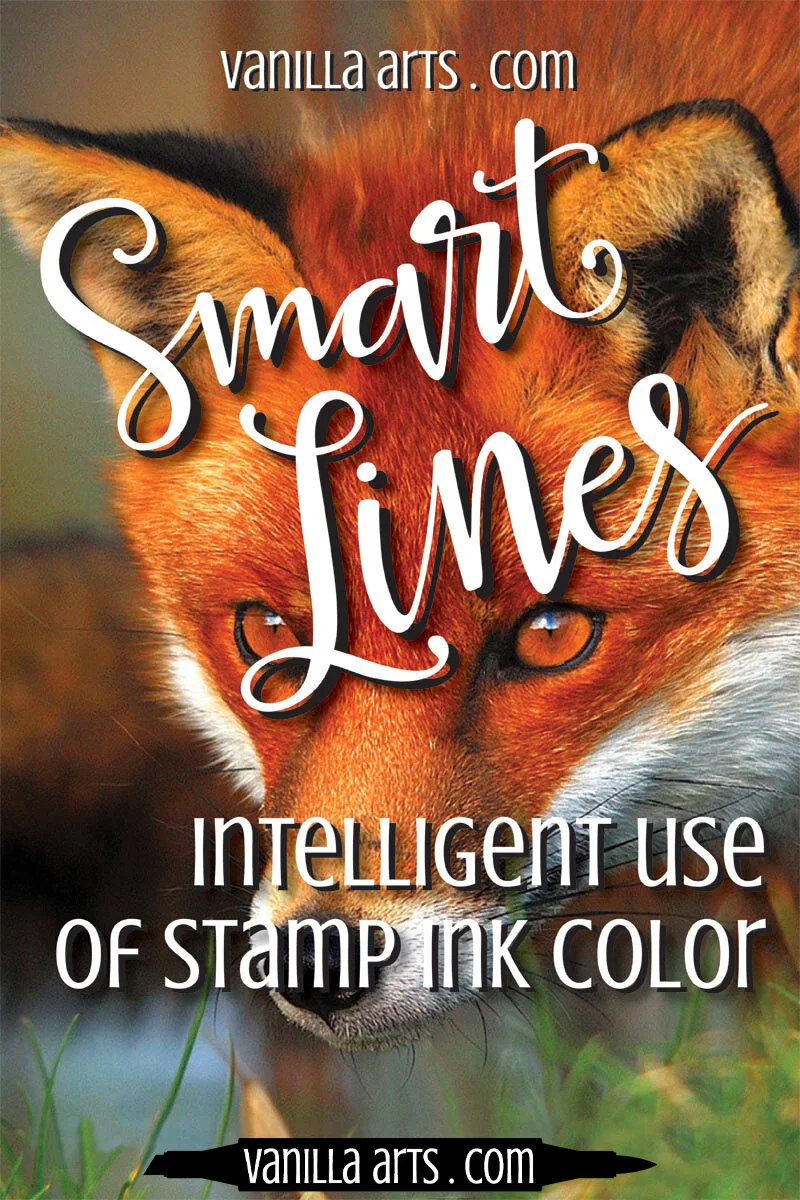
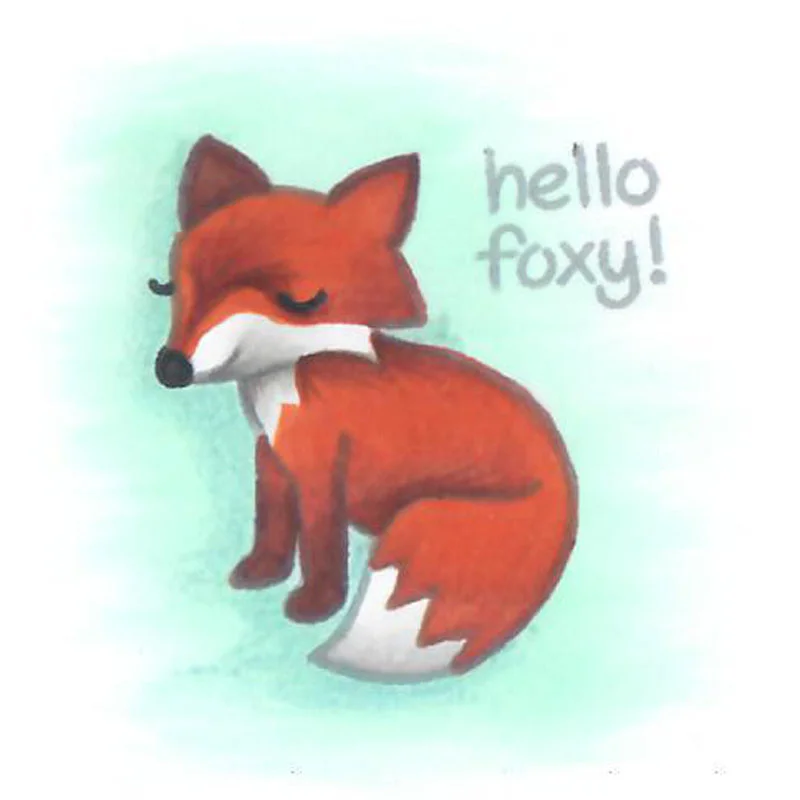
Here's a Lawn Fawn fox from the Critters in the Forest set. I chose this company as an example for a very specific reason.

Lawn Fawn makes bold and simple images. In my never-to-be-sat-upon opinion, I think Lawn Fawn and Copic markers are the perfect combination for creative colorers. Their clean and wide open images leave tons of space for really creative interpretations.
But here's the downside: those big, bold lines get even bigger and bolder when you stamp a Lawn Fawn image in black.
If you're looking to set a mood with the card that is simple and spartan, or maybe you're doing a children's card, then by all means, go with black. Black makes an LF image look like it's straight out of a children's coloring book.
Black sets a primitive and youthful tone to images. Not just Lawn Fawn images but to ALL stamp images.
But what if that's not the theme of your card?
What if you're sending a get well message to a sophisticated 50 year old woman?
Would you rip out a coloring book page, write "thinking of you in your time of difficulty" in the top corner and send that?
Because if you wouldn't, then you shouldn't be stamping the image in black.
Different ink colors send different messages
Your colored stamp image sends a message loud and clear BEFORE anyone ever reads the sentiment you stamped.
Think about the last card you received. Chances are you totally recall the picture on the front and you're a little soft when recalling the message inside.
See what I mean? Images send messages.
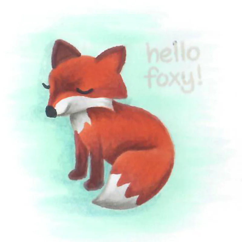
What does this one say?
Same exact image, same exact coloring process, but I used Memento's London Fog instead of Tuxedo black.
This one doesn't feel quite as pre-schooley, does it?
Now imagine that I had colored a far more complex stamp image, maybe an intricate floral bouquet stamp for use on a wedding card. Sophisticated gray ink completely tones down the kid factor and makes it more suitable for adult or serious purposes.
If the message I want to send is "Happy 45th wedding anniversary to a couple who has always served as a role model for my marriage..." or "Your son was an amazing person and I'm really sorry he had cancer and died in pain..." then gray is a much better tone to strike than the Romper Room look you get with Tuxedo Black.
It's subliminal but it's important to the final presentation.
You know what else this London Fog gray ink does?
It let's my coloring shine through. In the black sample, the fox screams "LAWN FAWN, BABY!!!!"
And yet in gray, you most likely looked a little harder at the coloring technique and the marker colors I used. If I'm spending more than 10 minutes coloring an image, I will always choose to highlight my technique. Because "LAWN FAWN, BABY!!!!" is really not a message I'm ever interested in broadcasting.


Now you may be tempted to think "hey, if a lighter line color is better than a darker line color, then maybe no-line is the absolute bestest..."
Well, calm down Trigger... Roy ain't saddled up just yet.
No-line or invisible-line coloring is a totally different beast.
For the uninitiated, no-line coloring is where you stamp out the image in a really light color that you know will eventually disappear completely, like Memento's Desert Sand or Angel Pink.
And if you do it just right, no-line coloring makes it look like you drew the image yourself.
Which can be pretty darned impressive.
Or freaky as all get-out.
Because the lines disappear, your viewer's brain won't be receiving the normal coloring book line cues. As the colorer, you need to have some skill to fill in the gaps that a viewer needs in order to consider the image pleasing.
Which means you need to have a really good grasp of depth and layering.
And which lines need to be reintroduced back into the image.
And what to do about the eyeballs.
Especially the eyeball thing. Because it's really easy to turn a sweet, charming, and innocent La-La Land girl into a homicidal axe murderer when you screw up the eyes.
You know what I'm talking about, don't you? We've all seen pinned invisible stamp images that give us the heebie jeebies. It's the eyes. Mess the eyes up and suddenly even Holly freekin' Hobby looks like the love child of Bloody Mary and Ted Bundy.
And I'm pretty sure you weren't thinking to send the Lizzy Bordon subliminal message on that birthday card.
Anyway... the point is that I want you to stop and think next time, before you stamp your image in black.
Am I sending a juvenile, humorous, or casual message?
Or do I need something more sophisticated than Sesame Street?
Choose your stamp inks as carefully as you choose your marker colors. You'll be amazed at the depth and maturity the right stamp color can add to your next card.