
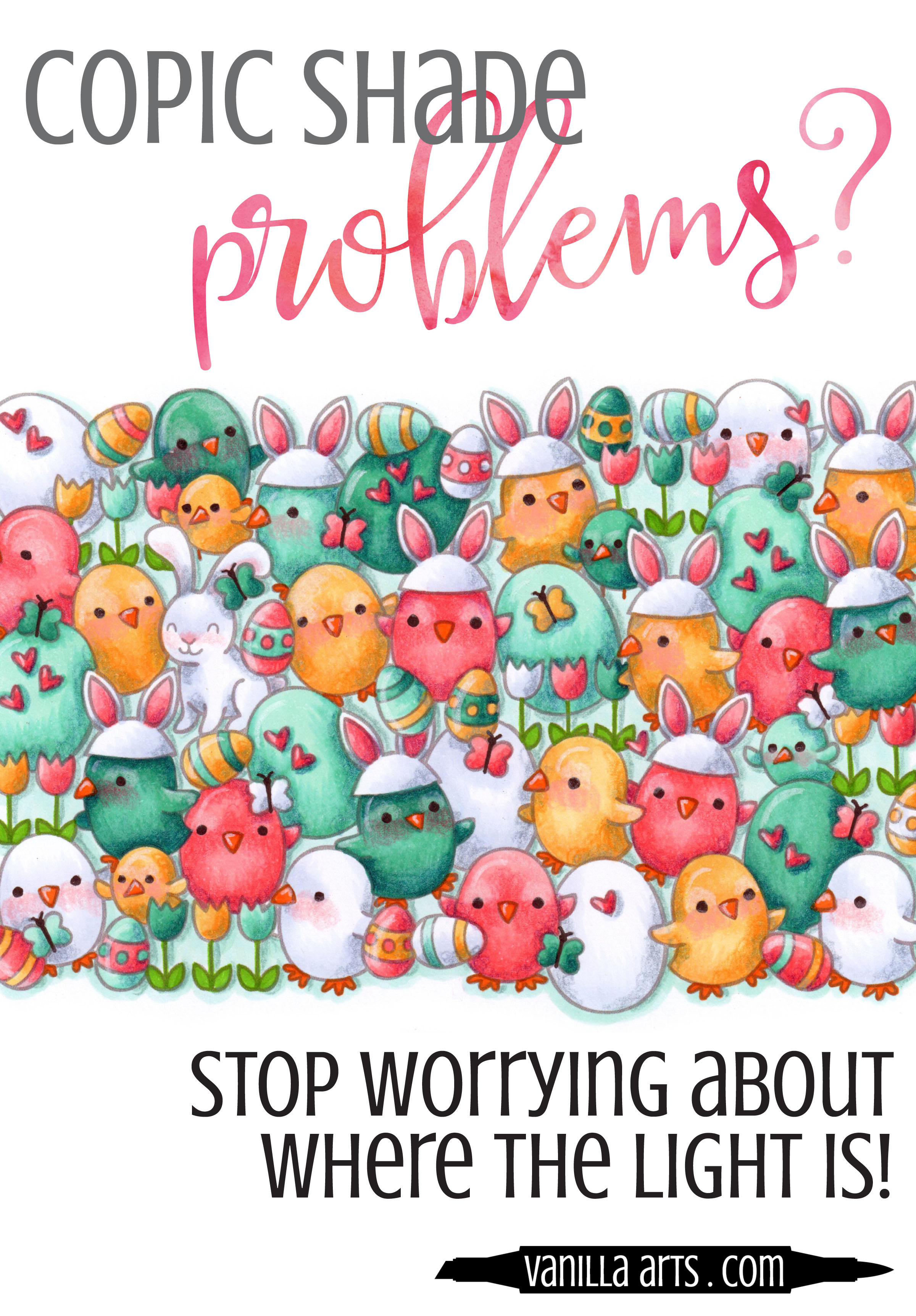
Is Your Copic Coloring Flat? Learn to Color with Depth & Dimension

Do you draw arrows?
Are you one of those people that starts every coloring project with a little tiny arrow in the upper corner of your paper?
Why?
No really. I sincerely want to know.
Why?
Because someone told you to.
Correct?
Because that's supposed to remind you which direction the light is coming from and somehow if you just remember that key fact, your coloring will be full of depth and dimension.
And yet you still have shading problems, right?
Yep. Drawing an arrow in the top right hand corner of your paper doesn't solve much if you don't understand what it means. And frankly, I'll bet the person who told you to draw that arrow doesn't really understand what it means.
Look, I don't know who started this idiotic idea of arrows and directional light charts. I've seen 'em all. Clear acetate versions, penetrating line versions, even one that involved the earth with a little pink equator going around it.
If those things actually worked, I could have saved myself four years of art school tuition and fees.
Sunlight charts and arrows are snake oil. They don't teach you diddly-squat about how to shade objects for depth and realism.
Yep, it's no wonder that you're confused about shade and shadow. You basically bought the Brooklyn Bridge. Instead of teaching you how to shade, all that tutorial gave you was a headache.
The secret to depth & dimension...

The secret to shade has nothing to do with which direction the sun is coming from.
I know that sounds strange, but that's because you've been brainwashed.
When the sun goes down, do you suddenly turn into a pancake?
Does your dog flatten out at the stroke of midnight ?
Oh... so you're still three dimensional when the lights go off?
That's because the shape of an object is completely unrelated to the lighting conditions around it.
I teach beginners, people who have never picked up a marker before in their whole entire lives, I teach them to color with depth and dimension and we do it all without a single arrow or sunlight chart.
You can learn it too. No advanced degree necessary. No mathematics, no rulers, and most especially- no arrows... just you, me, and a few Copic Markers.
End the confusion about shade. Join one of my Push & Pull classes. It will change the way you color forever.
Three live sessions in april:

Remember When Scrapbooking in Macomb, Michigan:
Wednesday, April 12th from 1 to 3:30pm
Thursday, April 13th from 6 to 8:30pm
Lesson: Push & Pull Technique for Depth
Stamp Sets: a collage of Chirpy Chirp Chirp and Happy Easter by Lawn Fawn
Medium: Copic Marker & Prismacolor Premier Pencils
Skill Level: Absolute beginners through intermediate colorers. No drawing skills necessary.
RSVP: Call 586.598.1810 to reserve your space or to order the class stamps or Copic Markers.
Bee Creative Retreat in Oxford, Michigan:
Wednesday, April 26th from 6:30 to 9:00pm
Lesson: Push & Pull Technique for Depth
Stamp Sets: a collage of Chirpy Chirp Chirp and Happy Easter by Lawn Fawn
Medium: Copic Marker & Prismacolor Premier Pencils
Skill Level: Absolute beginners through intermediate colorers. No drawing skills necessary.
RSVP: Purchase your space here. Sorry, no walk-ins.
Want the Online Version?

I teach the same Push & Pull technique in my online workshop called "Flutterby".
Flutterby is 1.25 hours of fully narrated video instruction plus learning aids and printables. Flutterby uses my original digital stamp, designed especially to help you learn and practice Pushing and Pulling.
My classes are thorough! I don't do "watch me color" videos. Instead, I break down the techniques and explain what we're doing every step of the way.
My goal isn't to teach you how to color butterflies. I want you to leave the course knowing how to layer and shape objects for maximum depth. That's not just a butterfly lesson it's an every-stamp-you-own lesson!
Forever access, instructor feedback, work at your own pace.
Join me for a class that clarifies the shading process
We'll burn the arrow charts in a bonfire afterwards.


Improve your Copic Marker projects: Balance your colors

After you've blended an area, do you call it finished?
A lot of Copic Marker colorers work that way- color - blend - finished. New area- color - blend - finished.
Hmmm... and a lot of you suffer from depth problems in your coloring.
Hmmm... have you ever thought those two things might be related?
The color you use is not the color we see

We all enjoy those optical illusion color tests... "Which square is darker, the answer will amaze you!"
But how many of you have stopped to think about how these little quizzes affect your coloring?
Not many, if the variety of coloring projects posted on the internet are representative. I see a lot of pale and flat projects on Pinterest and Instagram.
"But wait a minute! I used a lot of really colorful markers and I followed all the tutorials for shading! Why do some objects in my image still look flat?"
It's because you're not going back to adjust your coloring at the end of the project
Nobody but you looks at your project and says "that's B32 right there!". In fact, even really experienced Copic professionals would be hard-pressed to identify the specific markers you've used in any one area.
That's because humans do not see color in an isolated way.
An area of B32 will look like a very light blue when it's sitting next to an area that's been colored with V09. That same B32 will look dark and cool if it's sitting next to an area colored with YR82. It's the exact same blue marker but it looks totally different because the human brain always judges color in context.
Neighboring colors change our perception...

...of whether a color is light or dark, warm or cool. Value and temperature change based on what colors are nearby.
So the very first thing you color on a project- that first item, whether its the face or the cherry on an ice cream sundae... the very first thing you color goes down onto white paper. You judge how the coloring looks based on how it looks against stark white.
Meanwhile the last areas that you color are being judged against large areas of intensive marker-work. It's subtle, but the next time you color, take note of the changes in the way you use your markers from start to finish. People tend to color darker and shade more as the project progresses. That's because you're evaluating these newer areas based on the colors that are already on the paper- you are not making decisions based on white anymore.
But your viewers can't tell by looking, which areas you colored first and which areas came last. All we see are inconsistent color values across your project, with zones that are noticeably lighter, washed out, or lacking depth.

Decisions based on white will always look washed out later
This is why there are so many terrible Copic recipes on the internet for skin. Colorers tend to color the skin first which means that against the white paper, YR000 looks like a perfectly reasonable color. But once you've added vibrant hair, a bright background, and beautiful clothing colors... well, that character now looks as if they just got off a rollercoaster and are about to loose their lunch all over the sidewalk. YR000 only looks dark compared to white. Against real color, YR000 is deathly pale.
What's the solution?
It's rather easy. In fact, the fix to this problem is so stupid-simple that I'm amazed that it's rare to see instructors or tutorials mention it.
It is absolutely essential to go back and adjust your coloring!
After you've finished laying in the color on the very last item in the image, you need to re-evaluate all the areas that you colored first.

Are all your objects in the image still generally dark enough?
Did you loose some of the sense of depth because the shade is now too light?
Are the temperatures still correct?
Have recent additions led you to an image that feels temperature imbalanced because the palette skews warm or cool?
Have you over highlighted the project?
Now I know. Some of you are groaning.
You work hard to get blends nice and smooth. Once you get them silky and flawless, the last thing you want to do is go back and mess with them.
But if you want to take your coloring to the next level, if you want to amp up the realism in your projects and to get your depth and dimension feeling natural... you have to learn to ride the teeter totter.
If you add something dark, go back and adjust your lights. If you add something light, go back and adjust your darks.
It's a matter of balance.
Good coloring involves constant evaluation and adjustments. It's a process, not a do it once and you're done forever kind of thing.
SORRY, MARKER PAINTING FOUNDATIONS WAS RETIRED AFTER RUNNING FOR 10 YEARS. SEE CLASSES TAB ABOVE FOR A CURRENT SELECTION.

Learn to use Copic Markers with confidence

SORRY, THIS COURSE HAS EXPIRED.