The Danger of Step-by-Step Coloring Tutorials

The Danger of Step-by-Step Coloring Tutorials

Hooray! It's Blogday!

Ever notice how we look forward to certain days of the week when our favorite internetters post new content?

That's Blogday.

Time to check in with all your favorite Copic Marker bloggers. Time to scour the colored pencil channels on YouTube! And don't forget about all the coloring groups on Facebook!

But wait. Hold on a second.

Want to know why you've been coloring for years and yet…

Copic Coloring: Artists Do Not Shade- Part 3

 
The Copic shading system leads to frustration. Learn how to combat flat coloring by changing your technique and your outlook. | VanillaArts.com


Artists do not shade?

Last month, I innocently dropped a comment that “artists do not shade”Then the emails started coming in:

"But I've been taking coloring classes for years and that's what we've learned. What am I doing wrong?"

My answer is a three part series and it definitely pays to read the articles in order.

Please backtrack to read Part One first. That's where I explain the problems with the Copic blending trio system. If you're trying to add more depth, dimension, and realism then you should start by ditching the recommended Copic blending trios.

Then read Part Two where I discuss the problems with shading theory for colorers. If you've tried all the tutorials and you're still not coloring with realism, you'll find out why in Part Two. Standardized shading technique leads to flat coloring, no matter how much you practice!


The Tutorial Trap

In Part 2 we covered the two types of coloring classes or tutorials.

The "shade around the edges" technique leads to flat and unrealistic coloring. Meanwhile, the "put the shade where I tell you" style tutorials leave you dependent upon the instructor's wisdom.

The Copic shading system leads to frustration. Learn how to combat flat coloring by changing your technique and your outlook. | VanillaArts.com

But there is a deeper problem with both styles of shading-

Shading formulas rarely fit well with your stamp images.

What good is "shade the edges" when you're coloring a bicycle?

And you'd be hard pressed to find two Copic instructors who would tell you to shade identical bicycles the same way.

This failure leads you to hours of blog hopping, hoping to stumble upon something that works. You'll start hoarding tutorials and creating gigantic Pinterest boards full of "How to Color Easy Elephants" and "How to Color a Pink Squirrel on a Rusty Unicycle" step by steps.

Pink squirrel on a rusty unicycle? I'm not kidding.

For tutorials to work, they must be very specific to one particular stamp. The instructions for something as simple as "How to Color an Apple" fail completely as soon as anything in the stamp image changes. Place that apple on a black background or cut the apple open, put the apple in a basket, add a banana next to it, or change the apple from Red Delicious to Granny Smith and suddenly that realistic apple tutorial doesn't work anymore.

Then you're stuck hunting for new apple tutorials. It's a vicious cycle.


Learning to read

We thought my daughter was a genius.

We had a ton of early-reader books and she could read them all before she started school. For about six months, she was the kindergarten star. Point to any sentence and she'd tell you what it said.

But then she started falling behind. She struggled with new words and her cute little narrator's voice was lost in a sea of uhms and uhs.

Here's the thing that we didn't realize (and even her teacher missed)- my daughter had never really learned to read.

Her brother is two years older and we always read to the kids together. Then her brother started reading aloud and his books were at just the right level for my daughter to start making connections. It wasn't long before my daughter had memorized the entire bookcase of books.

It wasn't that she memorized stories or phrases; instead, she memorized the words "bed" and "dog" by their visual shape. The word "bed" was a picture; she saw it as three round shapes with a stick on each end, almost like hieroglyphics!

At a certain point, when the words got longer and the sentences contained more words, she wasn't able to keep up with the memorization game.

Without the ability to sound out new words, her amazing reading skills evaporated.

You're doing the same thing when you use tutorials to color.

Because you're not learning how to read.


Using your eyeballs

A lot of people assume that art classes teach people how to draw things- how to draw a lemon, how to draw a cupcake, etc. Bookstores are filled with "How to Draw a ______" type books and the children's department is littered with especially pernicious easy-draw books.

This leads to the idea that to be an artist, you've got to be able to draw random objects on demand. That the best artists are great because they've memorized how to draw more things.

The Copic shading system leads to frustration. Learn how to combat flat coloring by changing your technique and your outlook. | VanillaArts.com

But that's not how it works.

I've spent a lot of time sitting in art classes. I've never once had a "How to Paint a Pocket Watch" class.

Art at the college level is not Potted Plants 101 and Basic Buildings 140, working your way up to Advanced Chipmunk Techniques 450.

That's not how art works.

Art classes are about learning how to read

Art school was 4 years of figuring out how to use your eyes to observe the objects around you. Learning how to read the shape, line, and color of everyday items.

It's all about seeing.

The more you see and the stronger your observations are, the better your drawing, painting, or coloring will be.

It all starts with the eyes and that's the part which 90% of coloring tutorials skip.


Remember that sphere?

I mentioned in Part 2 that the sphere shading lesson was an exercise taken completely out of context. Colorers completely misunderstand the point of the sphere diagram.

The sphere exercise is not supposed to teach you how to shade a sphere.

It's a lesson on finding the surface of the sphere, letting your eyes wander across the surface and noting where the color changes. The goal is to find the edges between lights and darks and to note how the color travels.

sphere_large.jpg

The most important part is what happens after the students shade one sphere. Once students understand the sphere, the class gets up and switches seats. Suddenly, it's a whole new sphere! Now the challenge is to see how the lights and darks are different from a new vantage point.

Then in the next step, the sphere changes to red, or blue. How does it change the behavior of light and color? Or perhaps the teacher swaps the sphere for an egg, a cube, or a wadded up piece of fabric.

There's a lifetime of lessons that come after shading a sphere for realism! Every change the instructor makes forces the students into re-reading the object for new patches of light and dark.

That is why art is a life-long study.

Every time you change the vantage point, the lighting, the color... any slight change you make alters the entire look. Even subtle shifts create whole new landscapes of light and dark. It takes a lifetime to visually explore all the variables and options. 

You can't memorize this stuff. It's too much.

Artists learn to read and then they spend every day after that practicing their reading skills.


Tutorials do not work

... because life is too complex.

Look at my pocket watch illustration here.

The Copic shading system leads to frustration. Learn how to combat flat coloring by changing your technique and your outlook. | VanillaArts.com

I haven't Googled it but I'm certain that I'm not the first person to color a pocket watch with Copics. There may even be a "How to Color a Watch" video or tutorial on the internet right now.

But really look at my watch. Look inside the watch cover.

There isn't a Copic tutorial anywhere that shows you how to shade the inside of a watch cover like that.

And really look closely, because there's more than shade inside my cover. The cap looks concave and recessed, not because of shade but because of how the reflections travel.

Try to find a tutorial that explains how to reflect the watch face in three different areas of the inside of the cap! The larger numerals, the miniature clock-face, and the winding stem are all reflected inside the cover!

I can not teach you how to color something like this.

No teacher can.

This is not a lesson that can be conveyed via words, or written text, or even step by step work-in-progress photos.

You must learn to see it.

Only then can you do it.


Artists do not shade...

Because realism is so much more than shading.

There isn't a quick and easy formula, no one size fits all tutorial, and no 10-step solution to coloring objects for realism.

Tutorials can not teach you how to see and seeing is the key to life!

When an artist approaches a lemon, or a cupcake, or a pocket watch, they're not looking for shade. In fact, as I was coloring this watch, the only time I consciously thought the word "shade" was as I was darkening the upper left corner of the white watch face!

The rest of the time I was looking at the watch as if it were a landscape.

The watch has dips and valleys, plateaus and raised edges. Some of the surfaces are close to me, others are farther away. Some of the shapes have hard edges and others have very soft edges.

And the color!

The color saturates and desaturates as the eye travels across every single landscape feature.

"Shading" is an incredibly superficial way of approaching your art.

This is why you can get some depth, some dimension, and some realism without ever once coloring anything that actually looks real.

You're not reading the color!


Can you learn to read color?

ABSO-FREAKIN'-LUTELY! It's not a unique or rare talent.

The Copic shading system leads to frustration. Learn how to combat flat coloring by changing your technique and your outlook. | VanillaArts.com

Reading is something EVERYONE can learn to do.

But you have to ditch the tutorial concept.

You have to scrap the idea of blending combinations and project recipes.

No more light charts and no more "put the shade right here" style instruction.

And relax, I'm not about to recommend enrolling in years worth of expensive classes.

You've always had the power all along, Dorothy! And hey, no ruby slippers or creepy scarecrow hitchhikers required.

Before you color a stamp, look for a photograph of that object. If you're lucky, you might have the actual object in your house to look at.

It doesn't have to be an exact match. Close is good enough!

Visual references are what you've been missing. You have the eyes, now you need photos and objects to read.

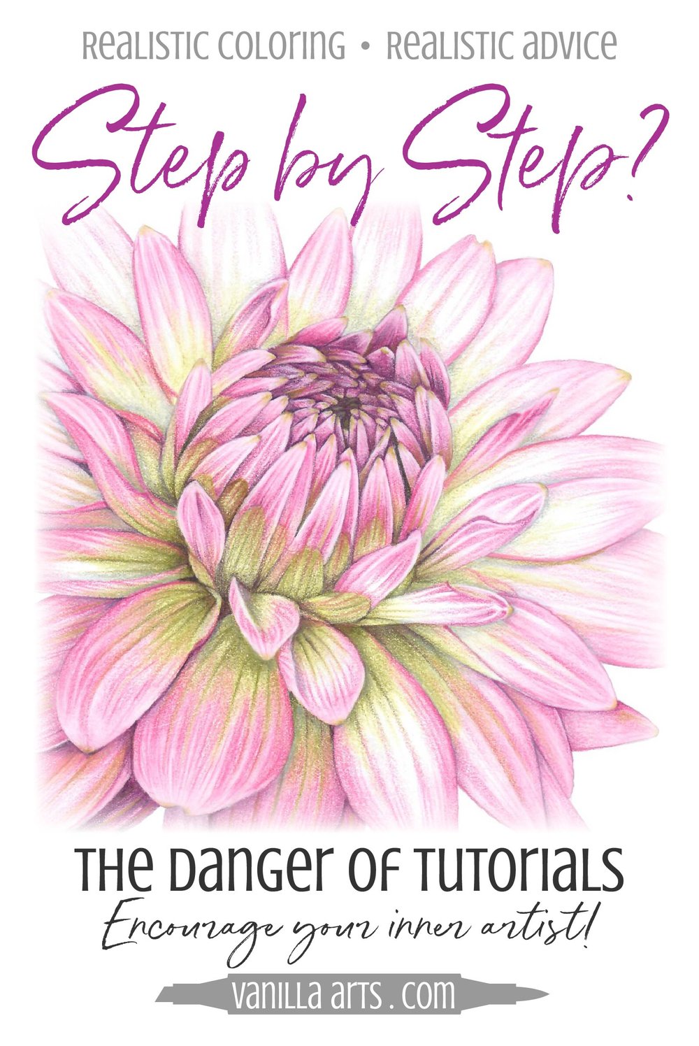
Look for lemons before coloring lemons.

Look for cupcakes before coloring cupcakes.

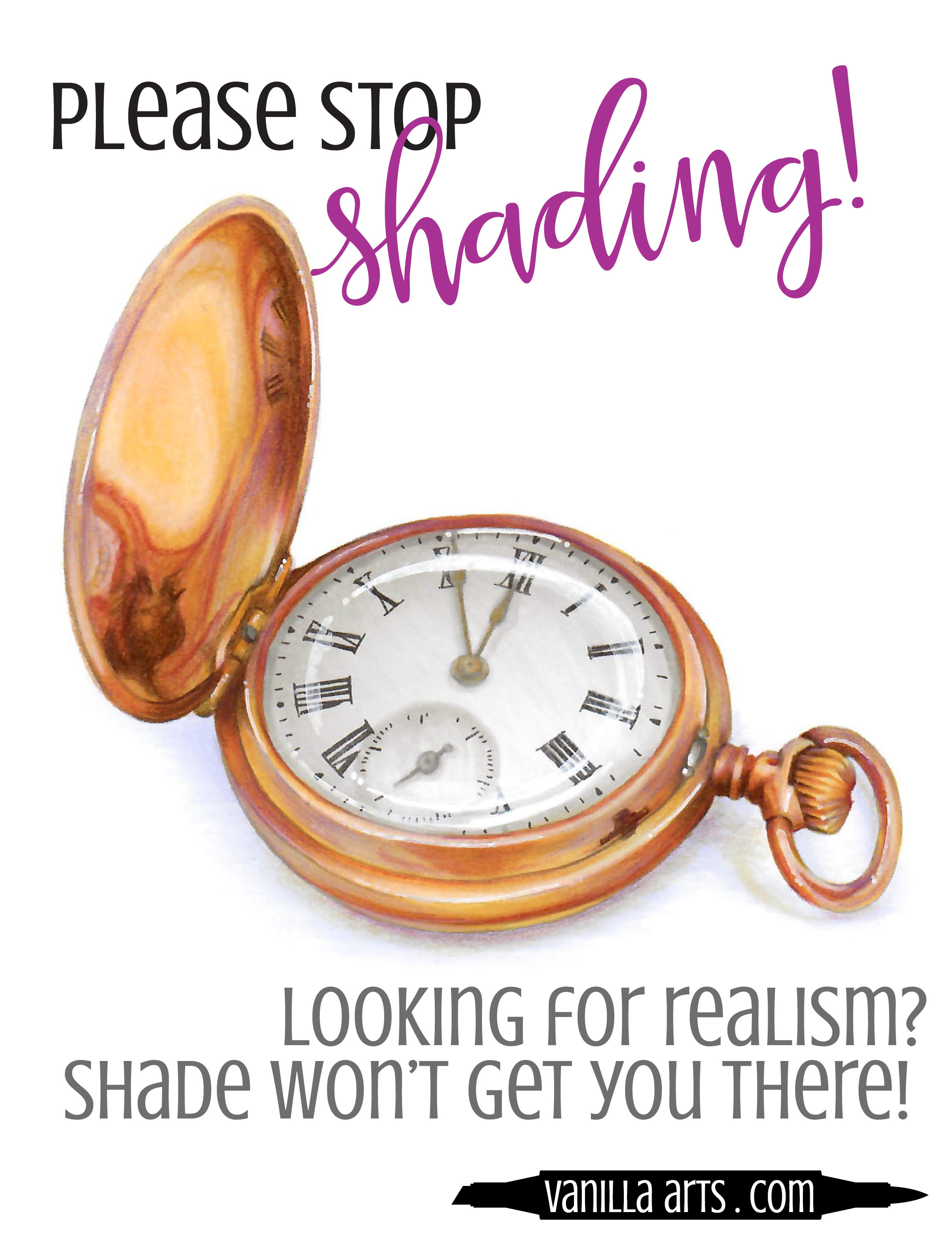
Look for apples, look for pocket watches.

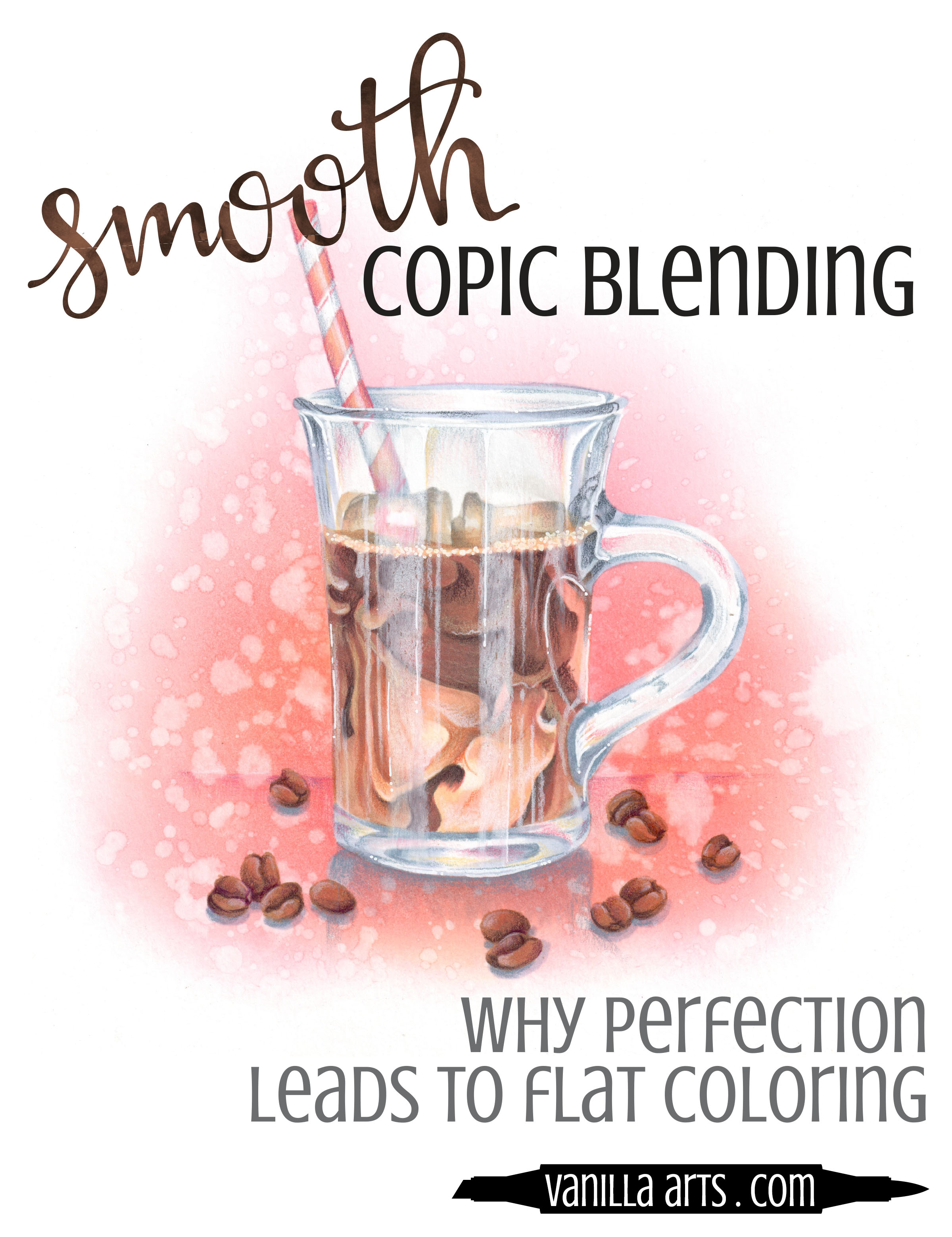
Let your eye travel across the surface of the item. Don't look for shade, look for changes in color. What colors do you see and what shapes do they take?

Then and only then do you pick up your marker to color.

You have to see before you do.

When you color, color what you see.

Don't color what someone told you, color what you see. The more you see, the more you'll add to your coloring. It's a slow-growth process but it's the same one used by artists everywhere.

It's not about shade, it's about the shape of color.

Artists read.

Artists do not shade.


Pocket Watch Is Now Available In The Vanilla Stamp Shop!

Pocket Watch -

Capture a moment of time! My students love the challenge of coloring realistic, unusual images. Pocket Watch is an intermediate/advanced level digital image and perfect for those looking to challenge themselves.

This digital image is an original stamp created for the students of my 2018 Harbor Springs Summer Art Retreat. It was originally colored in watercolor and colored pencil but is also perfect for Copic and other mediums.…your options are endless!

 
2 Signature Teal.jpg


Perfect Alcohol Marker Blends - At What Price?

 
Do you obsess about silky smooth Copic Marker blends? Why your quest for the perfect blend is killing your depth and dimension. | VanillaArts.com


Remember that feeling you had when you first learned to ride a bicycle? The speed, the wind in your face, the feeling that you’d fly to the moon if you could just pedal fast enough. You probably spent the entire summer riding up and down the street. That first burst of freedom is pure joy.

Copic colorers experience the same thing when they finally pin down the mechanics of smooth blending. And once we get a taste of it, we’re hooked. We will blend and blend and blend… just for the sheer happiness of it.

I’ll admit it, even after years of marker experience, I still love it when a satin smooth blend appears. It’s a special kind of satisfaction.

But at what price?

Yes, there’s a price to be paid when you blend.

Most colorers don’t even realize they’re paying for blends. They’ll blend all day long- smoothing and re-blending their projects repeatedly without recognizing the damage they’re doing to the overall image.


Your quest for the perfect blend sacrifices color value

Yep. Every time you blend, you loose some of the deep dark color that is essential to realism.

The more you blend, the more value you loose.


What is value?

Value is a measurement of the strength of a color. You can’t say “light” or “dark” because light and dark are relative terms. Lighter than what? Darker than what? Is dark yellow darker than light blue? 

Lighter or darker is an opinion.

Not value though. Value is a exact way of measuring the strength or visual potency of a color. Now I’m not talking theoretical art terminology here. You use color value measurements all the time; you just don’t realize it. 

Do you obsess about silky smooth Copic Marker blends? Why your quest for the perfect blend is killing your depth and dimension. | VanillaArts.com

In Copics, the last number on the marker cap indicates the value of the ink color. Copic has computer measured the strength of that color and they’ve told you where it rates on their value scale.

That last number is consistent across all the color families and it sets up a relationship between colors that you might think are completely unrelated. A Y38 is the same value as a BG78 because they both rate an 8 on the value scale. R17 measures the same value as E77 even though they’re from completely different color families.

Value is important because capturing accurate values are one key to realism. In order to make something look rounded and three dimensional, you don’t just need shade, you need shade that’s deep enough and potent enough to simulate depth. If you skimp on the values, your shaded areas aren’t strong enough, and that flattens out your coloring.

And as I said before, blending robs your project of value.

Why?

Because we blend with our middle and lighter Copic markers.

In Copics, a low last number indicates a higher level of colorless blender in the ink. Colorless blender destroys value. E33 has far more colorless blender in it than E37. So when I hit that E37 with a low value brown marker to blend it out, I’m moving some of that level 7 color around to make the entire area feel lighter and less potent. The more you blend, the more that E37 starts to look like E36 or E35.

That’s important!

You may have used a dark marker but it no longer carries the original value after you complete the blending process. Once you’ve blended it, it’s no longer as dark as it once was. You have removed some of its value.

This is a serious problem for a lot of intermediate level colorers who tend to be obsessed with blending. They’ll blend and reblend their areas, chasing the thrill of a perfect blend…

...and then they wonder why all their projects look flat.

Blending kills value.


Blending also kills contrast

Contrast?

Contrast is the difference between two values. There is very little contrast between E33 and E34, the colors are too similar. Conversely, there’s a lot of contrast between E33 and E39.

Do you obsess about silky smooth Copic Marker blends? Why your quest for the perfect blend is killing your depth and dimension. | VanillaArts.com

Artists care about contrast. The most pleasing images feature contrast AND a good range of values within that contrast range. 

The Iced Coffee illustration shown here uses markers that end in 9, 7, 5, 4, 3, 1, and 0. That’s almost a full range of Copic values from the darkest parts of the coffee to the palest gray of the glass mug. Realism relies on value and a balanced contrast range.

But think about what would happen if I started obsessing about my blends. 

If I hit my coffee browns (E89 and E59) with lots of E35 to improve the blend, that lighter marker will eat away at my level 9 browns, lowering their values to maybe 7s and 6s. Even though I used E89, it won’t look like E89 anymore. 

And it won’t look like black coffee anymore, it’ll look like chocolate milk.

Middle value washouts happen when you blend so darned much that you equalize the values between your lightest areas and your darkest. 

You chase away the value and you ruin the contrast in the attempt to create a perfect blend.

Blending flattens your projects because it decreases values and equalizes contrast. And I hate to put you in a box, but 90% of the time when someone comes to me with the old “why does my coloring look flat?” question, it’s a case of an intermediate level colorer who blends the heck out of every project. 

Your new skill is also your downfall.


You can’t keep blending without paying a price

Some amount of reblending is good!

But when you overwork your coloring in the quest for the perfect blend, you waste all the dark ink that you originally applied. “One more try” can be the kiss of death for depth and dimension.

Do you obsess about silky smooth Copic Marker blends? Why your quest for the perfect blend is killing your depth and dimension. | VanillaArts.com


Here’s the other problem: 

When you over-lighten the color of an object in the blending process, it not only flattens out, but sometimes people can no longer identify what the object is anymore. 

I can’t tell you the number of coffee projects I’ve seen where the coffee was peanut butter brown. I’ve also seen a lot of pink apples and yellow pumpkins. The colorer may have started with coffee brown, apple red, and pumpkin orange but when they blended the project to death, they killed off the color identity. Mis-colored food is confusing, unappetizing, and unrealistic.

Now I’m not saying that you should never blend a second time.

Instead, I want you to be aware that additional reblending passes will eat away at your value and contrast.

Knowing is half the battle. 

If you’re aware of the damage your’e doing, you’re less likely to keep doing it. Mindfullness helps curb your tendency to reblend and smooth an area for the third, fourth, or fifth time.

In the long run, that perfect blend means nothing if you’ve lost your values.


Swirls of Coffee Color

Learn to color realistic food and beverages with Amy’s mixed media techniques

Vanilla Workshops: Online classes for Copic Marker + colored pencil. Improve your coloring by adding fine art techniques to add depth, dimension, and realism. Classes for every skill level. | VanillaArts.com | Copic Markers, Colored Pencil, How to C…

Ready to try challenge level coloring?

Iced Coffee an Intermediate Challenge level Marker Painting Workshop

Learn how to read photo references to capture the most important details while simplifying the minor details. This concept will help you move beyond tedious coloring, relaxing into an artistic style that’s more intuitive and less exacting.

Real time coloring, recorded live

Live Workshops are unscripted demonstrations which provide students with a real look into the authentic coloring process. You’ll see mistakes being made and corrected. It’s just like visiting Amy in her home studio.

Log in and color with Amy at your convenience. Anytime access, no expiration dates.

Class was recorded in October 2021 and featured a live student audience. Amy answers questions from the students and offers many tips for better colored pencil art.


Advanced Copic Coloring: "Flamingo Feathers"


Flamingo Feathers is an intermediate/advanced level Copic & Colored Pencil Digital Stamp & Retreat Booklet  | VanillaArts.com | #coloredpencil #howtocolor #realisticcoloring


Flamingo Feathers is Now Available in The Vanilla Stamp Shop!

Flamingo Feathers -

For the bird lover in all of us!  My students love the challenge of drawing realistic birds. Flamingo Feathers is an intermediate/advanced level digital image and perfect for those looking to challenge themselves.

This digital image is an original stamp created for the students of my 2019 San Antonio Winter Art Retreat. It was originally colored in Copic and colored pencil but is also perfect for watercolor and other mediums....your options are endless!