Learn to Blend Copic Markers
In twenty years of teaching, I’ve seen many Copic Marker beginners. Here’s the weird thing—
Every student is different but I see the same coloring issues over and over.
Let's face it, it's a marker. Short of inserting it into your left nostril, there are only so many ways to screw it up.
So to help self-diagnose what goes wrong when you color, let's look at the five most common mistakes I see from beginners.
Correct these mistakes and you're not a beginner anymore!
Oh… a bit of a warning: THIS IS A JAM-PACKED ARTICLE. It’s long and full of important details plus links to more info. So grab a cup of coffee, sit back, and give it a couple of reads.
Do you make blending harder than it has to be? Here are the 5 most common Copic Marker blending mistakes I see from beginners and how to fix them:
Circular or zig-zag strokes
Starting a stroke in the middle of the shape
Bumpy Edges
Over-inking and over-correction
Coloring very slowly
Copic Mistake #1: Circular or zig-zag strokes
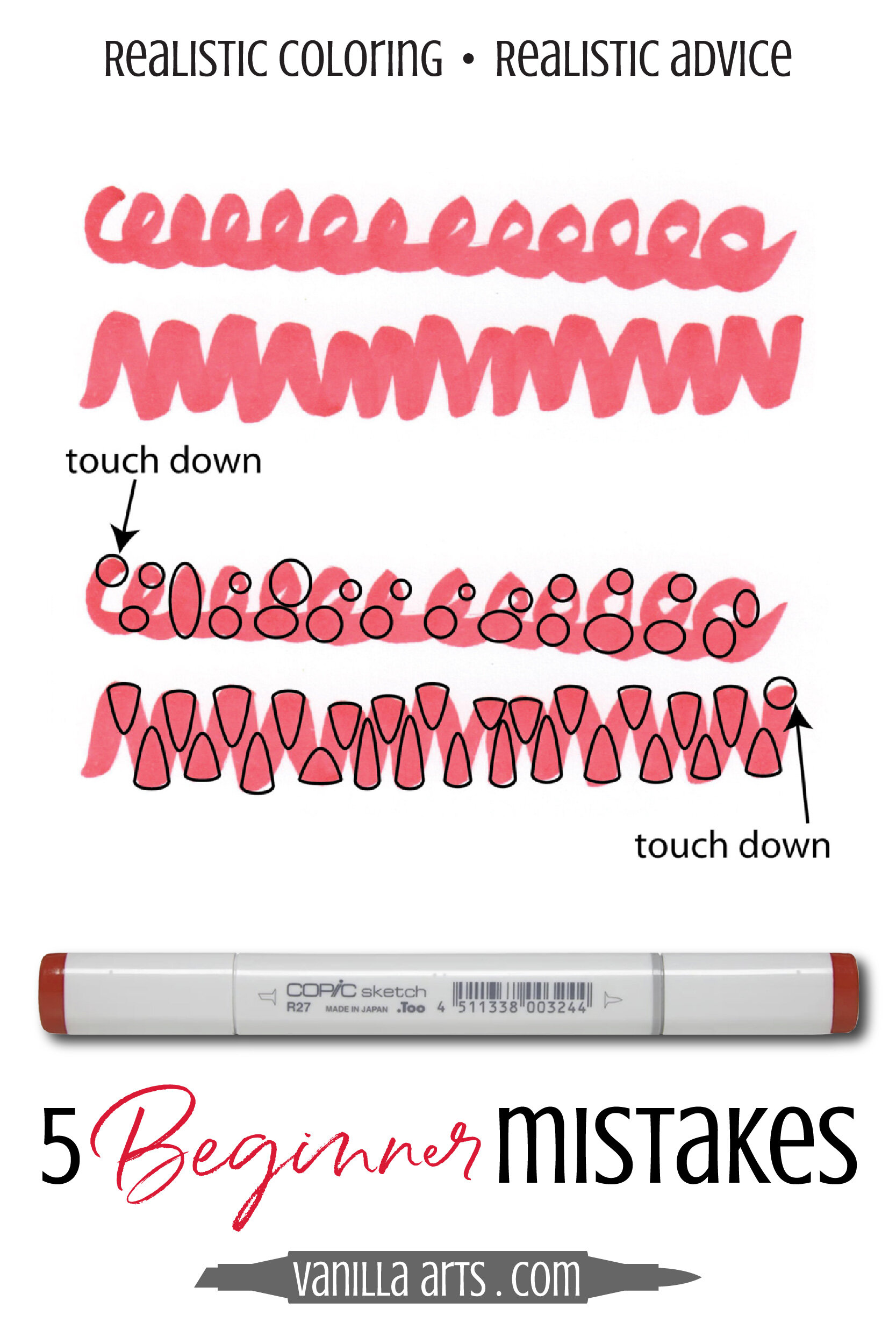
A consistent, even layer of ink is essential to smooth coloring.
You can not apply ink evenly with circular or zig-zag strokes.
You simply can’t color smoothly with an un-smooth stroke!
Here's a close-up look at swirling and zig-zags.
Swirling is a circular stroke recommended by a lot of online coloring bloggers and YouTubers.
Zig-zagging means working back and forth in a Z motion. Many students do this accidentally when they’re not paying attention.
With both strokes, you rarely lift the marker up off the paper. It’s a long and continuous stroke that winds around the shape. The more space you have to fill, the more winding and wandering your zig-zag or swirl will be.
Circular and zig-zag strokes double-back over themselves in an inconsistent manner.
This means you’re laying a lot of ink into some areas and almost no ink in other places.
Consistent layers = smooth coloring

I've circled the areas in each stroke above where the repetitive motion lays down extra ink.
And this is just the overlap in one row of swirls. Most people circle back over their previous circles!
Remember, extra ink makes a stubborn spot which causes blending problems when you add the next color.
A "touch down” is where I started the stroke. Markers always give an immediate gush of ink at the beginning (plus we tend to stall at the touchdown site a few milliseconds longer before we move the marker across the paper).
Every time a stroke overlaps itself, we get a double layer of ink.
The left lobe of this half-colored heart was zig zagged. The right lobe has the swirls.
This is only ONE application of R27 but in some areas, the ink is several layers thick.
Even though my coloring is tidy, it has a blotchy appearance due to the uneven coverage.
When I add the next color, further swirling or zigging will continue to multiply the unevenness.
Pssstttt… the Ebenezer Scrooge in me would also like to point out that you are wasting ink with all this doubling-back.
You don't need 3 layers of ink from the first color!
And I’m scared of what your layer-count will be after all the blending and re-blending. That’s a lot of expensive ink you’re wasting!
Bah-humbug!
How to fix a Circular stroke:

Use a controlled stroke pattern which is both regulated and consistent.
Think even. Think balanced.
Balance your ink layers to improve your blending.
With any brush nib marker like Copic, the easiest way to regulate ink layers is to use the flick stroke.
Flick strokes provide consistency and control.
When you work with flicks, you know exactly where the high and low concentration areas are.
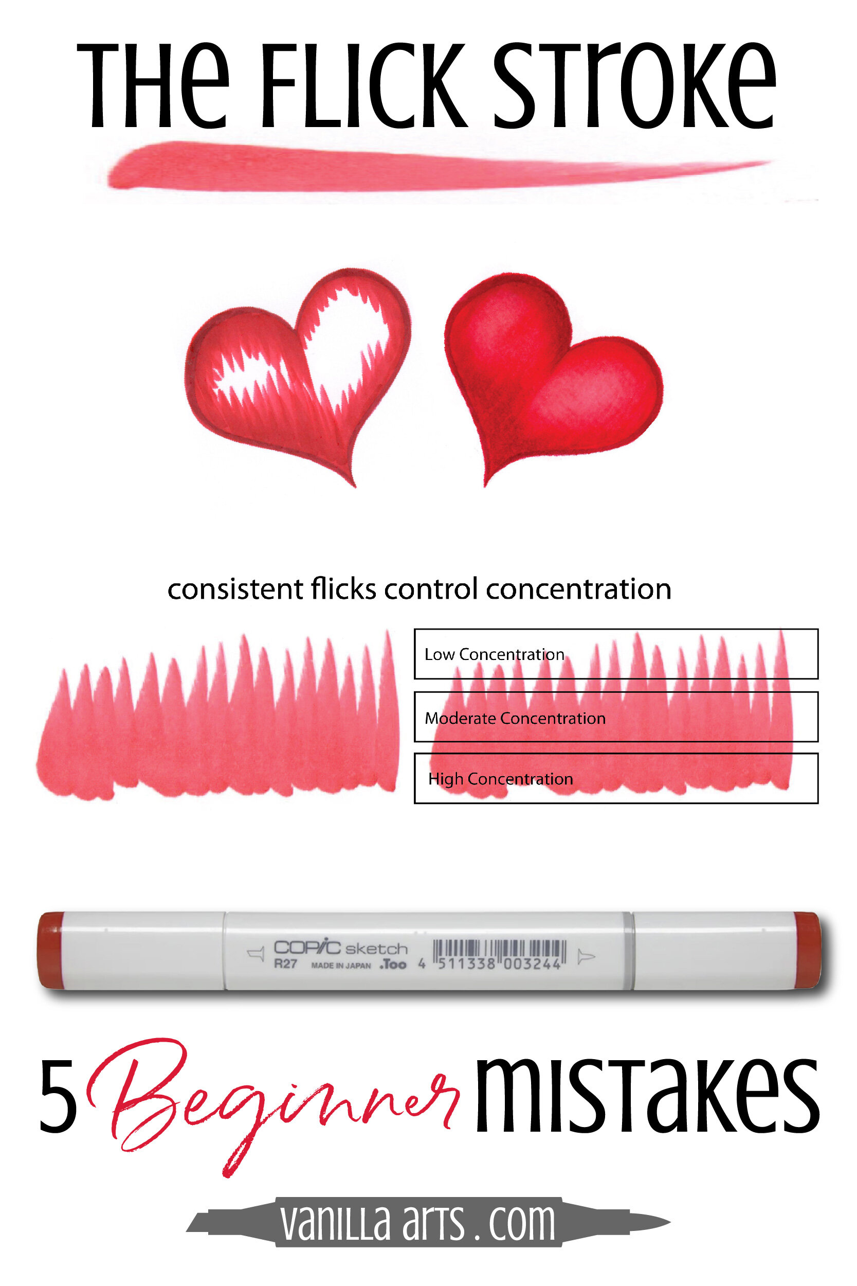
There will always be a gush at the beginning (that’s the touch-down spot) and the ink level will taper off towards the end of your stroke.
Unlike swirls or zig-zags, when we color with flick strokes, we know exactly which areas of the image have the heaviest concentrations of ink.
To give this heart a raised or puffed-heart look, I know I need to concentrate my darker colors towards the edge of the heart and leave the raised areas lighter.
Be smart: Plan your flick directions to place the high concentration of the darkest ink (R29) where you need the darkest color.
The concentration of ink softens as it moves towards the eventual highlight areas. Now when you introduce the next marker color, it will blend with a lightly concentrated area rather than having to fight with heaviest areas of R29.
The blends happen in the transition zones, not on the edges but in towards the center.

To blend smoothly, we want an area in the middle that isn't super-saturated by either color.
The key to this heart is that the edges are 100% concentrated with R29.
As we move closer towards the center, there is less and less R29 and more of the lighter marker colors showing.
Flicking ensures that the highest concentrations of ink land exactly where the ink is most needed.
Control your marker with intentional strokes.
If you are circling or zig-zagging randomly, you're just guessing where the high concentrations of ink will end up.
Guessing leads to bad coloring.
Mistake #2: Starting a marker stroke in the middle of the shape
Oh boy! I see a lot of people make this mistake in YouTube demonstrations.
So it’s not totally your fault if you do this. You likely picked up this bad habit from someone else!
Okay, from Mistake #1, we know that we want the greatest ink concentration to be out towards the outside edge of the heart, where the heart is naturally the darkest, correct?
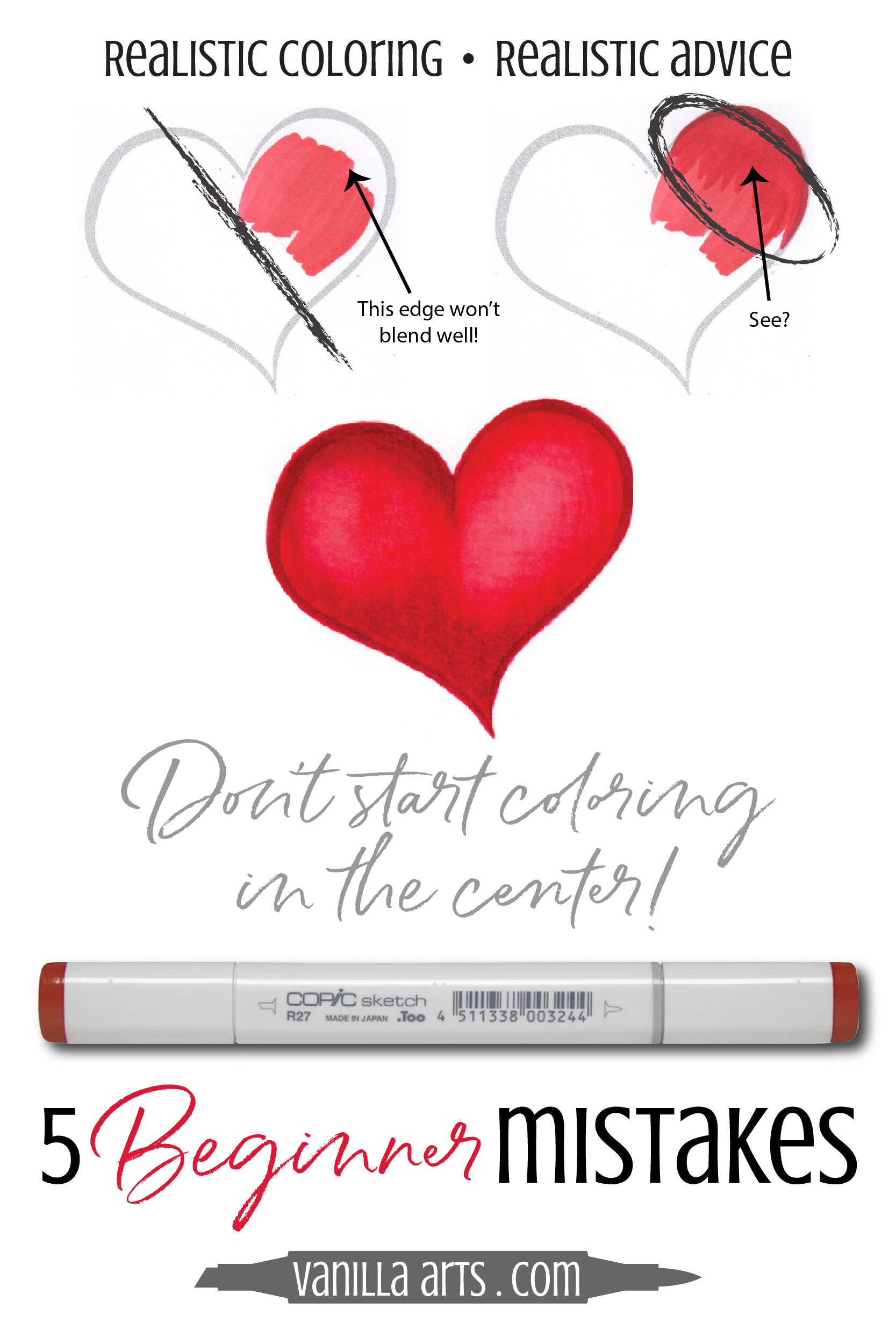
Well, that's hard to do when you start coloring in the middle of the heart!
This is R27. It’s the color we want to end up in the center-most raised part of the heart. So let’s carefully add R27 where we want it to eventually show.
Here’s the problem:
When you start in the center of a shape, it accidentally creates a heavy edge of ink.
All around this blob of R27, there’s a bit of extra ink where you touched down, doubled back, or simply hesitated.
And we know that extra ink is bad for smooth blending.
The edge build-up is what I call a "wall".
Note that the wall of R27 isn’t along the outside of the heart where a dark color might make sense; the wall is in a random center place.
Now when add the darker R29, even if I flick it perfectly... I'm always going to be fighting the wall of R27. Look at the top right heart, inside the circle. You can still see the heavy outline of R27 underneath the layer of R29.
This area will never blend easily. Walls are very tough to disguise!
How to avoid center walls:
This is one reason why I work dark to light.
I know, 4 out of 5 dentists recommend working light to dark but hey, I've never been a lemming.
If you work light to dark, you can’t help but scrub the lightest colors down in the center of the shape. Unless you color the whole darned thing R22 (which is a total waste of ink).
So this highlight zone now has 1 layer of ink and a wall of heavier ink all around it. The wall isn’t going to magically disappear either.
Light to dark coloring only works under ideal conditions.
If you're stacking your colors very evenly on a first pass, this is how it should look:

But instead, because we scrubbed in the highlight color into the middle, that means we left a wall around it.
So our layers actually look more like this.
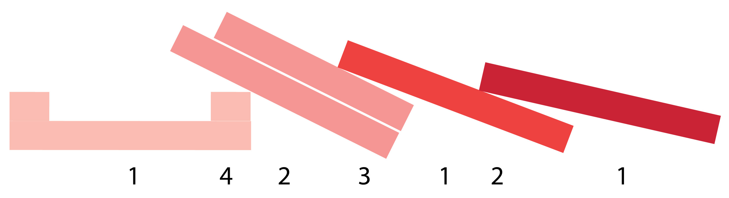
Layer one had the wall, Layer 2 needed to be extra heavy to handle the wall, so it might take 2 coats of a darker pink to fight the wall.
You now have FOUR layers in some places and only one layer in others.
But wait, it gets worse, because remember, this is light to dark coloring. Light to dark coloring could more accurately be called
Light to Dark to Light Again Coloring
At this point, you've only worked your way darker, you still need to work lighter again to finalize the blend!

Look at the incredible variation in the number of layers you have once you've worked your way through to light again.
You've got SIX layers of ink in what is supposedly a lighter zone!
You’ve got one layer on the outer edge where you need darkness.
Is it any wonder your blend looks choppy and sloppy?
A smooth blend requires consistency in layers. You can't get anything perfectly smooth when you start in the center.
You make coloring very complicated when you work light to dark.
Working dark to light saves time, ink, and heartache.
Now you may say I'm overthinking this.
I'll admit, drawing diagrams of microscopic ink layers does venture into overthinking territory...
Sure, it's a tiny 1 inch heart. When an image is small, I'm not using a lot of ink, so who cares where I start?
But hold on… if that stamp has a face, now we’ve got problems!
Layers matter a lot on faces!

If you start in the center of a face, like you blush the cheeks before you add the skin color… you've now killed your chance to create a smooth and even complexion.
Heavy build-up can make or break the look of a face!
If you put the blush and highlight colors on first, you are putting the most ink where you actually need the least.
Mistake #3: Bumpy Edges
I teach all my students to flick and I use flicks on every project.
I’m very pro-flicking, but even I’ll admit, there is one gigantic draw-back to flicking:
The starting point of a flick makes a very jagged outer edge.
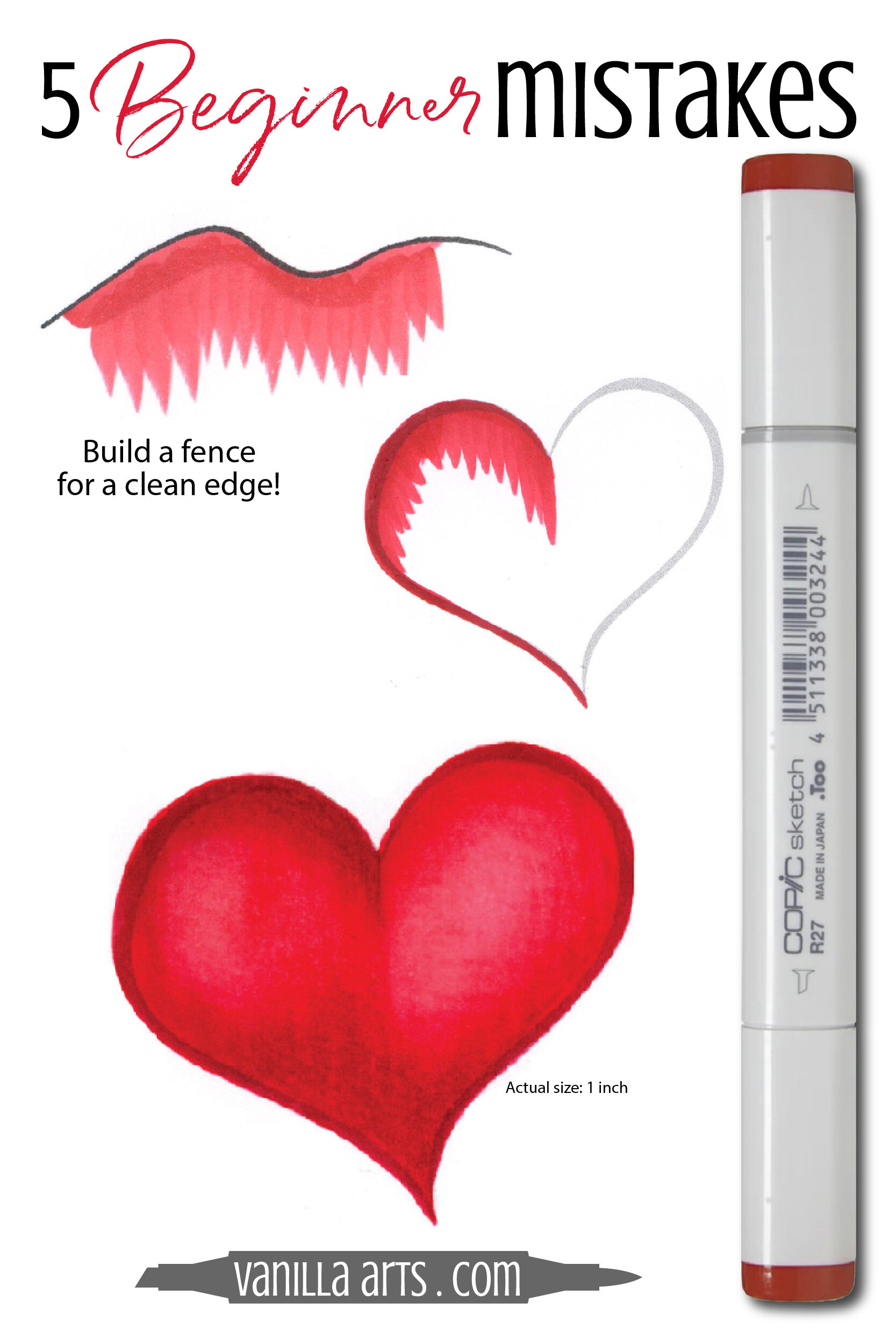
No matter how good you are, no matter how much talent you have, even the best professionals rarely flick from a consistent starting point.
Personally, I've got a better chance of winning the lottery than I have of forming nice neat clean outlines on my images with just flicking.
How to make crisp, clean Edges
Remember when I said coloring was all about intelligent ink placement?
If we know the outer edge of our heart will receive a few coats of ink to get it dark enough...
Why not use one of our coats to sharpen the edge?
Yep, I build a fence along the edges of my image. Then, no matter where I start those flicks, I know the fence will camouflage the little rounded starting points of all my flicks.
PRO TIP: Do not let the fence dry before you start flicking from it. Work wet-into-wet for a disappearing fence. The wave example shown at the top here was allowed to dry but the heart was colored wet-into-wet.
Here's how I typically work: I build a little bit of fence and then flick inwards from that fence. Then I move on to the next section.
By always hitting the fence while it's damp with the exact same color of flick, the two strokes merge smoothly and basically equalize. If you wait for the flick to dry, then you're adding one layer on top of another and it's not quite as subtle.

Mistake #4: Over-Inking
Over-inking is a problem I see more on the internet than with my local students. But that’s because I rush my locals through the coloring process.
I rush them on purpose!
When I keep the pace of the class moving, it prevents students from having time to over-ink their projects.
Over-inking is when you apply more ink than necessary.
Paper is a thirsty sponge, soaking-up your pretty Copic ink.
But at a certain point, your paper can’t absorb any more liquid. Every paper has a saturation point.
Most of the time, over-inking is a symptom of the disease Fix-it-Againitis.
You’re unhappy with your blending, so you go back and try to fix it.
But the fix doesn’t look good, so you fix the fix.
But that fix doesn’t look great either, so now you’re fixing the fix of the fix.
See where this is going? Nowhere good.
Some papers begin to seep, where color will bleed out beyond the outlines of a shape. Some papers won’t seep; instead, they leak out the backside. On layout style papers (used by illustrators, designers, and some Manga artists), you'll see an oily sheen where the ink is too heavy.
If you oversaturate X-Press It Blending Card (one of my favorite marker cardstocks), you will get what I call Copic Jelly.
Jelly is a puddle of concentrated colorant which won’t absorb into the paper. When ink doesn't have anywhere else to go, it coagulates on the surface of the paper. The solvent evaporates but the colorant particles stick around. They form a sticky gooey mess. It’s jelly.
Bleeding edges, backside leakage, oily patches, and Copic Jelly aren't the only bad things to happen when you over-ink the paper.
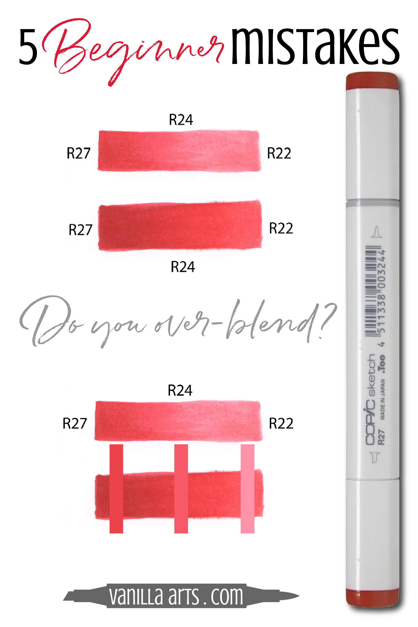
When you blend too many times, you lose color variation.
Here I've used the same 3 markers to make a blend. I colored dark to light using R27, R24, and R22.
On the bottom swatch in each sample set, I blended and re-blended the entire swatch, three times. Look at how flat it looks!
Re-blending kills contrast.
Not only does the bottom swatch look flatter and less dimensional, it's also significantly darker. In the bottom set of swatches, I’m directly showing you how much darker each ink gets with just three coats.
R22 x 3 coats looks more like R25 or R26. That’s not a little bit darker, that’s a lot!
How to avoid over-inking
1. Work dark to light. The fewer times you have to go up and down the blending scale, the less opportunity you'll have to over-blend.
2. There is a 20-30 second delay from the time you start blending to when you’ll actually see the blends form. Many people blend and blend until they see something happen but at that point, you’ve already overinked the image.
Instead, blend it once and then wait. If it still looks bad after a minute, then go back and blend it again. But wait because with good technique and on good marker cardstock, the first time is usually better than you think!
3. Take a step back. The average colorer hovers about 2 inches away from their paper when they're analyzing a mistake.
I know, I watch you folks cram up close and squint!
Here's a question: When you want to see if a pair of pants makes your butt look big, do you stand two inches away from the mirror?
How about when you check your makeup?
Whoa! Nothing looks good at two inches away. Even freakin’ Kate Upton looks like a hag from two inches away!
Step away from the paper.
Stand back.
Can you still see the mistake from 2 feet away?
Unless your card recipient is grandma who forgot her spectacles, your viewer is going to be looking at your project from about an arms length away.
Things always look better when they're not under a microscope!
Mistake #5: Coloring Slowly
When students finally understand the blending technique but they’re still shaky and unsure about how to do it perfectly, they tend to slow down and color very, very, very, very carefully.
The drive for perfection is the killer here.
Maybe it's because you're overthinking the process. It's only natural, when your brain gets busy, your hand slows down.
Or maybe you figure if you color slowly you’ll be able to correct yourself, mid-mistake.
But pay attention to the teacher or demonstrator… they’re not coloring slowly, are they?
Nope.
Good colorers are almost never slow colorers.
I'm a jack-rabbit. I don't waste time dinking around. Seeing a slow colorer makes me want to honk my horn at them. Beep-beep, hurry it up buddy!
But it's not just a driving-slow-in-the-fast-lane kind of problem.
Slow colorers cause themselves more problems than they're solving. Pokey-slow coloring looks bad.
When you color slow, you lay down a ton of ink!
And as we learned above, over-inking leads to dark coloring.
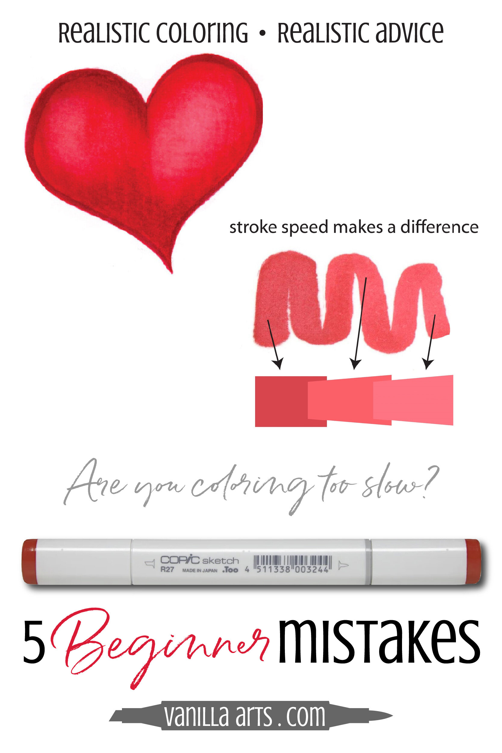
Here is one stoke. One long and slow (and painful) stroke.
For the first peak, I went slow. So slow, I almost died. Look at how much it bled!
The second peak was a teeny bit faster.
The third peak was faster yet but honestly, it was still pretty slow compared to my normal flick rate.
Now check out what the speed did to the line color.
The squiggly line I made isn't just fuzzy and weepy, it's also several shades darker! It looks like I used different Copics but I didn’t. That’s one marker giving me significantly darker coloring based on speed alone.
How to avoid slow over-inking:
Beep-beep! Hurry up!
If you are regularly getting bleed-through, oil slicks, or Copic Jelly on the surface of your cardstock, maybe it's not how many times you're re-blending, maybe it's your lack of speed!
So there you go:
5 Beginner Copic mistakes and 5 solutions
Circular strokes and zig-zags lead to sloppy, choppy blending.
Use a flick stroke for greater ink control.
When you start in the center, you build an unblendable wall.
Work dark to light, you’ll use less ink and ruin fewer faces.
Flick strokes have messy starting lines.
Build a small fence and flick from the fence while it’s still wet for clean, crispy edges.
Fixing the fix of the fix of the fix of the fix…
Stop and take a breath. Come back to it later to decide if you really need to fix it again.
Slow strokes and deep thoughts…
Pokey-slow coloring leads to over-saturated paper and flat color.
But wait, that’s not all!
There are more mistakes coming.
I sat down to brainstorm five mistakes and came up with a big long list. I've got five MORE mistakes here!
Want more helpful marker advice?
Check out my other site, MarkerNovice.com. As the name implies, it’s full of information for first timers, beginners, and people looking to transition to Copic Markers from other mediums.