It’s all been done before…
Ho hum…
Blah.
That’s not exactly the feeling you want during your next Copic Marker or colored pencil project, eh?
The blahs are basically what happens to many colorers about a year or so into coloring. You’ve built a good sized marker collection, you can blend fairly well, the tutorials actually make sense now, and your projects turn out pretty good (most of the time).
But hmmmmm, there’s something missing.
For a long time, you imagined how it would be to not-stink at coloring. You thought it would feel amazing but instead, it’s… well…
Blah.
As you move from beginner to upper level coloring, there comes a point when you realize the zing you once had is gone.

It’s not that you’re bored with coloring, it’s that you’re bored with YOUR coloring.
So what’s going on? Why do you suddenly feel this way?
The coloring doldrums— when it feels like you’ve done it all before or when you start noticing that everything you color looks the same as everything else everyone else is coloring…
That’s a sign you are ready for a challenge.
Smooth Copic blends and silky pencil gradients can only satisfy your artistic beast for so long.
When you couldn’t blend well, when it was hard to stay in the lines, when it took all your concentration to create even a little bit of dimension? Back then, your artistic beast had something to do. Simple competency was a goal.
But now that you can do it?
And do it without much thought?
Well, now you’re starting to notice that every tutorial out there is just another variation on the same old song.
Blend this using this combo. Blend that using that combo.
Even the hot new trends and freshest techniques look very similar when you pop open the hood and look at the engine.
More blending.
That’s the blahs. The doldrums.
And sadly, the blahs are why so many good Copic colorers wander off to try Plein Air Knitting or Whiskey & Watercolor classes.
Been there, done that, doin’ something else more exciting now.
Blah.
Spice up your coloring!
Stop searching for new craft products, mediums, or techniques to entertain yourself.
Holographic sequins in the margins or slapping on a detailed background as an afterthought, even if takes four hours to color…
Decoration and doodling are not the solution to the coloring blahs.
They’re band aids at best and distractions at worst.
Instead, how about taking your artistry to the next level?
Fine art concepts are easy to incorporate into your coloring routine and they do wonderful things to beat the blahs:
They challenge your artistic beast
They polish your presentation skills
Now don’t get all sheepish on me!
“Oh, but I’m just colorer, I don’t draw. I’m not an artist!”
You don’t have to be an officially-official artist, wear a beret, or enroll in real art classes to use fine art concepts in your coloring projects!
This knowledge is free for the taking, nobody owns it. There are no membership cards, no authorization forms required.
You’re allowed to do real art stuff!
Let’s learn the Rule of Three
I think the Rule of Three is one of the easiest methods to immediately step up your coloring game.
The Rule of Three is a simple concept to understand and a cinch to apply to your projects.

But here’s the wicked benefit:
This formula can challenge you for an entire lifetime!
That’s right. I started using the Rule of Three in highschool and I’m still using it thirty-umph years later. As I grow and mature, this same rule keeps opening new doors and new challenges.
It’s the rule that keeps on rulin’!
But first, a wee bit o’ disclaimer: I honestly don’t remember where this rule comes from. As I mention in this video, I had an awesome mentor in high school and the R3 could have been something he said or something I summarized. And while I’ve heard other illustrators talk about similar concepts, I’ve never heard anyone call it “the Rule of Three”.
Three is a freakishly recurring concept in art and design. Heck, three is downright magical in the regular world too. So I’m not about to proclaim that my Rule of Three is the most-bestest Rule of Three ever.
It’s just a nifty way to think about your art, okay?
Don’t name-drop R3 into your next conversation with a famous artist and expect them to know what you’re talking about.
It’s an Amy-ism, folks.
The rule of three: hue, Value, and Quality
Whoa, oh no. Amy’s throwing art words at us…
Oh but grasshopper, it’s simple…
and yet complex.
Worlds within worlds going on here. You’re getting deep stuff from the blonde girl today!

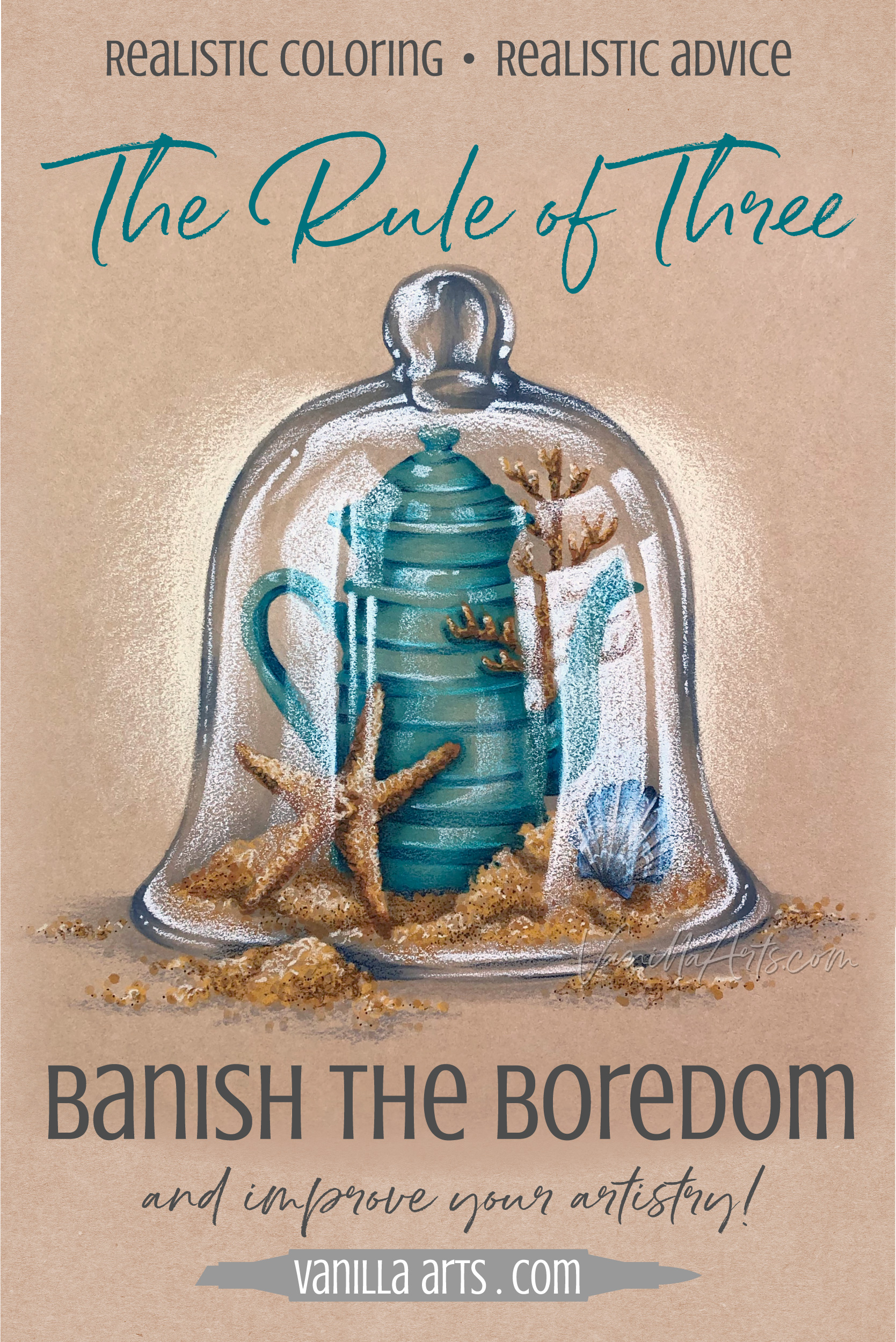
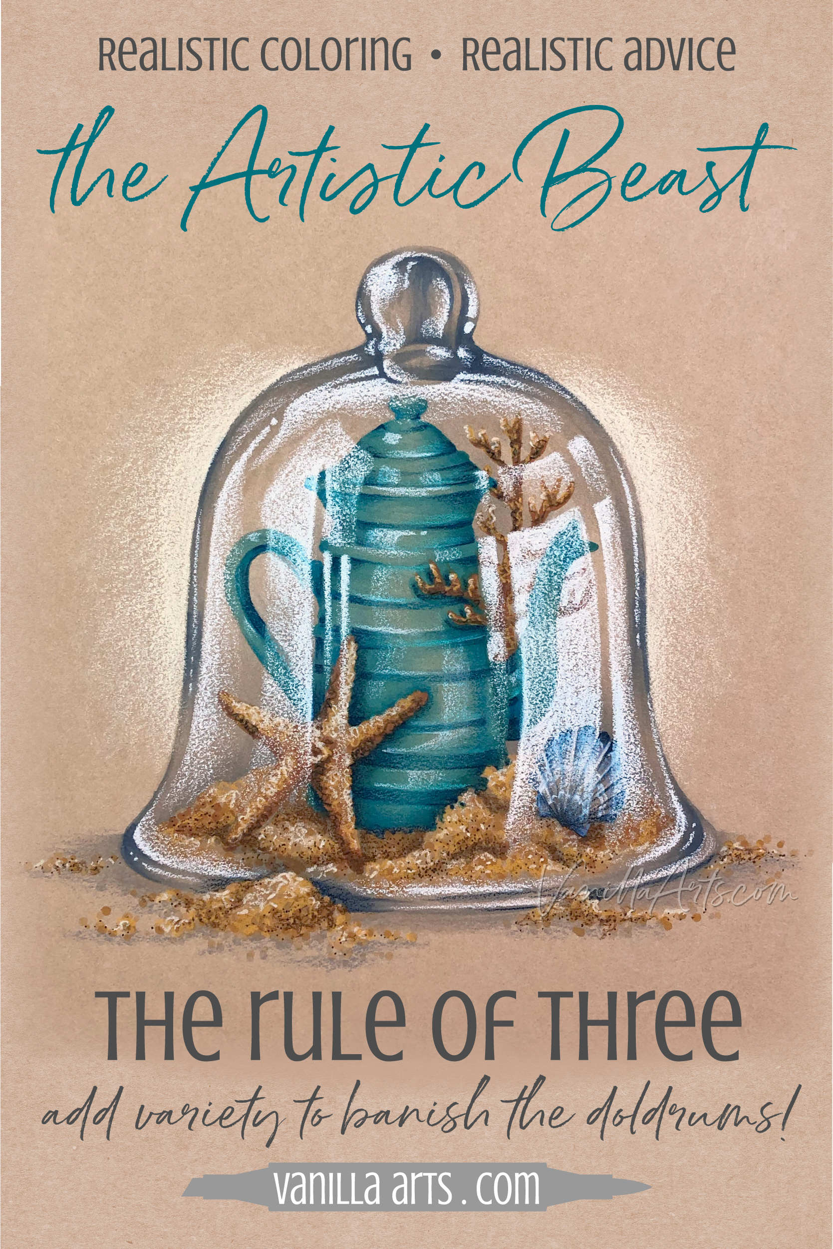
Let’s break it down now; divide the Rule of Three into its three components to see how they can improve the presentation, realism, and artistic nature of the Sea Glass project.
Hue x3
Value x3
Quality x3
Pssstttt… the Vanilla die-hards can have fun going back to see the R3 hidden in my other classes. It’s there if you know to look for it.
As I plan a project, the Rule of Three is my checklist.
I’m never just coloring, I’m always striving to see how well I can meet the R3 goals and how creatively I can achieve all three requirements.
It’s a mental game I play with myself but it also improves the visual presentation of my artwork.
1. Three Hues - Color Cohesiveness
For this article, when you see “hue”, think “color”. The two terms are not the same. But for today, let’s pretend they’re synonyms.
(I’ve got an article on color palettes here, a good primer if you’re new to planning color palettes.)
Okay, so back to the first R3 about three hues…
Most colorers and most beginner artists have a color editing problem.
I see it all over Instagram and the forums where fandom kids and manga newbies gather. Coloring book people, card makers, art journalers, and scrapbookers almost always have the exact same problem.
You love pretty colors, right?
So if one color is great than 12 colors must be 12 times greater, eh?
No!
Less is more when it comes to color.
The easiest way to make a project look rinky-dink and juvenile is to color every single object in the image with a different blending combination. Blonde hair, green eyes, red lips, pink shirt, blue pants, yellow shoes, orange backpack, gray hat, purple scarf…
It’s rainbow vomit!

The first challenge in the Rule of Three is to limit your color palette to three hues.
My video here shows you how to do this.
You can see the triad at work in Sea Glass.
Gold. Aqua. Blue.
I have a few variations of each hue here but every color in Sea Glass falls into one of three hue categories. If it’s not gold, then it’s aqua or it’s blue.
There is no lavender in Sea Glass and that’s a very deliberate decision.
Imagine how the addition of a teeny tiny pink seahorse would ruin the cohesive color story and kill the sedate atmosphere of the project?
In the beginning, simply sticking to three colors is going to be a difficult challenge.
It’s hard to color complex digital stamps with only three color families. Don’t even get me started on how frustrating it is, even now, to make sure that two blue seashells don’t end up next to each other! But you’ll get better at it over time.
With practice and skill development, you’ll find your groove and the simplified palette will become second nature. That’s when you can start to play and experiment.
What happens if the paper color becomes a hue?
How minimal or maximal can we go with one hue?
Can we make it read monochromatic while still retaining hints of the other hues?
Can we break the rule? How much can we bend the rule before we ruin the color story?
Are there projects which absolutely need a fourth or fifth hue? Why?
How can we use hue temperature to improve the color story?
Look, I’m not saying that you can never use more than three color families on a project. I don’t shoot students who walk into my class with rainbows.
But just for fun, google “Copic birthday cake”, then hit the image tab to see what comes up. Scan through the various pics and notice which ones appeal to you.
Then click to look at the appealing ones up close.
Notice anything?
What draws you in is almost NEVER the coloring skills! What grabs your eye is usually a 3 hue palette.
Bingo.
You can stink at technique but if you use clever color, you automatically get more attention and an aura of professionalism.
When you stop grabbing every color you own and start curating your color, you open a greater world of challenges.
Limiting your color range will banish the blahs and keep your artistic beast occupied!

2. Three Values - a Range of Potency
Value is another fine art term. You’ll hear it in Copic-world when we talk about blending combinations.
Value is the measurable strength or potency of a color.
You can’t really say value equals “darkness” or “lightness” because dark and light are relative terms. Lighter than what? Darker than what. A medium blue is darker than light blue but lighter than dark blue.
In Copic the value of a color is designated by the last number on the cap. A B29 Copic has a high value and it’s the most potent marker in the B2x number series. A YR30 Copic has a low value and it’s the weakest in the YR3x series.
Note: “High” and “low” value in Copic always confuses those who paid attention in art class. Copic is backwards in that “high value” = dark Copic. Meanwhile in the rest of the world, high value colors have lots of white in them. Even after all these years, I still catch myself grabbing a C1 when I want charcoal black. ARGH!!

Value is measurable on a scale. You can line up the colors in a hue family from lightest to darkest using the last number on a Copic.
Value measurements actually mean something. Copic doesn’t slap a 5 on a marker just for the heck of it. It doesn’t matter if the marker is yellow or blue, all Copics with a 5 at the end are all the same value.
Value has nothing to do with hue!
But here’s the wrinkle for the Rule of Three: Value is applicable to more than just the strength of a color.
Value Balance applies to your entire project.
We’ve all seen the joke about the drawing of a polar bear in a snowstorm or a black cat at midnight. There’s nothing to see there, right? The same thing happens if you don’t use a full range of values in your coloring project.
It’s not enough to apply Rule #1 and limit yourself to three hues per project.
Three HUES attract attention but three VALUES is what holds their attention!
Sea Glass uses a range of Copic Marker values which stretch from BG09 all the way down to YR000. That’s a big value range.
Look deeper though and you will see light, dark, and pale gold combinations. I did not repeat the gold combination everywhere.
Mixing things up with a range of values over several objects adds sophistication..
By the way, for those of you who love your pastel Copics, you folks lose our attention every time you color the entire image with nothing but 00, 01, and 02 markers. That’s a polar bear in a snowstorm. There’s no there there so we yawn and move on.
If you look down at the pile of markers you’ve used on a project and everything ends in a 1 or 2, or if everything ends in a 6 or 7 then you’ve got a value imbalance.
No contrast = Boring!
A word of warning about contrast: There are several Copic techniques that have crazy high marker counts. So you might color hair with 7 brown markers ranging from 0000 to 08 or you might use 6 blues on a pair of jeans. This doesn’t count as value range people!!!
If your audience sees faded blue jeans then it doesn’t really matter that you used a touch of B99 on the pockets. You don’t get credit for the hint of B99 because when you follow the tutorial instructions and blend the livin’ heck out of the B99, it disappears! What you use is not always what we see. If the pants look pale, then you colored pale pants, and you don’t get credit for using B99,
If you have the coloring blahs, odds are that you’re using the same values everywhere, all the time.
Your artistic beast is bored to tears.
The R3 challenge for beginners is to refrain from coloring everything either:
bright, bright, bright
pale, pale, pale
dark, dark, dark
What you want is variety across the entire composition. Some brights, some pales, some darks. Every value in moderation and balance.
As you advance, the challenge gets far more subtle.
Can you create three distinct value ranges if your highest value is only a 4?
How can you develop depth on a pale object without blasting it with 08?
Can you color everything realistically with only 2 markers per combo?
Can you work on mid-toned paper and develop accurate lights and darks?
What emotions can you emphasize with your value balance?
Mastering values is a lifelong process.
If you’re not working on value balance, then you’re not growing as an artist.
3. quality times Three - Variety of Texture
What makes my classes unique?
It’s the colored pencils over Copic, right?
Nope.
Oh, wait. It’s the Push & Pull we do for dimension, right?
Nope.
Photo references for realism?
Nope.
It’s texture.
You can’t leave my classes without using some form of texture. And texture is almost unheard of in Copic-world.
Pssstttt… squishing colorless blender soaked rags onto the paper doesn’t count as using texture. That’s a novelty treatment which is almost always the wrong size and scale to count as realistic texture.

Real life is full of real visible and feelable textures. Objects are hard, soft, glossy, matte, pebbled, furry, wet, crackled, slick, gnarled, spongey, pockmarked… we could go on for days here, right?
And how do you color with Copics?
Smooth.
That’s it?
Yep. Just smooth.
It’s no wonder you’ve got the doldrums!
Standard Copic blending technique makes everything look like plastic.
Smooth is almost useless for realism because so little in life is actually smooth.
Which is sad because you’ve been working on blending for ages, right?
But your amazing blending skills don’t contribute much realism unless you’re actually coloring plastic!
Blending skills also hamper artistry and self expression. You can’t color with a unique and interesting voice if you’re coloring with the same exact technique as everyone else!
So why would you ever want to be the world’s best blender?
Sea Glass has three major textures in it— the brittle glassy dome, the craggy starfish, and the grainy sand. This is an instance where the digital stamp prompted me to use the Copics in three different ways.
You’ll see me do the same thing with the stamen areas of flowers, the fur on animals, or with different kinds of food in various projects. The stamp simply doesn’t want to be colored plasticky smooth, so we won’t color it smooth!
A beginner’s approach to the Rule of Three forces you to respect the existing textures when you encounter them in your projects. Instead of following the traditional Copic blending rules, you let the stamp tell your marker what to do.
Allowing your markers to skip and dance instead of blend is fun. You can’t be grumpy when you’re swishing and swaying. It’s the perfect way to lift you out of the coloring doldrums.
Texture and stroke quality entertain your artistic beast.
Later, as an advanced colorer, you’ll notice that stamps don’t always have three textures in them. A single red rosebud doesn’t have fun fuzzy fur or fishy scales to scumble or speckle.
The advanced R3 challenge is to find ways to make texture happen when it’s not naturally part of the stamp.
How can you accurately portray super-subtle textures?
Can you exaggerate a subtle texture to make it more interesting?
Can you match the size and scale of the texture to real objects?
Can you create a background that texturally enhances visual interest without detracting from the image?
Can you incorporate textured or flecked paper for interest?
Can you use hatching, scumbling or leave exposed flick strokes for visual variety? How much can you use without overpowering the image?
Stop worrying about blended gradients and start coloring what you feel.
Let your senses guide your markers and pencils.
Color by feel to banish the blahs.

Check out Amy’s favorite art supplies, click above.
And there you go…
The Rule of Three pushes you to be more than a colorer:
And did you notice how the R3 is actually more of a R3x3
I warned you, three is kinda freaky. It pops up everywhere!
1. Limit yourself to three hues
Minimize the color palette for greater cohesiveness and professionalism.
2. Use three major values
If every marker ends in 3, your viewers go zzzzzzzzzz.
3. Give us three texture qualities
Show us how it feels; describe the quality with your strokes. Real life is not plastic.

Want to know more about dancing with your markers?
Join me for Sea Glass, a lesson on creating texture and transparency.
The Rule of Three is easy and fun and this is the start of a lifetime’s worth of challenges!


Sea Glass
Join me for a fun Copic Marker + Colored Pencil lesson in the Vanilla Workshop
Sea Glass was recorded live, now it’s available as a Marker Painting Workshop with anytime access.
Vanilla Live Broadcasts are live coloring demonstrations from Vanilla Arts.
Edited classes with perfect narration tend to make the coloring process look faster, easier, and smoother than it really is.
Stop comparing yourself to the supermodel version of an artist!
Real time coloring with real mistakes and real fixes.
Class Printable Pack Includes:
Class syllabus with detailed recipe guide
Full color project sample
Guide to Copic base
Detailed color map
Project inspiration references

Select Supplies used in “Sea Glass”:

Vanilla Arts Company is a participant in the Amazon Services LLC Associates Program, an affiliate advertising program designed to provide a means for use to earn fees by linking to Amazon.com.