Tiny Thing

Improve your Copic Marker Coloring Today: Size Matters

 
Improve your Copic coloring today with this one tiny tip- the size of your image directly affects your ability to add depth and dimension. | VanillaArts.com


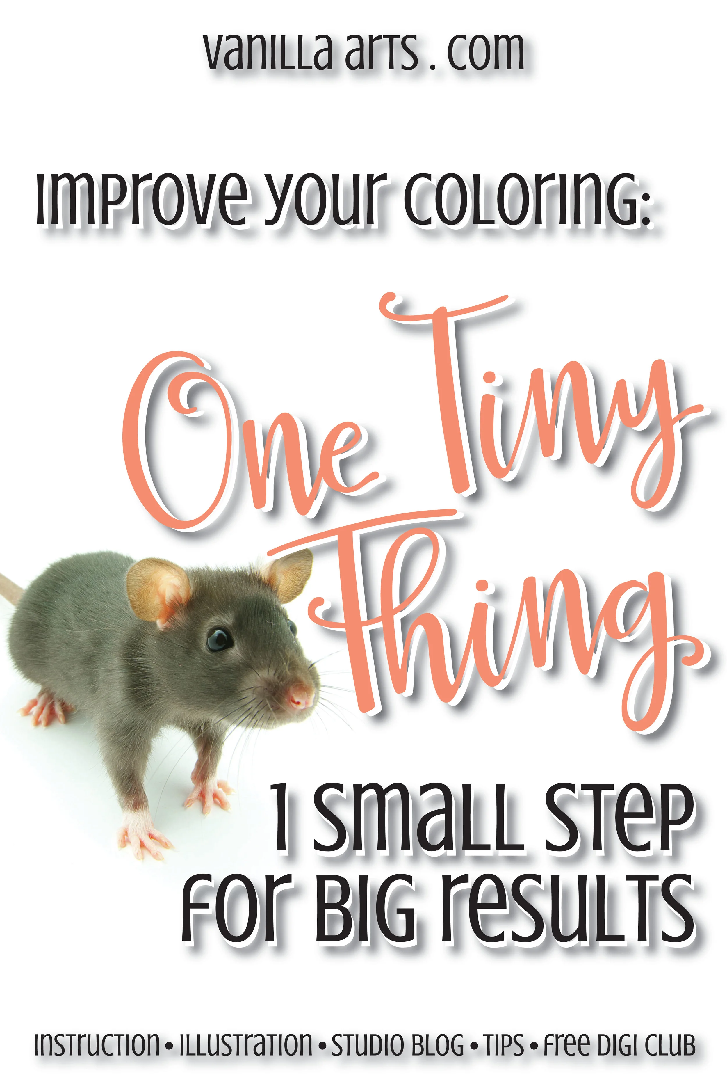
There are no magic shortcuts to better coloring...

But there are small and simple things that you can do TODAY to immediately improve the quality of your finished coloring projects.

Is your coloring flat?

I know, I write about flat coloring a lot.

But that's because I hear about it. A lot.

Copic beginners are always pretty worried about getting the blends nice and smooth. But once they've nailed down the blending process, they start to wonder...


Where is the depth and dimension?

Don't worry, you are not alone. It's a common problem.

There are very few colorers who achieve the kind of depth and realism they want from their projects. Every colorer I know is on constant look-out for the magic bullet that will solve their flat coloring problems once and for all.

There are a lot of tutorials and videos out there which talk about how to add dimension to your Copic projects.

But there's one simple key that I never, ever, no-never hear or see mentioned.
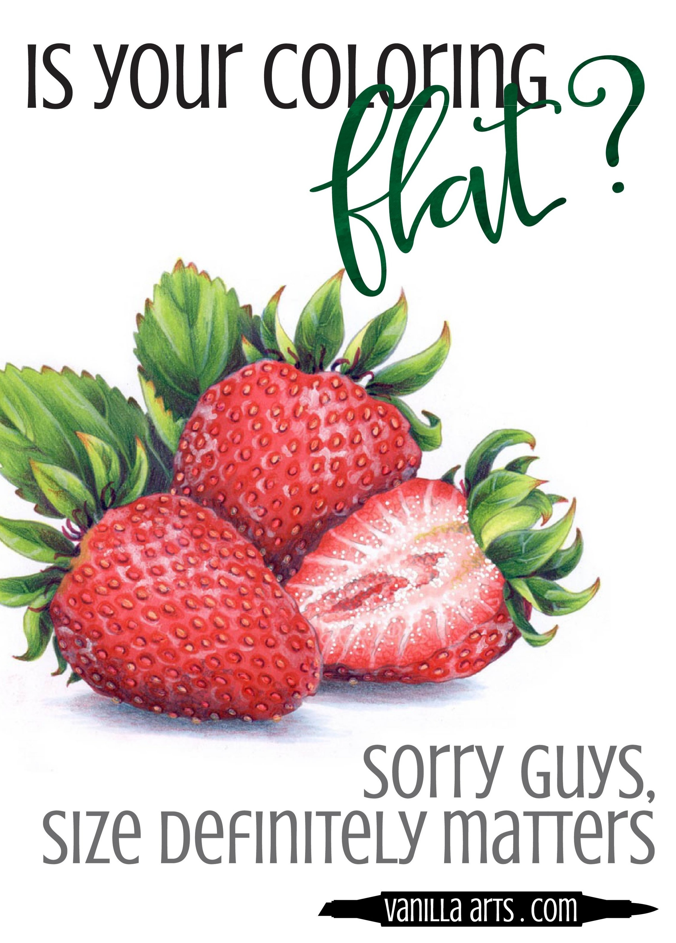
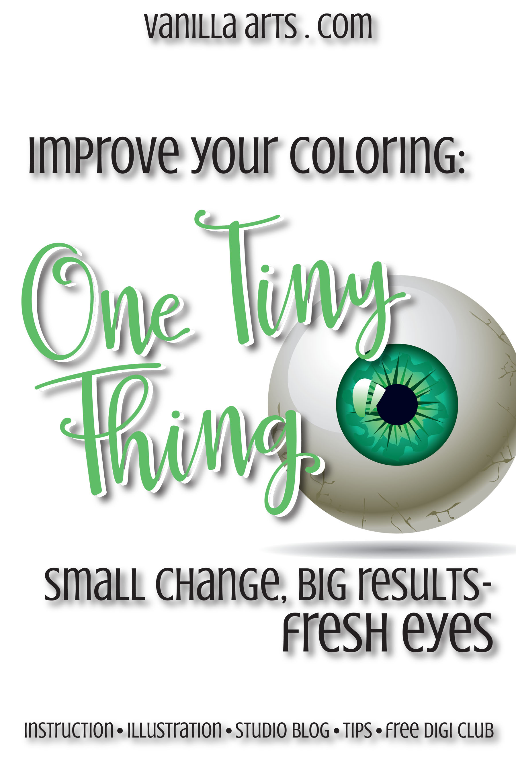
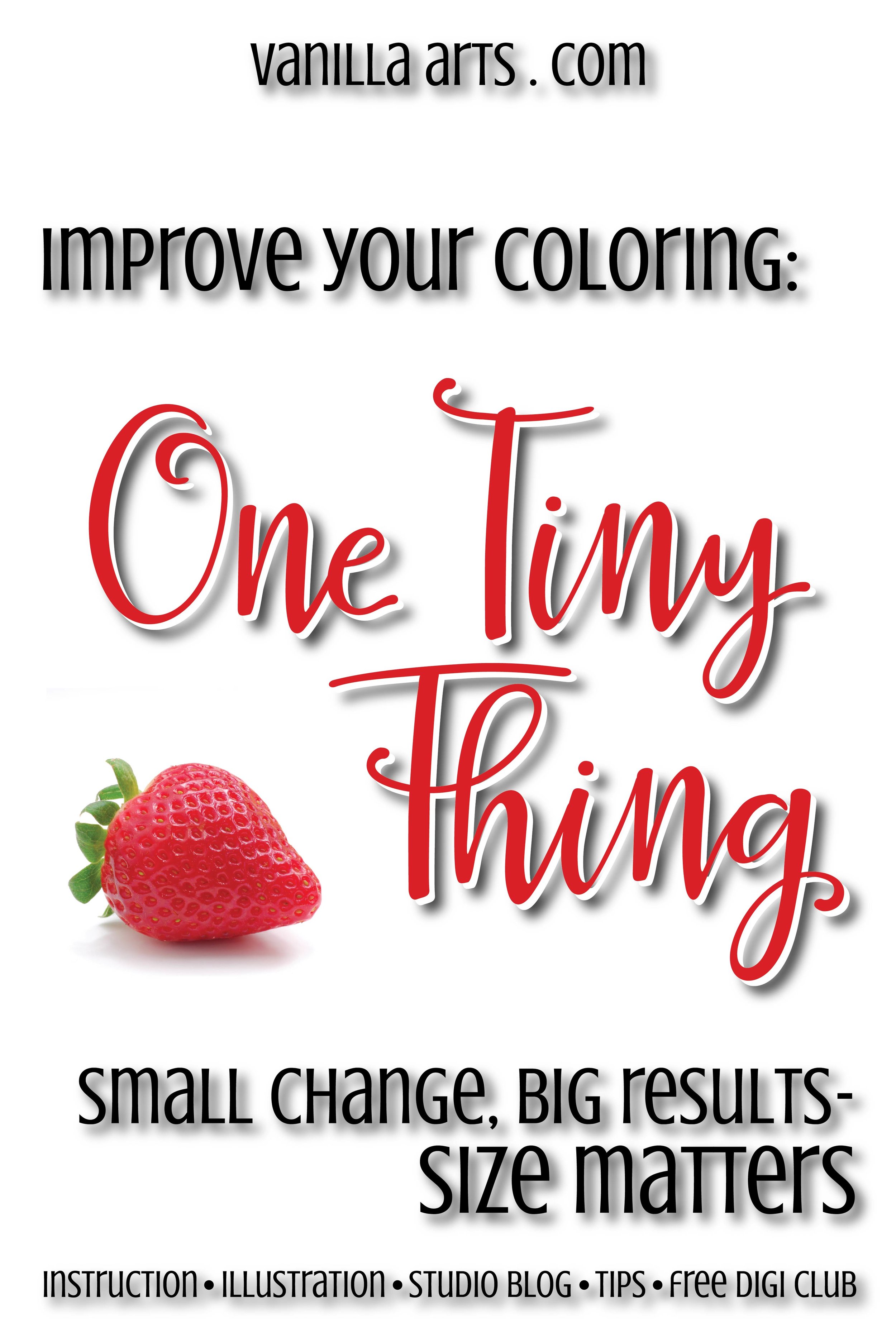
Improve your Copic coloring today with this one tiny tip- the size of your image directly affects your ability to add depth and dimension. | VanillaArts.com
 

Image size matters

When you walk into a museum, do they hand you a magnifying glass?

When you visit an art gallery, do they warn you to bring your reading glasses?

Heck, in the Pottery Barn catalog, do they show you big long couches with itty bitty wallet sized art over it?

That's because most artists work large.

Yes, you can purchase a pretty postcard with the Sistine Chapel ceiling on it but Michelangelo didn't paint the real ceiling that small.


Realism requires space

Improve your Copic coloring today with this one tiny tip- the size of your image directly affects your ability to add depth and dimension. | VanillaArts.com

Let's face it, most stamps are tiny. The average stamp image was designed to fit on an A5 or quarter-fold card front and many stamp sets give you the ability to fit several objects plus a sentiment on that card front.

That leaves colorers struggling to fit several marker colors into itsy-bitsy spaces.

With big giant brush nibs, by the way.

To paint or color with realism, you are essentially creating a trompe l'oeil effect (that's French for "fool the eye"). Depth and dimension are a matter of getting the right shade of the right hue into just the right spot to fool the brain into thinking a two dimensional item is actually three dimensional. It's not only about the colors you use, it's also about placing those colors into just the right spots.

When a face is the size of a postage stamp, it's pretty darned hard to color it accurately. Depth and dimension, getting that shade into just the right areas to feel real... that's next to impossible when the head on the stamped character is pocket-change sized.


Miniature painters have unique skills

Once upon a time, back before the days of photography, you had to hire a painter to make a portrait or to capture a landscape. And if you wanted a portrait to carry around in your pocket or in a locket, you had to find an artist who specialized in miniatures.

Painting in miniature is a very specific skill and frankly, it's a rather rare talent. Working small requires lots of study and practice and a whole slew of specialized tools and supplies. The smaller you get, the more talent required.

And yet you expect to master this kind of thing instantly using big fat juicy markers and a $5.99 tiny stamp?


Be kind to yourself, use large stamps

I shock and startle my newbies all the time. When a new student takes my class for the first time, they're always amazed at the project size. That's because as an artist, I understand that your best chance to color with depth and dimension... all of that good realism stuff is highly unlikely to happen if I don't provide large stamp images.

Improve your Copic coloring today with this one tiny tip- the size of your image directly affects your ability to add depth and dimension. | VanillaArts.com

Now granted, I draw the class images for 90% of my classes but I do use some commercial stamps. Rubber and silicone stamps are governed by the rules and regulations set by the issuing company. And some manufacturers are sticklers about enlarging their images, even if you're coloring them for personal use.

So the solution is easy. If the stamp image is too small, don't buy it.

Don't waste your money on teeny tiny stamps that are completely inappropriate for coloring with markers.

Companies are gradually learning that serious colorers want larger images. I support only those companies who produce appropriately sized coloring images, not just for legal reasons but because we want the sales statistics to show that there's a healthy market for large coloring images.

Or you can stick with digital stamps. When you purchase a digi stamp, you are not locked into using the stamp at one particular size. Digital stamps are scalable and that means you can squinch them small for a quarter-fold card front but also enlarge them when you want to practice coloring with realism.

Check out our Digi Stamps in the Vanilla Stamp Shop:


The Goldilocks Rule

Bigger is not always better; there is such a thing as too large.

Smooth blending gets harder as the stamp size increases. That's because the smoothest blends happen with fresher, wetter ink. So if the space you're coloring is so large that the ink has fully dried before you even get the whole thing base coated, then that's a blend that will require more nursing to make it happen.

And larger spaces usually require more markers in the blending combination. I save my two-color combo coloring for areas under .75 inch square.

Every colorer has an ideal size to work at. Not so large that the blend is choppy but not so small that you can't add shaded detail.

As you learn and practice your coloring skills, you can work smaller and smaller with more confidence. But just like when you were learning to write out the alphabet on wide lined kindergarten paper, it's definitely easier to learn a skill when you have room to see what you're doing (or doing wrong).


Quarter and Half-size images

When I draw stamps for classes, my beginner images are quarter sheet sized (a sheet being US 8.5x11 inches).

I don't mean that my Digis fit comfortably onto a quarter-fold with lots of extra space. I mean that my images ARE the size of a quarter sheet.

So for my classes, a single object in the stamp is usually anywhere from 4 to 5 1/2 inches wide. For intermediate students, I move them up to images that may fill the entire page.

I know, you can not fit large class projects onto a standard card. But you need the extra size to learn how to shade properly. When you get better, you can gradually begin to work smaller until you're back at standard card size.

Or maybe you'll stop producing everything for cards and start making framable art, hint hint.


Like day-old cola...

Improve your Copic coloring today with this one tiny tip- the size of your image directly affects your ability to add depth and dimension. | VanillaArts.com

If your coloring continues to be flat, no matter how much you practice, no matter how closely you're following the tutorials, stop to consider the size of your stamped images.

Coloring isn't a clown car experience. The goal isn't to impress us with how much you can fit in. If you're trying to squeeze shade, highlights, and local color all into a teensy tiny space, it's no wonder things don't look dimensional.

Real artists rarely work itty-bitty because we understand that realism requires some elbow room. Working in miniature is a specialty skill which requires customized tools to do it right. Artists know better than to force themselves into working abnormally small.

Purchase larger images. Color larger images. Learn and practice on larger images.

It's one tiny thing you can do today to begin improving your coloring.

 
Read the Studio Journal blog at VanillaArts.com

Want More Tiny Thing Tips?

Read the Entire Series:


Improve your Copic coloring: Use fresh eyes

 
One Tiny Thing can improve your Copic coloring TODAY! Fresh eyes. | VanillaArts.com


Wouldn't it be cool to trade bodies with someone?

One Tiny Thing can improve your Copic coloring TODAY! Fresh eyes. | VanillaArts.com

Like in the movie Freaky Friday. The Jodi Foster version, not the Lindsay Lohan version.

Oh Lord no, not the Lindsay Lohan anything...

If you could switch bodies with a really good artist, maybe you could pick up a few secrets about how to draw or color better.

Sadly, no. There are no easy fixes. Ask Lindsay Lohan.

Learning takes time and practice; and even if we wish really hard for a freaky exchange, there are no shortcuts to better coloring.

But there are a few tiny things that you can do today which will instantly improve the quality of your Copic Marker projects.

Really.


Before you call a project finished, look at it with fresh eyes.

Nobody knows your project as well as you do. After all, you were there when you made it, right?

And you know exactly where all the oopsies are.

You know where you went outside the lines; you know where the blend is a little choppy. You were there when you accidentally dripped a little blue ink in the bottom right hand corner. 

Yep. Been there, done that. More than once.

You've also spent a lot of time obsessing over the details. Getting everything just right.

But here's the thing- all that attention to detail? It has left you in a state of hyper-awareness.


Most people won't notice the mistakes

eye.jpg

It's not that we're stupid, it's just that we haven't spent the last two hours hovering six inches above the project. We simply don't see the flaws the way you do.

Meanwhile, you're sitting there wondering how in the heck no one has noticed the little blue drip in the bottom right hand corner.

On long coloring projects, I encourage my students to take a break every twenty minutes.

In my live classes, I secretly plot to distract people every ten to fifteen minutes by telling a story or asking a student how her weekend went. They don't realize what I'm doing, but it serves a purpose.

Taking short breaks from coloring isn't for the benefit of your rear end, although it is nice to get up and stretch. Short breaks are actually far more beneficial to your brain than to your buns.


After a break, you look at your project in a new way

We call this "using fresh eyes".

Taking a walk, doing a load of laundry, chatting with a friend about the new restaurant in town... all of these things pull you out of the self-critical zone. That's the state we get worked-up into, where every other thought that runs through your head begins with the words "well, I totally screwed that up..."

We're our own worst critics and that only gets worse the longer we sit chained to our desk, staring at all the mistakes.

Taking a break divorces you from the project. The longer the break, the more remote those mistakes seem. When you come back to it, you no longer look at your coloring with a super-duper hyper-critical eye; you are kinder to yourself.

Plus, with fresh eyes, you realize that the little blue drip in the bottom right hand corner isn't as big as you thought it was.

Fresh eyes are a volume control button for your inner voice. The flaws may still scream out at you but you'll be better able to tune them out. And the good stuff will start talking to you too.


Things don't look as bad as you thought when you use fresh eyes

By getting away from the project, you begin to see your work the same way we do.

It's a less emotional experience.

That little blue drip won't feel like a dagger in your left ventricle anymore.

And here's the really cool thing- you can increase the efficacy of the fresh-eye effect by increasing the length of your break!

10 minutes = good

10 hours = absofreekinwonderful

One Tiny Thing can improve your Copic coloring TODAY! Fresh eyes. | VanillaArts.com

Setting your project aside for a few days is an essential part of the process for most professional artists. We build that resting period into our delivery time frame because we know the power of fresh-eyed observations.

With portraits, I set them aside for a full week, completely out of sight and out of mind. When I pull it out again, I pay attention to my thoughts:

  • What's the first thing that drew my eye- chances are it's either something really good or it's a flaw I need to fix immediately.

  • Where does my eye linger- that's almost always something good

  • What are the first three flaws I notice- those instantly jump to the top of my "fix it" list

  • After my eye roves around the project, does my gaze settle back upon the eyes? If not, then the the eyes need more attention

Taking an extended break from your work is like a mini vacation. When you come back rested and relaxed, you will notice things you didn't see before- things your inner critique wouldn't let you see before.

You can't always run your projects by a trusted friend who will give you an honest critique. It's hard to trust family to tell you the truth because they love you, and frankly, they also want you to make dinner tonight and that might not happen if they mention the little blue drip in the bottom right hand corner...

Sometimes, your fresh eyes are the only tool available to you to evaluate the success of your projects.

And fresh eyes are free. You don't have to go anywhere or do anything. All it takes is a little will power to go a few days without peeking.


Take advantage of fresh eyes on your next project

If you're coloring a card on a deadline, leave yourself enough time to set it aside, at least overnight. Because when it's sitting on Aunt Minnie's mantle? That's not the time to discover that you forgot to glitter the unicorn's horn.

For larger projects, like coloring a class assignment or making a gift for someone, use fresh eyes several times during the process. Catching mistakes before the teacher does or before the recipient notices is embarrassment avoided.

Time spent in time-out is worth the wait. Fresh eyes will catch more than you think but fresh eyes will also pleasantly surprise you.

Because that little blue drip in the bottom right hand corner might look totally artistic and planned, once you see it with fresh eyes.


VanillaArts.com
 

Improve Your Coloring: Stamp Evaluation

 
One Tiny Thing you can do today to immediately improve your coloring: stamp evaluation | VanillaArts.com


Can one tiny tip resolve your coloring problems?

I don't usually make gigantic claims

I'm not the Sham-wow guy and I'm not a life hacker.

But I do know a thing or two about coloring.

What I know most is this:

How well you color images, actually how well you do ANYTHING in life is a direct result of how much effort you put into building your skills.

Even Mozart, who was born with boundless talent that practically dripped out his nose and ears... even he still had to practice, practice, practice before he became great.

But now that I've put a gigantic qualifier on everything I write below, there actually are a number of teensy-tinsy things that you (yes, YOU!) can do TODAY to immediately improve your coloring.

I'm serious.

There are small things you can start doing right now that will dramatically improve the quality of your coloring.


Introducing the Tiny Thing Series

Otherwise known as "Amy points out the little things some of you are not doing..."

Once a month, we'll talk about one small thing, one mind-numbingly easy step that you can add to your coloring routine that will allow you to color better forever.


Today, your Tiny Thing Assignment is to begin pre-evaluating your stamps

What the heck does that mean?

Well first, allow me to point out one small difference between an artist who colors and a crafter who colors. And this isn't a judgement here, I'm simply going to point out one key difference between the way I work and the way you work.

When I color one of my own digital stamps, I use the exact same tools and techniques that you use.

The difference is that I drew the original image and you're coloring an image that someone else has drawn for you.

It sounds like a small difference, because a drawing is just a set of guidelines, right?  Why does it matter who draws the stamp, as long as it's cute, eh?

Actually, it makes a world of difference.

Stampendous House Mouse "Pincushion" | VanillaArts.com

You see, when I draw a digital stamp for you, I do a lot of thinking. 

Take this House Mouse stamp here, it's "Pincushion" by Stampendous. 

As the illustrator (not me) drew out this scene of mice, thimbles, and a big pincushion, they went through a long thought process.

"The large mouse has two feet that he's lifting into the air on each jump. His ears are pinnned back in excitement. There are pins in the cushion but they're not right where the mouse is jumping, otherwise he'd stab himself. The sleeping mice are completely relaxed with limp ears and limp tails..."

Yes, artists actually think these kinds of thoughts as they draw.

This thinking process means that the artist is completely familiar with every single object in their drawing. They know what everything is, why it looks the way it looks, and where one object stops and another object starts.

They understand everything inside the image because they thought it through before they drew it.


When coloring, you're working on a second hand image

Whipper Snapper Design's "Squeaky Baker" | VanillaArts.com

And your information about the image is completely second hand.

Here's Whipper Snapper Design's "Squeaky Baker".

Tell me quickly, what are the two things falling off the baker's tray?

Cookies? Muffins? Truffles? Spitwads?

It's a little hard for us to tell, primarily because we didn't draw this stamp. But the artist knows exactly what those roundish brown things are.


How do crafters overcome the information deficit?

That's today's Tiny Thing: before you pull out your markers, maybe even before you stamp the image onto paper, stop and take a good amount of time to visually walk yourself through the entire image.

Evaluate everything you see.

Start at the most logical place on the image and work your eye around the entire image. Don't just look, actually think your way through every element in the stamp.

For me, I'd start with the face. Expression is key, so I'm not just looking to see how many eyes and noses he has, I'm looking at how his eyebrows are related to his eyes, is he happy? Sad? Surprised? Angry? Is he smiling or smirking? Where do his whiskers start and stop? All of these things are important to preserve the look of a cute and happy mouse. If we mistake a tuft of fur for an eyebrow, we could accidentally make him look evil and wicked. We don't want Satan's personal mouse baker on your grandaughter's birthday card.

Next I might move to his body. I note that I can only see one hand but I can almost see two feet. That affects the colors I choose for some of the foot-shapes.

From there I'd work even further outwards, evaluating every single item in the stamp image. What is it? What color should it be? How much of it can I see?


If you don't take the time to evaluate your image, bad things happen!

This is why I want you to perform the evaluation BEFORE you pick out your markers.

This prevents mistakes.

What kind of mistakes?

Well, here's one: Really look at that baker's hat. Now we're looking at a pre-colored version of the stamp. Lucky us, because the hat is shown as white, we can easily deduce that this is a chef's hat.

Chef's hat or Muffin? Look hard to find out | VanillaArts.com

But what if we were looking at that shape in just the black and white version?

Frankly, if all I could see was that cloud shape sitting on a cylinder shape, I might think it was a muffin.

I've seen stranger things in stamps. A mouse with a muffin on his head isn't out of the realm of possibility.

Without properly evaluating the entire image, I might grab a brown set of markers. I could give that muffin some blueberry spots. I could give it a pink cupcake liner. I could color that shape the best darned muffin you ever did see.

And then feel stupid later when someone asks why my mouse is wearing a dirty chef's hat.

C'mon. We've all done something similarly wrong.

How many times have you been coloring leaves in a tree, only to discover there was a bird in the tree AFTER you've colored his tail green?

Or colored a flower petal green?

Or thought you were coloring a long lock of hair that turned out to be a wind-blown scarf?


Thoroughly evaluating an image helps you to become completely familiar with the image

You want to be as familiar with the images as the original artist was.

To color it well, you need to know it well.

Don't believe me? Think I'm being silly because you would never-ever color a muffin on a mouse's head?

Well check out this image:

What do you see in this stamp image? Evaluate for better coloring! | VanillaArts.com

This is Penny Black's "Dear Mice, Watering Can" stamp.

I'm going to ask you a few questions now. And don't write them off as stupid questions because the answers won't be obvious to everyone.

 
Analyzing Stamps for Clarity | VanillaArts.com
 

What is the object at #1?

Is this a strap for overalls or a strap for the backpack the mouse is wearing?

What is the mouse standing on and what is the item at #2?

If the mouse is standing on a terracotta pot, that's the brim of the pot. Or is the mouse standing on an aluminum bucket with a small rolled brim on a hill of grass?

What is going on at #3?

Is that a water leak or is the watering can sitting on a paving stone?

What is item #4?

More water or a rock?

Think I'm kidding? I'm dead serious. I can easily color a very convincing version of every option I've listed.

And these options aren't as dumb as a mouse with a muffin on his head. Every question I asked was entirely reasonable based upon the drawing.

Only the original artist knows the correct answer. We can make an educated guess but we can't be totally sure.


This is why you must evaluate every item in an image before you color it

Make an educated guess based on careful thought and consideration.

Don't just color away at it without stopping to think about what you are coloring.

Evaluation is One Tiny Thing you can do to improve your coloring immediately.

It's a simple thing to do; it takes very little time and it prevents a lot of weird stuff from happening.


One Tiny Thing: Stamp Evaluation

Try it today. You'll appreciate the results!

VanillaArts.com