
Copic Marker Tip: Do You Blend Everything Smooth? The importance of texture to realism
Think back to your last Copic Marker Project…
Picture in your mind the last thing you colored with Copic Markers or even colored pencils.
I'll bet you made the same beginner Copic mistake everyone else makes.
Don't feel bad, I see people making this same blunder every day and many of them are definitely NOT beginners!
What mistake?
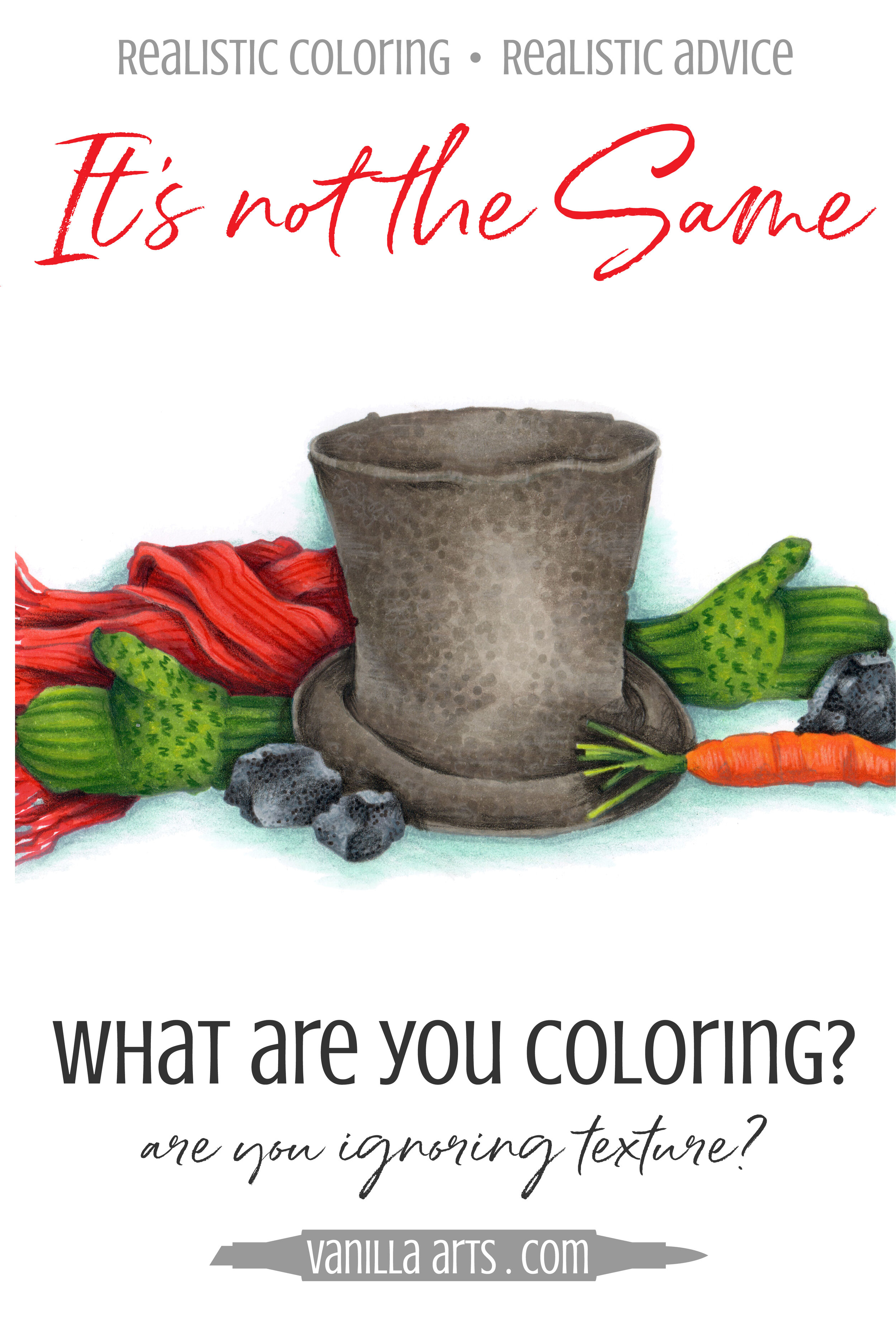
Well, it's what makes projects that look like this:

when you could be coloring like this:

Why are some Copic projects more interesting and professional looking than others?
It's not the stamp image.
I used the same digital stamp ("Snowman Supplies" found here).
It’s not the paper. I printed both on the same kind of marker cardstock.
Don't be tempted to blame the skill of the colorer. I colored them both.
And you can't say that I half-hearted the top image because I was really, really, really careful to use the same exact technique that I was given in Copic certification classes.
It has nothing to do with the colors either. I used the same markers for both images.
What’s the difference?
Too many colorers color every object the same exact way
Mount Rushmore stamp? Blend it smooth.
Clown on a unicycle stamp? Blend it smooth.
Dancing cow wearing a road cone for a hat? Blend that sucker as smooth as you can.
Remember that one annoying kid on the playground?
On our playground, his name was Phillip. No one wanted to play with Phillip, especially not games of chance like Rock-Paper-Scissors.
Because Phillip always chose rock.
Rock. Rock. Rock. It didn't matter what time of day or whom he played, Phillip chose rock 98.992% of the time. When we played tag, he went after the same person every time. And if we chose superheroes, Phillip was always the Hulk.
Not much fun, eh?
Now I know you really don't want to hear this, but every time you color your entire image with the same smooth blending technique, you become Phillip.
Blend. Blend. Blend.
Same. Same. Same.
Boring.
Traditional Copic Blending Technique can only take you so far…

Blending everything smooth?
It’s a dead end.
I don' t care how you use the smooth blending technique. Some work light to dark, others dark to light but y’all are consistently putting the darks along the outside edges and making the color light in the center.
And if there’s a fold, you trace the fold line on either side with the dark marker too.
Darks, darks, and darks. In Copic world, all everyone thinks about is where to put the dark marker colors. You read tuts, you watch videos, you scour the blogs and try every tip you stumble upon.
Yet somehow, no matter how much you color and practice, you're still not getting closer to realism.
It's because you are handcuffed by the blending process.
Classic Copic technique will never give you depth or realism.
Because no matter where you put the dark markers, you're still blending everything smooth.

Real Life is not smooth!
The top hat I drew for this image is from a photo of a hat that was once worn by Abraham Lincoln.
Either Old Abe was really hard on his headgear or maybe this hat was hidden away in someone's attic for a century— but it’s in rough shape. The beaver-felt is faded, cracked, scuffed, and rumpled.
You can't color something like that smooth.
Coal is a deep black rock but it has millions of facets on the surface that are almost reflective. Coal in bright light practically glitters.
You can't color something like that smooth.
Woolen mittens are soft and fluffy but that only describes how they feel. Using your eyes instead of your fingers, knitted objects are a series of ridges and each ridge is made up of tiny little knots. Knitwear is lumpy, bumpy, and full of cross-directional fibers.
You can't color something like that smooth.

To color with realism, you must think about more than color
Is the object in your stamp image made of:
fur?
plastic?
metal?
fabric?
flesh?
paper?
stone?
All of those objects feel different, correct?
Your fingers do not lie. I can hand you a pair of stainless steel scissors, then a pair of plastic scissors, and even with your eyes closed, you can tell them apart, right?
Realism is when your viewer can feel something using just their eyes.
So if a rock feels different than a pair of scissors which feels different than a piece of paper, your coloring should show me that.
Rock, paper, and scissors should never be colored the same because each object feels decidedly different. Your viewer should sense that from the way you color them.
Help me feel them with my eyes.
The Big mistake colorers make…
…is to think more about the color than the way something feels.
Even long time, very popular coloring bloggers... people with decades of Copic experience... most of them still color their images 100% smooth.
So this isn't a newbie mistake, it's an ALMOST-EVERYONE-WHO-OWNS-A-COPIC mistake.
People spend waaaaayyyy too much time planning out just the right blending palettes.
And they spend zero time thinking "Hey, what does a pair of scissors feel like?" "What does a rock feel like?" What does paper feel like?"
If you aren't describing the feel of unique objects with your coloring, if you're coloring everything smoother than Fred Astaire, you're blowing your shot at realism.
Before you begin your next coloring project, please pause!
Put aside your plans for awesome blending combinations and spend a few moments thinking about what each object in the stamp feels like.
Is it matte or shiny? Hard or soft? Gritty or silky? Heavy or lightweight?
Then tell us that story- through your use of texture, stroke quality, and line pattern.


