
Control Freak Tips: How to Color with Loose Artistic Style (Copic Marker, Colored Pencil)

Do you micro-manage your markers?
There’s something about Copic Marker and especially colored pencil which attracts persnickety people. We like control, so we choose the most controlled version of all art mediums.
Because really, how can you trust a drippy paintbrush? That stuff gets messy!
Markers and pencils are safe.
Yet we dream of painting with wild abandon. Splashing color in energetic swooshes and swirls. We envy the expressive art of watercolorists, pastel scribblers… the Impressionists and Expressionists…
But when it comes to trying it ourselves?
Nope, we stick to our technique bubble, blending everything to death and worrying about the difference between light-medium sky blue versus medium-light sky blue.
Control is hard to give up.
Today, let’s look at tips for coloring with expression and freedom.
Colored pencils and Copic Markers offer security and control for precise coloring. But tight coloring usually looks uptight and boring— lacking spontaneity, style, and emotion. Professional illustrator Amy Shulke offers tips to loosen your coloring style to create the expressive, artistic coloring you dream of.
I’m a control freak too!
Look, I’m right there with ya.
Sure, I’ve got years of professional work under my belt. And yes, I’ve been required to work in a wide variety of styles.
But I’m still pretty darned finicky and controlled, even when I try to let loose.
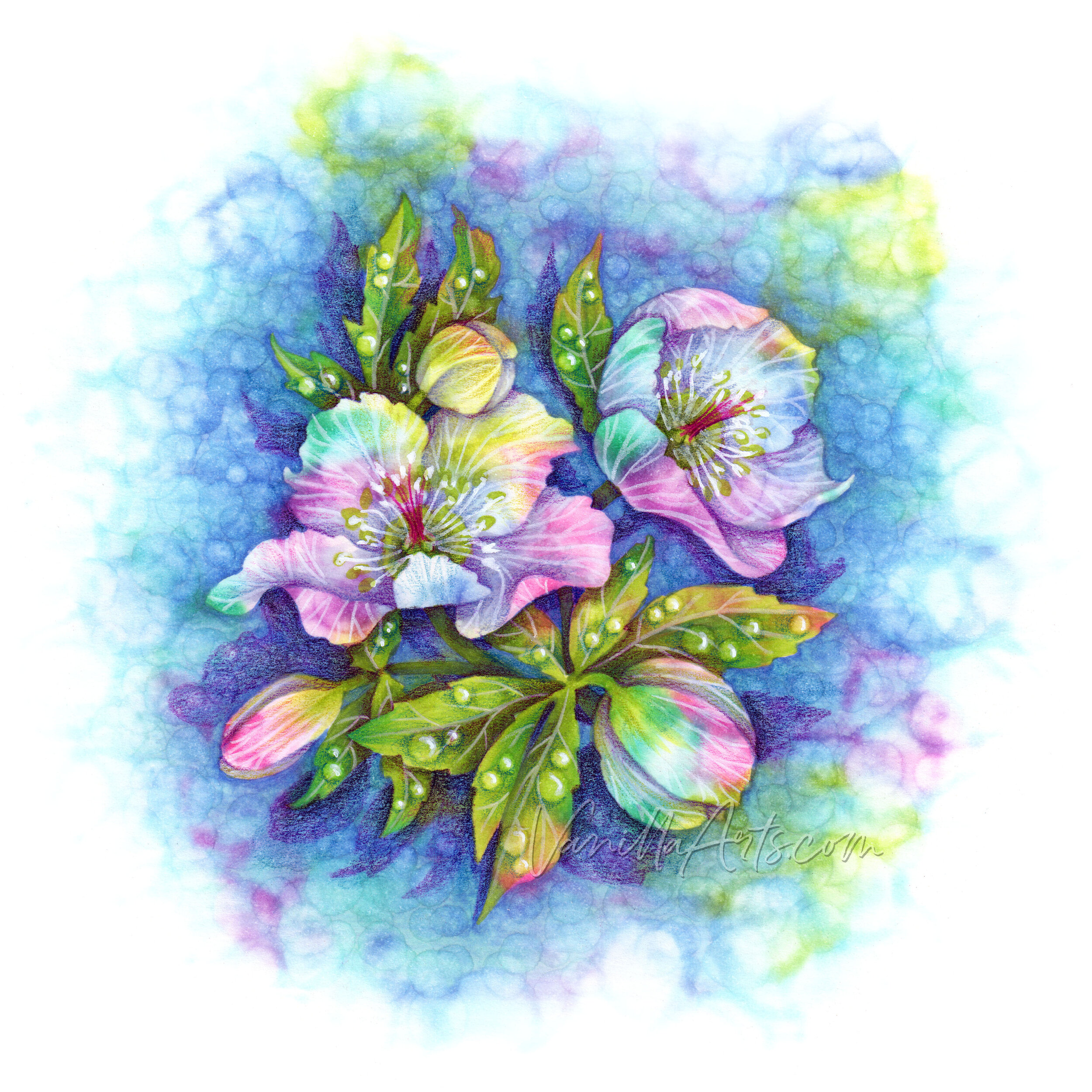
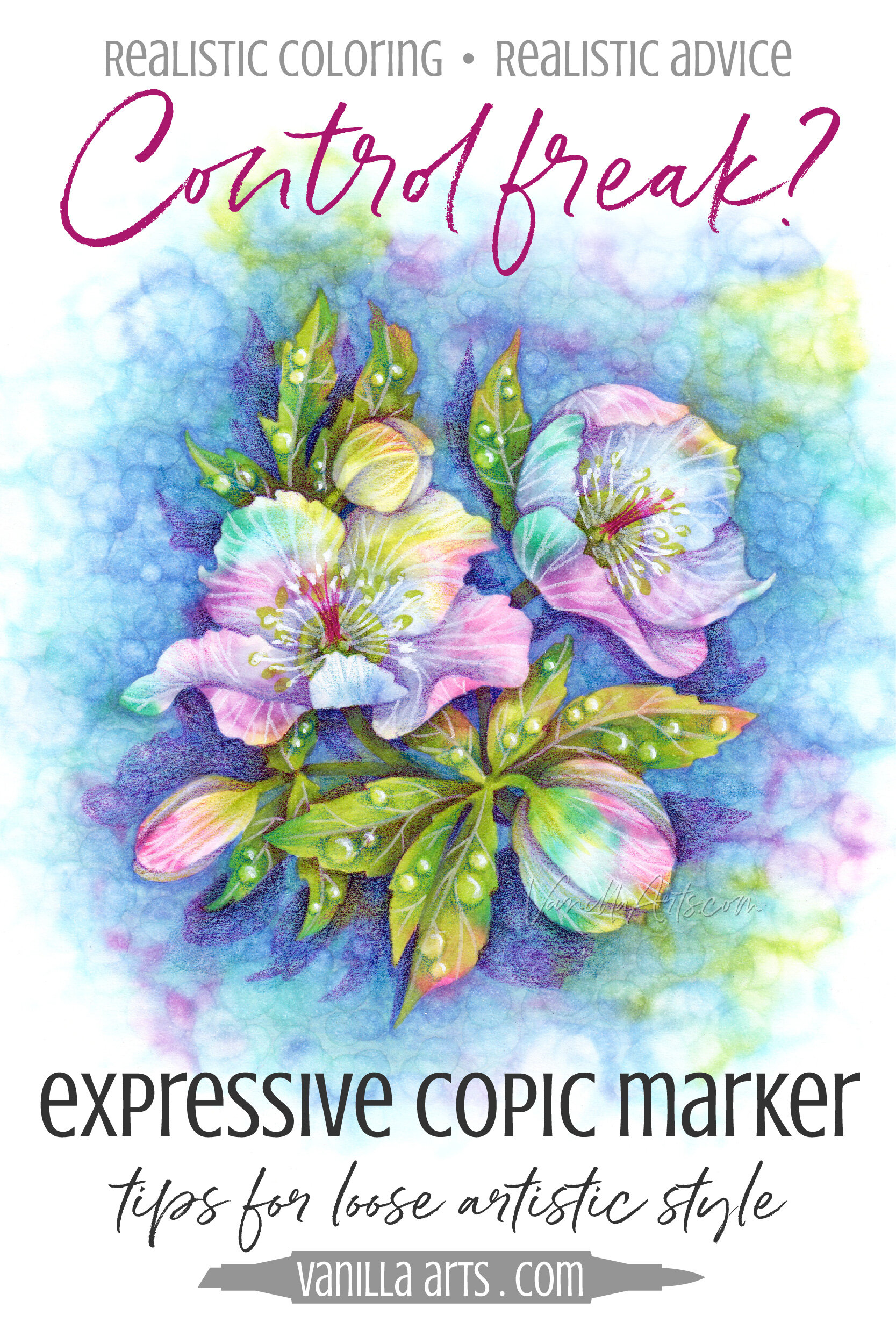
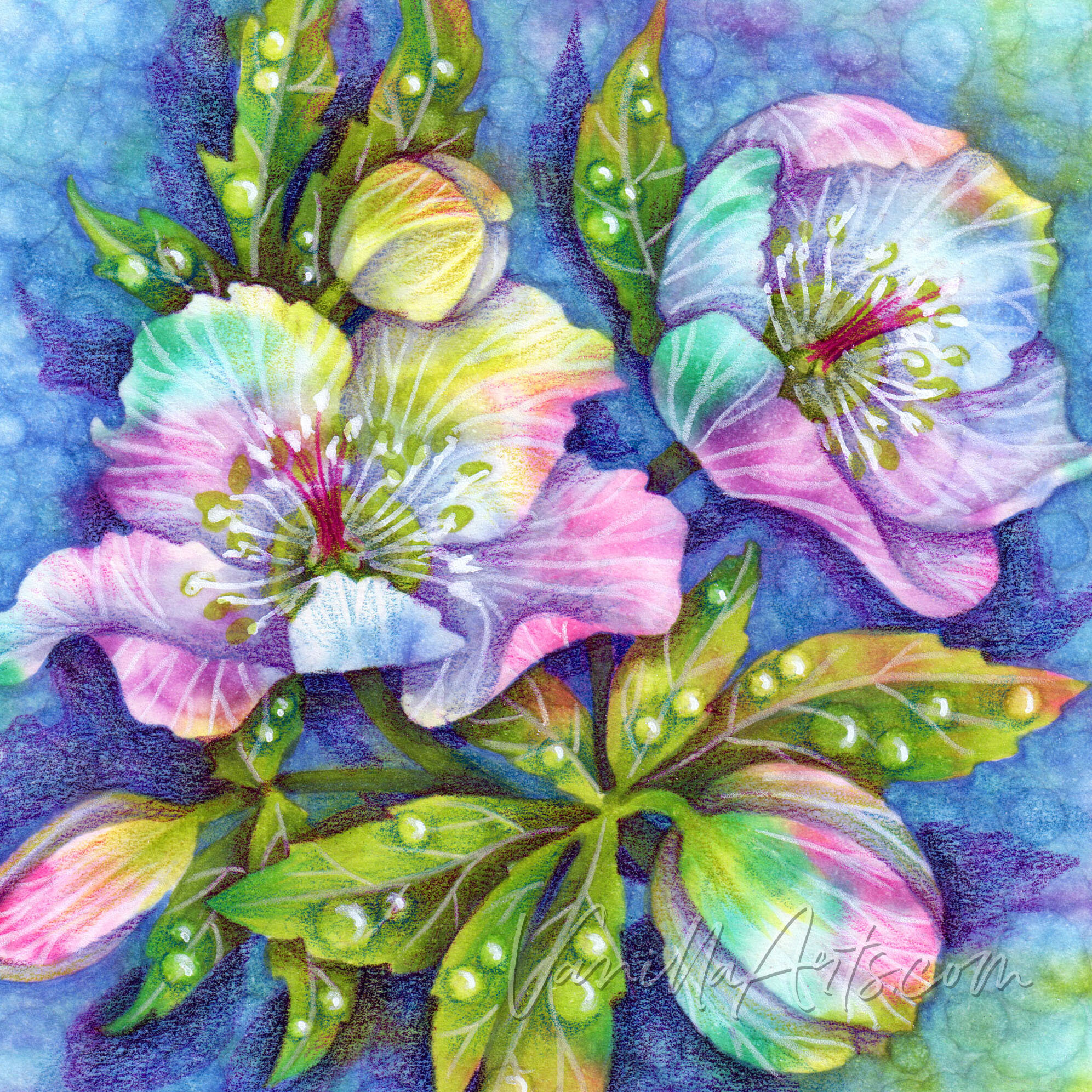
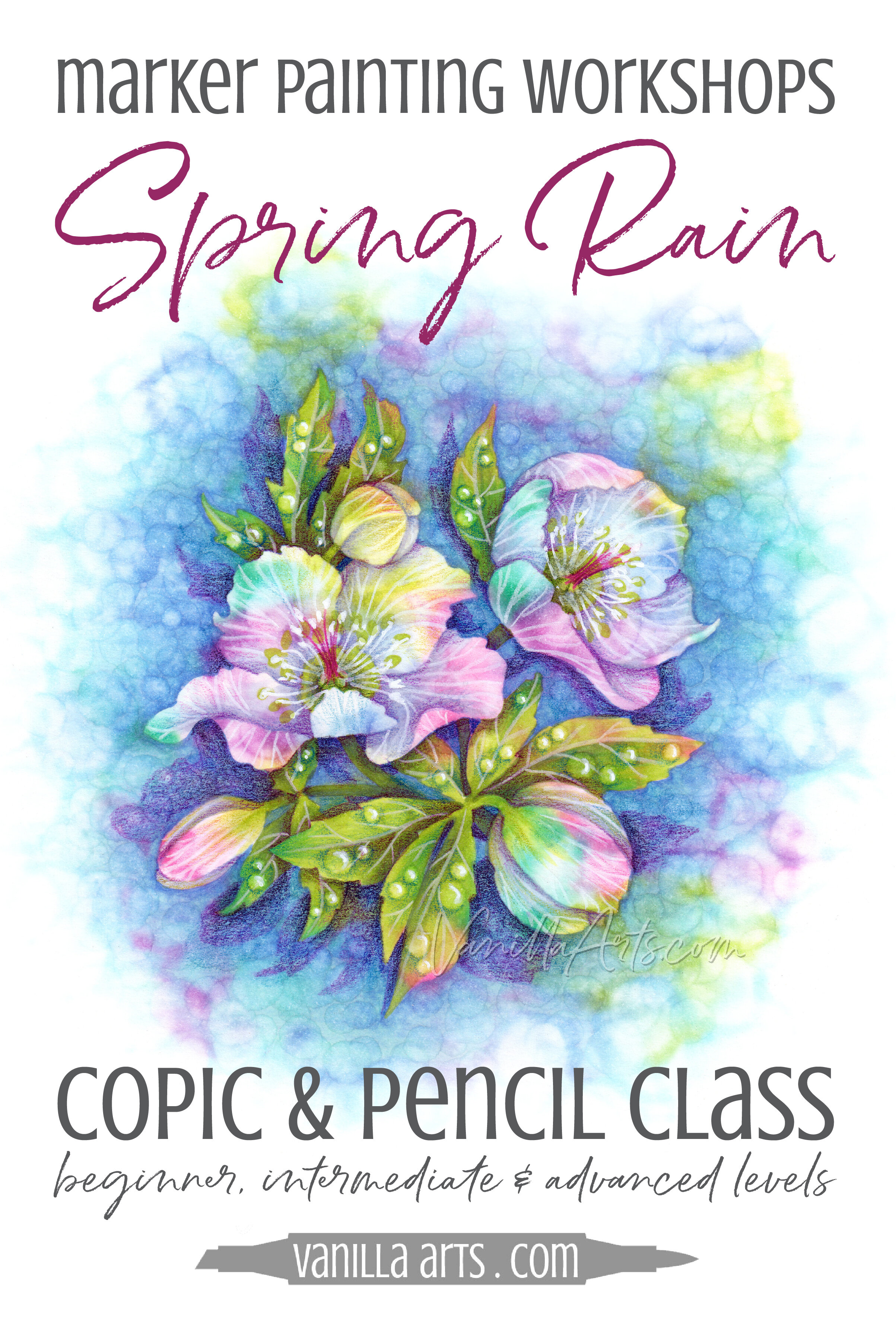
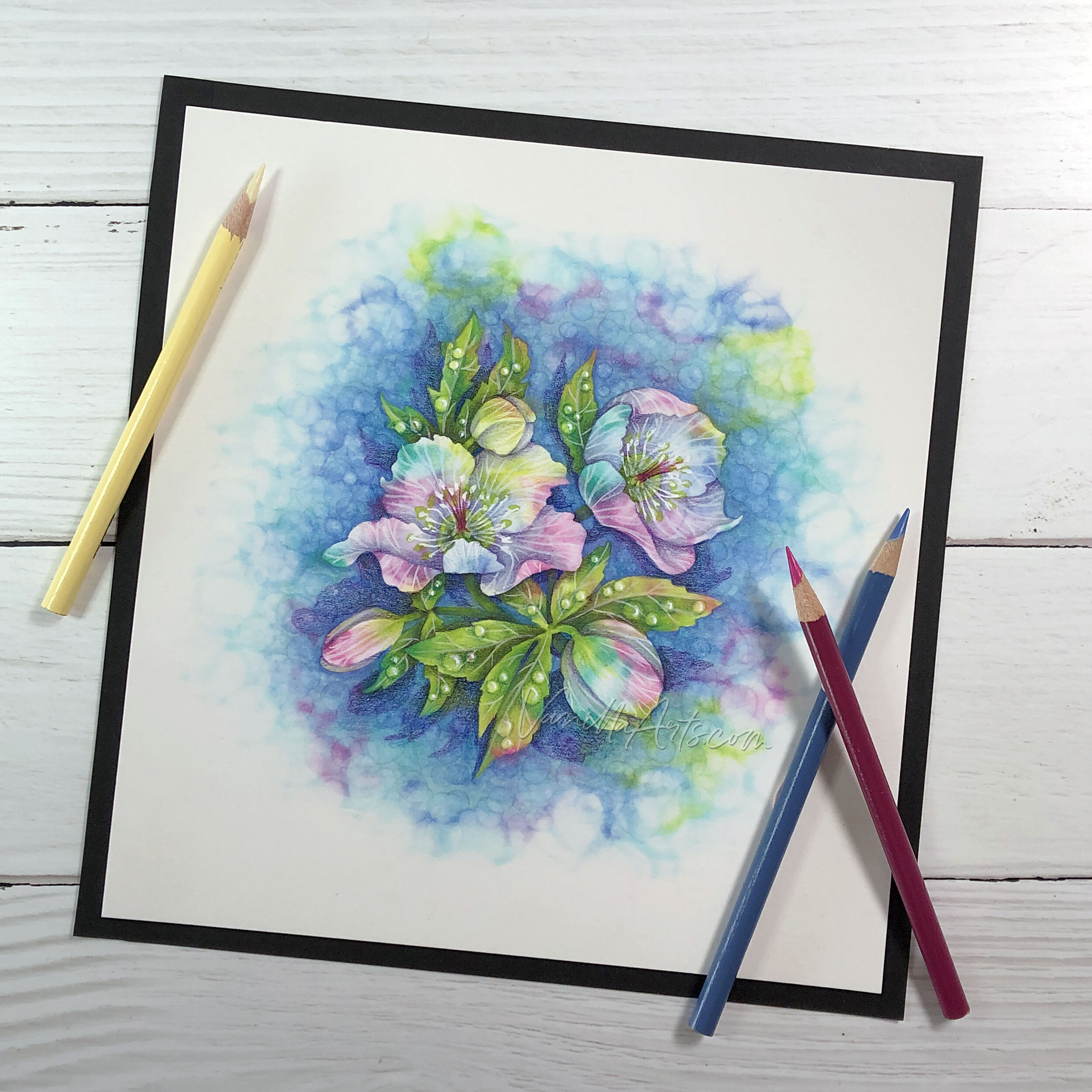
“Spring Rain”, colored by the author, Amy Shulke using her unique Parchment Splash technique. Copic Markers and colored pencil mixed media. See the online class info here.
Some of us are just naturally tight.
Heck, I went into technical illustration specifically because it requires precision and care. This field suits my fussiness.
People like us? We like the getting the details right and making the work crisp and clean.
There’s nothing wrong with this.
Except sometimes our greatest asset becomes a boring rut.
Sometimes we need to let our freak flag fly— make a few amazing messes.
Challenging yourself to work loose and almost-messy does great things for buttoned-up colorers.
Relaxed & Free can be another skill in your arsenal.
So here are six tips to help you loosen up and color with a bolder, free wheelin’, devil-may-care style.
Oh, I know it’s a challenge to work loose. But it’s good for us to try,
Right?
Right!
Stop following coloring tutorials
Most colorers don’t have any formal training, so you tend to doubt yourself.
But here’s the thing you don’t understand:
You are only interested in coloring because you have taste and style.
If you didn’t have artistic instincts, you’d be off playing basketball or fishing instead of reading this article.
The fact that you’re here reading this article and trying to push beyond your coloring limits means you have something artistically valuable to share with the world!
We love to color because we appreciate beauty and creativity.

And yet…
Go to any beginner Copic or colored pencil discussion board and you’ll see people asking “What’s the best green combo for leaves?” or “What’s a good tutorial for leaves?”
This constant show-me-the-best-way-before-I-even-try attitude?
It kills creativity!
Why would you want to regurgitate how a random Copic instructor three states away sees a flower?
Shouldn’t your coloring reflect you?
Here’s the other drawback to constantly relying on tutorials:
When you follow a step by step tutorial, you worry more about getting the steps right than about capturing beauty.
We’ll get to this more in tip number four but for right now, understand that most of the time, when you make a mistake? Nobody notices but you! That’s because you’re comparing your work to the tutorial.
But many of your mistakes are pretty.
You can’t see see it… in fact, you won’t see it until you stop comparing your work to the tutorial.
Tutorials are fine if you use them as inspiration. But otherwise? They’re killing your art.
2. Stop being so-darned literal
There’s one beginner trait which many control-driven artists never lose.
Doesn’t matter how good they get, how many years of experience, or how many accolades they receive— they still limit their own thinking:
I am coloring leaves. Leaves are green. Leaves have dark green veins.
I am coloring the ocean. The ocean is blue. The ocean has waves and there should be one sailboat at the horizon with two seagulls overhead.
I am coloring apples. Apples are red. Apples have one green leaf at the top, a brown stem, and sometimes there’s a cute little green worm poking his head out the side...
Zzzzzzzzz. Oh, I’m sorry, I fell asleep there for a second.
Look, we all have phones with built-in cameras.
Anyone, anywhere can take a photo of a green leaf. Zero brain cells required. We don’t need you to tell us leaves are green.
The job of an artist is to show us something more than a green leaf.
When you lock yourself into coloring all the tired old stereotypes instead of exploring the subtle variations in color, light, and shade that you see in real life?
It’s a waste of your talent and time.
Leaves don’t have to be all green. Water is rarely blue. And even a red apple isn’t all that red when you open your eyes and look.
When you color what you think instead of what you see, you limit your artistic potential.

3. Relax your grip
Okay, this one is kind of a head-smacker. It seems so obvious once someone tells you.
Why does loose coloring look loose?
Because the artist is physically holding their tools loosely.

One of the problems with teaching yourself to color is that you don’t know what you don’t know.
And the problem with letting a self-taught instructor teach you is you’re getting the same problem, but compounded.
One of the biggest mistakes I routinely see with marker colorers: they hold their markers wrong.
Online learning has a major drawback: the tutorial author or YouTube demonstrator can’t see your weird marker grip and show you how to correct it.
You’re coloring.
You’re not writing a grocery list.
There’s a difference between writing position and coloring position.
Not only do most colorers hold their marker or colored pencil in writing position, they also tend to grip the marker or pencil too tight as well. It’s gonna go all Cujo on you.
Loose coloring looks loose because the hand and fingers are loose.
We can read the tension in your hand by the marks you make on the paper. It’s just that simple. You can’t make carefree looking projects if you’re hunched down, gritting your teeth, and white-knuckling the life out of your marker.
Relax your hand and color from the elbow and shoulder.
Move your grip away from the nib; let the marker bounce a bit.
Move your chair back from the table and even consider standing up.
I stood up for most of the Spring Rain project featured in this article. Coloring while standing makes a difference.
Warning: A loose grip is not a sloppy grip!
I see this problem a lot in art journalling. You admire a loosely painted page because it looks splashy and scribbly… but when you splash and scribble, it doesn’t look good.
That’s because without composition, order, and symmetry, you’re just making a mess.
Be intentional with your marks and deliberate with your color choices.
Everything beautiful has a level of order.
4. Find beauty in mistakes
Remember back up in Tip #1 where I recommended ditching the tutorials?
Let me hit on the danger of step-by-step projects from a slightly different angle.

When we color, we use pretty stamps, right?
And we use pretty colors?
And we make pretty little marks on the paper.
We are making beauty.
Which you then quickly erase because it doesn’t look exactly like the sample project?
Oh no, that doesn’t look right!
Says who?
I see this a lot in classes. A student makes a gorgeous series of strokes but her coloring doesn’t look exactly like my coloring, so she attacks it with an eraser or colorless blender.
Or maybe her blend has depth and texture but in her head, it’s not smooth so it must be bad. She’ll fix it four times, ruining the magic that was originally there.
Or she grabs the wrong pencil and without bothering to ask “does it look good?” they erase something which looks amazing, just because it’s a different color.
Even if you’re working without a tutorial, many people start out with a vague idea in their head and scrap everything which doesn’t conform.
CONFESSION TIME: My original plan for Spring Rain was to color the flowers RV55 and RV19. I gathered magenta photo references. I colored two test samples with magenta petals. The RV markers are still sitting here on my desk.
But when it came time to color them pink, I couldn’t do it. All of the splashy undercolor which I had intended to shine through the pink was simply too amazing to color over. I had to find a way to celebrate it.
My most beautiful techniques are born by mistake.
If something delights you, DO NOT fix it.
Don’t sacrifice artistry for conformity.

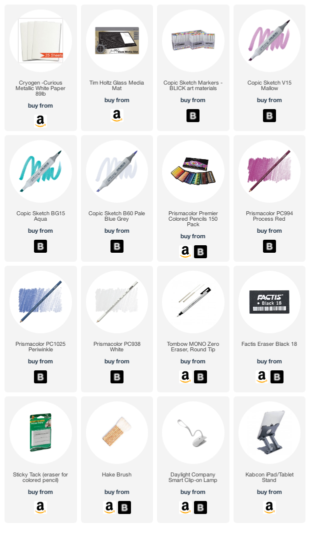
Check out Amy’s favorite art supplies, click above.
5. Take a watercolor class
When you’ve been zigging too long, you need to zag.
But zagging is harder than it sounds.
After more than a decade working with colored pencils, ink, and drawing in Photoshop and Illustrator, I basically hit a creative brick wall.

I’d been working so tight and controlled for so many years… I was tense and bored.
Yes, you can be both tense AND board.
I needed to do the opposite of colored pencil.
I started taking watercolor classes.
And I didn’t sign up for the kind of watercolor that uses teeny tiny brushes to paint tightly controlled realism with logical analysis.
Nope, I signed up for the most abstract, splishy-splashiest watercolor I could find, taught by a complete hippy.
I don’t think I ever communed with my artful chakras… I’m not even sure if I enjoyed the class.
But I learned a heck of a lot.
Stepping outside my comfort zone (waaaaayyyyy outside my comfort zone) was really good for me. It improved both my regular work AND my regular work flow.
It made such a difference in my art that just before the whole pandemic thing happened, upon finding myself in the same situation that I was in before… I was searching for a new medium to learn at a retreat or workshop. Instead, I’m buying books and hoping I can dabble with on my own. We’ll see.
If you find yourself overworking the medium and needling yourself to death with details, try abstract watercolor.
Exploring an alternative medium which forces you to work loose can help you find balance.
6. Allow yourself moments of tight control
One of the reasons why big New Year’s Resolutions do not work is because you’re trying to make a radical, life altering change in an instant.
But inside? You’re still the same you

It’s actually much more effective (and permanent) to make small changes gradually over time.
In that spirit, let me suggest that you don’t have to join a commune and grow your armpit hair long to loosen up in your art.
Try relaxing in little bits.
Look, I know me.
I’m never going to be a drippy, abstract, scribble kind of artist.
Instead, I added small moments of unbuttoned free-spirited coloring within an otherwise structured piece.
Spring Rain is actually more interesting because of the contrast between the informal splashes and accurate forms.
Try one of these kinda-maybe-sorta looser styles:
Take a teeter totter approach:
If you let something go wild, then balance it with a bit of structure.
And if you get too structured, force yourself to pop a little crazy in it.
2. Try an 80/20 ratio:
Spring Rain is a whole lot of drippiness but the leaves are very orderly and the petals have only enough shading to see the form.
3. Celebrate a feature item:
Be tight in one special spot, then loosen up everywhere else.
Always Remember: Change is Good
Think of a famous artist or someone you enjoy on Instagram or YouTube.
Chances are, you know them for one particular style.
But artists change over time and so does their art. Picasso at 20 looks nothing like Picasso at 40 or Picasso at 60.
We grow and evolve.
You may not be coloring fine art for museums but your work should grow and evolve too.
Colored pencils and Copic Markers appeal to our sense of security. We can easily control them, they’re not drippy or oozy. But that reliability comes at a price. Control limits your ability to make emotional and expressive, even non-representational art.
But only if you let it.
If your coloring starts to be weighed down by the blend, blend, blend— if your projects lack spontaneity, style, and that more-than-coloring feel, then you need to loosen up.
It’s time to paint with your pencils and splash your markers!

How do we splash with markers?
Join me for Spring Rain, a lesson on finding shapes in a bold and crazy backwards way.
This is marker painting at its finest, more of a watercolor approach than you’ve ever experienced before.
We’re not blending, we’re splashing color to create dynamic artistry.
You’ll never look at flower petals the same way again.
Here comes the rain!
Join Amy for a vibrant Copic + Colored Pencil lesson
Marker Painting Workshops - online!
Spring Rain features ”Hellebores” from PowerPoppy.com
Spring Rain is an advance level coloring class
Real time coloring, recorded live
Live Workshops are unscripted demonstrations which provide students with a real look into the authentic coloring process. You’ll see mistakes being made and corrected. It’s just like visiting Amy in her home studio.
Log in and color with Amy at your convenience. Anytime access, no expiration dates.
Class was recorded in May 2020 and featured a live student audience. Amy answers questions from the students and offers many tips for better colored pencil art.

Hellebores
Spring Rain uses the “Hellebores” digital stamp, an instant download from PowerPoppy.com.
Easily print your stamp on Copic safe paper and color along with me!
Join me for an online lesson…
that will change the way you think about marker and pencil technique. You don’t have to follow the rules to make beautiful realism.
Plus, it'll be tons of fun!

Select supplies used in Spring Rain:
Vanilla Arts Company is a participant in the Amazon Services LLC Associates Program, an affiliate advertising program designed to provide a means for use to earn fees by linking to Amazon.com.


Vivamus pellentesque vitae neque at vestibulum. Donec efficitur mollis dui vel pharetra.