
Color Theory: Are you blinded by color? Value vs. Hue (Alcohol Marker, Colored Pencil)
Confused by Hues?
As an alcohol marker beginner, you follow marker recipes given to you by instructors or bloggers.
Colored pencil beginners do the same thing, relying on proven color combinations and the advice of other pencil fans.
But as you improve your coloring skills, you try to invent your own color palettes.
Sadly, this is where a lot of colorers decide they can’t color well without the help of a tutorial or class.
Many intermediate colorers pretend to be beginners because they don’t color well alone!
They regress back to using prepared color palettes even though they’re capable of inventing their own.
Why?
Creating color palettes is hard when you’re Hue Confused!
I’ve written about color palettes before. I’ll link below so you can catch up.
But today, I’d like to talk about something I see a lot in the coloring world.
Most colorers focus on hues to the detriment of everything else.
This leads to unnecessary frustration.
Color is only a small part of a good color palette.
If you only look at hue, you’re missing the important stuff! So let’s stop beating our heads against the wall, eh?
Let’s look at Hue Confusion.
How most people pick color palettes
Here’s what I suspect is happening at your coloring desk. You find a stamp and start coloring logically:
the dog is brown
the tree is green
the tree has bright red apples
the sky is blue
You realize after 10 minutes of coloring that your project looks kinda childish.
Something’s wrong with the colors you’re using— they feel wrong but you’re not sure why.
So you start over, making random changes:
What if I made the sky a blueish violet instead of true blue?
What if I switch from Kelly Green leaves to Olive Green?
Would the dog be a golden retriever?
Maybe it’s a peach tree?
This is a common mistake, substituting one blending combination for a slightly different one.
Let’s call it the “Frustrated Subbing Method”.
We randomly substitute color combinations, hoping to blindly hit upon something pretty.
And it doesn’t work!
Why?
Because we’re substituting one hue for another, ignoring the more important aspects of color.
What is a hue?
You’ve heard the word hue before even if you can’t define it for a friend. Lots of art tutorials and videos use the word hue. It’s a way of saying color, right?
Most people think hue and color are synonyms; different names for the same exact thing.
But they’re not the same.
All hues are colors but not all colors are hues.

Look around you; everything you see has a color, right? Your desk is white, your mug is yellow, your wall is blue.
Color is a generic word for how we interpret different wavelengths of light.
Hues are different.
Hues are a specific kind of color.
Let’s pretend there’s a rainbow in the sky. If you could reach up and grab a handful of color from the rainbow, what you’d have in your hand would be a hue.
A hue is 100% pure unadulterated color.
A hue is the reddest of reds, the cleanest yellow, the purest blue.
But also the chartreusiest chartreuse and the most tangeriney tangerine.
A hue has no black, no gray, and no other color added to it to neutralize its vibrancy. It also hasn’t been tinted with white or stretched thin with water, solvents, or mediums.
In common usage, we tend to use hues as master names for color families. Reds, greens, blues— generic classifications.
But an actual hue is a true color.
Crisp and clean with no caffeine. No additives, fillers, or artificial preservatives— that’s a hue.
Value is not “darkness”
A value is different than color or hue.
And watch out, this is where a lot of coloring instructors reveal that they’re good at coloring but not so good at teaching correct information.
Notice that when I described a hue, I resorted to fantasy? Reach up and grab the rainbow…
Unlike hue, value is NOT a dreamy concept.
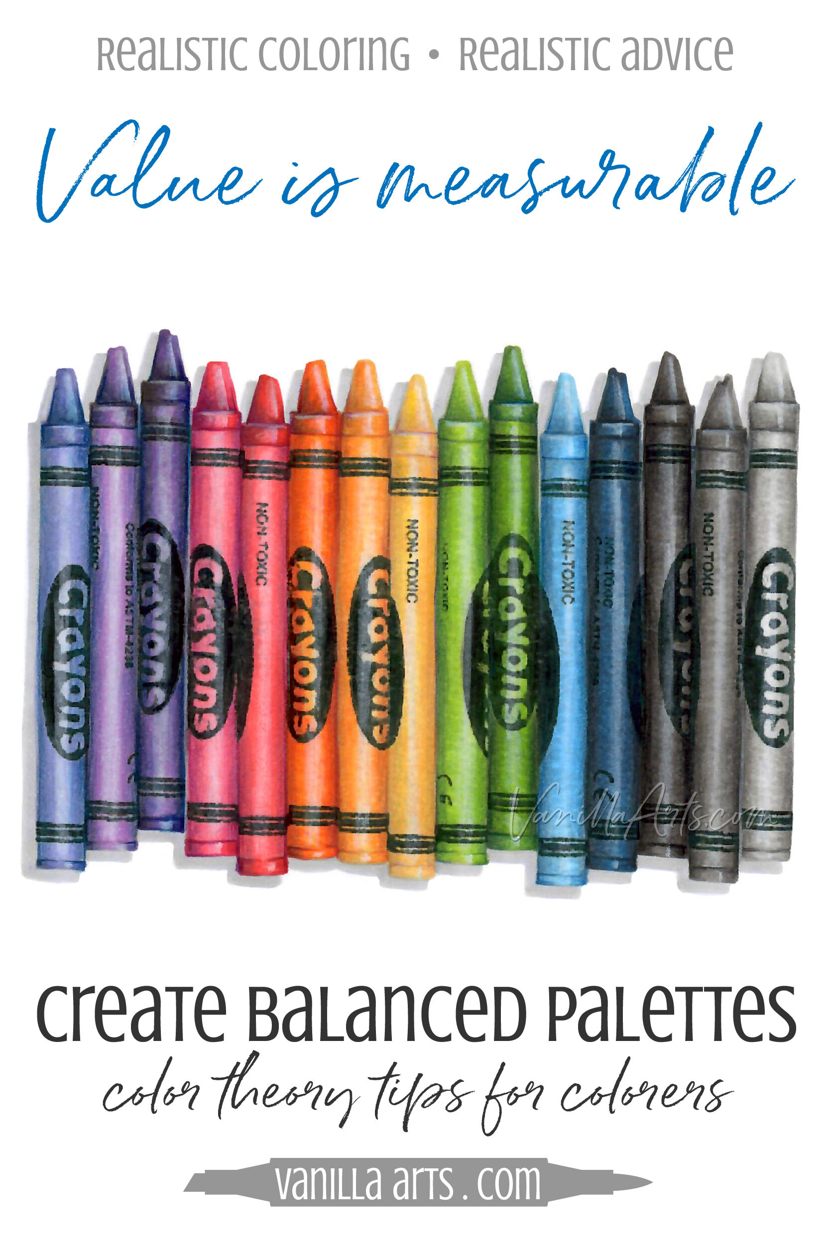
Value is scientifically measurable.
I ask my students to think of value as strength or weight because that immediately makes them think of something that can be measured.
Many coloring tutorials define value as darkness but that’s wrong.
Dark is a relative— your idea of dark isn’t consistent.
Darker than what? Is sunshine yellow darker than cloud blue? Is Kelly green darker than magenta?
Value is concrete, not abstract or relative. Value can be measured. Most artists use a standardized value scale like this neutral or Munsell style key but some art supply companies create their own value scales (more on this in a minute).
Value is basically how much light a color bounces back to your eyeball.
Value is the amount of visual punch aimed at your retinas and your brain; but it’s based on a scale, not personal taste or opinion.
A high value color is a high light bouncer. These colors tend to be lighter (which I know is a relative term). We give them a high number on the value scale because they’re high bouncers. So a value of 9 is a high bouncer and thus a high value. Pure white would be a 10 on the value scale.
Psssttt… ever wonder why we call bright spots “highlights”? Hmmm?
A low value color is a low light bouncer (which you could call darker). Low numbers = low bouncing = low value. Pure black would be a 0 on the value scale.
And now all the ladies who’ve had their hair professionally colored suddenly understand the term low-lights.
I know, we started this article talking about why it’s so hard to make attractive color palettes and now I’m taking you on a detour through Valueville?
Patience grasshopper, I’m getting there.


The Copic Flip-Flop
Before we go further, I must apologize to Copic readers. I know my definition of value has many of you confuddled.
Oops, Amy said it backwards. High value colors are dark and low value colors are light!!!
Nope. Copic lied!
Some of you know my Drunk Guy at the Copic Factory theory… how the Copic numbering system only makes sense until it doesn’t?
Yep, the drunk guy strikes again.
He flipped the value scale. He slapped a number 9 on a low value color and put a 0000 on the highest value possible.
Darn drunk guy! This is why you’ll hear me in videos correct myself frequently.
High value… I mean low… No, I said it right the first time.
Sometimes I forget who I’m talking to.
Copic numbers are the reverse of the value scale that the rest of the art world uses.
That’s partially because the Copic scale is not totally a value scale but that’s a digression for another day.
Just remember: when you visit Copicland, value is topsy-turvy.
Do you really understand value?
Color theory stuff feels very mind-bendy, but the answer to your color palette problem is slowly coming together here.
One more point before I knock your socks off with the solution.

As I said before, value is commonly misunderstood. You can tell light colors from dark colors, so you stop listening when color theory people mention measurements, desaturation, reflectivity…
You just stopped listening, right? Come back to me, baby.
All colors have a real value and an implied value.
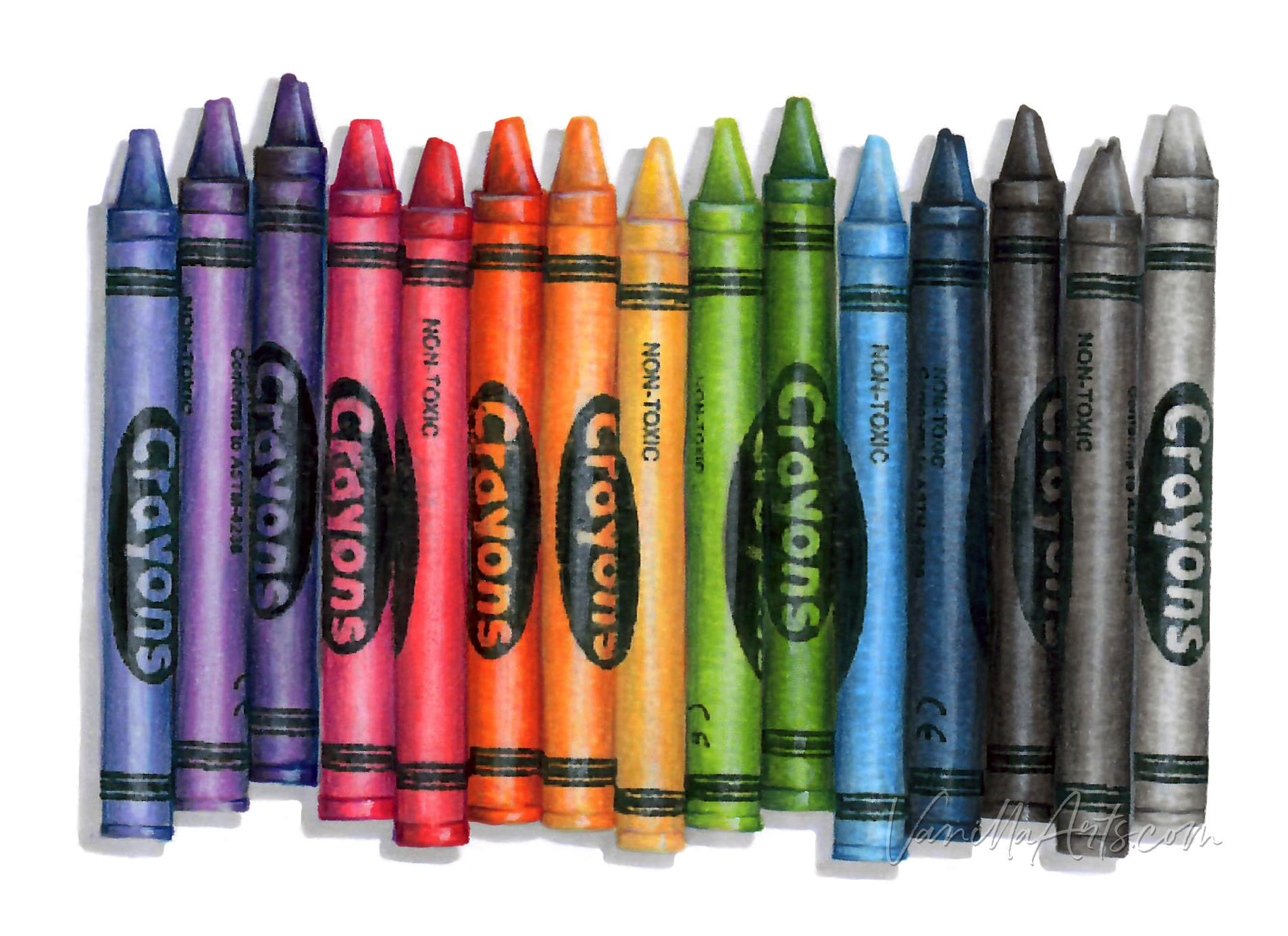
The real value is what you’re seeing here in my grayscale crayons. Every color has a value that matches an established value on a neutral gray scale. A blue that is a value 4 matches a value 4 gray which also matches a value 4 green.
Flipping a project to grayscale shows you THE GRAY SCALE— meaning the actual color values.
Pop Quiz time! Looking at my grayscale crayons, which crayon was red?
Uhm… why the hesitation? Just put your finger on the red one.
Ahhhh grasshopper, it’s harder than it looks, eh?
Many of you guessed wrong because implied value is different than real value.
In our heads, we think of yellow as pale. A yellow lemon in reality might actually measure darker than blue jeans or grapes but our brains are programed to assume yellows is lighter than every other color.
Implied value is a mental quirk which ruins our judgement.
This is why it’s hard to find the red crayon in my grayscale photo. Your brain is looking for something “dark” because red seems like a dark color. But the red marker I used was a medium value (Copic R14).
Psssttt… some of your assumptions are making important color palette decisions for you!

Check out Amy’s favorite art supplies, click above.
Why is it so difficult to create your own color palettes?
FINALLY!
Whew, I thought we’d never get here.
What does all this talk about value and hues have to do with why you have trouble creating attractive and beautiful color palettes?
Remember when I said that you sat down and colored:
blue sky
green tree
brown dog
red apple
And you thought that looked childish, so you switched it for:
periwinkle sky
olive tree
yellow dog
orange peaches
And the color palette still looks dumb?
What did you really do?
You basically subbed one hue for another hue.
Why didn’t it work?
Because your color palette problem had nothing to do with hues!
You could sub hues in and out all day and still never hit on anything pretty.
Beautiful color palettes have almost nothing to do with hue.
We’ve all had this experience before— you see a color palette that is three murky greens, a drab gray, and some terrible orange that nobody would ever wear… and yet you kinda like the way they look together????
Most ugly colors look great in palette combinations.
Pleasing color palettes are not magical hue combinations.
Pleasing color palettes are a balanced selection of values.
Value is useful for more than blending combinations!

Look, Copic offers you a wonderful time saver—
Use this marker trio and you’ll never have to guess which markers blend well!
But by offering you a shortcut, Copic locks you into some truly terrible ideas:
colorers think hues are the secret to depth & dimension
colorers think hues are the secret to realism
colorers think hues are the secret to pleasing color palettes
Hue, hue, hue, hue, hue all the live-long day.
What’s that saying about problems? “If you only have a hammer?”
Copic sells lots of hues— but now you think the solution to every problem is a new hue.
Hue Subbing can never improve a bad color palette.
It’s NOT because you pick the wrong hues. It’s because:
You swap the hue but don’t change the value.
The value is what looks wrong. Value imbalance is what triggers the “ewwww” reaction. Hue swapping can’t fix the value problem.
The most juvenile color palette you could invent is 5 hues all at a level same exact value.
5-5-5-5-5 looks like Barnum & Bailey whether you’re doing it with primary colors or the trendiest indigo-coral-gray combination.
If every color in the palette is a similar value, the palette is guaranteed to look immature—because it IS immature!
How to create attractive color palettes using value
When you pick colors for a project, stop thinking hue-hue-hue.
Hue is not the most important part of a color palette.
Remember the made-up color palette we were working on? The brown dog, green tree, red apples, blue sky example?
We know our palette looked childish and unsophisticated. Now we know that switching the apples to oranges or making the brown dog yellow will not change the childishness.
So let’s fix it properly.
Instead of coloring the sky B05, try a pale B00.
This swaps a value 5 medium blue for a very pale blue
Instead of coloring the dog E34, try a deeper E37
Again, we’re moving out of the middle value range towards a “darker” dog
Instead of coloring the tree leaves and the grass with G05, try going a few steps up or down in value.
Or keep with the G05! We’ve already changed the sky and dog values, so the greens could be our middle range.
And leave the red apples alone.
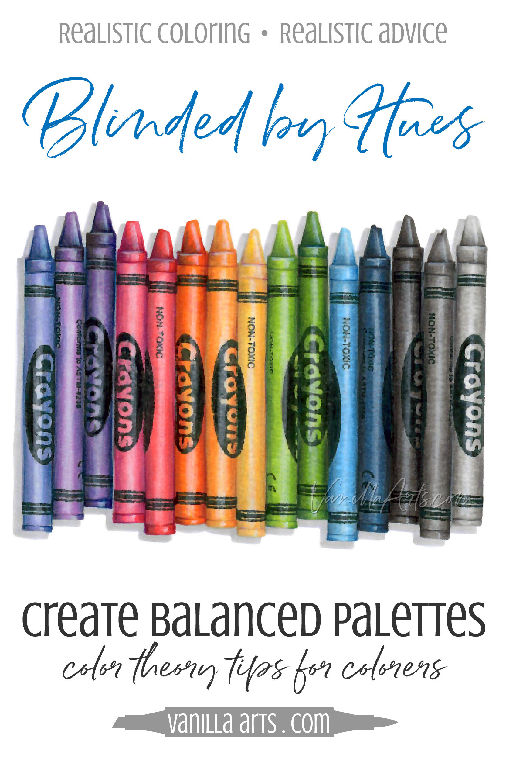
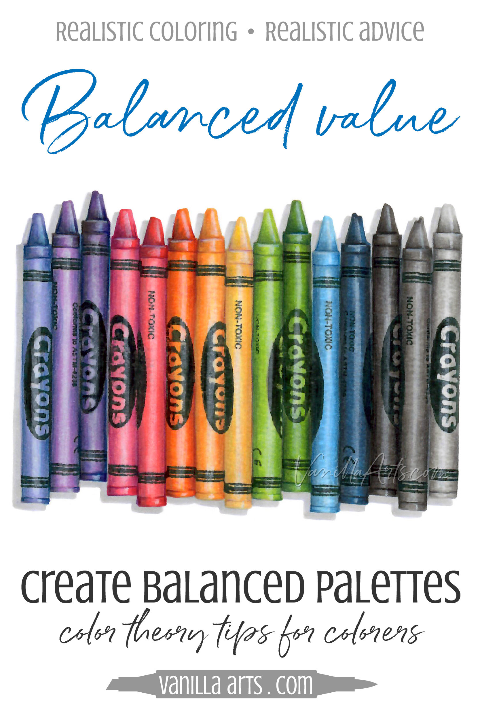
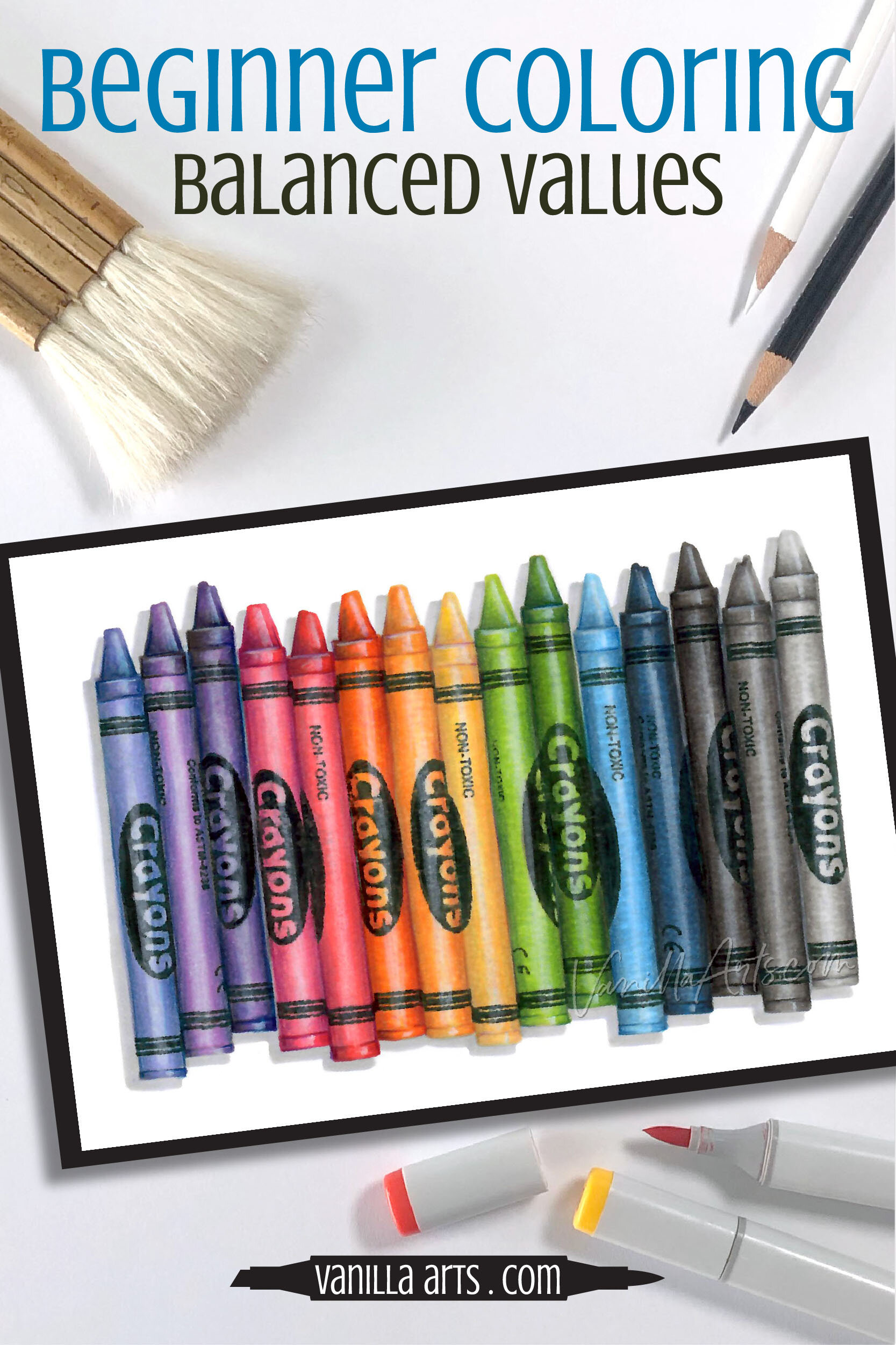
Think back to my crayons here. Did you notice something special about them? Yes, there’s a rainbow of color but I was very careful in choosing my rainbow color palette.
Remember when I flipped my crayons to grayscale?
The crayons didn’t all become the same gray, did they?
That’s because even in an extravagant, in-your-face, loud rainbow palette, I still was careful to use a wide range of color values.
Value ranges are the secret beauty tip for color palettes.
You need some highs, some lows, and some mediums in EVERY palette.
Attractive color palettes rely on value, not hue.
Want to color a value-balanced rainbow?
Join Amy for a fun Copic + Colored Pencil project.
Learn to color realistic objects using budget-friendly gray markers
Everyone talks about “shading” to create depth and dimension, but have you ever noticed how shading techniques make everything look cartoonish?
Let’s get you started on the road to realistic coloring using the underpainting method to develop accurate values and desaturation… plus we’ll play with realistic shade and shadow too!
Three hours of instruction. Full Demonstration. 31 Page Guidebook with step by step photos and tips.
The road to realism starts here.
More Color Theory Articles:


Vanilla Arts Company is a participant in the Amazon Services LLC Associates Program, an affiliate advertising program designed to provide a means for use to earn fees by linking to Amazon.com.


Donec id justo non metus auctor commodo ut quis enim. Mauris fringilla dolor vel condimentum imperdiet.