
Copic Marker Highlights: When Dimensional Coloring Technique Fails (Dark Pulling)

Do you use standard highlighting techniques?
C’mon, most people do.
Every Copic Marker class teaches it. Most beginner colored pencil classes do too.
Okay, so we start by putting lots of dark color down at the base of this petal, deep into the flower. Now let’s use our highlight marker at the end of the petal, making it lighter and brighter. Wow! Look at how dimensional our flowers look!
Highlighting for dimension is all over the internet. It’s rare to find a free tutorial that doesn’t use this coloring method.
And it’s wrong.
It does’t always work.
So what happens when the magic trick stops working?
Highlighting for dimension is a beginner coloring technique which is stylistic, not realistic. Your coloring may look better than before, but that’s not the same as realism. In realistic coloring, highlights are texture, not shape/form. Let’s look at the limits of dimensional highlighting and how to break the habit.
Highlighting for Dimension
Most Copic Marker classes spend a lot of time talking about blending combinations. They present you with a light-medium-dark marker combination. Everything they say and do is based on that combination.

A beginner class might focus on how to blend the colors. How to control the markers; how to make it all look neat and tidy.
Intermediate classes are usually about where to put the markers.
You’re still using a blending combination but instead of thinking about smooth color transitions, you’re told where to put the darker marker and where to put the light marker.
They call this “shading”.
To be very clear, it’s NOT the same kind of shading an artist does. Read more about this in my series of articles here.
As soon as you hear an instructor refer to a “shade color” and a “highlight color”… as soon as they credit the highlights for ‘dimension” your ears should perk up.
That’s a sure sign you’re dealing with a coloring tutorial NOT an art lesson.
It means what you’re learning is relegated to the coloring world. It’s of limited value and it can’t carry you into advanced art techniques.
Because it’s a trick.
Highlighting for dimension is not real.
I’m guilty too
I have a few tricks that I teach students. Push & Pull is one of them.
In my beginner and intermediate classes, we “push” areas deeper with murky, desaturated color. We “pull” areas closer with cleaner, brighter color.
But Push & Pull is a shortcut.
And it doesn’t always work.
There are many times when the natural color of an object works against you. The color is actually lighter in the shade and darker in the bright spots.
Yes, you read that right, shade can be lighter than a highlight.
This situation turns Copic Shading Technique and even my Push & Pull method on its head.
Take a penguin for example. He’s got a dark black body and a bright white tummy. Standard Copic technique teaches you that his cute little belly is the highlight area, right?
So tell me, what happens when the penguin lays down on his tummy?
What do you do when his black bum is the only thing gathering sunshine? What happens to the highlighting technique when his bright white stomach becomes the shadiest area on his body?
Uh oh…
Dimensional meltdown.
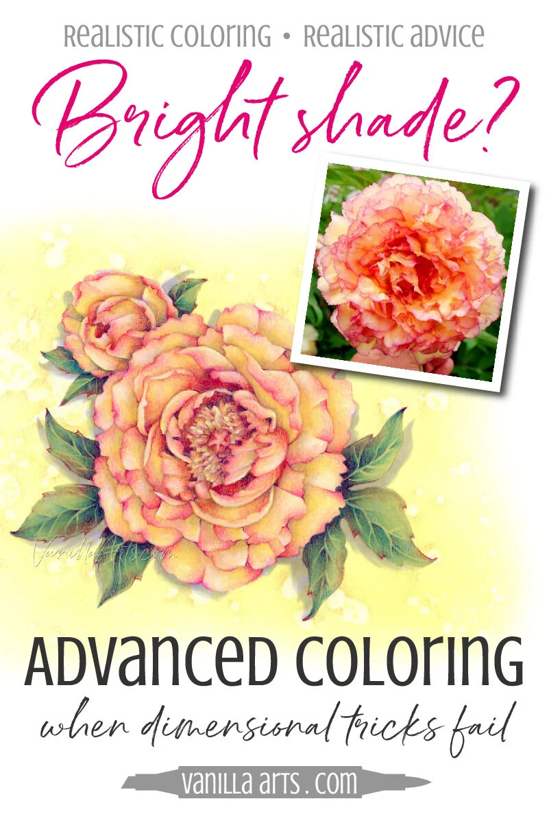
Now look closer at my peony photo reference for my Sunburst online class project here:
The pushes and pulls are completely backwards!
The pale yellow marker sits deep in the shady recesses of the blossom. The dark brick red and deep magenta are way out on the outer edges.
Cleanup on aisle three, we have a dimensional meltdown…
So how do we make a petal look as if it rises up and out of the flower head if the color gets darker as it rises?
How do we use dimensional highlighting if the natural color pattern works in the opposite direction?

One size fits all?
Don’t believe it. One size fits all is a lie.
In art? One size fits almost nothing.
This is the problem with focusing on blending combinations and calling your dark marker “the shade color” and your lightest marker “the highlight color”.
This a short cut for stylized coloring.

It’s impossible to color this peony with realism using standard Copic highlighting technique.
Even my Push & Pull method will let you down.
Standard Copic technique, the one where you grab an orange marker to shade yellow things and a red marker to shade pink stuff? It’s not a real technique. It’s a party trick.
Copic shading is easy to teach, easy to learn, easy to pull out and use on anything from flowers to fire hydrants.
It’s just not realistic.
It works until it won’t.
Standard Copic shading is stylized coloring.
It looks cool but it doesn’t look real.
That’s why colorers say “dimensional”, because they can’t call it realistic.
If standard technique is all you’re learning, if that’s all you’re using, then you’ll be stuck at intermediate level coloring forever.
You can’t get realistic coloring from stylistic methods.
Highlights are not what you think
I know this entire article has you feeling squidgy in your seat. Standard shading technique has taught you for years to think that shade and highlight in terms of color.
Yes, you think your dark marker is “shade” and your light marker is “the highlight”.
That’s a lie.
Shade is not a color.
Highlight is not a color.
There is a gigantic difference between a COLOR and a CONDITION.
Whoa, did that blow your mind?
If it didn’t, then you didn’t get it.
Ready for brain-explosion number two?
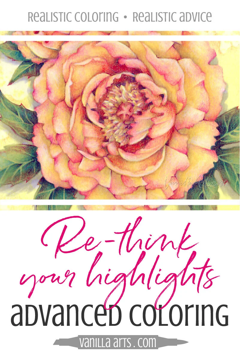
Highlights are texture.
Highlights have nothing to do with depth or dimension.
Highlights tell you about the surface texture of an object.
Is it smooth and shiny or is it dull and matte? That’s what highlights tell us.
That’s a condition, not a color.
That light marker you’ve been calling a “highlight color”?
Stop doing that!
Highlights are texture.
Don’t believe me?
In real life, how do you know if you’re looking at a real flower, a paper flower, or a glass flower?
How can you tell?
Even if all three flowers are the exact color, same petal count, same exact shape. You’re never going to mistake a glass flower for a paper flower, right?
Why?
The highlights are the clue. Highlights tell your eye what the flower is made of.
A glass flower will have hard, sharp highlights. Glass is shiny and smooth. It’s very reflective.
Paper meanwhile is matte and almost non-reflective. The highlights on paper are so soft and subtle as to be almost non-existent.
And a real flower is somewhere in between the two. They’re satiny which means they reflect a little bit of light but not so much that they seem glossy. I think of it as more of a gentle glow.
If you want to color with realism, you have to stop highlighting for shape and instead use highlights as a surface treatment.

Check out Amy’s favorite art supplies, click above.
The Professional Beginner
Beginner, intermediate, advanced?
What level you color at is not the result of time served with a marker in your hand.
You can spend decades coloring at a beginner level. Many card makers do exactly this, they never move past introductory technique. If you never do more than blend and fill in the shapes, then you’re a beginner no matter how nice your cards look.

Why do I bring this up?
Because many coloring instructors are very polished beginners.
I know this sounds harsh but it’s true.
Years of beginner level coloring and a knack for slick project presentation does not equal quality art instruction.
You’re paying good money for classes.
Some of you want to color with realism.
Make sure you’re getting your money’s worth!
If you want to improve your coloring, you can’t take classes that tell you to shade with the dark marker and highlight the beejeebus out of everything that isn’t shade.
Follow the leader, step-by-step, use-my-magical-blending-combo makes for super fun happy time and a cute card but it’s not going to introduce you to useful artistic skills.
If you can’t sit down and figure out how to color a simple peony growing in your garden, what use are all the classes you take?
Using highlights to shape objects?
That’s a sign your instructor is holding you back.
Observation & Analysis
Observation, analysis, and just plain using-your-brain-to-think are what’s missing from traditional Copic methods.
When you start with a blending combination that doesn’t look real, the coloring won’t look real.
When you shade with the dark marker and highlight with the light marker, your coloring won’t look real.
When you color step-by-step using someone’s instructions, your coloring won’t look real.

I’m not saying that Sunburst is the most realistic flower I’ve ever taught.
That’s not the point of the Sunburst lesson.
Sunburst is an intermediate lesson. We’re at the skill development stage here.
Sunburst is just the starting point to something more. We’re looking at a real flower and how real flowers carry real pigment.
We’re investigating the difference between color and condition.
We’re looking at real petals to determine how this flower is positioned and thinking about what happens to the color on each petal as it bends and waves.
Light, medium, and dark markers are not the key to realism.
On a real flower, there are no blending combinations.
And psssttt… sometimes the shade is lighter than the highlight.
If you want to capture REAL depth and REAL dimension, then you have to look at REAL flowers.
How many coloring classes do that?
Find one that does.
It’s important.

Want to learn about petals that bend, fold, and wave?
Join me for Sunburst, a lesson creating unique petals that show signs of life.
We’re starting with a glorious underpainting of bold yellow. Then we add Copics and colored pencils.
We’re not blending, we’re layering the colors to create dynamic shapes.
You’ll never look at flower petals the same way again.
Add Some Sunshine!
Join me for a fun Copic Marker + Colored Pencil lesson in the Vanilla Workshop
Sunburst was recorded live, now it’s a Marker Painting Workshop!
Edited classes with perfect narration tend to make the coloring process look faster, easier, and smoother than it really is.
Stop comparing yourself to the supermodel version of an artist!
Real time coloring with real mistakes and real fixes.
Class Printable Pack Includes:
Class syllabus with detailed recipe guide
Full color project sample
Guide to Copic base
Detailed color map
Project inspiration references

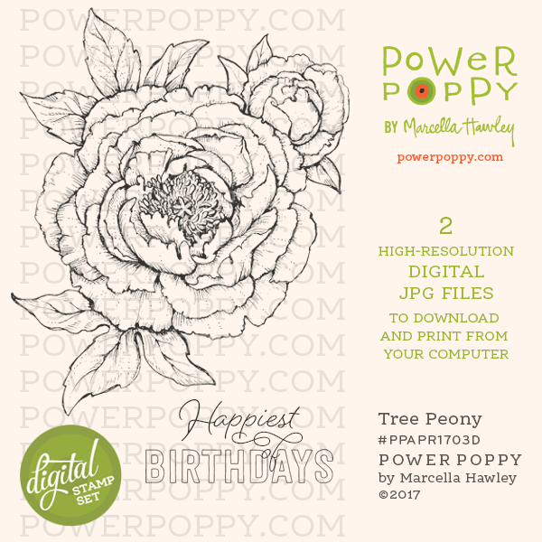
Tree Peony
Sunburst uses the “Tree Peony” digital stamp, an instant download from PowerPoppy.com.
Easily print your stamp on Copic safe paper and color along with me!

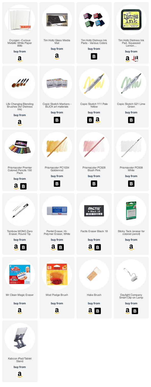
Select supplies used in Sunburst:
Vanilla Arts Company is a participant in the Amazon Services LLC Associates Program, an affiliate advertising program designed to provide a means for use to earn fees by linking to Amazon.com.