Artistic Coloring: How to color shade with realism (copic Marker & colored pencil)
Do you struggle with shade?
Fans of Copic Markers and colored pencils love to talk about the joys of shading.
"Shade, shade, shade! It's so much fun to shade my projects; it gives them tons of depth and dimension!"
But I'll bet you're not very confident about shading without help from a sample project or a tutorial. You probably feel safest when there's someone telling you where the shade goes.
Right?
"Where should I add shade?" is the number one hang-up for colorers at all levels.
Yes, even advanced colorers are often unsure about where to place shady colors.
Today, let's move beyond the copy-me style classes and tutorials, to look at a few methods that artists use to locate shade.
Accurate shading isn't just for fancy art students who take lots of studio classes.
Everyone can learn how to shade for better realism!
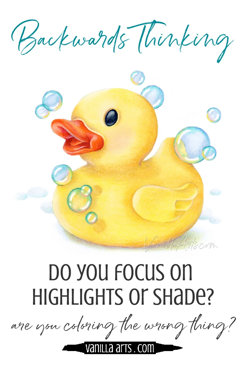
The backwards approach to shading...
First off, I want to make sure we're on the same page about what shade actually is.
If you haven't read my Artists Do Not Shade series of articles, please check them out. Chances are that you're working with a faulty sense of what shade actually is.
Artists Do Not Shade- Part One ("shade" is different for artists)
Artists Do Not Shade- Part Two (directional highlighting is wrong)
Are you getting the impression that a few coloring tutorials have led you astray?
Are you clueing in on the fact that what works for quick & easy card coloring doesn't really work for realism?
Good. That's the first battle. If you're frustrated at your lack of realism after years of practice, card coloring classes, and tutorials... Artists Do Not Shade explains why.
But here's the quick version:
Most coloring tutorials approach shading backwards.
Completely. Backwards.
You've been taught to think about highlights- places to highlight, colors to use when highlighting, fun highlighting techniques.
Then by default, anything that's not a highlight must be shady, right?
Ugh.
I don't blame tutorials for this approach. It's much easier to see and describe a highlight than it is to diagnose shade.
But by focusing on what's easy to understand in three simple steps, most colorers end up with a skewed idea about the importance of highlights versus the value of shade.
And that's why accurate realism is so darned hard for colorers to capture.
Because it's the shade, not the highlights, which add realism to your coloring.
The myth of "easy techniques"
I'm about to give you three exercises or mindshifts to help you see shade.
But before we get there, I have to warn you: This way lies madness.
I'm joking... but not really.
Shade is a subject for a lifetime of study.
Shade is what keeps some artists going back to the drawing table or the easel every day for years. It's endlessly fascinating and ever-changing.
Just when you think you're pretty good at predicting shade, you observe something new and wonderful.
So please note that while I'm outlining three methods to improve your understanding of shade, I'm actually launching you on a journey of practice, repetition, and exploration.
Only time and experience will improve your shading.
Exercise #1: Black & White Values
Remember when I said earlier that tutorials focus on highlights because they're easy to see?
It's true. Sunlight streaming onto an object is a thing of beauty. Like a swimsuit supermodel strutting through an accountant's convention, highlights demand your attention.
Meanwhile shade is harder to locate.
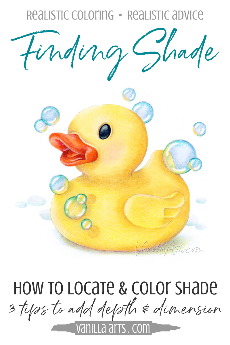
We can easily spot the obvious dark patches of shade lurking in a deep fold or crevice (like under the beak of this rubber duck) but most of the time, shade is very subtle with indefinite edges.

Artists even have a fun name for the indescribable areas where you can't quite tell where the shade starts or stops. We call it "the Penumbra" (puh-num-bruh). Penumbra basically means "Uhmmm... I don't know, maybe there's some shade starting to form there... or maybe not?"
Part of the problem with seeing the edges of shade (penumbra) is that gorgeous color can be very distracting. For this rubber duckie, if all you see is yellow-yellow-yellow, it's hard to focus on where the yellow shifts from golden deliciousness to murky shade.
Copic colorers are very susceptible to color distraction. Everything in Copicland hinges upon using the best blending combinations, so the marker selection process usually distracts you from looking for shade.
Realism doesn't come from the blending combination, it comes from using correct values in the correct places.
It honestly doesn't matter if I color the rubber duck with dark yellow markers, light yellow markers, green markers, or purples. It will still look like a rubber duck if I get the values correctly placed.
You have to get the shade into the right spots or the duck will not look real, rounded, and rubbery.
Marker combinations are of minor importance and yet they monopolize your time.
To eliminate color distraction and see where the values sit, use a black and white photo reference.
Now I know, photo references sound like something only official artists use. Don't be intimidated! Photo references are a learning tool. You can use them too!
Googling "Rubber Duck" turns up lots of photos. Save any photos which look close to your stamp. This one would work, so would this one. It doesn't have to be an exact match.
Then use any photo editing app to flip the photo into black & white or "grayscale" to get rid of the color. I use Photoshop on my desktop computer, and the native iPhone/iPad photo editor on my phone or tablet.
By viewing the photo in grayscale, you can more easily see patches of darkness around the neck, around the wing, and the penumbra that forms as the bottom of the duck comes in contact with the table below it.
Where you see darkness in the photo, that's where you apply shade.
Where you see the most darkness, that's where you deepen the shade colors the most.
Confession time: I know that I tend to get distracted by the natural glow of yellow. Even after all these years, I still view my yellow photo references in grayscale, just to confirm that I'm seeing shade and penumbras accurately.
BONUS TIP: A great way to double check your coloring is to snap a photo of your project and flip it to black and white! If your coloring looks dimensional and rounded in grayscale, there's a good chance that you're on the right track for realism.
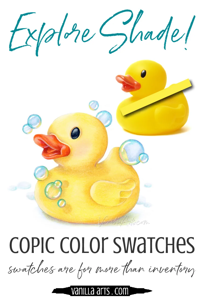
Exercise #2: Color Exploration
Raise your hand if you have color swatched your Copics or colored pencils.
Guilty, right?
Now raise your hand if you've ever used your color swatches to find shade.
Huh... anyone? Anyone?
Making color swatches feels like you're super-duper artistic, right?
And yet most colorers only use their swatches for inventory, a way to prevent buying duplicate markers or pencils.
Either that or you use your color swatches as points of pride...
"Look at all my pretty colors! I'm so happy because I own 50 million markers!"
Stop drooling over the size of your marker collection and start using swatches for something real!
Personally, I don't spend time dinking around with swatch collections. I think they're a procrastination tool. I could spend time making swatches OR I can spend time coloring.
I choose to color.
So as I'm coloring, if I need a swatch, I grab a scrap piece of blending card and scribble some color on it. I toss the swatch in the trash at the end of the project.
Please DO NOT read this exercise and spend week to trying to invent the perfect swatch chart for color exploration. Throw-away swatches are more than enough.
Remember: if you are swatching, you are not coloring.
If you are not coloring, you are not learning!
In my Rubber Duck photo reference, I see Y15 across most of the duck. I can confirm that by scribbling some Y15 marker at the edge of a scrap piece of blending card and holding that up to the photo.
Note, the Y15 isn't what's important here. If your photo isn't Y15, find your own match, even if that's not the final marker you intend to use.
Now for the color exploration part-- Using my swatch, if I move the Y15 towards the neck of the duck, I can see where the photographic yellow starts to change from Y15 to something else.
Don't immediately run and swatch a new deeper yellow. Instead, just leisurely explore the various areas of the duck using Y15 as your baseline color.
Identify and investigate as many darker zones as you can find.
Where do they start?
Does the shade end abruptly at the edge of the duck or does the shade fade away?
If the color fades away, look at the body part and think about why the color is fading there. Is the surface rising or falling? What is the reason for the color change?
How deep does the color get?
How quickly does the color intensify or fade?
Can you remove the swatch and still accurately see the shady zone?
Can you focus on the shape of the shade and imagine that same shape on your coloring image?
The point of this exercise is not to identify the perfect colors for shading. Instead, use the swatch to improve your ability to see penumbras on color photographs.
The questions I've listed above are the exact same questions an artist asks when painting or drawing with realism. The answers determine how and where they add shade.
It's not magic, it's observational skills.
You can't color with realism until you can accurately see realistic color.
Improve your vision and the realistic coloring will follow.
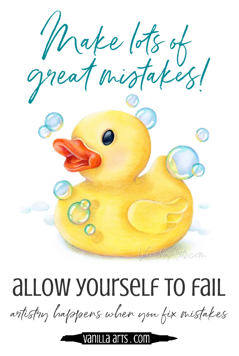
Exercise #3: Make Mistakes
Copic Marker and colored pencil people tend to be perfectionists. There's something about both mediums which attract those who love precision and exactitude.
That's not a bad thing.
Being persnickety is an essential trait for realistic coloring.
But the drive for excellence can keep you locked into safe mode
... where you only color projects with a guaranteed level of quality.
Meaning that it's safer to follow tutorial instructions than to make mistakes.
Sadly, the colorer who only follows guided projects is setting themselves up for a lifetime of copy-cat coloring.
"But I don't like the look of anything that I color by myself..."
"My color choices are not as good as the ones in online recipes..."
"I get so discouraged and lost when I color on my own..."
It's a vicious cycle.
You won't color independently because you're afraid of creating something mediocre. And yet everything you color is mediocre because it's a copy of someone else's artwork.
Everyone assumes that art school is four years of "how to" lessons. How to draw flowers well, how to draw faces properly, how to paint the right way...
And yet it's the exact opposite.
Art lessons force you to find your own way. You're stuck in a room with a bunch of art supplies, for three long hours, and there's no escape hatch. Your only goal is to get something good on the paper before the instructor comes over to mutter about what you've done.
When I was six, my cousin bumped me out of a canoe into 8 feet of water.
That was the same feeling I had every freakin' day in art school.
But we learn by making mistakes.
You learn to make better choices, you get more efficient, you repeat what works and you change what doesn't.
Even today, even on this Rubber Duck project, I fumbled my way through it. I've never drawn a rubber duck before. NEVER. No one has ever told me how to color one either.
I sat down and proceeded to make a series of mistakes:
I didn't draw the head large enough, so I erased it and drew it larger.
The wing was a little too close to the belly, so I moved it back.
It was boring until I added bubbles. Then I moved those bubbles around for almost 30 minutes until I was kinda-maybe-sorta happy with the balance.
I started coloring my new digital stamp with a Y08 and quickly decided I hate that color... so I printed a new copy and started over.
The eye felt flat until I added a ridge around it.
A bit of blush on his cheek gave some personality which was sorely missing from the photo reference.
The beak was too orange, so I added Raspberry pencil to deepen it.
The neck was too shallow so I carved into it with Parma Violet.
I made the white highlights too sharp and softened them with a sticky tack eraser.
The colorless bubbles felt too invisible. I added extra turquoise and a little bit of pink to make them pop more.
This is the artistic process.
And how does this apply to shading? Did you see in that list of mistakes how many were value related? And that isn't the half of it. I lay down shade and either lift it up or lay down more. Constantly! Then I return later to improve it again... and again. The shading process is basically 84 mistakes followed by either an "ah ha!" or a "kill me now, because I can not fix this again".
I can't sit down and execute a perfect Rubber Duck.
I stumble and fumble and bumble my way towards something I can almost tolerate. But trust me, for the next two weeks, this silly duck and all my mistakes will percolate in the back of my head. I'll be using these thoughts to improve the next yellow project or the next duck project.
Mistakes are the way we learn and grow.
Mistakes are the way to develop skills which the world erroneously calls talent.
You can't make these essential mistakes if someone works out all the shading steps ahead of time for you.
And hating your own artwork?
Honey, please.
That's art too.

"Rubber Duck" is a coloring exercise + digital stamp for intermediate to advanced Copic Marker and colored pencil students. Can you find the shade? Can you color the shade accurately? Note- there is NOT an online class for this image. Exercise available in my digital stamp shop.
There you go, 3 tips for Finding shade
Actually, they're more about what to do with your brain rather than what to do with markers or your hands.
1. Locate increased value and shade using grayscale photographs.
Because color can be a distraction.
2. Explore photo references with a color swatch.
Because you can't accurately color the shape of shade if you can not see the shape.
3. Give yourself permission to make mistakes.
Because the artistic process depends upon you digging a hole and then finding your own unique way out.
Learning to shade with accuracy and realism isn't something I can bestow with a wave of my magic wand.
It's a learning process. A study project. A mission. A goal.
And you can totally do this!

Products used in Rubber Duck:
(Affiliate links to Amazon, Dick Blick, and/or Ranger Ink)

Vanilla Arts Company is a participant in the Amazon Services LLC Associates Program, an affiliate advertising program designed to provide a means for use to earn fees by linking to Amazon.com.