
Grayscale Coloring: Depth & Dimension + Tips for success (Copic Marker, Colored Pencil)

Why is Your Coloring Flat?
In the coloring world, grayscale projects are presented as novelties.
“We have all the gray Copic Markers and a ton of gray colored pencils, so let’s color a bunch of funny penguins!”
But in the art world? Monochromatic is how we train!
So as a colorer, when you wonder why your projects look cartoonish or lacking in depth and dimension, you assume it’s because you’re not using the best blending combination.
Hold on.
Your coloring isn’t flat because of the colors you’re using.
Your coloring is flat because of the values you’re not using.
Grayscale training is how skilled artists avoid value issues.
Coloring in grayscale encourages you to think in terms of value rather than color. Value control greatly improves depth, dimension, and realism. Many colorers resist monochromatic practice because they feel deprived of color. To make gray projects more entertaining and successful, try these project tips:
Use midtone paper
Establish darks early
Create lights which are not white
Banish white gel pens
Avoid value creep
Add smart pops of color
Amazing Grays…
How sweet the sound, that saved a wretch like me!

It’s true.
Formal drawing classes, not the how-to drawing tutorials on the internet but real, honest drawing classes— they all use graphite pencils and maybe a few charcoal sticks or conte crayon.
What they don’t use is 358 markers.
Artists start the formal education process with severe minimalism— almost no color. This trains the brain to explore the shape and surface of objects and students learn to focus on how surfaces interact with light. We do all this without the distraction of dazzling greens and sunshiny yellows.
Drawing classes are
90% learning to see
10% drawing
It all starts with a ton of monochromatic projects.
If you can make something look dimensional and realistic in blacks and grays, then it’s a heck of a lot easier to add pretty pink to the process later.
But nowadays, people skip the formal training.
They hop onto YouTube following “how to paint a daisy” or “how to draw a dog” tutorials. They read step-by-steps and take classes, mimicking every move the instructor makes.
Then they get frustrated because there aren’t enough tutorials to show how to draw or color every object they want to draw or color.
Many people color well— not because they’re good at coloring but because they’re good at copying.
Without understanding the fundamentals of shape and value, you’re doomed to a life of Simon Says. You can only color well when someone with more skill tells you what to do.
That’s a terrible way to live.
But it’s not too late.
You can double back and pick up the skills you missed when you leap-frogged your way into advanced color rendering.
When you color projects in grayscale, you pick up many of the sculpturing skills you skipped.
It’s easy to con yourself into thinking your project looks better than it does. “Sure it’s a little flat but the red is just so beautiful!” or “Yes, it’s a bit cartoonish but the color palette is so happy!”
You don’t get this false sense of security when you color projects monochromatically.
There’s no redeeming color to distract from your flaws.
It’s just you and the values.
Your skill (or lack thereof) is right there on the paper in black and white. Grayscale projects reveal the faults in your value choices and your rendering skills. Basically, if you color it flat, it’s going to look flat. There’s no denying it. No hiding. No excuses.
You can practice all the live-long day, color more and more projects until you’ve colored them all.
Until you explore how value determines depth and dimension, you’ll always be stuck looking to others for how to do what you dream.
It’s all about the values.
Grayscale coloring teaches value control.
Related Articles & Classes:

Read more about coloring night time scenes with accurate color.

“Vintage Home Run” is a grayscale lesson with a fun antique vibe.
“All is Bright” is colored on mid-toned paper without the use of white.
How does grayscale work?
Colorers spend a lot of time fiddling with color.
Color palettes
Blending combinations
Shade colors
Shadow colors
Which color to use where
Grayscale eliminates all of that. You’re using gray. That’s it.
And gray Copic Markers all blend really easily, so you’re not even putzing around with the actual blending process. We’ve cleared the decks of everything that stands between you and learning.
Now the only question is which value of gray to use where.
The general rule in grayscale is that dark colors recede and lighter colors come forward towards the viewer.
(This rule also works with color but it gets hella’ complicated.)
For my classes, I simplify this perspective rule to “Pushing & Pulling”.
We push objects farther away with deeper color.
We pull objects towards us with lighter, brighter color.
So pushing and pulling can establish depth (distance). But we also use Push & Pull to create dimension (shape).
The surface of every object contains its own series of pushes and pulls.
And here’s where your grayscale practice kicks in, improving how you color, even with colors.
Grayscale is 100% pure Push & Pull practice!
If you want the door to sit deep into the porch, it has to be darker than the porch values.
If you want a fence post to sit way out in front of the house, it has to be a lot lighter than everything behind it, including the lawn, bushes, and building.
If you want the roof to pop forward from the walls but then tilt back towards the peak, you’ll need to pull it at the bottom and push it at the top. The degree of difference between the top and bottom value determines how we interpret the angle.
And what happens when you want black fence rails to sit in front of a pale lawn?
Or how do you make white window trim sit deep into a shady porch?
As you think through each of these decisions, coloring something dark, not “because the teacher told you to” but because you’re creating logical shape and distance…
Now you’re color sculpting…
AND you’re making artistic decisions…
AND you’re working independently without a step-by-step tutorial…
For the first time, you’re making your own art!

Warning: I’ve scattered a few affiliate links into the article below, to help you identify specific recommended products.
But we love color!
I know, I know.
You started this whole expensive Copic Marker hobby because you love working with color.
Where’s the fun if you’re not allowed to use color?
I’ll meet you halfway then, okay?
Let’s come up with some guidelines to make the gray stuff more enjoyable.
And successful.
Here are 6 tips for smart and fun grayscale coloring:
Work on Mid-Tone Paper
Black and white is dramatic and fun… at least for a little while.
But oh, it can get really boring, really fast. Especially if you’re a color fan!

Switching to a mid-tone colored paper will satisfy your inner color demon.
“Mid-tone” is the key.
You want to choose a color that’s fairly neutral. Let’s avoid flamin’ hot pink or road cone orange.
I’ve noticed cool colors usually work better, likely because backgrounds are supposed to be in the distance. Cool colors recede more than warm colors. Grays and browns work well too.
You also want the paper color to sit in the Goldilocks spot— not too dark and not too light. Halfway or slightly lighter is a good target.
And hey, test that paper!
This is not the time to drag out the weird construction paper you’ve had in your paper stash since 1982.
You want a paper which behaves well for both Copic Markers and (if you intend to use them) colored pencils too.
This project was colored on Bazzill Heavyweight Cardstock in a color called “Candy Buttons”. Even though Bazzill is technically not a drawing or coloring paper, it works. I’ve had success with lots of other Bazzill colors too. Just make sure you’re not using the linen textured version. Bazzill is not my ideal Copic substrate but it doesn’t bleed too-too much and it comes in a lot of fun mid-tones.
Stonehenge also makes a Kraft cardstock which I love dearly for these exercises. I’ve asked Santa Clause for more Stonehenge smooth color options. He said he’d work on it.
Just remember— grayscale projects on white will always look gray. Grayscale projects on beautiful color look amazing!
2. Establish your Darkest Dark
Now I know— this part is going to scare some of you. Don’t panic!
Color your darkest dark object first.
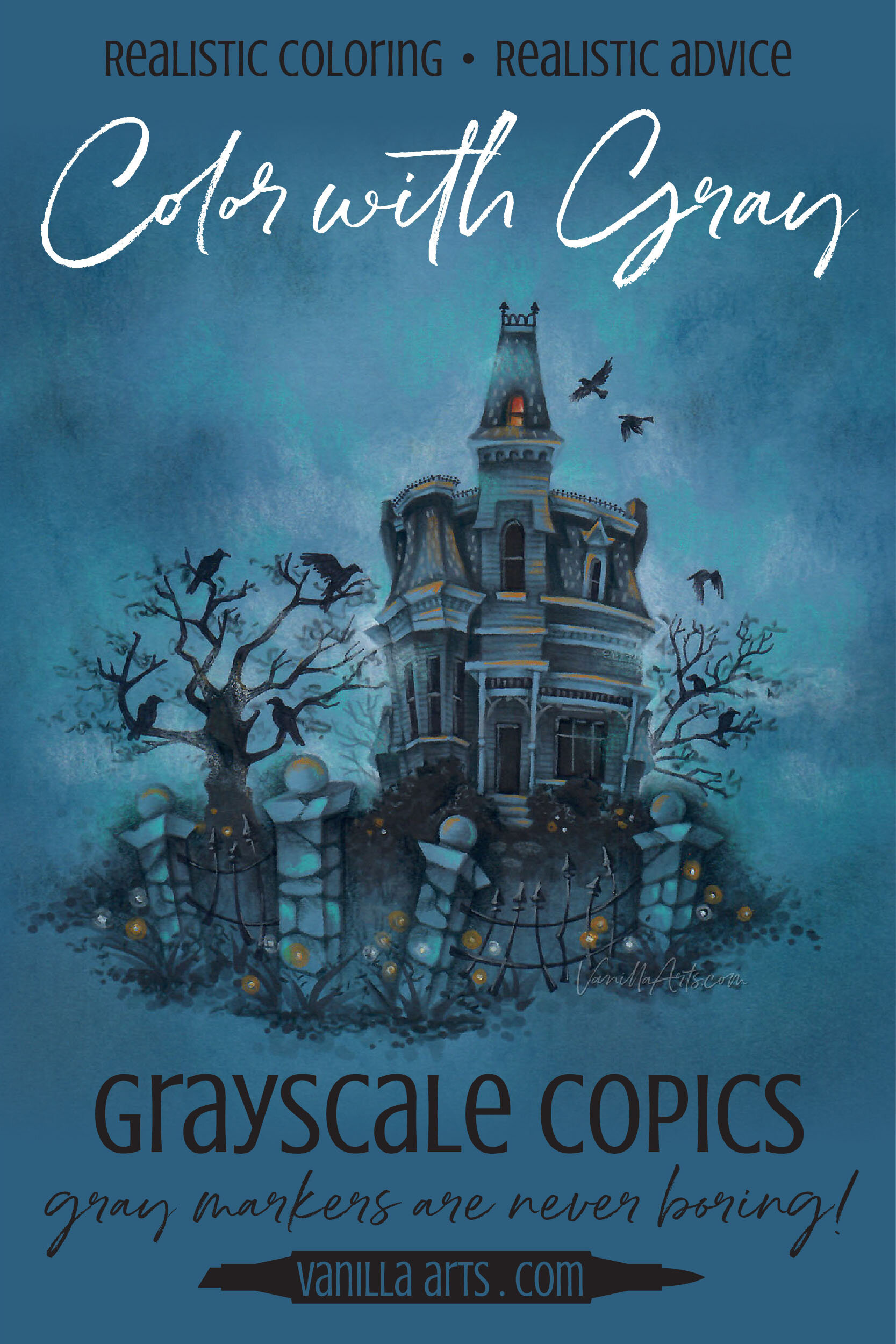
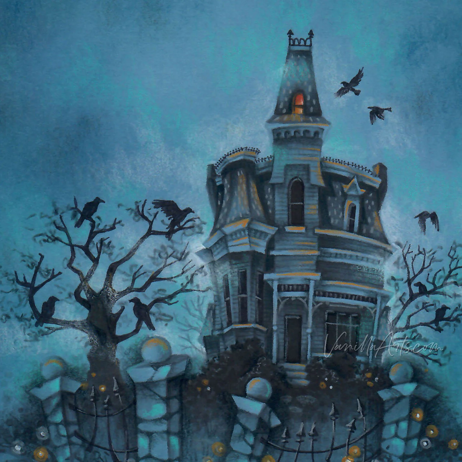
For Nevermore Manor, I started with the big raven tree in the front yard. Then I colored the deep, dark windows, then the iron fence rails.

What we’re doing is called “Establishing Your Darks” and it’s an old artist’s trick. By coloring the darkest things in the image first, we’re setting up the dark end of our value scale.
Once you decide what black looks like, you tend not to over-kill the shade on things that are dark-ish but not actually black.
Establishing your darks early in the project is like an insurance policy.
Without an established black, you’ll find everything ends up getting shaded with a touch of black. Too much black looks bad!
Pssstttt…
I’ve got a little secret.
There’s something special about my darks here in the Nevermore Manor project. You’ll see the same trick in ALL my projects…
The tree, the windows, and all the birds look black…
But they’re actually N8.
N8 is definitely not black but it looks like it, eh?
The problem with black stuff is how do you shade something that’s already black? Do you have a magical pencil or paint in your art stash that’s blacker than black? I certainly don’t.
How do you go darker than black?
You can’t.
Don’t start out with black, even on truly black objects like ravens. Instead, choose a dark gray. Everyone will assume it’s black (just like you did).
By establishing N8 as your darkest dark, you’ll still have black waiting in the reserves in case you truly need it.
3. Establish your Lightest Light
If you’ve already guessed that my lightest light isn’t white, then you get a gold star sticker to wear on your forehead today!
Look closely.
What color is the white trim on my house?
Ohhhh… it’s the color of the paper. My lights are medium blue!
If I hadn’t pointed it out, would you have noticed?
Again, I’m leaving myself an escape clause… I’ve got highlights in reserve if I need a color that’s lighter than light.
And hey, this time I took advantage of my escape clause! I used white to add a touch of moonlight to the foggy drifts and to add cute little fireflies on the front lawn.
4. Step away from the bleepin’ white gel pen!
I know this is going to cause some controversy. But I firmly believe it, so I’m gonna say it!
White gel pens make for bad art and bad habits.
White gel pens might be the downfall of humanity as far as I’m concerned.

I know. Everyone everywhere all over the internet is telling you to add cute little comma-shaped gel pen highlights to everything you color.
AND IT ALL LOOKS BAD!
White gel pen doesn’t make things look shiny.
White gel pen doesn’t make things look wet.
White gel pen doesn’t make things look like glass or metal.
White gel pen makes things look like you used white gel pen on them.
It never looks real.
You can pretend white gel pen looks realistic. You can pretend it looks cute. You can pretend it’s your “artistic style” to add blips, dots, and annoying streaks.
Pretending doesn’t make it true.
White gel pen is a beginner technique and it marks you as someone who isn’t paying attention to color values.
Highlights are almost never white.
Let me say that again: Highlights are almost never white.
You’ve been pretending they’re white because someone told you they were. But if you’d been doing your grayscale exercises and actually looking at real highlights you’d see that highlights are never white-white.
Highlights a lighter version of the local color but they’re not white.
I’ll admit, I occasionally pull out a white paint pen. But I don’t use it straight. I tint the white ink with color over the top. I also use a damp paintbrush to melt water-soluble white ink. Sometimes I smear it with my thumb.
When I do use white— either pen or pencil, I want the base color to shine though and lessen the extreme value punch of white. Pure white simply doesn’t occur often in nature.
And I know, we’ve got a lot of Manga and comic illustration fans who visit this blog. White gel pen is prominently used in both illustration styles. But they also feature a lot of people wearing glossy armor, sweating up a storm as they battle aliens, mutant ninjas, and dark elves.
So we will make an exception: You can use a gel pen if you’re coloring a woman with her triple D’s barely tucked into a vinyl catsuit… but only if she’s fighting to save the galaxy.
Otherwise, put that freakin’ frackin’ white gel pen away.
5. Avoid Value Creep
What is value creep?
Value creep is what I hinted at when I talked about establishing your darkest darks and lightest lights.
We judge color based on the colors next to it.
Pale blue is only pale if it’s sitting next to a darker color. If pale blue is next to light yellow, the same pale blue suddenly looks dark.
This also happens as you color. You judge “dark” based on the other dark items in your project.
Grayscale projects are especially prone to value creep because you’re working with a limited color palette.
Let’s say you’re coloring a something with Copic N7 and you shade it with black. The next item is only N5 but you’re now thinking “shade = black” so you pull out the black again. Before you know it, everything has black on it whether it needs it or not.
There’s also a nasty version of value creep that happens with Copic Markers.
Let’s say you have an image with 3 birds— a light, medium, and dark bird.
You color the lightest bird with N2-N4 but the blend doesn’t smooth out, so you re-blend it with another coat. Then you give it another hit, just to make sure.
At 3 coats of N2, your light gray bird looks more like N3 or N4. The more coats of ink you use, the darker the bird will be.
Now when you try to color the medium bird, you can’t use N4, you have to use N6. And your darkest bird can’t be N6, it has to be N8.
See how the project accidentally creeps darker and darker and darker?
Value creep happens to EVERYONE, even professionals. The difference is that the pros know to watch out for it.
Be a pro. Avoid value creep.
6. Add Pops of Color
Hey, I know we’re learning with grayscales but that doesn’t mean we can’t have a little fun.
Once you’re done practicing your values, why not add a few hits of color?
Something’s going on in the Nevermore attic. It ain’t good.
I borrowed the attic color and used it as the highlight (see tip #4).
Wherever the creepy light lands, I’ve added a dash of yellowy orange. Little touches, here and there. Just a sprinkling.
I’ve also added a bit more blue to the sky. Kisses of Indigo Blue and Light Aquamarine. Not a lot, just enough to contrast with the yellow orange for a zesty zing.
So there you go,
6 Tips for Fun & Smart Grayscale Studies
Gray is only boring if you color it boring!

Mid-tone paper: Change the look of transparent gray ink by layering it over blue, mint, aqua, violet, or kraft.
Establish your darkest darks first: Set the standard for black before the black gets out of hand. And by the way, don’t make the black actually black.
Set your lightest light: Just like the darkest dark, make sure you’re far shy of white with your lights.
Ditch the gel pen: Highlights are never thick coats of plasticky semi-gloss white.
Avoid the creep: Color naturally shifts darker when you stop paying attention. Stop yourself before it creeps too far.
Colorful kisses: Once the learnin’ is done, have a little fun with accents of pretty color.
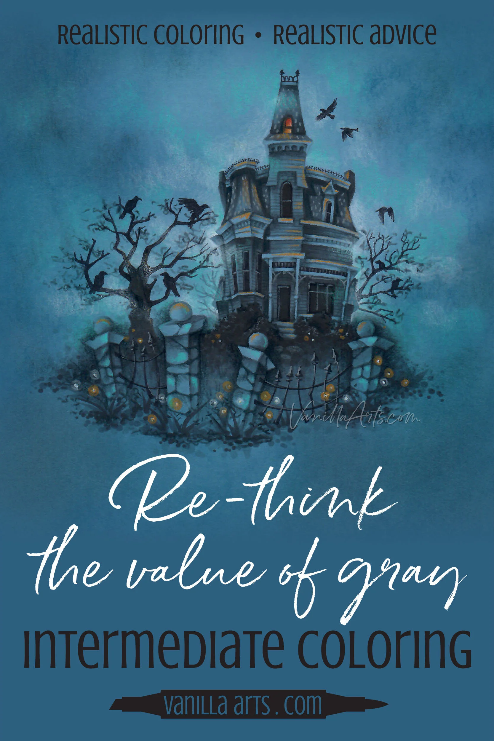
Grayscale coloring is such a valuable exercise!
This is why it’s a staple warm-up exercise for artists going back centuries.
Yes, look at Leonardo Da Vinci’s journals. They’re full of value studies!
Understanding the value of color, what works and what works better is part of the life-long learning process. We will never be good enough to not need grayscale practice.
Grayscale value exercises make everyone’s coloring better!
Ready to try challenge level coloring?

Nevermore Manor an Intermediate Challenge level Marker Painting Workshop
Learn how to apply the storytelling process to your next digital stamp. Can you color this same image for other holidays like Easter or Christmas? You can with our helpful personality guide.
Real time coloring, recorded live
Live Workshops are unscripted demonstrations which provide students with a real look into the authentic coloring process. You’ll see mistakes being made and corrected. It’s just like visiting Amy in her home studio.
Log in and color with Amy at your convenience. Anytime access, no expiration dates.
Class was recorded in October 2020 and featured a live student audience. Amy answers questions from the students and offers many tips for better colored pencil art.
Select Products used in Nevermore Manor:

Vanilla Arts Company is a participant in the Amazon Services LLC Associates Program, an affiliate advertising program designed to provide a means for use to earn fees by linking to Amazon.com.


