
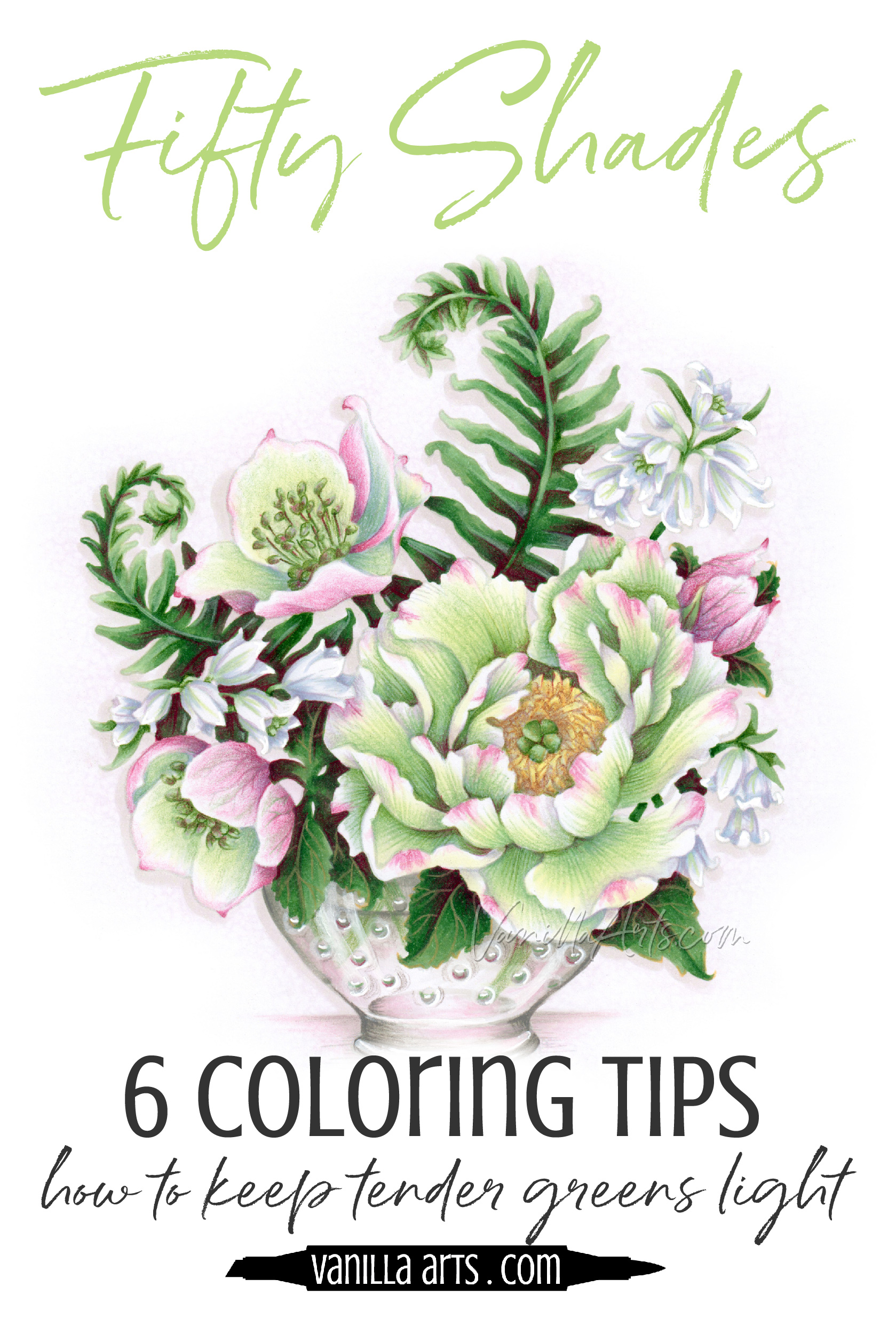
Improve Your Coloring: How to Keep Green soft & Delicate (Copic Marker, Colored Pencil)

Do your soft greens grow into loud green monsters?
You started out with a G0000 Copic Marker.
That’s the lightest green Copic makes! A marker so pale and whispery, it’s barely green. All your colored pencils were soft and delicate too.
So why does your finished project look like the darkest jungles of Brazil?
Or why does it glow in the dark?
It’s not just you.
Green is very vexing.
Green is a color we see all the time- everyday, everywhere.
Some of you live in places so green and lush that you barely even notice green anymore.
Green is elevator music for the eyes.
Chartreuse, celedon, lime, kelly, sap. viridian, emerald, seaweed, olive, forest… heck, I’ll bet you can name more shades of green than any color family.
We underestimate green.
Green is harder than it looks!
Go into any art store and look at any color medium. You’ll find more pre-mixed greens than any other hue. If art supply companies are making soooooo many versions of green, that must mean lots of people are using all the green stuff right, eh?
Honestly?
No.
The reason there are so many green paints, markers, and pencils in the art store is precisely because NO ONE is having any luck.
If there was a perfect green, we’d all be using it, all the time!
Green is deceiving. Green is stubborn.
Green starts off nice and turns to poison.
It ain’t easy, bein’ green!
Green is tough, even for artists
I’m about to shock you. So go give it a google if you have doubts:
If you go to discussion boards, product information sites, and communities where artists hang out, you will find more conversation about green than any other color.
Especially if we’re talking painters- everyone from oil painters to watercolorists… especially watercolorists. They’re all up for more green chat- anytime, anywhere.

What green pigments to look for, how to make green pre-mixes work, how to mix more natural greens…
Green is the poison ivy of the art world
Why?
Because forget red, the devil wears green!
I’m pretty sure Lucifer developed the first green himself and then he handed it to his henchmen who spread it all through nature, just to cause all the artists never ceasing anguish.
Good job, Satan. Mission accomplished.
Green paint, the stuff straight out of the tube- it’s very candy-colored. Almost plasticky. Pre-mixed green paints don’t look anything like what you’d find in nature.
Using tube green is actually banned in many art classes.
It’s not just fake looking, pre-mixed green is an art faux-pas.
So without the help of tube colors, an artist is forced to mix their own green. That’s when the real torture begins.
Sometimes the only thing worse than a tube green is one you’ve mixed yourself.
Blue and yellow don’t really make green. At least not a green found in nature.
And this is why there’s a never-ending quest for green. Some folks dream of world peace, tantric bliss, a cure for cancer, or bananas that don’t turn brown five minutes after you buy them.
But artists?
Most artists dream of finding a perfect green.
50 Shades of Envy…
Remember what I said about a million different tubes of fake looking green paint? The same holds true for Copic Markers.
I know, I know. Copic makes a lot of greens. Ohhh, ahhh! Look at all of the pretty green markers.
But how many greens do you actually use?
I’ve got about six in my regular rotation.
Honesty Time: I use most of the Reds. I use most of the Blues. I’ve used all the Grays, all the Blue Violets, and every single one of the Earths.
But all the greens?
No thank you!
And I love green. I love doing botanicals because I love green. I’d love to have a green Copic worth loving.
Heck, I teach with 2 YGs and a B as my standard green combination for 70% of my classes because I’m so hard-up for decent greens.
It’s that bad.
You could walk into my studio right now and filch most of my greens into your back pocket and I’d wish you well.
Good bye and good riddance.
Copic greens are saccharine like tube paint. I dare you to find G16 in nature. Most of the Copic Gs are useless and there are a few YGs that I wouldn’t touch with a 39 1/2 foot pole.
And believe it or not, Copic actually makes better greens than a lot of the other marker brands. So it’s not like you can shop around and mix your own collection of usable greens.
A good green is hard to find!
And bad greens are even harder to control.
Bad color gets badder, not better
Color is relative. This means that we judge color based on what other colors are around it.

In the beginning of a project, you’re looking at a lot of white paper. So you pick greens and use them based on how they look and feel next to white.
But the more colors you add, the more your greens change and evolve.
Green against white looks totally different than that same green next to orange. Which is why I tell students:
Color is relative and color evolves.
Every new color addition changes how you see the green.
You physically use color differently at the end of a project than you did in the beginning. The more colors you add, the more color decisions you’re forced to make.
Relativity causes evolution.
Which is why artists are so picky about greens.
If you start out handicapped with a bad selection of greens, you’ll start making bad decisions based upon those greens.

How can you control green?
How do you keep green from becoming wild, obnoxious, and radiating an energy that detracts from the flower blossoms or the cute animal… you know, the stuff in the stamp that’s more important than the green?
Sedate green takes practice. With practice you’ll develop better taste and a sense of style. You have to know how to use it to know how to use it better.
That isn’t going to happen overnight.
But there are a few things you can do to start the task right and end up with the greens you want.

1. Don’t shade with dark green markers or pencils
I shouldn’t even have to say this, at least not to anyone who’s taken one of my classes. We don’t usually shade using traditional Copic methods. And when we do, it’s definitely not with a darker version of the same green number family!
That stuff just doesn’t look realistic.
But today, this warning about darker-marker shading has nothing to do with realism.
This time, it’s about value.
Remember when I said that color evolves? In Copic-world, when color evolves, it almost always gets darker.
So you might start out coloring a flower petal with a G20 but by the time you’re done shading and blending, you’ve also got a G21, a G24, and a G28 on your desk.
Folks, if you’re using G28 on something, there’s no way in Saint Patrick’s blessed tweed underwear that it looks light green anymore!
This rule is simple and more than a little obvious:
If you want green to look light, don’t color it dark.
2. Shade with blue violet Copics
This rule is an extension of rule number one.
I just told you not to shade with dark green. So what’s left?
Ahhh grasshopper, if you’ve peeked at my class selection, you’ve seen how we use some strange colors to create shade.
Then sometimes, we get all normy-normal and use a gray.
And don’t get me wrong, as a general rule, I’d tell you “when in doubt: underpaint with gray”. Hey, if it was good enough for Rembrandt and Vermeer, it ought to be good enough for us, right?

But green kinda bends that rule on it’s remaining right ear.
Gray does not work well under green.
The problem is that underpainting was developed for use with oil paints and the process is slightly different when we’re working with markers.
An oil painter can paint right over the top of an underpainting without worry. Oil underpaint stays exactly where you put it.
Meanwhile in Copicland, if we’re not careful, we’ll accidentally rehydrate too much gray and start dragging stray gray all over the surface of the entire project.
Not good.
First, it’s not good because ugly gray smears tend to be… well, ugly.
But the other problem is that if you’re using a gray ink underneath a G family green, you’re not going to see much shading because the gray just kinda dies undeneath green. So you end up using a stronger gray than usual which then makes the ugly smearing thing worse.
Personally, when I’m shooting for maximum realism, I shop for greens in the YG section. YGs tend to look more natural (if you avoid the acid greens.) Then I tame the wild YGness by underpainting with a Blue Violet.
Yes, BV looks amazingly awesome underneath YGs!
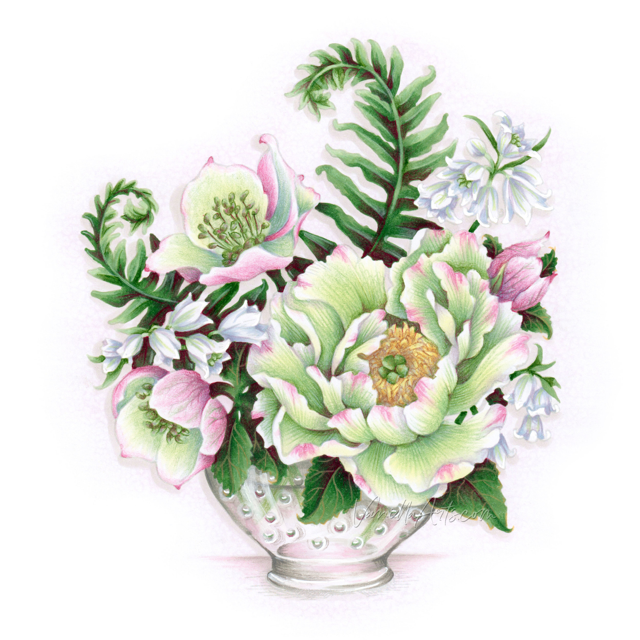
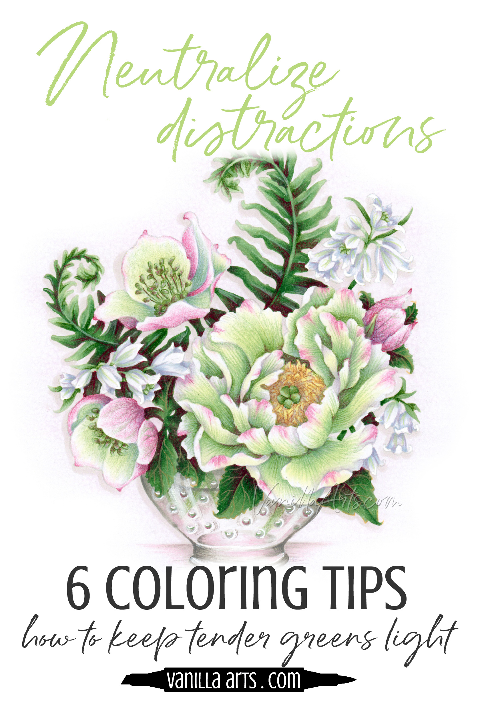
But hey, sometimes I feel a little crazy. The Bowl of Beauty stamp featured here was underpainted with pink. Not kidding! I used RV14 to create the shadiest green leaves and it looks pretty darned cool.
The trick is to underpaint with real color.
…not muddy gray. And I underpaint with a color found on the opposite side of the color wheel. Complementary colors neutralize the green hue without making ugly mud.
But taste is always the deciding factor. Use my suggestions or experiment to find what suits your fancy.
3. Choose complex greens
Earlier in this article, I talked about artists mixing their own greens.
The recipes can get kinda crazy. You can mix green by combining:
phthalo blue + burnt sienna
ultramarine + yellow ochre
ivory black + cadmium yellow with a touch of cobalt blue
burnt umber + cadmium yellow
my favorite mix is prussian blue + gamboge with a touch of red iron oxide
But this wizardry doesn’t work in Copics.
I wish!
Man, if I was allowed to develop my own line of markers, I’d scare the argyle socks off the marker factory foreman!
But… since they’re not letting me into the Copic kitchen anytime soon, we’ve got to shop from what Copic offers.
Here’s my list of natural-ish greens. The rest are either too acid, too viridian, or too blue.
YG0000 & YG000
YG01, YG03, YG17, YG21
I like the whole YG60 series
I kinda like the YG90s
G20, 21, 24
G40s and 80s are not natural to my eye, but students love them so I use them more often than I normally would
G90s
Notice what’s missing?
I don’t do many low number families. Not much from the 01-09 group, only one teen number made the cut.
That’s because low-enders all look like something scraped off the sidewalks of Chernobyl.
I don’t do neon and I don’t do glow because these colors force you to spend all your time fighting radiation.
If the colors are natural right from the nib, you’ll have an easier time keeping them in check.
Even a little glow can steal the show!

Check out Amy’s favorite art supplies, click above.
4. Flood the zone
What do you notice about my Verdant Spring project here?
It’s teeming with green!
One of the easiest ways to control your greens is to give ‘em a little fertilizer and let them spread.
Greens feel calmer in a collection.
Have you ever walked into a red room? I mean a truly red-red room. Walls red, ceiling red, carpet red, furniture red…
I can stop talking, right? You’re already shuddering. Red is my favorite color and even to me, an all red room sounds hideous.
But pop someone into a forest or a garden surrounded by nothing but green-green-green and it’s zen city, right?
It’s weird.
If you showcase a whole range of green values, instead of dominating the show, the greens start to recede into that pleasant nature vibe.
It’s a green paradox!
True story: in coloring the first draft of this image, I actually had to go back and add more yellowy tones to the peony. I’m still not convinced that I got it bright enough! In my first version, the peony went total wallflower on me and camouflaged itself into the pileup. I ended up adding golden stamens to the peony, just to draw attention to the star of the show.
Even in planning for a green recession, I still wasn’t prepared for how effective the snooze effect would be!
Just be sure to keep your greens in a similar temperature range and make sure to use a full range of lights, mediums, and darks for variety.
One green = wow! Lots of green = sedate
5. Complementary accents
Opposites attract, right?
The husband is nit-picky while the wife is relaxed and casual. Or the boss is big picture oriented while his assistant handles all the fiddly details.
Opposites fill in the gaps where the other lacks.
Opposites make each other more than they are alone.

The same is true with color.
I wanted to color very pale green flowers, which then forced me to do some hard thinking.
G double, triple, and quad zero markers are very blue looking. I actually think they feel more aqua than green.
And YG double and quad zero markers read as very yellowish.
Go yellow or go blue? That’s a tough choice to make when you’re shooting for green!
I ended up with the YGs here and surrounded them with darker greens to send that green message…
But then I also emphasized the greeniness by hopping directly across the CMY color wheel to grab green’s opposite - magenta.
The opposite color is called a “complement” and complementary colors work wonders.
The YG greens look greener here because of the pink.
It works both ways too; the pinks look pinker because of the green.
If I’d have used orange on the hellebores and the edges of the peony, the peony would look sickly yellow because the YG000 marker and orange share warmth in common. And conversely, coloring the hellebores blue would have emphasized the green everywhere else, swallowing up the poor peony in a sea of green.
Magenta sits right smack-dab in green’s sweet spot. A complementary color will both tame and emphasize it’s opposite.
Magenta makes greens look greener.
6. Neutralize the color palette
We’ve been talking about green a lot here but it’s important to keep in mind that most stamps are compositions of several objects. Not all stamps are a single rose bud or a solo piece of candy.
Nope. There are going to be several things to color.
Several things to color require several different colors.
After you use lots of green and temper it with bits of magenta, what do you do?
Don’t randomly toss in other colors!
Hey! Let’s do turquoise bluebells and how about a road-cone-orange bowl?
NO!
First off, nobody looks at this stamp in it’s uncolored version, hanging there on a peg in a store and thinks, “man, that’s one gorgeous bowl stamp!”
And nobody rushes to buy it for the bluebells.
The bowl and bluebells are bit players in a much grander image.
The peony and hellebores (maybe the fern too) are the focus.
Let them be the superstars.
If you force your greens to compete with wild color everywhere else, you’re giving the green permission to be wilder too.
If you wanted the peony to stand out in a hurricane of color, it would have to be neon acid green.
Acid green is not calm and sedate!
Instead of chucking in other colors, go neutral.
The blueish violet gray color that added shade and depth to my light greens is now making white bluebells look dimensional.
And I used warm grays to make the bowl transparent and almost invisible.
Your eye still goes to the peony, right? And the greens still look tranquil and calm, right?
Only neutrals can do this. They keep the focus where it needs to be, playing back up to the main color palette.
Neutrals add smart sophistication.
Control your green!
Green can be zen or green can be an acid trip.
It’s completely up to you and how you use it.
Color with intelligence and intention to get the look you want from your G and YG Copic Markers.
6 tips for keeping green calm & delicate:
1. Don’t shade green with more green
It will never look light if you’re slapping on tons of dark ink!
2. Shade with blue or violet rather than gray
Gray works with paint but not as well with ink. Knowing your medium will prevent ugly gray smears and muddy color.
3. Choose complex & natural greens
There are a lot of green markers and colored pencils. That doesn’t mean there are a lot of natural green markers and colored pencils.
4. Fill the page with green
One green screams, many related greens sing soft lullabies.
5. Complementary color
Contrast makes for more interest but complementary colors also emphasize what’s most beautiful in their opposite.
6. Neutralize rather than distract
Let the greens sing lead rather than bringing in an entire Broadway company of colors to rob the spotlight.
Want to know more about sedate and calm green coloring?

Join me for Verdant Spring, a lesson on controlling the vibrancy of your green projects.
We barely even notice greens in everyday life, until you realize that the jungle has grown out of control!
You don’t have to be an artist with a gigantic brain and overflowing talent to master this method! Color Control is for everyone.
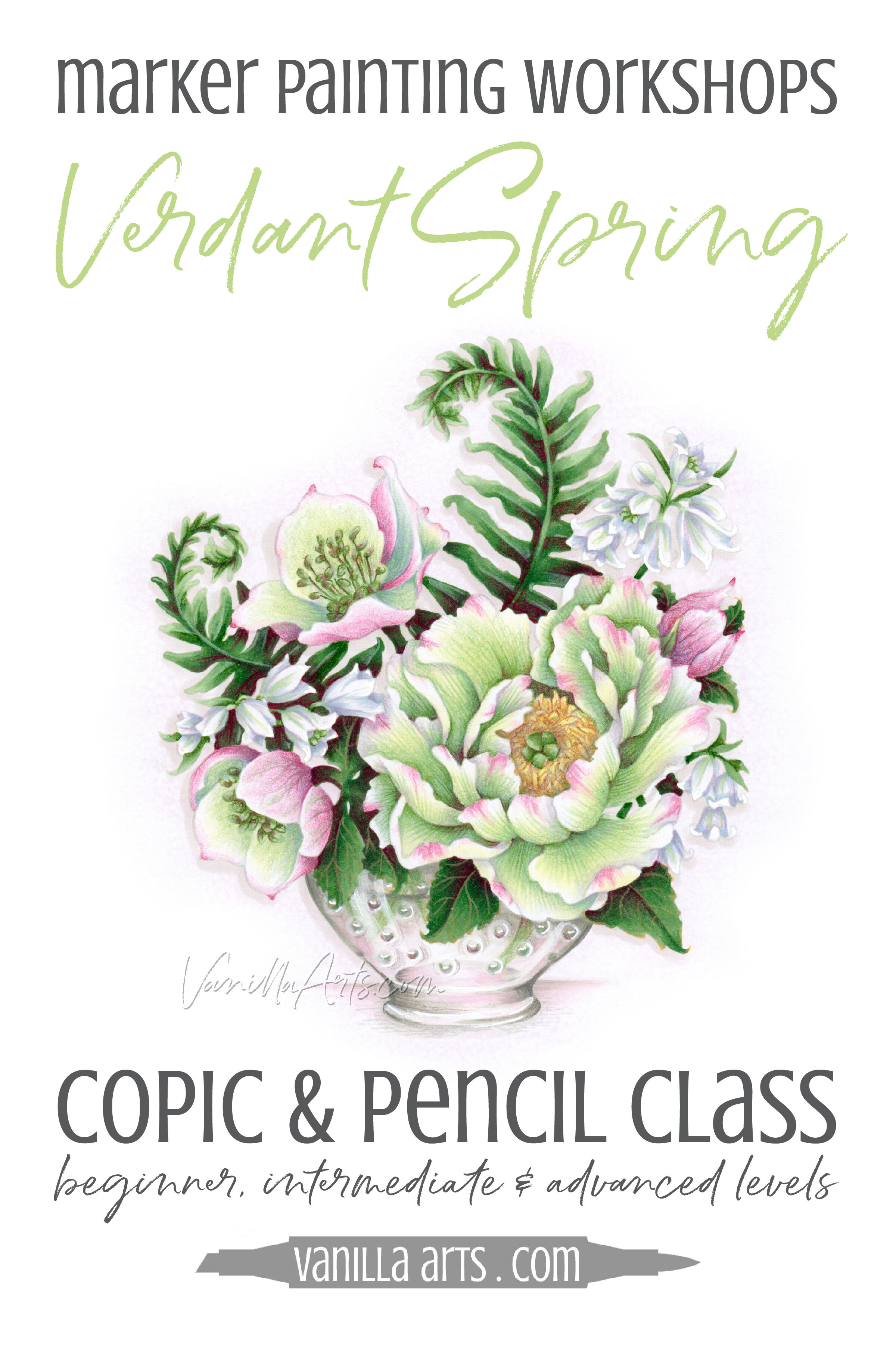
Verdant Spring
Join me for a fun Copic Marker + Colored Pencil lesson in the Vanilla Workshop
Verdant Spring was recorded live, now it’s available as a Marker Painting Workshop with anytime access.
Vanilla Livestream is a live demonstration program from Vanilla Arts.
Edited classes with perfect narration tend to make the coloring process look faster, easier, and smoother than it really is.
Stop comparing yourself to the supermodel version of an artist!
Real time coloring with real mistakes and real fixes.
Class Printable Pack Includes:
Class syllabus with detailed recipe guide
Full color project sample
Guide to Copic base
Detailed color map
Project inspiration references
Join me for an online lesson that will change the way you think about color!
Plus, it'll be tons of fun!

Select Supplies used in “Verdant Spring”:

Vanilla Arts Company is a participant in the Amazon Services LLC Associates Program, an affiliate advertising program designed to provide a means for use to earn fees by linking to Amazon.com.


Lorem ipsum dolor sit amet, consectetur adipiscing elit. Vestibulum id ligula porta felis euismod semper.