
Real Color Theory: Skip the Blending Combinations! Layer Color with Realism by Glazing

Blending combinations are for Beginners
I know this sounds controversial, especially coming from someone who teaches marker blending classes…
But here’s the dirty truth no one wants to tell you.
The reason why your Copic Marker or colored pencil projects look flat and cartoonish?
The reason why you never color anything that looks remotely realistic?
It’s because you’re using blending combinations.
Blending combinations, marker recipes, and the tutorials or classes which teach them are for beginners.
It doesn’t matter how advanced your blending skills are, if you take the blend approach to coloring, you will always color like a beginner.
Blending combinations are for beginners. Using a light, medium, and dark set of Copic Markers or colored pencils creates a dead end for colorers, locking you into cartoon images with little realism. Artistic coloring uses a glazing technique to layer colors for amazingly realistic projects.
The simplified approach to coloring
Did you start coloring because you wanted to make cartoons?
Don’t get me wrong, I’m not knocking them. Some people really do fall in love with the stylized look of graphic novels and caricature coloring. Many hobbyists enjoy the soothing gradients and optical illusion blends found in the coloring book world. If that’s what makes ya’ happy, then keep on keeping on. That’s not what we do here at Vanilla Arts but I can totally see the appeal.
Here’s the problem: A lot of people purchase artist grade markers and especially colored pencils because they want to create beautiful images with style and sophistication.
Actually, many of them secretly want to paint but at this point in their busy lives, markers and pencils feel more accessible and forgiving of mistakes.
These aspiring artists get trapped in the online wild-west where anyone can call themselves a coloring expert and everything is based on blends and blending combinations.
Blending techniques are designed to get decent results with minimal skill.
Does that really sound like a method for artistic expression and realism to you?
This ain’t your momma’s blending combination!
I resisted posting my color combinations on the blog here for many years.
And now that I’m doing it more regularly, I find I was right. My project recipes are not much good to anyone used to coloring with the typical light-medium-dark blending combinations.
Wait, what? You put the which where? And what do you do with that weird color?

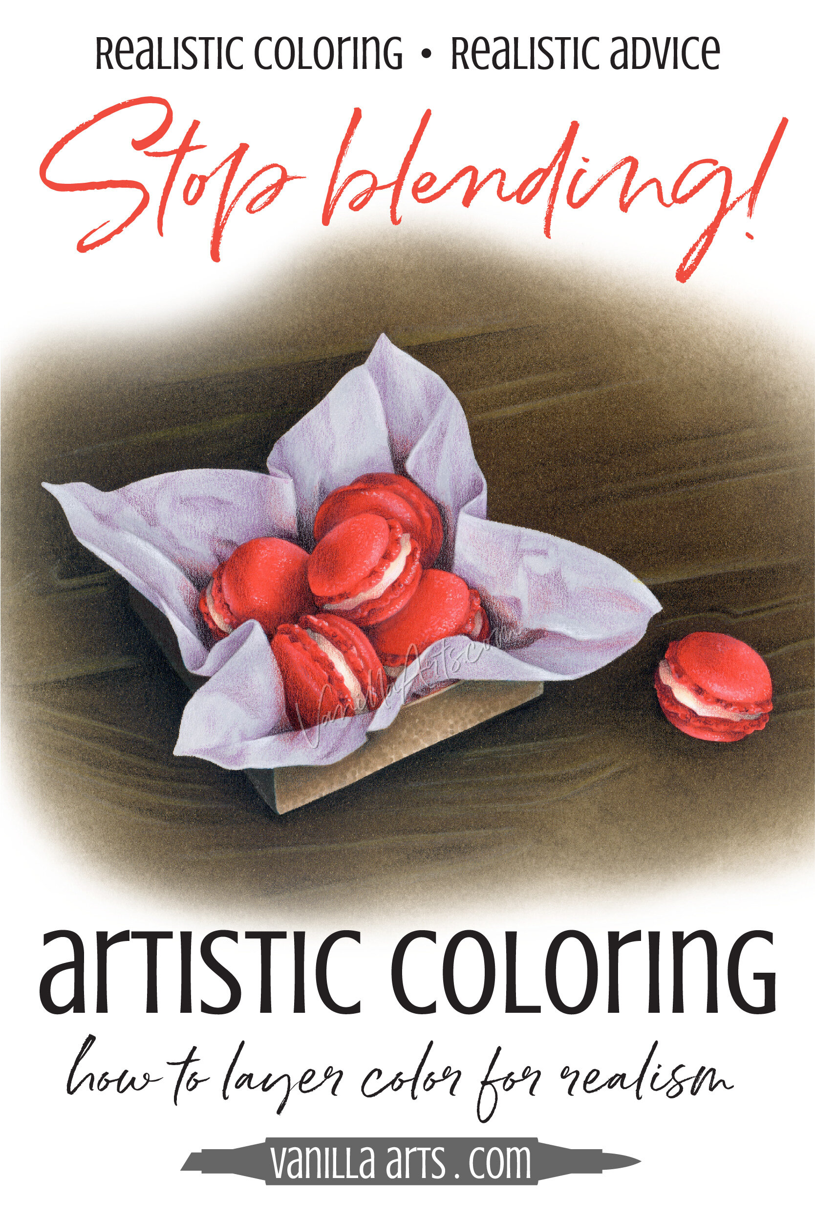
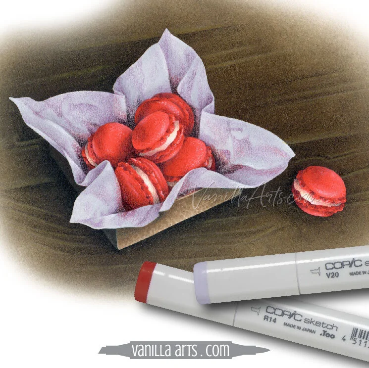
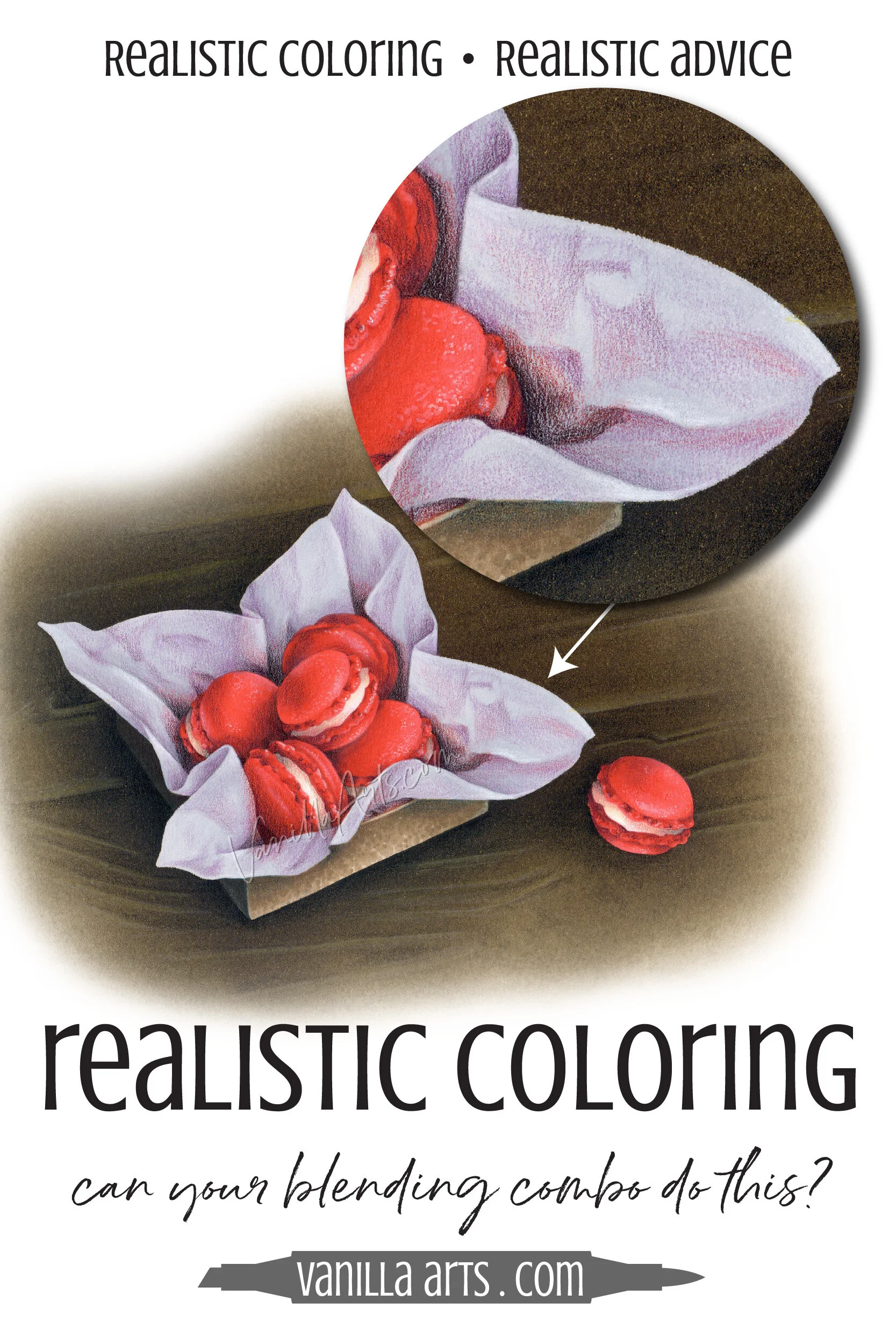
Here, I’m showing you all the supplies I used for the lavender tissue paper in this photorealistic box of Red Macarons.
Two markers— a gray and a light violet.
Five pencils— a warmer lavender, a deep purple, bright red, a brown-black, and a warm skin tone.
Wait, what? You put the red where? And what do you do with the peach?
No, I’m not kidding. This is everything I used on the tissue paper.
Guess what? The supply list for the red cookies is pretty much the same pencils with a couple of red Copics.
Honest. Cross my heart and all that jazz.
Are you starting to understand why my advanced and photorealistic class projects look different than other coloring classes?
We use the same supplies but we’re not using them the same way.
Which is why I’m telling you that you can blend your colors all the live-long day, but you’re not going to get much realism out of ‘em.
Real color or Copic color?
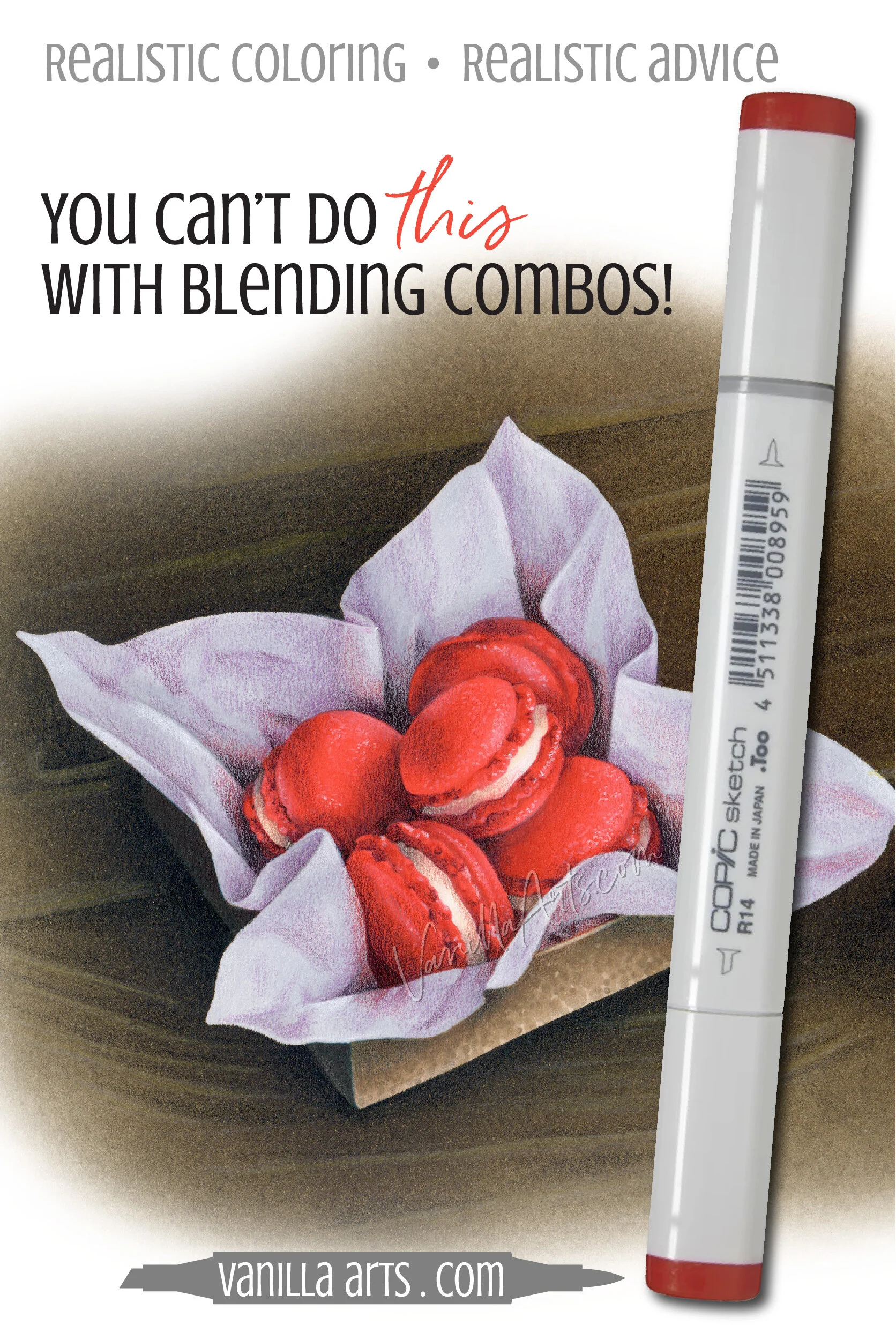
Want to color the lavender tissue paper from a box of Red Macarons?
Copic says they’ve got you covered.
No problem, sit back and relax. Try our handy blending suggestions, how about V20-V22-V25?
But do you honestly see any V25 in this image?
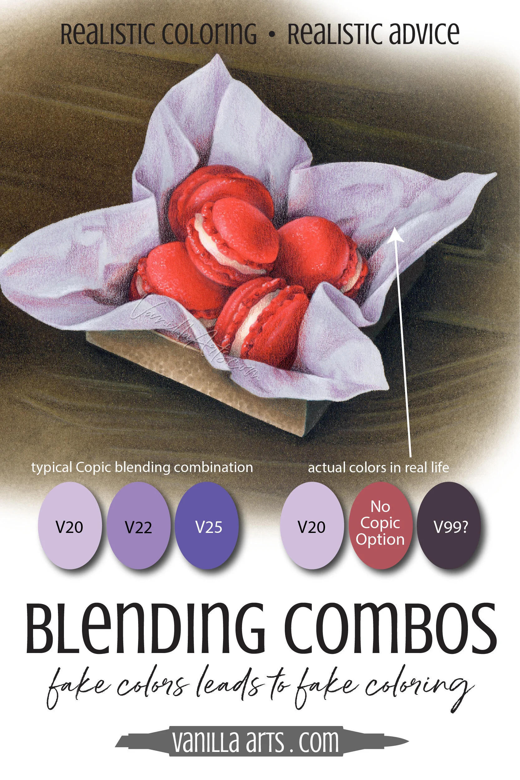
No!
Because that’s not how color works in real life.
If you use artificial looking blending combinations, you will always get artificial looking projects.
Real color is far more complex than Copic blending combos.
To color with photorealism, you must capture the flavor of real color.
As the tissue crinkles, the color doesn’t get darker, it shifts a bit grayer.
Then as we plunge down towards the red cookies, the tissue picks up some of the color from the cookies and shifts red. There are spots where the tissue actually matches the cookie’s vibrant scarlet.
In the murky depths of the box where we see the lavender tissue covered completely by shadow, the reddish tones are blackened.
Even if Copic made the markers to capture these real colors, how could you possibly blend them seamlessly with V20? It’s such a small space and the transition from pale lavender to black is so fast, even my Rebel Blending technique won’t work.
Realistic color is almost never light-medium-dark.
A layered approach to coloring
What’s the difference between layering and blending?
How about everything?
Blending is a hobby level approach with a superficial understanding of how color works.
Let’s be honest, if dimensional coloring actually looked realistically dimensional, would anyone have to loudly declare “oh, it’s sooooo dimensional!”
Folks, if you have to tell us it’s dimensional, it’s obviously not.
The layered approach to coloring is different.
Using color theory and fine art techniques developed by classical style painters over several centuries, we can create realistic color not by blending but by stacking colors on top of each other.
This is a process called glazing.
Glazing is not about the color of your marker or pencil, it’s about the color it makes.
As I developed the lavender paper here, I wasn’t looking at the lavender hue.
Instead, I focused on the values and color temperature of the lavender in each area.
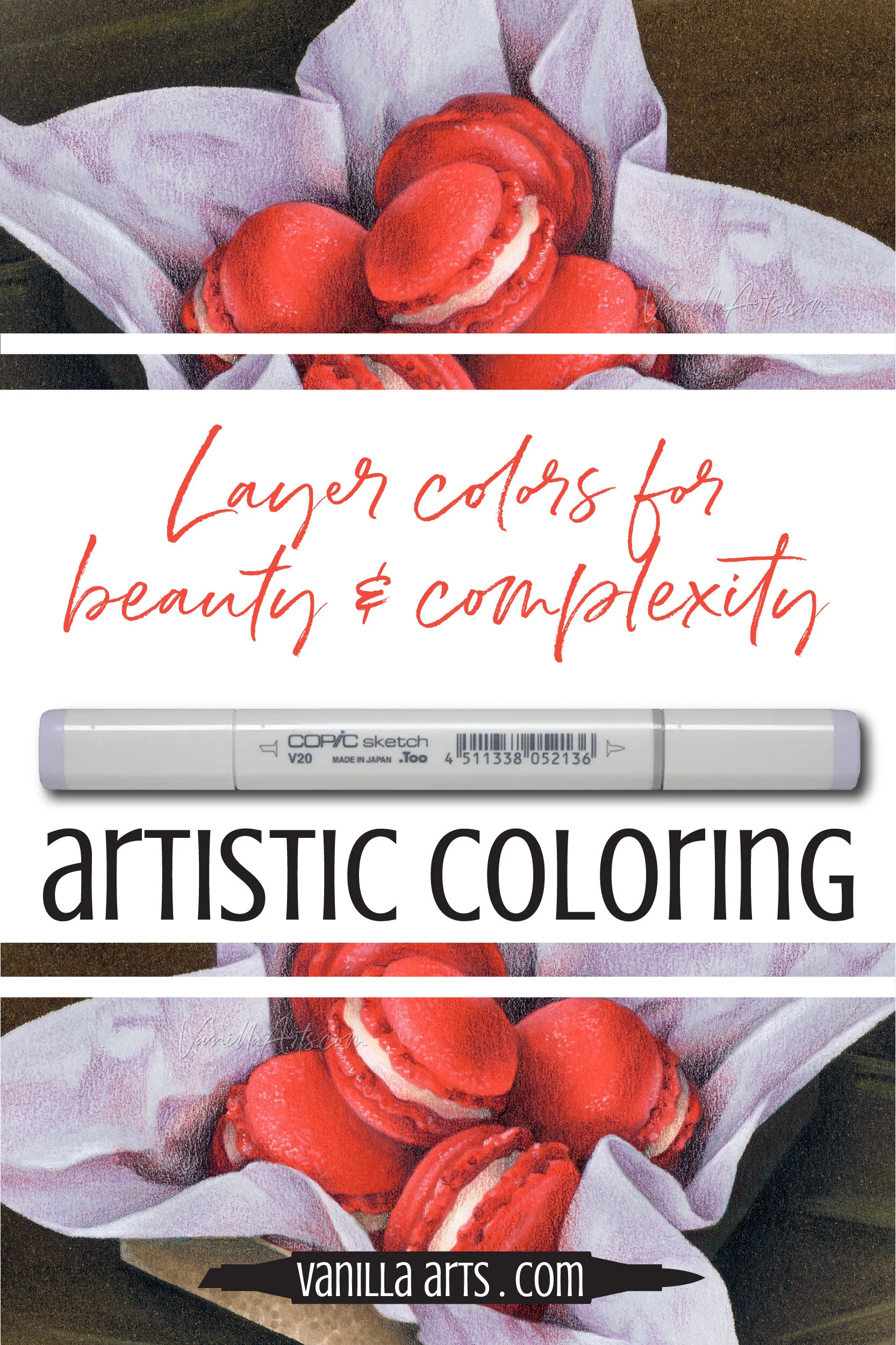
I base-coated the tissue with V20 because that’s the actual color (the “local color”) of the tissue paper. Then I added desaturation into the deep wrinkles with an N2 marker.
Next came the glazing layers with colored pencils. The goal isn’t to hide the V20 and N2, it’s to shift the value and temperature as I see these shifts in my photo reference.
For the wrinkles, I tested several colored pencils. I wasn’t looking at the color of the pencil because the appearance of the lead really doesn’t matter.
Instead, I tested what each pencil looked like on top of the V20.
The classical painting approach is to use colors not for what the color actually is, but for the colors it can make.
Derwent’s Wild Lavender layered over V20 gave me the color found in the light crinkles of the tissue paper but I also tested a grayed pink and several gray pencils. I chose Wild Lavender, not because it was actually lavender but because Wild Lavender over V20 gave me a grayed lavender color.
It’s not the lavender, it’s the subtle changes you make to the lavender.
As the color in the reference brightened to red, I tested several red pencils over an area of V20. Remember, I’m not looking at the pencil color, I’m looking at what the pencil does to V20. The winner of my swatch tests was a cherry red pencil for some areas and a deep purple pencil in other areas.
And here’s the important part, with each additional pencil… and in some areas I have brown-black over a layer of purple, over a layer of red, over a layer of lavender, over a layer of V20, over a layer of N2…
In every place, I’m still relying on the original V20 to shine though and make the tissue paper feel lavender.
This layered, glazing approach is what opens the doors to capturing convincing and lifelike realism in your coloring projects.
Simple yet complex coloring
If you enjoy the kind of coloring you currently do and if it makes you happy, please keep doing it.
But if you’re frustrated because you’ve been color-blending for years and you’re still not capturing the kind of realism you want?
This is your next step.
Artistic coloring is not for everyone but that doesn’t mean that YOU can’t learn to do it.
It’s a different approach than blending and in many ways, it’s much simpler.
The supply lists are smaller and the colors we use are more versatile— meaning that my students use many of the same colors over and over on multiple projects.
Because we repeat colors so often, you get to know the colors and how they work.
And the lessons cross-pollinate with your other independent projects. We may be coloring tissue paper here but it’s not a tissue paper technique.
I use the same exact layering technique to color fabric, food, fur, and faces.
The Red Macarons project shown here is an independent-challenge level for advanced students but this is where all my beginner and intermediate classes lead.
You can use markers and colored pencils for artistic expression and photorealism.
You can do this!

Beyond blending classes
If you’re new to Vanilla Arts, we have a wide range of coloring classes here. and an expanding selection of line drawings and coloring kits here. At the beginner level, we start with simple blends but quickly move past traditional blending technique, applying it to underpainting, overpainting, color sculpting, and expressive artistic coloring.
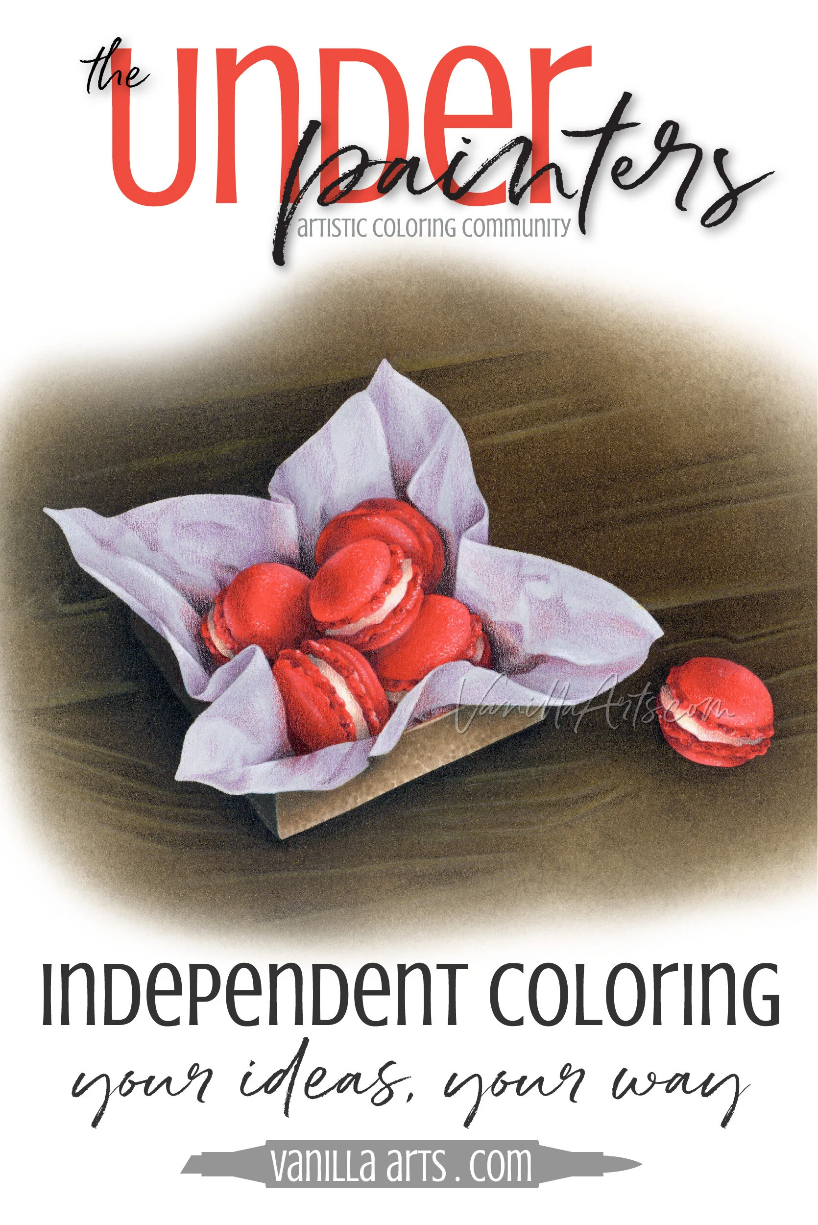
Our advanced group is where we’re working on Red Macarons… or maybe green macarons… or purple? We like to find our own twist on projects.
The Underpainters: an independent coloring community
A place to experiment with your materials, strokes, and your interpretation of the assignment.
It’s an open-format art classroom.
Each month, we’ll explore a new project reference.
Use the digital stamp or draw your own.
Color it with pencils, markers, watercolor, pastels… you do your artsy thing.
And use the colors you want to use.
Stay faithful to the reference or switch it up. Be conservative or get creative.
How you complete the assignment is up to you.
And I’ll be there with the Vanilla Team and a great group of students to help you over the rough patches.
Classical style marker painting
Create photorealistic still life and object studies with an old master’s feel
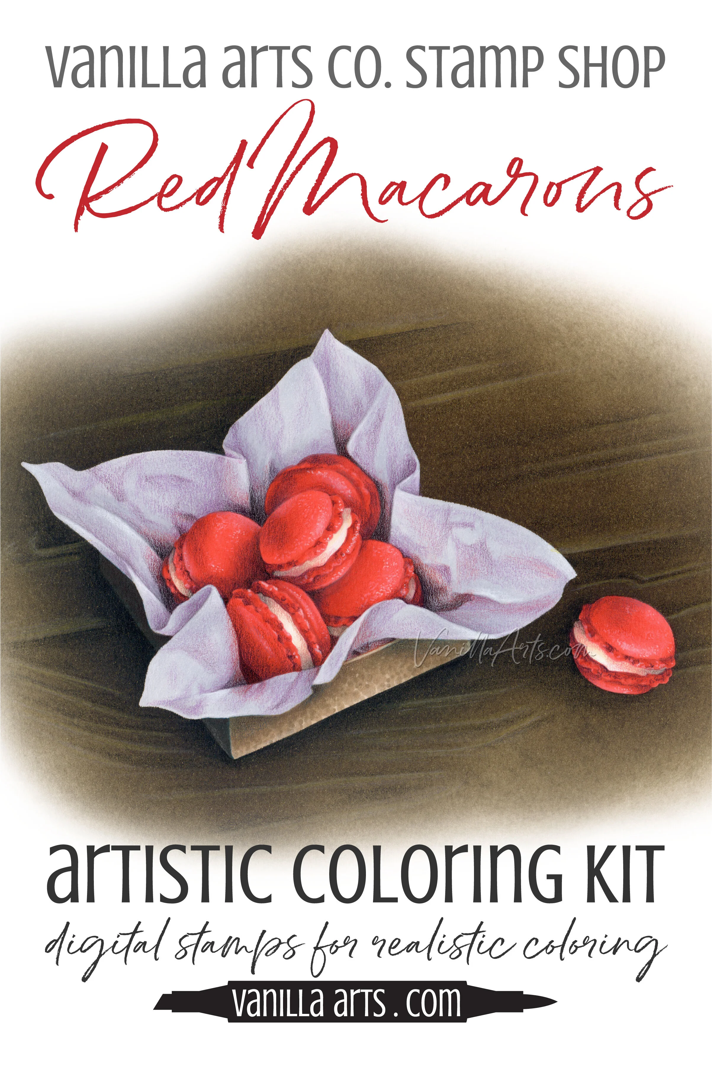
Red Macarons
Artistic Coloring Kits are everything you need to challenge yourself with intermediate to advanced level images.
Use your color sculpting and folds & waves skills to create amazing realism!
Let your skill & creativity be the star of the image, not the stamp art. Ideal for large-scale projects in Copic Marker, colored pencil, or watercolor
Kit includes: digital stamp, suggested supply list, photo references, guide to shade and shadow & underpainting advice, color map & coloring process tips & photo collage
Select supplies used in Red Macarons:

Vanilla Arts Company is a participant in the Amazon Services LLC Associates Program, an affiliate advertising program designed to provide a means for use to earn fees by linking to Amazon.com.


