Coloring Myths: Underpainting makes everything look realistic (Copic Markers, Colored Pencil)


Underpainting is becoming a popular coloring technique
When I taught my first artistic marker classes, few people outside of oil or acrylic painting had heard of underpainting. I kind’a felt like a marker rebel because there was nothing online about underpainting with Copic Markers.
I’m thrilled that underpainting is finally catching on.
But I do worry that people are overdoing the underpaint.
Underpaint shading is not a one-size-fits-all technique.
Today, let’s look at where underpaint shading works best and more importantly, when underpainted shade can damage your realistic coloring.
Don’t fall for the myth: Underpaint shading adds realistic color to shaded areas but this coloring technique doesn’t work for everything every time. Professional illustrator Amy Shulke offers tips for using clean saturated colors to develop dimension and form in translucent or illuminated objects.
What is underpainting?
Underpainting is the process of laying down a starter-layer of color. The final image is then developed over the top and is often called the overpainting.
Underpainting originated in classical oil painting but you can modify the process for almost any medium. It’s also a great way to mix mediums, using one medium (like Copic or watercolor) as the base and then adding the top layers in colored pencil or even pastel.
Some artists let the underpainting show through the top layers; others completely hide the underpaint. The artist decides how much or how little to reveal.
Underpainting can be a simple base-coat of color or you can fully develop the shape of every object in the image.
There are many types of underpainting. Grisaille is a grayscale underpaint. Some artists modify grisaille by using a sepia scale or a red scale. Many artists underpaint with the complement for each of their eventual colors (underpainting the grass red and the flower purple before overpainting the grass with green and the flower with yellow).
At Vanilla Arts, I teach the underpainting method with three goals:
First, Copic doesn’t usually make the color we need for realistic results. Underpainting is a way to create missing colors by layering.
Second, we use the underpainting to develop desaturation which will eventually look like realistic shade when the top layers are added.
Third, we use the underpaint as a dress rehearsal— a way to begin thinking about the shape of objects and where they sit in space. This preliminary thought process leads to greater student success.
More Realistic Coloring Tips:
Don’t miss my previous realism articles, click to read more


The problem with underpainting for shade
Have you ever noticed that some of your underpainted projects look heavy and slightly dull?
Many people notice this effect with flowers. Instead of looking totally realistic, underpainted flowers often look heavy and thick— almost like they’re made of hard plastic.
Underpainting adds visual weight.
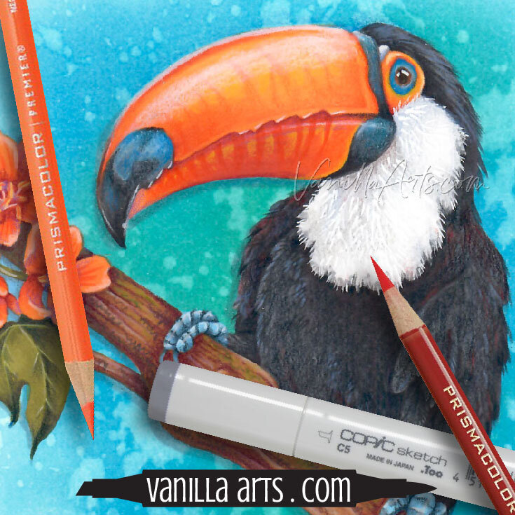
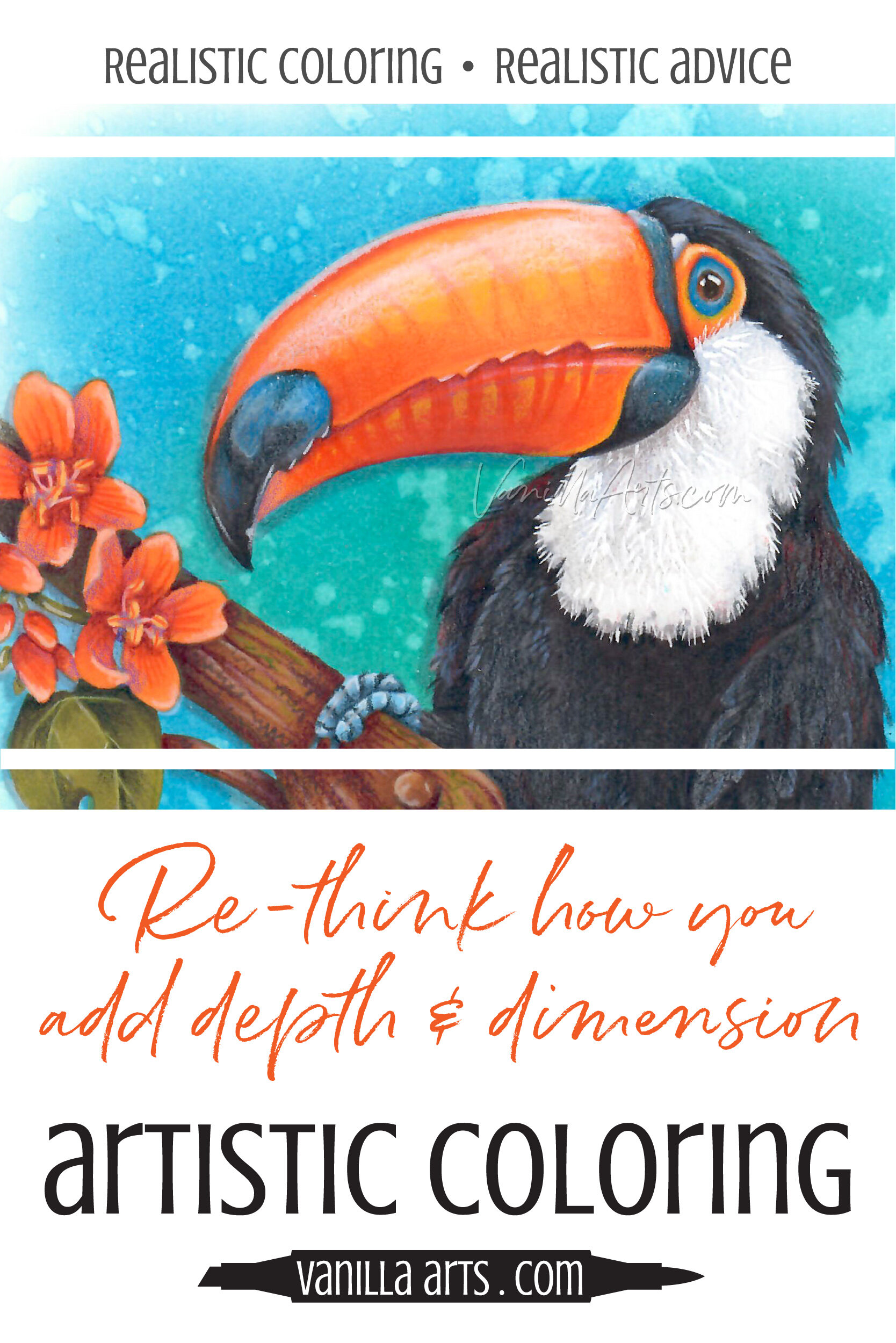
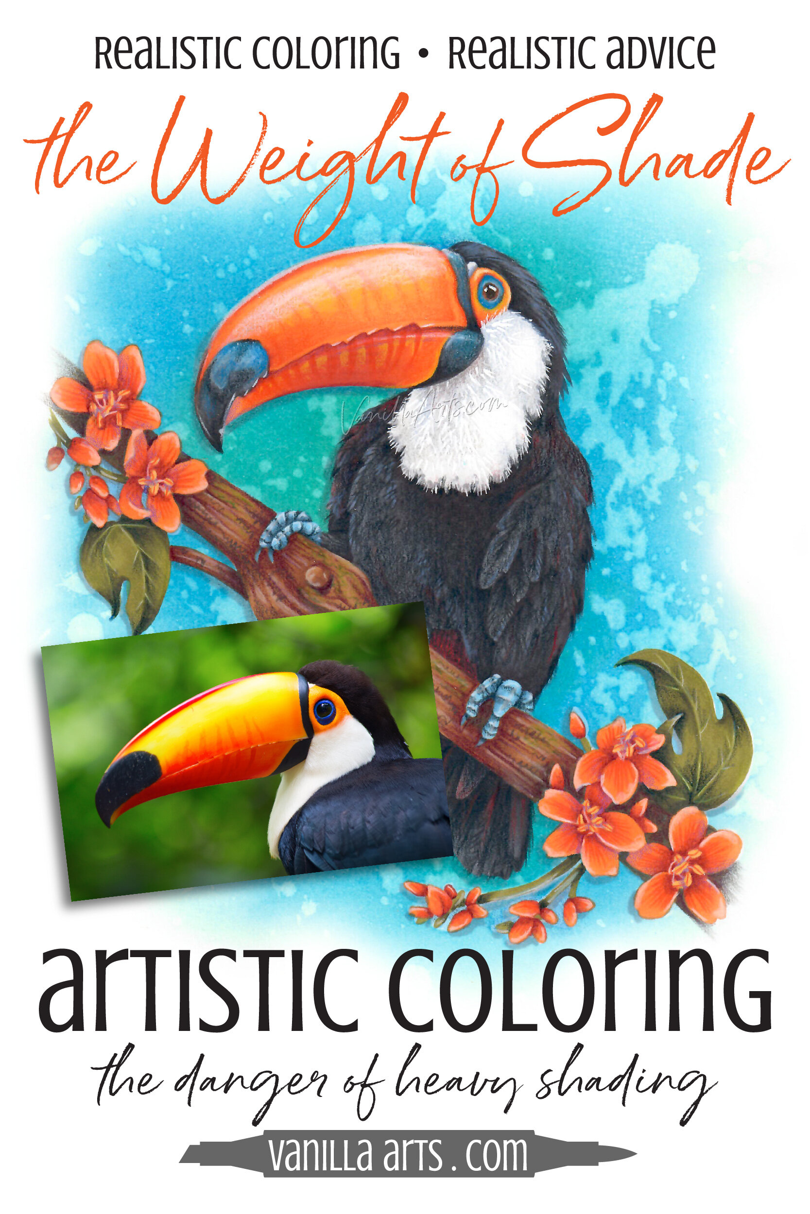
Underpaint shading works really well when the object is thick and solid. On my toucan here, the underpainting on the body and branch… it makes these objects look three dimensional and touchable.
Underpainting creates a feeling of solidity.
But a toucan’s beak is not heavy or solid. Look at the light shining through the beak in photo reference here. His beak is almost translucent.
If you want to convey the feeling of lightness and translucency, you can’t underpaint with heavyweight colors.
There are times when I do not underpaint.
I skipped the usual shading layer of blue, violet, or gray. This is why the beak has a nice glow. It also has the illusion of coming towards us a bit.
Underpaint would have killed this dimensional effect.
When should you skip the shading process?
I can’t tell you a universal rule for shading versus not-shading. Every object and every situation is unique.
You have to think it through.
It’s not enough to ask yourself the usual questions:
What color is this object?
What shape is this object?
You must also consider how the item is made… or what it’s made up of… or what it feels like in real life…
I’m sorry, I don’t have the right words to express this higher-level thought process. I don’t have words because when an artist does this kind of thinking, they’re not thinking with words, they’re thinking with all their other senses.
If I were holding this toucan right now or if I were wearing his beak on my own face, would it feel heavy? If I’m feeling the beak with my hands, does it feel thin and light or thick and rubbery? Is it hollow or solid? Does it feel warm or cool to the touch?

Good artists have the ability to deconstruct objects in their mind to understand their composition.
For accuracy, we usually research the subject. I looked up toucan anatomy to find out how solid their beaks are. In doing so, I accidentally stumbled into a whole world of veterinarians and avian biologists who specialize in rehabbing birds with damaged beaks. They’re 3D printing new beaks for injured toucans… it’s incredibly cool!
The research side-tangent is typical for good illustrators. We don’t just draw stuff, we try to understand it before we draw it. Good colorers should do the same thing. You can’t color something well until you understand why it looks the way it looks.
Anyway, back to underpainting…
Should you underpaint a bird’s beak?
Only if the beak is thick, solid, and doesn’t transmit light.
Light transmission is an excellent cue to stop and think about what you’re coloring.
Because if something in the image has light shining through it, we’re dealing with a totally different composition than everything else around it.
Balloons, blow-up pool toys, candles, lightbulbs, lanterns, glass, curtains, and yes, toucan beaks…
We can’t shade these things as normal because they’re not normal.
And I really want you to stop and pay attention to flower petals and delicate leaves!
I often see cases of amazing floral coloring but there’s something “off” or odd about it. The petals look too thick, too solid, not real because they’re heavy and leaden.
It’s almost always a case of something that was underpainted when it shouldn’t have been.
Exercise extreme caution when coloring delicate items because underpainting adds visual weight.

The following article contains affiliate links to trusted retailers like Blick.com and Amazon.com.
Vanilla Arts Co. is a participant in the Amazon Services LLC Associates Program, an affiliate advertising program designed to provide a means for use to earn fees by linking to Amazon.com.
This is not a sponsored post.
How to add a glow instead of shade
There are two things to keep in mind when coloring translucent, light-filled objects:
To end with a glow, you must start with glowing colors
Keep your colors clean
For the toucan’s beak and the flowers, I started by staining the paper with a bright yellow Y15 marker.
Notice that the beak doesn’t look Y15 now that I’m done. The bold yellow was just the beginning of the glowing process.

Staining is what happens when the first marker touches uncolored paper. Your first ink is the color that soaks deepest into the paper fibers. No matter what color you add after, the paper fibers will always want to return to that original stain color.
If you want a glow, you have to start with a glow!
So I started by staining the paper yellow and then created an orange to red blending combination over the top, using the red to shade. When I was done, you couldn’t see any yellow.
But it’s still there… waiting… lurking…
Once the beak was smooth and orange, I returned to the Y15 marker and used it in just the high spots. This rescued the original glow which was hiding underneath the orange inks.
That was the marker part. Then I added pencils.
I deliberately selected very translucent pencils. Using PC901 Dark Purple, I started to emphasize the top edge of the bottom beak, pushing it deeper below the serrations. Then with PC916 Canary Yellow I did the opposite, pulling the serrations forward with yellow highlights.
Because Dark Purple is so close to red on the color wheel, it shades the area without creating the muddy, murky, desaturated color we normally want for shaded areas.
Clean shade colors allow the original yellow marker to create a lasting gentle glow.
Translucency is the key to glowing objects
Remember, I mentioned that all my colored pencils were very translucent?
Translucent pencils allow the base colors to show through.
Translucent pencils add temperature more than actual color.
The places I color with purple don’t actually look purple. It still looks red, we’re just making it look like a red that’s farther away from us. We added depth without shade. We call this a push. We pushed it visually up and underneath the top beak.
The places I color with yellow pencil doesn’t look yellow. These areas just look closer. It’s the opposite of a push, it’s a pull. We’re pulling some areas visually closer without changing the color.
Translucent pencils are magic because they always let the Copic ink below shine through.
What good is a glow if you don’t let it show?


Research your subject before coloring
Coloring is a ton of fun. You just want to pick up your pretty markers and pencils and color, color, color!
And the underpaint shading technique works so well, so darned often.
It’s like a superpower. Your artistic ace-in-the-hole. It feels like you should use it everywhere, all the time.

But underpaint shade is not the answer to everything.
Sometimes underpaint shading creates realism and sometimes it distorts realistic coloring into something that looks real-ish but kind’a fake.
It’s important to understand what you’re coloring.
How heavy, how thick, and how translucent is the item you’re coloring?
And does it transmit light?
If the answer is yes to any of these questions, the last thing you want to do is add visual heaviness and extra solidity to the object.
Photo references, research, and next-level thinking are required to color with realism.
It’s not enough to take a technique that mostly works and apply it to everything.
Be a smart artist.
Know your subject and match your method to the object.
Shading with underpaint is a great technique but it doesn’t work for everything.
Use it wisely.
Amazing Color
This Smiling Toucan is just waiting for your brightest, boldest, most tropical color combinations.
Tired of cartoonish results which always look like like a coloring book project and never like YOUR art?
Let’s combine your blending skills with a fine arts approach to color selection and texture.
COLOR WONK- The Art Beyond Blending
Professional illustrator Amy Shulke shares her approach to next level artistic coloring in fun and mind-blowing lessons.

RECENT ARTICLES: