
Is Your Coloring Flat? You Need More Ugly Copic Markers

Do you have depth problems?
It's a common complaint I hear from new Copic Marker students.
I've tried and I've tried. I've taken classes and I've worked through every tutorial I can get my hands on. I own a lot of markers and I keep trying new blending combinations... but still, everything I color looks flat!
Part of the problem is the learning process. Free tutorials can only teach you what the blogger is willing to give away for free. Which usually isn't much and it's almost always relegated to how they colored one particular stamp.
But honestly? The source and true underlying problem is glaringly obvious when I ask to see what markers the person owns. This is photo is fairly typical; most people only own the beautiful colors.
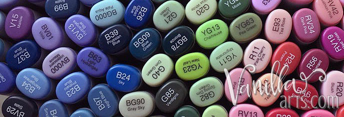
It's fun to buy pretty markers
Copic newbies buy markers in small bursts, carefully selecting only the best and most beautiful colors.
Oh! That's pretty! I like that red and the purple... I should get a pink? That one's nice. Let's get a green too!
You did the same thing, didn't you? When every dollar counts, you select the colors you love most. That's completely logical. I get it.
But then you get home and find that you can't color anything because you only own two greens, a bright yellow, fire engine red, and three pale violets.
So you head back to the store

Because the internet said that you should buy markers in blending combinations.
And the internet never lies, right?
So you plop down more hard-earned cash to purchase two markers to go with each of your existing markers. You start buying Copics by number, one step up and one step down. Perfect little Copic approved blending combinations.
Now you feel special because you own lots of markers; enough to need a special box and to fill out lots of rectangles in your inventory chart. And hey, look at all the blending trios! Aren't you clever?
But you still can't color much because you haven't done a thing to remedy the fact that you're STILL sitting there with only green, yellow, red, and violet markers.
You can't color bears, you can't color Easter baskets, you can't color chickens, or sailboats or monkeys or piglets or rainbows or ice cream or that funny stamp with smiling underwear rolling around in a little clothes dryer.
Then you get smart
You take your stamps to the store.
This weekend I'm going to color the bear. I need a brown bear combination. No pretty colors, just a brown trio!
About now is when students usually hunt me down for help. They own over a hundred markers and still can't color much. And it's all flat. No depth. No dimension. Just pretty colored flatness.

If you want dimension, you've gotta get ugly!
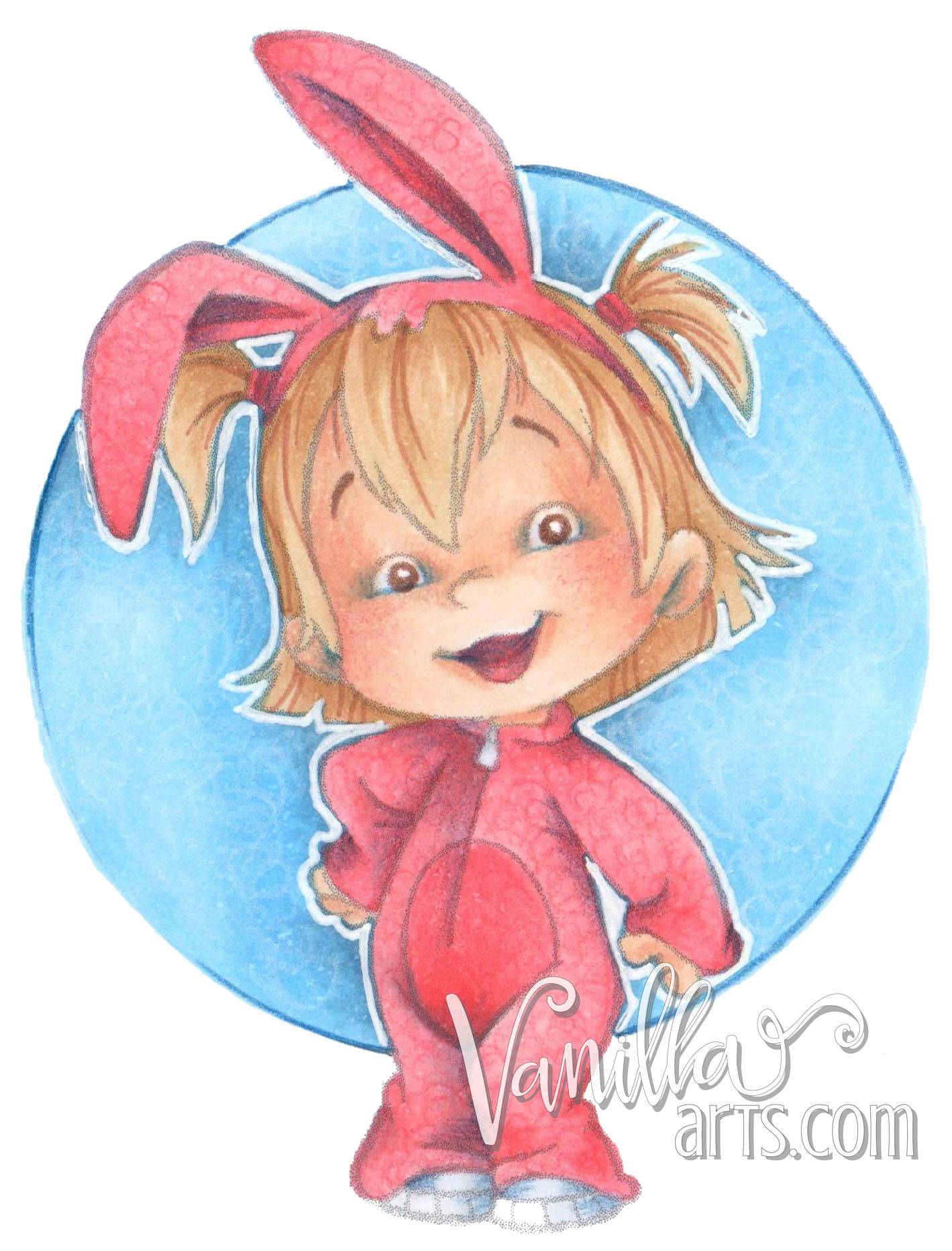
I colored this C. C. Designs image using just pretty colors. I used a couple nice skin tones, some lovely hair colors, a few cute pinks and two dreamy blues.
Then I did my usual colored pencil magic over the top. I added all the texture I normally would. But again, I only used pretty pinks and blues and one Copic approved Sepia Multiliner.
Boring. Snooze fest. Unimpressive.
What's missing?
Neutrals! Desaturated Colors! Muddy Tones!
You know, the colors that you skipped over because they're not very pretty?
I'll buy a few grays someday... but first I want to own all the cute colors.
Here is Bunny Twila again. I used all the same colors as the first shot, but this time I added the grunge.
Whoa!
Completely different.
It's important to understand that depth is a trick of the eye, a false sense of spacial distance. The look of distance doesn't come from using a darker marker. It's not the dark pink that makes the inside of Twila's bunny-rabbit ears look deep and inset.
Instead, the central ear looks deep because I muddied up the color by putting some gray underneath the pink. Then I added some Indigo Blue pencil on top. Gray? Indigo? On pink?
The inside of her ears is not a pretty color anymore, but it does look pretty darned dimensional. If you want objects to look deep or recessed, you have to shade them and that's different than coloring them with the next level of pink.
Copic makes 44 gray markers
And they have a ton of pseudo grays hiding in amongst the other color families.
And I'll bet that even if you own some of them, you're not using them.
You have to make a little mud if you want to get dimensional. That means choosing grays or other colors that deliberately clash with your pretty markers.
Underneath your sunshine yellows, there needs to be a little violet. Under your skin tones, you gotta have some sleep-deprived-eye-bag blue. Reds need more than burgundy to look shaded. And don't get me started on the wonderful relationship between orange and purple!

If all of this sounds strange, you are not alone

Free tutorials don't cover this stuff because it's not something you can explain in four paragraphs and a few tut photos.
And frankly, most Copic instructors don't understand desaturation well enough to teach it. Ask 'em why some artists use bold violet on faces and you're not likely to get a correct answer.
It's easy to include a gray marker in a free tutorial, especially when you saw someone else use the same recipe and it magically worked for them. So why not pass it on in your blog readers too?
It's much harder to explain why it works or to give readers advice on other similarly effective colors.
A student asked me what Copic Markers I use most
Here's the list.
Not what you expected, eh?
You would never know from this list that red is my favorite color. You can't tell that BG11 appears in almost all my color palettes or that I go through YG03 like it's water. And my list here isn't muted because I only draw and color drab or uninteresting things. I use these markers on everything from freelance human anatomy and technical illustrations to my hobby botanicals.
And yet, these are the markers that sit in little mug on my desk. They rarely go back into my marker storage unit. There's no point in putting away something I'm going to use again soon.
My most used markers won't win any beauty contests. Thhey're not the stars of the show but they are the supporting cast of every image that I color. Every single one.
I use this weird raggle-taggle group of ugly markers to push the beauty queen colors deeper, farther, and stronger. These are the colors I use to create dimension. I don't use them to color, I use them to color my colors.
And I can teach you too.
Join me in a coloring class- learn to push colors to a whole new depth
COURSE HAS EXPIRED


Vivamus pellentesque vitae neque at vestibulum. Donec efficitur mollis dui vel pharetra.