
5 Tips for Realistic cast shadows with Copic Marker, colored pencil, or even watercolor


Do your shadows look fake?
My latest Copic Coloring Tips video at YouTube is all about the physical rules for realism.
Fans of Copic Markers and colored pencils always want more realism in their coloring projects!
One of the keys to realistic coloring is simple: For your coloring to look and feel real, your objects must look as if they occupy real space.
When we don’t follow the rules of basic physics, our coloring looks weightless and artificial.
And that includes the way we color shadows.
When you color shadows, do they look weird & wonky?
How can we fix this problem?
Simple:
Stop coloring your brain’s imaginary idea of shadows.
Start coloring shadows the way they really look in real life.
You can’t color a stereotype and expect it to look real.
Today, let’s look at the 5 most common misconceptions about shadows.
So that you can stop coloring fakes and start coloring authentic shadows.
1. Real shadows are darker than you think
Do you grab an N1 Copic for coloring shadows?
Most colorers wimp out when selecting shadow colors.

N1 is not scary or intimidating.
Light gray is delicate and soft. It’s the cute kitten of the gray family.
If you make a mistake with a light gray marker, it’s pretty easy to fix it with the use of a #0 Colorless Blender.
But here’s the problem:
Most shadows are not N1.
When you use artificial colors, you create artificial shadows.
Start paying attention and looking at the real color of real life shadows. Observe the color of shadows in reference photographs too.
Even on a white surface, most shadows measure about an N4 or N5 in darkness. Many are significantly darker.
To get my Rustic Maple Leaf shadow here to look authentic, I had to use a W9!
W9 is not a cute fluffy kitten color.
Want to test this dark shadow theory?
Many of us have eyedropper and other color sampling tools included as part of our photo editing or graphics software. It’s very easy to check the color of shadows using Photoshop or Illustrator.
Once you isolate a shadow color, it’s easier to visualize and register with your brain how dark the shadow really is. You can learn a lot about color by messing around with color sampling tools.
I’ve have two apps on my iPad which can take color samples and make suggestions for appropriate colored pencils.
Arty by Uplabs is a free app for iOS which can edit photos, add a drawing grid, or take color samples. It suggests pencil matches for Polychromos, Prismacolor Premier, and Luminance pencils.
(Note, I thought Arty was also available for Android but I was unable to find a link. If you have one, send it to me at amy@vanillaarts.com and I’ll update this post to include the link.)
Color Picker by Jasmina Susak is available for $7.99 on iOS and Android. This is the one I use most often (although I find the Arty bullseye tool easier to control.) Color Picker offers graphite suggestions which are good for value measurements and the colored pencils include Prismacolor Premier, Polychromos, Luminance, and a Derwent mixture of Coloursoft and Procolour.
I don’t think you should rely on eyedroppers and apps to choose your project color palettes but they are a really great reality-check tool.
It takes time to develop an accurate sense of color and shadows are especially hard to visualize.
If a tool can help you see color more clearly, I’m all for it!
2. Real shadows are softer than you expect
The quickest way to make fake shadows is to outline the shadow shape with your marker and then color it in.
When you draw something with a Copic, you leave a heavy dark line. That line has hard edges. To make matters worse, when you fill in the shape, you go over the line making it darker, harder, and bolder.
But most shadows have soft edges. They’re not one solid color from edge to edge. Shadows are deepest at their core and fade a bit as you approach the outer edge. And that edge? It’s not crisp and well defined.
Even the harsh shadows you get at high noon on concrete aren’t as hard edged as you assume.
Your idea of a shadow is rarely as subtle and velvety as an actual shadow.
On my Rustic Maple Leaf project here, You can easily see the shadow, right? But try to put your finger on the edge of the shadow. That’s a little harder, eh?
The edges of my shadow are soft and hard to define because the shadow in my photo reference was also soft and hard to define.

Go outside and cast some shadows. Play with a flashlight in a dark room. Observe the shadows you see in your home and workplace.
Observation is an important key to realism.
You’ll quickly see that shadow edges are softer than you’ve always assumed.
Your shadows will never look real if you’re coloring from a warped sense of reality.
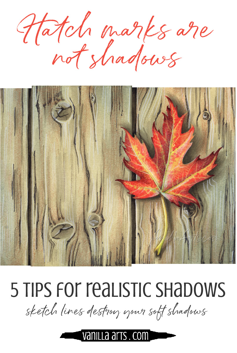
3. Hatching, Cross hatching, and decorative squiggles are not shadows
One of the biggest drawbacks to stamps and coloring book images is that they’re drawn by artists who draw rather than artists who paint.
I know this sounds strange but hear me out.
Most artists have some sort of training; it can be years of formal education or classes from community ed or even online courses.
Good drawing skills come from lots of practice.
The problem is that when someone draws a lot, they develop a shorthand way of indicating things in a drawing.
Some people call this “style” but it’s really just the artist taking personal liberties with the way they communicate what they see.
Many artists use a series of lines to indicate shadows in their sketches.
Now if you talk to the artist, they’ll tell you right away:
“Oh, that’s not what I meant! There were no black lines radiating off the bottom of that teapot. I just added the lines to indicate a shadow.”
Hatch marks are the sketch artist’s way of indicating that something different is happening in the area.
Sometimes hatching indicates a shadow but it can also mean a bending of the surface, distance, or even a change in texture.
The point is that the lines are not real, they’re a clue.
Some artists have the bad habit of over-decorating their drawings with lines and other hatch marks. It’s a compulsion that stamp artists don’t always think about when drawing images for colorers.
So you get the stamp and you see lines and other squiggles in the shadows and shady areas. You start to associate hatching with shadows, never thinking about what the lines do to your realism.
The lines were never real.
And they’ll never look realistic.
Because they’re not real.

4. Shadows are not silhouettes
When I first introduce shadows to students, they always panic.
If we’re working on a floral bouquet image with 10 daisies, 4 roses, a ton of baby’s breath, and a long flowy ribbon…
And if I ask you to add a shadow to the bouquet…
You start to cry because I’m asking you to draw 10 daisies, 4 roses, a ton of baby’s breath, and a long flowy ribbon, right?
Nope.

That would be a silhouette. Silhouettes are a precise outline of an object. Silhouettes actually look best when they’re complicated and full of tiny details.
A shadow is different though.
There is no bonus payoff from making a shadow full of intricate detail.
Shadows usually peek out from underneath an object. Most shadows are at least 50% hidden. Unless you’re drawing long cast shadows like you might see when the afternoon sun is strong and low; but that’s a special circumstance.
You are not going to see most of a regular, normal, ordinary shadow.
Shadows are also mushy. The bouquet may contain 14 flowers and a ribbon but the shadow it casts probably looks more like a rounded triangle than 14 individual flowers and a ribbon. Shadows are blobby!
Look at how un-leaf-like my shadow is here.
If I erased the leaf, you’d have a hard time telling what this shadow belongs to. It’s not a leaf silhouette, it’s barely even leaf shaped!
Don’t assume shadows contain intricate detail. Most do not.
5. Shadows are not gray
Remember the color sampling eyedropper tool I talked about in tip #1? If you use it to measure shadows on a regular basis, you’re going to notice something weird.
When the app suggests which marker or colored pencil to use?
They’re not usually gray.
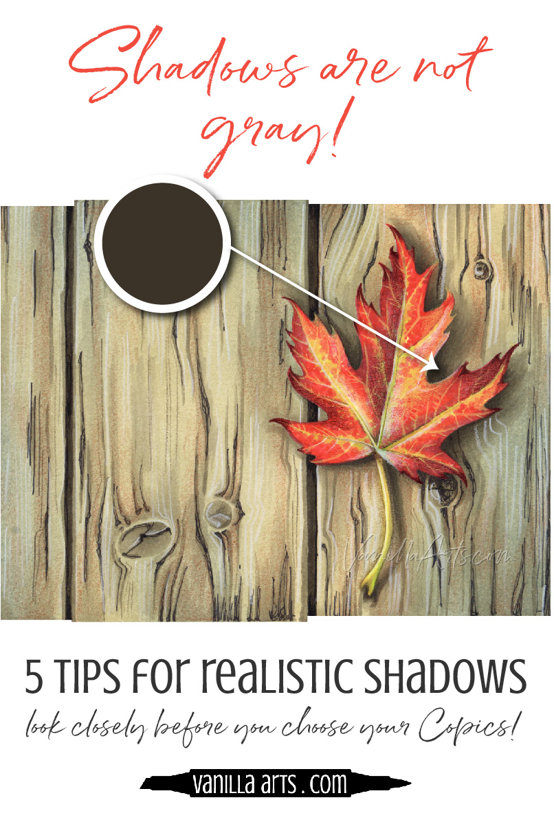
Think about it… if a tree casts a shadow onto green grass, will the shadow be gray?
Really?
If you’re making shadow puppets against a pink wall, will the shadows really be gray?
No.
The color of the shadow will be GRAY-ER than normal but the shadow won’t be any of the Copic grays.
Shadows take on the color of the surface where they occur.
And don’t jump to the conclusion that shadows on white surfaces might be gray.
Light waves play tricks.
Let’s say we have an apple on a white table. The apple blocks the light from hitting the table and that’s what makes the shadow, right?
Well, not totally. There’s also a thing called color bouncing.
Light bounces and it changes color with each bounce.
Some of the light is bouncing off the table back onto the apple. That light picks up some of the red of the apple when it gets bounced again from the apple onto the table.
Look, I’m not a physicist. You’re getting the dumb artist’s version of this phenomenon here. I’m sure my husband the engineer could explain this much better…
But if you look closely at a white surface shadow, you’ll see that the shadows are usually a murkier, muddier version of the original object color.
Basically, a banana casts a yellowish shadow. An apple has a reddish shadow. And a bottle of wine has a bottle of wineish colored shadow.
If you start looking, you’ll find it hard to locate actual gray shadows.
Shadows are not gray which is why painters do not use pure gray paint to make shadows. People think artists make colorful shadows to be artistic, but that’s not the case. We’re just painting the obvious.
Gray markers are a Copic thing, not a realism thing.
So there you go.
5 shadow tips to help you avoid coloring fake shadows
And it’s funny, they all boil down to coloring what you see rather than what you assume.
Let's summarize:
1. Shadows are darker than the markers you’re choosing
Use a color sampling tool to see how inaccurate your favorite Copic shadow colors are!
2. Even crisp shadows have softer edges than you think
Copic Markers are perfect for creating soft blends. Take advantage of this feature!
3. Sketchy lines are not a shadow
Don’t let the stamp artist ruin your shadows and definitely don’t mimic what they’re doing!
4. Shadows are blobby rather than detailed shapes
Try to get the generic shape. Added detail is not worth the anguish!
5. Shadows are not gray
One gray marker will never look real.

Are you ready to color a shadow?
Introducing my new Rustic Maple Leaf class.
We’re working on how to create lots of realism, not just with shade and highlight on the leaf but with a shadow underneath!
But first, let's start with the free stuff!
Watch the latest Coloring Tips on YouTube:

(Click the image above to watch the video at YouTube)
And of course, there's the Workshop class!

Rustic Maple Leafis a challenge level for intermediates and advanced students.
The best thing about Marker Painting Workshops?
Workshops are NON-SEQUENTIAL!
Learn to incorporate real artistry into your coloring projects, one concept at a time. Every Workshop details a new method for enhancing realism, depth, and dimension.
Each class stands on its own as independent learning. You don't have to take six of my other classes to understand this lesson.
All of my Workshop classes are ANYTINE ACCESS. Work at your own pace and repeat the project as many times as you'd like.
Come color with me. It's a ton of fun!
Select products used in Rustic Maple Leaf:
(Contains affiliate links)

Vanilla Arts Company is a participant in the Amazon Services LLC Associates Program, an affiliate advertising program designed to provide a means for use to earn fees by linking to Amazon.com.


