Copic Class

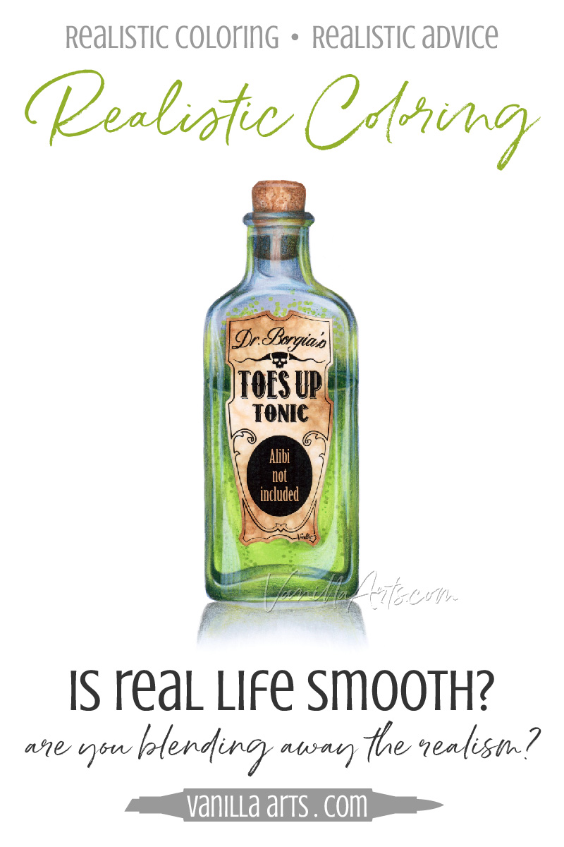
Realistic Coloring: How to add authentic texture to your Copic Marker and colored pencil projects

Realistic Coloring: How to add authentic texture to your Copic Marker and colored pencil projects

Do you blend everything smooth?

My latest Copic Marker Coloring Tips video at YouTube is all about texture.

As a beginner, most colorers focus on blending skills. After all, the blends are what originally attracted you to markers in the first place.

So you dream about blending, you practice blending, and the color blends are what you notice most when you go online to look at other coloring projects and tutorials.

Blend, blend, blend.

But wait, are you stuck on blending?
Always Use Your Best Paper for Every Copic Coloring Project

 
Why you should use the best quality marker paper you can afford for ALL your projects (not just the special projects) | VanillaArts.com


"Can you tell me how to fix this streaky marker look?"

Ugh. If I had a nickle for every time I hear this question... we'll, frankly,  I'm not really sure what I'd do with a pile of nickles larger than my house... who thought of that stupid saying anyway?

VanillaArts.com

I can usually help people fix their blending or streaking problems. Maybe the solution is an alternative stroke technique, sometimes we can switch the blending combination or change the order that colors are applied.

But do you want to know when I fail every time?  When I'm completely powerless to help?

"So uhm, yeah... I was using regular 110 pound office cardstock. I've got better paper but I save it for the good projects."

Okay, word of warning here. Because I hear this so darned often, I'm about to get all rude and preachy on you here:


Saving good paper for later is one of the dumbest things you can do

I'm being deliberately harsh with that statement.

I know. This is a mean and cruel thing to say. But geeze, Louise, I feel like I could tattoo "Always Use Good Blending Paper!" on my forehead and people still wouldn't think I'm serious.

Ask yourself these important questions:

  • Would you ever chew garlic cloves right before your first date with a hot doctor?

  • Would you strap on a pair of cement shoes to go swimming?

  • Would you smear your body with raw ground beef before starting your fist day as an assistant lion tamer?

No, you wouldn't do any of these stupid things.

And yet you regularly set yourself up for failure by grabbing office paper for coloring?

Can we please end this nonsense?


Always use "the good paper" for every coloring project

Coloring is easier when you use good quality paper designed for use with markers | VanillaArts.com

Getting ready to color a stamp for the first time?

Use the good stuff.

Experimenting with brand new markers?

Use the good stuff.

Sitting in front of the television, coloring doodles because you're bored?

Use the freekin' good stuff.

As a matter of fact, I'd remove all office grade paper from your craft room. Go put it someplace else- someplace far far away. So far away that even if you are tempted to grab some, you can't get to it, because it's buried under a stack of boxes and that dead body in the attic.

Okay, I'm going to break it down for you now. Why do I feel so strongly about banning office paper from your stash of coloring supplies?


Five reasons to use the good stuff:

And I'm not kidding here. When you really look at it, coloring on crummy paper makes no sense.

1. Office grade paper will never, ever, ever blend as well as marker paper

Now I know, I've seen it. The internet is full of people boasting about the great results they get from Dunder Mifflin Color-Copier Cardstock.

"It works just like marker blending cardstock! I can't tell the difference!"

I'm a marker instructor. There are very few people in the world more motivated than me to find a cheap yet excellent marker paper that's easily available at many local stores.

I teach five different coloring classes every month. For every image, I color at least two experiments and a third as the class sample. If I film the class, I color it a fourth and sometimes a fifth time. In each class, I color the image again for the students to watch. Every live class I teach includes a kit; every student receives one kit and every kit contains two coloring images.

So for just one class, I use upwards of 25 pieces of marker cardstock. And I teach FIVE classes.

I USE A TON OF BLENDING CARDSTOCK. I am highly motivated to find the cheapest source of reliable cardstock!

I've not found an office cardstock that performs the way marker cardstock does.

NEVER.

It's harder to blend on office grade cardstock because it wasn't designed for use with alcohol inks | VanillaArts.com

This shouldn't be shocking.

Office cardstock is designed to be used by printers and copy machines, NOT for Copic coloring.

  • Printers and copiers machines do not use alcohol ink

  • Printers and copiers do not apply ink with a felt tipped brush nib

  • Printers and copiers don't apply 3-4 layers of color

  • Printers and copiers do not use rubbing friction to blend different ink puddles into a new color

  • Printers and copiers never re-hydrate dried ink with fresh ink

Copic blending on office grade paper will always be harder because you're asking it to do the exact opposite of what it was designed to do.

You can dress your dog up in red and blue feathers. You can teach him to sit on a perch and maybe you'll get him to appreciate the taste of bird seed. But your dog will never learn to say "Polly wants a cracker" because no matter how smart your dog is, he is not a parrot.

Never.

Your office cardstock is the same. You're asking it to do something it was never intended to do.

Office paper stinks at blending because it was not designed to be a blending paper.

It's a waste of your time to try.


2. You learn what you use

You do yourself a disservice by coloring daily on cheap paper, then switching to good quality blending paper for special projects.

Switching back and forth confuses your brain.

Here's the deal- the human brain is a miracle at overcoming obstacles.

Think back to the last time you smelled skunk. It was pretty potent when you first noticed it, right? Then after a few minutes, you stopped thinking about how the nasty smell and got on with your life.

That's because your brain is constantly making accommodations. It does this without you even realizing it. Your brain knows that if you spend all your time obsessing about the skunk outside your window, you'll never get anything else done.

Coloring on less-than-ideal blending paper is a little like skunk. When you use skunky paper your brain kicks into gear and figures out a way to make the best of a bad situation.

"Okay, so this paper bleeds a little. Maybe I should color a little quicker? Yeah, that helps. And now I'm seeing streaks, so let's press a little harder... okay, that works! But these two colors aren't blending, maybe we'll go over it a few more times... that's better."

When you color on one type of paper day after day, your brain starts working on how to best color on that paper.

You learn how to use what you're using.

So if you save your best paper for only the best projects, you're always going to get mediocre results because you have no experience using good quality paper.

You've spent all your time learning how to make the best out of crappy paper.

Wouldn't that same time be better spent learning how to make pretty art on proper paper?


3. Are you actually saving money?

The best office grade cardstock for marker use (and frankly, I don't think it's all that great) is Hammermill Color Copy Digital Cardstock 80 lbs. A pack of 250 sheets = $11.47 + $3.95 s/h on Amazon today. That's $.06 per sheet

A really nice blending paper is Cryogen White Curious Metallic Cardstock, 89lbs, pack of 250 sheets = $71.00 + $9.50 s/h on Amazon today. That's $.32 per sheet.

My favorite paper is XPress-It Blending Card, 90lbs, pack of 125 = $39.95 with free shipping on Amazon today. That's $.31 per sheet.

So yes, the office grade copy paper is quite a bit cheaper when you look at price per page.

Except there's a hidden cost. 

Marker papers use less ink than office grade paper. That's because marker papers are slightly moisture resistant while office papers are absorbent. To get the true cost of office cardstock, you should add in the cost of Various Ink refills because ink ain't free. 

And how about the cost of starting over? When you make a mistake on blending paper, you can usually fix the error. Not on office grade paper. You'll use more paper on more attempts and more ink with each attempt.

And really, we're talking about paper here. At two projects per sheet of paper, the cost of coloring on premium marker paper is a measly $.16 per project.

16 cents.

You save 12 cents when you use Hammermill.

Wow?


4. The cost of frustration

Imagine the following:

What if every time you pull your car out of the garage, a pack of rabid gang-banging squirrels pelts the car with acorns?

And what if... maybe not every single time, but what if maybe once or twice a month at least one squirrel throws a brick?

Let's say that there is no escaping the curse of the rodent gang. What if every time you try to drive your car, your car gets damaged?

I think you'd start taking the bus, right?

Now here's the key to my silly story: 

You are not sitting on the bus because you're a bad driver, right? It's totally not your fault. You're stuck on the bus because of Nutsy McSquirreleson and his furry pack of hooligans.

You've given up driving because the price you pay in frustration is greater than the joy you get from driving.

Frustration has a cost. You can not escape it. You will always pay the price.

If every time you sit down to color something, if the markers don't work the way you want, if the blending doesn't happen, if there are streaks everywhere, if the paper bleeds through to your table, and if it all ends up looking like a kindergartener colored it...

How much longer are you going to keep coloring for fun?


5. The Goddess of Fleeting Excellence

Now this is the artist in me talking... An artist with 30 years of experience drawing, painting, and making beautiful messes.

You never know when you sit down to do a project if this is going to be the best thing you've ever done or the worst thing you've ever done.

It's a 50/50 shot.

Sometimes the Goddess of Fleeting Excellence will take notice of you. She will kiss you on the cheek. She will bless the work of your hands.

Magic happens.

And you're plum out of luck if it happens while you're working on cheapo paper.

You don't have to be a professional artist for magic to occur. Every once in a while, you will look down at your half-finished project and think "Hey, that's pretty darned okay! I'm getting better at this! I like how this is turning out!" Even the suckiest of all of us has an occasional good day.

If you're always working on your best paper, you will never have to cry about it later.

I've had the magic happen when working on yellowed newsprint. It's happened on the back of a bank deposit slip. It's happened with florescent yellow crayon on the paper covering the tablecloth at my favorite Italian restaurant.

And no matter how I've rushed home and tried to duplicate my work on better paper, the spontaneity is always missing. The re-do is never quite as nice.

I work on the proper paper as often as possible because 30 years has taught me not to tempt the gods.

When the magic comes, I want to be ready for it.


I can't force you to buy quality paper

In my years of teaching, I've met more than one student who will never be as good as they could be because they refuse to invest in the proper supplies.

It's sad when I see it.

You have a love of color, a love of ink, a love of blending...

And you've been gifted with the time and resources to make coloring a hobby.

It's a rare gift to find your bliss. And time to spend on a hobby is a privileged luxury that many people in the world will never have access to.

You cheat yourself and you waste this gift when you fail to take advantage of readily available, relatively inexpensive, proper materials.

Start using your good quality paper today. Please.

Don't waste your precious gift.

VanillaArts.com

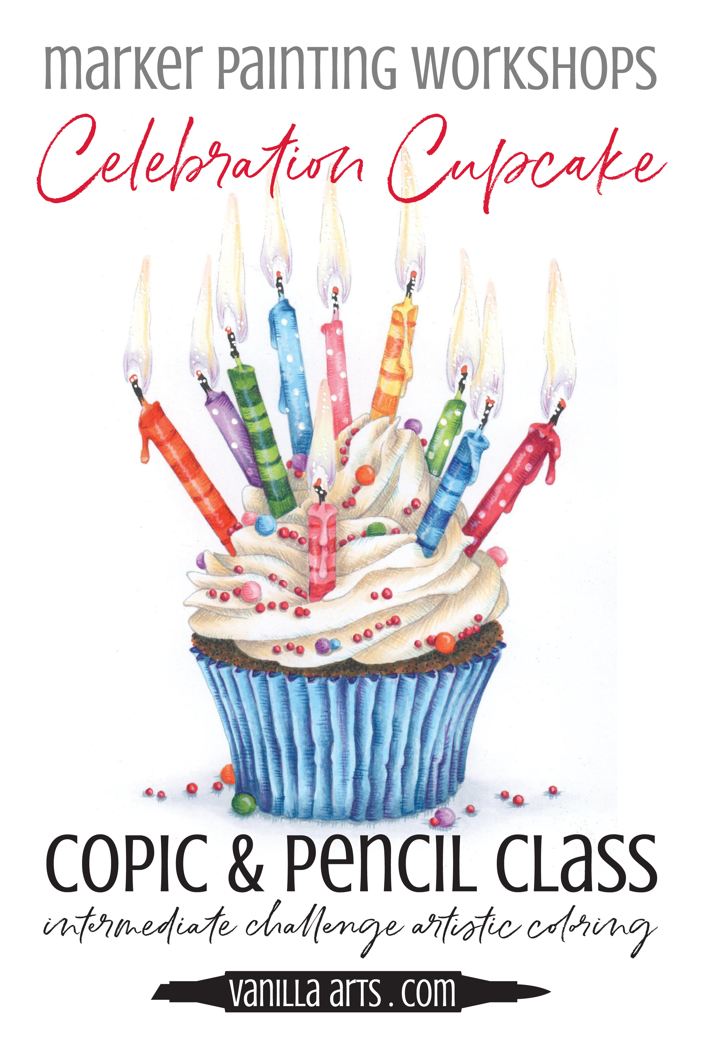
Celebration Cupcake: Copic Marker and Colored Pencil Online Class

 
Celebration Cupcake - a Copic and Colored Pencil Marker Painting Workshop.  Learn the universally adaptable technique for coloring folds and waves.  | VanillaArts.com | #copic #coloredpencil #realisticcoloring


Make a wish!

People frequently ask for a class on clothing. Here you go!

Celebration Cupcake

Learn the universally adaptable technique for coloring folds and waves.

Soft fluffy frosting and tasty cake, perfect for any birthday celebration. We’re coloring gentle waves of frosting and crisply folded pleats but you can use it on skirts, shirts, curtains, or anything else with folds.

Real time coloring, recorded live

Live Workshops are unscripted demonstrations which provide students with a real look into the authentic coloring process. You’ll see mistakes being made and corrected. It’s just like visiting Amy in her home studio.

Log in and color with Amy at your convenience. Anytime access, no expiration dates. Class was recorded in March 2021 and featured a live student audience. Amy answers questions from the students and offers many tips for better colored pencil art.

Class Kit includes: digital stamp, photo references, supply list, value reference, color map, plus helpful tips and work-in-progress photos


If you’re looking for the Free Digi Club, the program has been discontinued.

You can check out the many free resources at VanillaArts.com which include the Studio Journal Article Archives, Vanilla Beans, YouTube (demonstrations & tips), Computer for Colorers, Undercover Swatches and Instagram for Works in Progress.


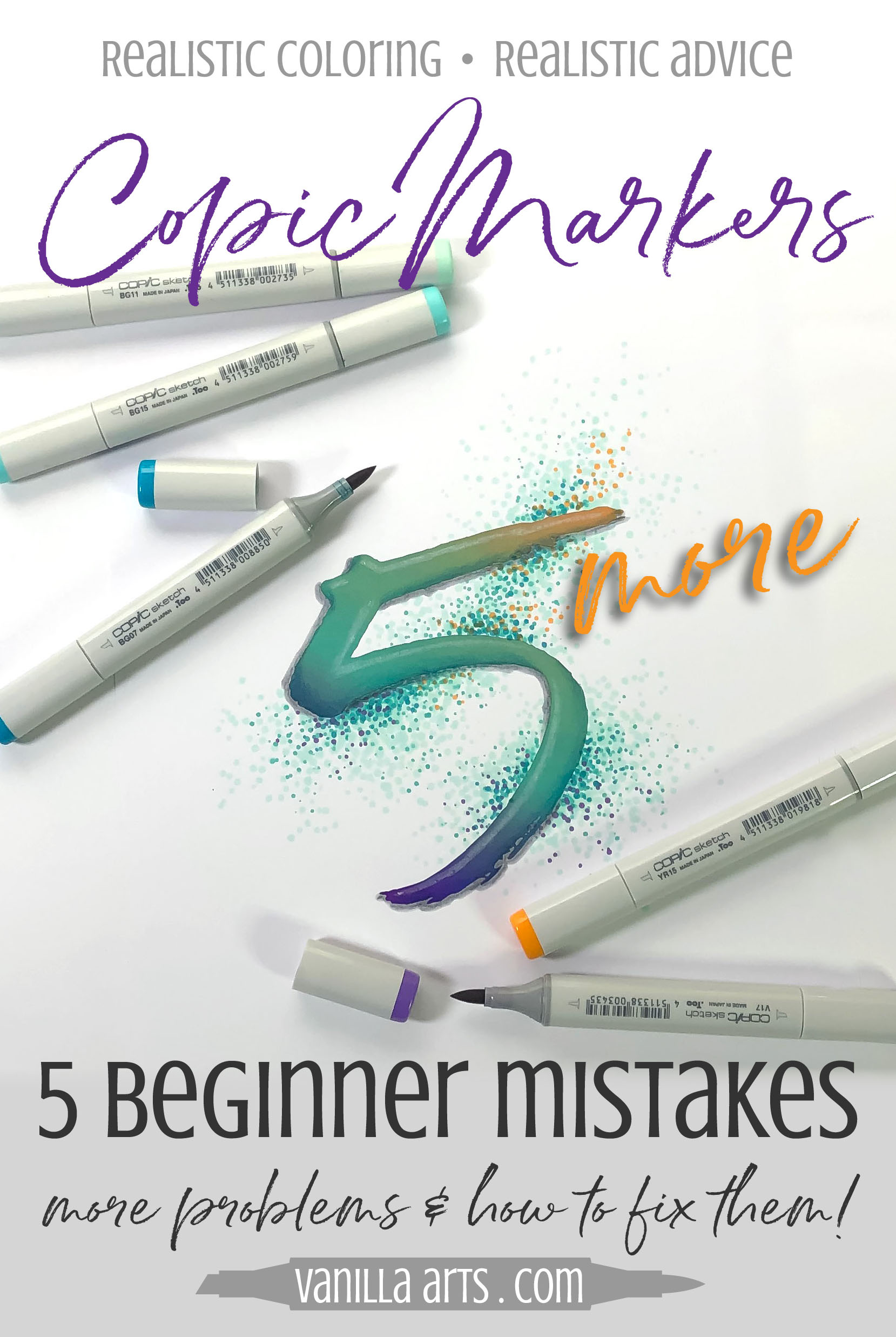
Five MORE Mistakes Beginning Copic Colorers Make (and how to fix them)


No one is a perfect colorer…

…especially not in the beginning stages

It can be pretty easy to assume that your Copic Marker idols popped out of the womb with a Copic in one hand and a certificate of genius in the other.

But the stinkin' truth is that everyone starts out rough.

Really rough.

There is a definite learning curve to coloring with markers. It takes time and practice to develop good marker skills.

5 More Mistakes Beginning Copic Colorers Make (and how to fix them) | VanillaArts.com
 

I teach a lot of marker classes

And the one thing I notice is that everyone screws up.

Everyone.

The thing is, we all don't screw up in the same way. Every beginner has a different set of hurdles to overcome. Some people have hesitancy problems, others are over-eager.

Every student I’ve ever met has two or three technique flaws that lead to less than stellar projects.

5 MORE Copic Mistakes (and how to fix them) | VanillaArts.com

What's interesting though, is that while student A has 3 problems and student B has 3 problems, once you see enough colorers, you realize that all students make similar mistakes, the only thing that changes is the combination they come in.

So to help you diagnose what goes wrong when you sit down to color, let's look at five MORE of the most common mistakes I see from beginners.

Correct these mistakes and you're not a beginner anymore!

MORE mistakes? Yep, today we're covering Mistakes #6 through #10.

Don't miss the first article 5 Mistakes which covers Mistakes #1 through #5, here.

In the last article, I used a puffy red heart to illustrate mistakes. This time we're doing blue-violet balloons.

Here’s a good-blending sample. I used BV04, BV02, and BV01.

This isn't going to win me any prizes at the County Fair, especially since this balloon measures only 1” tall in real life and has now a high resolution, blown up giant...  but it is a fairly good example of the kind of smooth blending to shoot for.

Each ink color blends into the next in a fairly smooth manner. The lights are light and the darks are dark with no jarring streaks or blobs to ugly-up the image.

So now that you know what pretty good coloring looks like, let’s take a look at some typical bad coloring and how to fix it.


Improve your Copic Marker blending. Avoid these 5 mistakes beginner colorers make. Solve your blending problems to improve your artistry. | VanillaArts.com | #howtocolor #copicmarker #adultcoloring
 
5 MORE Copic Mistakes (and how to fix them) | VanillaArts.com

Mistake #6:  Coloring in blocks

Smooth blending should be a gentle transition from one marker color to another. The transition zones are key.

Think of a transition zone as a series of overlapping halves. You use markers A and C. Where the two colors overlap creates color B.

Where markers C and E overlap, you create color D.

To be clear, colors B and D are not actual marker colors, they're colors that are created when you transition between two markers.

In my pretty sample above, I overlapped BV04 and BV02 allowing them to magically create a BV03 section. I did not use BV03, I created it.

Same thing with BV02 and BV01. Those inks mixed and mingled to form the equivalent of a BV01.5.

It's all about the mixing.

But mixing can not happen if you color in blocky sections, as shown here.

The Fix:

5 MORE Copic Mistakes (and how to fix them) | VanillaArts.com

Block colorers are not using flick strokes and that’s why they end up with stripes or blocks rather then transition zones. 

They're physically laying down the correct colors but without the overlap, the inks barely touch each other and never get a chance to blend.

This is a flick stroke, it's a controlled pattern. I've used flicks here to concentrate the heaviest coat of BV04 down where the balloon is the darkest. As I move upwards, the flicks taper off, like little fingers. There is less BV04 ink at the top edge of my coloring and more down at the bottom.

Essentially, smooth blending is all about easing into the transition zone. Easy transitions lead to smooth blending.

It's much easier to blend finger zones to finger zones because there's less BV04 in the upper region for the BV02 to fight with.

Using flicks rather than coloring in blocks will improve your ability to blend inks in the transition zone and to form beautiful middle tones.

A quick note about blocky coloring: You may be a block colorer and not know it! If you typically color quarter-fold card sized stamps with Copics, you are likely coloring in blocks. The teeny-tiny size hides a lot of technique flaws! It’s usually not until you try coloring a larger image that your blocky habit becomes apparent.


Mistake #7: Not enough juice

5 MORE Copic Mistakes (and how to fix them) | VanillaArts.com

Here’s a scenario for you: You want to make a batch of pancakes.

Just for kicks, let's say you add only half the liquids. So instead of adding 1 cup of milk you use 1/2 cup. Instead of four eggs, you use only two.

How will the pancakes turn out? Will they be light and fluffy?

Probably not.

You're going to have powdery mess on the griddle. Even the dog won’t eat these pancakes.

You need moisture to make the pancake magic happen.

The same is true for markers. You need wet ink on the paper to facilitate blending.

The Fix:

I usually see dry coloring from hesitant students.

They're afraid to lay down too much color for fear of doing it wrong.

But trying to blend with only a little bit of ink is a like trying to do the backstroke in 6 inches of water. Your heart may be in it, but there's not enough moisture to swim.

Improve your Copic Marker blending. Avoid these 5 mistakes beginner colorers make. Solve your blending problems to improve your artistry. | VanillaArts.com | #howtocolor #copicmarker #adultcoloring

In the bad balloon above, I used a really healthy amount of BV04 but then I let it cure for about 20 minutes before proceeding.

Then I laid down a very wimpy layer of BV02.

Because I was working a light layer over a dried heavy layer, I did not have enough moisture to rehydrate the darker ink.

And surprise, surprise! It didn’t blend.

Ink particles need moisture to move.

Blending is impossible in a desert.

The best blending happens when you work wet into wet. That means not waiting a long time in-between colors.

It also means being generous with the ink on every single coat.

It's not impossible to blend wet into dried ink but the process requires more ink than wet into wet. This is because ink #1 must be re-hydrated before the blending can begin. It's much easier to hit the ink while it's still fresh.

The other thing for beginners to note is that the magic doesn't always happen on the first pass.

Sometimes the two inks won't begin to blend until you hit it with a second coat.

Blending requires a sense of both timing AND quantities.

If the blend isn't what you wanted it to be after the first application, it's okay to go back and wet it again!


5 MORE Copic Mistakes (and how to fix them) | VanillaArts.com

Mistake #8: Too much light ink

Too little ink is a problem, but so is too much ink.

Remember when I said in the last fix that blending relies on a sense of timing AND quantities?

Well, here's why you can't go overboard.

This blend was going well until I got really happy with the lightest marker (BV01).

Basically, I went back with my lightest marker and coated the heck out of everything in the light and medium zones.

Single marker fixing is a problem because now my light area is almost as dark as the dark side.

And see the weird drying line running through the transition zone? That’s a bathtub ring!

And look in the upper left area, the paper is so saturated that we’re starting to get an oil slick up there.

The Fix:

Here's something you may never have considered.

Improve your Copic Marker blending. Avoid these 5 mistakes beginner colorers make. Solve your blending problems to improve your artistry. | VanillaArts.com | #howtocolor #copicmarker #adultcoloring

One coat of BV01 equals BV01. But what does three coats of BV01 equal?

You can easily get away with a second or third coat of most inks but when you start playing with multiple layers of the same color, all those lovely transparent layers start to add up to more than your original color.

BV01 + BV01 + BV01 + BV01 = BV02.5 or even BV03

By adding too much BV01, I've darkened the top of that balloon past the middle color. I've ruined my dark to light transition.

How do we avoid this?

Do not blend with just one marker.

Balance your applications of every color.

If you're not happy with the blend, don't grab just the lightest marker to make the fix. Instead, go back with your middle color THEN go back with the lighter.

We’re not only blending, we’re also balancing.

Reblending with multiple colors keeps your lights from accidentally layering up to be darker than your middles.


5 MORE Copic Mistakes (and how to fix them) | VanillaArts.com

Mistake #9: shaggy coloring

When I introduce flicking, about half of the students do this.

It’s a tip flick which kinda wanders across the color zone. I call it “dinking around”. It’s like they’re saying “I’m an artist, so I make these sketchy artistic strokes.”

Dink. Dink. Dink.

Dinking is when you look like you’re busy but you’re not really getting anything done.

I think dinkers are so wrapped up in the fun of making pretty flick marks that they forget the ultimate goal of filling-in the shape with solid color.

Shaggy coloring is inefficient and a waste of time.

Shaggy strokes will never blend because you’re barely using enough ink to cover the white of the paper, much less make a blend.

Here’s the other bad thing I’ve noticed: even though a shaggy student might fix the problem, they still revert back to shaggy strokes when they get nervous or stop paying attention.

It’s a life-long tendency which you never really cure.

Improve your Copic Marker blending. Avoid these 5 mistakes beginner colorers make. Solve your blending problems to improve your artistry. | VanillaArts.com | #howtocolor #copicmarker #adultcoloring

The Fix:

Be mindful.

Pay attention to the look of what you’re doing and not just the feel.

Flicking only works when you're generous with both the number of flicks and the length of those flicks.

Your flicks need to overlap each other, they need to touch and get really snuggly in order to cover over the white space.

This isn't just a case of the BV04 flicks not touching each other either. We've got double trouble in this example. The BV02 flicks need to come down and lay on top of a good portion of the BV04 for the actual blending to begin.

It's not enough to have coverage, the coverage needs to be layered.

Play some Barry White and turn the lights down low. These colors need to get comfy, romantic, and downright dirty with each other. If your two inks never touch, if they sit in quarantine, like wall flowers at a sixth grade dance, then they're never going to merge and mingle and make beautiful music together.


Mistake #10: Overstroking

5 MORE Copic Mistakes (and how to fix them) | VanillaArts.com

This is not usually a first-timer problem.

This bad technique develops after a few coloring sessions, once the student gets comfortable with flicking and coloring with using lots of moisture.

Actually, this is someone who is a little TOO comfortable.

Overstroking is dancing on the edge between a pretty darned good blend and perfection.

Dancing is only cool until you tumble headfirst into the piranha tank.

If you look really closely here, you'll see a mottled texture in the upper and middle thirds of the balloon.

That’s because I blended and blended and blended and blended and then blended some more with all three colors.

I'm right on the edge of oversaturating the paper and in the process, I've used too much of every color.

There’s so much ink here that the solvent in the lightest formula is starting to break down the darker inks.

Mottling happens when the paper is right at the saturation point. The ink particles are so free and floaty that they start to coagulate and clump together into islands of pigment surrounded by pale solvent.

This is basically too much of a good thing.

Mottling can also happen when the lightest marker in your blending combination is a smidge too light for the overall blend… but most mottling is when students get way too confident, pushing the wet into wet technique more towards sopping into dripping.

The Fix:

Know when to stop.

Improve your Copic Marker blending. Avoid these 5 mistakes beginner colorers make. Solve your blending problems to improve your artistry. | VanillaArts.com | #howtocolor #copicmarker #adultcoloring

There is a limit to how much wet ink a paper can hold.

Just because you can balance on the edge doesn’t mean you should.

More is not better.

In fact, with some Copic inks, more is worse.

If you load enough moisture into the paper, some inks will not just mottle, they’ll shatter.

Shattering is when an ink breaks down into its components. With a dark gray or black you'll see greens and purples start to ooze out.

Green inks can shatter with little yellow halos that often seep outside the boundaries of the image.

Purple and orange can leak reds or pinks.

Experience will teach you to quit while you're ahead.

Good colorers step back from the project to evaluate before they add more ink.

Are you trying to fix a truly bad blend or are you trying to fix a flaw so tiny that you're the only one who can see it?

In my experience, 60% of your mistakes are ones only you can notice. We're our own worst critics and nothing looks awesome from 3 inches away.

Step back and put the marker down! Learn to live with good instead of killing it in the quest for perfection.


So there you go-

5 more common mistakes and 5 solutions to prevent them from happening again.

  1. Blocky coloring

    Overlap those colors because inks that never touch can never blend.

  2. Dry coloring

    Don’t be afraid to use some ink. Blends can only happen when you use adequate moisture.

  3. Using too much light ink

    Smooth out your blends with more than one marker. Use both the medium and the light color, not just the lightest.

  4. Shaggy coloring

    Don’t dink around with sketchy strokes. Cover that paper in smooth and generous flicks!

  5. Overstroking

    I know it feels artistic and oh-so-professional to blend well but too much of a good thing leads to mottles and shattering.

Don't feel bad if you're guilty of more than one!

Heck, I've broken four or five of these rules on a single project. The key is to spot it happening and mentally slap yourself out of it before you take it too far!

Correcting mistakes and flaws in your technique is part of the learning process.

It's good for you!

5 MORE Copic Mistakes (and how to fix them) | VanillaArts.com