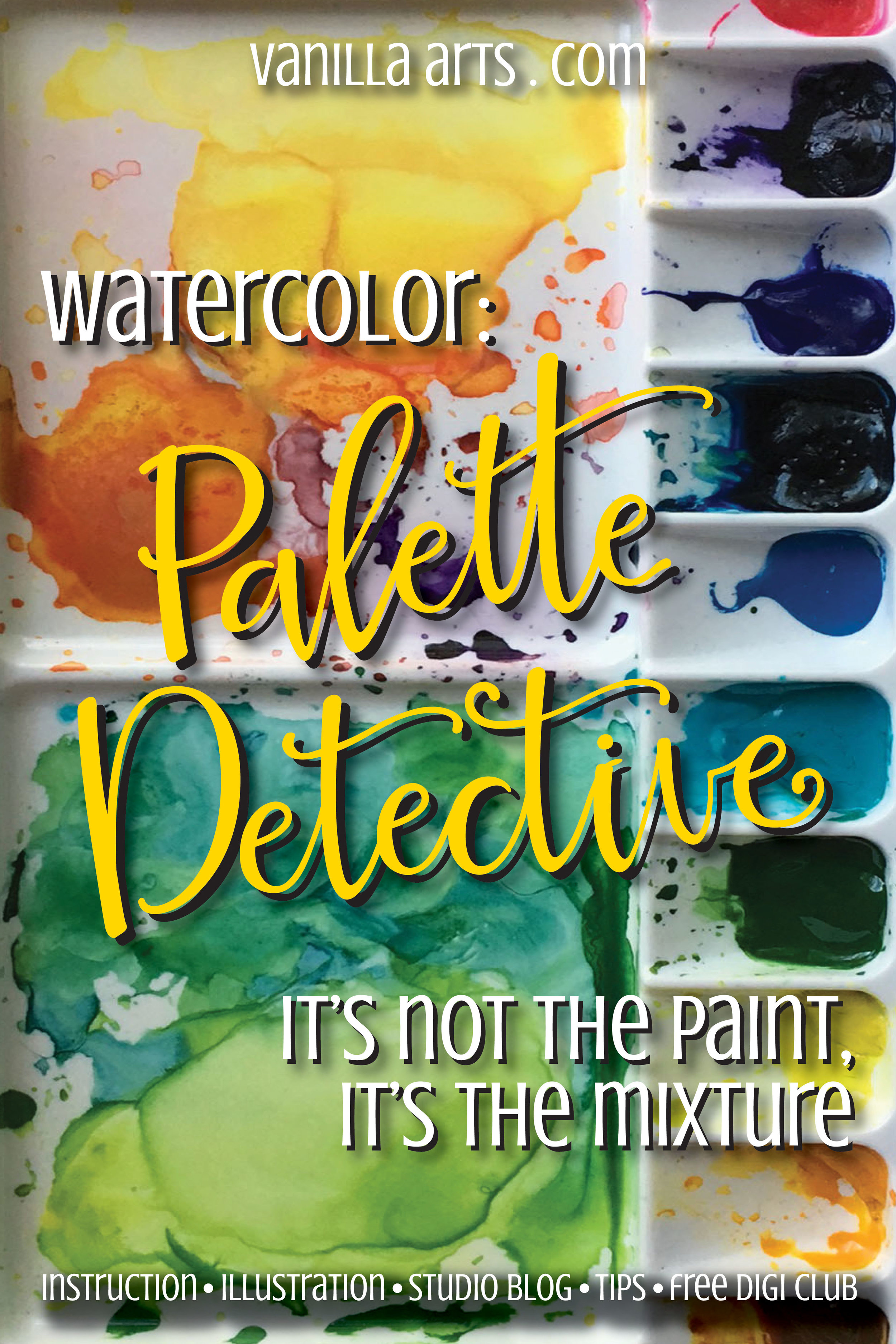
M Graham

Palette Detective: Watercolor Mixes for "Nasturtium" Botanical

 
In watercolor, it's not about the paint color, it's about the colors you mix. "Nasturtium" analysis. | VanillaArts.com


Colorers tend to use color names as a security blanket

What colors did you use on this project?

What's the marker list for that image?

What's your favorite red blending combination?

Admittedly, this has always been a hard thing for me to wrap my brain around.

I totally understand that using the same exact marker or pencil colors as the instructor increases the odds that a student will be able to duplicate the look of a class project... but it seems to me that holding the same supplies in your hand is only about 20% of the necessary information.

This is especially hard for crafters, people who are used to working with detailed supply lists and step by step tutorials. 

I get it. You want specifics, lots and lots and lots of specifics.

But I'm warning you. The next time I'm up in the bell tower ranting at the top of my voice, this is what I'll be yelling-

It's not the colors you use, it's how you use them!

It's not the name on the tube of paint that matters, it's what you do with it. | VanillaArts.com

Write that down and tack it on your craft room cork board. Tie a string around your finger to remember it. Tattoo it onto your dog's forehead so that you see it multiple times daily.

I can tell you every single color that I use on a project. I can list all minute details right down to the UPC code and link to the best price on the internet. And yet that tells you virtually nothing.

It's especially true with paint

Very few painters use color straight out of the tube.

For my watercolor classes, it's not enough for me to tell you what brands and what color paints I used. If you want to duplicate my look, you need to understand the mixes I make and their concentration levels.

I saw a photo on instagram a few weeks ago

The watercolorist had captioned it something along the lines of "Isn't my palette almost as pretty as the painting?"

And she was right. Her palette was absolutely beautiful. But the more I stared at it, the more I understood her painting. Her palette told me what colors she was mixing and I could trace the mixes on her palette right back to specific areas of her project.

Her palette was a road map to recreating her artwork.

And that idea has been brewing in the back of my mind for weeks now.

Here's "Nasturtium":

"Nasturtium" a beginner watercolor project for H2Oh! class. Teaching marker students to apply their coloring skills to watercolor paints. | VanillaArts.com

And here's my palette, which was clean when I started:

Green watercolor mixes used in "Nasturtium". Teaching marker colorers to apply their skills to watercolor paints. | VanillaArts.com
Orange watercolor mixes used in "Nasturtium". Teaching marker colorers to apply their skills to watercolor paints. | VanillaArts.com
 

Now be a palette detective

The greens are mixes of:

  • OH Sap Green

  • DS Hansa Light

  • MG Prussian Blue

The oranges* are mixes of:

  • DS Hansa Light

  • DS Pyrrol Scarlet

  • DS Carbazole Violet

  • sometimes I instinctively grab bits of MG Quin Red or Rose to brighten things

* remember that I shade last, so some of these oranges have now been neutralized by the violet. They appear dirtier than they did when I made my original passes on the petals.

We can make palette shots a regular thing

If you think it helps.

Thoughts?

Can't wait to paint with you tonight!!!


Nasturtium

Designed for watercolor but perfect for Copic or colored pencil.

This full page digital image is an original stamp used in my H2Oh! watercoloring classes in 2016. It was designed as a full page stamp (8.5" x 11") but can be scaled down if desired.

"Nasturtium" has wide open areas with no texture marks and is perfect for colored pencil, alcohol markers, watercolor... your options are endless!

Lettering is not included in the digital stamp as it was hand lettered by me after the project was completed.

This stamp was taught as a watercolor class, therefore I do not have a recipe guide to include in the stamp package. You can view my ā€œwork in progressā€ photos for this project on Instagram here.

Nasturtium FC Promo.jpg
 
VanillaArts.com