
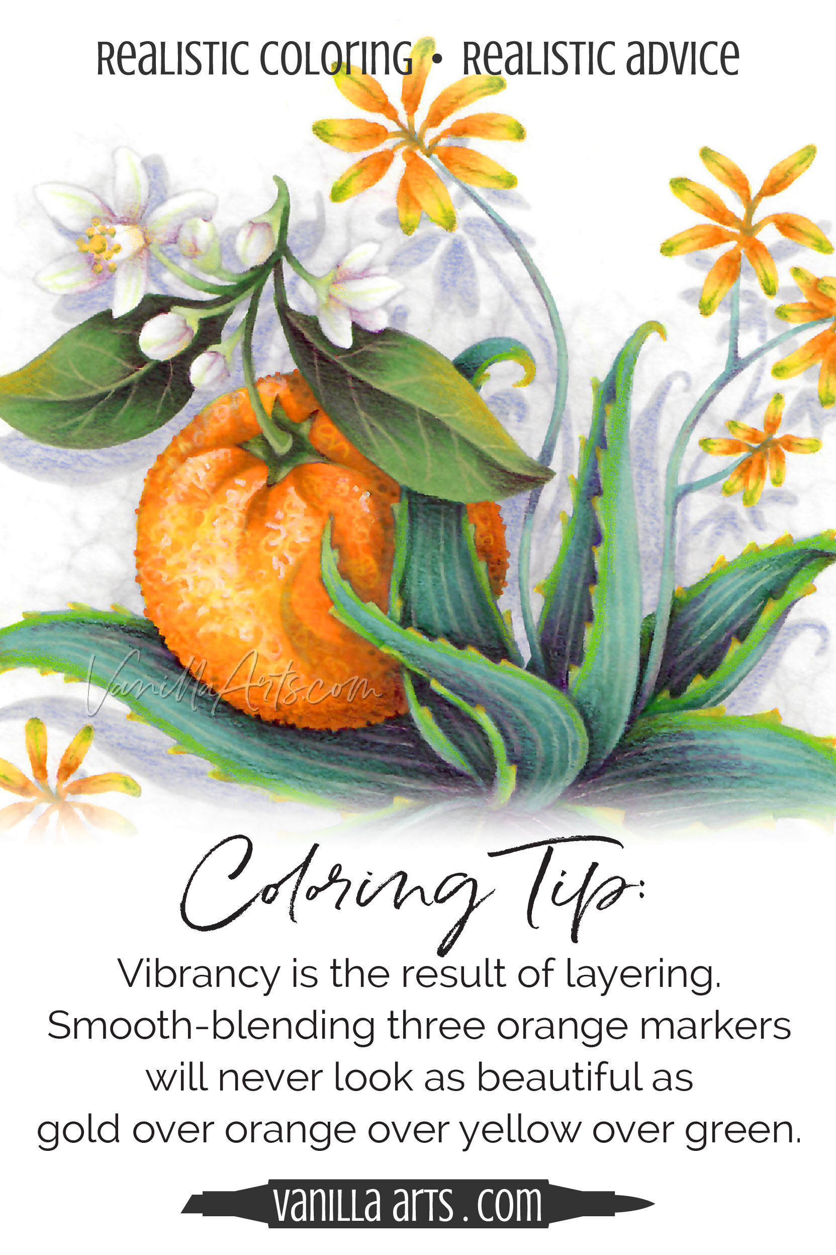
Coloring Tip: Traditional Copic Marker Blending Techniques Limit Vibrancy
Have you ever noticed how the most vibrant Copic Marker inks look duller when applied to white paper? It’s not the ink, it’s your blending technique! Natural vibrancy comes from layers, not blends. It’s an easy technique to learn. Learn to create glowing colors that look lit from within.
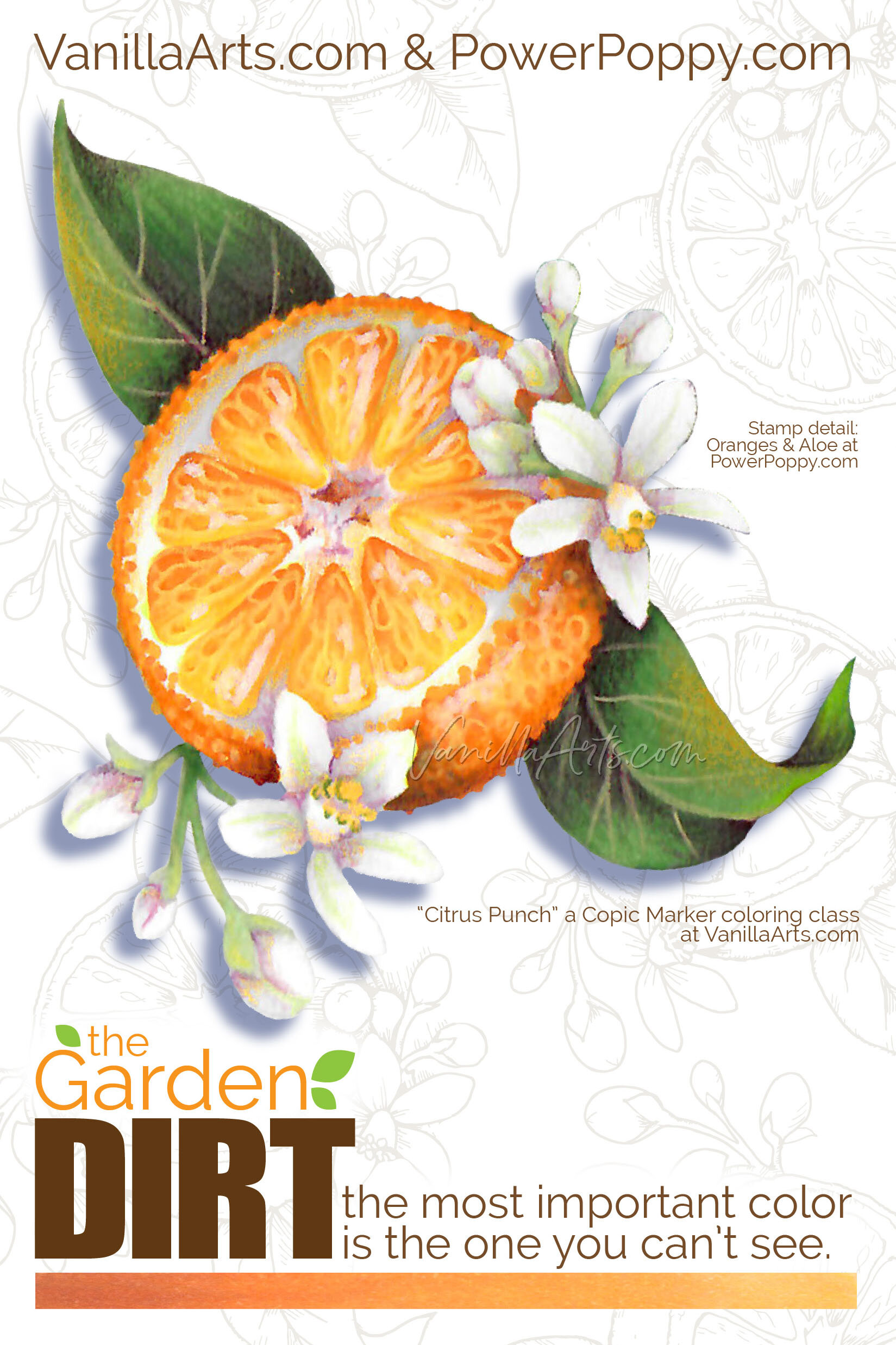
Garden Dirt: Copic Marker Blending Combinations for Realistic Coloring (Orange)
Let’s Color Realistic Oranges!
Today I’m showing you an up close, tight shot of just one glorious orange. It’s based on a brand new digital stamp from Marcella at PowerPoppy.com.
The entire Oranges and Aloe stamp has a lot more to color. To my eye, this is the best orange in Marcella’s line drawing, it’s a juicy cut-half showing off the cute orange segments which are perfect for fun texture details.
I’ve colored the orange with a combination of Copic Markers and Prismacolor Premier Pencils.
So why would I name this color swatching series after dirt? Take a closer look.
This isn’t just any old Copic color swatch…
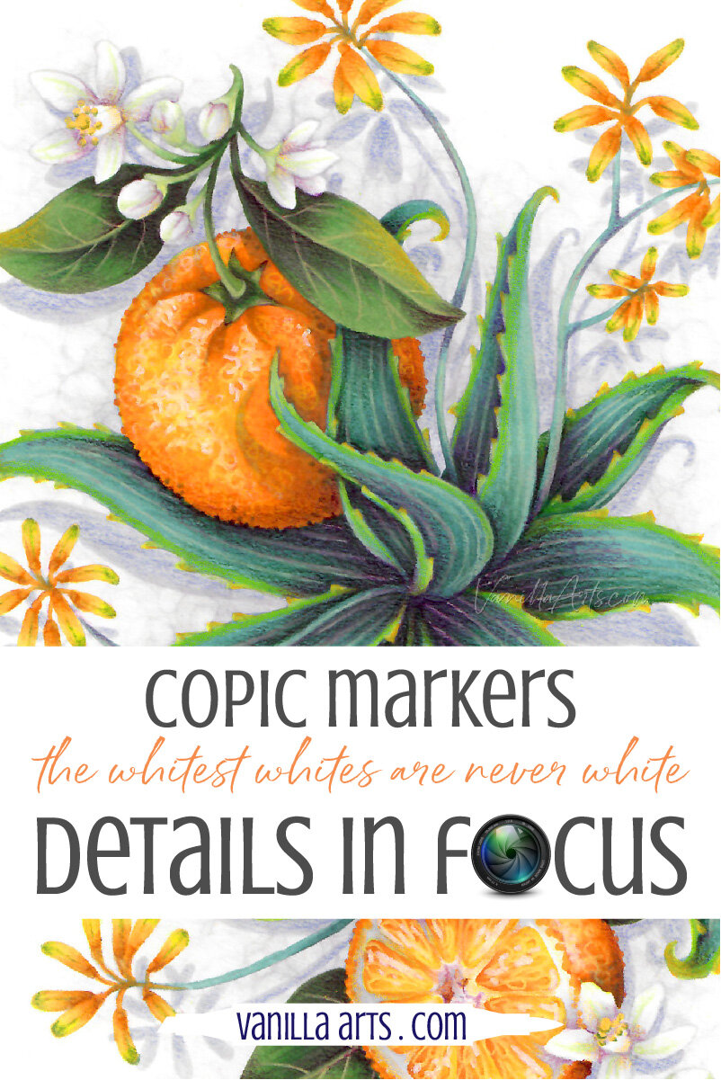
Details in Focus: Color White Flowers with a Rainbow (Copic Markers, Colored Pencils)
How To Color White Flowers?
White flowers are white. Your paper is white and they don’t make white Copic Markers…
Do you color white flowers by not coloring them at all?
Or do you pull out gray markers, hoping to add a bit of shade and dimension.
Pssstttt… that’s why your white flowers are flat and lifeless.
Let’s look up-close at beautiful white flowers that are everything but white.
Colorful whites are easier than you think. You can do this!