
Color Theory Tip: How to Tame Clashing Complementary Color (Copic Markers, Colored Pencils)

Color can Get Loud!
You’re coloring a beautiful new stamp with Copic Markers and colored pencils. About halfway into the project you realize:
Whoa! These colors are really bright!

Which is weird, because nothing you’re using is florescent. They’re just regular ol’ colors.
But together?
Skip the sunglasses, you need protective goggles!
Why do normal colors team up and glow like toxic waste?
And more importantly, how do you avoid creating loud color palettes that can be seen from the International Space Station?
Let’s look at why certain color palettes get obnoxious, plus the methods professional artists use to avoid triggering emergency HazMat protocol.
Complementary Colors add life
What are complementary colors?
Complements sit opposite of each other on the color wheel. Red is the complement of cyan blue. Magenta is the opposite of green. Yellow and violet; orange and indigo.

Please note that I’m referring to a CMY or subtractive color wheel because that’s what we use for transparent color like Copic Markers, inks, and watercolor.
Complementary colors have an adversarial relationship. If mixed together, they create perfect neutrals.
But pure complementary hues, sitting side by side?
Complement pairs vibrate with energy.
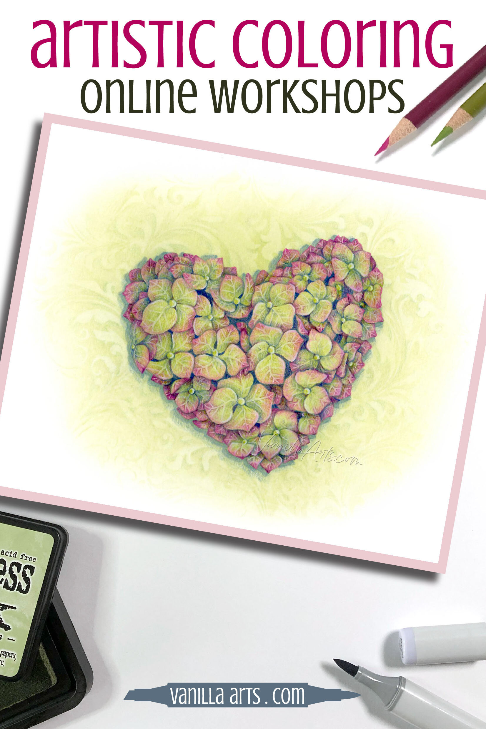
That’s what’s happening here in my Annabelle’s Heart project. The chartreuse bounces off the magenta making for a bit of electric zing.
Not everyone will like the way this looks. Heck, I’m not even sure I like it yet. Complementary buzzing is an acquired taste.
In this project I was pushing the boundaries, seeing how much I could clash the complements before someone called in a S.W.A.T. team.
So that’s the answer to the toxic glow you get from some color combinations.
You’ve started a war between two complements and the effect is a clashing color palette.

A natural advantage…
In my classes, we always work with photographic references. especially for florals. Because we use photos for color, it’s not unusual to hear::
Why isn’t this color working? I matched all my colors to the photograph, exactly!!! It looks great in the photo, so why is it ugly on paper?
Well, here’s the thing, nature has an advantage:
We don’t question Mother Nature.
She can throw any ol’ handful of obnoxious colors together and because it’s au naturel, we give it a standing ovation.
If you do the same thing in your art, we wince.
Photographers kinda get the same benefit of the doubt. They can even amp up the color saturation and we usually won’t question it.
So bright! So cheerful! So tasteful!
We don’t scrutinize real life or photos as much as drawings or paintings.
So no, the complementary colors in a photograph or in your garden won’t always work on paper.
The fact that it’s a painting or a coloring project just turns some complementary color schemes into eyesores.
Naturally garish color becomes garish-er in art.

It sounded like a good idea
I hear this one a lot too:
I have this awesome bright color palette idea. I can see it in my head so clearly. But on paper, it’s just not turning out right!

Look, I know the colors look perfect in your imagination but let’s get real. You thought about this colorful idea for about two seconds, right?
No, no, no. I know you think you’ve been planning the color scheme for days. But you haven’t. We have squirrel brains. We think hard for an instant and then we’re distracted by a new nut.
We don’t think as deep or as long as we think we think.
Okay, that’s a clunky way of saying it, but it’s true. The actual amount of time your brain concentrates on a subject is much less than you assume.
And hey, pull up that vivid vision you claim to have in your head. Can you please tell us about the details?
Why not?
Mind images are not crystal clear. There are foggy places in everything you envision, missing details you haven’t thought much about yet.
And the imagination is very flexible. Which magenta are you thinking of? Your magenta is constantly shifting warmer, cooler, lighter, darker. Colors change even as you’re thinking about them.
You can’t plan color palettes solely in your head.
A good idea starts in your brain but you have to continue the development process on paper in order to see what it really looks like.
Wait, It looks different now!
Lastly, there’s a brand new, totally modern problem for creating friendly complements. Van Gogh and Da Vinci never had to deal with this one.

Color is different on digital screens than in real life.
I’ve decided: I can color a project to look great online or I can color a project to look great in-person. But I can’t do both.
Even the most accurate scanner or the best photographer will have problems capturing authentic complementary color schemes.
Because complements are opposites and so are the little dials on your photo software, when you adjust one compliment, by default you change the other. You might capture the green perfectly but the magenta will be off. Or vice versa. Or it’ll be missing something. That’s the worst— you know it’s missing… well… it’s missing something important but you’re not sure what.
Which is the real Starry Night?
I don’t know. By themselves, each one is pretty amazing but every site shows a slightly different version. The near-complementary color scheme of Starry Night doesn’t make color accuracy easy.
The complementary colors that look fine on the desk in front of you may clash more on a computer screen. They can also go dull in the editing process.
My Annabelle’s Heart project here is very different in real life. The original is a bit more cheerful and the pinks are more vocal in person. Most of the time I like the virtual version better. But with Annabelle, I like her in person far more.
What do professionals do?
I promised you some pro level tips, right?
How can you work safely and prevent complementary color explosions?
Solution: Do color studies
What’s the biggest difference between professional artists and hobby level colorers?
It’s not talent. I’ve met some amazing colorers and some mediocre pros.
The biggest difference is that professionals take the preparation process seriously.

Your time is valuable.
Your supplies are valuable.
Your happiness is valuable.
So why are you wasting them?
Professional artists swatch the heck out of their colors and we do several color studies before we start a project. We edit and rehearse and make major changes during a pre-testing phase.
Only when we’ve tried it a few times on scrap paper do we move to the final version. And even then, half the time, I know I may end up starting over.
Hobbyists just jump in and try to do everything right the first time. Plus, most crafters won’t cry uncle! and start over, not even when the project has failed six ways from Sunday.
Gosh, that’s a rough way to work! On the edge, nervous about messing up, afraid to take any chances…
Swatching and color studies are extra important when you’re working with a complementary color scheme.
If you know you’re going into it with two hostile colors, you better have a battle plan and a back up plan before you start!

Check out Amy’s favorite art supplies, click above.
Solution: Dominant color
My next suggestion is one I picked up in an oil painting class. We worked with the Zorn palette which isn’t a complementary palette but it does use a lot of Cadmium Red. Cad Red is a total loudmouth color which must be kept on a short leash.
The advice?

Never try to balance colors 50/50. When you give equal space to every color, you set them up to clash.
This is very true for complementary color combinations. Give them equal time and they’ll spend it arguing.
In Annabelle’s Heart, I’m giving more space to the Chartreuse. The complementary magenta plays second fiddle. There are lots of pink touches but there’s more green in total.
Now I told you earlier, I was trying to push the limit, to see how close to obnoxious I could get… so the magenta and yellow-green levels here are a bit closer to equal than I’d normally take them. But this was my limit. I was afraid to push it further.
I’m not suggesting that you count petals or measure space with a ruler, but keep an eye out for the overall balance between your complements.
Let one lead and the other will follow nicely.
Solution: Neutralize it
Remember when I said that complements have a special relationship? When mixed, they create perfect neutrals?

Mixing magenta into green sounds crazy… but ohhh, what a world you’re missing if you never try!
When you neutralize a color you are taming it. Add a little green to your magenta and it dampens the vibrancy a bit. Add a little more and the pink gets quieter still. If you neutralize it to the 50/50 point, you’ll get a brownish gray color which is oddly nice. But it’s the 90/10 to 70/30 stages that I find most interesting.
In Annabelle’s Heart, the magenta is colored OVER chartreuse.
I started by laying down a base of chartreuse ink. The magenta pencils can never fully hide the green, a little will always show through.
Magenta is less of a loudmouth because of the green underneath.
Professionals know that neutralized color can calm an otherwise energetic color palette. Don’t be afraid to experiment with mixing complements.
I almost killed this project!
In my defense, I’m off my game. I’m now taking care of my aging parents and my normal work routine has been shot to heck. But I tried to rush my coloring process for Annabelle’s Heart and it cost me in time and frustration.
First mistake: When I packed the supplies to color this project at my parent’s house, I selected a very vibrant Twisted Citron Distress Ink for the background. I saw Citron in my photo reference, so that’s the only green ink I grabbed.
Bad move! Mother Nature can use Twisted Citron, but it’s clearly beyond my skills. You could hear my first color study crying in pain. The second study and the third gave off violent vibrations too. I gave up and switched to Shabby Shutters but I had to make a two hour trip home to get it!
Second mistake: even though Shabby Shutters feels green at full strength, I was still never able to totally conquer the yellowish vibe because I used such a thin coat. It’s not the green I envisioned.
Yes, because I was hours away from my studio, I did a lot of mental planning. It’ll never live up to the green of my dreams.
Third mistake: This scanned version is more yellowish than the real art. I should have scanned my color studies to check their digital appearance. I prayed and hoped when I should have tested.
See? Complementary color parings challenge even seasoned artists. Projects don’t flow smoothly just because you have lots of experience. And even smart people make dumb mistakes.
YOU can save yourself time and heartache by swatching, testing, and planning complementary projects ahead of time.
Learn from my mistakes!
Want to learn about simplifying complex coloring projects?
Join me for Annabelle's Heart, a lesson on using Visual Planes to maximize depth.
We’re teasing out the details to address the shape of objects on multiple levels. That sounds more complicated than it actually is.
There’s also a strange side-effect to addressing Visual Planes. When you color planes, it simplifies the coloring process while maximizing depth.
You’ll never look at complex stamp images the same way again.

Annabelle’s Heart
Join me for a fun Copic Marker + Colored Pencil lesson in the Vanilla Workshop
Annabelle’s Heart an Intermediate Challenge skills class learning about visual planes
Learn to incorporate real artistry into your coloring projects, one concept at a time. Every Workshop details a new method for enhancing realism, depth, and dimension.
Each class stands on its own as independent learning. You don't have to take six of my other classes to understand this lesson.
Workshops are NON-SEQUENTIAL!
All of my Workshop classes are ANYTIME ACCESS. Work at your own pace and repeat the project as many times as you'd like.
Come color with me. It's a ton of fun!

Join me for an online lesson…
that will change the way you think about complementary colors and complex projects!
Plus, it'll be tons of fun!


Select supplies used in Annabelle’s Heart:

Vanilla Arts Company is a participant in the Amazon Services LLC Associates Program, an affiliate advertising program designed to provide a means for use to earn fees by linking to Amazon.com.


Lorem ipsum dolor sit amet, consectetur adipiscing elit. Vestibulum id ligula porta felis euismod semper.