
Coloring Tip: Don’t Let Dimensional Coloring Techniques Distract From Realism (Copic Marker, Colored Pencil)

Coloring Tip: Copic Marker blending and dimensional coloring techniques distract you from what’s really important when coloring with realism. Instead focus on how objects are shaped and how they sit. Are they tilted? Do they cast shadows? Realism relies upon creating a believable environment.

Smooth Copic blending is the least important part of coloring
That’s a pretty harsh statement, especially coming from someone who teaches smooth marker and colored pencil blending for a living.
But honestly, blending is so overrated.
In fact, I’d say smooth blending and all those dimensional coloring techniques everyone wants to learn? They kill your chances to color with life and realism.
It’s not that the techniques are bad, or wrong, or useless.
It’s that blending techniques distract you from what’s really important.

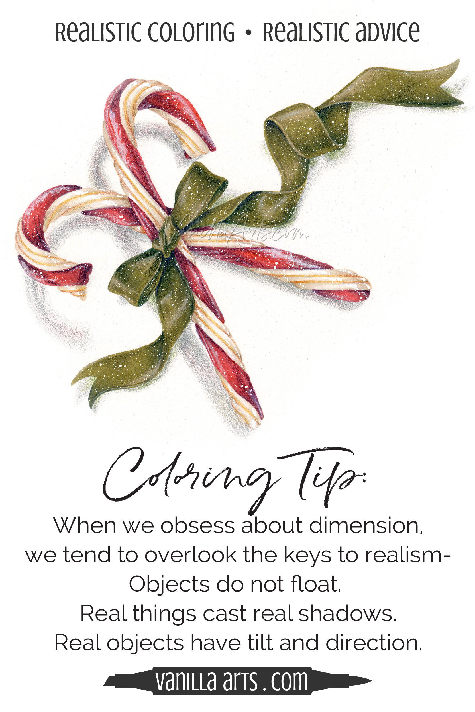
Candy Canes is my latest artistic coloring stamp kit.
I’ve colored it here with light realism. It’s not photorealistic but it is a step beyond regular old dimensional coloring.
What is dimensional coloring technique?
Well, it’s that shortcut to thinking that many colorers take. They pull out a blending combination of light-medium-dark Copic Markers or colored pencils and they spend the whole time making the edges of everything dark and the centers light.
It kinda adds dimension because it sorta-almost-maybe makes objects look rounded and puffy.
And it kinda adds depth because you sometimes-almost make two objects look layered.
But it sure as heck doesn’t make things look real.
As an artist, when I look at the photo reference for these candy canes, the first thing I notice is NOT that candy canes are round.
When I look at the photo reference, I see that the top candy cane is tilted up and then it bends down towards the paper.
And I see that the bottom candy cane lies flat on the surface until it bends up and towards my eye.
The fact that a candy cane is rounded on the sides is a total duh moment, barely worth thinking about.
Roundedness is trivial. It’s inconsequential.
But that’s what most tutorials teach you to focus on, right?
That’s why your objects look fake and cartoonish.
My candy canes look realer than average because I’ve taken the time to study real candy canes.
I’m looking at how they relate in a real life environment. How they sit, how they tilt, how the two objects interact with each other and how they make contact with the table below.
I’m actually looking.
Not letting some tutorial dictate where the dark red goes.
Don’t let dimensional blending techniques take your eyes off the prize.
Realism doesn’t come from rounded surfaces. It comes from observation.


Color with Realism & Artistry
A simple still-life without the Christmas clutter…
Tired of cartoonish stamps which always look like a stamp and never like YOUR art?
Vanilla Arts digital stamps are designed for advanced, realistic, and artistic coloring
Candy Canes
Minimally drawn stamps with wide open spaces and no annoying texture marks.
Festive Christmas candy with a rippling ribbon— perfect for framing large or tiny tags.
Let your skill & creativity be the star of the image, not the stamp art.
Ideal for large-scale projects in Copic Marker, colored pencil, or watercolor


