
Tools On My Desk: Favorite Colored Pencils for Creating Depth & Realism (Pulling Pencils)
Do you want to color realistic highlights?
The problem with traditional Copic Marker blending technique and a lot of craft based colored pencil instruction is that they teach students to highlight everything.
EVERYTHING.
They treat highlights as if they’re magical.
Add a highlight and voila! Now it looks dimensional!
All this over-highlighting… and your strange addiction to white gel pens?
This is why your projects look fake.
Real highlights are not white.
And folks, not everything has a highlight on it!
Realistic depth and dimension do not come from slapping white comma shapes on everything.
Read more about the artist’s approach to dimensional coloring in my article series above.
Today, let’s look at the Vanilla Team’s favorite highlighting pencil colors.
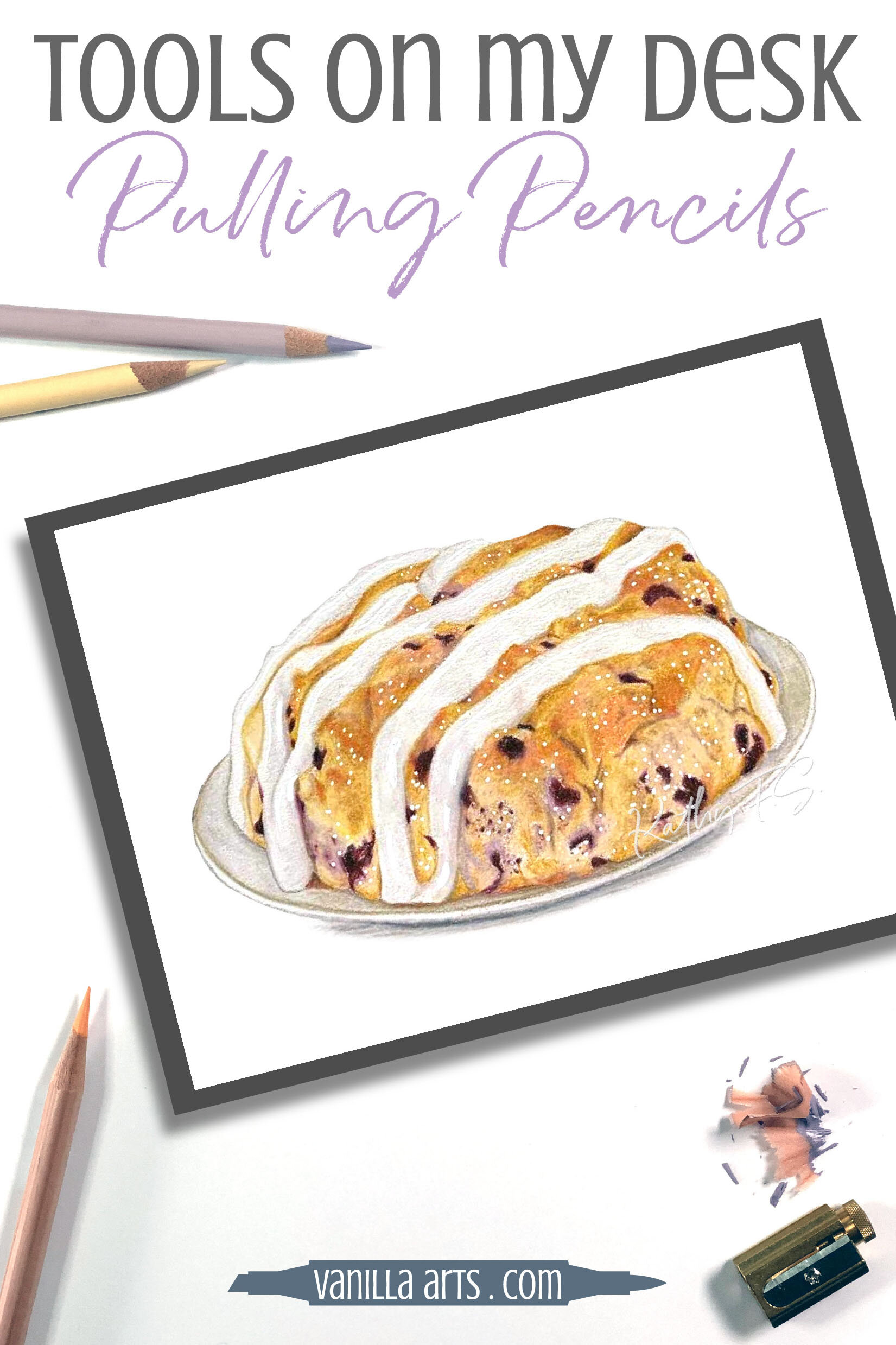
A photo-realistic Scone
Kathy FS, our tech expert here on the Vanilla Team is is now obsessed with training herself to see color accurately. She’s downright amazing at capturing realism in her Copic Marker and colored pencil projects.
You can’t create photo-realism if you’re highlighting everything with bright white!
Kathy colored this Blueberry Scone as part of her FABulous challenge team..
Kathy used Prismacolor’s Greyed Lavender (PC1026) to add highlights to the blueberry spots. She used Prismacolor’s Cream (PC914) across much of the body, giving it a golden baked look. White highlights would have made it look underbaked!

The rest of this article contains affiliate links to trusted retailers like Dick Blick and Amazon.
Vanilla Arts Company is a participant in the Amazon Services LLC Associates Program, an affiliate advertising program designed to provide a means for use to earn fees by linking to Amazon.com.
We love natural shaping
As the team learns to color with greater realism using photo references and real life observation, our white gel pens get used less and less.
Accurate dimension requires real color, not more white.
We also like our shape-enhancing pencils to be slightly opaque and yet a wee bit translucent.
I know that sounds like a total contradiction but there’s a fine balance we need to strike.
The color needs to be opaque enough to be visible on the project. Total transparency wouldn’t work.
And yet the color can’t be fully opaque. We want some of the base color to shine through. This helps the highlight look like it’s part of the object, not painted on later.
Here are the semi-opaque “pulling” pencils we reach for most:
Please note: this article was written in March 2020 and reflects pencils available at this time. We can not guarantee future availability.
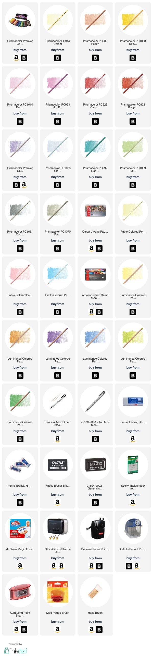
YELLOW
Cream, Prismacolor Premier PC914. A versatile color that can pull almost any warm color forward. Amy uses it on more than just yellow.
Light Lemon Yellow, Pablo 241. Kathy loves this beautiful delicate yellow. It’s very clean with no hints of gray or orange.
Naples Ochre, Luminance 821. Another clear, clean yellow which despite the name does not have the usual Naples desaturation.

ORANGE
Peach, Prismacolor Premier PC939. An easy to use color. Because this is a flesh tone, it has a slight bit of muddiness to it.
Spanish Orange, Prismacolor Premier PC1003. Amy’s favorite hit of sunshine for fruit and vegetables.
Apricot, Luminance 041. If Prismacolor Peach feels too dirty, try this. It’s the same white-based peach color but really clean.
MAGENTA
Deco Pink, Prismacolor Premier PC1014. The lightest clean pink that Prismacolor makes.
Hot Pink, Prismacolor Premier PC993. Darker than Deco Pink, makes a more subtle light on darker magentas.
Granite Rose, Pablo 493. Another of Kathy’s favorites; a classic baby pink. Very versatile.
RED
Carmine Red, Prismacolor Premier PC926. Remember, light red is NOT pink. Pink is part of the magenta family. Light reds are warmer than pink. Carmine one of Amy’s most used colors.
Poppy Red, Prismacolor Premier PC922. Prismacolor makes several traditional reds. For a subtle red highlight, try Poppy which is the lightest of the red-reds.
VIOLET
Greyed Lavender, Prismacolor Premier PC1026. The lightest of the pale purple/violets. Has a slight bit of grayness to it but still works as a delicate pull.
Manganese Violet, Luminance 112. A beautiful warm purple with more opaque white than you’d expect for a mid-value color.
BLUE
Cloud Blue, Prismacolor Premier PC1023. White pencil can sometimes reveal green or violet tones in the darker blue Prismacolor pencils. Cloud blue has enough blue pigment in it to mask those hidden colors. The whole team uses this one!
Bluish Pale, Pablo 371. A classic baby blue. Beautiful.
Light Cobalt Blue, Luminance 661. Another classic baby blue. Bluish Pale Pablo leans a little warm while this Light Cobalt Blue is a little cooler.
Light Aqua, Prismacolor Premier PC992. If you’re working with aquamarine, turquoise, or teal, this is Amy’s favorite pull.
GREEN
Cream, Prismacolor Premier PC914. Amy uses this on leaves more often than white!
Pale Sage, Prismacolor Premier PC1089. Don’t let the name fool you. This is not a dusty sage. A clean pale green with a slightly warm vibe.
Olive Yellow, Luminance 015. This is Amy’s go-to pencil over Copic YG90’s. Gorgeous.
Cobalt Green, Luminance 182. Some greens lean towards viridian. This cooler green is perfect over unique viridian greens.
NEUTRAL
Amy likes the 30% grays for pulling. Anything lighter tends to have too much white and opacity. Anything darker is too potent. The team in general finds they use French Grey more than Warm Grey.
30% Cool Grey, Prismacolor Premier PC1061.
30% French Grey, Prismacolor Premier PC1070.
See more of Amy’s favorite art & coloring supplies, click above.
Thanks to Kathy for sharing her amazing Blueberry Scone project!
And thanks to the Vanilla Team for sharing their favorite “pullers”.
Pulling Pencil Colors for Realistic Highlights:
Vanilla Arts Company is a participant in the Amazon Services LLC Associates Program, an affiliate advertising program designed to provide a means for use to earn fees by linking to Amazon.com.


