
Tools On My Desk: Favorite Colored Pencils for Creating Depth, Shade, & Realism
Looking for realistic shade color?
The problem with traditional Copic Marker blending technique and a lot of craft based colored pencil instruction is that they teach students to shade with a more saturated version of the same color
Shade pink with light red, shade yellow with orange, shade sky blue with royal blue, etc.
Which is why your coloring looks overly bright and fake.
This crafty rule is the exact opposite of what happens in real life.
Real shade is de-saturated, not more saturated.
Real shade is a grayer, muddier, and dirtier version of the original color, not just the next darkest marker or pencil.
Read more about the artist’s approach to desaturated shade in my article series above.
Today, let’s look at the Vanilla Team’s favorite shady pencil colors.
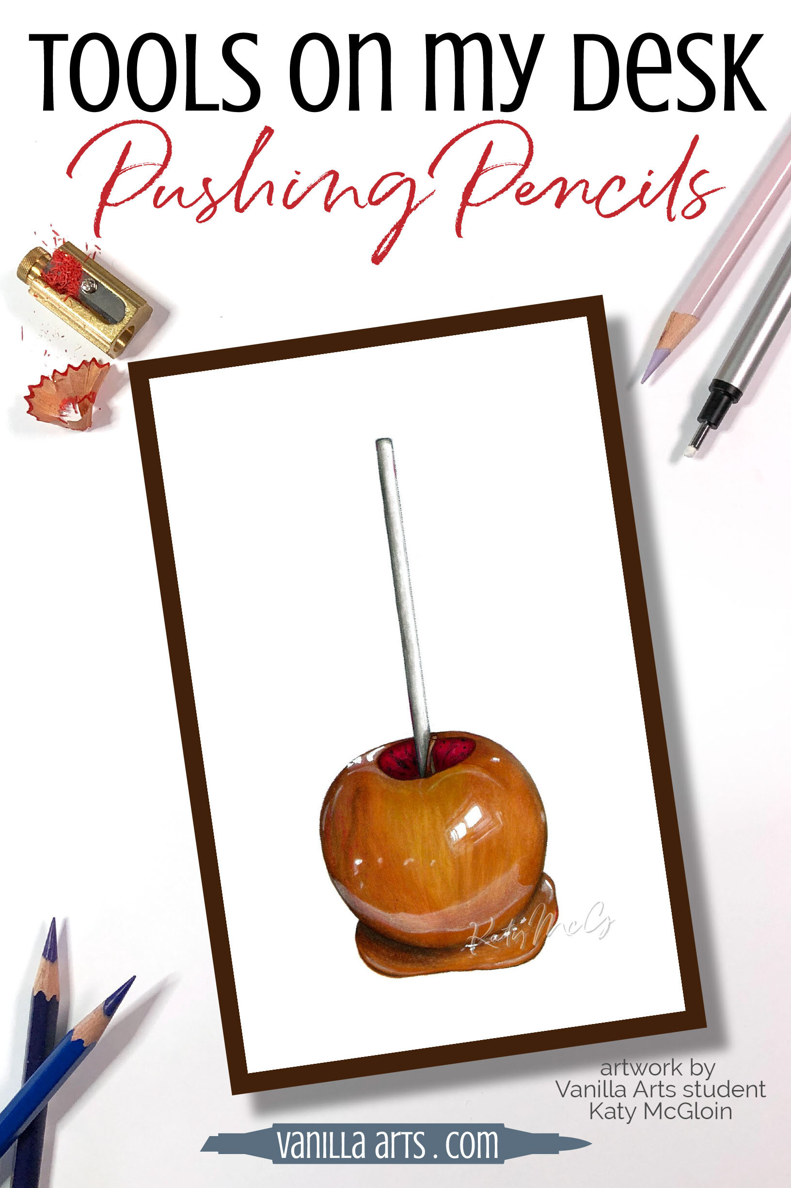
A photo-realistic caramel apple
Katy McGloin is a Vanilla Arts student who now finds herself routinely capturing amazing realism in her Copic Marker and colored pencil projects.
You can’t create photo-realism if you’re shading with the next-darkest marker!
Katie colored this caramel apple in the Practice Corner membership group. It’s one of the fun challenge projects the group works on each month, to grow their coloring skills.
She relied heavily on Prismacolor’s Tuscan Red (PC937) which is an odd maroon red shade with strong hints of umber in it. Read more about Tuscan Red in our recommendations below.

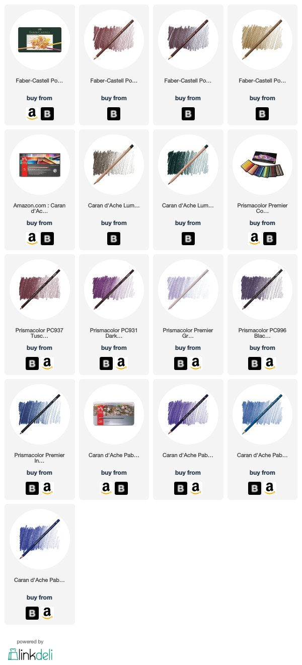
The rest of this article contains affiliate links to trusted retailers like Dick Blick and Amazon.
Vanilla Arts Company is a participant in the Amazon Services LLC Associates Program, an affiliate advertising program designed to provide a means for use to earn fees by linking to Amazon.com.
We love muddy color!
As the team learns to color with greater realism using photo references and real life observation, we find ourselves using fewer and fewer pretty pencils.
Accurate shade and shadow require colors that are less vibrant. The names are sometimes weird and when organizing our pencils, it’s sometimes hard to tell where these colors should go. Funky brown with a hint of pink isn’t exactly a color in the Roy G. Biv rainbow.
We also like our depth-building pencils to be a bit translucent. This allows us to push objects deeper with a light layer of pencil. The translucency allows the base color to still shine through.
Here are the desaturated “push” pencils we reach for most:
Please note: this article was written in February 2020 and reflects pencils available at this time. We can not guarantee future availability.
Caput Mortuum and Caput Mortuum Violet - Polychromos #169 and Polychromos #263. This is an odd pinkish brown, almost a darker version of your natural lip color. Useful on human faces, animals, and pink florals. Prismacolor Henna (PC1031) is very close substitute.
Bistre - Polychromos #179. A tanned ochre color. Works well in florals and animals, essential for landscapes.
Cassel Earth - Caran d’Ache Luminance #046. A potent umber based brown which Amy uses a lot in portraiture and animals. Don’t let the color shock you, this can be used with almost no pressure to develop extremely subtle shade or more firmly for eyelashes and dog noses.
Tuscan Red - Prismacolor Premier #PC937. Katy’s caramel apple recommendation but also a color Amy purchases in bulk. An essential color for landscapes and food illustration.
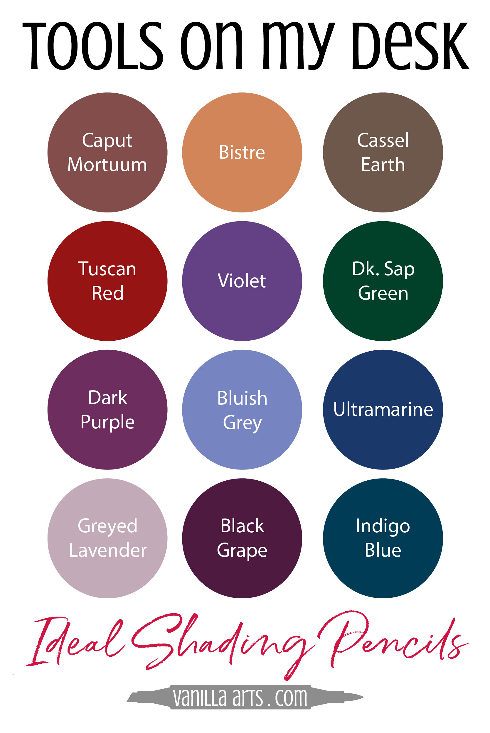
5. Violet - Caran d’Ache Pablo #120. Kathy is a big fan of the Pablo series. Violet is an all purpose pushing color, perfect for cool depth in florals and other still life illustrations. Amy uses this with firm pressure as as substitute for Prismacolor Imperial Violet (PC1007) and with soft pressure to sub for Prismacolor Parma Violet (PC1008)
6. Dark Sap Green - Caran d’Ache Luminance #739. Don’t let the name fool you this is not a traditional sap. Looks really dark in pencil format but is a beautiful push for floral greenery and pine boughs. Has a cool hint of violet already in the color.
7. Dark Purple - Prismacolor Premier PC931. Amy goes through a dozen Dark Purple pencils every year. It’s in all her beginner classes and the entire Voice team is totally addicted. Trust us, try it over pumpkin orange. It’s amazing!
8. Bluish Grey - Caran d’Ache Pablo #145. Don’t let the paint on the pencil fool you. The pencil looks like a medium warm blue but the pigment is actually a cool Periwinkle. Beautiful on white florals and in combination with Copic B60.
9. Ultramarine - Caran d’Ache Pablo #140. Kathy highly recommends this red-shift blue for pushing florals and still life. It’s just a great all-around color that you’ll find endless uses for.
10. Greyed Lavender - Prismacolor Premier PC1026. Another pencil you can’t avoid in Vanilla Arts Workshops. Ideal for shading yellow with realism but also essential for portraits and white florals. The palest of the pushing colors shown here today and the most opaque.
11. Black Grape - Prismacolor Premier PC996. When Prismacolor Dark Purple is too warm for the base color, try Black Grape. Absolutely beautiful over floral greenery and essential for landscapes.
12. Indigo Blue - Prismacolor Premier PC901. No list would be complete without our beloved Indigo pencil. This is the first pushing color Amy introduces to beginners and she uses it every day at the professional level. This neutral blue can skew green-shade or red-shade depending upon the circumstances. All purpose applications, everything from portraiture to product illustration. This pencil is a MUST for all colorers.
See more of Amy’s favorite art & coloring supplies, click above.
Thanks to Katy for sharing her amazing Caramel Apple project!
And thanks to the Vanilla Team for sharing their favorite “pushers”.
Pushing Pencil Colors for Realistic Shade:
Vanilla Arts Company is a participant in the Amazon Services LLC Associates Program, an affiliate advertising program designed to provide a means for use to earn fees by linking to Amazon.com.


