Improve your Copic Marker Coloring with Photo References & Observation

Realistic Flowers & Botanicals
Do you dream about coloring beautiful botanicals with Copic Markers or colored pencils?
Are you striving to create more depth and dimension?
Do you want to color with more realism?
Psssttt… I’ve got a little tip for you:
A great coloring project starts long before you select marker and pencil colors.
It’s not choosing the “best” colors for realism. It’s not even about choosing a great stamp or line drawing.
Good coloring is the result of understanding your subject.
Research and observation are the key to realistic coloring.
There are many factors which contribute to advanced level coloring with Copic Markers or colored pencils. Few hobbyists understand how much research and observation professional artists do to prepare for projects. Illustrator Amy Shulke talks about how preparation can be more important than skill.
Observation skills are essential for artists!
I’ve said it before in my classes and courses. You’ll find the same theme running through multiple articles here in the Studio Journal…

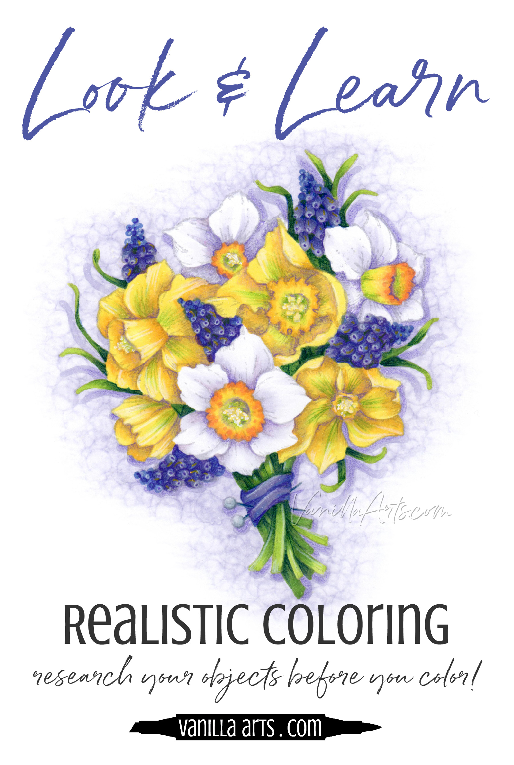
“SPF for Yellow”, an online beginner’s class by the author, Amy Shulke. Copic Markers and Prismacolor Pencils on X-Press It Blending Card. Class uses the “Daffodil Bouquet” digital stamp, available at PowerPoppy.com
Good artists are good observers.
It doesn’t matter if a professional artist is working with paint, charcoal, clay, or even tattoo ink— a good artist understands the object they’re trying to draw or paint.
It’s pretty simple— You can’t color a realistic daffodil if you don’t know what a real daffodil looks like.
“But Amy, I’m not a professional artist”
That’s okay; the same rule holds true in coloring, when you’re working with stamped images that you did not draw yourself.
Actually, the rule is especially true if you didn’t draw the stamp yourself!
If you want to capture accurate depth, lifelike dimension, and realistic color, you must understand the three dimensional form of the object you’re trying to color.
Shut up and see!
I’ve noticed a striking similarity between the best professional artists I know and the best coloring students I’ve met over the years.
There are a heck uv’a lot of introverts making outstanding art.
I’m pretty-much the poster child for introverted artists. I know my articles here make me sound chatty and outgoing, but in real life, I’m the girl who barely says 3 words to anyone.

Art and artistic coloring appeals to a lot of introverts.
Art allows us to speak without speaking.
Anyway, I’ve thought about the introverted artist thing for a while now and I’ve got a theory:
Introverts make good artists because we spend our time observing rather than conversing.
Instead of entertaining crowds with fun stories and conversationy stuff, I sit and watch.
I’m a hermit, even in a crowd. But I’m never bored. I spend a lot of time looking deeply at stuff.
My husband is used to me staring at everyday objects for long periods of time for no apparent reason.
He calls it “zoning out” but actually, I’m zoning in.
So if I’m sitting on a park bench waiting for my son to finish soccer practice, instead of chatting with the mom next to me, I’m likely staring at the nearby patch of daffodils, wondering how I’d draw them.
But I’m not just admiring the pretty color— I’m looking at how the stem attaches to the blossom, how the leaves seem to grow out of dirt rather than branching-off from the stem, and why some blossoms rise toward the sun while others hang low, bent over from their own weight.
“Research and observation” sound very official.
But really, I’m just staring at the everyday objects in my life.
Everyone can do this.
To color something well, you must know it well
I investigate objects before I draw them.
Before I draw something, I google the heck out of every single element in the project.

So if I’m drawing daffodils and hyacinth with ribbon, I’m looking at multiple photos of daffodils, hyacinth, and ribbons. Many photos. I want to see everything from every angle. This helps me to create an accurate drawing.
But I don’t just research objects for my own drawings.
This is “Daffodil Bouquet” by the wonderful artist Marcella Hawley at PowerPoppy.com. Even though I purchased this stamp instead of drawing my own daffodils, I still looked at about 20 different daffodil photos and maybe 10 shots of grape hyacinth before I started to color the project for my upcoming online class.
And remember, my research is not always about color. Yes, I do recommend using photo references as color inspiration but references are valuable for more than color!
I spent most of my daffodil investigation looking the cup area (called the “corona”) of the blossom.
The corona isn’t just a petal that’s been curled around into a tube shape as I previously thought. The corona is an extension of the stem. It’s like the bell of a trumpet, a gradual widening and yellowing of the stem.
Before, I had assumed that the cup was literally that, a cup which was plopped-down on top of a regular ol’ blossom. Instead, I find that the flower petals grow out of the base of the corona, not the other way around.

“How can research help me color a better flower?”
For starters, the trumpet bell structure of a daffodil’s corona means that when you look down into the center, you will see green.

You see green because you’re actually looking down into the tube that becomes the stem. There are bits and bobs of reproductive organs down in the base but the green you see is coming from the stem.
And it’s deep in there. There is no bottom of the cup, it’s not closed off. The hole keeps on going well down past the start of the stamens.
To capture the look of a deep tunnel, we need to use more shading color than if the cup had a shallow bottom.
Too many people assume there’s a shallow bottom to the cup. Heck, I was one of them until I looked!
By missing this important daffodil detail, many people color daffodils wrong.
The other important thing I learned from looking at daffodil references is that while some varieties have very short coronas which barely rise high enough to count as a cup, the squatty corona versions don’t look kinda weird.
They’re real but they don’t look real.
Now I know this sounds weird but it’s actually kind of important. There are daffodils which don’t look like daffodils, so when I go to select my final photo references —the ones I’ll actually use when drawing or coloring— this means I should avoid the fake-looking daffodil pics.
Not every photo reference is useful. If the photo doesn’t doesn’t feel real, it can’t help me draw or color realistic daffodils.
Photo references create your mission plan
So up above, I was yakking about all my weird little daffodil observations… but if you go back and review it again, you’ll see a concrete daffodil plan taking shape.

This will happen to you as you do similar research.
Research provides guidelines for more accurate coloring.
Daffodil petals are teardrop shaped with the point closest tot the stem. So when I see a petal not taking the traditional shape, this indicates a fold or a wave in the petal. A fold or wave changes how I color the petal.
The petals emerge gradually from the side of the corona, so there will not be a sharp right angle where the corona meets the petal. This means the shade where the petal connects should be soft and fuzzy instead of dark with hard edges.
The corona is a continuous tube, so stop looking for the edges of a rolled petal.
There is no bottom to the corona. It’s not a cup, so don’t color a bottom
The stamens and filaments come from deep within the tube and they fill up a lot of the space. If you make the inside of the corona too light, it will appear shallow but it also cuts off the length of the filaments.
The green inside the corona isn’t imaginary or an artistic touch, that’s realistic stem color.
Make sure the corona appears to rise tall above the petals, even on full-face blossoms.
Do you see how the research guides how I color the daffodil?
Every observation you make directly changes your coloring process.
Better research = better coloring.

To color something well, you must know it well.
Now that you see how much I’ve thought about and observed daffodils, is it any wonder that my project here looks more thorough and accurate than someone who just grabbed three yellow markers and colored some stuff?
There are a lot of daffodil drawings out there.
There are a lot of people coloring daffodil stamps too.
But not many people take the time to observe and understand daffodils.
Do daffodils better and you’ll stand out as a different kind of colorer.
To color smarter, be smarter
Improve your coloring by improving your observation skills.