
Artistic Coloring: 3 Mistakes Everyone Makes with Popular Stamps and Line Art

You use lots of pretty markers and pencils…
So why doesn’t your coloring look just as pretty?
You’re not alone.
Here’s how it usually goes— you find a beautiful stamp or the perfect line art. You can’t wait to color it. You’ve got big dreams and a pile of markers. Can you do it justice?

Let’s say everything goes right. Good blends, no big mistakes, and you stayed inside the lines.
Great coloring on the perfect stamp!
But…
The finished project is just a little…
Boring?
What a let-down!
Even worse is when the project turns out amazing and for once, you actually like your own coloring…
Until you see sixteen other people colored it exactly like you.
How did that happen?
Why is it so hard to color commercial stamps and line art in beautiful, original, and artistic ways?
Let’s look closer today at how great stamps go mediocre during the coloring process.
3 MISTAKES WE ALL MAKE WHEN COLORING

When your coloring turns out meh, it usually has nothing to do with the stamp.
That’s on you.
When your coloring looks the same as everyone else’s— we think, “Oh, it’s because we all used the same stamp!”
Nope. That’s on you too.
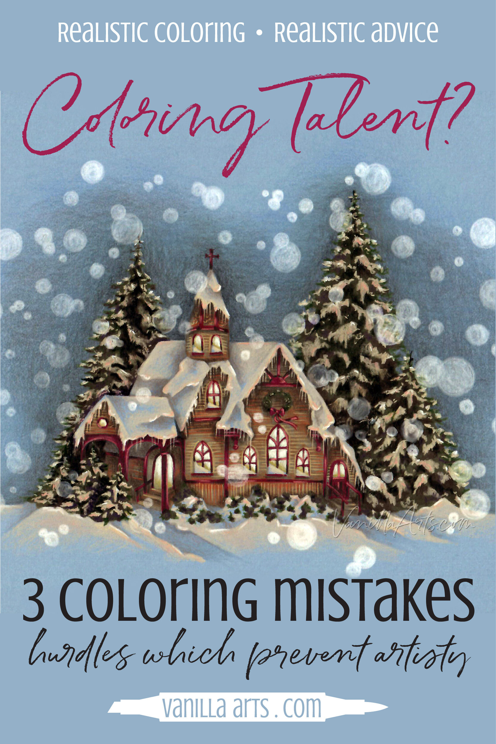
My All is Bright project here started with the Snowy Church/Oh Holy Night stamp from PowerPoppy.com.
This is not a new stamp. It’s been out for ten years now. Hundreds of people have colored this stamp before. Heck, you’ve probably colored this stamp before!
And yet when you saw my project here, you hesitated for a moment, right?
You weren’t 100% completely sure that I used a stamp, right?
You’re still not sure, eh?
So what’s the secret to getting something fresh and original from a classic stamp?
It’s all about the mindset and approach to a stamp.
You’re making three big mistakes which stunt your artistic potential.
But first: it’s not talent!
Don’t roll your eyes. “Oh, that’s just Amy. She’s really talented.”
WRONG!
People use talent as an excuse. “She can but I can’t.”
SO WRONG!
I wasn’t born with the ability to color snow and churches.
I learned how.
Did you catch that? I learned.
It’s not talent. It’s skill.
All skills are learnable.
YOU can learn to do it too.
Let’s look at the 3 mistakes you make when coloring stamps.
Three things I’ve learned NOT to do.
1: Do you treat the uncolored stamp like finished art?
You fell in love with the stamp the minute you saw it. It triggered something—
a happy memory
a great idea for how to color it
you got the joke
the cuteness hit you right in the heart
We all buy line art for a different reasons but the universal truth is that you identified with something in the line drawing.
Here’s the problem though… it doesn’t matter how much you love the image or the sentiment. It’s just a drawing, it’s just a stamp.
It’s not finished.
No stamp artist ever sketches out a stamp and says “Voila! This is done!”
Stamps are made with the intention that YOU will complete the project.
The stamp artists wants you to add color, value, texture, light, shadow, depth, dimension, personality, and love.
If a stamp was perfect, as-is with nothing more, nobody would ever send a Christmas card. We’d mail each other rubber stamps.
On some level, many card makers don’t quite understand this. The lack of understanding is why you’ll see so many cards with just the image stamped or embossed on white paper. No coloring. Nothing but pretty paper around it.
They’re treating the stamp like it’s something worth framing, charishing, and celebrating.
Stamps are NOT art!
A stamp is just an ingredient. It’s the start of something better.
Too many colorers tiptoe around the line art, afraid to screw it up. They treat it with far more reverence than the stamp artist ever did.
“Oh, I’ll just add a pop of color but not too much because I don’t want to ruin it.”
When you treat a stamp as precious, you kill the opportunity to be creative.
2: Do you color with preschool rules?
I’ve got a few questions for you:
What color is snow? White
What color is a pine tree? Green
What color is the moon? White… or maybe yellow
What color is the night sky? Black… or dark blue
What color is an old fashioned church? White
What color is a glowing window? Yellow
Hmmmmmm… we just described a lot of Snowy Church cards, didn’t we?
Wait, we can do this magic trick again!
What are the traditional colors of winter? Blue and white
There you go. Blue and white pretty much covers ALL the other Snowy Church cards, eh?
I’m not psychic, I’m just poking fun at your childhood stereotypes.

Too many colorists color exactly like a kindergarten teacher.
You literally color every stereotype you’ve ever encountered.
No amount of skill, talent, or general amazingness can overcome your bad habit of coloring every object exactly the same color you’d find in a toddler’s picture book.
Red apple. Gray elephant. Brown dog. Green grass. Blue water. Yellow star.
Zzzzzzz!
Stop for a second and look at my All is Bright project here. What color is the snow?
Is the snow on the roof and trees white?
This is a tricky question because you want to tell me snow is white. It feels white. But really look at my project.
Did I use a white pencil to color the snow?
Nope.
The only white pencil in the whole entire image is the big circles of out-of-focus snow falling from the sky.
The rest of the snow is pink. I used Prismacolor’s PC1001 Salmon Pink.
Why did I use a pink pencil?
Well, I looked for a nighttime photo reference and what I learned from the snow in the photograph is that snow at night under the glow from windows is not white.
It’s really, really, really not white.
So if I want Snowy Church to look like snow at night under the glow from windows, then coloring it white isn’t going to get the look I want.
When you color stereotypes, you kill the opportunity to be creative.
3: Tell me a story!
Every good drawing, every good painting, every good piece of art tells a story.
Art is only art if it tells a story!
On Christmas Eve, the entire town gathered at the old country church to sing carols. As the first notes came from the organ, the snow started to softly fall.
That’s my story. Did you get the same feeling from my coloring?
Sadly, here’s the story most people tell:
I found this stamp at PowerPoppy.com and I colored it with Copics.
Zzzzzz.

Art is communication.
If you’re not communicating, you are boring.
There are thousands of ways to tell a story with the stamps you color.
use a dramatic or a super-zen color palette to set a distinct mood
use interesting texture to remind people of objects they know
create a setting or time of day to trigger a memory
Too many colorers look at a stamp and think all kinds of wonderful thoughts which could be used to make art.
Oh, I visited a church like that when I was young!
I remember daisies like that growing in my grandmother’s garden.
I once had a dog with that same sad expression.
When I was a little girl, I would have loved a ruffled skirt like this!
You see things in the stamp that trigger memories and wishes. The small thoughts that run through your head are exactly what your art needs! These are valuable ideas which can be used to tell a unique and interesting story.
But no, you skip the storytelling in favor of blending or using some new glitter you just bought.
You’re thinking about technique or tools when you should be focused on communicating something from your heart.
I’m not going to lie. It’s easier to think about glitter glue than tell a story.
But if you want to color something worth paying attention to, you’ve gott’a tap into your memories and share what you’re remembering.
When you don’t communicate a story, you kill your chance to be creative.

Check out Amy’s favorite art supplies, click above.
Stop taking the easy way out!
Ultimately, all three of today’s coloring mistakes boil down to the same thing: it’s easier to blend than it is to think deeply.
When you treat the stamp as precious, when you color the same old things in the same old way, and when you color shapes rather than communicate…
It all adds up to a boring project which looks like everyone else’s boring project.

Artists think deeper about their projects in order to be more creative.
You can do the same.
3 mistakes everyone makes with stamp images:
1. A stamp image is not finished art
A stamp is just one ingredient. You wouldn’t serve your guests a bowl of flour, right? So stop serving uncolored or barely colored stamps!
2. Coloring everything exactly as expected is boring.
Google the stamp name to find 100 people who have colored red apples, blue water, or white snow. If you want to be an artist, you’ve got to break away from the kindergarten stereotypes.
3. You are a storyteller!
The stamp outlines are just a hint. Your job is to fill in the story.
Select supplies used in “All Is Bright”:

Vanilla Arts Company is a participant in the Amazon Services LLC Associates Program, an affiliate advertising program designed to provide a means for use to earn fees by linking to Amazon.com.