Are you good at picking colors?
Or do you get a headache thinking about all the possible combinations of Copic Marker and colored pencils?
Relax. It's normal. Not everyone is born with the ability to whip out original and beautiful color palettes on demand.
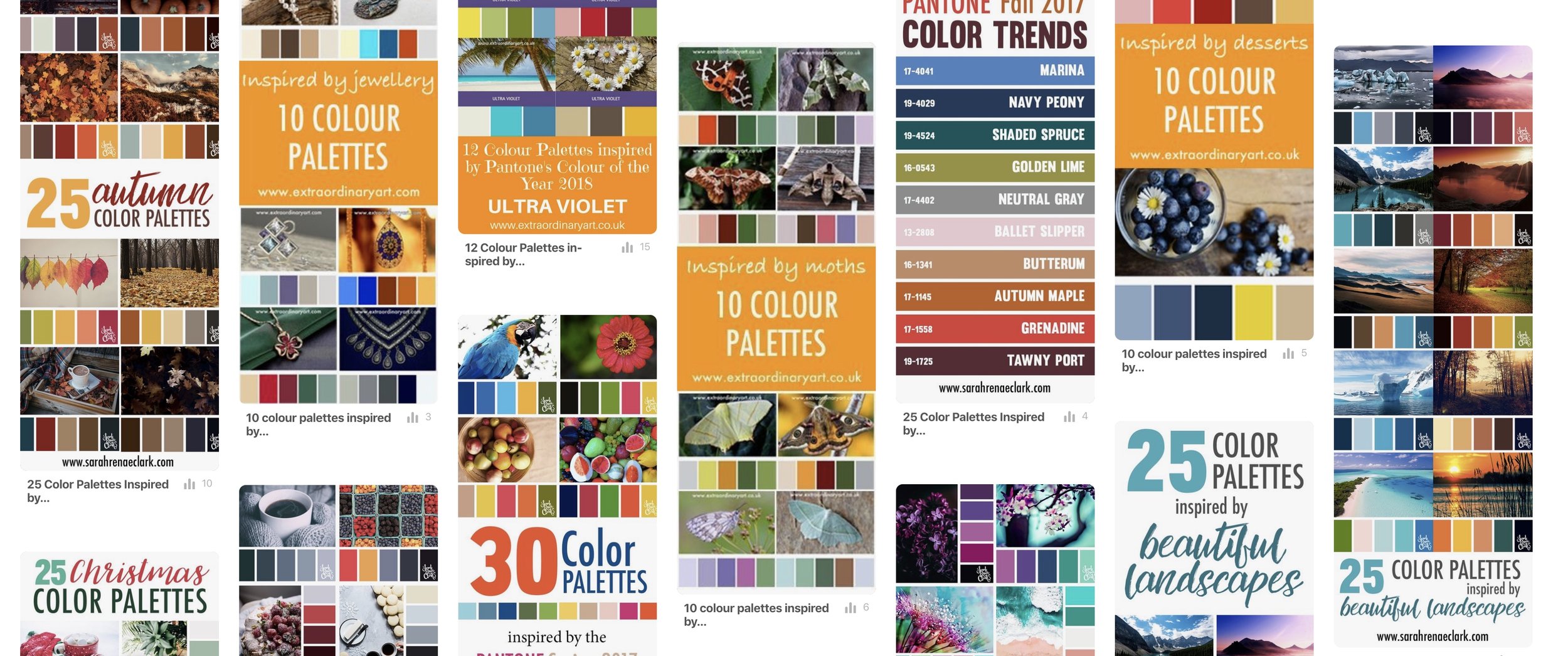
In Part One of this series, I showed you how to weed through the various color palette websites like Design Seeds, Colour Lovers, and Sarah Renae Clark, finding workable color palettes to use in your adult coloring projects.
Today, let's learn how to create our own palettes.
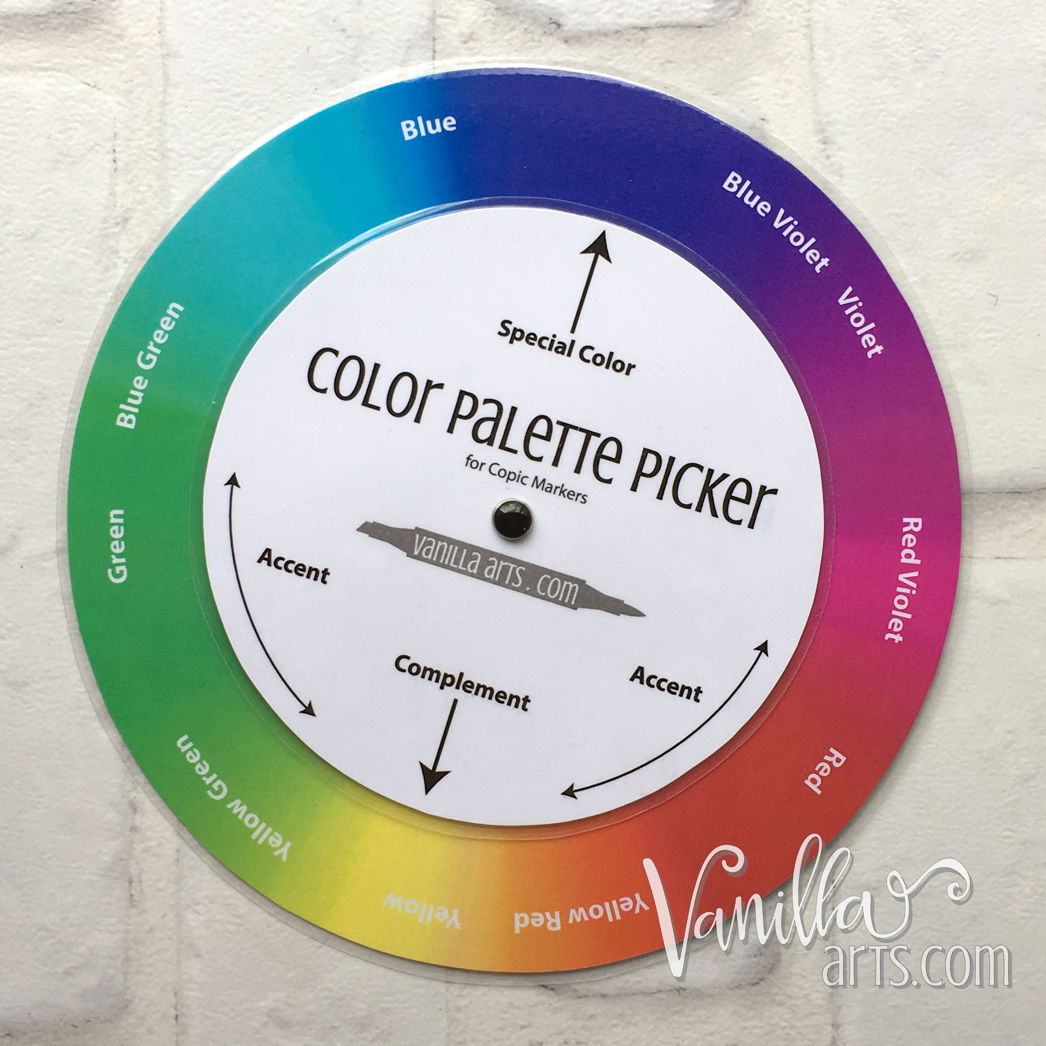
And psssttt... don't miss downloading your FREE copy of my Color Palette Picker wheel for Copic Markers! The link is at the end of this article and well worth your time.
Start with line art, not with a color palette
Do you have a drawing or stamped image ready to go?
Good, because that's the first step.
Look, I know it's fun to spend hours and hours online, pinning or saving all the pretty color palettes you find. But if you don't have a project to use the palettes on, then it's completely wasted effort.
A large collection of pinned palettes doesn't make coloring easier.
It makes you feel good. It helps you pretend that you know something about color.
But no, not really.
Trust me. I have a pin board full of gorgeous color palettes too. I keep thinking I'll use one of them someday... but I never do.
Why not?
Because there's always something in my drawing or stamped image that doesn't quite work with any of the palettes I've saved.
Looking at my pin collection above. very few of them contain the color green.
And guess what I color about 60% of the time? Florals.
Duh!
But greenery isn't the only thing missing from most of my collection of color palettes. What if there’s an elephant in the stamp? Do you have any pins with gray in them? What if you have a gushing fire hydrant? Have you pinned anything with red AND a watery blue together?
Probably not. So much for your useful pin board!
Stamps can get complicated. It's very hard to make them conform to anything in your palette collection.
It's soooooo much easier to create custom color palettes especially suited to needs of your coloring image!
One wheel to rule them all...
Do you have a good color wheel?
No, not that Stampin' Up thing that everyone owns. I was right there with 'ya in the 90s. That wheel thing the consultant kept waving in our faces?
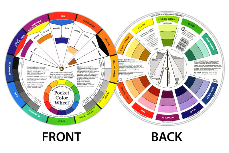
... It won't work for Copics.
The number one selling color wheel in the U.S. is also useless!
Both of these wheels are Red-Yellow-Blue based wheels. That's an "additive" wheels if you want to get technical.
Additive wheels are based on the idea that red, yellow, and blue are primary colors.
But red, yellow, and blue are not primaries for Copics!
Don't believe me? What colors of ink do you put in your computer printer?
Ohhhhh... we don't use red ink in printers, do we?
And what's inside your Copic Marker?
Ohhhhh again...
Copic Markers work on a CMY or Cyan, Magenta, Yellow format. "Subtractive" color for the techies.
In ink world, red is not primary, magenta is.
So look at your color wheel and count the spaces it takes you to go from yellow to cyan. Cyan is that light bluish color that everyone calls light blue. Cyan isn't really light and it's not blue... it's cyan... but that's a different blog post for a different day.
So you're counting spaces from yellow to cyan. How many spaces did you count? Two? Three? Four?
Now go back to yellow and count the same number of spaces from yellow in the other direction.
Did you land on red? Boo! Put your color wheel away. It's no good for Copics.
Did you land on magenta? Thumbs up, dude! You've got a good one!
Plan first, color second!
In Part One, I talked about the tendency to color images piece by piece.
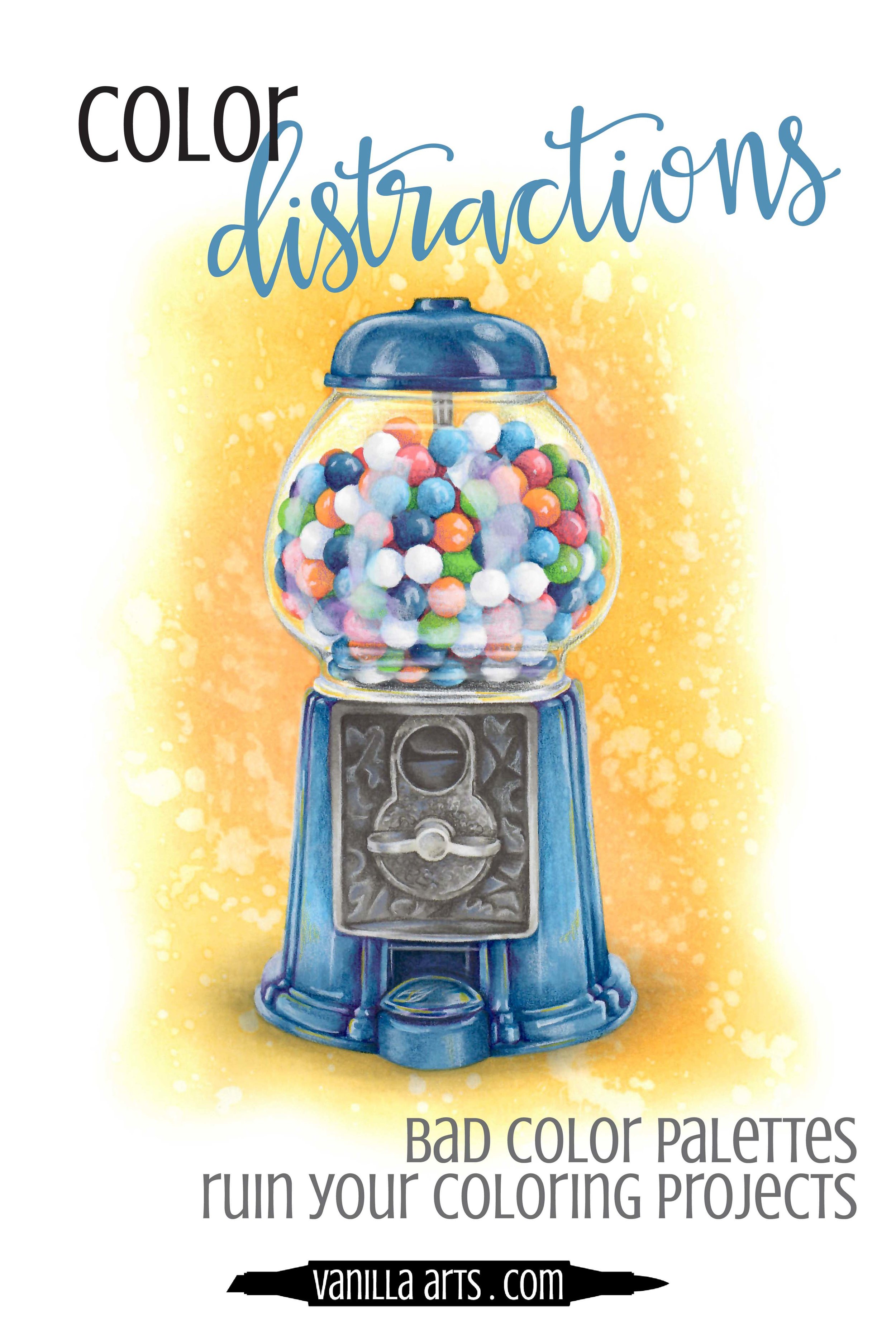
You have a fire hydrant in the image so you grab three reds. Then you color the bird in the tree with three yellow markers. Then you need some greens for the tree...
... and by the time you're done, it looks like Ronald McDonald vomited on the page. Color overload!
Instead, let's make a plan before we ever pick up a single marker.
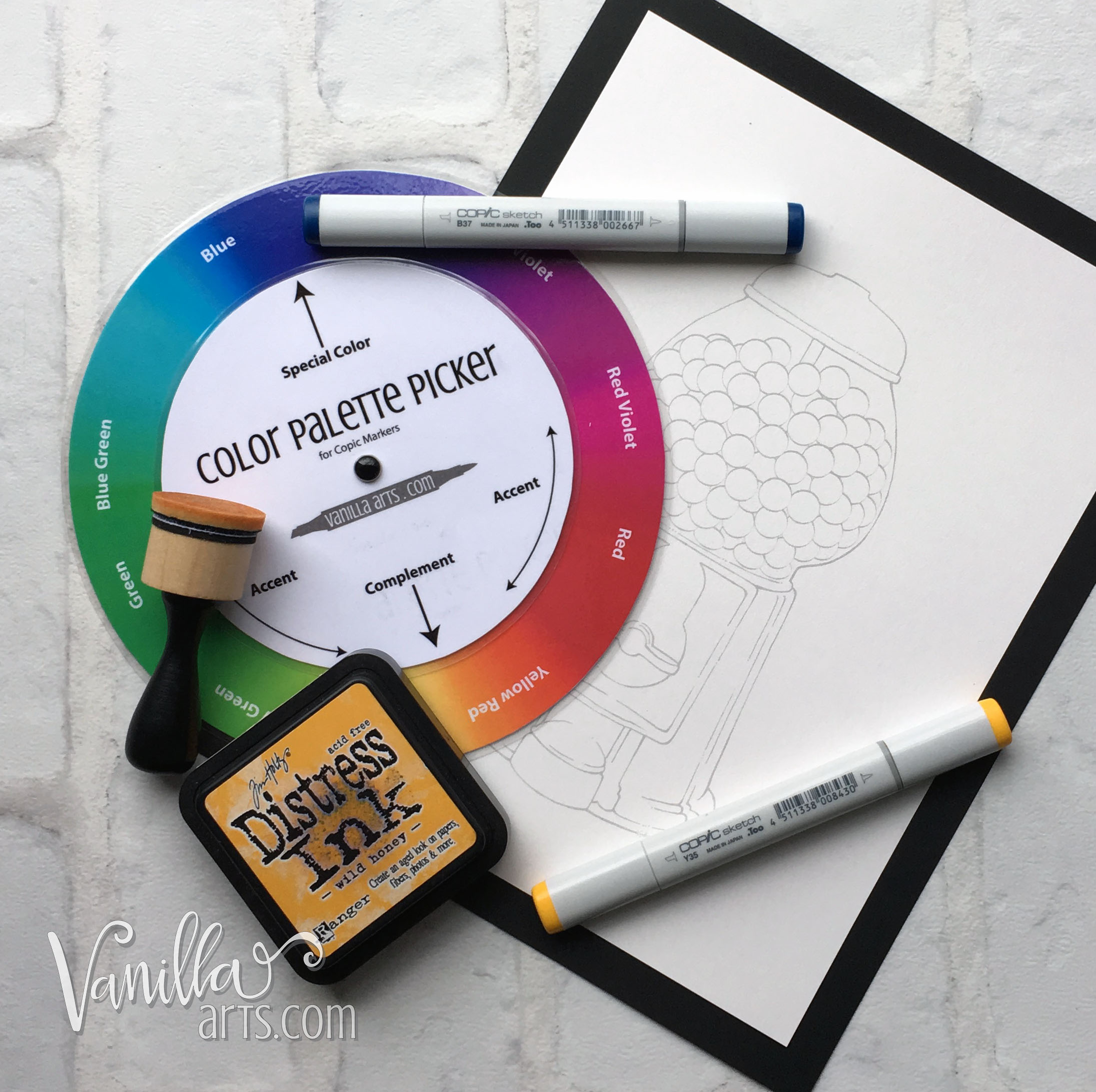
I'll be demonstrating with my FREE Color Palette Picker which you can download below.
1. Find the Focal Point in your image, then pick a color
Every image has a focal point- the thing in the drawing that's the most important.
If you can't decide the most important thing, try this experiment: Close your eyes and count to twenty. When you open your eyes again, what's the first thing in the stamp that grabbed your attention?

That's the focal point!
We want other folks to look there first too. If you overshadow the focal point with wild color everywhere else, your image won't feel cohesive or mature.
So what's your focal point?
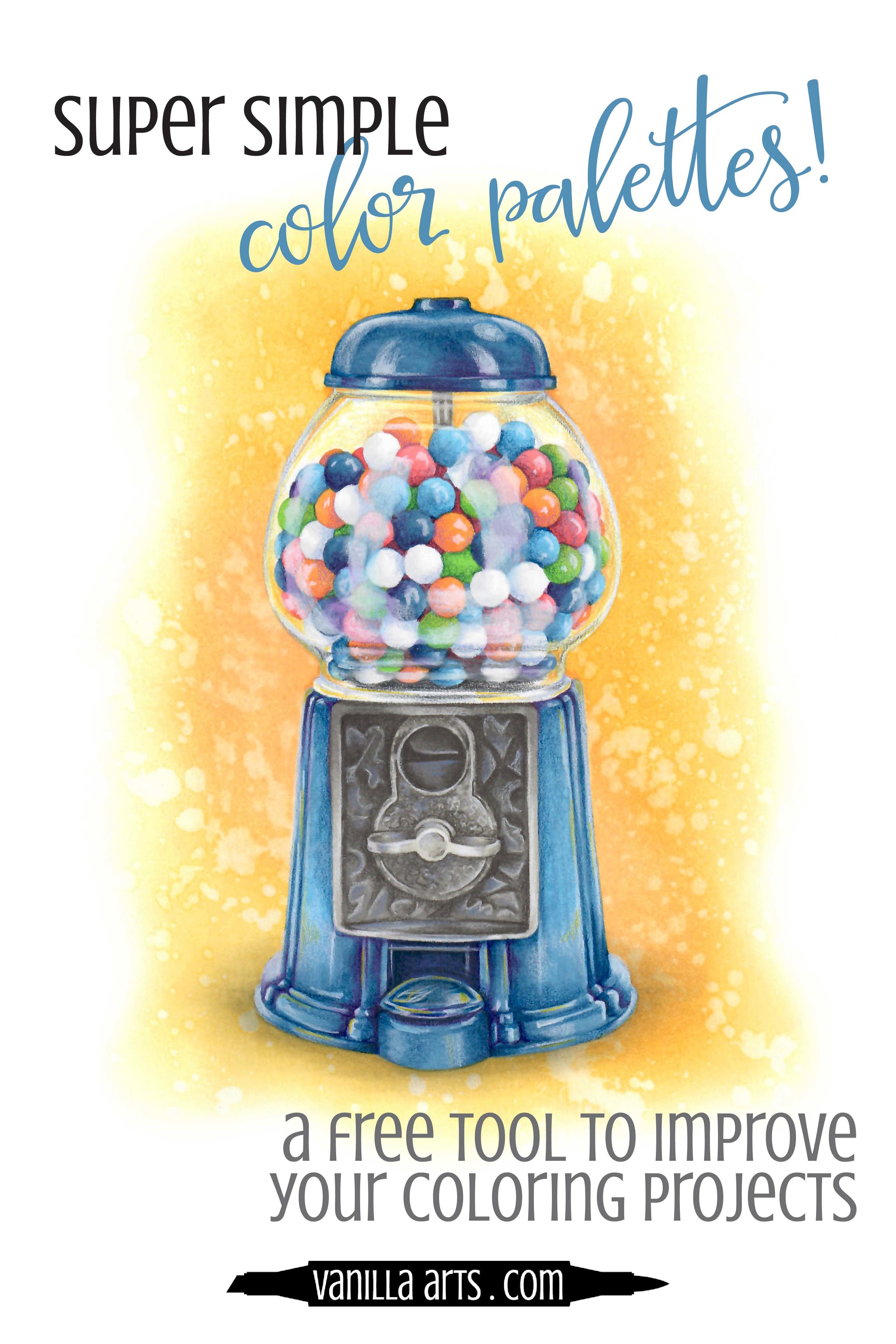
For my "Penny Candy" stamp, the main attraction is the gumballs but they are going to be multicolored. So the second most important thing in my image is the gumball machine itself.
Now have some fun: decide what color that object should be. Here's your chance to get creative or to use your favorite marker.
I've decided I feel like using blue today. I picked out B37. No special reason for that, it just happened to be sitting on my desk from a previous project.
I'm going to find B37 on the Color Palette Picker. You don't have to be super precise. Close is good enough!
By the way: If you've chosen a pale Copic, something that ends in a 4 or less, find the darker version of that marker. Look at your markers or a Copic chart and find the highest last number in that series (match the first number, increase the second number). Now find that darker color version on the Color Palette Picker.
So find the color of your focal point object on the outside of the wheel and point the "Special Color" arrow to it.
Got it?
2. Add a Complementary color
The "Complement" color is the color sitting across the wheel from your special chosen color.
Complements are fun to work with because opposites attract! There's a special electricity that happens between complementary colors and they look great together in art.
The complement of my B37 is a yellowish orange color. I've matched that area on the wheel to a Y38 Copic Marker.
I frequently use the complement as my background color. For most projects, I use a pale version of the complement but this time around, I've decided to use it full strength. Both approaches work!
Tim Holtz's "Wild Honey" Distress Ink matches my Y38 marker, so now I've got a background color PLUS I'll use the Y38-Y35 Copic combination on some of my gumballs.
3. Accentuate the positive
We've got gumball colors to choose next!

With the Color Palette Picker still aligned to B37 and Y38, focus your attention to the two side arrows indicating "Accent" colors.
Accents are colors that act like the complement but with a little less attitude.
Think of them as the backup singers for the true complement. (And for those of you who like to get technical, the accents are referred to as "analogous" to your chosen complementary color.)
Now accent colors are a little flexible, that's why there's a long arrow range instead of a precise pointer. You can choose any color that falls into that range.
Actually, you can choose something just outside of the range. Don't worry, it won't kill you. Just don't stray too far from the complement!
You don't have to use both accents either. Some images won't have enough objects for both. In that case, choose your favorite from either side.
But I've got lots of gumballs to color, so I'm living wild and going with a YG07 on one side and R32 on the other.
4. Double check your last numbers!
Balanced color palettes feature a range of color values.
The value is the last number on your Copic Marker. Light value colors have low last numbers and high value colors have high last numbers.
If all your chosen markers have similar last numbers, make some changes!
My gumball machine will run from B39 to B32; that's a really wide variety!
Let's keep it going with the gumballs, choosing markers which end in a similarly wide range.
My gumball markers end in 8, 7, 5, 3, and 2. I can color a few balls using my machine blues to add a level 9 marker to the gumball range. I'll even throw in a white ball and use a B60 for its shade. That gives me the widest possible range from pure white to a level 9!
5. Wheel of fortune?
Maybe you don't like the suggested complement. Or maybe you don't own any markers in the complement or accent areas.
No problem! This is coloring, not the President's nuclear football.
You can fiddle a little with the arrows, rotating the wheel a smidgen to the left or right and that won't damage the integrity of the suggested palette. I do this a lot, especially if there's an object in my image that requires a specific color (like a fire engine or a banana). Move it slightly to encompass the colors you need.
You can also turn it upside down!
Rotate the spinner 180 degrees, switching the special color and the complement. That will give you entirely new accent choices!
And bonus time!
Neutral colors like beige or gray are freebies. You can add as many of those as you need to complete the image.
The front of my machine has a metal plate which could be gold or silver depending upon my mood. I've chosen Warm Gray "W" markers to give it a tarnished antique look.
Need a green for florals? On the rare occasion when green doesn't appear in any of your arrow ranges, don't panic! Look at your complement and the accents. Are they warm or cool colors?
If your complement & accents are warm, choose a YG green for the stems and leaves.
If they're cool, choose a G green.
Cheaters win!
Now I know, some snooty color people think that color wheels are cheating.
If it ain't easy, it ain't art?
But that's silly. Most of us don't have time to sit through color theory classes learning the ins & outs of color usage.
And besides, I've sat through the color theory classes and darn'itall, we used a wheel there too!
Only we had to use our fingers to count these formulas out. "Cross the wheel for the complement, skip two for the analogous accents..." The spinner on my wheel does the finger stepping for you!
Color wheels are useful tools.
Use my free Color Palette Picker to simplify the planning process and maximize your coloring time!
Good color palettes make professional looking projects!
Play with color!
After all, isn't color what drew you to coloring in the first place?
Experiment with the wheel and get to know the Copic color families represented on it. Nowadays, I don't even need to spin the wheel. It sits on my bulletin board, just out of easy reach but that's okay. I can mentally spin the wheel for perfect color palettes every time.
Sophisticated and mature looking color palettes which direct the focus to special areas of your project are easier than you think.
You don't need special talent, art classes,or fancy degrees to create your own color palettes.
All you need is the right color wheel.
Let the color play begin!

FREE COLOR PALETTE WHEEL
Stop stressing about color palettes and find the perfect palette for all your Copic projects in seconds!
The FREE Color Palette Wheel is one of many amazing downloads in my
FREE DOWNLOAD LIBRARY
Library access is exclusive to subscribers of my weekly Color Theory Newsletter — Vanilla Beans. Every issue contains the top secret Library password plus the secret door to the library.
After subscribing, you’ll be emailed a link to the latest issue of Beans. Read through to the Library section, take the link, use the password, and download like crazy!


Take the Online Class!
Penny Candy is an advanced coloring class teaching how to see color as value. “Value Vision” is what helps you color red objects blue, which is exactly what we do in the class. The original gumball machine was red and you’ll see step-by-step how to color it with non-red markers.


Products used to color Penny Candy:
Purchase Penny Candy digital stamp here