
Details in Focus: Add Beautiful Color to Gray Copic Marker Projects (Grayscale Coloring Paper Recommendations)

A whole project with only gray Copic Markers?
How boring!
Actually no.
In the coloring world, grayscale is presented as a fun novelty technique. Something to try just for the heck of it.
But in the art world, gray is serious. Gray is how artists train.
Grayscale projects improve your coloring by teaching you to focus on value rather than color.
But oh, gray markers are so… uh… well… they’re gray.
Gray is drab and ho-hum.
Meh times 10.
Pssstt… gray is only boring if you color it boring.
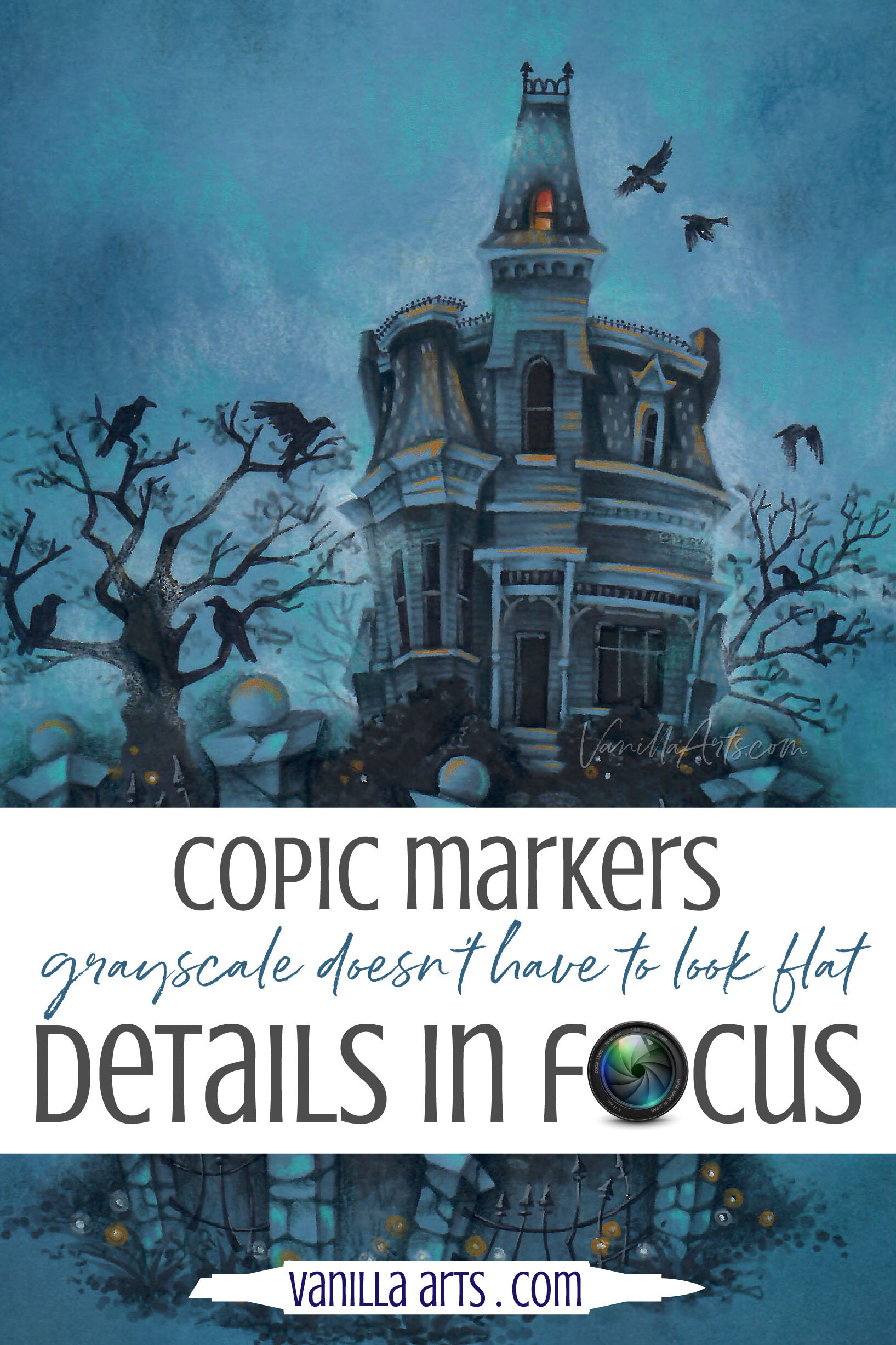
My spooky Nevermore Manor online class project is anything but drab. You can get the same beautiful effects from your gray markers on a wide variety of projects!

Grayscale coloring is only boring if you make it boring. Copic Markers are transparent; the ink adopts any color you place below it. Coloring on mid-tone jewel colored paper adds beauty and professionalism to value studies and gray palettes. We discuss paper brands for your next grayscale project.
The Power of Grayscale Coloring
Artists learn to draw and render shapes by working with a pencil.
By removing all color distractions from a project you’re left with just the values.
Value is the potency of a color: dark, medium, or light.
Working with nothing but gray values is a mental exercise which will improve your ability to create depth and dimension.
You can read more about why artists learn with gray in my article here. You’ll also find 6 tips there to improve your grayscale coloring

If you can make a drawing look like it has volume, depth, and dimension using nothing but gray values, it makes doing it with color a lot easier.
But you love Copic Markers because you love working with color.
So even though you understand the point of practice…
And even if you get the logic of training your eye to see shape and form in black and white…
The idea of using nothing but 10 gray markers holds little appeal.
In the article linked above, my first tip is to work on mid-toned or colored paper.
Adding colored paper to your routine makes grayscale practice much more entertaining.
Less drudgery and more of what you love— glorious color, color, color!
Today, let’s talk specifics about colored paper: Which brands work with Copic Markers and what types of color should you look at first?
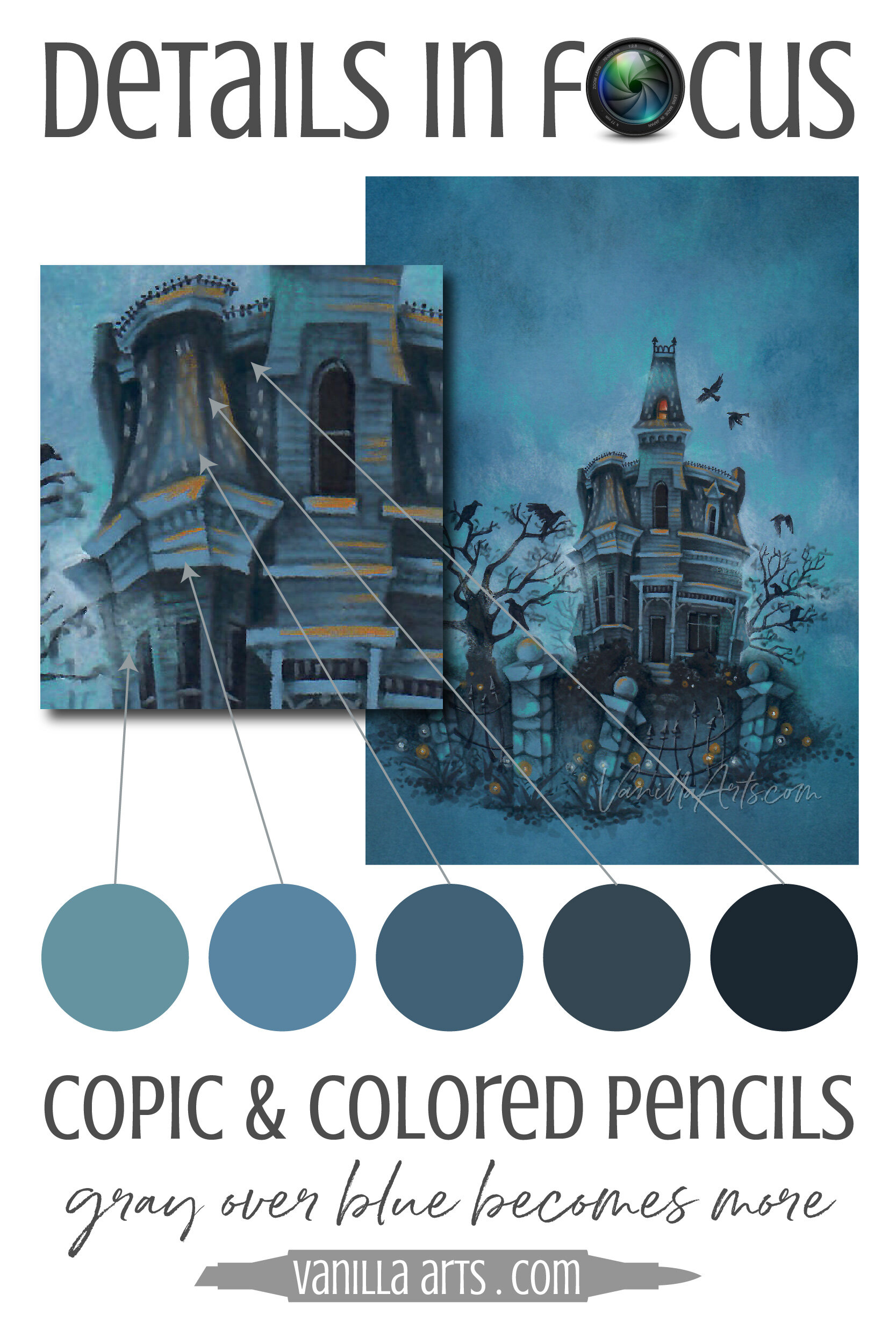
Gray Copic Ink is a chameleon
To demonstrate the versatility of gray Copic Markers, I sampled the color in several places of my Nevermore Mansion project with Photoshop.
I used 5 gray markers but it looks like a wide range of blue Copics.
All Copic ink is transparent. No matter how dark the ink gets, it’s still perfectly clear. This allows the color of the paper to shine through.
It’s really the best of both worlds— you’re training your brain to think in terms of value; practicing Push & Pull techniques to create dimensional objects.
But when you’re done, the finished project looks amazing!
I selected a blue paper to create a midnight haunted scene with murky clouds and creeping fog.
But this same stamp could be colored on a light bright blue for a softer, less somber feel.
In fact, when I taught the first version of this class back in 2017, the class used a pale aqua paper. A few students went home and tried it on lilac and even amethyst.
Same markers, different paper, totally different looks!
What is mid-toned paper?
Mid-toned is one of those artsy-artist terms which you won’t hear in regular life.
Mid is short for middle, as in a middle value. It’s a color that’s not too light or too dark.
Tone is the toning process, something artists used to do before the advent of colored drawing papers. Now we mostly do it in drawing classes when we want to use a pencil for the darks and an eraser to make the lights.
To tone paper, start with regular white drawing paper (or watercolor paper, or a canvas, etc) and apply a middle value of charcoal, conte crayon, pastel, a watercolor wash… anything that tints the entire expanse of paper to a medium color.
Mid-tone or Mid-toned paper is simply colored paper that has a medium color value.
Do I have to use gray markers?
No, not at all.
But it’s easier to visualize value differences with gray.
And gray Copic Markers are kittens when it comes to blending. Gray markers make value practice easier because you’re not battling the blending process.
But honestly, you can use any number series in any Copic color family if they have a nice assortment of light, medium, and darks.
Sadly, there are many holes in the Copic color palette. Some number series have just 3 or 4 colors. I love the BV20’s but there are only 4 values to work with (BV29, BV25, BV23, BV20). You can do it but it’s harder when there are fewer colors.
I highly recommend trying the B90’s (99, 97, 95, 93, 91) on blue paper.
And the E series has a lot of number runs with almost all the values. E markers look great on kraft or fawn colored paper! Try the E30’s or the E40’s.
Which mid-tone paper colors work with grayscale?
It’s entirely up to your taste.
The only rule: Don’t choose a cardstock that’s darker than all your inks. Dark ink on dark paper is practically invisible.
Obviously black paper doesn’t work but navy blue and chocolate brown are also hard to work with.
But other than the deepest colors, the color is entirely up to you.

If you buy a pack of mid-tone papers, you’re likely going to get a neutral assortment of grays, soft browns, and maybe a few sedate blues or greens.
I personally tend to choose cool colored mid-tone paper. Cool colors recede which makes your drawing pop forward.
But mid-tones can be any medium color you want!
Pastel colors like pink and mint are the easiest to work on (they’re technically not mid-tones but we can pretend because they’re so much fun to use).
No matter the color, testing is essential.
Let’s say you want to try red.
Sounds great, but keep in mind that the paper color will shine through every marker you use over it.
Pale grays like C2 or N3 won’t show up at all on red paper; you might as well be using water. And dark-ish grays like C8 can look black over red.
Test to see how your grays look on your chosen color before you get too excited about the project. If nothing under W5 shows up on olive cardstock and everything over W7 looks black, then olive is going to be very hard to work with because you’ve only 3 markers to use (W5, W6, W7).
Psstttt… don’t forget about colored pencils!
Prismacolor makes a large collection of amazing grays and many of them are translucent to almost opaque! You can use a lighter gray pencil to expand your gray marker color palette.
OR you can do what I did in the Nevermore Manor project. Add pops of something bright like orange and aqua pencil to create points of interest and highlights.
Test markers for visibility. Test the paper for compatibility.
I frequently test new papers as I find them in art stores and scrapbooking shops. You can test too.
There are many colored cardstocks that work moderately well with Copics. Test your paper stash to find them.
Warning: Copic bleeds through a lot of standard (non-marker) papers.
I happen to be of the school that doesn’t care much about bleed-through. I color on a glass surface so if my paper leaks, it’s not a big deal to clean up the mess with rubbing alcohol. But it drives other people nuts. C’est la vie.
Test 1: Coating
Many papers have coatings applied at the factory. Watercolor papers are sprayed with a starch called “sizing”. Photo papers are sprayed with polymers. Decorative papers may have gloss, glitter, or even photographic overlays.
Copic ink can often melt or dislodge coatings. You may see smearing, dark streaks, or the ink may absorb more/less in certain areas. If the solvents in Copic ink melt a coating, the residue can clog your nibs.
Avoid coated papers. Polished paper surfaces are fine but coated surfaces are usually a no-no.

Test 2: Feathering
Any paper with a high cotton content and/or really long paper fibers will spread the ink out from where you place the color. You might draw a thin line but the ink seeps out along the paper fibers creating a fat wooly caterpillar looking line— that’s feathering.
Feathering makes it hard to color accurately and stay inside the lines.
Also, feathering papers tend to be highly absorbent, so you’re wasting a ton of ink to get messy looking results.
Test 3: Blendability
Cotton content (also called rag) can make blending a bit of an issue. Some paper fibers grab ahold of the ink and refuse to let it blend. Don’t fight with a paper just because you like the color.
No paper color is worth the heartache you’ll experience if the paper won’t allow blending.
Test 4: Absorbency
Markers work best on paper that’s slightly resistant to ink. The best blending cardstocks let the ink sit on the surface of the paper longer, keeping it wet, allowing you more blending time.
A paper that acts like a sponge will suck your markers dry faster but it will also wick the moisture into the core of the paper, shortening your “open time” when the ink can be blended.
You’re unlikely to find a colored paper that’s absolutely perfect for Copics but you will find many that are okay to mediocre. Paper doesn’t always have to be “the best” to look great.
Give your paper stash a look-through. You may find a hidden gem!
Recommended Mid-Tone Paper for Copic Markers
Please note: none of the following brands are recommended for regular everyday Copic coloring. These all meet the 4 tests I listed above and can be used for grayscale practice and the occasional fun project.
I would also note that grayscale value studies and colored paper are NOT beginner level projects! I recommend that beginners learn to blend on a quality WHITE blending cardstock like X-Press It Blending Card. XPI makes the learning process easier. Once you’ve mastered basic marker techniques like Flicking, Blending, Swishing, and Fences, then you can try coloring for depth & dimension.
Here are the colored papers and cardstock I use with Copics and colored pencils

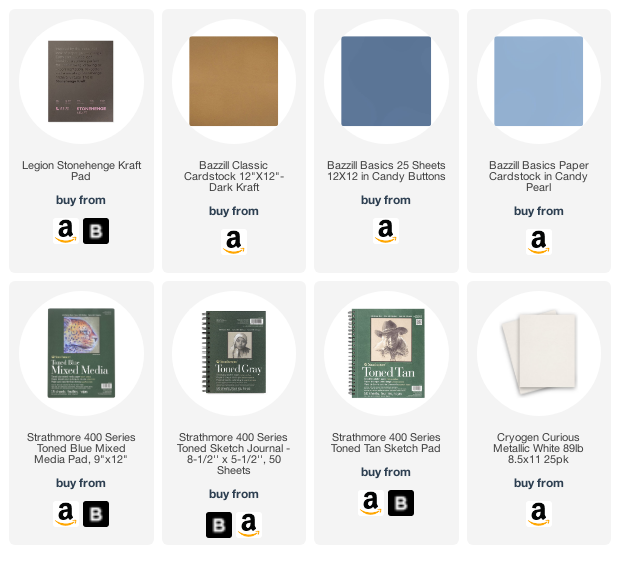
Stonehenge Kraft - Stonehenge makes an entire line of mid-tone drawing papers but it’s a bit thin and it feathers. Avoid their midtone line. Instead, look for pads marked “Stonehenge Kraft”, It’s a sturdy weight, the markers don’t bleed, and it’s toothy enough for colored pencils. Love this stuff!
Bazzill Classic Cardstock - Sold in scrapbooking stores and on cardmaking sites, Bazzill has a gigantic range of colors to try. Some feather more than others. Nevermore Manor here was colored on Bazzill “Candy Buttons”. Avoid the linen textured line of Bazzill; it has a slight coating and the weave impression is terrible for pencils.
Strathmore 400 Toned Mixed Media - Sold in art stores and some craft stores, this 185lb. cardstock comes in blue, gray, and tan. It works moderately well with both markers. Warning to digital stamp colorers, this cardstock may not run through your printer.
Recollections Cardstock and Astrobrights Cardstock - Sold at many big-box retailers like Michaels, Hobby Lobby, Walmart, and Staples. This will be hit/miss by color, I have not tried them all and some feather a lot more than others. Both brands are a step down from Bazzill but some are not terrible. The light and dark kraft colors seem to work well. I’ve also had good luck with a few blues and purples. Recollections tends to work better with colored pencil than Astrobrights (which is a tad smoother). But if you want economy paper, this stuff will work.
Bonus Tip: Tone your own paper!
I regularly teach Copic + Colored Pencil classes on Cryogen Curious Metallic White (discontinued, 2023) and Strathmore Bristol 300 Smooth (Amazon link).
The beauty of Bristol is that it can be tinted or toned with ink pads. See below for examples of hand toned class projects.
Classes which feature my toning technique:
(Click to visit the class info page).


Ready to try challenge level coloring?
Ready to try challenge level coloring?
Nevermore Manor an Intermediate Challenge level Marker Painting Workshop
Learn how to apply the storytelling process to your next digital stamp. Can you color this same image for other holidays like Easter or Christmas? You can with our helpful personality guide.
Real time coloring, recorded live
Live Workshops are unscripted demonstrations which provide students with a real look into the authentic coloring process. You’ll see mistakes being made and corrected. It’s just like visiting Amy in her home studio.
Log in and color with Amy at your convenience. Anytime access, no expiration dates.
Class was recorded in October 2020 and featured a live student audience. Amy answers questions from the students and offers many tips for better colored pencil art.

Paper recommended in today’s article:
Vanilla Arts Company is a participant in the Amazon Services LLC Associates Program, an affiliate advertising program designed to provide a means for use to earn fees by linking to Amazon.com.


