
Copic Marker & Colored Pencil Mixed Media: Less Pencil Than You Think
I am a mixed media artist
Well, at least technically.
My projects do not look like the typical mixed media. I don’t glue photographs to a board and drizzle paint everywhere… but that’s the point. This is subtle mixed media.
I use a combination of Copic Marker and Prismacolor Soft Core Colored Pencils but I use them in a way that’s cohesive and seamless.
If I didn’t tell you I was mixing media, you’d never suspect.

Sneaky, eh?
So why am I even mentioning this?
Well, because as soon as people figure out why my Copic coloring looks different than all the other marker coloring out there, they try mixing media on their own.
Which is great. You’ve got the supplies; let’s see what you can do with ‘em!
But frankly, there’s not a lot of subtle going on out there. And honestly y’all are making this much too difficult.
That’s why I’m writing this article. Because it’s not the ingredients that make it look special, it’s the harmony.
Ohmmmmm…
Yes, we’re being very zen today.
If you want a subtle look, you can’t color like a paint-splashin’ glue-stickin’ stencil-pouncin’ mixed media artist.
Overdrive makes it look overdone.
The key to mixing media for realism is balance and restraint.
You can’t let the mixed media-ness dominate the project.
Don’t let the supplies overpower your message.
Let’s look at how to find balance between your markers and pencils.
I use less colored pencil than you think
In my classes, courses, and projects here at Vanilla Arts, you’ll find a variety of media mixes. I’ve got:
But here’s the catch, it’s never a 50/50 mix.

One medium always takes center stage.

Everything else is a bit player. It’s never an equal mix.
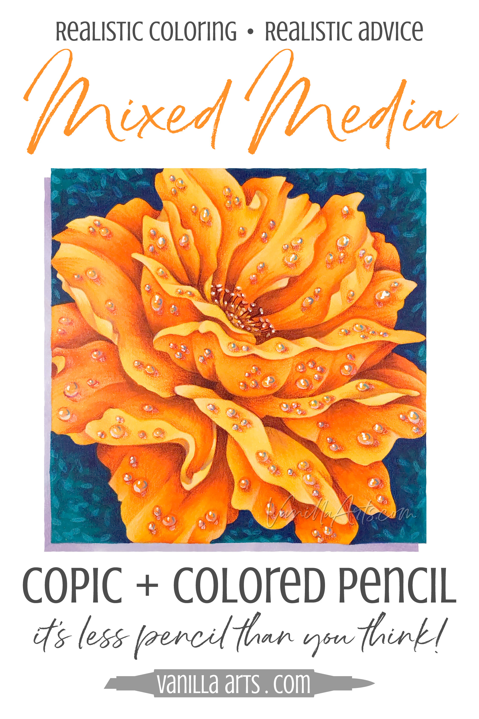
The Autumn Dew project shown here is a Copic Marker painting with colored pencil details.
That means it’s heavy on the marker and light on the pencil.
Autumn Dew is at least 80% Copic. Most of what you see here is pure Copic without any colored pencil on top.
This project took me about 2 hours to color. Of that, only the final 30 minutes were with pencil. Most of the pencil time was spent on the dew drops, not adding pencil to the actual flower petals.
The bright orange and the light orange you’re seeing in the image is straight Copic.
When you try to make the project an even 50/50 split, what you’ll find is that the coloring takes on an overworked quality.
If I spent 2 hours on the Copic and then another 2 hours on the pencil, that’s 2 hours too much. The coloring doesn’t get any better after it has reached its maximum potential point. More is always less.
Everything that you add beyond the finish is too much.
So let’s look closer at how to know when to call it quits and how to keep from overworking your Copic Marker paintings with pencil.
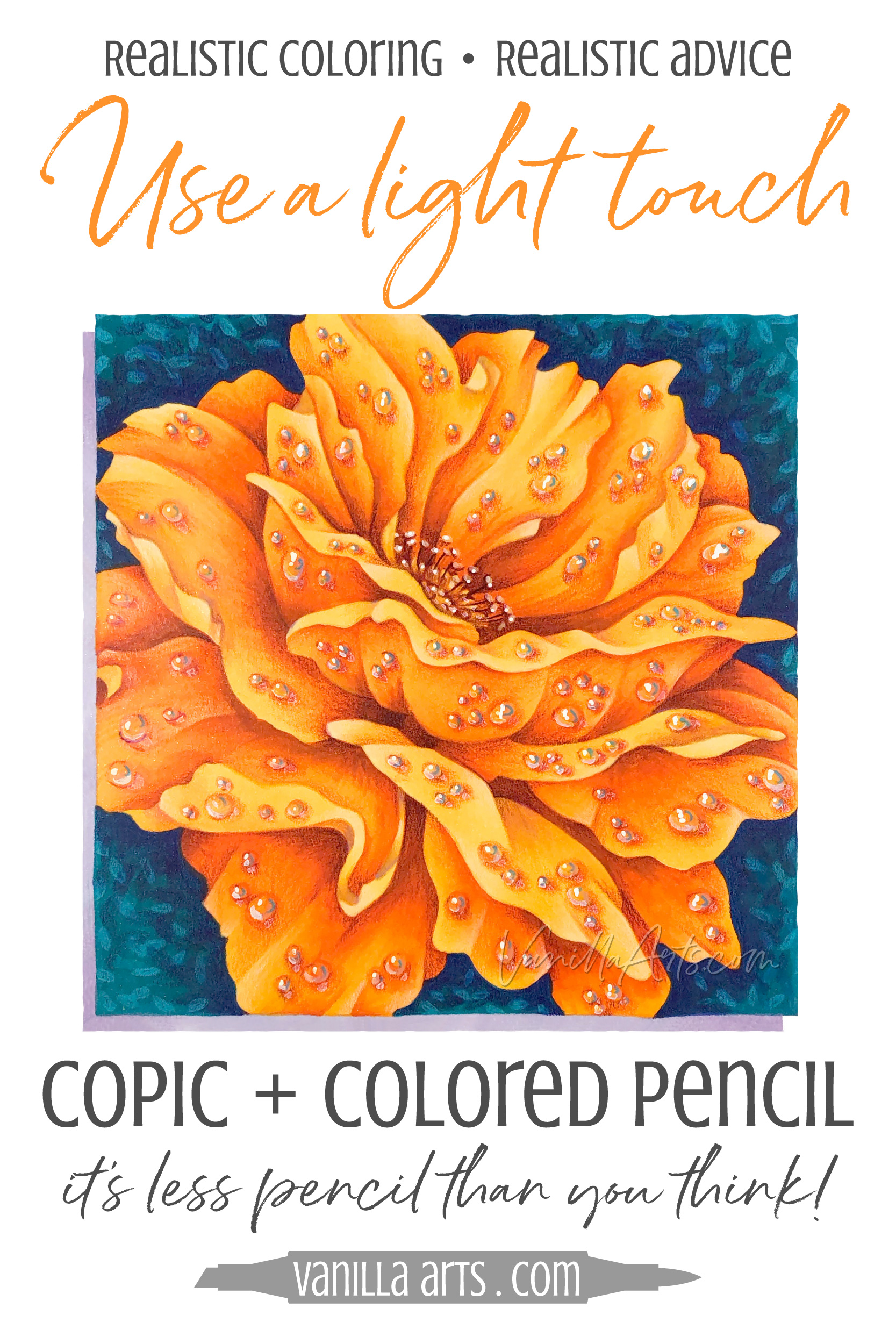
A light touch
I just got done telling you that I use less colored pencil that you might assume.
But now I’m also warning you that my less pencil is lesser than less.
The number one way to spot a newbie in my classes is that they press way too darned hard. We call it “the Hand of Thor” but it’s basically just adding pencil with all your might.
It’s not enough to use fewer pencils and to use fewer layers. You also have to apply the pencil very very gently.
Burnishing is bad.
Here’s the thing to keep in mind:
You can always add more pencil if you need more— it’s much harder to remove excessive pencil.
I don’t do the pencil all in one shot. I lay down a whisper of pencil and then I move on to the next area. A little bit later, I’ll let my eye wander back to the first area and if it needs more, I’ll give it another gentle nudge.
Baby steps.
Take it easy. Take it slow.
Let the color slowly grow.
Use artist grade colored pencils
I know you just spent a kazzillion dollars on Copic Markers and your credit card is still smoldering.
So you save money by purchasing a double ended set of 12 colored pencils because it gives you more colors.
Or you dig out the fancy gold finished pencils that came with some stationary you bought a few years ago.

Or you read at ColoringBookQueen.com that her dollar store pencils look good in the Fairy Fantasma book from Michael Ann’s Lobby.
Hoo boy, are you in for some tears and anguish.
Cheap pencils are hard and crumbly so they dig ditches into your paper. Or worse, some are sticky and slick and won’t stick to the paper without Thor’s help.
Cheap pencils act like cheap pencils.
And either way, they’re all low on pigment so you’re going to get wan and nasty color.
You can’t make soda pop into Dom Perignon.
If you are new to my mixed media approach, then you’re learning lots of new stuff. You’re thinking about where to put the pencil, what stroke to use, what pressure to use, which color to use…
Do you really want to be fighting with a crummy pencil too?
I know artist grade pencils look like a big investment but they’re easier to learn and easier to use.
And they look better too.
Artist grade pencils are worth every penny.

Use translucent pencils
What color pencil did you use on the base of the petals?
I’ve lost count of the number of times people have asked me what color went where.
But no one, NO one. No one has ever asked me the most important question:
How transparent was the pencil you used at the base of the petals?

All pencils have different translucencies. Some are highly opaque and some are translucent.
This is an important factor to know.
In the Autumn Dew project shown here, I’ve used Prismacolor 931 Dark Purple at the base of each petal to shade it and push it deeper.
But knowing that I used purple will only get you so far.
It’s not enough to find a similar color. Opacity is more important than the actual color.
Translucent purple over orange Copic looks like shaded orange.
Opaque purple over orange Copic looks purple.
Big difference!
Use a good quality artist grade pencil but make sure it’s fairly translucent.
Translucency helps you keep the pencil subtle.
Enhance the Copic marker
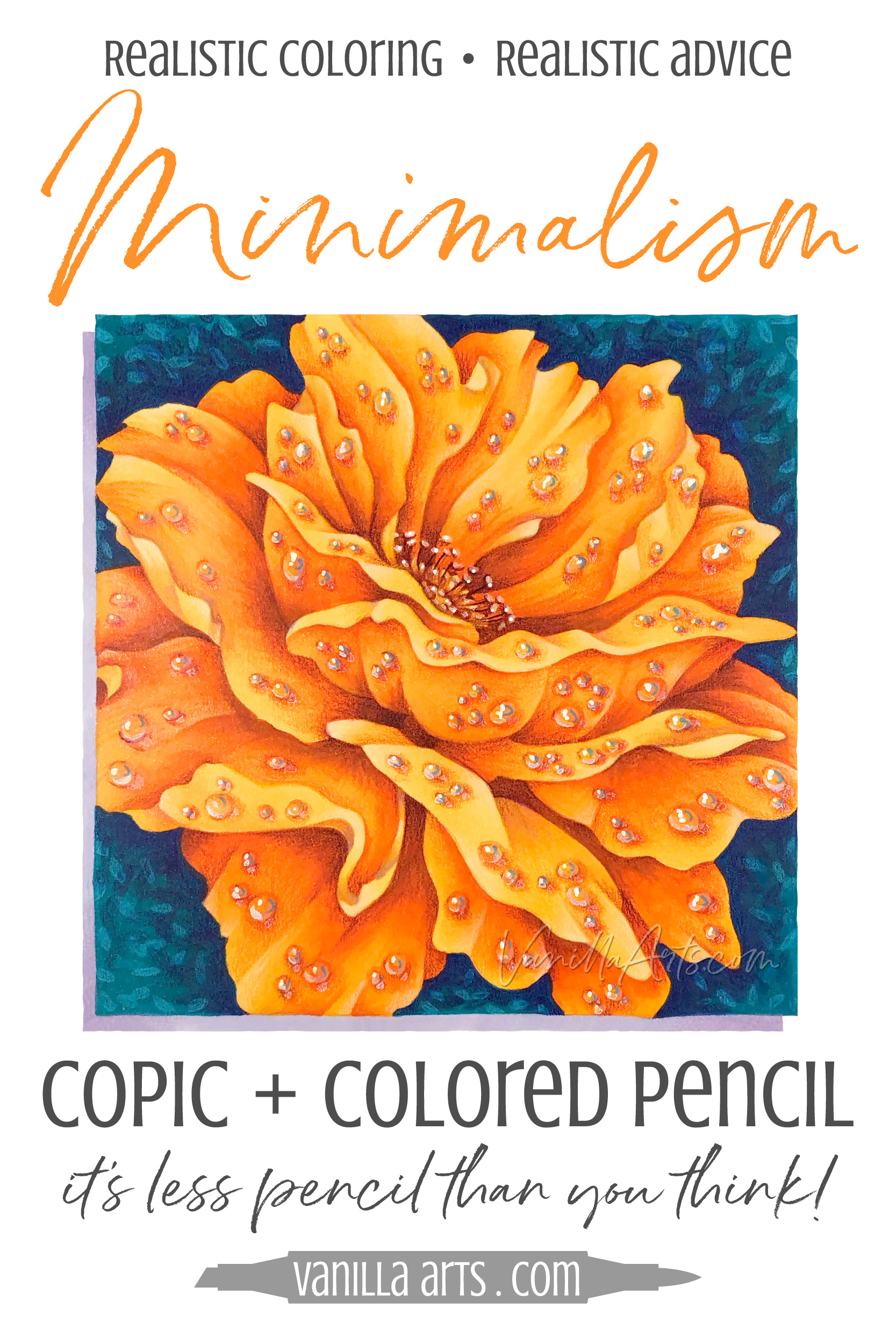
Take a minimalist approach.
If you’re spending a ton of time making perfect Copic blends, the last thing you want to do is spend a ton of time making perfect pencil blends over the top of your perfect Copic blends.
Ugh, that sentence was clunky!
But when you color that way, it looks even clunkier.
If it’s a marker project then we should see mostly marker.
Let the pencil enhance and improve the marker rather than hide it.
For the Autumn Dew petals, I use a Dark Purple pencil to make some of the deepest areas of Copic look slightly deeper.
But pencil is the finishing touch, not a whole layer.
We’re not trying to hide the marker, we’re making the marker look better. More intense, crisper edged, or pushed/pulled for dimension. It’s not a coverup, it’s an enhancement.
Think about grandma’s drawn-on eyebrows. Do it subtle and it looks great. But it it’s heavy or if they’re wandering way up on her forehead? That ruins Thanksgiving dinner for everyone.
Too many people bury a beautiful blend with a thick layer of mediocre pencil.
Underpaint for depth first
As I hinted above, the depth in the Autumn Dew petals is created not with orange but with the color purple.
And I talked about enhancing the depth with a Dark Purple Prismacolor pencil, right?

But the pencil layer wasn’t the first time purple was used in the image.
The petals all started with layers of purple marker long before I added the first purple Prismacolor.
Most of your shading should be done with Copics first, not pencils after.
If you wait until pencil time to add the murky shade colors required for realistic depth, you’re doomed. The amount of pencil required to push something that has never been pushed before is way too much to look good.
The pencil does not make the shade, it makes the shade shadier.
Markers and colored pencils are not the same. Markers are completely transparent and they transmit light. Pencils range from semi-translucent to semi-opaque but they all bounce light.
That’s a sciency way of saying that purple from a Copic looks completely different than the same shade of purple from a pencil.
Markers and pencils are not interchangeable.
The shady pushes need to be there from the start in order to look the most natural. You can’t slap it on later.

Check out Amy’s favorite art supplies, click above.
Original colors
Sit down.
I’ve got some crazy news for you.
Are you seated? Are you braced? Are you ready?
I did not use orange pencils in the Autumn Dew project.
Nope. I used purple, light red, lavender, yellow, cream, and aqua.
No orange.
Why not?
Well, what would be the point? I colored the petals orange with my Copic Markers, so coloring them orange again with pencils is redundant.
Same color over same color is a waste of time.
You’re not adding anything new.
If the color in your hand is the same as the color already on the paper, then stop. You are overworking the project.

Use your eraser!
The biggest lie your grade school teacher ever told you… and we all know by now, she was wrong about a lot of things…
Like where is my permanent record? I didn’t get lead poisoning. No, my mother wasn’t ashamed of me for saying that word. And why don’t I have a flying car yet???

Anyhoo, the worst lie we were taught is that erasers are for mistakes.
Sure, if you’re using an eraser in algebra then maybe you did make a mistake.
But life isn’t algebra class. Art isn’t algebra class.
And I’m still miffed about the flying car thing.
An eraser is not a dunce cap.
Erasers are tools.
In fact, the eraser might be the most important tool you own.
Using an eraser is not an admission of failure.
I use sticky tack erasers to gently lift minimal amounts of color and to soften the fade-out of pencil color.
I use a white eraser to smudge color and ease graininess.
I use a black eraser to lift color up completely so that I can do the same exact thing a few millimeters to the left or right.
I clean my margins with magic erasers.
I lift oils or smears with a dead mouse (powdered eraser).
When you lay down too much pencil and it starts to overpower your Copic, it’s not a mistake, it’s a lesson. Learn from it.
The only mistake you can make is not to make it look better with an eraser!
Go ahead. It’s okay.
Erase and try again.
Mixed Media is easier than you’re making it!
You can get great results from mixing Copic Markers and colored pencils, it doesn’t take a ton of talent.
What it takes is a sense of balance and restraint.
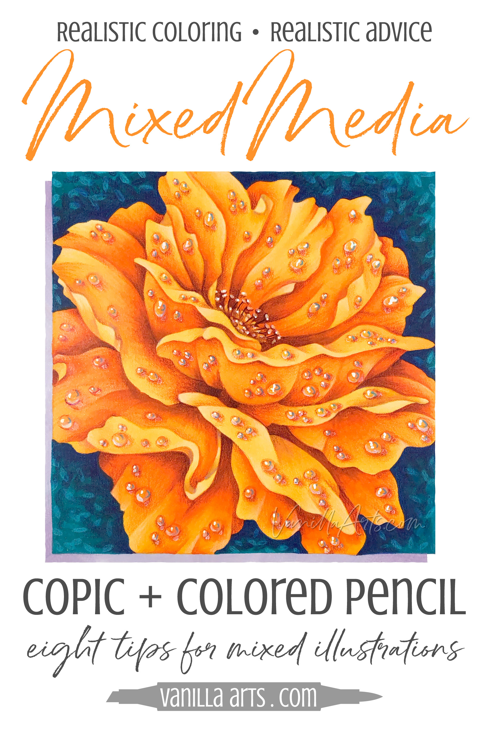
Remember these 8 Mixed Media tips:
For amazing Copic + Colored Pencil projects
Mixed media doesn’t have to be half & half
70/30 is my usual ratio of marker to pencil. Sometimes it’s 80/20.
Use less pencil than you think you need
Soft pressure, a light touch, and fewer layers look much better than Thor’s wrath.
Use artist grade colored pencils
You pay for cheap pencils in frustration and tears.
Use translucent pencils
Complex and sophisticated color comes from translucent layers.
Enhance the Copic Marker
Don’t hide your beautiful, glowing, (and expensive) marker inks!
Underpaint for best depth
Begin by addressing depth and you’ll end with better results.
Don’t double-over your colors
If you’re coloring orange over orange, you’re doing it wrong.
Use your eraser!
It’s not a mistake, it’s an opportunity for improvement.

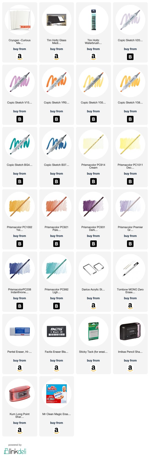
Supplies used in Autumn Dew:
(Affiliate links)
Stamp = Rose Friend from Stampendous
Vanilla Arts Company is a participant in the Amazon Services LLC Associates Program, an affiliate advertising program designed to provide a means for use to earn fees by linking to Amazon.com.


Lorem ipsum dolor sit amet, consectetur adipiscing elit. Vestibulum id ligula porta felis euismod semper.