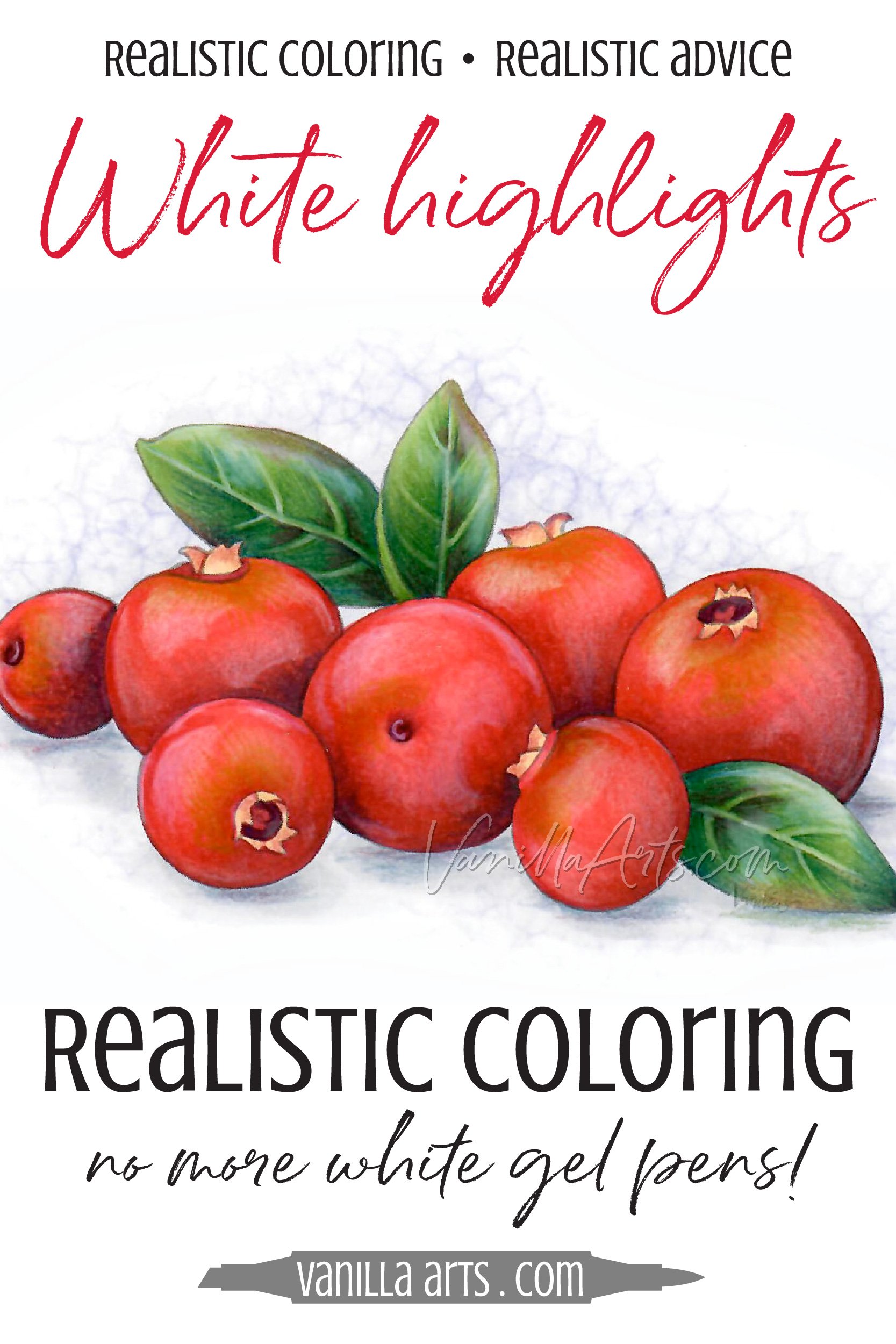
Do Not Use White Gel Pen for Realistic Highlights (Copic Marker, Colored Pencil)

What’s the Best White Pen for Copic Marker Highlights?
I get this question a lot— as if you think the reason your highlights look weird is the brand of pen rather than your coloring technique.
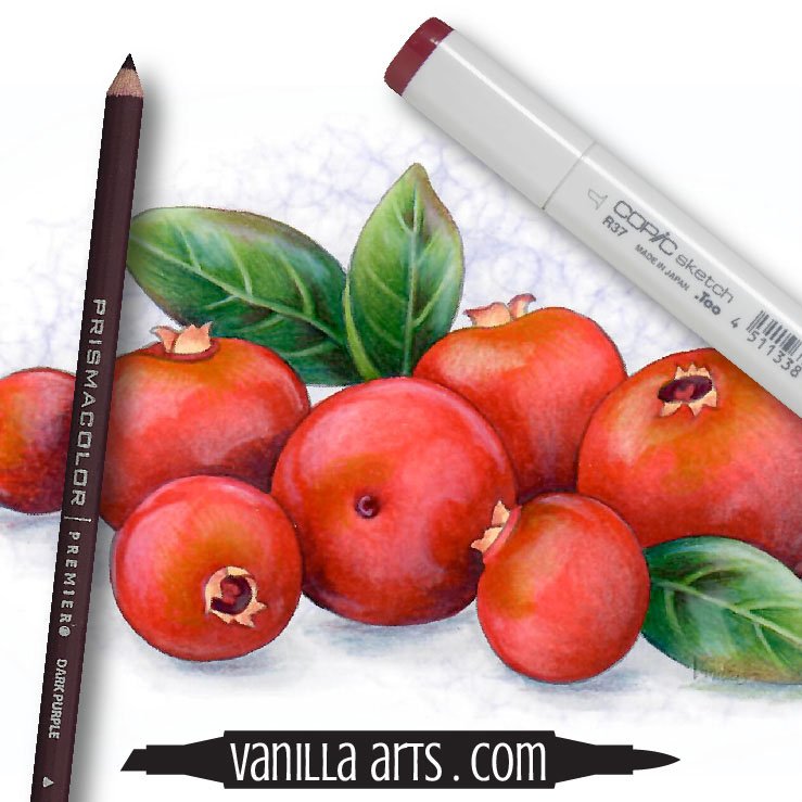
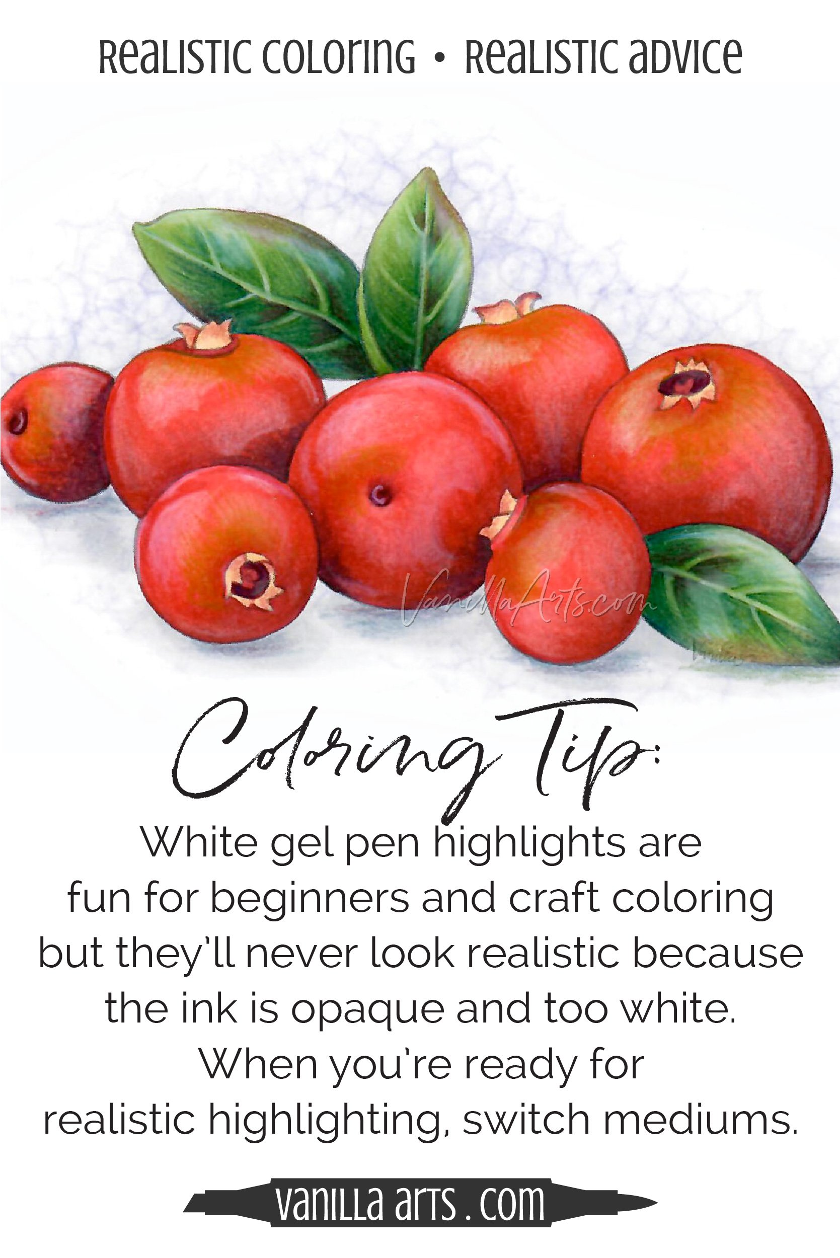
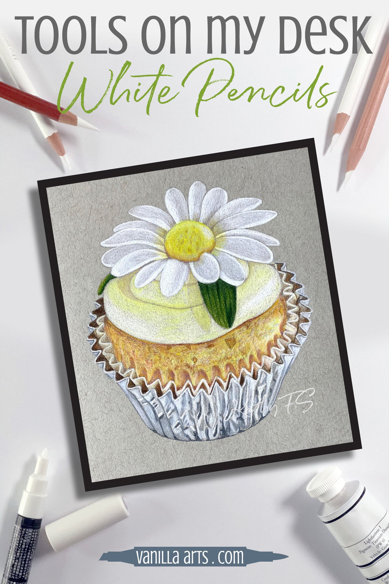
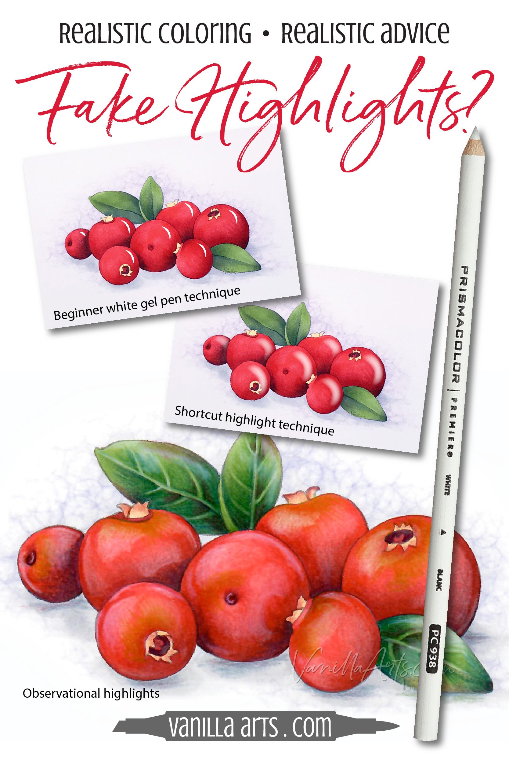
“Festive Cranberry” by the author, Amy Shulke. This original line art was colored with Copic Markers and Prismacolor Premier Pencils.
My class projects look different…
And people assume it’s because I’m teaching different techniques…
In reality, I don’t teach techniques at all.
No techniques?
Nope. Not really.
Coloring techniques should actually be called shortcuts or hacks.
Shortcuts lead you into the mindless coloring trap where everything looks the same because you’re using the same hack on everything you color.
No shocker there, right?
If you’re coloring cranberries with the same technique you also used on a fuzzy brown bear or a frosted cupcake…
And if you’re using the same white gel pen technique on them all?
You’ve got realism problems.
Today, let’s look at why the white gel pen highlighting technique leads to cartoonish coloring.
Plus, I’ve got a few tips for better highlights on your next marker or pencil project.
Read more about highlights here:

Gel Pen Highlights are a Beginner Technique
Experienced colorers kinda squirm in their seats when I call white gel pen highlights “beginner level”.
But wait, Amy! I’ve been coloring for years. I’m not a beginner! I add highlights with white gel pen all the time.
I’m not trying to sound mean but we’re kinda stuck. We don’t have a word for “person who uses beginner shortcuts for ten years.”
You’re equating time spent coloring with artistic skill. Art doesn’t work that way.
Look, if you’re someone who colors for fun or relaxation, then this article is not for you.
There’s nothing wrong with white gel pen highlights for casual coloring.
If you like the look, keep doing it!
And gel pens have a place. Crisp white highlights are perfect for genres such as manga and heroic comic illustration.
But don’t pretend it looks real.
Beginner shortcuts never look realistic.
The easiest way for an instructor to teach glossy highlights is to have everyone grab a white gel pen and make little comma shapes in the top right corner of everything.
Commas are easy to understand. Anyone can make a “c” shape.
Later, some of you realize how flat gel pen highlights look. At this point, many start substituting white pencil for pen, making softer comma shapes.
But there’s the catch… pencil highlights may look better than gel pen highlights but they still don’t look realistic.
Why not?
Because real highlights are not comma shaped.
Artists should be careful observers.
And if you observe highlights in real life, you’ll quickly notice that highlights are not always in the top right corner of an object. They’re not C shaped and they’re not usually white.
Quick & Easy = Fake
The key to a fun beginner class is to give every student lots of little victories.
Blending is a skill which takes time to master, so an entertaining instructor will add cute distractions to give you a quick win. Small “hooray!” moments keep you from feeling bad about your beginner blending skills.
White comma highlights are an easy score.

I use shortcuts in my beginner classes. All good teachers want you to leave feeling positive and encouraged.
The problem is: You ca’t be doing the same beginner shortcuts, years later.
When I teach realistic highlighting in advanced classes, I show how to do things the painterly way. The extra effort provides more realistic results.
Here’s a closeup of the photo reference for the center cranberry in my Festive Cranberry class.
Look at the shape of the cranberry highlights.
See any commas?
No?
So what is the shape of the highlight?
Well, which one? There’s a bent parallelogram with a thin stripe of light along the lefthand side that kinda stops halfway down but then makes a triangle…
These weird shapes are not easy to describe, are they?
But this is what we do to create realism.
Artists look deeply and follow the shapes of light and color with our eyes, then we try to duplicate these indescribable shapes on paper or canvas.
Observational highlights look more realistic because they’re based on reality.
Important Tip: Don’t Highlight Too Early!
Many colorists focus on highlights at the start of the project.
You try to color highlights with a lightest marker in their blending combination.
For example, color the berries here with R29/R27/R24 but first, you’d color the highlight areas R00.
I think this is a mistake.
Highlights look more realistic when you add them at the end of the project rather than starting with them.
Remember, the highlight isn’t part of the cranberry. A highlight is light shining ON the cranberry. There’s still red underneath the highlight!
I teach students to color the shape of the cranberry first— creating believable, realistic spheres. We capture the realistic shape (called the “form”) before we worry about superficial details like highlights.
Form is ALWAYS more important than color!
At the end of the project, once you have realistic spheres with accurate values for dimension and the right value of shading for depth… that’s when we finally look for highlights.
Then, when we add the highlights, we use translucent pencil so as not to hide the dimensional shapes we’ve created.
Highlights add sparkle and decoration, they’re not essential shapes.
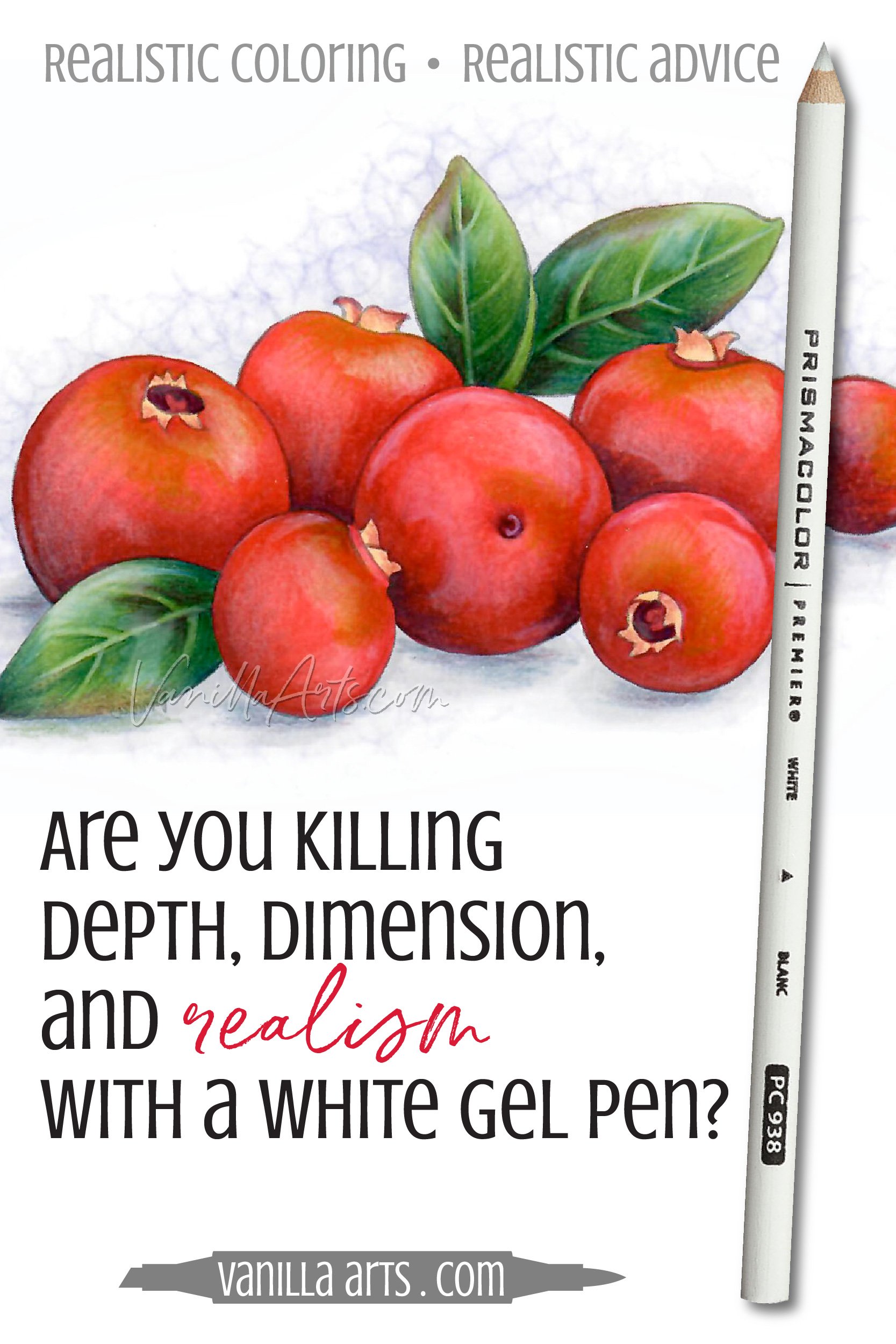
Stop looking for “the most opaque” white gel pen
Every colorist is always looking for the next best, new, and greatest gel pen.
You’re looking for the whitest white and the most opaque.
You’re seaching for something you don’t need.
Sakura Gelly Roll, Uniball Signo, Pentel Hybrid, or Happy Panda Funtime?
It doesn’t matter.
They all make heavy white lines.
Real highlights are not heavy opaque bright white.
They just aren’t.

Psssttt… White ink bounces light back at your eyes rather than absorbing light.
So white gel pen visually pops forward in a way highlights never do.
Tips for Observing Realistic Highlights:
There’s nothing magical about seeing highlights. Anyone can do it! Don’t use lack of talent as an excuse!
Oddly enough, kids are better at observing the shape of highlights than adults because they go into it without years of preconceived notions. Get the idea of hard white commas or soft white circles out of your head. Open your mind to the possibility of strange shapes and unexpectedly subtle colors.
Spend more time observing real highlights. It doesn’t have to be anything you intend to color. Even studying the highlights on the bathroom doorknob is beneficial!
In the beginning, it can be easier to observe highlights in professional photographs than in real life. Photographers often set up ideal lighting conditions to create beautiful (and more obvious) highlights. It’s easier to find the highlights in our Cranberry photo reference than it would be to find them in a pile of cranberries on your kitchen counter.
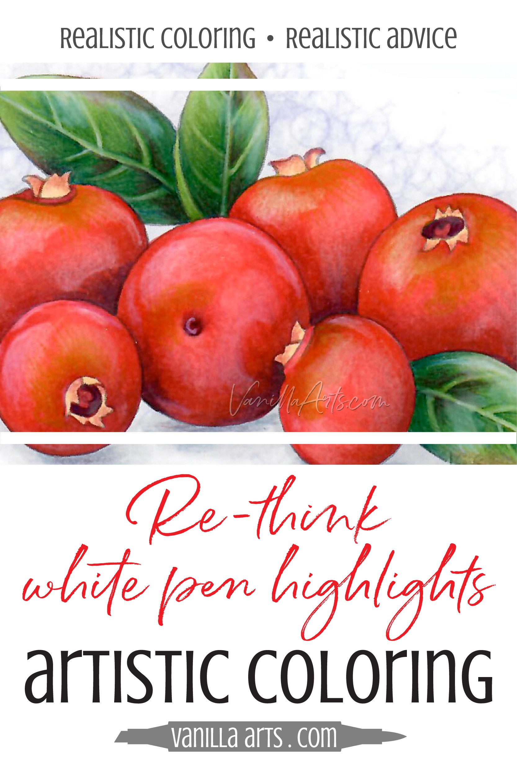
Keep in mind that sometimes, you’re not looking at highlights— sometimes it’s a reflection. The shape of the highlights on our cranberries here make more sense if you can start to notice the shape of other cranberries reflected on each berry.
As you observe highlights, look for hard and soft edges. This is called edge quality and it’s an important detail to add to your projects. This is another reason why white gel pens fail, you can’t make soft edges with heavily pigmented opaque ink. By the way… do you notice a correlation between the finish of the surface (high shine or matte) and the crispness of the highlight’s edge quality?
C shapes and commas sometimes do happen in real life. Usually you’ll find them on spherical objects with just one very bright light source. This scenario doesn’t happen very often but it can happen. If you place our cranberries in a dark room and light them from the side with one flashlight, you could get C shapes… but who wants to color cranberries in the dark?
Nature always throws an occasional curveball. I love it when I find unexpected changes to highlights, such as when one cranberry in the group carries a slightly different highlight shape. Finding and adding these inconsistencies to your art projects is what divides realism from photorealism. The more accurate you are, the more realism you’ll capture.
Most of all, keep observing. The more you look, the more you’ll see!
Tips for Coloring Realistic Highlights:
Small changes add up to something bigger. Don’t try to jump from white gel pen commas to photorealistic highlights in one project. To start, switch to a white colored pencil. On the next project, try adding soft edges where you see them. The next time, capture the shape more accurately. After that, switch to a more realistic pencil color, like pink for these cranberries. Little by little, you’ll make more realistic highlights.

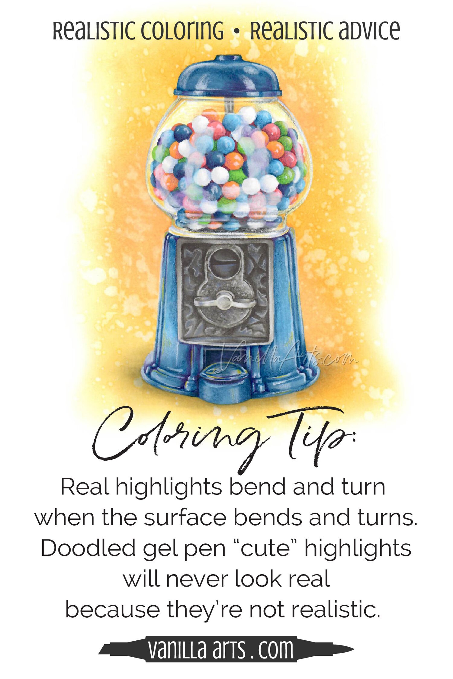
Beginners should avoid metal and glass objects. Highlights on metal and glass can be incredibly complex. Start with the easy highlights on matte objects. Slowly work up to shiny or reflective surfaces.
Try my tutorial here for using colored pencil to add soft edges to highlights.
Good quality art supplies are essential! Even professional artists can’t capture realism with a broken crayon on the back of a grocery receipt. If you’re coloring on copy paper or cardmaker’s cardstock, it’s holding you back. Here’s an article about paper recommendations. And because we’re talking about ditching the gel pens, see my article here for the supplies I use for highlights.
Color larger images. There’s a reason I don’t teach card sized projects with small stamps. Realism is a combination of shade values, texture, details, and highlights. It’s hard to squeeze it all into small spaces! Give yourself room for realism.
Practice pays off! The more you observe highlights, the easier you’ll see them. The more you color highlights, the easier it will be. Familiar processes feel comfortable. Comfort makes better art!
You don’t need a dedicated highlighting class to practice highlights. If you have a stamp with holly berries on it, use a Google image search to find photo references for similar holly berries. Add these highlight shapes to your existing stamp. I do this all the time for local class lessons, combining found photos with commercial stamps!
The Most Important Highlight Tip:
People often work themselves into a nervous state trying to capture every little detail exactly as they see in their photo reference.
Did I get the color right?
Did I get the texture exact?
Are all my highlights in the same spots and do the shapes match exactly?

Stop.
A highlight doesn’t have to match the photo reference to look realistic.
My article here about photo realism can help you relax a bit.
Yes, accurate details add to the sense of realism but there’s no point in stressing-out over details.
Realistic art looks like it could be a photograph but it’s not the exact duplication of a photograph.
When you find yourself erasing a highlight for the 3rd time because the shape isn’t exactly like the photo…
Stop.
You’re doing it wrong.
The goal is to capture the spirit of the highlight. My cranberry highlights here are not exactly like the photo reference. Mine are softer with fuzzier edges but they still work.
Close and believable is a much more attainable goal than duplication.
Realistic Coloring Requires Thinking
It’s more than a bunch of easy techniques thrown onto the paper.
Swiping a comma shape on the right with a gel pen is so easy even a child can do it. And that’s the problem. When a technique is that easy, you stop thinking.
Good art requires thought.
The thinking part really bums some people out. Realism is harder than wearing a beret and feeling artsy. You can’t sleepwalk through it.
So I understand, realism is not for everyone.
But hang on, realism isn’t out of your reach.
It’s not about talent, it’s about building observational skills and teaching your hand to make the shapes you see with your eyes.
Anyone can learn to highlight with realism. Dropping the gel pen is the first step towards realistic coloring.
You can totally do this!