How to Simplify Texture & Detail (Plus my latest Tutorial in Colored Pencil Magazine)


Do You Feel Overwhelmed By Details and Texture?
You want to color with more realism— improving your skill and artistry with colored pencils or Copic Markers. All the classes on realism say you need to look closer at photo references or study real life objects.
But holy shinola! When you look closely at even a simple item, you see tons of teeny-tiny textures like flakes, freckles, bumps, cracks, crumbs, and itty-bitty specks of color.
How are you supposed to color all that detail?
If that’s what it takes to color with photorealism, how is it even possible? It’s too much!
Feeling hopeless?
Hang on; I’m here to help.
Many artists use a chunking process to break complex shapes into smaller, more manageable forms. Instead of completing one section at a time, work the entire shape in a series of passes. Every pass breaks existing forms into smaller forms. With each layer, more detail and texture is created in a stress-free way.

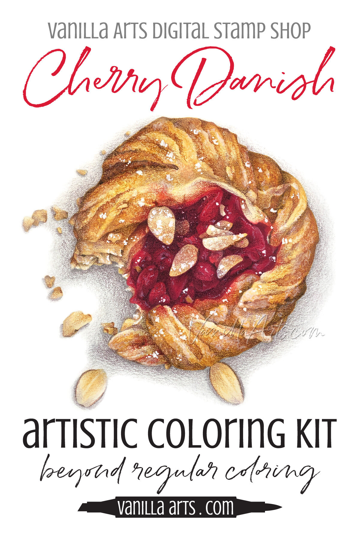
Tender, Flaky Pastry
If you’re ready to try your hand at photorealism, be sure to get a copy of my latest tutorial.

Amy Shulke’s Cherry Danish
Derwent Lightfast Colored Pencils over a simple base of Copic Marker
Colored Pencil Magazine, April 2021
Tutorial includes supply guide, line drawing, photo reference, and step by step process photos.
More Colored Pencil Tips:
Don’t miss my previous colored pencil tips and suggestions!


The Knowledge Gap
Okay, I’m about to say something which may offend you.
Let’s put a trigger warning on it or a big blinking caution light beside it. You’re not going to like what I’m about to say.
We’re here on the internet.
In internet-land everyone pretends that if you read enough free coloring tutorials, watch all the free videos, if you do ALL the free stuff, then you’ll become a great colored pencil or Copic Marker artist.
No.
I’m not even going to soften the blow here. No. Just no.

You may learn how to do some stuff pretty good but you’re fooling yourself if you don’t acknowledge that self-taught artists have big gaping holes in their knowledge base.
You encounter these skill gaps every time you find yourself staring at the piece of paper, unsure about how to start or what to do next.
Feeling overwhelmed by texture & detail is a symptom of a Swiss Cheese education.
Holes. Holes where you missed learning about something important.
Holes make you feel lost and unsure but you can use that feeling as a clue to go search for the thing you missed.
So while I’m writing this article to help you over the texture/detail hurdle, I would be remiss if I didn’t mention this:
The fact you feel overwhelmed is a sign.
What you’re doing right now, whether you’re googling for free answers or maybe you’ve been paying for pretty project demonstrations instead of educational classes… if you’re overwhelmed by texture and detail then there’s a problem.
You’re not learning the processes you need to make it through a project on your own.
All the articles and tutorials, the blend-everything-smooth classes— they missed something important.
Texture and detail are not hard if you’ve been taught how to approach them properly.
What I’m about to cover today is something that every beginner student learns in the first few days of a good drawing class. It’s also a concept covered in quality drawing instruction books and articles. Good teachers and authors cover this information. The fact that you missed it means you’re not learning as well or as fast as you assumed.
This is basic stuff and if you’re just now hearing it for the first time, that’s a sign.
Texture & Detail are Superficial Decoration
In beginner drawing classes, we start by learning to visualize and accurately draw a few simple three-dimensional shapes. I’m sure you’ve seen these before, the shaded sphere, cone, cube, cylinder exercises.
We start simple.
You may think we start simple because it’s cruel to ask a complete newbie to draw something the Eiffel Tower or grandma’s portrait on the first day of class. That’s true, we don’t want to overwhelm brand new students.
But we also start with simple shapes because they’re the heart of art. Whether we’re drawing or painting, it doesn’t even matter which medium we’re using— an artist’s goal is to accurately draw the forms we see in the world.
Forms.
The sphere is a form. The cube is a form. Cones and cylinders are forms. A form is the overall three-dimensional shape of something.
Artists spend their whole lives perfecting their ability to draw forms. It’s the first lesson, the last lesson, and everything in between. We never outgrow the need to understand the form.

Forms.
When you look at an object and say “that’s a poodle” instead of “that’s a slice of pizza”, it’s because the human eye looks for forms. Your eyes see the form, then your brain runs that shape through your database, matching the form you see to the forms you know.
We identify everything based upon its unique form.
If you can draw the form well, then you’ve captured the appearance of an object.
Think about it, when you purchase a line drawing of a polar bear, you can tell it’s a polar bear, right? You magically know it’s a polar bear even though it’s just thin black lines on a white background. It’s not covered in short white fur and the eyes may not show the tear ducts or eyelashes. The bear doesn’t need half a Canadian hanging out of its mouth for you to know it’s a polar bear.
You don’t need color, details, or texture to know it’s a polar bear. You read the form.
Shaped like a polar bear = I see a polar bear
Drawing students learn that polar bear texture and polar bear details aren’t as important as an accurate polar bear form.
But coloring students rarely hear about the importance of form.
Admit it, how often have you heard form mentioned in coloring classes? Instead, colorers are flooded with an endless assortment of texture techniques.
Use this tutorial to color denim!
Let’s color fluffy fur with my latest Hair & Fur video!
I’ve created a new class showing how to create 20 realistic textures!
Download my PDF booklet with 52 colorless blender techniques!
You could be a texture professional with hundreds of techniques in your repertoire, but texture is worthless if you don’t know how to color the form.
Learning texture before form is like hanging drapes in the bedroom before you’ve poured the foundation, built the house, or installed any windows.
Form must come before decor.
Texture is Not The Key to Realism
This is so important, I’ll say it again in all caps and I might even bold it too:
TEXTURE IS NOT THE KEY TO REALISM.
So relax.
Accurate texture and small details are nice but they’re not going to make or break your project.

Just pointing this out to my colored pencil students makes them feel so much better.
Whew! The pressure is off!
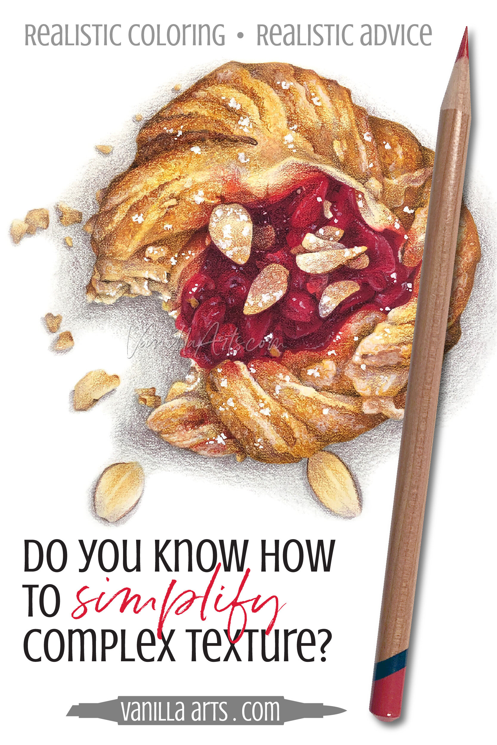
Far too many students think they have to duplicate every single detail and every speck of texture they see in a photo reference. They worry if they don’t get it all, it won’t look realistic.
Hmmm, are there three cracks and one flake next to the third cherry from the left? Or is it two cracks and three flakes?
Stop.
The world already has lots of cameras. If we want to know how many eyelashes Cousin Cindy has over her left eye, she can send us a selfie.
Photorealistic art looks like it could be a photograph but it’s not the exact duplication of a photograph.
So when you find yourself stressing out and squinting to count how many sprinkles of sugar are in the photo reference for this danish…
Stop. You’re doing it wrong.
I would much rather see students zooming in on a photo reference to see more of the form than to count the details.
Realism comes when you use Terminator Vision
Artists develop the ability to see objects on several levels.
I think of it as Terminator Vision but without the 10 gauge sawed-off shotgun or the cool Austrian accent.

When an artist draws or paints, we compartmentalize how we look at objects.
We scan photo references like a Terminator, focusing on just the characteristics we need.
Sometimes we look at the major form, sometimes we zoom in on the minor forms. Sometimes we look just for color or value. Later, we scan for surface quality and texture.
Basically, we choose when to see the forest and when to see the trees. We learn to isolate for clarity.
You can do this too.
You can develop form vision, value vision, shade vision, detail vision, and texture vision.
All it takes is a bit of practice.
Psssttt… you can practice the cool Austrian accent too!

How to simplify detail for easy coloring:
Work from general to specific
If the details for this Cherry Danish project feel overwhelming then you’re not using Terminator Vision.
You’re looking at all the detail at once and overloading your brain.
It’s a danish and it has pastry and jam and almonds and sugar and twists and weird crevices and burnt spots and squishy dough spots, and wet spots and there’s red and gold and brown and white and there’s a gray cast shadow and tiny white highlights and there are layers of pastry and if we look between the layers there are about thirty more smaller layers…
WHOA! My blood pressure went up just typing that sentence.
Stop. Use your Terminator vision.
What shape is the danish?
(Engage form vision)
Oh, that’s easy. It’s flat disc. It kind’a looks like a frisbee.
Are the edges of the disc flat or rounded?
(Engage zoom view)
The edges are rounded and I can see the color darkening more towards the outside.
Okay, what are the main colors?
(Engage color vision)
I see gold pastry with red jam in the center.
If we look at just the pastry, how is that shaped?
(Engage zoom on the minor form)
I see twists that run clockwise.
What color separates the twists?
(Engage value vision)
I see a deep Umber brown between each twist.
And what colors do you see in the center of the first twist?
(Engage color zoom)
I see Goldenrod and Burnt Sienna.
Terminator Vision narrows our focus to bite-sized, easy to understand pieces of information.
We only look at what we need to see at the moment.
We start by exploring the general form and we make that shape on the paper.
Then we slowly open our vision to allow in just a bit more information and we add these smaller forms. Then we open our vision to include the next smaller forms.
Little by little, we gradually work our way towards smaller, less important characteristics.
We start big with the important stuff and work our way smaller to the less consequential stuff. General forms to specific forms.
Starting with piddly details like tiny texture leads to insanity.
My Around-the-Clock Method
I practice a method called chunking to break large objects into easy to manage groups or chunks. It’s pretty standard in the art world and versions of this have been presented to me in many art classes over the years.
Every artist modifies the chunking method slightly but we all learn to start large and work our way smaller.
The largest chunk is the main object, the whole thing, the entire danish.
A lot of artists, especially painters and pastel artists will block in the large areas of color using a giant paintbrush or big strokes. Each block of color then becomes a smaller sub-chunk. These are the minor forms.
Color blocking is harder for marker and colored pencil artists because our nibs and points are so small. Color blocking with colored pencil on a large piece can take hours. Many pencil artists mentally color block rather than physically blocking.
Pssttt…If you’re someone who uses solvent to melt the base layers of colored pencil, this is a form of color blocking.
This Cherry Danish can be broken or chunked into the white background plus the cast shadow (group 1), the golden pastry (group 2), and the red cherry jam (group 3). You can work on them in any order.
The trick is to mentally separate each zone.
When I’m working on the pastry, I’m not thinking about cherry jam or looking at the red areas in the photo reference.

I work in circular passes as if I’m moving around the face of a clock.
For the first pass around the danish, I’m looking at the rounded edges of the whole danish; it’s a very generic sweep of the entire form. I move counter clockwise around my drawing, rounding the edges. I usually make a couple of trips around the shape, each time with a new pencil, adding more soft base color.
On the second major pass, I break the large pastry shape into twists, finding the largest crevices and adding them lightly. Each twist becomes a form and I study how this smaller form is shaped in the photo reference. Again, I may make a few trips around, adding a new color each time but I’m only focused sculpting the large twists.
On the third pass, I take one large twist and divide it into smaller twists. Each small twist is now its own form and that’s the only level I’m looking at in the photo reference. I work my way, twist by twist, around the entire image.
On a fourth pass, I break each of the small twists into ripples. Now every ripple is a form.
On a fifth pass, I add cracks to every ripple. The cracks become a form.
We can keep going— always circling the whole image, each time breaking the existing forms into smaller forms.
Each trip around the danish adds more detail as I shift my Terminator Vision down to the next level of form.
Eventually, you’ll find yourself working on details small enough to be considered texture.
Because we’re only thinking about forms, we’re never stressed or frustrated.
The next step is always obvious because there’s always another form to divide.
We’re boiling the frog slowly.
Here’s the best part: You can jump off the train whenever you want.
If you want moderate realism, you color the forms a few times around and then hop off.
If you want photorealism, you circle around to the point where the object looks touchable, then you stop.
If you want hyperrealism, you stay on the train until you can’t stand it anymore.
Avoid the Grid Method
At this point, some of you who took Art 1 in high school are now wondering
Hey Amy, why don’t we use the grid method to simplify details?
The grid method?
Sigh.

The grid method is something professional artists occasionally use to keep their line drawings proportionally accurate when they enlarge a small drawing to cover a mural sized wall.
Remember, Michelangelo and daVinci didn’t have access to projectors. It was a real bummer.
So yes, some artists use the grid method, once in a while for a very specific purpose.
But the grid method has been abused by high school art teachers for decades. I don’t blame them. If I was surrounded by twenty-five surly teens who are only there because they’re required to complete 3 art credits to graduate, I’d hand them all grids too. Here you go, have at it!
To use the grid method, we draw a grid of equal squares over our danish photo reference, then we draw a matching grid on our sheet of art paper.
The student starts by drawing everything they see in square A1. Then they draw everything they see in square A2. Square by square, you gradually draw a whole person or landscape or horse riding a unicycle.
The point of the exercise is to limit the details we see to one small square. We’re not trying to draw the whole horse, we’re limiting the flood of information down to just one little part of the horse.
That’s the problem with the grid method— Nobody draws the horse.
Student grid drawings look creepy because everyone is so worried about what’s in the square that they never see the whole horse. The lines and even the colors all stop dead at the edge of each square. Many of the squares are several steps lighter or darker than their neighbors.
Grid drawings are also very flat because the kid draws the background and the foreground with the same emphasis.
As I explained earlier, to draw or color with photorealism, you must develop Terminator Vision.
You need to be able to look at the whole danish, then 3 seconds later, switch to detail vision, and then flip quickly to value vision.
You never learn to see like an artist when you’re focused on B7 and E9.
The Chunking Method Works For Everything
It doesn’t matter whether I’m drawing a Cherry Danish, a bouquet of Tulips, or my dog Finnegan. Everything gets chunked and I scan it all with my Terminator Vision.

I use the chunking method for coloring projects too.
I start with the general form and slowly work my way down to the crumbs, pollen, or the mischievous glint in my puppy-pup’s eye.
Work it all, big to small. Terminator style.
It’s not just me.
I recently sat in on a coloring class given by a very popular colored pencil artist. He taught the chunking method for coloring photorealistic hair.
I’ve attended more than one watercolor demonstration where the guest artist used the chunking method on landscapes and botanicals.
And when I join life drawing sessions at the art center, I’m surrounded by artists focusing on chunks. Someone may be drawing just the nose while another is studying just arm muscles.
We all chunk. We all break the form into smaller forms.
We logically divide complex objects into manageable parts.
Being overwhelmed is no fun.
Coloring, creating art, and even drawing tiny little crumbs… if you’re not enjoying the process, then why are you doing it at all?
Eliminate the stress of coloring small details and texture by developing your Terminator Vision. Chunk your projects into gradually smaller forms.
It’s the smart way to create realistic art.
Tender, Flaky Pastry
If you’re ready to try your hand at photorealism, be sure to get a copy of my latest tutorial.

Amy Shulke’s Cherry Danish
Derwent Lightfast Colored Pencils over a simple base of Copic Marker
Colored Pencil Magazine, April 2021
Tutorial includes supply guide, line drawing, photo reference, and step by step process photos.

Select Products used in Cherry Danish:

Vanilla Arts Company is a participant in the Amazon Services LLC Associates Program, an affiliate advertising program designed to provide a means for use to earn fees by linking to Amazon.com.