
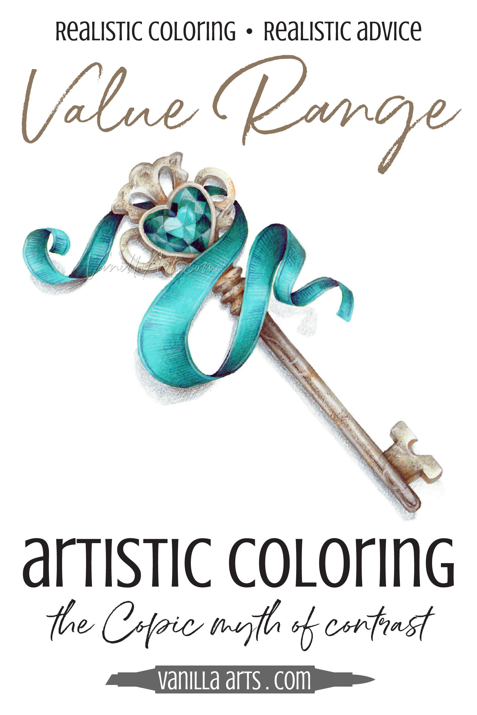
Real Color Theory: Improve Your Coloring with Smart Values Rather Than Contrast (Copic Marker, Colored Pencil)
Is contrast the secret to amazing coloring?
Many Copic Marker and colored pencil tutorials make it sound that way. Add contrast for depth and dimension, so you darkened your darks and lightened your lights. Now your coloring looks… uhm… it’s very interesting?
Psst… Contrast doesn’t add dimension. Let’s look at how to control contrast to color with greater realism.
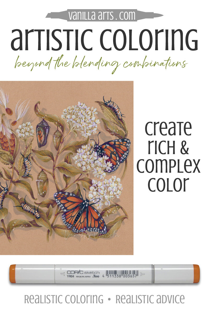
Artist’s Notebook: How to Create Rich & Complex Color (Copic Marker, Colored Pencil)
Light, medium, and dark Copic Marker combinations
As a coloring newbie, you didn’t really know what to do, so you colored the center of a daisy with one yellow marker or pencil. The petals were one solid color of pink. The leaves were one green.
It was fun but you quickly noticed it looked flat…
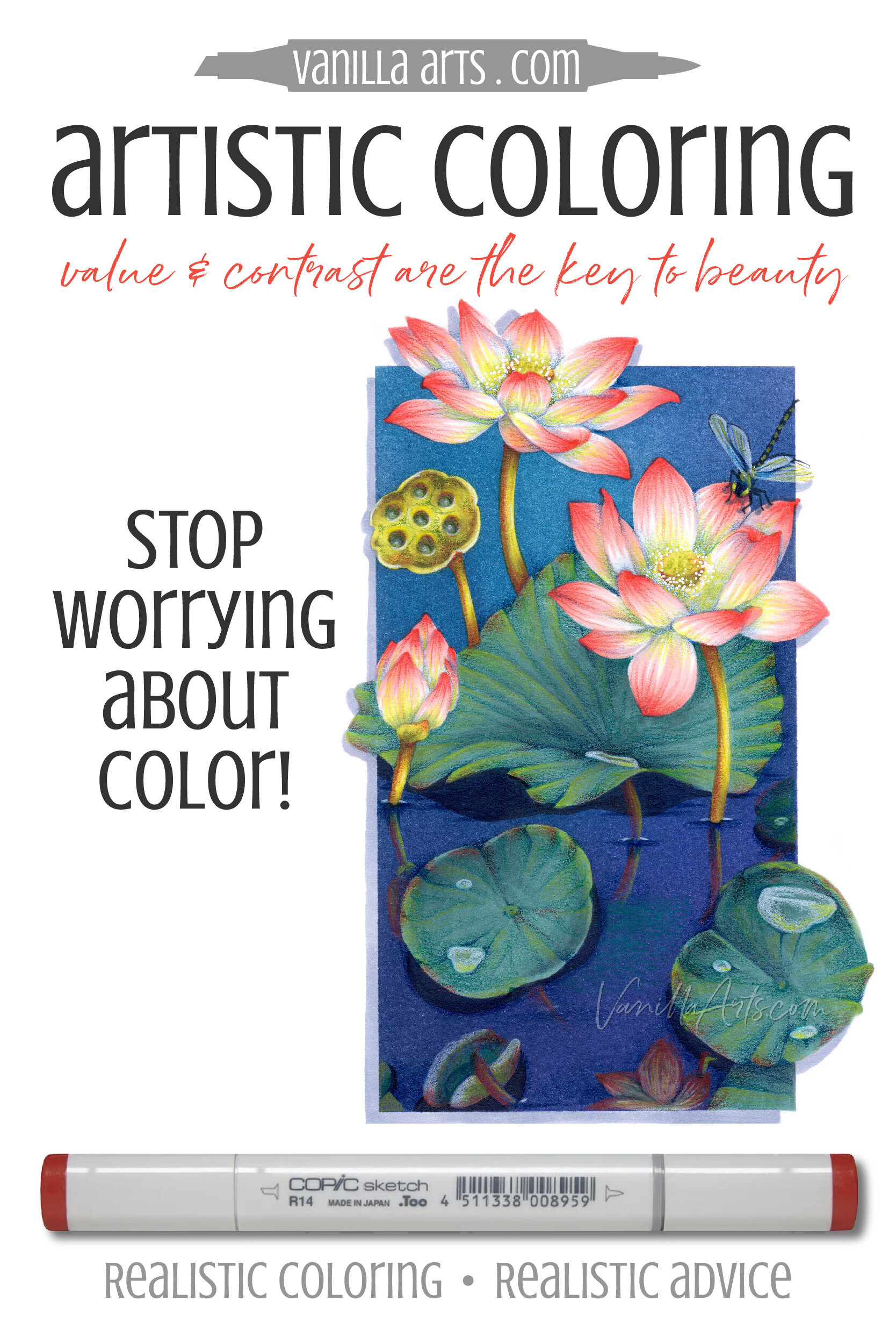
Artist's Notebook: Check Your Color Values! (Copic Marker, Colored Pencil)
Tell me if this sounds right…
You’ve colored for months or maybe years, and you’re pretty darned good at it. There’s no tutorial that you can’t knock out of the park.
And yet when you go off on your own, picking original color palettes and choosing your own markers or pencils… well… your coloring is still good but, uhm… there’s something missing.
Your personal projects don’t have the same oh-la-la you see in professional projects.
You can’t quite put your finger on it, but something is just… off?