
Real Color Theory: Improve Your Coloring with Smart Values Rather Than Contrast (Copic Marker, Colored Pencil)


Is Contrast the Secret to Amazing Coloring?
A lot of Copic Marker and even colored pencil tutorials sure make it sound that way. Just add contrast for astounding depth and dimension!
So you tried. You darkened your darks and lightened your lights, reinventing every blending combination as a high contrast series of five or more markers.
And… well… now your coloring looks… uhm…
Shall we say, interesting?
Ugh. Adding contrast does nothing to improve depth, dimension, and realism.
It just makes everything more contrasty.
Today, let’s look at contrast and how to use it intelligently to improve the professionalism and artistry of your next coloring project.
Hobby colorers often use high contrast color blending to add spark to Copic Marker or colored pencil projects. But failure to control contrast leads to juvenile, stylized projects which look crafty rather than artistic. Artists use value ranges to limit contrast in a pleasing, professional way.
What is Contrast?
For anyone of a certain age, CONTRAST was the dial on the television your dad yelled at you for touching.
Turn the contrast dial all the way up and the dark stuff on the screen went black. All the light things would glow. People looked like monsters with deep gaping holes instead of eyes.
Turn the dial all the way down and everything went mushy and pale. Like faded Polaroid photos, you couldn’t tell the actors from the scenery, every shape melted into the things around it.
Yes, I touched the forbidden dial a lot…
In coloring, contrast isn’t all that different from the TV dial.
Contrast is the difference between your lightest lights and your darkest darks.
A high contrast Copic blending combination for the ribbon around this key would be something like BG18-15-13-11-10-00-0000. There’s a wide difference between the color of the darkest marker and the color of the lightest marker.
A low contrast ribbon would be colored with just BG11-10. The difference between the light and the dark marker is very subtle.
High contrast coloring looks very exaggerated and extreme.
Low contrast coloring can be pretty boring.
And boredom might be why the myth about contrast started.
More Color Theory Tips:
Don’t miss my previous color theory articles and tips!


The Myth of Beautiful Contrast
A standard Copic blending combination is three markers, right?
Light, medium, and dark. Which is lots of fun until you get pretty good at it.
So why not add more markers?
As colorers get better at blending, they instinctively add more markers to their blending combinations.
Look, look! I can do four.
Oh, yes? See here. I can do more!
It’s a bit like Dr. Seuss’ apple story. Why stop at five or six when you can make blending combinations of eight, nine, or ten?

When we add more markers to a blending trio, we tack them onto the ends, adding darker darks and lighter lights.
So a ribbon combination that was once three simple markers becomes something monstrously large like:
BG99-09-18-15-13-11-10-000-0000 (with a white gel pen for highlights)
That’s extreme coloring.
It’s high contrast.
And there’s a weird thing going on in the coloring community now. Everyone is gorging on high contrast.
If you ask “how can I improve this project?” on any online coloring forum, you’ll get several people telling you to add more contrast.
Contrast is addictive!
The more you color in high contrast, the more you trick your brain into thinking high contrast looks normal.
And the more you think it looks normal, the more you’ll color with high contrast.
It’s a vicious, self-defeating cycle.
Why is high contrast so bad?
Because high contrast is very hard to look at.
High contrast objects are interesting. They attract the eye.
In the Key to my Heart project here, what was the first object you saw?
The gemstone, right?
It’s high contrast.
High contrast objects dominate a project and naturally become a focal point.
Unless you color everything with high contrast. Then our brain explodes.
And not in a good way.
So if you color a dog with a high contrast recipe using six browns, black accents, and white gel pen highlights, it probably looks great. He’s a cute puppy and he’s the star of your handmade birthday card.
The problem is most colorers don’t just trick-out dog. They color every single thing in explosive high contrast— the fire hydrant, the grass, the doghouse, the sidewalk, the tree, the sky, the clouds, and the smiling sun.
OUCH!
It visually hurts.
I’ve seen a few projects where you simply can’t focus on them for long. It’s unpleasant to look at but you also can’t tell the dog from the grass from the fire hydrant. It’s mind-boggling mush.
So hooray. Congratulations. You’re very talented. You can balance 9 marker blending combinations. We’re all very, very impressed.
But your coloring stinks because you won’t control the contrast.
Copic makes value sooooo easy!
As a Copic user, you have been handed a rare and valuable gift.
I can’t think of another art medium where it’s this easy to control your contrast. Not colored pencil, not pastels, certainly not any paint I’ve ever tried.
Heck, even other brands of marker don’t give you the big Copic gift.
Copic tells you the value of every color they make.
No other medium, no other marker does this for you!

The Copic numbering system indicates the value of the marker color.
Value is the relative lightness or darkness of a color. If you chart this darkness on a scale, you get a value level for each color.
Copic measures values against their series of N Gray (Neutral Gray) markers.
So all Copics that end in a 5 are a value match to an N5. All markers that end in a 7 are a match to N7. It doesn’t matter if the marker is yellow, blue green, or red violet, any Copic that ends in a 7 is a value level 7.
BTW: My “Copics Uncapped” articles at MarkerNovice.com tests how accurate Copic’s value designations are. With a few exceptions, they’re fairly accurate.
Copic users are extremely fortunate to be given value indications.
Occasionally in other mediums, you’ll find colors listed as light, medium, dark, or sometimes with a percentage (i.e. Cadmium Red Light or Cool Grey 50%) but it’s a vague comparison, not a standardized value measurement. “Light” compared to what? 50% of what?
Because you know the values in every Copic blending combination, there’s no excuse for allowing your contrast to grow to painful levels.

Value ranges, not random contrast
“Add more contrast” is terrible advice!
The smarter way to improve the presentation and readability of your art is to segregate your values into unique value ranges for each object in your composition.
The Key to My Heart project shown here is a simple composition— it’s just a key, ribbon, and a sparkly gemstone.
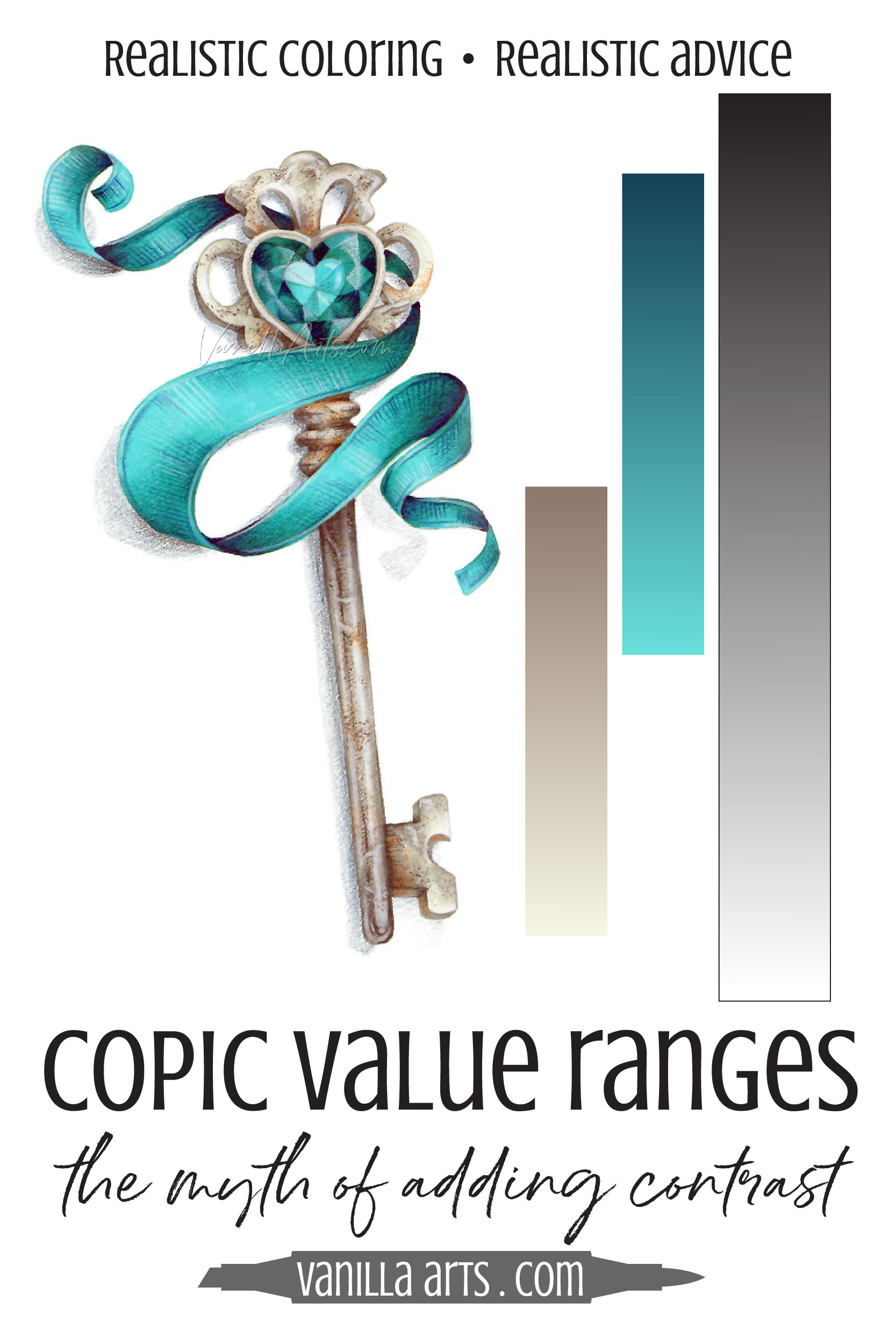
Every item has its own value range. While the color ranges overlap slightly, they are unique and distinct from each other.
At the far right, I’m showing you the entire value scale, all the way from white to black. Copic numbers this range from 0000 to 10.
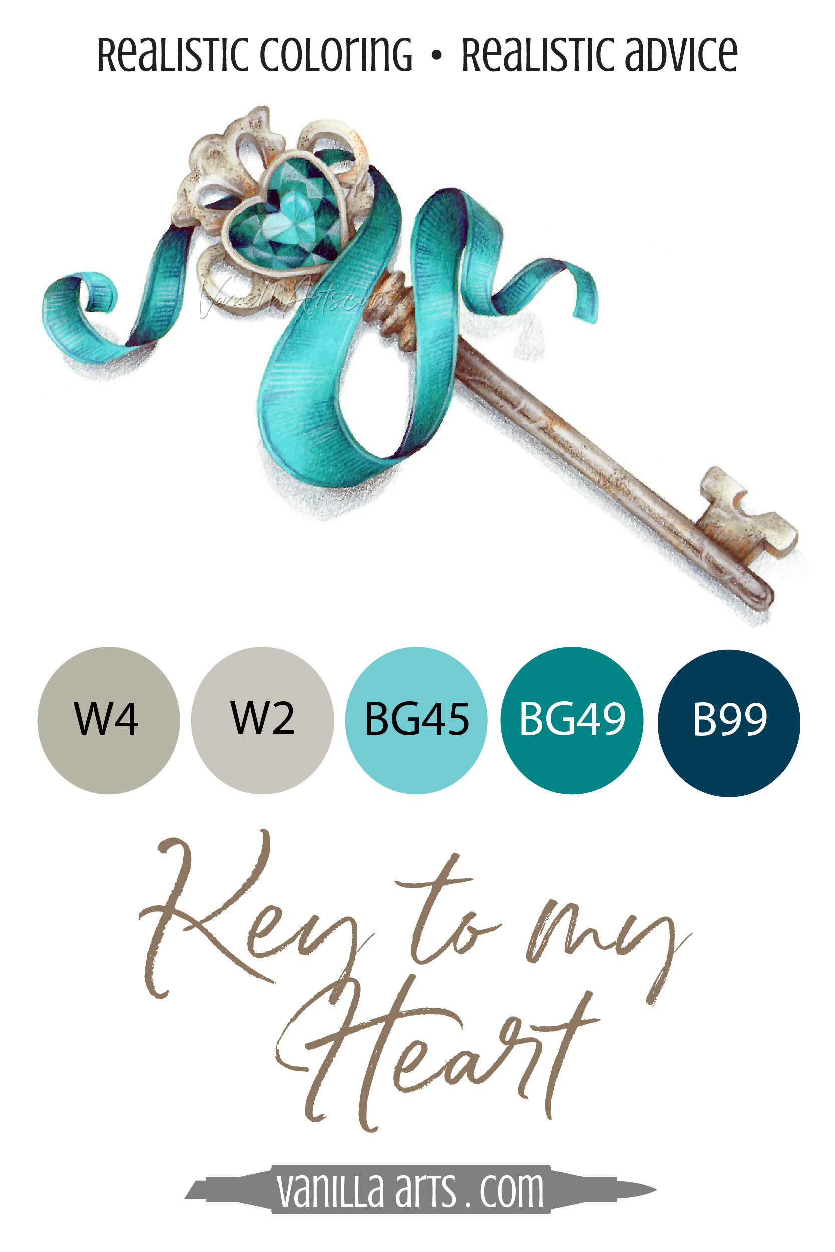
The ribbon’s value range runs from a dark 9 (B99) down to a medium 5 (BG95).
The key’s value range is deliberately different from the ribbon. The key’s range is W6 to W0.
The reason why this project looks professional and polished has little to do with contrast. It’s because I’ve applied value ranges.
The key and ribbon feel distinct and unique because their value ranges are distinct and unique.
Then, because I wanted the gemstone to grab a lot of attention, I added high contrast to the gem colors. I darkened the darkest dark facets and introduced white highlights for the first time.
The gem stands-out because it’s the ONLY high contrast item in the entire project.
High contrast as a pie-eating contest, forcing your viewers to binge 900,000 calories at once.
It’s too much color, it’s overwhelming.
Instead, serve your contrast as a well balanced meal. Give people bite-sized pieces and manageable serving sizes. Let them rest between courses.
Control your contrast for balance and beauty.
Check your work
So Amy, I separated everything in my stamp into different color ranges. I think it looks pretty good… but then again, I thought the high contrast stuff looked good before. How do I know if I’m doing this value stuff right?
I hear ya and I get it. Many of you were attracted to Copic Markers in the beginning because you admired high contrast coloring.
And some of you were taught to color from high contrast tutorials or instructors.
The extreme look is all you know.
Remember, high contrast is deceptive.
You think it looks normal but the rest of the world is wondering how long you left the cap off the sequin glue.
So what’s a good reality check?
Don’t fret, it’s easier than you think.
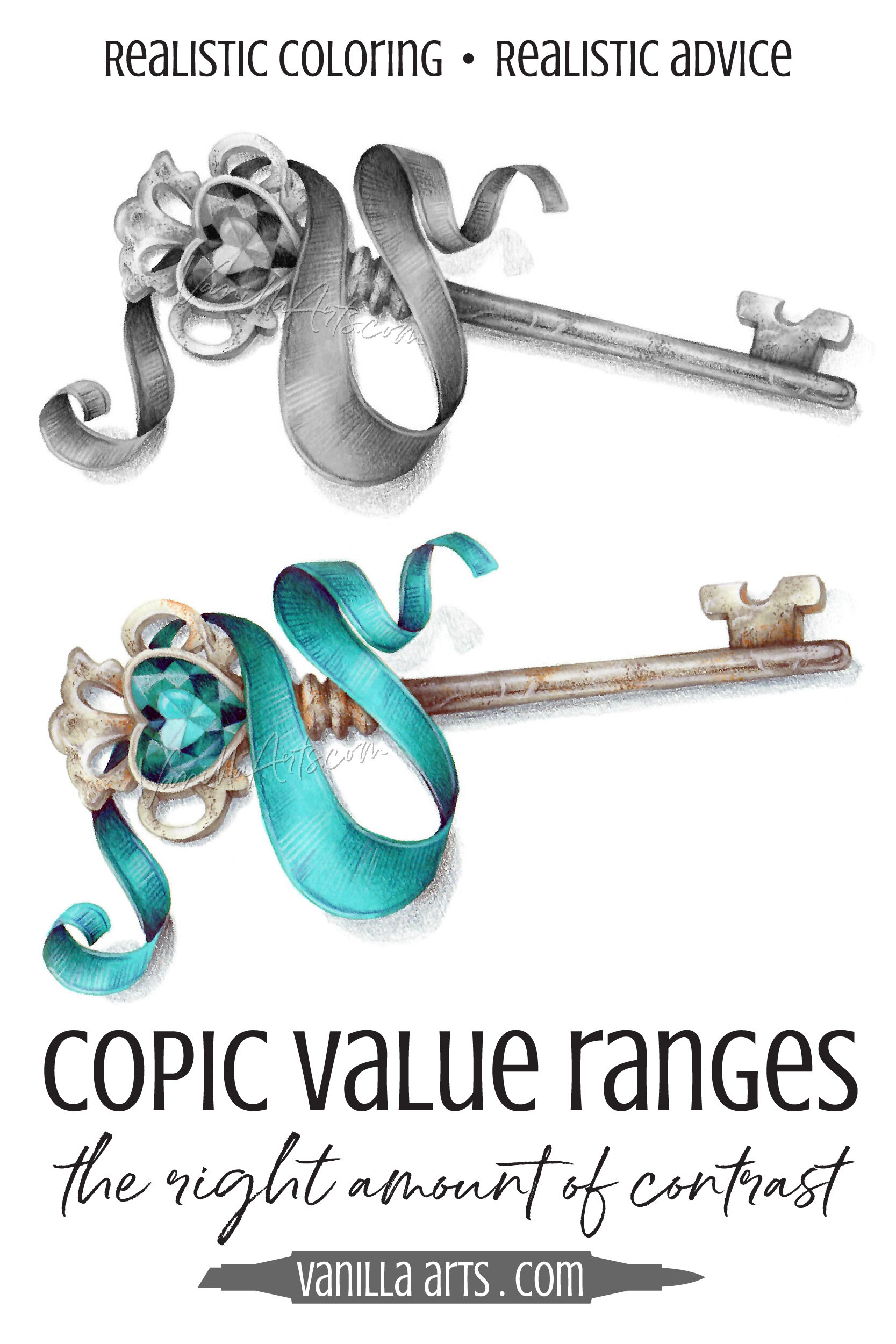
Take a photo of your project in progress and use the edit button to switch the photo to a grayscale setting. Common names for these filters/settings include Mono, Noir, Silvertone, Grayscale, or Black & White.
When you remove color from a photo, you’re looking at nothing but values.
If your objects merge together— perhaps you can’t tell where the key stops and the ribbon starts? Indistinct objects mean you don’t have enough contrast and your value ranges are too similar.
But if the project reads pretty good in grayscale— nothing is melting into the thing next to it and nothing jumps out and screams for attention? This means you’re on the right track. Keep going.
Simple Color Substitutions
Here’s the secret bonus to working in value ranges rather than random high contrast recipes.
Value ranges make it easy to change the color palette without damaging the balance of contrasts.
Don’t like the rusty antique silver vibe I’ve created? Change the W markers to N or C but keep all the numbers the same.
Want a pink ribbon for Valentine’s Day? Change the BG to RV, keeping all the last numbers consistent or as close as possible.
Voila, presto-chango!
Here are a few ribbon recipes which would substitute nicely. Each took me less than a minute to come up with because I’m letting the values guide me, not the hue.
Magenta: RV69-09-06
Blue: B39-69-66
Yellow: Y28-19-15
Red: R59-29-24
Orange: YR27-09-04
Green: G29-19-14
Violet: V99-09-06
But contrast is my style!
It’s going to happen, I’m bracing for it.
Inevitably, when I write an article or teach a class encouraging hobby colorers to make changes to the traditional Copic technique they’ve known and loved for years…
Someone always tells me:
But Amy, you call it standard, traditional, or formulaic Copic blending, but that’s my style!

Okay, I’ll play along.
Your style is to choose markers based on a math formula. You’re a 2+2+2+2+2+2 marker colorer. Or maybe your style is the (10+2)x8 method.
You totally love the high contrast look. You want that to be your style.
Fine.
But now you can’t complain that it looks fake… or that it looks exactly like what hundreds of other colorers are doing… and that you really want to learn to be an artist…
You can’t complain because you can’t have it both ways.
A lot of people get their self-esteem all tied up with the idea of style— a style they’ve mimicked from someone else.
YouTube is full of videos and the internet is covered with bloggers who talk about finding your style as if style is the most important thing about making art.
It’s not.
What’s more important than your coloring style?
Learning. Growing. Making interesting art which channels your own unique voice.
If you’re worried about protecting your contrasty coloring style, you will never grow as an artist.
It’s time to ditch the tutorials
How to Color a Ribbon and How to Color a Key is holding you back.
Formulas, blending combinations, and blindly adding more contrast are preventing you from learning and growing into the artist you were meant to be.

This is why I take the time to write articles like this, which point out how the color theory I learned in art school can be applied to your own Copic work.
It’s not because I want the concept of value ranges to be your new coloring crutch.
I want to demonstrate that with more thought and a fun bit of experimentation… you can use fine art concepts and color theory to enrich, improve, and amplify your unique and beautiful artistic voice.
Value ranges are a trick that artists use.
You can use them too.
Value ranges add interest and a pleasing sense of order to artwork.
Deliberate use of high contrast can be used to emphasize a focal point.
Above all, contrast control makes your art look more polished and more professional.
And as you learn to use values and control your contrast, you improve your presentation and storytelling ability.
You become a better artist.
Isn’t that why we’re here?
Artistic Coloring Classes
Ready to move beyond follow-the-leader style lessons?

Ready to try challenge level coloring?
Key to my Heart an Intermediate level Marker Painting Workshop
A lesson on finish & shine, two of the most under-appreciated elements of texture. Finish and shine are important to telling stories with your artwork.
Real time coloring, recorded live
Live Workshops are unscripted demonstrations which provide students with a real look into the authentic coloring process. You’ll see mistakes being made and corrected. It’s just like visiting Amy in her home studio.
Log in and color with Amy at your convenience. Anytime access, no expiration dates.
Class was recorded in January 2021 and featured a live student audience. Amy answers questions from the students and offers many tips for better colored pencil art.
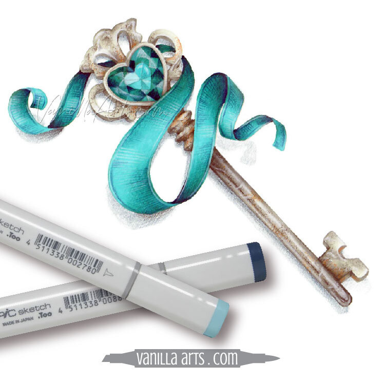
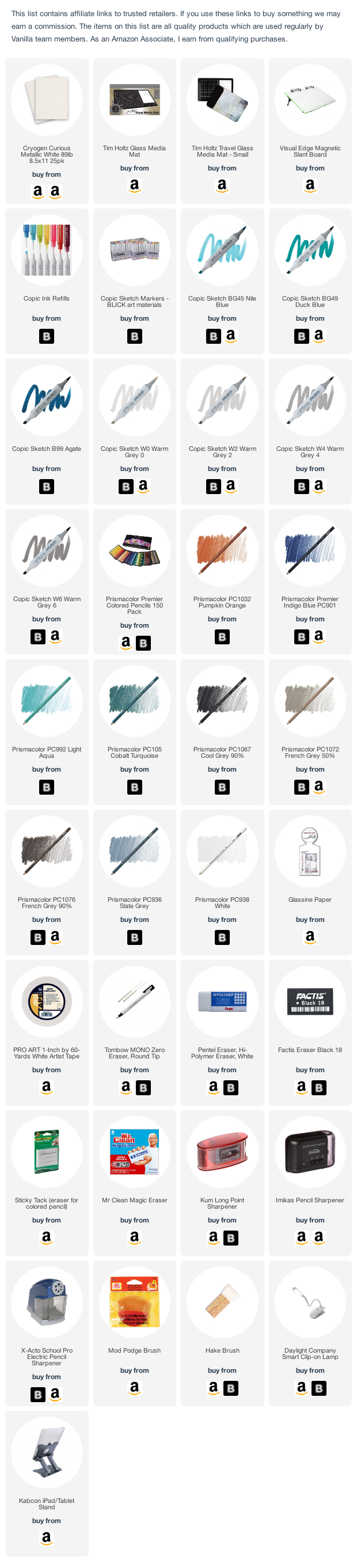
Select Products used in Key to My Heart:
Vanilla Arts Company is a participant in the Amazon Services LLC Associates Program, an affiliate advertising program designed to provide a means for use to earn fees by linking to Amazon.com.


