
Coloring Tip: Leave Air Space for Light and Delicate Flowers (Copic Marker, Colored Pencil)


Coloring Tip: Do your Copic Marker or colored pencil flower projects look solid, heavy, and unrealistic? It might not be the colors you’re using, perhaps you’re coloring too many spaces? Lightweight natural flowers have gaps and airspaces between the petals. To add more realism, leave more spaces.

What’s the secret to realistic flowers?
It’s not what you think.
A lot of people assume their floral projects lack depth and dimension because they’re using the wrong Copic Marker blending combination. Or maybe they chose bad colored pencils?
Nope.
I’ve sketched, painted, and colored flowers for decades, teaching everything from beginner to advanced photorealistic florals.
Trust me, there are no magical colors or blending combinations.
For realistic flowers, don’t worry about picking colors…
It’s more important to pick where NOT to color.
Read more about coloring realistic flowers here:


Which shapes are flower petals? Which shapes are not?
You find a gorgeous line drawing or digital stamp and you pick out the most amazing colors. You’ve got the best red blending combination and the perfect greens to go with it.
You dive in and start coloring everything.
Everything.

The tear drop shapes that are obviously petals?
You fill them with color.
And the big, bold leaves?
You fill them with more color.
And the spaces in-between the petals?
Color. Color. Color them all.
And the spaces between the leaves?
Yep. Nothing but color.
Wait!
Stop!!!
Hang on a moment, you’re coloring the air!
Flowers are not bowling balls.
They’re not massive globs of solid material.
They’re paper-thin sheets of delicate tissue held together with fine strands of stems. Even though the petals and leaves overlap in the drawing, in real life, there’s actually lots of space between all the different parts.
You can see through the petals, you can see between them.
When you color all the spaces between the petals and leaves, you add unnatural weight and mass to your flowers.
When you fill in all the gaps, your flowers don’t look light and delicate anymore.
A Flower = Petals + Spaces
“Hey Amy, that little triangle space in-between the two petals here? What color should I make it?”
Nooooooo. Don’t color it!
It’s air. It’s space. It’s nothing.
That little bit of nada is the thing that’ll make your flower look more like a flower.

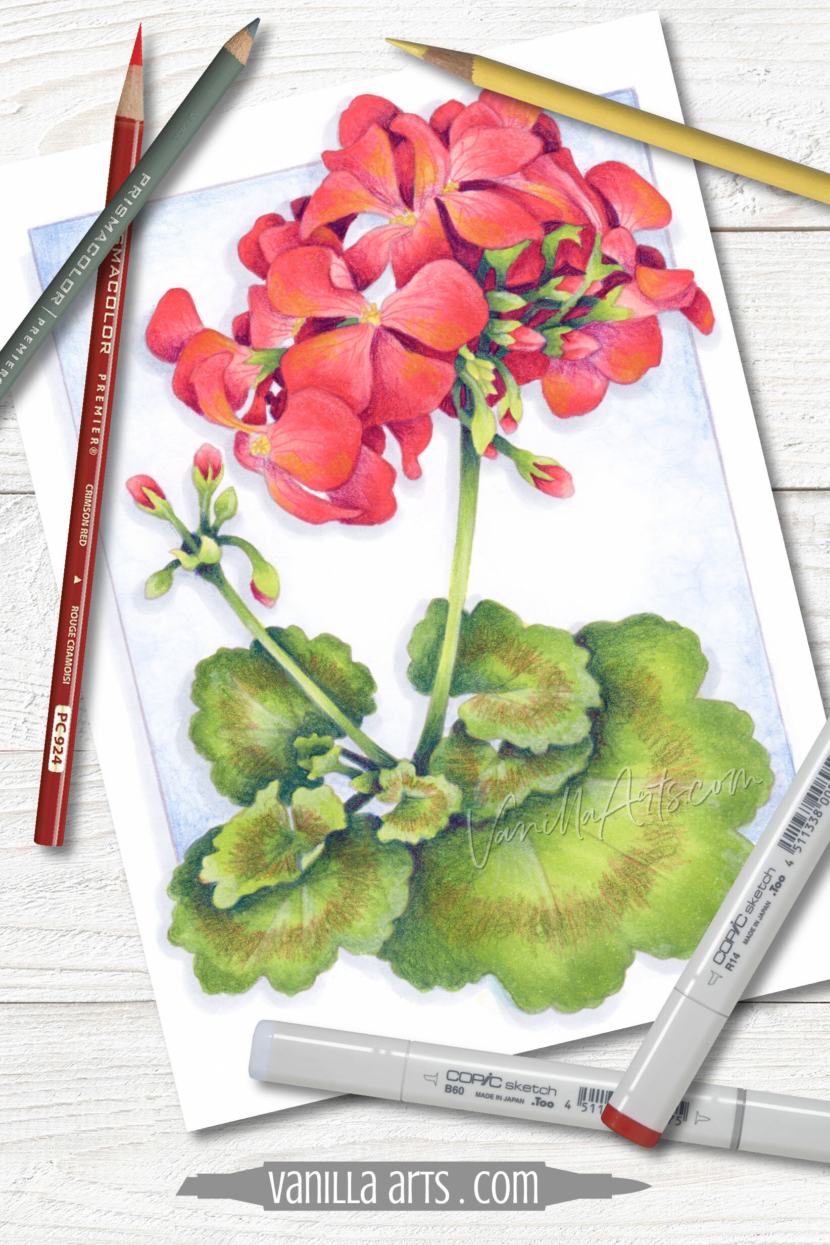
Here’s the photo reference I used to draw the geranium line art for my intermediate level Scarlet Geranium online coloring class.
I know… it’s pink.
And yet my geranium is red, right?
This is why you don’t need to worry about the colors quite so much. It’s not a life or death decision.
There are literally hundreds of colors and thousands of possible blending combinations which will all produce realistic looking geraniums.
Instead of looking at color in the reference photo, look for the gaps.
On the left side of the flower, there are white spaces where we can see through the florets to the background behind it.
Many students will rush right past this observation. I’m guessing that if I don’t point out the gaps, probably 80% of students would color all the gaps a deep dark red.
Don’t color the air.
Geraniums are naturally a very loosely spaced flower. If you don’t leave the spaces your geranium will look less geranium-ish.
We don’t just identify flowers by the color and shape of their petals, we also look at spaces. The amount of air space in a flower is essential as color to realism and accuracy.
Realistic coloring values the empty spaces as well as the petals.
Now look at the right side of the photo reference. We’re not seeing any background between the florets, right?
But there’s still air.
Look where all the little green buds are shooting out to the right. The petals form a bit of a cave right there and the buds are spreading out in the open space in the cave. Even though we don’t see the background through the petals on the right, we still should convey the impression of open space.
If you’re not leaving space, you’re sacrificing realism.
Not all flowers have the same amount of air space
Remember when I said that air space helps us identify the type of flower we’re looking at?
Well, no-space is also a factor.
So all of this talk about leaving space doesn’t apply to roses or peonies where the petals are compact and dense.
But air does apply to flowers like daisies or sunflowers where the petals may not snuggle tightly next to one another.
The air rule also applies to bouquets or clusters of flowers. Look at the air Van Gogh left between his Sunflowers. Remember to leave air the next time you’re coloring a flower arrangement.
Research the kind of flower you’re about to color to see how much airspace your flower needs.
But what if my Geranium stamp doesn’t show air space?
I totally get it.
Geraniums are a popular flower and there are lots of cling, clear, and digital geranium stamps out there, drawn by many different artists.
What if the artist didn’t leave any gaps in your geranium stamp?

Ahhh, grasshopper, you may have to be clever.
First, let’s say a lot depends upon the style of the stamp artist.
If the artist drew something a bit cartoonish, like I’ve seen geraniums made up of the same simple flower shape repeated over and over to make a flower head…
Anyway, if the stamp is super basic and very cartoonish, you really can’t do much about that.
But on the other hand, many stamp artists today are drawing more realistic forms. After a quick google search, many of the geranium stamps I see are a combination of the simple and complex— they have some flower shapes with partial petal shapes between them.
In this case, look closely at the partial shapes. Skip some of them. Pretend they’re air.
If you’re brave, you could even add a few extra flowers.
Geraniums aren’t terribly tidy flowers. Geraniums seem to grow wonky and loosey-goosey.
So look at the stamp to see if you can scatter a few more floret shapes just outside the main cluster. When you do that, you’re not just adding extra florets, you’re also adding spaces.

Negative space
Negative space is the artist’s term for what we’re talking about here— the petals are the positive space and the space between the petals is negative space.
In drawing classes, artists are trained to look for negative space.
It’s reverse thinking, sometimes you can simplify the drawing process by drawing the shape of the space around the flower instead of actually drawing the flower.
Yes, that’s a brain-bender. And it totally works.
Here’s the thing: negative space is a very common artist trick but you don’t have to be licensed and bonded as an officially official artist to use these tricks.. They’re open to everyone. You can do it too!
You may be “just coloring” but when you begin noticing the role of negative space, you’ll take your coloring to the next level!
How to identify flower petals in stamps, coloring books, and line drawings
It’s very easy for me to color my own drawings.
It’s not because I’m a genius, it’s because I was there when I drew it. I know which shapes I meant to be petals and I know which shapes I meant to be spaces.
Most colorers don’t have that luxury.
You’re always coloring someone else’s drawings.

But I do understand what it’s like to be in your shoes.
For years, I’ve taught some of my online classes using Power Poppy digital stamps. And when I teach at scrapbook and papercrafting stores, I use cling and clear stamps from companies like Stampendous, Darkroom Door, and Technique Tuesday.
So just like you, I’ve sat there staring at a stamp I did not draw, trying to decide if the weird heart-looking thing next to the third petal from the left is air or petal.
Over the years, I’ve developed a process to help me find my way around other people’s floral stamps and line art.
This is the way I make sense of realistic flower drawings:
I try very hard to put a name to every flower in the stamp.
It’s hard to color something with accuracy if you don’t know what it is. So if the name of the stamp doesn’t say “geranium” or “hyacinth”, then I run a few Google Image searches to figure out what the plant might be. Some stamps are drawn more accurately than others (which is why I love Power Poppy because she knows her flowers).
Once I have a flower name or species, I do a Google Image search to see several photos of the real flower. I make sure I understand where the stem attaches to the flower head and then I count petals.
Flowers are consistent. Geraniums have flower heads made up of multiple florets. Each floret has exactly 4 petals, so the magic number for a geranium is 4. Tulips don’t have florets but most tulips have 6 petals (3 petals, 3 sepals) and their magic number is 6. Maybe a rose or sunflower has too many petals to count but if a flower has countable petals, then I know the magic number before I start coloring!
When I color flowers, I color the leaves and stems first.
Leaves and stems are usually easy to identify and by coloring them first, you reduce the number of mystery spaces that might be petals or air. For a complicated bouquet stamp, filling in the leaves first makes it less likely that I’ll accidentally color a leaf pink.
After the leaves, I locate and color the centers or stamen areas.
If I’m coloring geraniums or a cluster of daisies, I find all the yellow centers first and color them fully. Until you know where the the centers are, you can’t make sense of all the confusing petal shapes.
Find the magic number of petals around each center.
In my geranium here, I’d find the centers and color them yellow. Then with my magic number 4, I literally start matching petals to their appropriate centers. Not every stamp artist draws the magic number accurately so do the best you can. Once you know which petals logically belong to which center, it’s easier to tell which shapes might actually be air gaps or deep dark spaces.
It is normal to stumble upon parts you missed.
I regularly find stray leaves or missed pieces of stem. Sometimes I even find myself adding missing bits of stem the artist missed! I think it’s best to stop and color the missed items as you find them. Don’t wait to come back later because there’s a good chance you’ll accidentally color it pink.
There will be mystery shapes.
Sometimes you’ll find shapes that could be a hidden piece of petal, or part of a deeply set leaf, or air. This happens most often with bouquets but there are a few of these mystery spots in my Scarlet Geranium project. There’s no right answer because anything will work. I prefer to make these spots air if I can. My next bet would be leaf; leaves don’t reduce the weight of the image but they do break up the flower. Coloring them as a petal is always my last resort and when I do, I make it a deeply shaded petal, as if we’re seeing through the cluster to a petal on the other side.
You can add too much air.
Air is good, especially in bouquets— but too much air can make a bouquet look structurally unrealistic. If there’s nothing but air around a petal, you might need to add some stem or other connective tissue to physically join it to the cluster instead of letting it hover.
When coloring flowers, don’t forget the air space
I know it’s easier to simply color the all the spaces some version of red but to add more realism to a geranium, you need as many not-petals as petals.
Light and airy flowers get woefully heavy and unnatural when you color them solid.
For more realistic flowers, leave air gaps between the petals or blossoms.
It’s that extra punch of realism and the care behind it that will distinguish your coloring from the crowd!


A kiss of Color
Let’s mix up our greens and reds for artistic pops of color!
Scarlet Geranium
Learn to add unusual hints of amazing color
Smooth blending is fun but real life is so much more amazing. We’re adding hints of sunshine and bursts of color in unexpected ways.
Available now in the Marker Painting Workshop for anytime viewing.
Immediate access. Watch at your convenience, as many times as you wish. No expriration.
Class Printable Pack Includes:
Class syllabus with detailed recipe guide
Full color project sample
Guide to Copic base
Detailed color map
Project inspiration references
Select supplies used in Scarlet Geranium:

Vanilla Arts Company is a participant in the Amazon Services LLC Associates Program, an affiliate advertising program designed to provide a means for use to earn fees by linking to Amazon.com.


