
Coloring Tip: Test Background Colors to Prevent Accidental Distractions (Copic Marker, Colored Pencil)

Coloring Tip: Plan the background color before you begin your next Copic Marker or colored pencil project. Test several colors to make sure they do not distract from the focal point by attracting attention. If you notice a background before the artwork, then it’s not really a background, is it?

Do you wait until the end of the project to add a background?
Uh ohhhh…
Backgrounds are far more important than most colorers realize.
You’ve just spent hours coloring a beautiful image with your very best Copic Marker techniques. You added lots of amazing details with colored pencils.
Do you really want to mess it up now with a bad background?
Smart artists plan the background and test several color options BEFORE they begin coloring!
Too many colorers wait until they’re done coloring before they think about the background.
But Amy, what good is a fancy background if my coloring stinks?
But at the end of a project, you’re tired and you just want to be done. So you grab your favorite color or some generic blue and scribble it in the background.
Oh, it hurts my heart when you grab random colors!
The right background color can make an otherwise plain image sing.
The wrong background makes excellent coloring look awful.
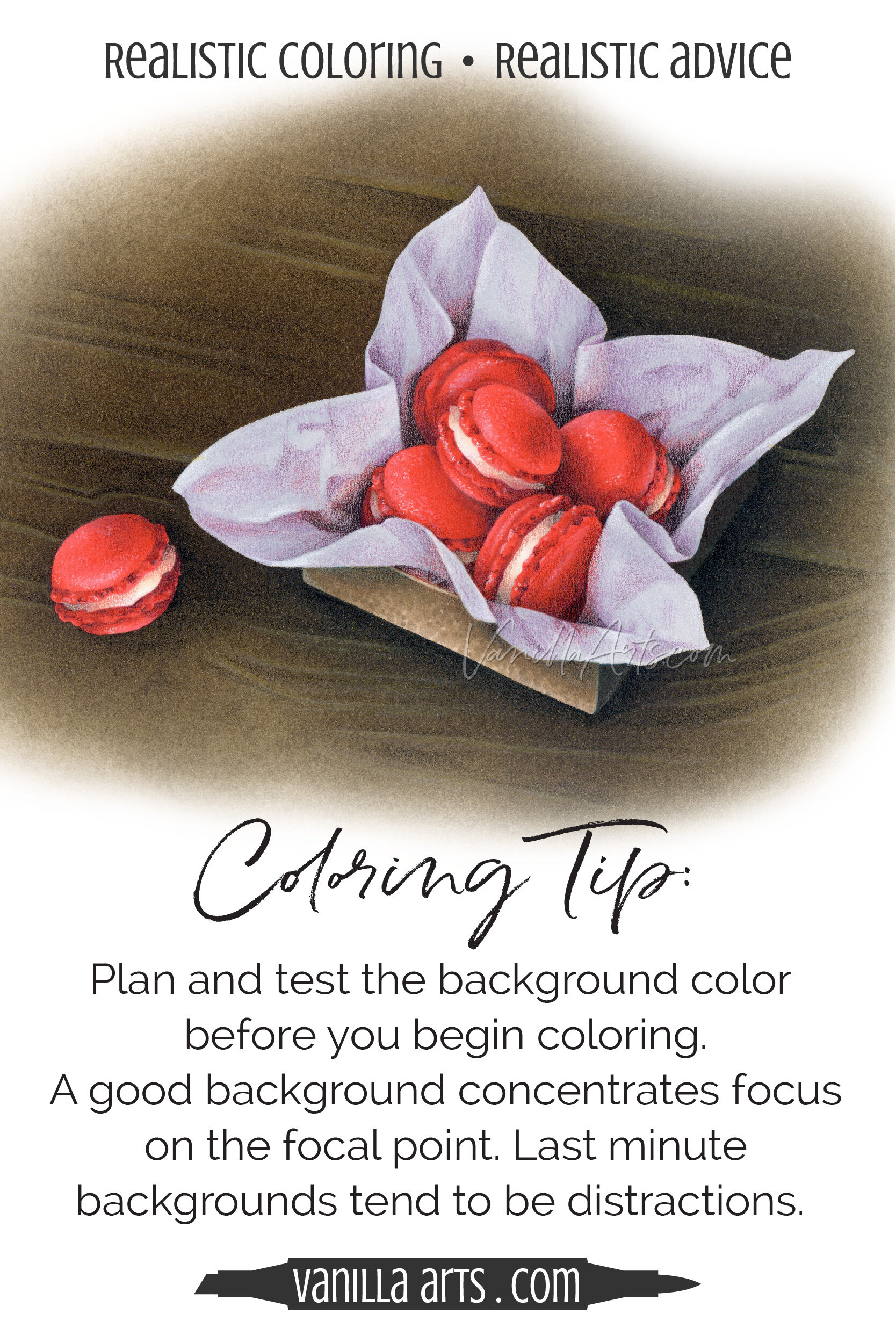
Look at how different my Red Macarons look on various colored backgrounds.
The white background isn’t too bad but honestly, it’s kind of boring. It’s not hurting the art but it’s not exactly helping it either.
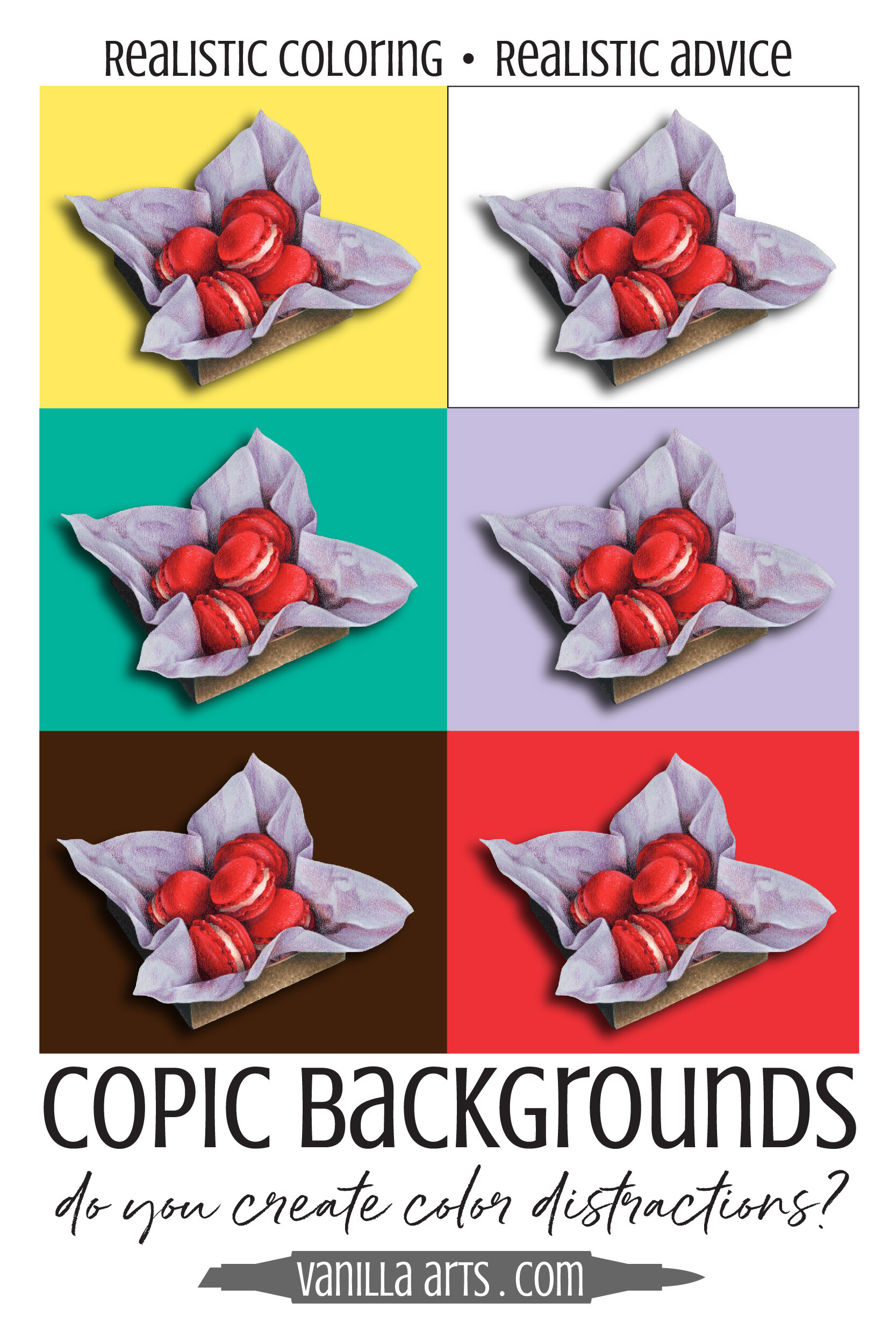
The yellow and teal backgrounds are all wrong. Look at how the yellow pops forward and makes it hard to focus on the macarons. Yuck! And the teal background? It’s no shrinking violet either.
So how about violet then? What if we matched the background to the tissue paper? Wait… where did the tissue paper go? The tissue paper and even the box disappear on violet.
Let’s match the red then! Whoa, the red jumps forward (almost as bad as yellow) but also, where did the macarons go? The tissue paper is certainly not the focal point.
In Red Macarons, I’ve chosen a deep chocolate background for two reasons.
First, my last few projects have all had minimalist white backgrounds. I enjoy challenging myself by doing the complete opposite.
Second, I’ve always been fascinated by Rembrandt's backgrounds. He’s a master of brown; it makes his reds, blues, and golds pop forward like sparkling jewels. A lot of colorers and artists today throw stuff on black backgrounds with the hopes of getting the same effect— but black doesn’t work as well. Deep chocolate is a truly magical color.
It’s not just the color of the background…
The value of your background color also plays a large role in how we see your project.
One of the reasons the violet sample above doesn’t work is because the violet is middle toned just like the tissue. The same box would also disappear on medium gray, medium blue, or medium brown.
But if you change the value of the violet, perhaps to a deep amethyst or a pale whisper, I think a violet background would look great.
Background color decisions are too important to leave until the last minute. Backgrounds are too vital not to test and plan for.
Many times, my background color influences my other color decisions. I need to know my background color ahead of time if I’m to incorporate it into my focal point.
In Know It Owl, I added violet to the feathers because of the violet background. In Seashell Trio, I used the background color as shade. And in Iced Coffee, my background color tints the waves of cream.
I frequently ask students to test their Copic blends first on scrap paper. And I challenge them to make color palette substitutions by swatching or using my color palette picker.
A successful coloring project requires planning.
Plan the color palette; plan which color goes where; plan the background color too.
The success of your art depends upon it.


Classical style marker painting
Create photorealistic still life and object studies with an old master’s feel
Red Macarons
Artistic Coloring Kits are everything you need to challenge yourself with intermediate to advanced level images.
Use your color sculpting and folds & waves skills to create amazing realism!
Let your skill & creativity be the star of the image, not the stamp art. Ideal for large-scale projects in Copic Marker, colored pencil, or watercolor
Kit includes: digital stamp, suggested supply list, photo references, guide to shade and shadow & underpainting advice, color map & coloring process tips & photo collage
Select supplies used in Red Macarons:

Vanilla Arts Company is a participant in the Amazon Services LLC Associates Program, an affiliate advertising program designed to provide a means for use to earn fees by linking to Amazon.com.


