
Coloring Tip: Don't Talk Yourself Out of Realistic Shade Colors (Copic Marker, Colored Pencil)

Coloring Tip: Do your Copic Marker or colored pencil projects lack depth and dimension? When you talk yourself out of using dull color in shady areas, you rob your art of beauty and life. A professional artist offers tips for overcoming the urge to color everything with pretty rainbow colors.

Copic Markers and colored pencils are big, mean bullies!
Don’t be silly, Amy. I’m an adult. Nobody bosses me around!
Oh really?
I’ve been teaching artistic coloring classes for over a decade and I’ve got to say, it’s pretty rare for me to meet a new student who isn’t afraid to take control of their colors. Even the long time students often revert back to their old ways.
Who’s your boss?
The rainbow.
Who’s making all your coloring decisions?
The pretty colors.
Who’s responsible for the fact that your coloring is flat and lifeless?
YOU.
When you let your art supplies run the show, you end up with generic, ho-hum, fake looking, bad art.
Today, let’s look at how to take control of your markers and pencils for more beautiful coloring.
Read more about realistic coloring here:


Do you talk yourself out of realistic color?
Have you ever stood in supermarket watching a young mother plead with her toddler,
“C’mon honey. If you stop crying, momma will let you open the box of frosted sugar cookies and you can eat them while we finish shopping…”

Sure, you roll your eyes but that’s how most of you color.
“Ohhh dear, we’re supposed to shade the underside of the watermelon but then the color won’t be pretty. Let’s substitute a lighter marker. Is it pretty? Do you want more prettiness? How about some sugar cookies?”
So let me get this straight…
You saw the class image and fell in love with the amazing color…
You bought the class with the intention of learning how to make the same amazingness yourself…
But now you’re chicken.
You’re going to wimp-out and go back to your same old boring blending combinations
Because pretty Copic Marker trios are safe.
Okay…
But honey, you’re rainbow-whipped!
Do you sacrifice realism for the rainbow?
As I said, I’ve been teaching for many years and we run several discussion groups where students post projects for feedback.
And several times a week, people post projects with giant disclaimers:
“I’m having problems. I started to darken that deep dark area but the shady color just didn’t look right, so I used a lighter marker and then I skipped the pencil part but now the whole thing looks kinda flat and I really wish it had the dimension I see in the sample project.”

Flat is what happens when you let prettiness stand in the way of shape, form, and dimension.
Your coloring looks fake & flat because you’re using fake & flat colors in fake & flat ways.
In the coloring world, people talk about Rainbowitis. I’m sure they mean it in a cute way— someone who loves color so much that it’s a sickness.
Color! Color! Color!
But Rainbowitis limits your artist potential.
There are a lot of people who would be happy to sit and gaze at their pretty marker and pencil collections, drinking in all the cap colors and painted pencil bodies.
Color! Color! Color!
Then you transfer this Rainbowitis mindset over into your coloring.
You want to color beautiful things and you know marker cap colors are beautiful, so you make your coloring match the cap colors.
This spot is perfectly R29 and that spot is perfectly R22.
Even though you talk about beautiful blends, you shudder at the idea of a blend damaging the cap colors.
But the human eye doesn’t see art the way it sees cap colors.
So when you color a watermelon with nothing but pretty red markers and pencils, it looks artificial and generally unpleasing because the brain really doesn’t care much about color.
The brain delights in shape and form.
A supermodel is beautiful not because of the color of her skin or the color of her hair… they change that stuff all the time with makeup and hair dye. They’re beautiful because of the shape of their face and body.
A sports car isn’t attractive because of the paint color. I could paint my ‘82 Yugo in the perfect Lambo Yellow but it’d still be a sad hunk o’ junk.
Rainbowitis is just color for color’s sake.
Beauty is in the interplay of light and dark across the surface of an interesting shape.
And to create shape, you’ve got to mess up your colors.
Celebrate shape rather than color
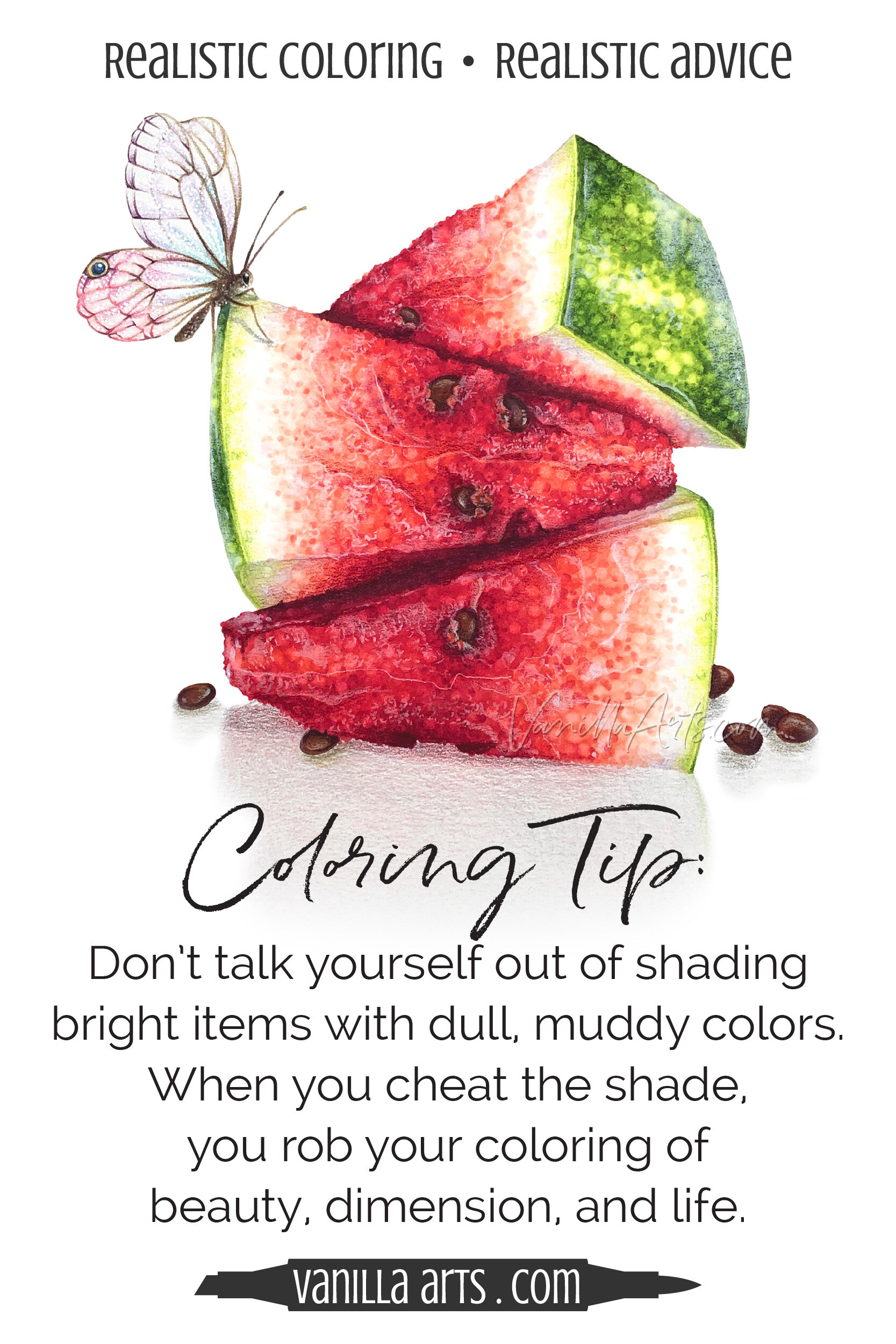
A slice of watermelon is a three dimensional shape.
My wedges here are almost pyramid shaped with four flat sizes, wide at the rind and tapering to a point at the other end.
Each side is at a slightly different angle to the light. Some sides show pure reds and pinks but you won’t see pure, clean color on the undersides or in the crevices.
If you capture the shady colors correctly, you create the illusion of dimensional shape.
Ultimately, beauty is in the shape of the shade, not the color of light.

Our brains are smart.
You can grab a dark red marker but that color won’t fool a brain which has spent a lifetime enjoying the shape of shaded surfaces.
We use photo references to keep our coloring honest and true.
What color is the watermelon skin when the rounded surface tips away from the light?
What color is the juicy flesh when it slopes downward and hides behind another wedge?
What color is the white rind when it turns under a corner and receives a bounce of reflected red?
The colors of shade are uglier than you want.
Don’t let your heart talk you out of the murky color which your brain expects to see on dimensional objects.
As soon as you start thinking “oh no, that’s not a nice color”, as soon as you start grabbing safer colors, when you give the shade less space than it deserves, when you lighten or brighten the undersides, and when the Rainbowitis kicks in…
When you pretty-up the color of shade, you’re changing the shapes we’re supposed to see.
Cheating the shade flattens the object and destroys the illusion of dimension.
Shape is more important than color.
Celebrate what counts for greater beauty and realism.

To everything, there is a season
I know it sounds trite but you really can’t appreciate happiness without times of sorrow. The same thing is true for art. You need shade to understand pretty colors. It’s a comparison thing. Yin-yang. Balance.
Imagine a slice of watermelon, colored with nothing but brilliant color. Actually, you don’t have to imagine it. Just Google watermelon tutorial and you’ll get lots of Rainbowitis melons.
They’re cute but not beautiful.
I totally understand. Every bone in your body rebels when you’re asked to color a white rind with BV23 or to base-coat light red with YG93.
It just feels wrong.
But the presence of mud and murk makes your brights look brighter.
How to conquer your fear of shade
Ah, grasshopper. Take this slowly.
Shade is an acquired taste, especially for colorers who have steeped themselves in traditional Copic blending techniques and clean color tutorials.
In the beginning, you almost have to force yourself to use dirty colors.
The real color of real shade feels very, very wrong. Rainbowitis skews your perception. You’ve talked yourself into believing Copic cap colors are realistic.
They’re not.
This is a real red pill moment.

Open your eyes.
Look for the color of shade in everyday objects to start seeing it in your art.
Make it a game. When you’re sitting on a park bench, waiting in the drive-through, or just camped out on the corner of the couch— look for natural shade in the world around you. The more you see it, the more you’ll see.
And at least for a while, limit your visual influences. Find instructors, tutorials, and follow artists who use real shade colors. If you keep following Rainbowitis Instagrammers, watching clean color videos, and surrounding yourself with clean-color colorers, you’ll be slower to accept real shade as natural.
Lastly, man up.
It’s not very polite but when someone turns in an assignment where they’ve talked themselves out of using the right shade color, I always fight the urge to remind them that they’ve done this to themselves.
You’re the one holding the marker, not the other way around. Nobody forced you to skip the underpaint or leave the white unshaded. You went to great effort to substitute, wimp-out, and dink around with the color— all to avoid doing what you know darned well you should be doing.
Stop helping yourself fail.
So I want you to notice, I’m giving you tips to help conquer your fear of shade and the first three are 100% mental:
Look for natural shade and let your eyes get used to seeing it
Limit your visual influences so that you’re seeing more art with true shade rather than Rainbowitis
Stop allowing yourself to substitute lighter, brighter colors when you know you should be making a muddy color
Now we can finally get to a physical tip:
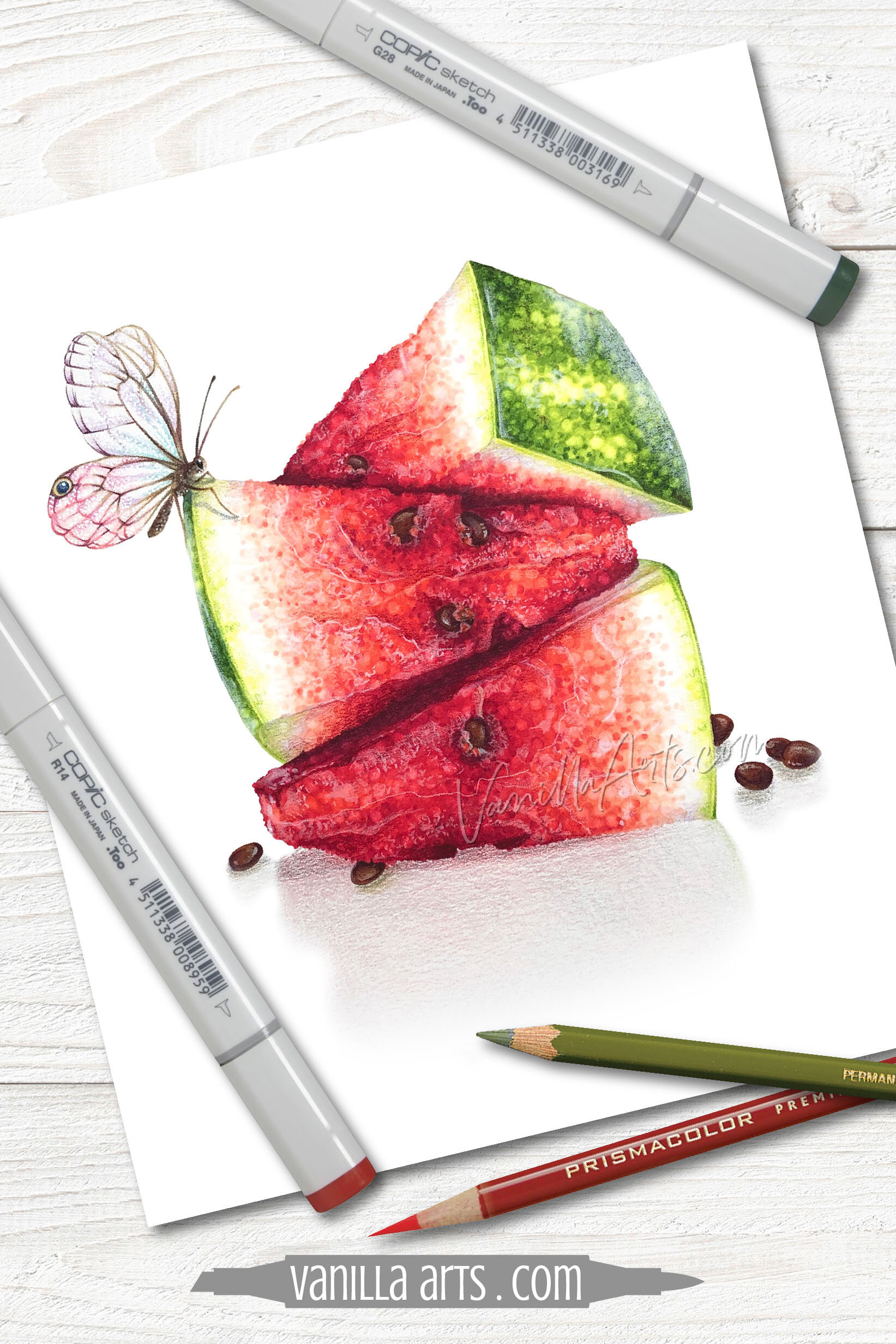
4. Add shading colors to your Rainbowitis recipes with underpainting and overpainting
I recommend digging-out the following colors from your supply kit or purchasing these colors if you don’t already have them. Then keep them in a mug on your desk.
Copic Markers:
Copic Sketching Grays Set
or N0, N2, N4, N6, N8
Prismacolor Premier Soft Core Pencils:
PC901 Indigo Blue (use over cool brights)
PC931 Dark Purple (use over warm brights)
PC1026 Greyed Lavender (tones-down yellow)
PC1088 Muted Turquoise (to shade white or beige)
Grays: PC1060 20% Cool Grey, PC1063 50% Cool Grey, and PC1067 90% Cool Grey (use gray very lightly!)
COPIC: When you’re faced with a bright color recipe, don’t ditch it completely. I frequently underpaint standard Copic colors with gray or violet markers because I know that the recipe I’ve been given won’t produce truly shady colors.
Start with a layer of gray in the shady areas, then add the bright blending combination over the top.
With a range of grays, you can control the brightness of any color. Test to see which gray looks best underneath the bright color. You want just enough gray to tone the color down a notch, you don’t want it to look obviously grayed.
I think the N grays are the most versatile but Cs work nicely too.
PENCIL: If you’ve already applied bright ink colors onto the paper and belatedly realized they’re not shady enough, I find it’s easier to “push” them darker or deeper by overpainting (or toning) with a soft layer of colored pencil. In the pencil list above, you’ll find my most frequently used mud making colors.
CLASSES: I can’t provide a full tutorial on the process here, it takes time to explain and practice— but I teach these underpainting/overpainting techniques in all my coloring classes. For an introduction to the process, see these Marker Painting Workshops:
Let’s shift the focus away from pretty marker and pencils
Beauty comes from shape, not color.
To create beautiful shapes, you need accurate shade.
Don’t talk yourself out of the murky colors which create dimension and beauty in your art.
Stop letting the markers boss you around.

A taste of Realism
Polka-dots are cute but they can become mouthwatering realism!

Ready to try challenge level coloring?
Watermelon Stack an Advanced level Marker Painting Workshop
Learn to create touchable food texture. Stop treating pointillism like a novelty technique. We’re exploring the advanced use of a simple dotting technique to create tasty texture for food illustrations.
Real time coloring, recorded live
Live Workshops are unscripted demonstrations which provide students with a real look into the authentic coloring process. You’ll see mistakes being made and corrected. It’s just like visiting Amy in her home studio.
Log in and color with Amy at your convenience. Anytime access, no expiration dates.
Class was recorded in June 2021 and featured a live student audience. Amy answers questions from the students and offers many tips for better colored pencil art.
Select supplies used in Watermelon Stack:

Vanilla Arts Company is a participant in the Amazon Services LLC Associates Program, an affiliate advertising program designed to provide a means for use to earn fees by linking to Amazon.com.


