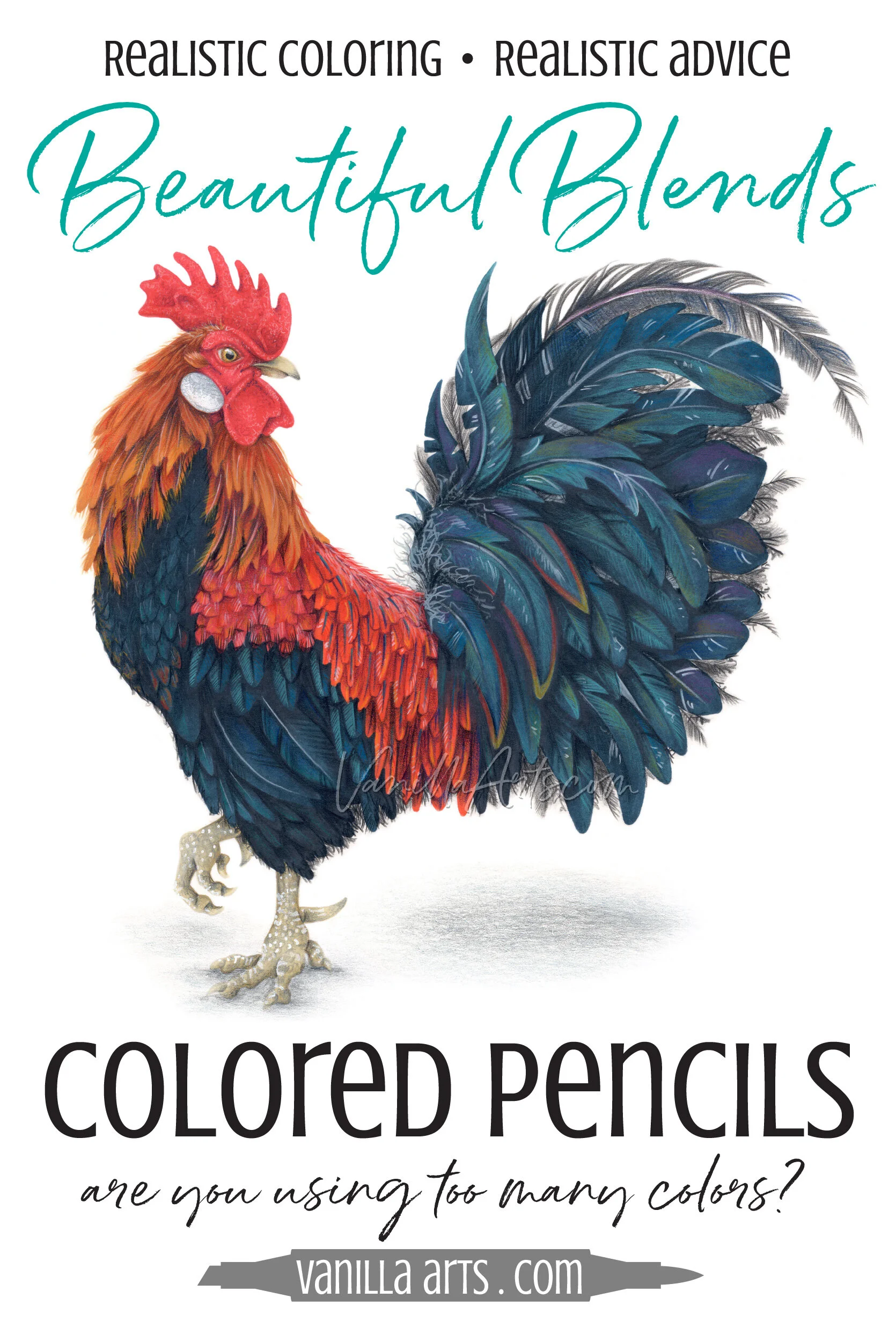
Blending with Colored Pencils: Are You Using Too Many Colors? (More Realism with Fewer Pencils)

Are you frustrated with your colored pencil blends?
You’re not alone.
A lot of people are finding their way into artistic colored pencil now. Maybe you’re coming from the coloring book world, from paper-crafting, or you’re someone who returned to art during the pandemic.
Colored pencil sounds easy, Come on, it’s a pencil! And there are tons of free tutorials, videos, color recipes, and articles out there.
But there’s a problem with all that free knowledge:
Many colored pencil recipes and tutorials lead to cartoonish, flat, or heavy looking projects with very little realism.
You wanted to learn to color with realism and artistry. Instead, you’re getting artificial candy colors and strange blends which don’t turn out the way you expected.
When you try to research what’s going wrong, the information out there is all about the physical process of blending and how to make blends look smoother.
Nobody is talking about color selection, other than to feed you more fake-looking recipes.
Today, let’s look at the most common issue I see with current pencil instruction and why it doesn’t work well for realistic coloring
You are using too many pencils.
Many colored pencil tutorials encourage blending techniques with 5+ pencil colors. Blends make it hard to transition to realistic pencil art because you’re limited to just the colors you own. The artist’s approach layers color to create new colors. Amy Shulke shows you how & offers success tips.
The logical way to blend?
As a trained illustrator— someone who’s gone through the whole art school process and all the classes in painting, drawing, and stuff I’ll never, ever use…
Anyway, I was startled the first time I saw people posting colored pencil glamor shots on Instagram. You know, the kind where they show you the artwork with a rainbow of 40-some pencils lined up in the margins?
Looks super artistic, right?
Except I’m sitting there wondering, “who in the heck uses pencils this way?”
Sadly, a lot of people do.
A rainbow of colored pencils tells me that person has a shallow understanding of how pencils work.
Shallow? Isn’t that a bit harsh?
Okay, but I’m not sure how else to describe it.
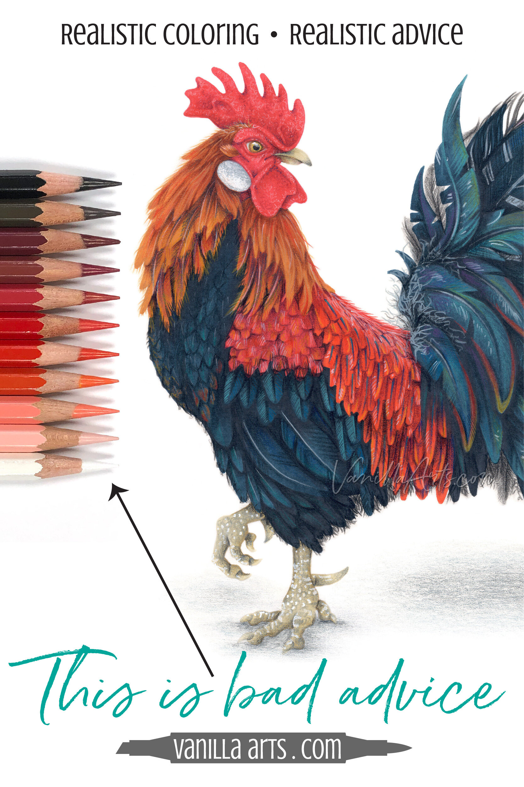
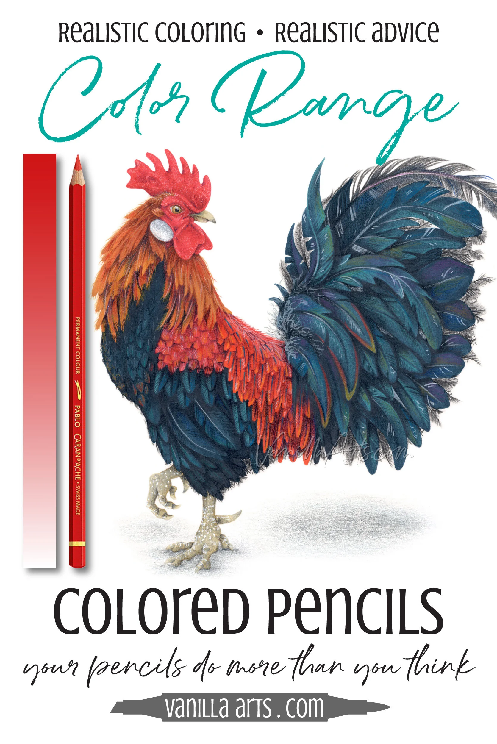
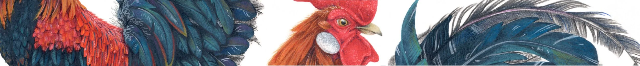
You’re looking at something like the comb on the top of this rooster and trying to identify every single color you see, then selecting a pencil to exactly match that color.
The more colors you see, the more pencils you use. That’s a shallow, superficial approach to coloring.
Let’s call this the methodical method of coloring. Even I have to admit, there’s a strange logic to it.
Methodical coloring assumes that if you want to use a specific color, you must purchase a pencil in that specific color.
So the rooster’s comb is red, let’s grab a couple of red pencils. As the comb dips down on the backside of the head, it starts to gather darkness, so let’s grab some dark reds and reddish browns. We’ll pull out our trusty black pencil for where the color is the deepest. We’ve also got some high spots and highlights on the comb, so let’s select a few light red pencils leading all the way up to white for the hottest highlights.
I’ve pulled all the pencils a methodical colorer might want for the rooster’s comb here. I found 11 pencils.
But if I used all 11 of these pencils, methodically putting each pencil in just the right spot, I’d spend a ton of time worrying about where to put which color.
Then I’d waste more time trying to blend them all smooth.
And people who use this method tend to give way too much space to the darks and the lights leaving little room for any actual red. So in the end, I’d get something which looked cartoonish or even burnt instead of realistic.
Sigh.
Methodical coloring is needlessly complicated and ignores the fact that colored pencils can be layered to create an infinite rainbow of colors.
More Colored Pencil Tips:
Don’t miss my previous colored pencil articles, click to read more


You don’t need a ton of pencils!

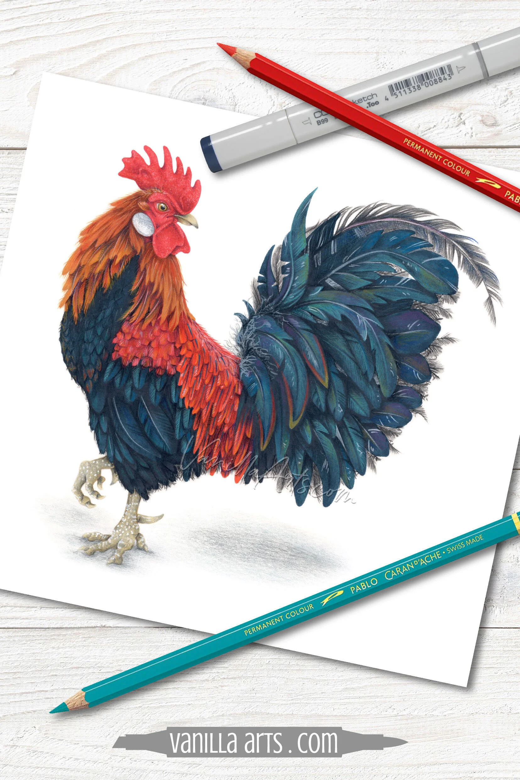
I colored the rooster’s comb with three pencils.
Yes, three pencils.
Only one of them was red.
Scarlet Red, Ultramarine Blue, and a funky peachy-pink pencil called Granite Rose.
That’s it.
And my rooster’s comb looks touchably real.
Now I’m not saying I have the best colored pencil method mankind has ever seen. I’m not saying my way is the only way to color with colored pencils.
My point is that you don’t really need eleven pencils if it can be done with three.
Maybe we meet somewhere in the middle? Four? Six? But oh, even six feels like overkill.
Let’s take a look at how colored pencils work.
If you’ve been using the methodical method, let’s get you thinking less about color matching and pencil blending…
Let’s get you to a place where you can spend your time thinking about how to color with life and artistry.
Because realistic color doesn’t have to be so hard!
Every pencil is a range of colors
Far too many people misunderstand what the paint on the outside of a colored pencil means.
“This pencil is this red.”
Nope.
That’s not what the paint is there for.
The indicator on a colored pencil is NOT what color the pencil is— it’s one of the many colors the pencil CAN be.
The paint indicator shows you the maximum color of the pencil.
This pencil is red. If you build up several layers of this red pencil, you’ll get a red color which matches the red exterior paint.
But that’s not the only color it can be.
If you use less pressure or fewer layers, you can get a whole range of interesting red values from one red pencil.
A proficient colored pencil artist will use this one pencil for a wide variety of reds instead of grabbing lighter and lighter red pencils.
I personally almost never use a pencil for its maximum color. I’m always using pencils in their mid to faint range.
This is why I said earlier that someone using eleven pencils has a shallow understanding of color. They’re only looking at the paint indicators and never using a pencil to its full potential.
If you’re always coloring at maximum color, you will always be limited by the size of your pencil collection.
And you’ll never develop the dynamic, interesting, and realistic colors that come from using several layers of diverse mid range colors.
This article contains affiliate links to trusted retailers like Blick.com and Amazon.com.
Vanilla Arts Co. is a participant in the Amazon Services LLC Associates Program, an affiliate advertising program designed to provide a means for use to earn fees by linking to Amazon.com.
This is not a sponsored post.

The problem with using too many colored pencils…
Look, I can’t stop you from using every pencil at its maximum color. I can’t stop you from switching pencils instead of switching pressure.
But here’s why I don’t teach the eleventy-million pencil method and why it’s causing your work to look flat, cartoonish, and just plain fake.

Remember the series of light to dark methodical colors I selected for the rooster’s comb?
The comb itself is cool red, it’s pencil E in the photo above.
That was my starting point. Then I had to find several lighter reds and several darker reds, so I went pencil shopping in my set of 120 Caran d’Ache Pablo pencils.
The problem is that stepping lighter or darker ignores more important factors in pencil selection.
Pencil F is one step lighter than E but it’s also several steps warmer. Pencil H is so warm it actually looks orange in the photo. My rooster’s comb is skewing warm when I only intended to step lighter.
Even worse is what’s happening on the dark end. From cool E, we went warmer with D, cooler with C, warmer with B, and cooler with A.
When you mix warms and cools randomly in a blend, your colors start to look heavy and dull.
Temperature isn’t the only thing that went haywire when I started picking pencils based solely on lighter and darker.
Many people think they have blending technique problems when two pencils don’t blend smoothly…
In reality, it’s not a blending issue, it’s an opacity issue.
Opaque pencils tend to be softer than transparents and when you blend them together, one will always overpower the other.
Base red E is a medium translucent pencil. F is several steps more opaque but G is transparent. H is translucent but then I, J, K are as fully opaque as a pencil can get. On the dark end, D is translucent, C is transparent, B is opaque, and A is translucent.
See how we’re bouncing around everywhere from opaque to transparent with no rhyme or reason? Picking colors light to dark gave us at least 5 pencil neighbors who will not be happy blenders.
Now admit it, your eyes glazed-over about 5 paragraphs ago, didn’t they?
Half of you only skimmed this section. Some of you are hitting this bolded paragraph and wondering if you should double back and read what you missed.
That’s because nobody wants to think about this stuff.
I DO THIS FOR A LIVING AND EVEN I DON’T WANT TO THINK ABOUT THIS STUFF!
You want to color. You don’t want to think warmer, cooler, lighter, darker, transparent, opaque, hard, soft, french fries, or onion rings?
This is why I don’t recommend gigantic blending combinations.
The more pencils you pick, the greater your odds of picking wrong.
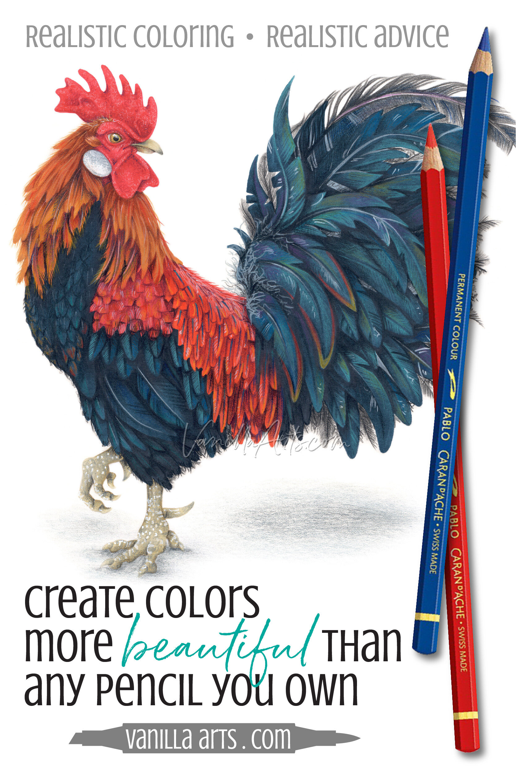
Layer colors instead of blending
Instead of looking at a pencil and asking what color do I see?, ask yourself what colors can I make?
It’s a totally different mindset.
Blending one color into another can only take you so far. You’re limited by the number of pencils you own, the kinds of colors you own, and the number of blending combinations you can find which don’t result in disappointment.
Colorers blend existing colors.
Artists create new colors.
To take the next step from coloring books and tutorials to artistry, you must treat your pencils like paint.
Artists don’t buy 900 tubes of red, they mix 900 reds on a palette.
In colored pencil, instead of mixing paint on a palette, you’re layering a red pencil with a blue or a purple pencil to make a gorgeous new color that’s not in your pencil box and probably doesn’t even have a name.
It’s your unique color.
This process is easier than you think and it’s a heck of a lot easier than tracking down a pencil that’s 1 step lighter than scarlet but not cooler with the same translucency and the right consistency and adheres to the paper you’re using without beading up or fading over time… ugh!
You can do this!


How to create beautiful colors
I can only teach you so much in one article.
But this is something you can totally learn to do on your own over time. Nobody taught me to do it, I figured it out by myself but remember, that was back in the dinosaur days (the 1980s), long before anyone took colored pencil seriously enough to offer classes.
Once you get the general concept, you can teach yourself to do this.
In painting, we mix colors. Squirt a blob of one paint and stir it together with a different blob of paint to make a third color of paint.
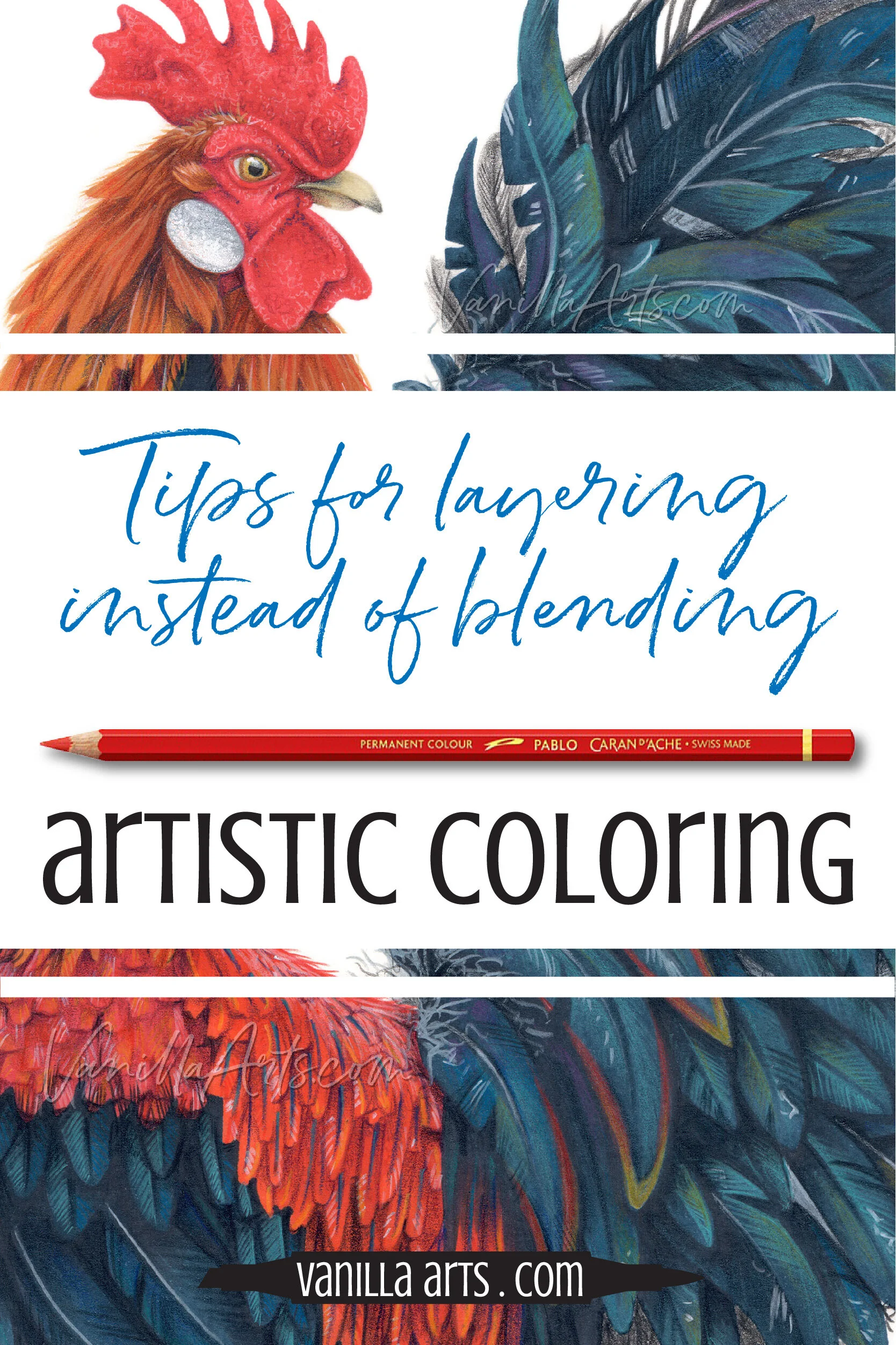
In colored pencil, you mix colors by layering one color directly over top of another color.
In blending, you’ve been laying two colors side by side and smoothing out the transition between. Layering is different, it’s physically laying blue over the top of red to create something that looks a little red but also a little blue.
Because its pencil, we’re never fully stirring the colors together. In layering, I call the process brain blending because from a distance you see a dark red wine color but up close, you see bits of blue and flecks of red.
You don’t need solvents. In fact, this looks better without solvents. Just lay one color over the top of another. It’s that simple.
That’s really the whole technique.
Now how you layer is another matter.
How you layer makes all the difference.
And that’s the part I can’t teach you. It’s all experimenting to find what looks good and what doesn’t.
It’s largely a matter of taste.
What looks good to you?
What looks interesting to you?
What looks realistic to you?
Don’t expect to hit great layering combinations right away or every time.
You’ll create a lot of ugly layering combinations before you hit a combination which pleases you. Over time, you’ll develop a sense of what works and what you like. With experience you’ll build a repertoire of colors and layers that you like.
Okay, now that you’ve got the concept, let’s cover a few tips to make your self-learning process easier than mine was…
Tips for layering colors
Here are a few tricks I’ve learned over the years.
You can mix brands of pencils. Smart artists use a second brand to fill the color palette holes in the first brand. But be aware that pencils can match color without matching in opacity, pigmentation, and hardness. This is why I get so frustrated with color substitution charts because they only look at color! Recommended pencil brands + info here.
Quality paper is important. Sadly, you get what you pay for. To layer pencils, we need a toothy (textured) surface. Popular card stocks for card makers and paper crafters are usually too smooth. Consider hot press watercolor paper, fine drawing papers, vellum textured bristol board, or illustration board. Recommended paper suggestions here.
Always use soft pressure. We want the ability to add many layers of pencil. Using a soft pressure allows more layers but also allows the color of lower layers to shine though your upper layers. Heavy pressure can also damage the toothy texture of the paper and lead to premature burnishing.
Do not burnish until you’re in the end stages of the project. Burnishing is when you’ve filled the toothy texture of the paper completely (or you’ve flattened the tooth with pressure). As you approach the burnished stage, your color starts to look smooth and glassy. The problem is that nothing sticks to a burnished surface, so you can’t go back and make color adjustments or fix mistakes. Not everyone burnishes, I rarely do, so don’t feel obligated. If you must burnish, save it until the very last step when you know your layers look correct and pleasing.
Do not burnish with white or transparent pencils, burnish naturally. Many hobby level pencil tutorials recommend burnishing with a white pencil or a colorless blending pencil. This is simply not necessary. When you use enough layers for vibrancy and to fill in the tooth, you’ll naturally reach a burnished stage without special pencils. I’m not saying artists never burnish with white or blender pencils but there are downsides to both which many prefer to avoid:
Burnishing with white lightens the overall color of the area.
White can chemically react with lower layers, turning hot pink or florescent blue over time.
Blending pencils can bloom or discolor over time.
How you layer changes the mixture. This is why experimentation is so important. Red over blue looks different than blue over red. Some of my favorite combinations look completely different in reverse order.
Practice on scrap paper. This refers back to the previous point. Because order is important, I color with a sheet of scrap paper next to me. Figure out the ideal layering order on something disposable rather than on your final project.
Many layers look better than few. Even if I’m only layering 2 colors, it’s never just one coat of each. My typical order might be something like 2 Scarlet, 1 Ultramarine, 1 Scarlet, 1 Ultramarine, 2 Scarlet.
Top layer determines the color we see. Remember when I said red over blue looks different than blue over red? The top layer usually determines the name we give to the mixture. Blue over red looks blue-ish. Red over blue looks red-ish. Keep this in mind when coloring a banana, if your banana looks orange-ish, maybe you need one more layer of yellow on top to restore the yellow banana vibe.
Start with a base coat of the local color. As a beginner, it’s best to start a rooster’s comb with red because layers can be distracting. Starting with red increases the odds that you’ll end up with a red comb when you’re done, rather than a blue comb. As an advanced student, you can start to play with under-tones and under-glows but in the beginning, you’ll learn faster if you don’t overcomplicate your experiments.
Shade or darken the base color with a transparent pencil. In general, shading is done with darker pencil colors and because it’s darker, you don’t need to apply as much pencil to create the sense of shade. Transparent darks are more forgiving because they allow the previous layers to shine through. My students know dark transparents as “magic pencils”. I teach with them because they’re easy to master but I use them in my own art because they’re so flexible.
Highlight or lighten the base color with a more opaque pencil. Translucent light pencils look almost invisible over darker colors so they’re a waste of time and tooth. Use an opaque pencil which can block or mask some of the color below.
Every brand has reactive colors. The incongruency often happens when mixing a light opaque with a dark transparent. As I hinted above strange chemical reactions happen when dark sticky pencils meet pencils with a high white content. White acts like a sponge, sucking color from lower layers and letting it bloom days or weeks later. What started as white or pale pink top layer can absorb color and turn hot pink or vibrant green. This is why I encourage students to stick with one brand for six months to a year, learning which pencils react with which other pencils.
Lift a mistake rather than layer over it. Top layers can’t completely cancel out lower layers. It’s easier to lift the mistake color with a sticky-tack eraser than to use numerous layers trying to hide it.
White content & opacity matter. If you’re layering and the color starts to look less vibrant and slightly muddy, take a look at the pencils you’re using. One of them likely has too much opacity and is dirtying the blend.
There are always exceptions to the rule. For every tip I’ve listed here, I can think of situations where I broke the rule to get a specific effect. This is why you need to experiment for yourself. Your art should reflect your taste, not my rules!
The most important tip: With time, you’ll develop an instinct for how to layer.
When I first started with pencils, I’d fill several scrap papers with my layering experiments. Now 30-some years later, I maybe do 2-3 test swatches per project. I’ve developed an instinct for what works. The same thing will happen to you too.
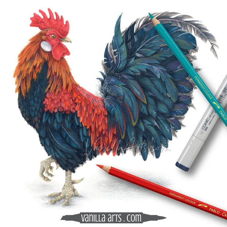
“Chanticleer” the rooster in this article was colored with Copic Markers and Caran d’Ache Pablo Colored Pencils
Where can you find Pablo Colored Pencils?
Caran d’Ache products are easy to find in the United States, Canada, and Europe.
Caran d’Ache makes many different kinds of colored pencil including student grade pencils. Please make sure you’re purchasing Pablo pencils.


Cock-a-doodle-dooooooo
Introduction to bird coloring techniques— let your markers fly!
Join Color Wonk today for instant access to this workshop and many, many more
Select Products used in Chanticleer:
Vanilla Arts Company is a participant in the Amazon Services LLC Associates Program, an affiliate advertising program designed to provide a means for use to earn fees by linking to Amazon.com.