Beginner Lessons, Remember When Classes, Journal Amy Shulke 10/26/16 Beginner Lessons, Remember When Classes, Journal Amy Shulke 10/26/16 12 Pages: "In One Acorn" a Kit-Based Art Journaling Class Read More Beginner Lessons, Remember When Classes, Supplies, Watercolor Amy Shulke 9/28/16 Beginner Lessons, Remember When Classes, Supplies, Watercolor Amy Shulke 9/28/16 Palette Detective: Watercolor Mixes for "Nasturtium" Botanical Read More Watercolor, Floral, Botanical, Beginner Lessons, Challenge Level Classes Amy Shulke 7/15/16 Watercolor, Floral, Botanical, Beginner Lessons, Challenge Level Classes Amy Shulke 7/15/16 Royal Iris: a Copic and Colored Pencil Vanilla Arts Digi Stamp Read More Beginner Lessons, Copic, Copic Blending, Tips, Improve Your Coloring Amy Shulke 4/18/16 Beginner Lessons, Copic, Copic Blending, Tips, Improve Your Coloring Amy Shulke 4/18/16 Five MORE Mistakes Beginning Copic Colorers Make (and how to fix them) Read More Newer Posts
Beginner Lessons, Remember When Classes, Journal Amy Shulke 10/26/16 Beginner Lessons, Remember When Classes, Journal Amy Shulke 10/26/16 12 Pages: "In One Acorn" a Kit-Based Art Journaling Class Read More
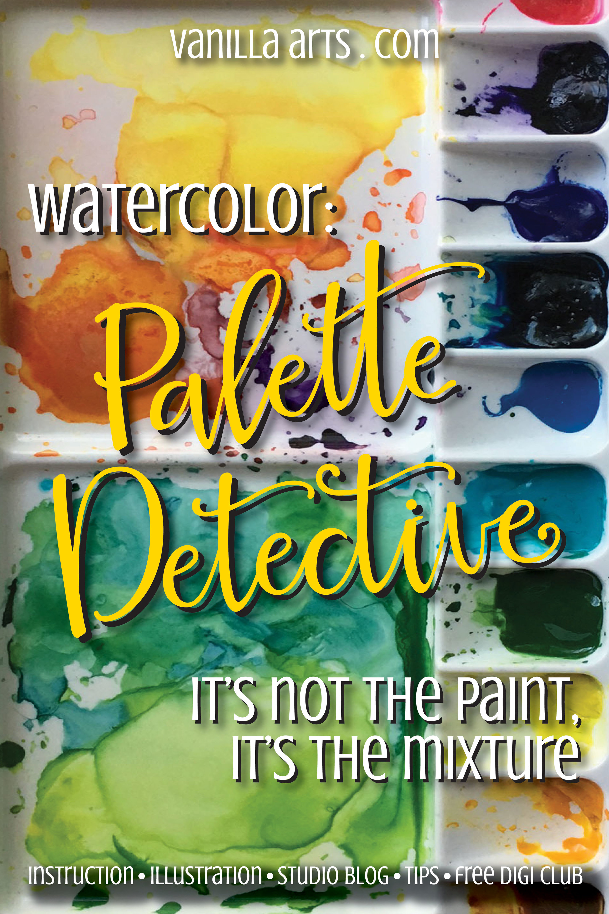
Beginner Lessons, Remember When Classes, Supplies, Watercolor Amy Shulke 9/28/16 Beginner Lessons, Remember When Classes, Supplies, Watercolor Amy Shulke 9/28/16 Palette Detective: Watercolor Mixes for "Nasturtium" Botanical Read More
Watercolor, Floral, Botanical, Beginner Lessons, Challenge Level Classes Amy Shulke 7/15/16 Watercolor, Floral, Botanical, Beginner Lessons, Challenge Level Classes Amy Shulke 7/15/16 Royal Iris: a Copic and Colored Pencil Vanilla Arts Digi Stamp Read More
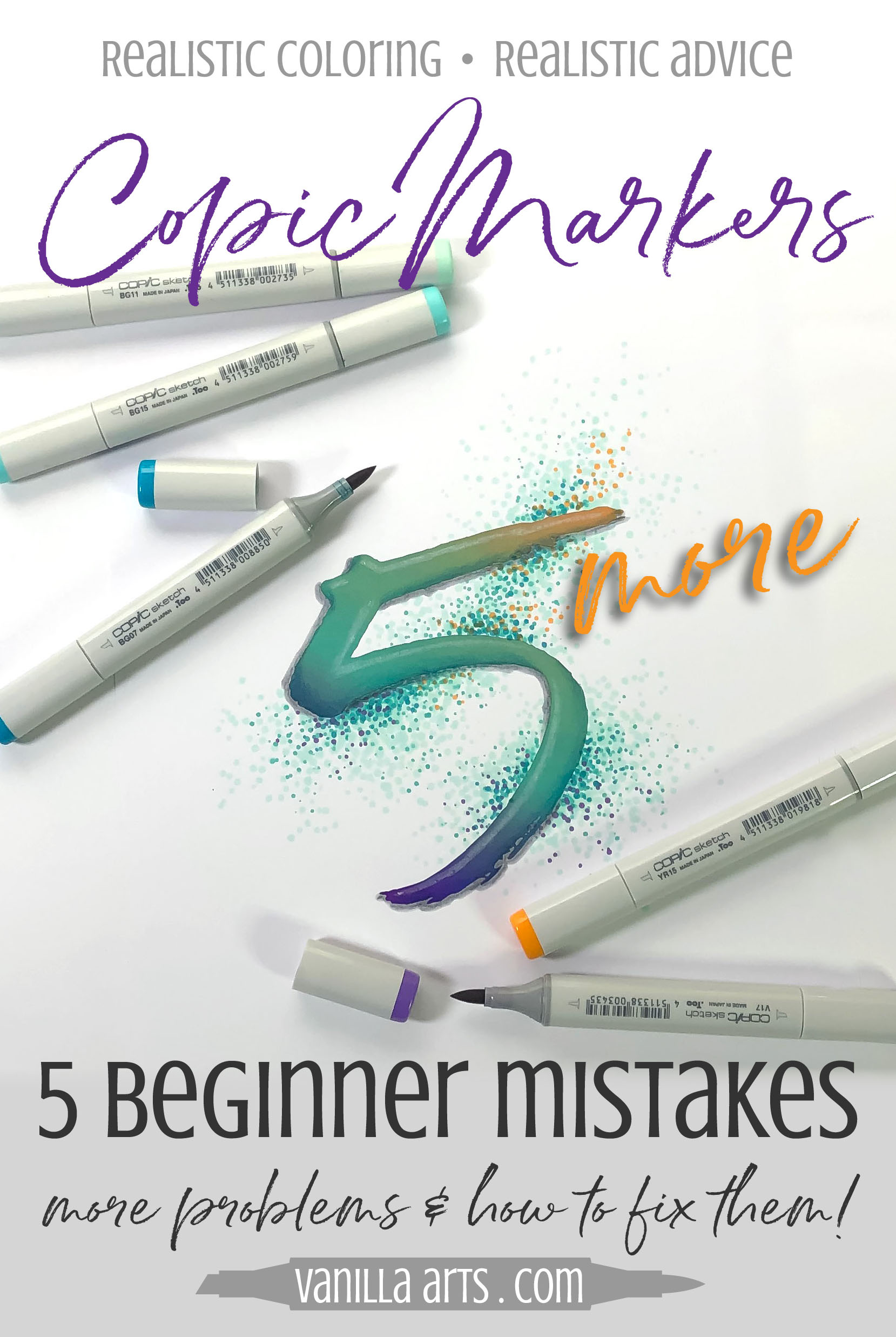
Beginner Lessons, Copic, Copic Blending, Tips, Improve Your Coloring Amy Shulke 4/18/16 Beginner Lessons, Copic, Copic Blending, Tips, Improve Your Coloring Amy Shulke 4/18/16 Five MORE Mistakes Beginning Copic Colorers Make (and how to fix them) Read More