Remember that feeling you had when you first learned to ride a bicycle? The speed, the wind in your face, the feeling that you’d fly to the moon if you could just pedal fast enough. You probably spent the entire summer riding up and down the street. That first burst of freedom is pure joy.
Copic colorers experience the same thing when they finally pin down the mechanics of smooth blending. And once we get a taste of it, we’re hooked. We will blend and blend and blend… just for the sheer happiness of it.
I’ll admit it, even after years of marker experience, I still love it when a satin smooth blend appears. It’s a special kind of satisfaction.
But at what price?
Yes, there’s a price to be paid when you blend.
Most colorers don’t even realize they’re paying for blends. They’ll blend all day long- smoothing and re-blending their projects repeatedly without recognizing the damage they’re doing to the overall image.
Your quest for the perfect blend sacrifices color value
Yep. Every time you blend, you loose some of the deep dark color that is essential to realism.
The more you blend, the more value you loose.
What is value?
Value is a measurement of the strength of a color. You can’t say “light” or “dark” because light and dark are relative terms. Lighter than what? Darker than what? Is dark yellow darker than light blue?
Lighter or darker is an opinion.
Not value though. Value is a exact way of measuring the strength or visual potency of a color. Now I’m not talking theoretical art terminology here. You use color value measurements all the time; you just don’t realize it.

In Copics, the last number on the marker cap indicates the value of the ink color. Copic has computer measured the strength of that color and they’ve told you where it rates on their value scale.
That last number is consistent across all the color families and it sets up a relationship between colors that you might think are completely unrelated. A Y38 is the same value as a BG78 because they both rate an 8 on the value scale. R17 measures the same value as E77 even though they’re from completely different color families.
Value is important because capturing accurate values are one key to realism. In order to make something look rounded and three dimensional, you don’t just need shade, you need shade that’s deep enough and potent enough to simulate depth. If you skimp on the values, your shaded areas aren’t strong enough, and that flattens out your coloring.
And as I said before, blending robs your project of value.
Why?
Because we blend with our middle and lighter Copic markers.
In Copics, a low last number indicates a higher level of colorless blender in the ink. Colorless blender destroys value. E33 has far more colorless blender in it than E37. So when I hit that E37 with a low value brown marker to blend it out, I’m moving some of that level 7 color around to make the entire area feel lighter and less potent. The more you blend, the more that E37 starts to look like E36 or E35.
That’s important!
You may have used a dark marker but it no longer carries the original value after you complete the blending process. Once you’ve blended it, it’s no longer as dark as it once was. You have removed some of its value.
This is a serious problem for a lot of intermediate level colorers who tend to be obsessed with blending. They’ll blend and reblend their areas, chasing the thrill of a perfect blend…
...and then they wonder why all their projects look flat.
Blending kills value.
Blending also kills contrast
Contrast?
Contrast is the difference between two values. There is very little contrast between E33 and E34, the colors are too similar. Conversely, there’s a lot of contrast between E33 and E39.
Artists care about contrast. The most pleasing images feature contrast AND a good range of values within that contrast range.
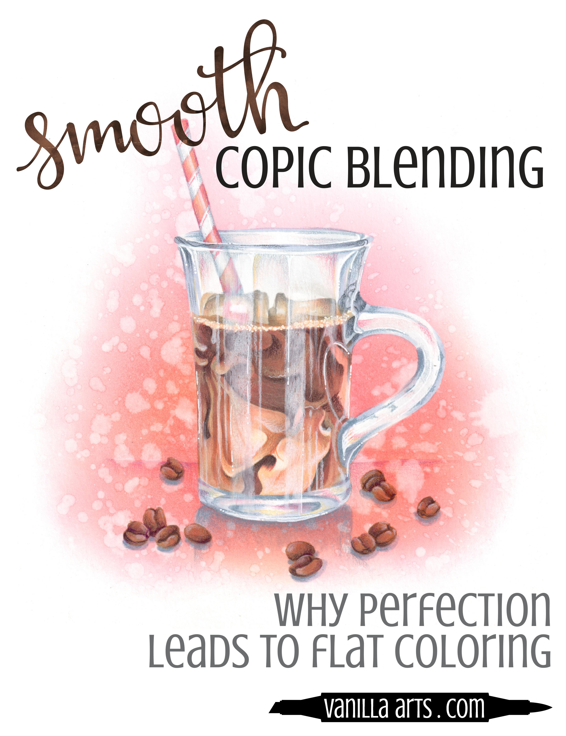
The Iced Coffee illustration shown here uses markers that end in 9, 7, 5, 4, 3, 1, and 0. That’s almost a full range of Copic values from the darkest parts of the coffee to the palest gray of the glass mug. Realism relies on value and a balanced contrast range.
But think about what would happen if I started obsessing about my blends.
If I hit my coffee browns (E89 and E59) with lots of E35 to improve the blend, that lighter marker will eat away at my level 9 browns, lowering their values to maybe 7s and 6s. Even though I used E89, it won’t look like E89 anymore.
And it won’t look like black coffee anymore, it’ll look like chocolate milk.
Middle value washouts happen when you blend so darned much that you equalize the values between your lightest areas and your darkest.
You chase away the value and you ruin the contrast in the attempt to create a perfect blend.
Blending flattens your projects because it decreases values and equalizes contrast. And I hate to put you in a box, but 90% of the time when someone comes to me with the old “why does my coloring look flat?” question, it’s a case of an intermediate level colorer who blends the heck out of every project.
Your new skill is also your downfall.
You can’t keep blending without paying a price
Some amount of reblending is good!
But when you overwork your coloring in the quest for the perfect blend, you waste all the dark ink that you originally applied. “One more try” can be the kiss of death for depth and dimension.


Here’s the other problem:
When you over-lighten the color of an object in the blending process, it not only flattens out, but sometimes people can no longer identify what the object is anymore.
I can’t tell you the number of coffee projects I’ve seen where the coffee was peanut butter brown. I’ve also seen a lot of pink apples and yellow pumpkins. The colorer may have started with coffee brown, apple red, and pumpkin orange but when they blended the project to death, they killed off the color identity. Mis-colored food is confusing, unappetizing, and unrealistic.
Now I’m not saying that you should never blend a second time.
Instead, I want you to be aware that additional reblending passes will eat away at your value and contrast.
Knowing is half the battle.
If you’re aware of the damage your’e doing, you’re less likely to keep doing it. Mindfullness helps curb your tendency to reblend and smooth an area for the third, fourth, or fifth time.
In the long run, that perfect blend means nothing if you’ve lost your values.
Swirls of Coffee Color
Learn to color realistic food and beverages with Amy’s mixed media techniques

Ready to try challenge level coloring?
Iced Coffee an Intermediate Challenge level Marker Painting Workshop
Learn how to read photo references to capture the most important details while simplifying the minor details. This concept will help you move beyond tedious coloring, relaxing into an artistic style that’s more intuitive and less exacting.
Real time coloring, recorded live
Live Workshops are unscripted demonstrations which provide students with a real look into the authentic coloring process. You’ll see mistakes being made and corrected. It’s just like visiting Amy in her home studio.
Log in and color with Amy at your convenience. Anytime access, no expiration dates.
Class was recorded in October 2021 and featured a live student audience. Amy answers questions from the students and offers many tips for better colored pencil art.