Copic Coloring: Artists Do Not Shade- Part 3

 
The Copic shading system leads to frustration. Learn how to combat flat coloring by changing your technique and your outlook. | VanillaArts.com


Artists do not shade?

Last month, I innocently dropped a comment that “artists do not shade”Then the emails started coming in:

"But I've been taking coloring classes for years and that's what we've learned. What am I doing wrong?"

My answer is a three part series and it definitely pays to read the articles in order.

Please backtrack to read Part One first. That's where I explain the problems with the Copic blending trio system. If you're trying to add more depth, dimension, and realism then you should start by ditching the recommended Copic blending trios.

Then read Part Two where I discuss the problems with shading theory for colorers. If you've tried all the tutorials and you're still not coloring with realism, you'll find out why in Part Two. Standardized shading technique leads to flat coloring, no matter how much you practice!


The Tutorial Trap

In Part 2 we covered the two types of coloring classes or tutorials.

The "shade around the edges" technique leads to flat and unrealistic coloring. Meanwhile, the "put the shade where I tell you" style tutorials leave you dependent upon the instructor's wisdom.

The Copic shading system leads to frustration. Learn how to combat flat coloring by changing your technique and your outlook. | VanillaArts.com

But there is a deeper problem with both styles of shading-

Shading formulas rarely fit well with your stamp images.

What good is "shade the edges" when you're coloring a bicycle?

And you'd be hard pressed to find two Copic instructors who would tell you to shade identical bicycles the same way.

This failure leads you to hours of blog hopping, hoping to stumble upon something that works. You'll start hoarding tutorials and creating gigantic Pinterest boards full of "How to Color Easy Elephants" and "How to Color a Pink Squirrel on a Rusty Unicycle" step by steps.

Pink squirrel on a rusty unicycle? I'm not kidding.

For tutorials to work, they must be very specific to one particular stamp. The instructions for something as simple as "How to Color an Apple" fail completely as soon as anything in the stamp image changes. Place that apple on a black background or cut the apple open, put the apple in a basket, add a banana next to it, or change the apple from Red Delicious to Granny Smith and suddenly that realistic apple tutorial doesn't work anymore.

Then you're stuck hunting for new apple tutorials. It's a vicious cycle.


Learning to read

We thought my daughter was a genius.

We had a ton of early-reader books and she could read them all before she started school. For about six months, she was the kindergarten star. Point to any sentence and she'd tell you what it said.

But then she started falling behind. She struggled with new words and her cute little narrator's voice was lost in a sea of uhms and uhs.

Here's the thing that we didn't realize (and even her teacher missed)- my daughter had never really learned to read.

Her brother is two years older and we always read to the kids together. Then her brother started reading aloud and his books were at just the right level for my daughter to start making connections. It wasn't long before my daughter had memorized the entire bookcase of books.

It wasn't that she memorized stories or phrases; instead, she memorized the words "bed" and "dog" by their visual shape. The word "bed" was a picture; she saw it as three round shapes with a stick on each end, almost like hieroglyphics!

At a certain point, when the words got longer and the sentences contained more words, she wasn't able to keep up with the memorization game.

Without the ability to sound out new words, her amazing reading skills evaporated.

You're doing the same thing when you use tutorials to color.

Because you're not learning how to read.


Using your eyeballs

A lot of people assume that art classes teach people how to draw things- how to draw a lemon, how to draw a cupcake, etc. Bookstores are filled with "How to Draw a ______" type books and the children's department is littered with especially pernicious easy-draw books.

This leads to the idea that to be an artist, you've got to be able to draw random objects on demand. That the best artists are great because they've memorized how to draw more things.

The Copic shading system leads to frustration. Learn how to combat flat coloring by changing your technique and your outlook. | VanillaArts.com

But that's not how it works.

I've spent a lot of time sitting in art classes. I've never once had a "How to Paint a Pocket Watch" class.

Art at the college level is not Potted Plants 101 and Basic Buildings 140, working your way up to Advanced Chipmunk Techniques 450.

That's not how art works.

Art classes are about learning how to read

Art school was 4 years of figuring out how to use your eyes to observe the objects around you. Learning how to read the shape, line, and color of everyday items.

It's all about seeing.

The more you see and the stronger your observations are, the better your drawing, painting, or coloring will be.

It all starts with the eyes and that's the part which 90% of coloring tutorials skip.


Remember that sphere?

I mentioned in Part 2 that the sphere shading lesson was an exercise taken completely out of context. Colorers completely misunderstand the point of the sphere diagram.

The sphere exercise is not supposed to teach you how to shade a sphere.

It's a lesson on finding the surface of the sphere, letting your eyes wander across the surface and noting where the color changes. The goal is to find the edges between lights and darks and to note how the color travels.

sphere_large.jpg

The most important part is what happens after the students shade one sphere. Once students understand the sphere, the class gets up and switches seats. Suddenly, it's a whole new sphere! Now the challenge is to see how the lights and darks are different from a new vantage point.

Then in the next step, the sphere changes to red, or blue. How does it change the behavior of light and color? Or perhaps the teacher swaps the sphere for an egg, a cube, or a wadded up piece of fabric.

There's a lifetime of lessons that come after shading a sphere for realism! Every change the instructor makes forces the students into re-reading the object for new patches of light and dark.

That is why art is a life-long study.

Every time you change the vantage point, the lighting, the color... any slight change you make alters the entire look. Even subtle shifts create whole new landscapes of light and dark. It takes a lifetime to visually explore all the variables and options. 

You can't memorize this stuff. It's too much.

Artists learn to read and then they spend every day after that practicing their reading skills.


Tutorials do not work

... because life is too complex.

Look at my pocket watch illustration here.

The Copic shading system leads to frustration. Learn how to combat flat coloring by changing your technique and your outlook. | VanillaArts.com

I haven't Googled it but I'm certain that I'm not the first person to color a pocket watch with Copics. There may even be a "How to Color a Watch" video or tutorial on the internet right now.

But really look at my watch. Look inside the watch cover.

There isn't a Copic tutorial anywhere that shows you how to shade the inside of a watch cover like that.

And really look closely, because there's more than shade inside my cover. The cap looks concave and recessed, not because of shade but because of how the reflections travel.

Try to find a tutorial that explains how to reflect the watch face in three different areas of the inside of the cap! The larger numerals, the miniature clock-face, and the winding stem are all reflected inside the cover!

I can not teach you how to color something like this.

No teacher can.

This is not a lesson that can be conveyed via words, or written text, or even step by step work-in-progress photos.

You must learn to see it.

Only then can you do it.


Artists do not shade...

Because realism is so much more than shading.

There isn't a quick and easy formula, no one size fits all tutorial, and no 10-step solution to coloring objects for realism.

Tutorials can not teach you how to see and seeing is the key to life!

When an artist approaches a lemon, or a cupcake, or a pocket watch, they're not looking for shade. In fact, as I was coloring this watch, the only time I consciously thought the word "shade" was as I was darkening the upper left corner of the white watch face!

The rest of the time I was looking at the watch as if it were a landscape.

The watch has dips and valleys, plateaus and raised edges. Some of the surfaces are close to me, others are farther away. Some of the shapes have hard edges and others have very soft edges.

And the color!

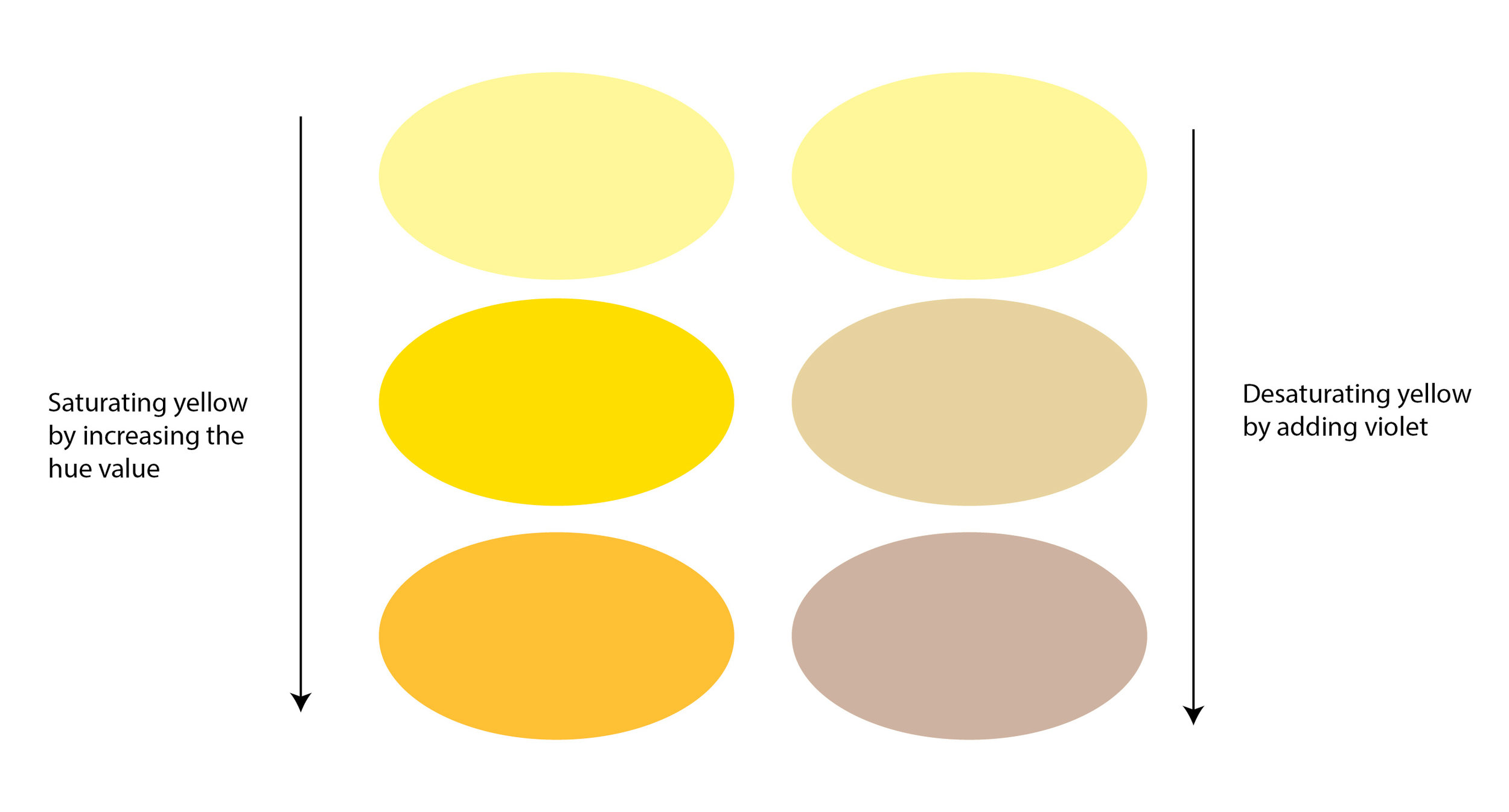
The color saturates and desaturates as the eye travels across every single landscape feature.

"Shading" is an incredibly superficial way of approaching your art.

This is why you can get some depth, some dimension, and some realism without ever once coloring anything that actually looks real.

You're not reading the color!


Can you learn to read color?

ABSO-FREAKIN'-LUTELY! It's not a unique or rare talent.

The Copic shading system leads to frustration. Learn how to combat flat coloring by changing your technique and your outlook. | VanillaArts.com

Reading is something EVERYONE can learn to do.

But you have to ditch the tutorial concept.

You have to scrap the idea of blending combinations and project recipes.

No more light charts and no more "put the shade right here" style instruction.

And relax, I'm not about to recommend enrolling in years worth of expensive classes.

You've always had the power all along, Dorothy! And hey, no ruby slippers or creepy scarecrow hitchhikers required.

Before you color a stamp, look for a photograph of that object. If you're lucky, you might have the actual object in your house to look at.

It doesn't have to be an exact match. Close is good enough!

Visual references are what you've been missing. You have the eyes, now you need photos and objects to read.

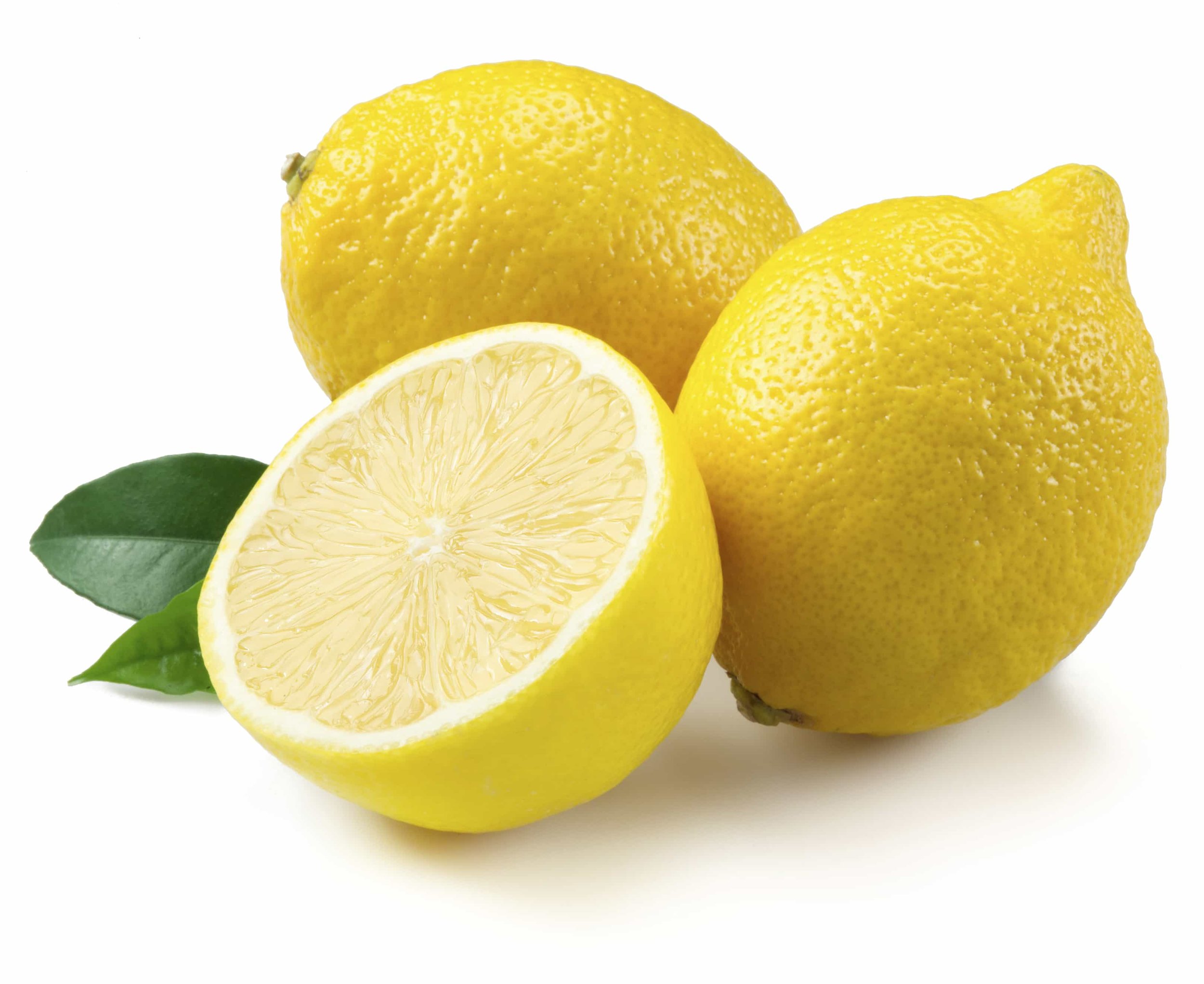
Look for lemons before coloring lemons.

Look for cupcakes before coloring cupcakes.

Look for apples, look for pocket watches.

Let your eye travel across the surface of the item. Don't look for shade, look for changes in color. What colors do you see and what shapes do they take?

Then and only then do you pick up your marker to color.

You have to see before you do.

When you color, color what you see.

Don't color what someone told you, color what you see. The more you see, the more you'll add to your coloring. It's a slow-growth process but it's the same one used by artists everywhere.

It's not about shade, it's about the shape of color.

Artists read.

Artists do not shade.


Pocket Watch Is Now Available In The Vanilla Stamp Shop!

Pocket Watch -

Capture a moment of time! My students love the challenge of coloring realistic, unusual images. Pocket Watch is an intermediate/advanced level digital image and perfect for those looking to challenge themselves.

This digital image is an original stamp created for the students of my 2018 Harbor Springs Summer Art Retreat. It was originally colored in watercolor and colored pencil but is also perfect for Copic and other mediums.…your options are endless!

 
2 Signature Teal.jpg


Vibrant Copic Color: Finding Balance for Bold Colors

 
Vanilla Livestream lessons for Copic colorers. Ultramarine Blue is a bold and vibrant color which can easily overwhelm your projects. Learn to balance gem tones to make mature and sophisticated color palettes. | VanillaArts.com


A clown Car crash?

We've all been there.

You pull out your favorite color marker for a brand new stamp. Maybe it's Ruby Red, Emerald Green, or Ultramarine Blue.

Oh, glorious color! So yummy.

Vanilla Livestream lessons for Copic colorers. Ultramarine Blue is a bold and vibrant color which can easily overwhelm your projects. Learn to balance gem tones to make mature and sophisticated color palettes. | VanillaArts.com

But the stamp image has lots of little pieces and elements to it, and every one of those things needs another color.

So you end up grabbing lots of other markers, just to make it work.

And when you're done, it looks like the aftermath of a Crayola factory explosion.

Color riots happen to the best of us!

They're a bit embarrassing because you're not an eight year old girl. Adults are supposed to have better color sense and mature taste...

...right?

A simple color like Ultramarine Blue can take over and dominate any image. It's so loud and attention hogging that suddenly all you see is glowing blue.

"Gem tones" are the nice name for vibrant extroverted color.

"Obnoxious" is a little closer to the truth though.

I suspect this is why Copic sells so many 0, 00, and 000 markers. People want to use bolder colors but they can't figure out how to do it with sophistication and taste.


But the world is full vibrancy!

And darn it, we want to use our favorite color!

Finding balance is the key to using extroverted color. Balanced color palettes add serenity and restore order to lively color.

Vanilla Livestream lessons for Copic colorers. Ultramarine Blue is a bold and vibrant color which can easily overwhelm your projects. Learn to balance gem tones to make mature and sophisticated color palettes. | VanillaArts.com

But color palettes can be intimidating. You've seen pre-made color palettes on Pinterest and other websites... but creating your own color palettes? That sounds hard!

So let me ask you...

How's that grabbin' colors at random method woking out for you?

Four simple steps...

Yes, I use four simple steps when I design new color palettes for student projects and those for my professional artwork.

And it's not hard. You don't need an advanced degree or a genius I.Q. to do it.

  1. Minimize

  2. Neutralize

  3. Balance

  4. Desaturate

That sounds fancy but I can show you how to do it in just one lesson!

You can learn to balance your vibrant Copic Markers and Colored Pencils to create mature and sophisticated coloring projects!


Take the next step!

Vanilla Arts Company is everything that comes after blending lessons.

Perfect for card-makers, paper-crafters, stampers, and colorers who dream of coloring with realism.

Vanilla Livestream lessons for Copic colorers. Ultramarine Blue is a bold and vibrant color which can easily overwhelm your projects. Learn to balance gem tones to make mature and sophisticated color palettes. | VanillaArts.com

For almost a decade, Amy Shulke and her Vanilla Arts support team have made fine art techniques accessible and understandable to marker and colored pencil hobbyists. People like you who want more than follow-the-leader style tutorials.

We help students to improve their technical skills and powers of observation. Most VAC students do not realize they're secretly learning how to draw and paint. We live for the light bulb moments, when a student finally sees the world not just in color but with light and shadow, line and form.

Let’s tap into that talent you’ve been hiding. It’s there, waiting for you.

Become the artist you were always meant to be!


2 Signature Teal.jpg


Copic Coloring: Artists Do Not Shade- Part 2

 
The Copic shading system leads to frustration. Learn how to combat flat coloring by changing your technique and your outlook. | VanillaArts.com


Artists do not shade?

I caused a kerfuffle a few weeks ago by casually mentioning that “artists do not shade”. Attentive readers were puzzled. Without shading, how do you add dimension and shape to your coloring?

The Copic shading system leads to frustration. Learn how to combat flat coloring by changing your technique and your outlook. | VanillaArts.com

Shading is essential, right?

Last week, I published Part One. Today I'll cover Part Two of the series with Part Three coming soon.

Please read Part One first because I lay out clearly how artists and colorers use the same words to describe completely opposite techniques.

Part Three is here, read it after you've read parts one and two.

And remember, this whole series of Artists Do Not Shade articles is deep-talk. We’re getting into some serious art ju-ju here. If you’re a Pure Colorer who colors small projects for fun, it’s okay to skip this stuff. Ju-ju can kill the fun; you are not obligated to read any further.

Today, let’s explore the use of shade by colorers.

But first, I have a question for you:


What is shade?

It turns out, most colorers have a hard time with this question. You have a vague idea in your head but it’s hard to put into words. Most colorers end up repeating something they’ve heard in class or on a blog:

“you take three markers… a light, medium, and a dark… then you use the light one to create highlights and the dark one to add shade… and it all turns out looking sort’a dimensional”

But hold on, you’re telling us how to shade, not telling us what shade is.

At this point, both the self-taught artists and the trained artists are all waving their hands, “Call on me!”, “I know, I know the answer!!”

Artists spend a lot of time studying shade. We know shade. It’s our job.

All objects have surfaces. When that surface bends, dips, or tilts farther away from the viewer’s vantage point, the color of the surface appears to change. The color doesn’t really change, it just looks that way from where you’re standing. 

Shade is the toned-down look when the surface is farther away or overlapped by another object.

Not a pipe.jpg

Put simply, shade is an area of murky color that tells our brain what shape an object is.

Shade provides an optical illusion. Shade tells the brain “she colored a box, not a square”, that’s a ball, not a circle. That’s a real flower, not a drawing of a flower.


Shade adds dimension 

It’s all about the shade.

So right off the bat, you should have warning bells going off in your head:

Am I learning to color from someone who doesn’t understand shade?

Great question!

Most of my students are looking to add realism to their coloring. “Realism” is the word they use repeatedly.

But realism is just code for successfully pulling off a good 3D optical illusion. There are different levels of realism stretching from coloring with dimension all the way up to photorealism or hyperrealism.

And guess what? They all use the same artistic process.

Unfortunately, that’s NOT what you’re getting in most coloring classes.


How coloring instructors teach shading:

The Copic shading system leads to frustration. Learn how to combat flat coloring by changing your technique and your outlook. | VanillaArts.com

In Copicland, the focus is on color. That’s not a bad thing and I totally understand why. Copic sells markers, it’s natural and normal for them to concentrate on color. I don’t have a problem with a marker company selling markers. That’s a good thing.

But because Copic is focused on color, marker classes also tend to focus on color. Blends take center stage.

Now last week, I showed how the standard Copic color theory is wrong for creating realistic dimension.

That blending combo mistake? It's a little seed which quickly grows into a noxious weed.

Copic blending trios are a recipe for shading. Some instructors create their own trios (or duos, quads, etc) but it’s still working from a recommended recipe, correct?

By that logic, if there’s a formula for what to use, there must be a formula for how to use them, eh?

That’s where classes and tutorials come in. They’re basically teaching you where to put the dark marker.

You’ll see two main schools of thought:

  1. Put the dark color all around the outside edge

  2. Put the dark color where I tell you to

sphere.jpg

"Around the outside edge" leads to pretty but primitive coloring. 

The person who came up with this technique was probably looking at a Drawing 101 textbook. They all show a shading guide for a sphere.

According to colorer's logic, the sphere in the example looks real and rounded and hey, look, all the edges are dark! So we should darken the edges on elephants, coffee cups, and rose petals too. Darkened edges must be the key to real and rounded.

Or so the story goes…


But hmmm... it doesn’t work very well, does it?

The sphere model only works for sphere shaped objects. It works on bowling balls and scoops of icecream, but not so hot on clover or cupcakes.

Life is never one size fits all. Treating a lotus flower the same as a lemon leads to fake looking lotuses and fake looking lemons.

The complete failure of theory #1 gives birth to classes and tuts using theory #2.


“Just do what I do.”

Most colorers figure out that the sphere technique doesn’t look right, so they seek out blogs or classes where the teacher magically knows where the dark marker goes.

Now you're at the mercy of the instructor.

The Copic shading system leads to frustration. Learn how to combat flat coloring by changing your technique and your outlook. | VanillaArts.com

As long as you do what he or she says, you get something which kind’a maybe sorta looks realistic. It’s better than sphere-theory but hoo-baby, it really depends upon the teacher. If she calls it wrong, she leads you all astray.

"Just do what I do" makes the student entirely dependent upon a coloring guru.

Without their guidance, you don’t know where the shade goes. When you’re on your own, your coloring reverts back to darkening the edges.

Want to know why the internet is flooded with “How to Color an Apple” tutorials? Because y’all are looking for someone to tell you where to put the dark color.

So let’s be clear, you are using the wrong colors to create shade AND you are relying on someone else to tell you where to put the shade.

That isn’t artistry, that’s copy-catting.

And let me remind you, through this whole process, you’ve been blaming yourself. You never question the Copic blending trio. You never question the instructor or tutorial. Yet somehow, you blame yourself for your mediocre coloring.

It MUST be you, right? Everyone says this stuff is supposed to work.


NO!

No, no, and no again. The wrong color theory led you to the wrong technique. That’s not your fault!

But wait, it gets worse.

At some point, a student asked their instructor:

“Hey, I want to color independently! Teach me how to decide where the darks go.”

And the damnable sunlight chart was born.

I swear folks, those directional light tutorials were all written by Satan himself.

They don’t work.

Why?

You know that little arrow telling you where the light is coming from?

It’s wrong.


Real life doesn’t work that way

Listen up, there is only one time in your life when you will encounter a single light source coming from one direction.

It’s when you rat on the mob and Guido starts fitting you for a pair of cement shoes.

Single lightsources are a completely artificial set-up.

Art teachers use them to teach students how to observe shade. It’s a beginner exercise to improve your eyeballs. No art teacher ever intended for you to use single light sources on anything but this one exercise.

If you doubt me, look at this photograph. Now tell me how the brick wall gets any light if Guido is shining the lamp directly on his accountant?

Are you sitting in a room right now? Good. Take out some scrap paper and let’s do some counting:

The Copic shading system leads to frustration. Learn how to combat flat coloring by changing your technique and your outlook. | VanillaArts.com

How many windows are in your room?

How many lights or lamps do you have on?

How many mirrors are in the room?

How many walls are in the room?

How many glass framed photos, art, etc. are on the walls?

How many white or light colored objects are in the room?

Now add all of the numbers up.

In my studio, I just got the number 33 and that's pretty conservative.

I’m dealing with light coming from 33 different directions. Light is either being generated or it’s bouncing off of 33 objects in my studio.

Now tell me the last time your sunlight arrow chart calculated the effects of 33 different directional lights.


Want to know why the sunlight chart doesn’t make sense?

Want to know why it looks logical on paper but when you try to use it on a project, you fall flat on your face?

Because Guido isn’t yelling that you're about to sleep with the fishes.

Single light source theory is confusing because it’s not real.

So let’s recap:

In Part One I showed you why Copic color theory is wrong. Shade is not more color, it’s less color.

Today, we looked at the flaws built into coloring classes and tutorials. Real life isn’t about blending trios, spheres, copy-catting, or mysterious arrow charts. When you rely on someone else to do the thinking for you, you get bad coloring.

In Part Three, we’re going to look at how artists create dimensional looking art.

It’s not as hard as you think.

But you have to dump all of this shading nonsense.

Because artists do not shade.

2 Signature Teal.jpg


Copic Coloring: Why Artists Do Not Shade- Part One

 
The Copic shading system leads to frustration. Learn how to combat flat coloring by changing your technique and your outlook.| VanillaArts.com | #realisticcoloring #howtocolor #shading


Artists do not shade?

A few weeks back, I mentioned in an article that “artists do not shade”.

This caused quite a bit of confusion for my readers.

The Copic shading system leads to frustration. Learn how to combat flat coloring by changing your technique and your outlook.| VanillaArts.com | #realisticcoloring #howtocolor #shading

So let’s explore what I mean when I boldly yell from the rooftops that no, artists do not shade.


BUT FIRST, A GENTLE DISCLAIMER:

There are different types of colorers reading this today. 

I don’t want to insult anyone but I do want to be honest. What you take from this series of articles depends largely upon what type of colorer you are.

For the record, there is no bad type of coloring. Coloring is a great hobby; it brings joy and relaxation to a lot of people

But understand that there are different colorers with different goals. Do not assume that everyone in Coloringworld shares your outlook.


Pure Colorers are what I’ll name those who keep it simple. They take joy from the use of pretty materials and get intense pleasure from the blending process. They love trying other mediums, not just Copics. They’re not looking to challenge their personal limits. Their goal is to color for the love of color.

Then there Style Colorers (again, my name for them) who want more than copy-cat coloring. They’re not necessarily on a quest for drop-dead photorealism, they’re simply looking to improve the look of what they color. Many want to create a unique coloring style for themselves OR to accurately recreate the feel of gorgeous coloring they see from illustrators, manga specialists, or other admired artists. Style Colorers are selective about coloring images. They’re also picky about mediums because appearance and aesthetics trump everything else. Their goal is to color with style.

Last is a deceptively large category and if you're reading here, you're likely one of them. Artistic colorers were born to be artists and yet ended up in dentistry, banking, or teaching. A great many of them were discouraged from following art as a career but some of never even realized they were artistic until late in life. This group has untapped drawing or painting talent. Now that they finally have time to color, they’re deeply frustrated by the limitations of most marker instruction. The goal for an Artistic Colorer is to color with greater realism and freedom.

If you are in the first category, if you’re a Pure Colorer who just likes to play with markers once in a while, then this series of articles is not for you. 

We’re about to go in-depth and do some serious art-talking which will complicate life. There's nothing wrong with saying "this isn't my thing!"


Deep talk about Shade for those who want more

Blending Combo.jpg

Okay, so I’m talking to Style Colorers and Artistic Colorers now, right?

Let’s dig in because this is a big subject.

We need to start with a definition. When I say “artists do not shade”, what do I mean by “shading”.

Artists actually do use the terms shade and shading a lot. But artists and colorers have completely opposite meanings.

Definition makes a difference.

When Copic colorers talk shade and shading, they’re referring to a relatively new, Copic-centric process of using a blending combination to add shape to line drawings or stamps.

A blending combination is almost always a set of light, medium, and dark versions of a single color.

A stamp with tennis balls or lemons  might receive two, three, or four different yellow markers which are blended together smoothly. Colorers call this process shading. 


Shade is different for artists

Shade to an artist is not an area of bolder, brighter, or more vivid color. 

An artist’s shade is a muted or toned-down color. That’s different than “darker”.

Copic shading is the exact opposite of artistic shading. 

Colorers SATURATE color for depth

Artists DESATURATE color for depth

They are not the same process. They are not the same technique.

The Copic shading system leads to frustration. Learn how to combat flat coloring by changing your technique and your outlook.| VanillaArts.com

So while an artist and a colorer both say “I shaded the edges of the lemon”, they are not talking about the same technique.

The colorer is saying that they added color.

The artist is saying they subtracted color.

Most artists have studied a process called Color Sculpting (the name can vary by school/instructor/author). When an artist says they’ve shaded something, it’s another way of saying they have visually carved the shape of a drawing into something that appears dimensional.


Color Sculpting

Color sculpting is a process of changing the base color tone and value.

Lemon Trio.jpg

Color Sculpting for realism involves the desaturation of color. Desaturation creates realistic shape and shade.

The desaturation process uses either black, grays, sepia, or complimentary colors to temper or mute the color in shady areas. Through it all, the artist always tries to mimic what they see happening in real life.

So let’s work on some lemons.

First, we’ll do a lemon Copic style.

A lemons are a classic, traditional yellow. The lemons in my kitchen are Y13 which is conveniently named Lemon Yellow. 

The Copic shading system leads to frustration. Learn how to combat flat coloring by changing your technique and your outlook.| VanillaArts.com

(Note: not all Copics are conveniently named. See E77 or BG78.)

If you follow the Copic shading technique, as you move from the center of the lemon out to the edge of the fruit, the color changes. To create a rounded sphere shape, Copic experts will tell you to darken the color from Y13 to Y15 to a Y17 and maybe then a Y19.

But this doesn’t look right! Y17 and Y19 are almost orange. Lemons are not orange on the edges!

 
The Copic shading system leads to frustration. Learn how to combat flat coloring by changing your technique and your outlook.| VanillaArts.com


Let’s try with Y06.

Now we run into problems. The Y-zero series of markers is almost florescent (look, the glow even throws my scanner off). An atomic Y06 lemon doesn't look real either. Besides, after Y06, there’s only a Y08 and nothing higher. So with a Y-zero blending combination we're covering a lot of territory with only a two markers.

There’s Y32 which stretches the idea of yellow but the blending trio for the Y30 series gives us an all-out orange!

So now comes the Copic colorer's dilemma: We know our lemon is absolutely not Y11 or Y00 but we’re forced to color it that way if we want to avoid using orange markers.

Really Copic?

You don't think anyone will color bananas, rubber duckies, or Texas roses?


Look at real lemons!

Check out the color along the bottom edges and where the lemons overlap.

The Copic shading system leads to frustration. Learn how to combat flat coloring by changing your technique and your outlook.| VanillaArts.com | #realisticcoloring #howtocolor #shading

That’s not orange or a even a bolder yellow; we’re looking at muddy yellowy greenish browns.

Copic doesn’t even make that middle color!

And where in the heck did the browns come from?

Quick, name the last time a marker blogger told you to shade a lemon with an E15?

This is real life here folks. 

Realistic shade means using muddy weird colors that don’t seem logical to people trained in the Copic system.


The Copic shading system leads to frustration. Learn how to combat flat coloring by changing your technique and your outlook.| VanillaArts.com | #realisticcoloring #howtocolor #shading

The Copic skew

Why is Copic forcing us to use orangish markers? And why is their only other alternative to color lemons abnormally pale?

It’s because as the Copic marker groups climb up the value scale from a last number of 0 to a last number of 9, the color SATURATES rather than DESATURATES. Copic color gets more potent and pure, not weird and muddy.

And even though Copic instructors love to use the terms saturation and desaturation a lot, the sad fact is that Copic doesn’t make many tonal desaturate markers. 

Tone and shade desaturates are ugly. Ugly doesn’t sell.

If you want ugly, you gotta do it yourself.


Remember, I said it before- 

Copic colorers shade by saturation. They add more color to the color.

Artists shade by desaturation. They subtract vibrancy from the color.

And that’s a gigantic difference!

If you’ve got a splitting headache, do you turn up the Led Zeppelin?

The Copic shading system leads to frustration. Learn how to combat flat coloring by changing your technique and your outlook.| VanillaArts.com | #realisticcoloring #howtocolor #shading

If the twelve chili dogs you ate at lunch are starting to haunt you, do you yell “One more time around!” to the roller coaster carnie?

If it’s 102 degrees and you’re sweating like a sumo in a sauna, should you turn on the furnace?

Adding to the problem is not a solution.

You add to your depth problems when you “shade” according to the Copic +2, +3, or 10+2 formulas. 

More yellow is not shade, it's just more yellow.

You are NOT shading, you’re adding and intensifying the purity of the color. It’s the exact opposite of real shading because it’s not what happens in real life.

Real shade is not brighter, stronger, more saturated color.

Do you want to know the secret of my dimensional lemons here? It's a V12 marker. I may be the only Copic Certified instructor on the planet who would assign you a blending combination of V12, Y15, Y11 and then tell you to put purple pencil on top!

Artists do not shade the way Copic Colorers shade.

Your shade and my shade are opposite techniques.

We are not talking about the same thing.

If you are stuck like glue to the Copic shading rules, this is why your coloring is flatter and less realistic than you’d like.

You are going the wrong way.

Artists do not Copic shade.


Want more reasons why artists do not shade?

 
2 Signature Teal.jpg


Want to know more about coloring from an artist’s perspective? Check out my 12 week beginner course!

The Copic shading system leads to frustration. Learn how to combat flat coloring by changing your technique and your outlook.| VanillaArts.com