
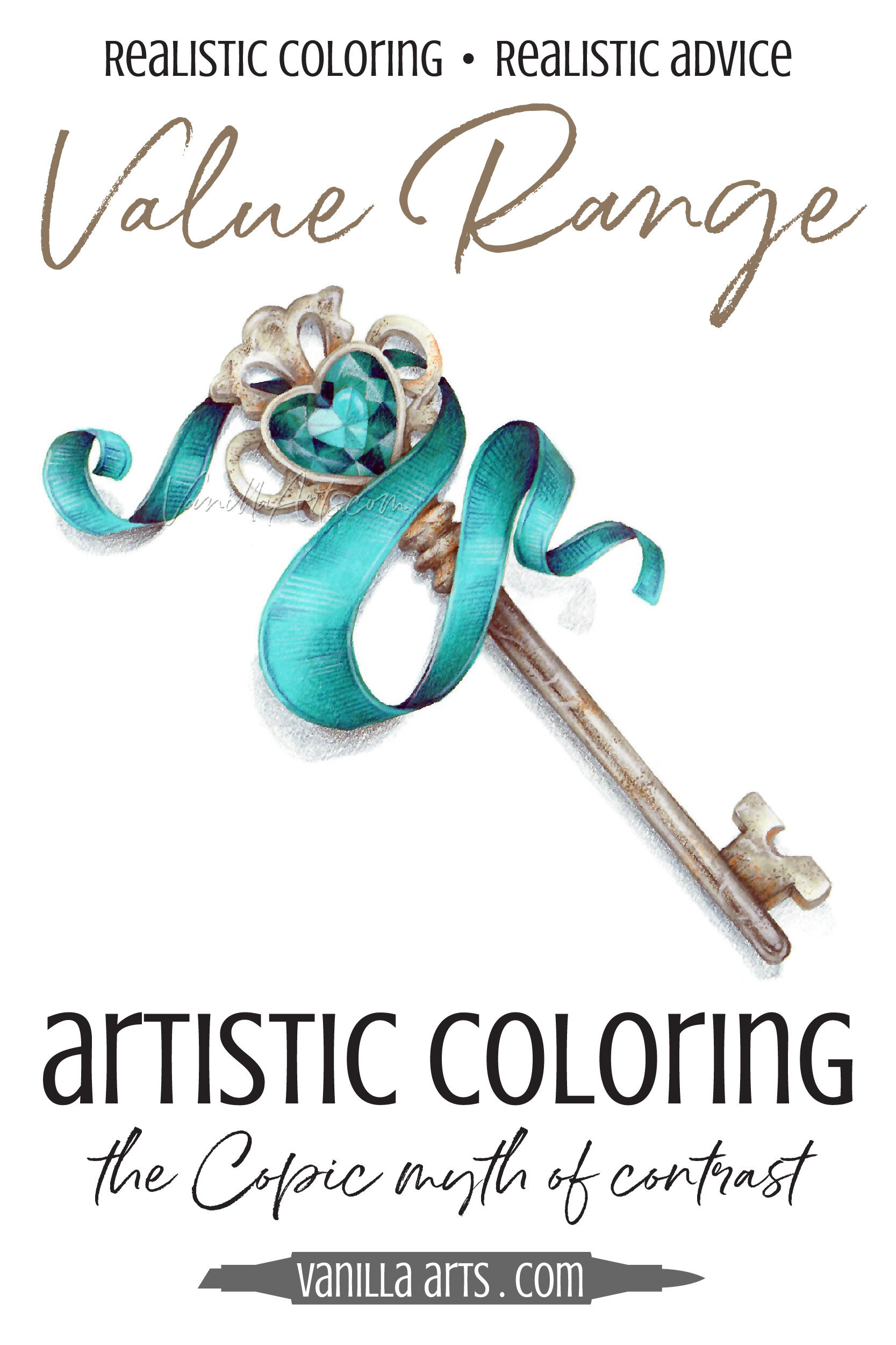
Real Color Theory: Improve Your Coloring with Smart Values Rather Than Contrast (Copic Marker, Colored Pencil)
Is contrast the secret to amazing coloring?
Many Copic Marker and colored pencil tutorials make it sound that way. Add contrast for depth and dimension, so you darkened your darks and lightened your lights. Now your coloring looks… uhm… it’s very interesting?
Psst… Contrast doesn’t add dimension. Let’s look at how to control contrast to color with greater realism.
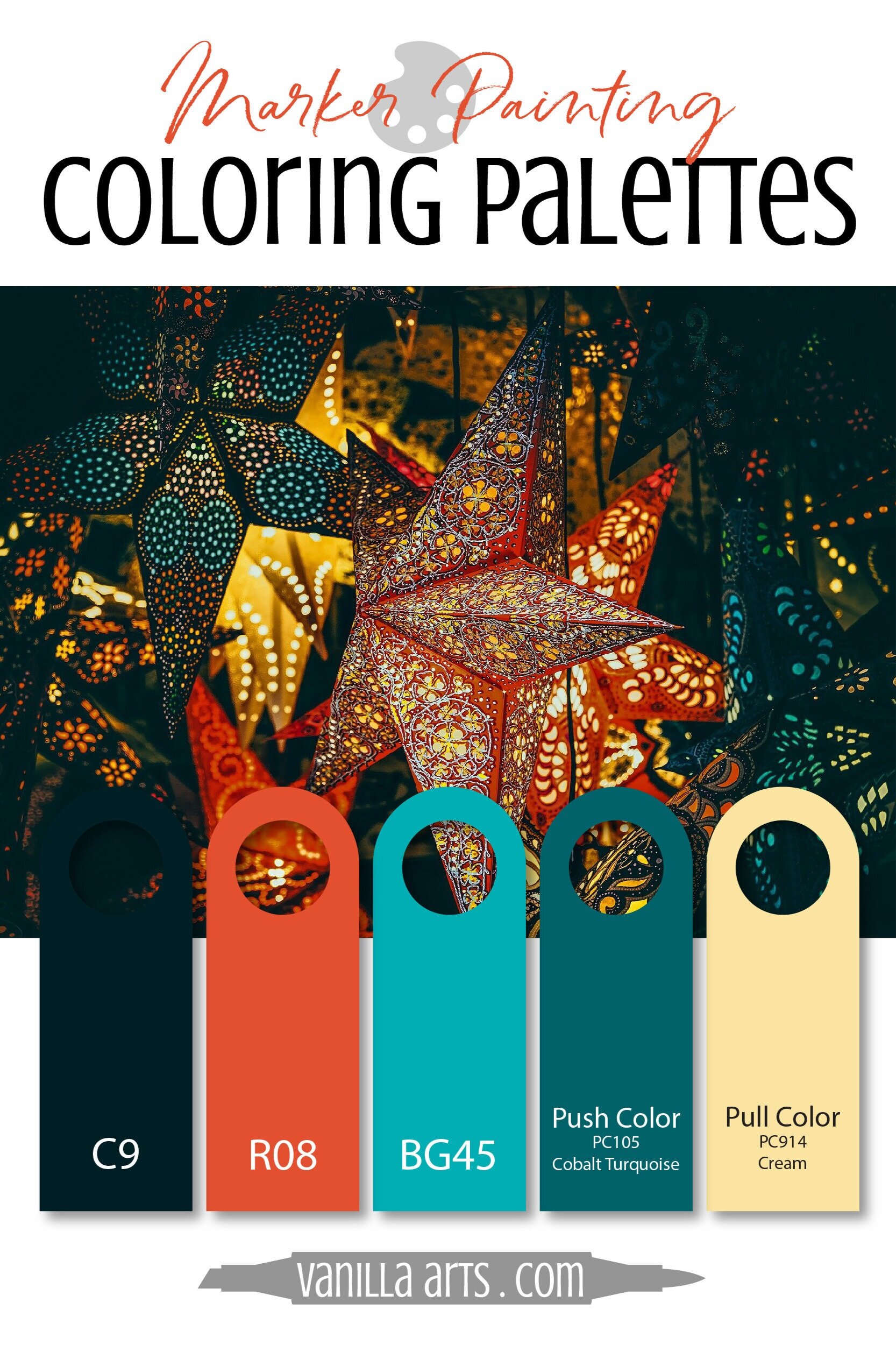
Color Palette: Copic Marker + Colored Pencil Combination (Red, Aqua)
Turquoise & warm red make a lively color palette for your next project.
Today’s color palette pairs complementary Blue-Green and Red Copic Markers to make a beautiful color scheme for your next project.

Vanilla Undercover: Underpaint with Copic Markers for Beautiful Realism - Hawaiian Pink
Real shade is not darker color, real shade is desaturated color. To create the desaturated colors that Copic Marker does not make, Vanilla Arts Company teaches Online Workshops using the underpainting method. Students learn to layer colors realistically rather than blend. Underpainting creates natural colors found in everyday life.
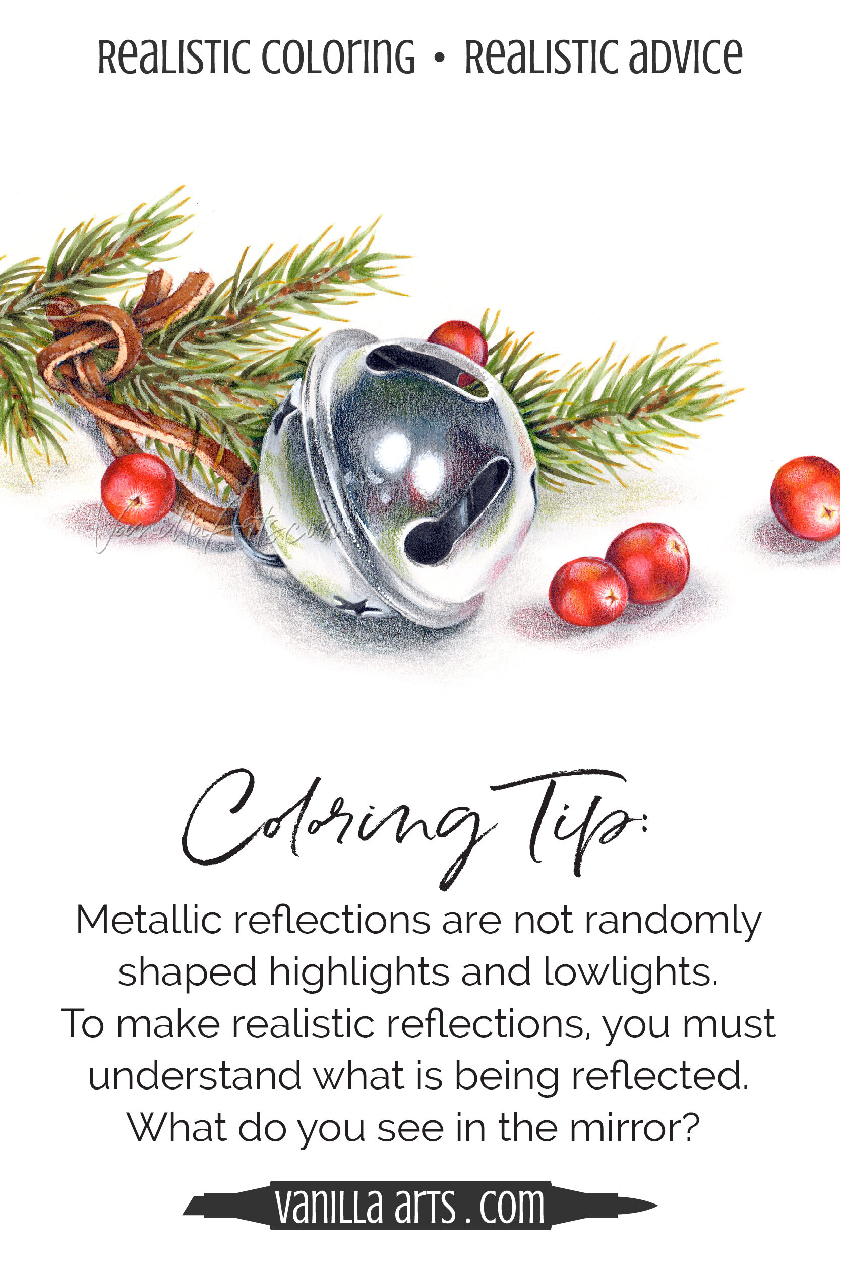
Coloring Tip: Look Deeper at Shiny Reflections to Add Realism (Copic Marker, Colored Pencil)
Do you add shiny reflections with a white gel pen?
Oh no. Please don’t tell me that you make them in the shape of a comma or semicolon…
Noooooo! That’s not shine, that’s a punctuation!
Here’s a great tip for coloring lifelike and amazing reflections on metal with Copic Markers and colored pencils.