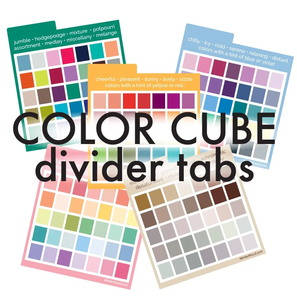
COLOR CUBE DIVIDERS
an alternative filing system by Amy Shulke, MarkerPecil.com
INSTRUCTIONS and TIPS
Here by mistake? This page explains how to use Amy’s Cube Divider Set sold here.
Color Cubes are an exclusive and patented product of Sarah Renae Clark
I highly recommend Color Cubes for colorists, beginner artists, and anyone learning color theory.
Amy is an affiliate for Color Cubes but has no other association with SarahRenaeClark.com or That Creative Couple Pty Ltd.
THE GOAL OF AMY’S CUBE DIVIDERS
is to limit visual distractions when choosing a color palette for your next project.
Every card is beautiful but too much beauty makes it hard to concentrate on the project at hand.
When we file cards based on color theory, it’s easier to focus on what actually matters:
“Will this color palette work for my project?”
My dividers have reduced the time it takes me to find potential palettes and picking the perfect colors is so much easier now. I’m so glad I did this.
Now let’s simplify your Color Cubes!
“But wait, why do I need different dividers?”
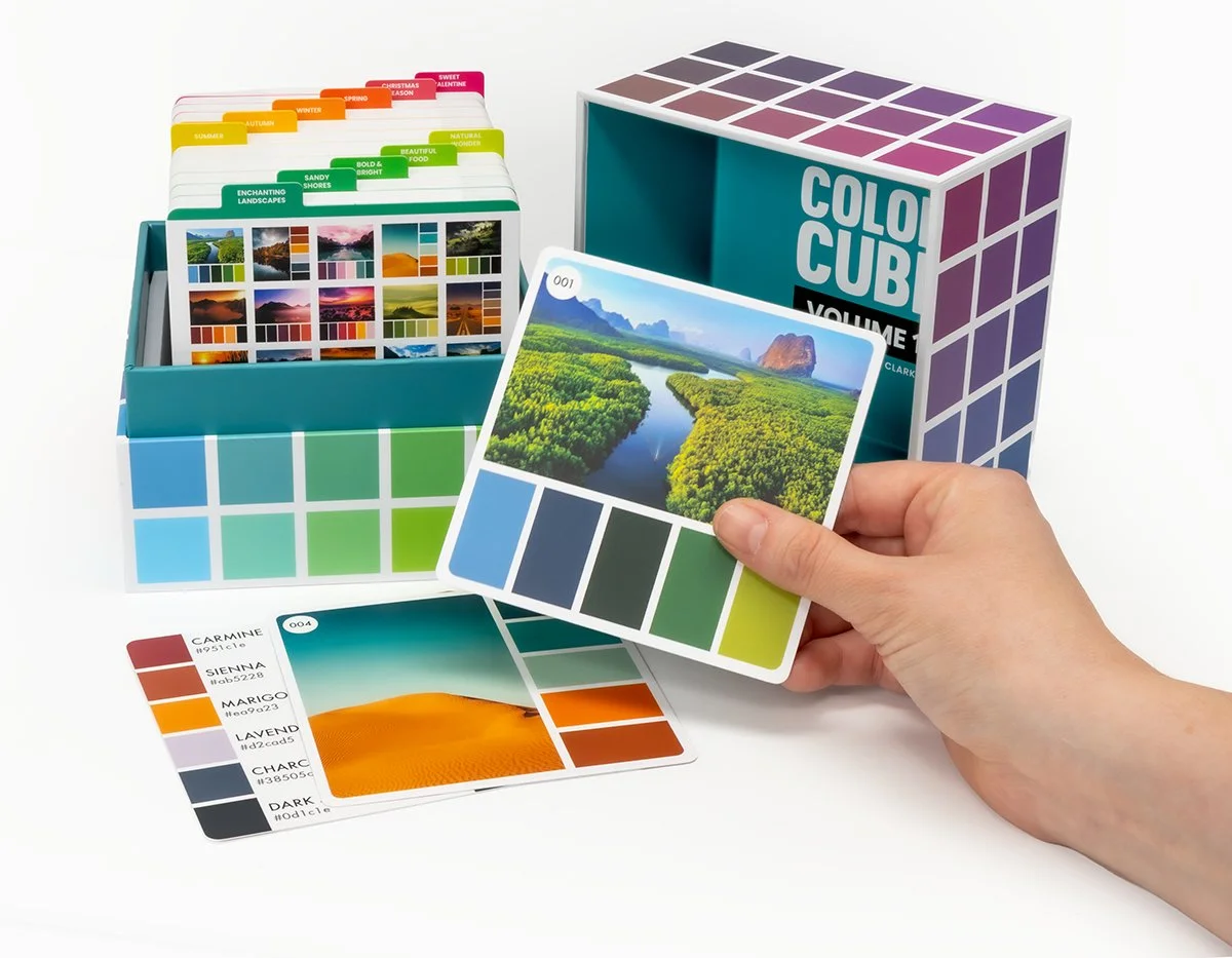
Well, for starters— Color Cubes purchased before late 2025 didn’t come with dividers or categories. The old Cubes are just a box of random cards.
Which is why I’ve been messing around for years with Post-It notes and ripped strips of paper, grouping and regrouping my cards, trying to find order in the mess. I actually put my divider project on hold when Sarah announced new dividers were coming. I hoped she’d solve the problem for me.
Unfortunately, the new dividers don’t help me. Yes, they divide each box into smaller groups but they categorize everything based on the photograph, not the color.
Are we looking for photos or color palettes?
The new dividers also limit your creativity by guiding you directly towards the most over-used ideas. You’re supposed to look through Christmas photos to color a Christmas tree and use ocean photos to color a school of fish.
The clever artistry happens when you color a Christmas tree with ocean colors.
But ultimately? I can’t find what I need with the new tabs.
Most art projects require a few specific colors— we’re unlikely to color a realistic Cocker Spaniel with all blue markers, right?
So tell me, which of Sarah’s tabs in which box gives me lots of brown-ish color palettes, maybe something with a pop of color for the dog collar or background? To find the perfect dog palette, we’re still stuck digging through every card in every box.
We’re colorists. We need to organize cards by color.
If the new tabs grouped cards by color, I wouldn’t be offering alternative dividers.
INSTRUCTIONS
Step One:
Print Amy’s Palette Divider Cards onto 110 lb. office grade cardstock or matte photo paper using best quality settings. Cut dividers apart with a paper cutter, using scissors to trim the tab area. Laminate cards for greater durability.
Lay each divider on a table or floor with space for the piles of cards we’ll be making.
Step Two:
Combine cards from all your boxes into a single pile. Yes, I know this hurts.
Step Three:
Keep your focus on the colors rather than the photographs. I sort my cards looking at the backside.
Looking at the palette, think about the theme or feeling you get from the colors in combination. Which category could it fit into? Place the card by that divider, but you can always change your mind.
Step Four:
Don’t linger too long on any card. Quick decisions are usually more accurate.
Step Five:
Once all the cards are sorted, you’ll need to play with the order of the categories as you return each group to the boxes. There is no best order and everyone will have a different number of cards in each group. Place your groups as they fit best.
I STRONGLY ENCOURAGE YOU TO COMBINE ALL YOUR COLOR CUBE CARDS INTO ONE MASTER SET.
I know it feels naughty to mix cards from different sets. You may be tempted to organize each box individually.
But the goal is to minimize distractions, right?
What could be more distracting than hunting through four separate boxes and trying to remember which card came from which box?
Mix your sets. It makes finding cards easier and returning cards a breeze.
Spend your time coloring, not keeping track of cards.
As you sort cards, please remember:
There is no best category for a card. Most palettes fit multiple categories.
You will change your mind a million times.
Move a card if you don’t like where it’s at. No big deal.
If you need a special category, use a blank divider to make one. For a long time, I had all palettes with green in a “Botanical” category.
IMPORTANT: I STORE MY CARDS BACKWARDS AND SIDEWAYS!
By placing the photos to the rear and tilting the card 90 degrees clockwise, I get the full color palette at the top facing forward. This allows me to quickly leaf through a section, seeing every palette at a glance.
TO FIND A PALETTE FOR YOUR NEXT PROJECT:
Think about the color theme or vibe you want for your project. Most projects have a logical theme, like wintery colors for penguins on an iceberg or festive colors for a birthday cake… but also don’t discount your artistic instincts. Sometimes you get a strong vision for a project, maybe you really want teal and purple palm trees.
My point is that you should set your intention for the project before you shop for color palettes. Otherwise, you’ll end up looking through the entire box and still feel like you’re guessing.
Pull cards from the section which best matches your color theme. I deal them like playing cards into YES and NO piles. Put the no’s back in the box, then re-deal the remaining cards into YES and NO piles. Keep eliminating NOs until you have 3-5 good palettes to choose from.
Make decisions fast. You have good color instincts but they get weaker the longer you debate yourself. You know at a glance when you don’t like something or when it’s wrong for the project. Trust your gut!
I think we get stuck looking for what’s best and confuse ourselves with too many potential options. Eliminating the obviously wrong palettes is faster. It’s much easier to choose between 3 cards which are not NO than it is to argue the pros and cons of 50 maybes.
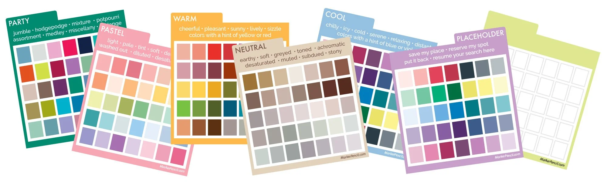
THE CATEGORIES
Here’s how I define each color category. Your definition may change over time. If you notice a missing category, make it with a blank divider from page 4.
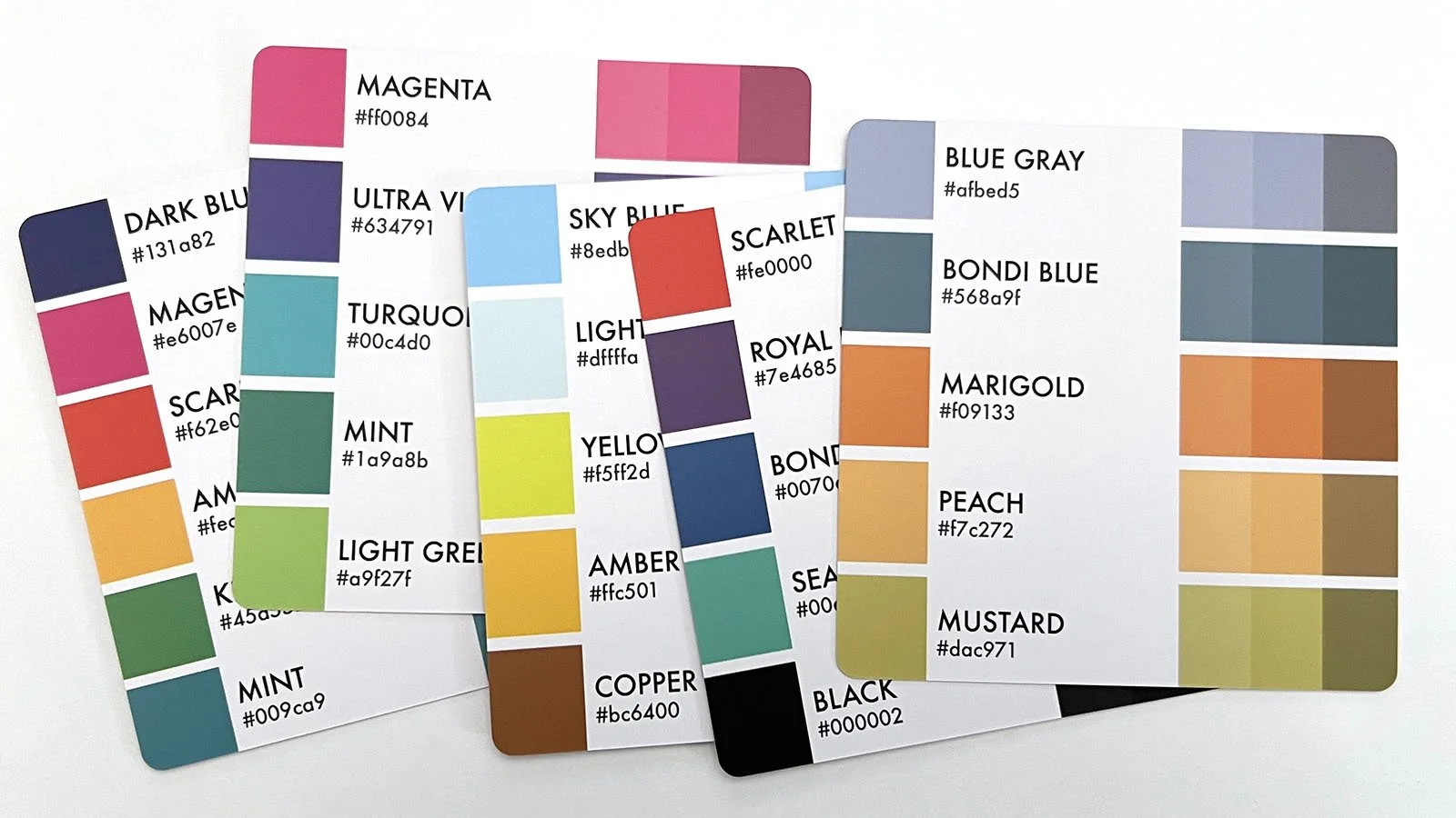
GRADIENT
Confession: My GRADIENT cards are kept in a zip lock bag in my bottom desk drawer.
This category frustrates me. Gradients are not true color palettes, so I’m a bit ticked at the large number of gradient cards in the Cubes.
Gradients are easy to spot because they’re monochromatic— multiple values of the same color, sometimes in order, sometimes jumbled.
If gradients look familiar, it’s because Copic number families are gradients. Do we really need a card to remind us to color something blue with B99 - B97 - B95?
I removed my gradients to free-up space in my boxes but I’ve made a divider if you want to keep them.
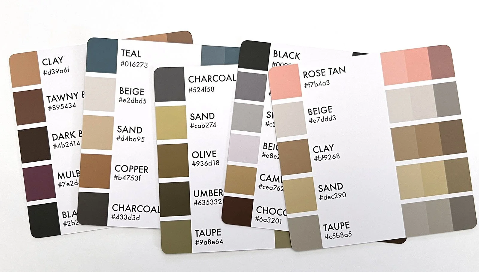
NEUTRAL
I rarely use all-neutral palettes, so for years, I’ve been shoving brown and brownish palettes to the back of my least used box.
Most of these neutral cards are brown with a pop of color. Like the Gradients, I don’t need a card to suggest this.
BTW, you can file any mostly gray palettes here. There aren’t enough all gray cards to justify their own category.
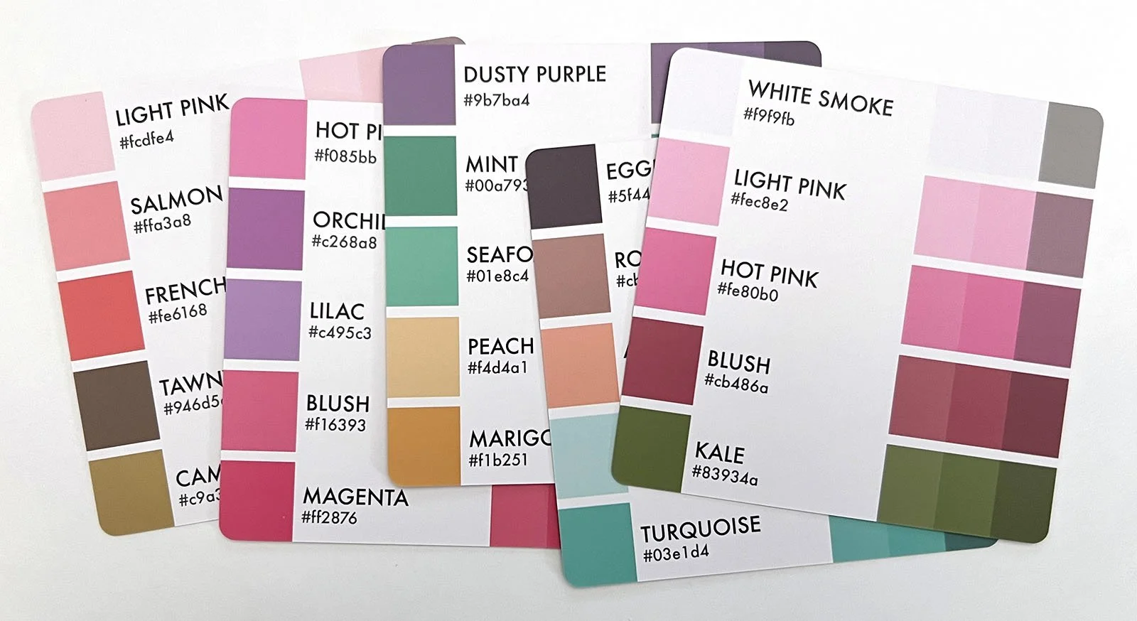
PASTEL
Technically, pastels are pale tinted versions of a bright color but there are not many tint swatches or truly pastel palettes in the Color Cubes.
I suspect any pastel cards were eliminated during the prototype stage due to printing issues at the factory.
Anyway, many color cards give off Easter bunny vibes, even if they’re not pale. PASTELS is where they go.
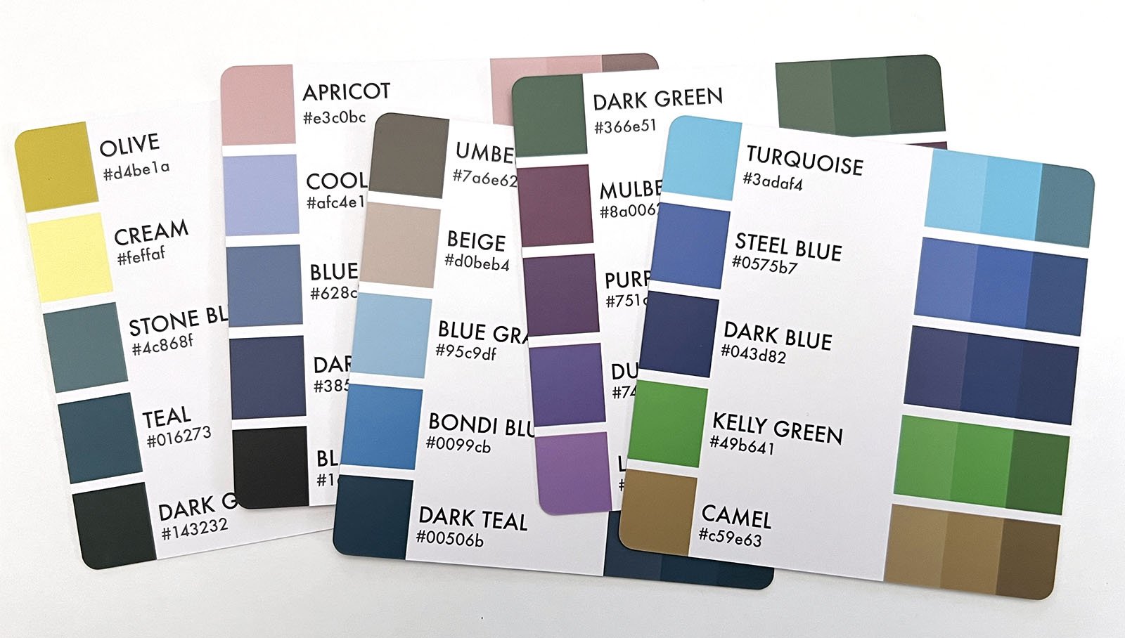
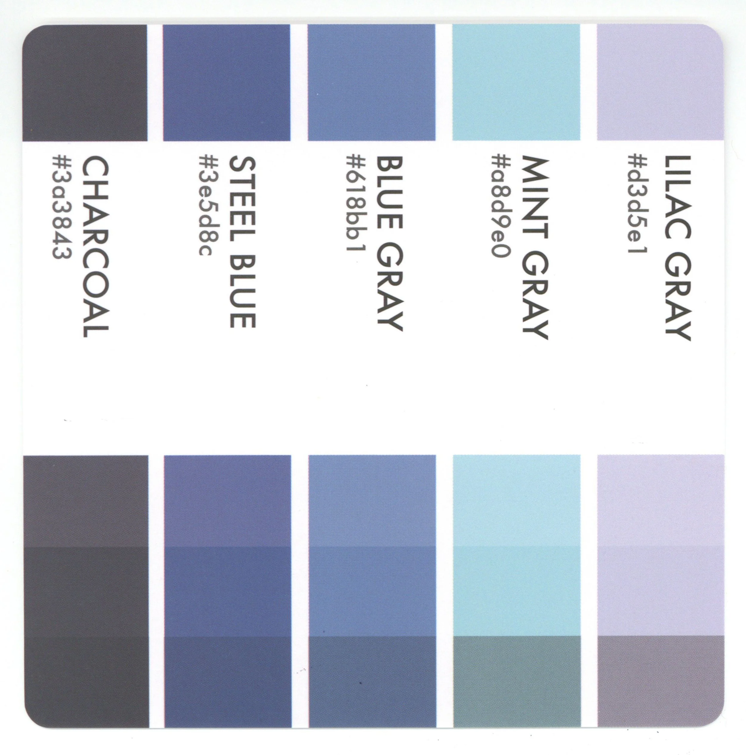
COOL
Most Cool cards in the Color Cubes feature blue but this category should also include cards with purple, violet, aqua, teal, or viridian green.
Don’t overthink this category. Cool is a general feeling or instinct.
A cool palette can have a few warm colors in it, but the overall group impression is wintry, watery, and chilly.
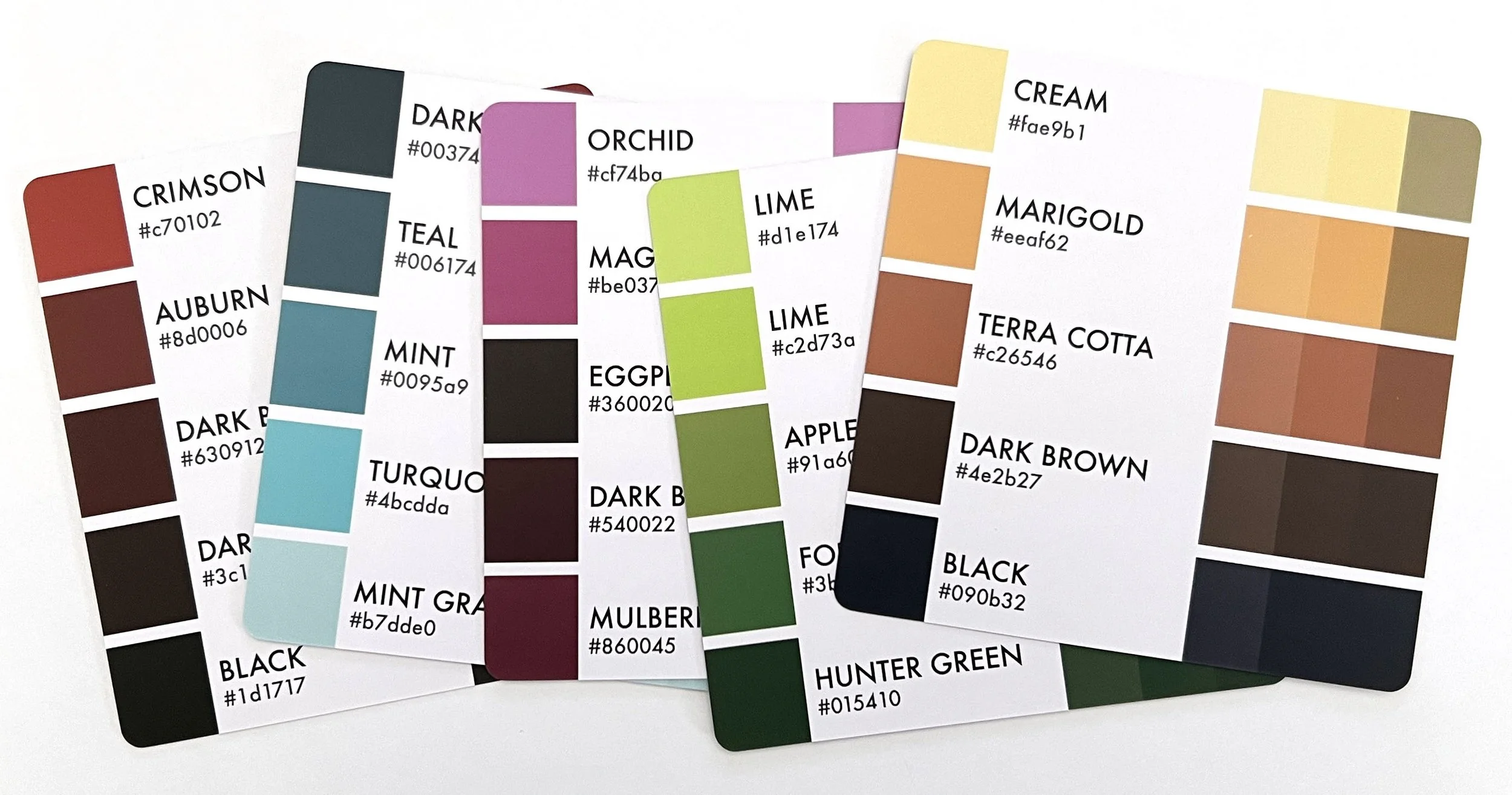
WARM
This is the largest category and most of them have orange. Sarah really likes orange? Warm includes palettes with red, scarlet, gold, yellow, and yellow-greens.
Like the Cools, not every palette needs to be all warm colors to feel generally warm.
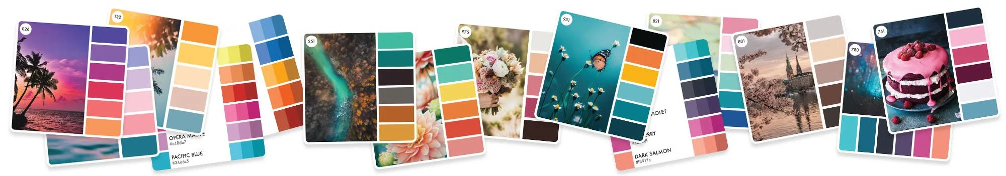
Notice the palette on the far right— 3 warm orange-browns and 3 cool violets. If you move this card to the COOL section, it feels noticeably out of place. Sometimes it’s easier to eliminate the wrong answers first.
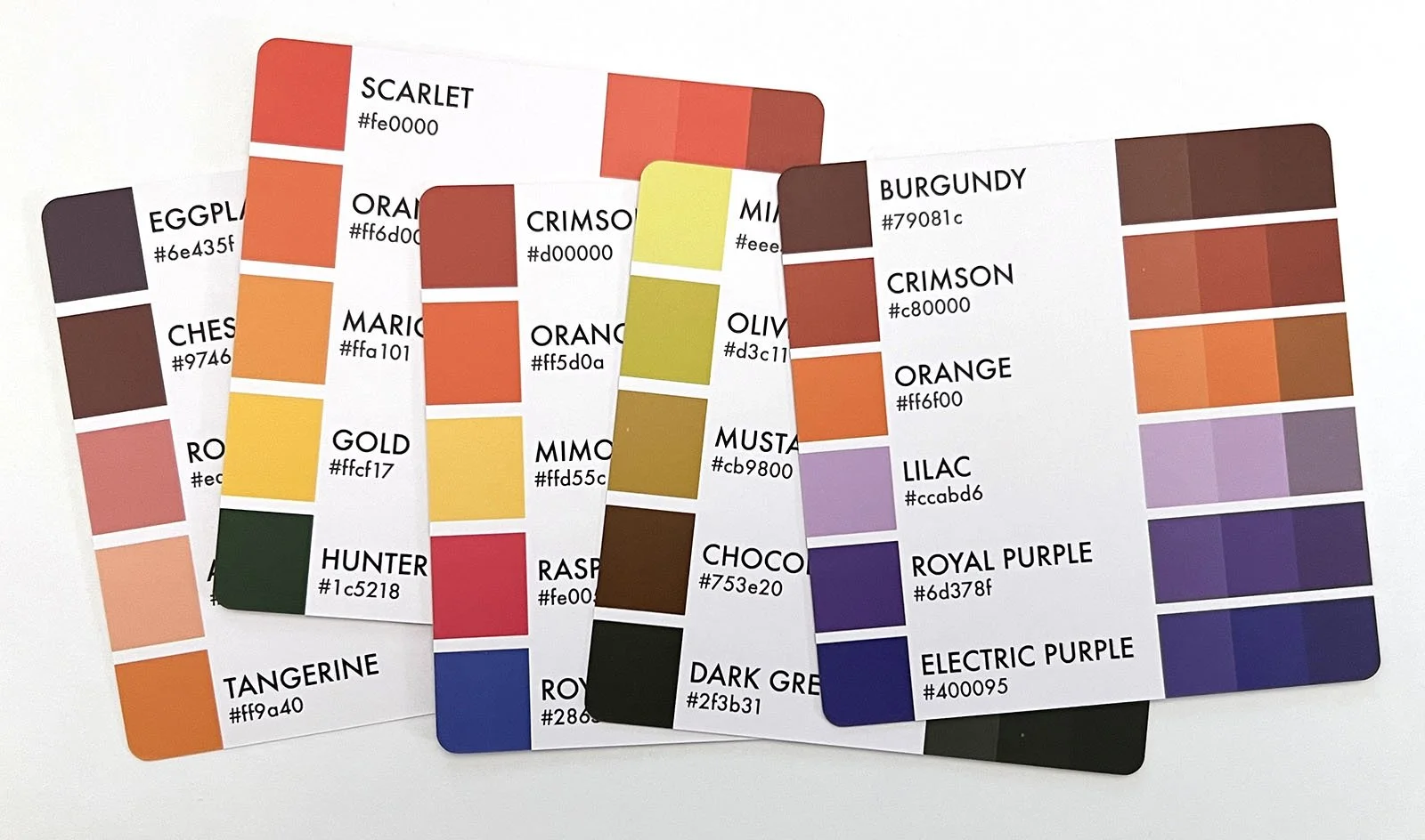
PARTY
There will be cards which don’t fit anywhere. For years, I’ve been shifting certain cards around, trying to find their natural home. Warm? Cool? Who knows?
If you look closer, we’re usually dealing with random colors with no relationship to each other. They look good together and the general feeling is happy and energetic, but they’re all over the color map. This makes them extremely hard to categorize.
I call these PARTY palettes. You’ll often see party cards when coloring influencers play the palette challenge game on social media. They go out of their way to pick party cards.
Party cards are fun and exciting.
From an education standpoint, I’m not a fan. Party palettes can make good coloring look cartoonish because random colors are not balanced. They’re exciting because of the imbalance.
Use Party cards with caution.
BTW, the card on the far right— that was in my Party section and I included it in the photo because it was one of the few which didn’t look like unicorn barf. Now that I see it in context, this card belongs in the WARM section.
See? I told you. Moving cards and changing your mind is normal and eternal.
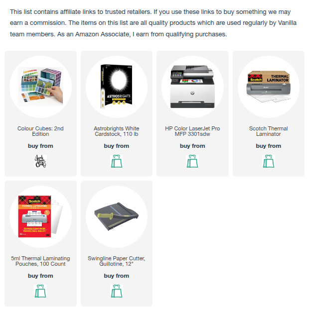
DIVIDER SUPPLIES
Here’s what I used to make bright and durable dividers.