No-Bunny Special
Thanks for taking the jump to read today’s newsletter. If you landed on this page by accident, subscribe to the Vanilla Beans Newsletter here.


Shopping soon? Remember to use the link above when shopping at Blick. This newsletter survives on affiliate earnings.
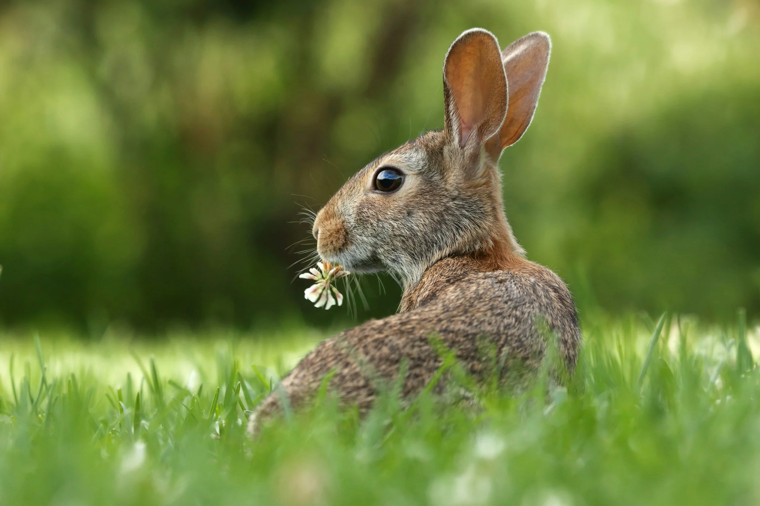
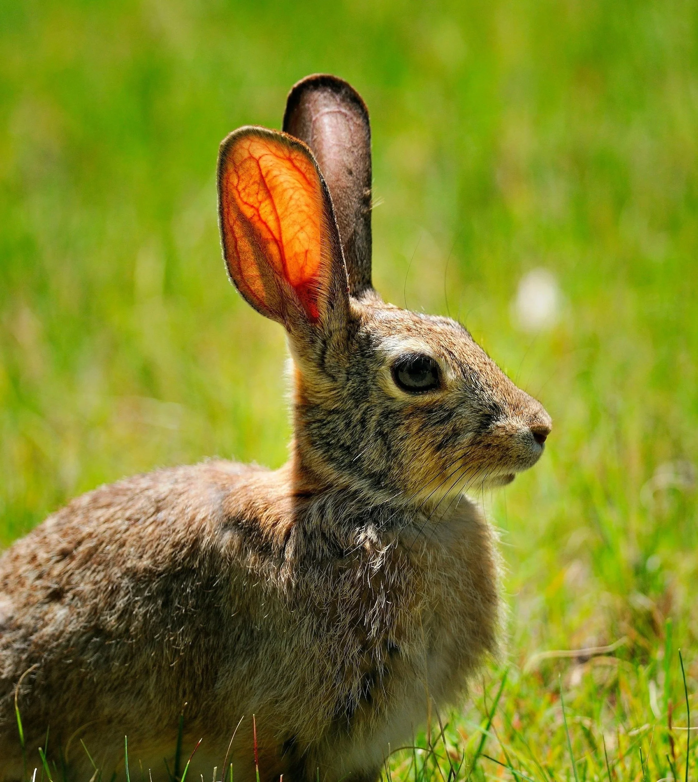
Here’s the welcoming committee, whenever I step outside.
And Angel? The wrap did the trick, on both sides. I honestly can’t tell which one is her anymore. Hooray!

NO-BUNNY SPECIAL
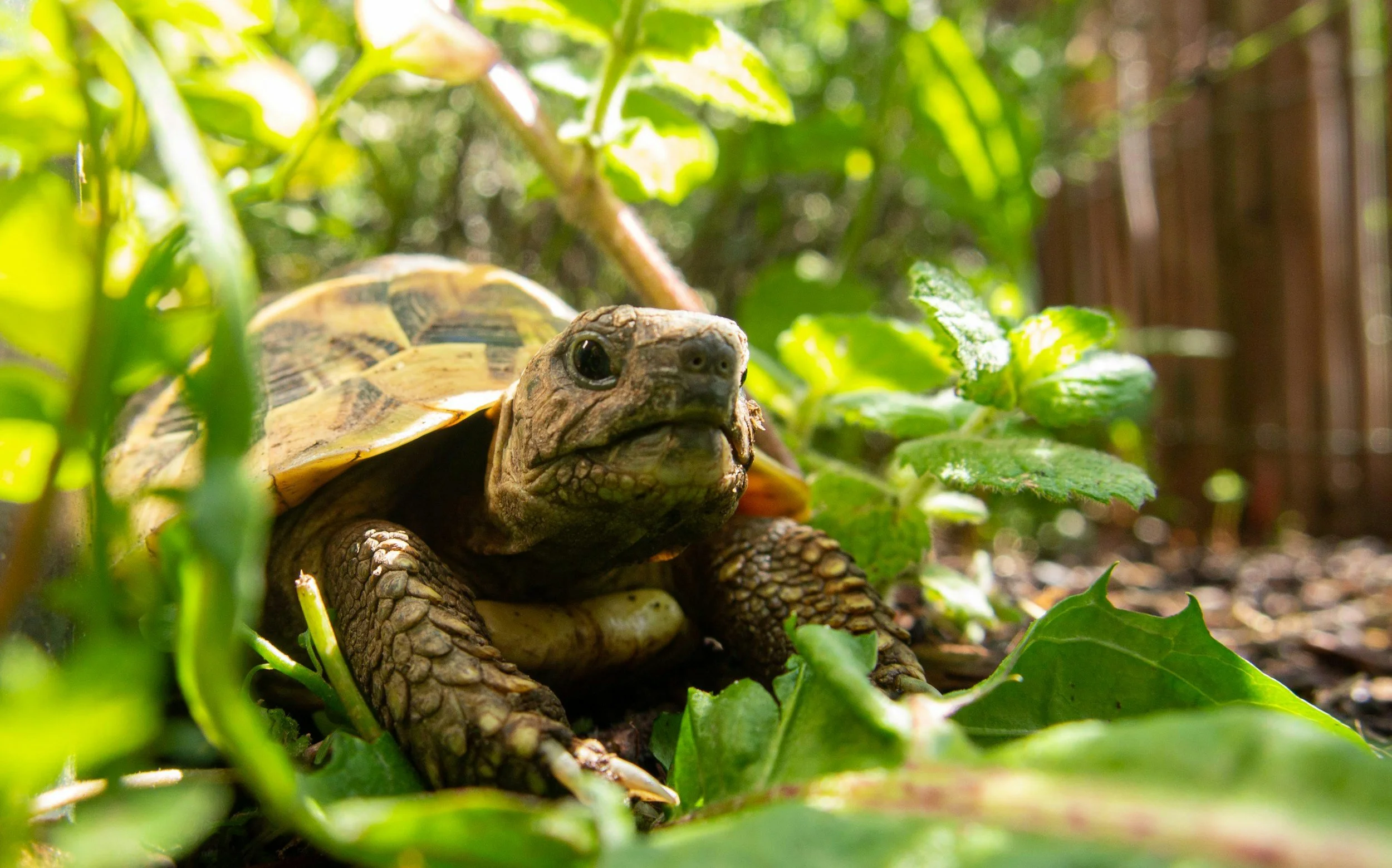
Last week, we talked about the tortoise and the hare.
And contrary to Aesop’s big book o’ wisdom, I strongly encouraged you to color like the hare.
Even though the fast-running rabbit is not the hero of the story, he’s our coloring hero.
Don’t be the tortoise who colors super slow and methodically, afraid to make a sudden move.
Over-thinkers are over-inkers.
This week, I’m doing a 180 and recommending the total opposite.
Yep, I’m flip-flopping. Changing my mind.
How very hare-like of me, eh?
Because sometimes it’s good to be pokey-slow.
Do you have blending issues?
You make nice pointy flicks (you’ve practiced!)
Your markers are full (you checked, then checked again!)
And after last week’s article, you’re moving quick like a bunny.
But your blends look awful because the dark flicks never fully smooth themselves out.
Darn it!
The truth is, we can’t be a rabbit all the time.
But I don’t want you to be a full time tortoise either.
Here’s the thing— beginners tend to go slowly and carefully at precisely the wrong moment.
“Amy says to color the dark flicks on the left side… Should I put them here? Maybe over here instead? Wait, how long were her flicks? Try it again… Is that right?”
This is what we call turtle-ing.
You’re dinkin’ around, thinking about what to do.
Meanwhile your marker is gushing ink onto the paper. Then you don’t like how it looks, so you make a better stroke on top of the first stroke….
And oh my gosh, you’re doing all of this with a really dark marker in your hand! Ack!
You’re a total tortoise when you’re shading!
Never think while your marker is touching the paper.
Think before, think after, think when you’re in the shower, or sitting stuck in traffic…
But please, please, please— don’t plan an entire D-Day invasion while B99 is touching the paper!
That’s the overthinking which leads to overinking.
But then when it’s time to blend?
Now suddenly you’re like “I’ve got this in the bag!”
The handcuffs are off and you’re ready to run.
With all the shading out of the way, you don’t have to think anymore. So you jack-rabbit a fast coat of light ink over all your turtle-shaded spots.
Let the blending magic begin!
Except the magic doesn’t happen.
You’re looking at blotchy blending because you hared when you should have tortoised and you tortoised when you should have hared.
Ask yourself: Are you shading? Are you holding a dark marker in your hand?
Be the hare.
Be fast. Be light. Be quick because the more YG99.999 you soak into the paper, the harder that’s gonna be to blend.
Or are you blending? Are you holding a light marker in your hand?
Now be a tortoise.
Not too tortoisey, though. I mean, don’t go overboard with the slows.
Be generous. Be juicy. Get the paper nice and moist with your blending ink so that all the little ink particles can smooth themselves into a perfect blend.
You don’t need a biblical flood, just get the evenly paper wet.
Here’s the other thing to note:
As you improve your coloring skills— over time and with experience, you will become more the bunny than the turtle.
I’ve been coloring with markers since 1989, so when I pick up a marker to demonstrate something, the first thing students say is “whoa, she’s fast.”
Relax, my speed has nothing to do with talent.
We think less and color more automatically over time.
My brain doesn’t have to coach my hand through every single move anymore. In fact, the only time I think about blending is when someone asks me about blending.
Blending is like breathing— if you stop to think, you stop doing it right.
But even after all these years, I still shade much faster than I blend.
I still tortoise and hare it.
Even though I’m going faster than you, I’m not doing everything at a consistent 75mph.
Professional level coloring is faster than beginner speed, but it’s not all hare all the time.
We never totally lose turtle mode because turtles blend better.
Be the bunny. Then be the no-bunny.
Variable speeds. You can do it.
It’s funny how many blending problems have nothing to do with blending.
Mindset matters.
We’ve been unpacking that a lot lately inside Color Wonk.
Most coloring frustration begins long before the marker touches the paper.
Technique matters.
But mindset matters first.
IF YOU LIKED TODAY’S ARTICLE, SUPPORT FUTURE FREE LESSONS
We had some breakthroughs in Color Coach this week…
“I struggle to pick my own colors” isn’t really true.
Color selection is easier when we stop searching for the perfect yellow and start looking at the potential in every yellow.
Which doesn’t sound like a yellow problem, right?
I’ll let you know how this works out.
Several readers have asked about the line art in the Cube series.
The PNG files are available in the FREE Download Library below.

CURRENT PASSWORD: RubberDuckie
MY MOST-USED PENCIL COLORS
Affiliate links help support the free content here in Vanilla Beans
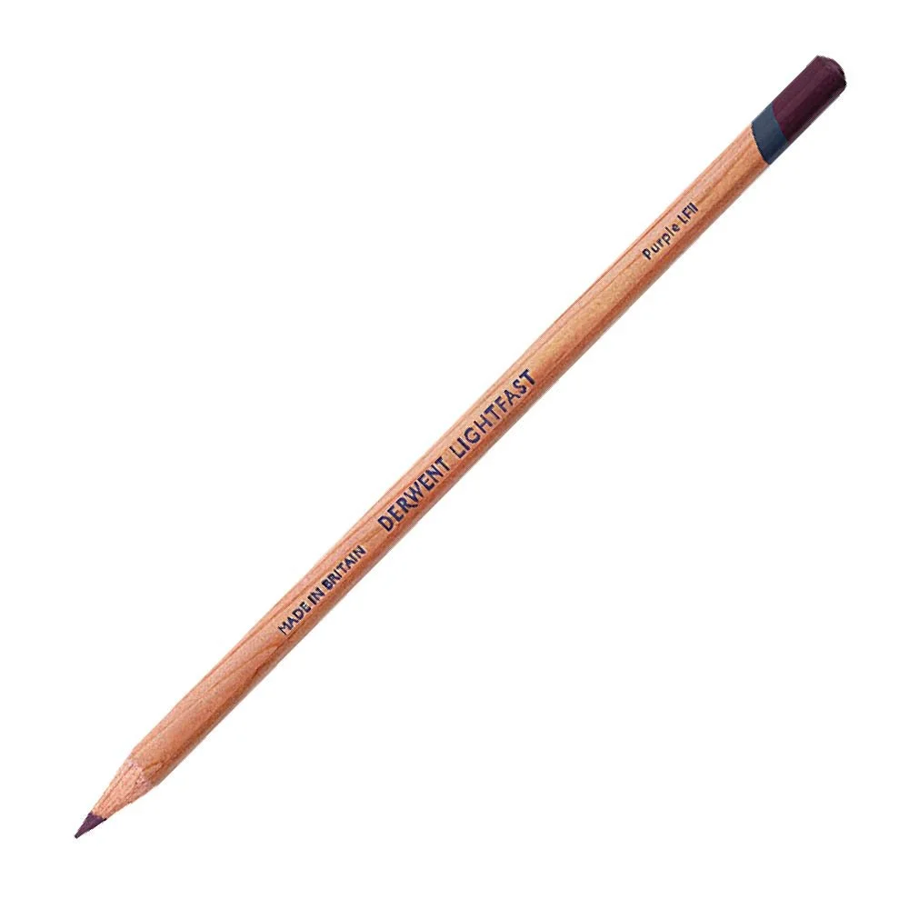
Universal shading color
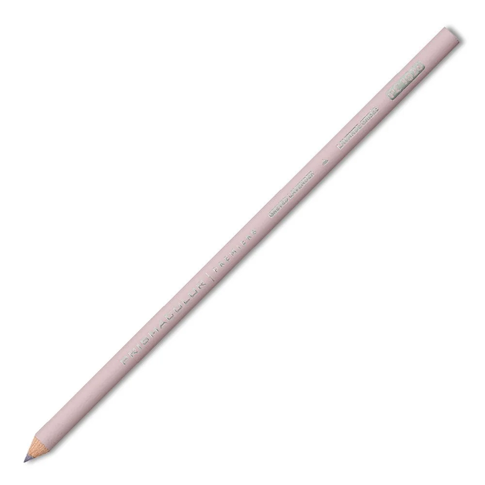
Universal shading for light colors
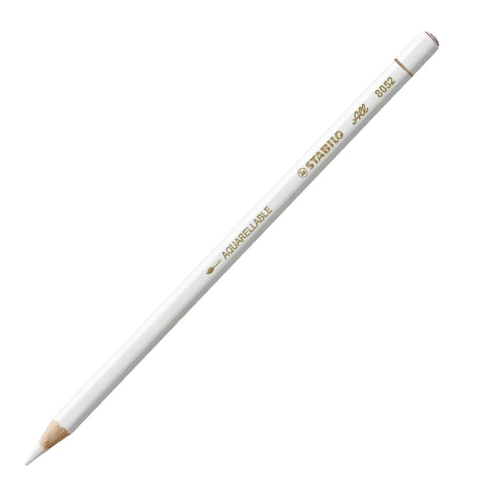
Opaque and sticks to anything