How to Color Realistic Depth with Marker and Colored Pencil (Draw & Color Demo)


Real Depth with Green YG Alcohol Markers

Every coloring teacher teaches the same thing…
It's standard practice to “shade” the objects you color with a dark marker in your blending combination. People even refer to the lighter markers as "shade colors".
Then they wonder why their coloring looks kinda flat.
Psssttt... shade is not just a darker version of your medium marker color.
Let’s explore why.
DON’T MISS THE SHAMROCK FIELD SUPPLY LIST (MARKERS & PENCILS) AT THE BOTTOM OF THIS PAGE
DRAW & COLOR: Shamrock Field
How to create REALISTIC DEPTH with Copic Markers & Prismacolor Pencils
(click below to watch at YouTube)

Last Month’s Livestream

Every coloring teacher teaches the same thing…
It's standard practice to color highlights with the lightest marker in your blending combination. People even refer to the lighter markers as "highlight colors".
And this method is spreading. Colored pencil people are now using this same technique with colored pencils-- building pencil combinations as "shade, medium, and highlight color".
Then as the cherry on top, everyone adds little white dots and dashes with a gel pen.
Psssttt... did you ever notice this highlighting technique never looks realistic?
There are several reasons your highlights look fake—
Let’s explore why.
Love the FREE lessons?
I’m happy to bring them to you. But please understand:
Free lessons are not free to produce.
Just like you, I must buy paper, pencils, and refill ink.
Unlike you, I also have cameras, microphones, broadcast software, and usage rights for photo references to pay for. There’s also this website and the apps I use to create graphics, reminder emails, supply lists, and PDF learning aids. Then there’s the hours I spend researching and creating every free video, livestream, and color theory article.
But the best way to support me is to support yourself! Classes, kits, and digital stamps keep you learning and keep me a’float!
Resources for Shamrock Field:

Subscribers to Amy’s Saturday newsletter can download a free PDF photo reference worksheet with color and texture prompts. Subscribe here.
Photo Reference Worksheet
Get your copy of the primary photo reference for the Shamrock Field project. Worksheet includes the photo plus color and highlight prompts.
FREE Worksheet now available inside the Vanilla Beans Library
All subscribers to my Saturday newsletter have password access to the library where I keep lots of nifty downloads plus an exclusive blending video.
Subscribe, then take the link to the latest issue of Vanilla Beans. Every issue of Beans lists the current Library password.
Tips for Coloring Realistic Depth

TIP: Depth does not magically happen when you add an extra dark marker to your blending combination.
In fact, most of the time, depth isn’t actually darker than the colors you’re already using. The blending combination concept is designed for crafting and cardmaking. Their rules don’t work for realism because they stress the use of simple color recipes instead of teaching you to use realistic color.
TIP: Lighting direction does not create depth.
Again, the crafting approach is to create an easy rule to follow. You’ll see as I draw and color “Shamrock Field”, I’m not charting where the sun sits and I don’t always shade the same side of every leaf.
And yet the finished project is FULL of depth?
That’s because depth is not about directional lighting.
TIP: How do I choose my shading colors?
Watch me choose and use one simple shade color for the entire project. My methods are simple and effective. Stop overthinking color selection process!

NEW Digital Stamp
During the livestream, I draw an original image… but then I color over it!
So after the stream, I recreate the original line drawing, making slight improvements.
Introducing: Shamrock Field
Clean and minimalist digital line art
I always keep keep my drawings simple with no texture marks or artistic decoration. I want your color choices and your added details to give the stamp personality and character.
What story will you tell with my line art?

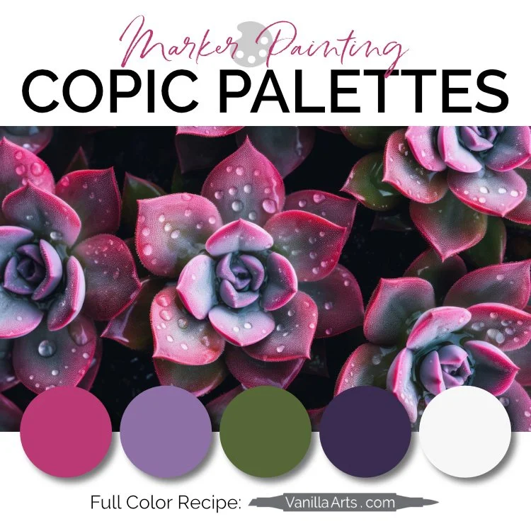
Color Inspiration:
Vanilla Undercover is my series of underpaint blending combinations— creating realistic color with unusual markers.
I’ll be coloring our livestream shamrocks with this marker combination.
Because the deepest areas of this photo are extra-dark in color, I’ll also be adding a V09 marker to this blending combination.
My Marker Journal

I use a Zeta journal in the Draw & Color livestreams.
It’s hard to find good paper for my mixed media illustrations. Markers like ultra smooth paper while colored pencils need tooth. Markers and pencils are opposites, so any paper that works for both mediums will always be a compromise.
And once you find a good compromise, it rarely comes in journal format.
This paper is pretty good for markers— it doesn’t feather, bleed, or discourage blending.
It also has enough tooth to add a few layers of colored pencil.
Is this the paper I’d use for an all-marker illustration? No.
Is it the paper I’d use for an all-colored pencil illustration? No.
But this is one of the best journals I’ve found for marker + pencil.
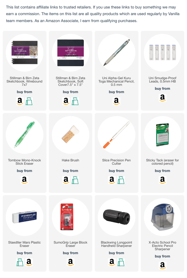
(affiliate links)
Copic Markers & Colored Pencils for “Shamrock Field”

FLOWER PETALS:
Copic: V04, V01, BV0000, YG25
Prismacolor Colored Pencils: 931 Dark Purple (Amy subs Derwent Lightfast Purple), 901 Indigo Blue, 915 Canary Yellow, 995 Mulberry
SHAMROCK LEAVES:
Copic: V04, YG17, YG25
Prismacolor Colored Pencils: 931 Dark Purple (Amy subs Derwent Lightfast Purple), 914 Cream
BACKGROUND:
Copic: G29, V09
Prismacolor Colored Pencils: 931 Dark Purple (Amy subs Derwent Lightfast Purple), 913 Spring Green
CAST SHADOW (OUTSIDE):
Prismacolor Colored Pencils: 936 Slate Grey, 931 Dark Purple (Amy subs Derwent Lightfast Purple), 109 Prussian Green
MAGIC SPARKLE: Posca White, Extra Fine plus Staedtler All Pencil White
Related Reading

Supply List
(This is an estimate of what I expect to use during the livestream. This list will be updated after the livestream with actual supplies used)