
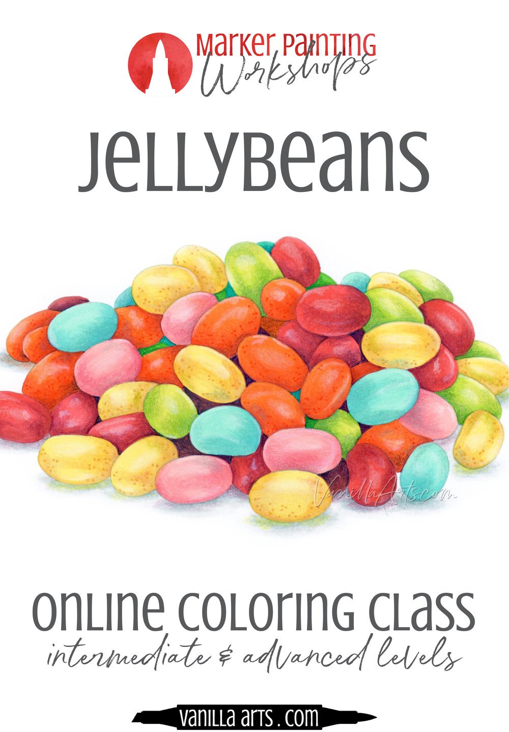
Coloring Flowers: Depth And Dimension Are Not The Same (Copic Marker, Colored Pencil)

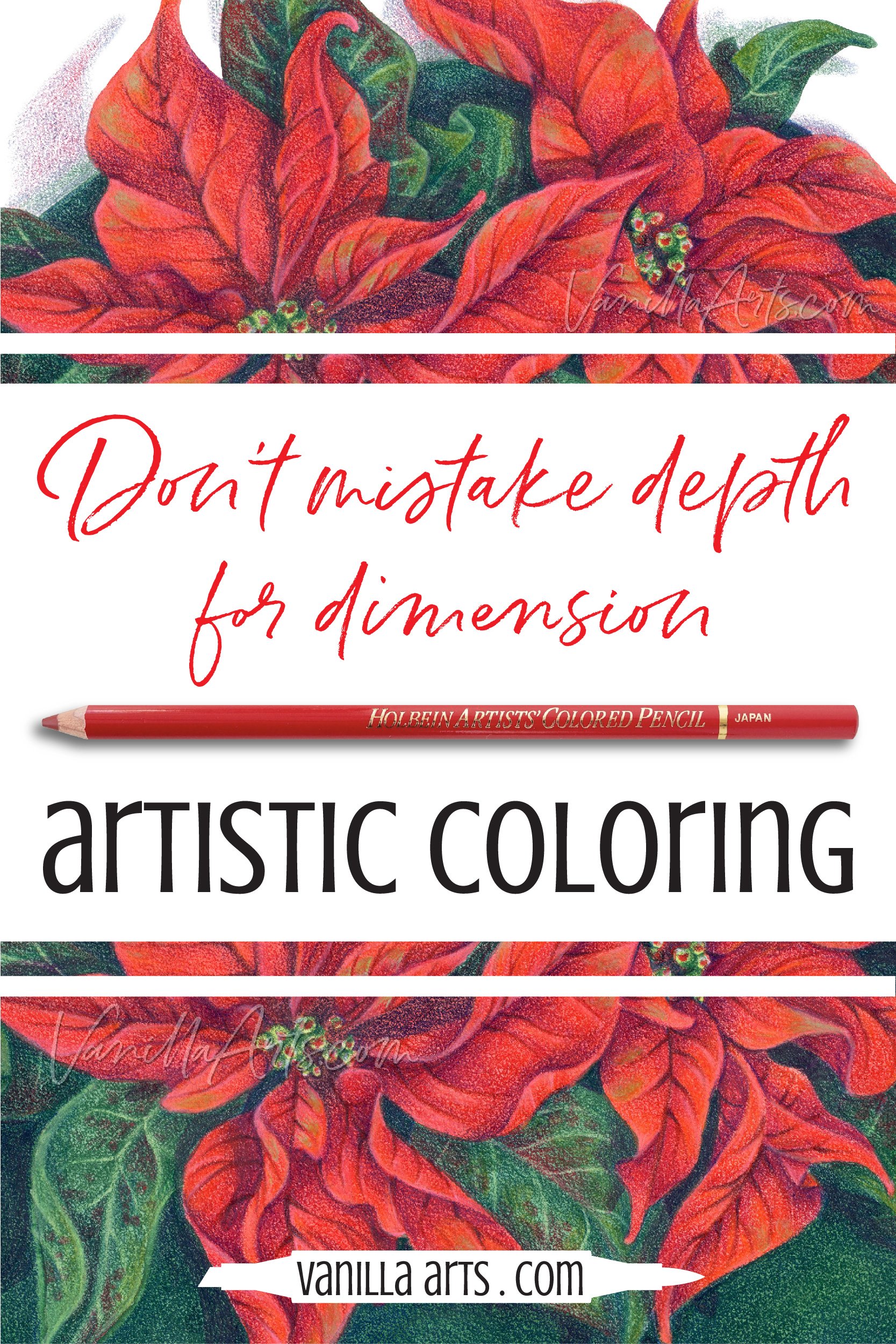
Don’t confuse depth with dimension. Depth is a measurement of distance. Dimension is a description of an object’s form. Many colorers use shortcut tutorials to create depth but call it dimensional coloring. Artist Amy Shulke offers tips to incorporate both into your coloring for greater realism.

“I want to color with depth & Dimension!”
It’s not just you.
Everyone wants more depth and dimension in their Copic Marker, colored pencil, or watercolor projects.
I’ll bet that’s why you clicked on this article.
Yes, I want ALL the dimensional coloring tips!
And that’s kinda the problem… learning to color is hard if you’re only using free resources like YouTube videos, introductory tutorials, and tip articles.

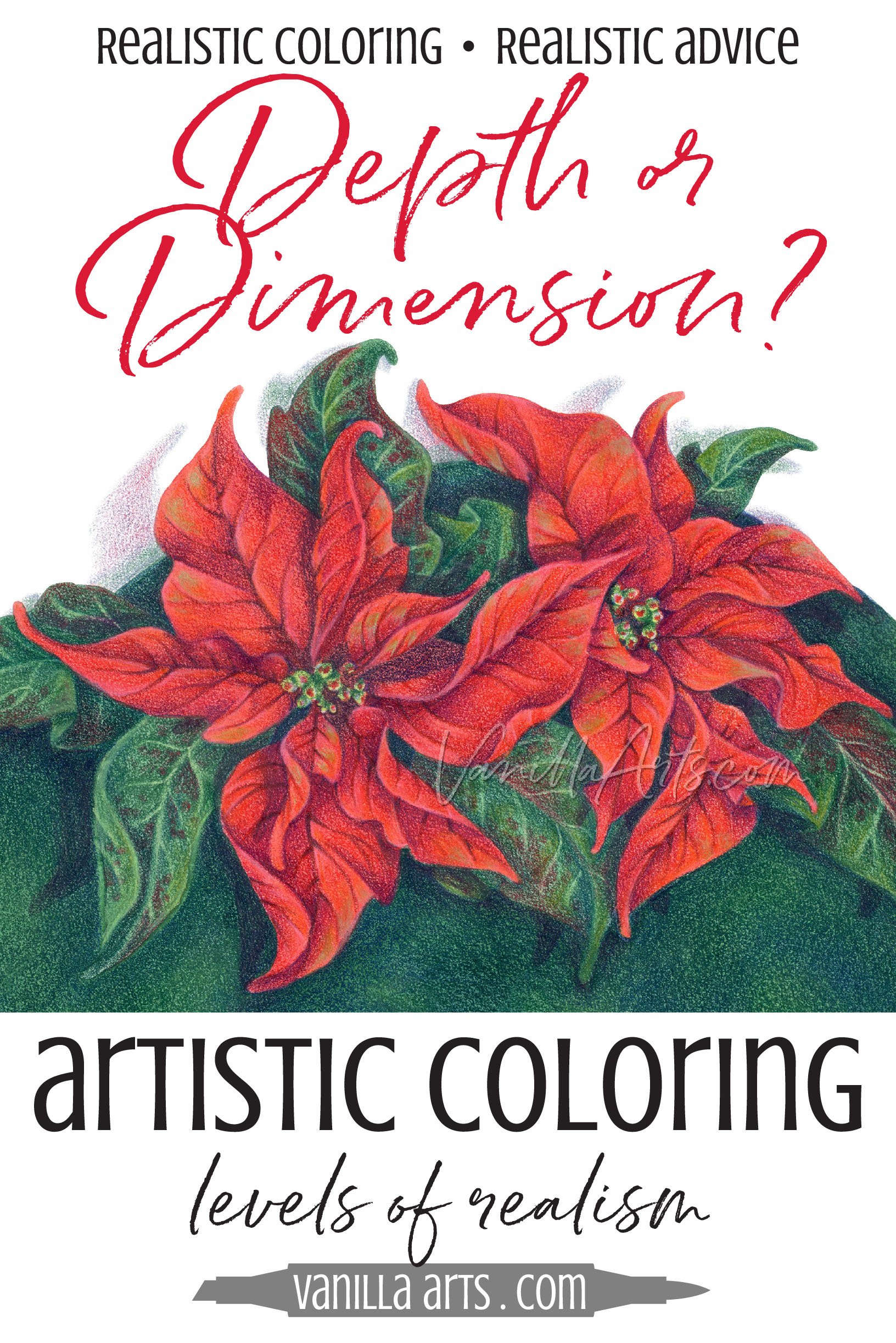
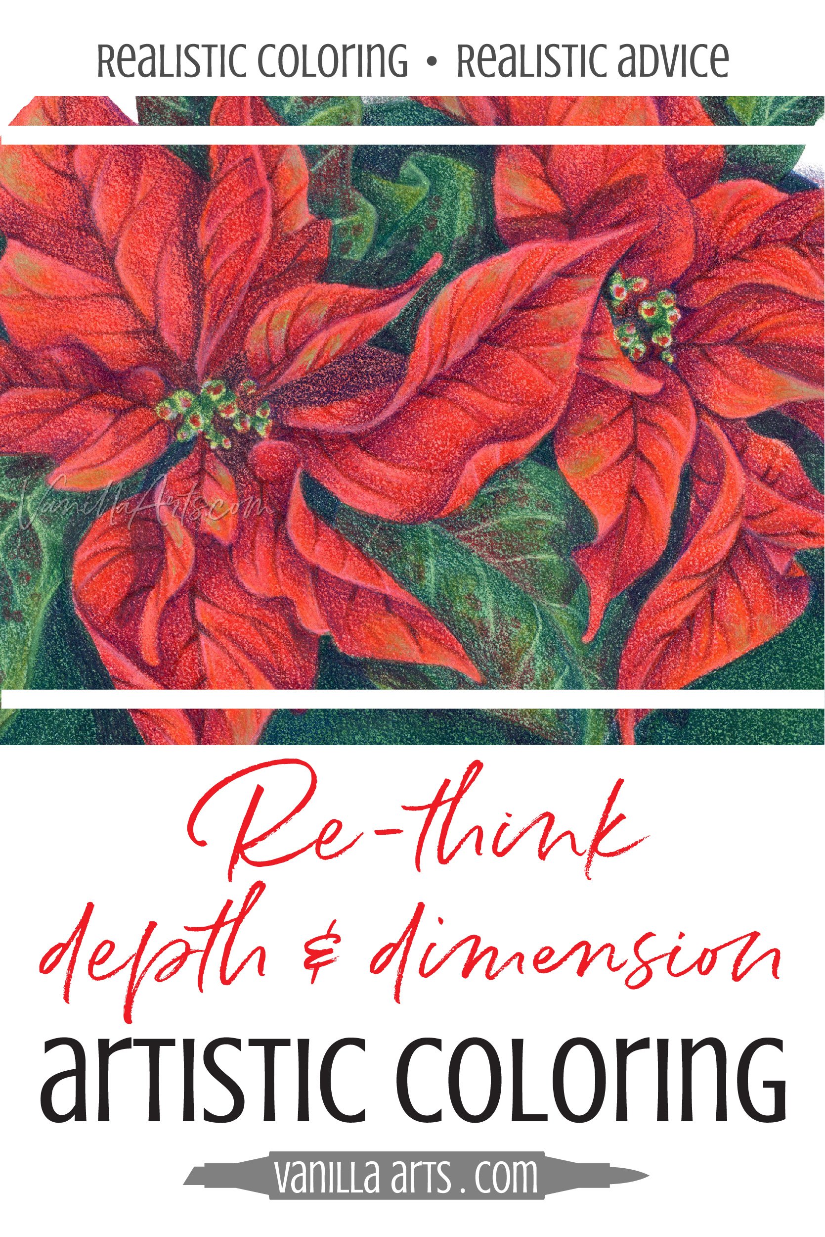
“Poinsettia Navidena” by the author, Amy Shulke. This original line art was colored with Schmincke Watercolors and Holbein Colored Pencils.
There’s a disconnect in the coloring education community. Because there’s no credentialing, anyone can set themselves up as an expert. There’s nothing to guarantee that the video or tutorial is coming from someone with training or skill… there’s nothing to even prove they know what they’re talking about.
Which has led to an internet overflowing with questionable info.
Here’s a case in point:
Many resources refer to “depth” and “dimension” as if they’re the same thing.
They are not the same.
And this confusion explains why so many people color flat flowers.
Because most colorers can color with depth OR they color with dimension…
But they can’t do both.
Today, let’s look at why confusing depth with dimension leads to cartoonish coloring.
Plus I’ll give you some tips on how to combine depth with dimension for more realism in your next coloring project.
Read more about dimension here:


What is the difference between Depth and dimension?
In coloring, “depth” and “dimension” are basically nice things you say to complete strangers.
“Oh my! You have so much depth and dimension in your coloring!”
Colorers use depth and dimension interchangeably— like we might say something is pretty/beautiful or amazing/wonderful. Yes, there’s a slight distinction between the two adjectives but no one will stomp and huff, forcing you to decide whether you meant pretty or beautiful.
In the coloring world, depth and dimension essentially mean “this is more real-looking than average”
But in the art world, depth and dimension are distinctly different concepts.
Depth is a measurement of visual distance— how far is this object from the viewer?
Dimension is how we describe a form— what is the surface shape of this object?
Which is why I get confused when my coloring students say something has depth but it’s actually colored quite shallow or they say something is dimensional when it’s pretty darned flat.
And here’s the bad part, because colorers confuse depth and dimension, they also confuse the techniques used for creating them.
Full of depth but no dimension
When someone complains that their flowers are flat, it’s usually because they’ve followed tutorials for depth.
They’ve never been taught to address dimension.
Most free tutorials and even a lot of paid coloring classes teach depth. They usually skip dimension.

Depth is a very easy concept to teach.
See these two flower petals? Which one is on top? Okay, now shade the bottom one. Done!
This leads to flowers which fan out like a handfull of playing cards.
One card sits on the top of the pile and every card below it gets a little bit of shade.
Layer, layer, layer.
Stack, stack, stack.
When you color something to look like it’s on top of something else, this is creating depth.
And you’ll see this in lots of coloring demonstrations.
“Let’s color this bear’s arm to look like it’s in front of his belly…”
“Now we’ll put a little shade under the hat so it looks like it’s on her head…”
“Add some darkness to the stem, right were the leaf overlaps it…”
This is depth. It’s the easiest thing in the world to master. What’s on top, what’s on the bottom is all you need to think about.
But dimension?
Hang on folks, you’ll have to dust-off the old neural pathways if you want to create dimension!
Exploring flower petal dimension
I want you to imagine picking one of these poinsettia petals. Go ahead, visualize plucking one red petal off the plant and hold it by the stem.
Got the picture in your head?
Now set the petal down on a table.
Does your petal lay smooth and flush to the table? Do you have trouble picking it back up again because the petal is so thin and flat?
Of course not!

Poinsettia petals are not flat.
There’s fold down the center which divides the petal in half, left from right. The left half leans one way, the right half leans the other.
The exterior edges are wavy, sometimes they curl over. Even the spine of the petal has a gentle inward bend.
There’s no way a poinsettia petal will lay flush to the table. It’s curly!
Even if you uncurl the petal, the whole thing is a series of lumps and bumps.
Look at the spaces between the veins, the petal puffs up and then tucks downward to the next vein, puff and tuck, puff and tuck. Bumpity bumpity bump.
This is dimension.
This is the stuff that’s harder to teach. Curls, bends, folds, and waves make everything complicated.
Depth is easy. With depth, you only worry about what’s on top.
But dimension goes waving and wandering off in unexpected directions. No two petals have the same dimension. They’re all frustratingly different, which means that the tutorial can’t be three simple steps repeated ad infinitum.
Think of dimension as the landscape of your flower petal. There are mountains and valleys, there are cliffs, ridges, and plateaus. You can’t color a dynamic landscape form by quickly throwing a shady color into the blending combination.
This is why most tutorials teach you to color flowers like a deck of cards.
Layers are easy.
Your petals end up individually stacked with depth between them but dimension-wise, they’re flat as pancakes.
“But wait! I’ve taken several classes on dimensional coloring!”
Have you really?
Most colorers confuse depth with dimension… and where do you think the confusion comes from?
From people who teach tricks for depth but call it dimension.
It’s hard to teach dimensional coloring. Trust me. My students laugh as I try to communicate about flipping folds and wandering waves. When I explain dimension, I start using my hands and arms to model what the petals and stems are doing and my face squinches up in weird ways… then they ask me questions and the best I can say is “uhhhhh… it depends”.

“Poinsettia Navidena” by the author, Amy Shulke. This original line art was colored with Schmincke Watercolors and Holbein Colored Pencils and is available as a coloring kit here at VanillaArts.com.
If you’re taking classes, watching videos, or reading tutorials where the instructor focuses on where to put the dark color of the blending combination, you’re not learning about dimension.
Dimensional coloring defies the tutorial system.
I can’t say “do this, then do that” because the colors we use to create dimension change constantly with the circumstances and with the way each petal has been drawn.
You may be learning to add some dimension to your objects… like maybe you’re making a polar bear’s head look a bit spherical. But unless I’m missing some rare species, polar bears don’t have basketball shaped heads.
Dimension is difficult. You have to investigate and think it through.
You’ll spend a lifetime trying to master dimension.
Which is why most coloirng instructors skip dimension entirely. There’s too much to think about for an hour long class or a 10 minute video. It can’t be summed up in eight easy steps.
Here’s the other weird thing about coloring resources:
I’ve noticed when someone accidentally touches on dimension, they stop thinking about depth or vice versa. It’s a lot of balls to juggle.
Which is why I say most people color with depth or dimension but not both.
But if you’re shooting for greater realism in your coloring, you need both depth and dimension.
Born to be flat
Now here’s the catch, some of this flatness is not your fault.
I happen to love dimensional folds and waves, so I draw digital stamps with lots of meandering lines whenever I can.
But a lot of flower stamps are drawn dead flat.
Deck of cards isn’t just a coloring thing, it’s also a stamp-drawing thing.
So how’s a poor colorer supposed color dimension if the artist doesn’t draw any bends, folds, or waves?
Well…
Now that you know about the problem of depth without dimension, I’m hoping you’ll invest your money with the artists who care enough to draw dimension.
It usually means paying a little bit more for images from people with better drawing skills but dimensional drawings make dimensional coloring easier.
Good coloring starts with a good stamp!
But even if you’re working with a stamp that was born flat, you can still add touches of dimension.
Let’s look at how.

Tips for adding dimension to floral stamps and coloring pages:
Caution: These are general tips to kinda-sorta turn a flatly drawn image into something with more movement and life. These tips won’t save a badly drawn digital stamp and they won’t turn you into Rembrandt.
If you want real dimension, you gotta take the real classes and do the real work.
Find a photo reference. Too many people try to color stamps and line drawings without any visual guidance. Without a good reference to look at, you’ll default back to the fake depth coloring tricks everyone uses when they get lost. If you want to color something which looks real, you need to be looking at something which actually looks real!

Bend your petals at the tips. In the sample on the left, I’ve bent the left petal shape downward at the point with a bit of darker color. You could easily add lightness at the tip to bend it upward. This is just a visual trick and not totally convincing but it does make for a more interesting and slightly more dimensional petal.
Add a center fold. I do this to purchased cling/clear stamps all the time, sometimes adding veins along with the center line. Choose one side of the fold and make that half of the petal darker, then pop a highlight along the vein on the lighter side. Instant fold!
Combine the point bending tip above with the center folding tip. Honestly, this is what I teach my intermediate students to do. Color half the petal at a time and dip the points. This is a relatively easy process to do and it creates a feeling of dimension. Once the student gets comfortable seeing the volume they can create, they start noticing the natural types of volume in photo references. It’s a good bridge between a tutorial and the kind of observational coloring we practice in advanced dimension classes.
Print in light gray, then draw new edges over the original stamp. It’s not hard to add a wave to the outline of a petal or to extend the point into a little curl. Practice on a piece of scrap paper first, then get brave and do it to your project!
Add puffs between the veins. Many floral images come with the veins already drawn. Why not use the space between them to add a little dimension?
Vary the blending combination. Most colorers have been taught to use the same exact combination on every single petal. Why not skip the darkest on a few petals? Or skip the lightest.
Don’t highlight both sides of the petal. Along with the same blending combination, many coloring tutorials teach you to add the same highlights everywhere. I rarely highlight both edges of a petal. I also break the rule about always putting the highlight on the right side. Petals twist in the wind and so the highlights can shift sides depending upon which way they tilt. Do some on the right and others on the left, some at the point and others near the base. Variety adds spice!
Note: We’re talking about flower petals today but dimensional folds and waves occur everywhere.
I teach dimension concepts with flowers because people love flowers but also because if a student screws up a little, it’s less noticeable on a flower than if we were coloring a pretty face.
Every object has dimension. The same color sculpting we use for leaves and petals applies to clothing, food, animals, even the human face! Folds and waves are everywhere.
When you learn to color dimension, you can color anything!

The Most Important Tip:
And honestly, I can’t emphasize this enough…
Even though I know it’ll anger some people.
Not every free course or video has good information.
Not every paid class is taught by someone who knows what they’re doing.
You can’t learn dimensional coloring if the instructor only teaches depth.
Find a good instructor who teaches dynamic dimensional coloring.
Read blogs and support YouTubers who are coloring with realistic dimension.
And refer your friends to people who teach quality coloring.
When you support good coloring classes, you make it possible to create more good coloring classes.
And remember, paid content helps support free content.
I’m not the only instructor who uses the money from classes to pay for their website, videos, and free downloads. Coloring supplies are not cheap, neither are cameras and the digital necessities to bring you great info.
To be honest, I know several talented instructors who no longer teach because they had to find a better paying job. They want to teach and they would teach more if they had your support!
Support good instructors. Support quality coloring education.
Coloring with depth and dimension Leads to realism
As I said, coloring with both depth and dimension is a bunch of balls to juggle.
Does this look deep? Does this look distant? Does this petal look like it’s overlapping its neighbor and are they both sitting to the front of the full blossom?
That’s all depth.
Does this petal look like it rises in the mid-section and plunges on the end? Is it curved enough? Does this fold look convincing? Do the veins run straight through the channel and then grow delicate through the curl?
These are the challenges of dimension, a step beyond depth.
When you put depth and dimension together, you start to color with more realism.
If you want to progress to artist level coloring and even photorealism, you need all the pieces of the puzzle.
Make sure you’re not cheating your education by learning from those who confuse depth with dimension.

Classes on Dimensional coloring
At Vanilla Arts, all classes involve coloring with dimension but these three courses have a more intensive focus:


Feliz Navidad!
Tired of coloring flat flowers with no dimension?
Poinsettia Navidena
Artistic Coloring Kits are everything you need to challenge yourself with intermediate to advanced level images.
Color folds and waves in brilliant reds to create dynamic and lively florals
Let your skill & creativity be the star of the image, not the stamp art. Ideal for large-scale projects in Copic Marker, colored pencil, or watercolor
This project is part of The Underpainters, an advanced coloring challenge group.
Kit includes: digital stamp, suggested supply list, references, color map, and process tips
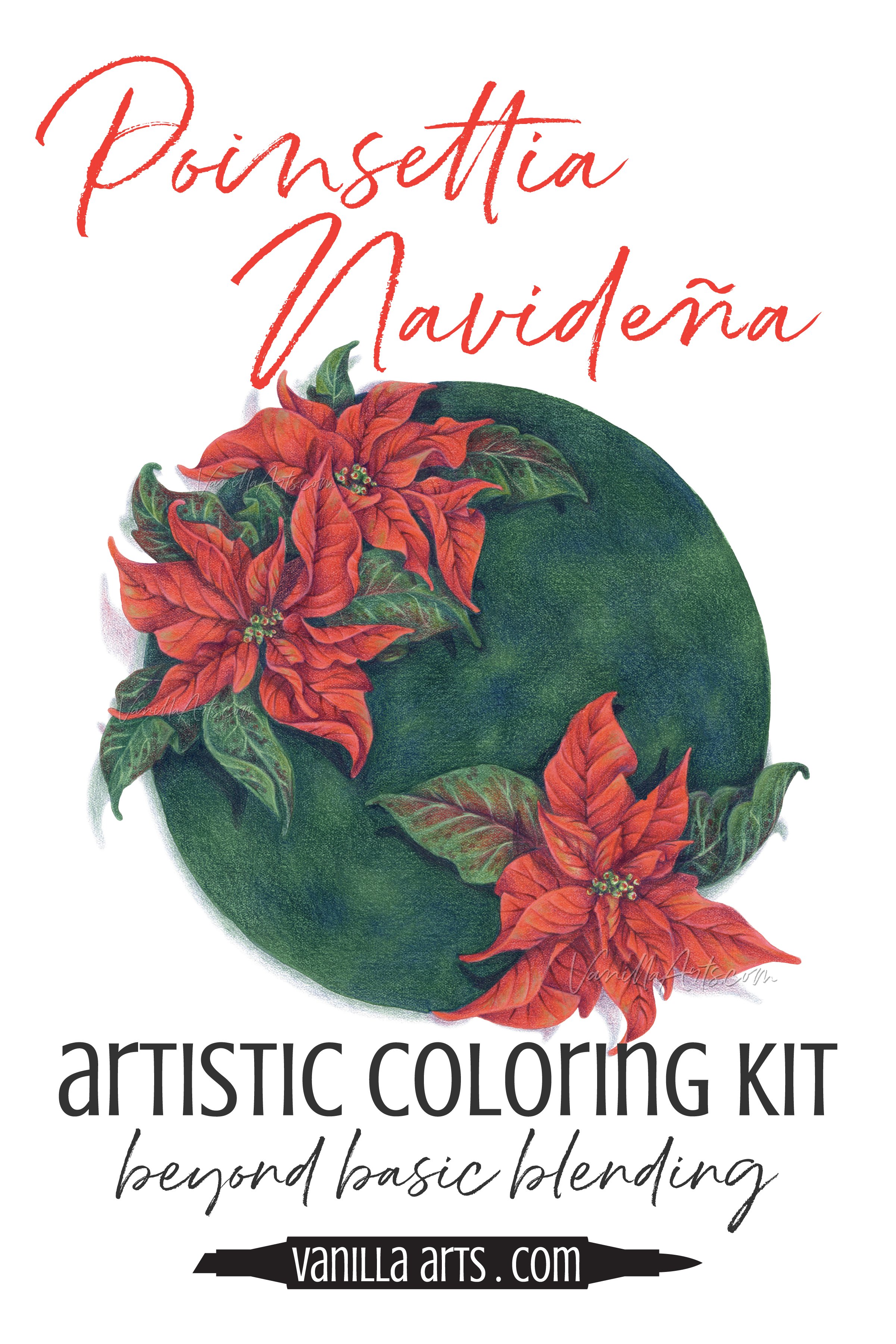
Select supplies used in Poinsettia Navidena:

Vanilla Arts Company is a participant in the Amazon Services LLC Associates Program, an affiliate advertising program designed to provide a means for use to earn fees by linking to Amazon.com.


