
Details in Focus: 6 Tips for Coloring Realistic Flowers (Copic Marker, Colored Pencil)

Are you tired of the same ol’ flowers?
Traditional blending techniques teach you to color everything smooth.
It doesn’t matter what kind of flower you’re coloring— roses, daisies, sunflowers, pansies, or those stinky dead-body smelling orchids that only bloom once a year… No problem; just color them all smooth!
So it’s no wonder your flowers all turn out the same.
Ho hum, another flower.
Look, I get it— you’re just following the tutorial. But then you say you’re tired of cartoon flowers and you wish your coloring had style and personality…
Folks, style and personality come when you ditch the tutorials. Realism happens when you start adding realistic details.
Here are six tips for adding more realism to your next flower project.
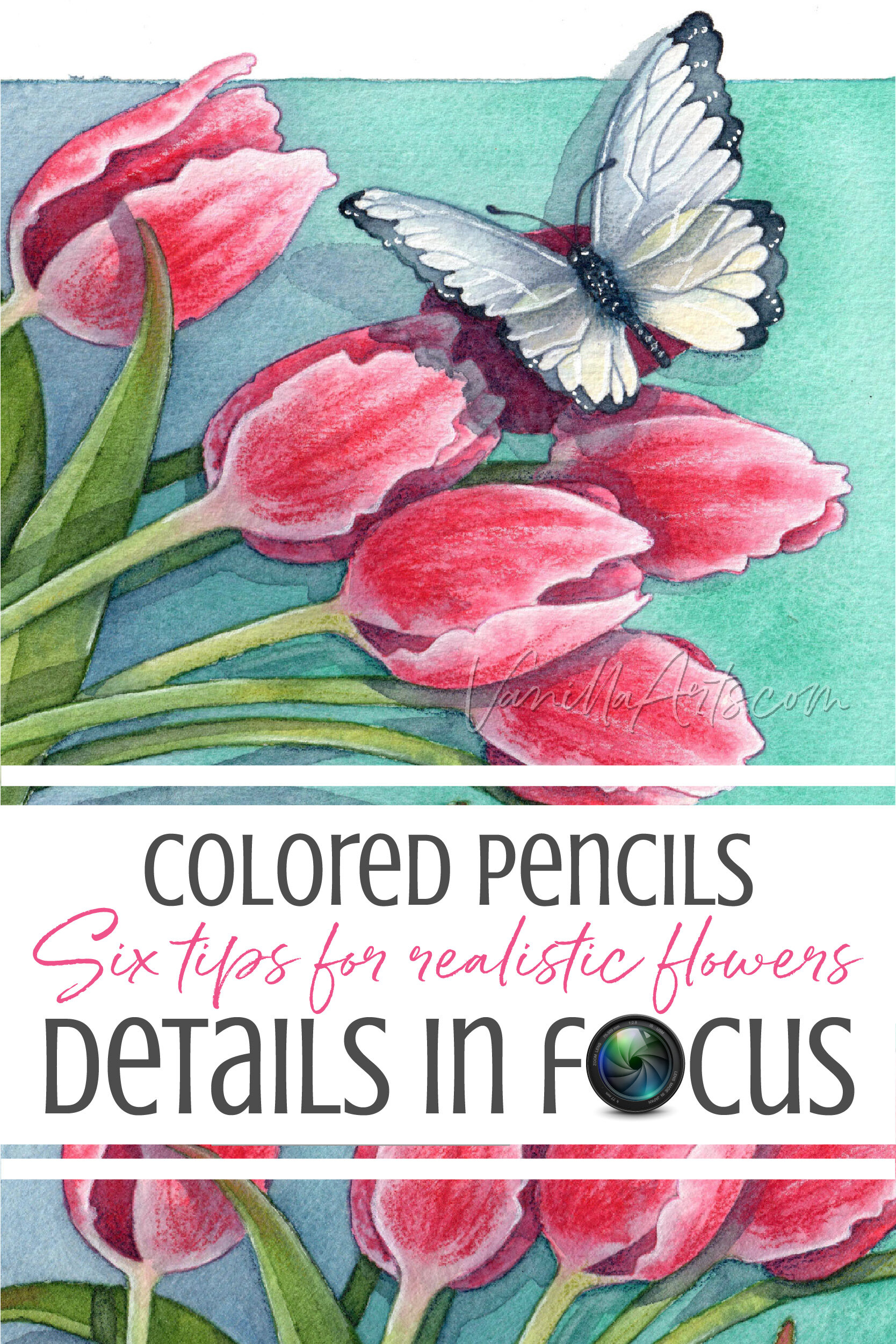
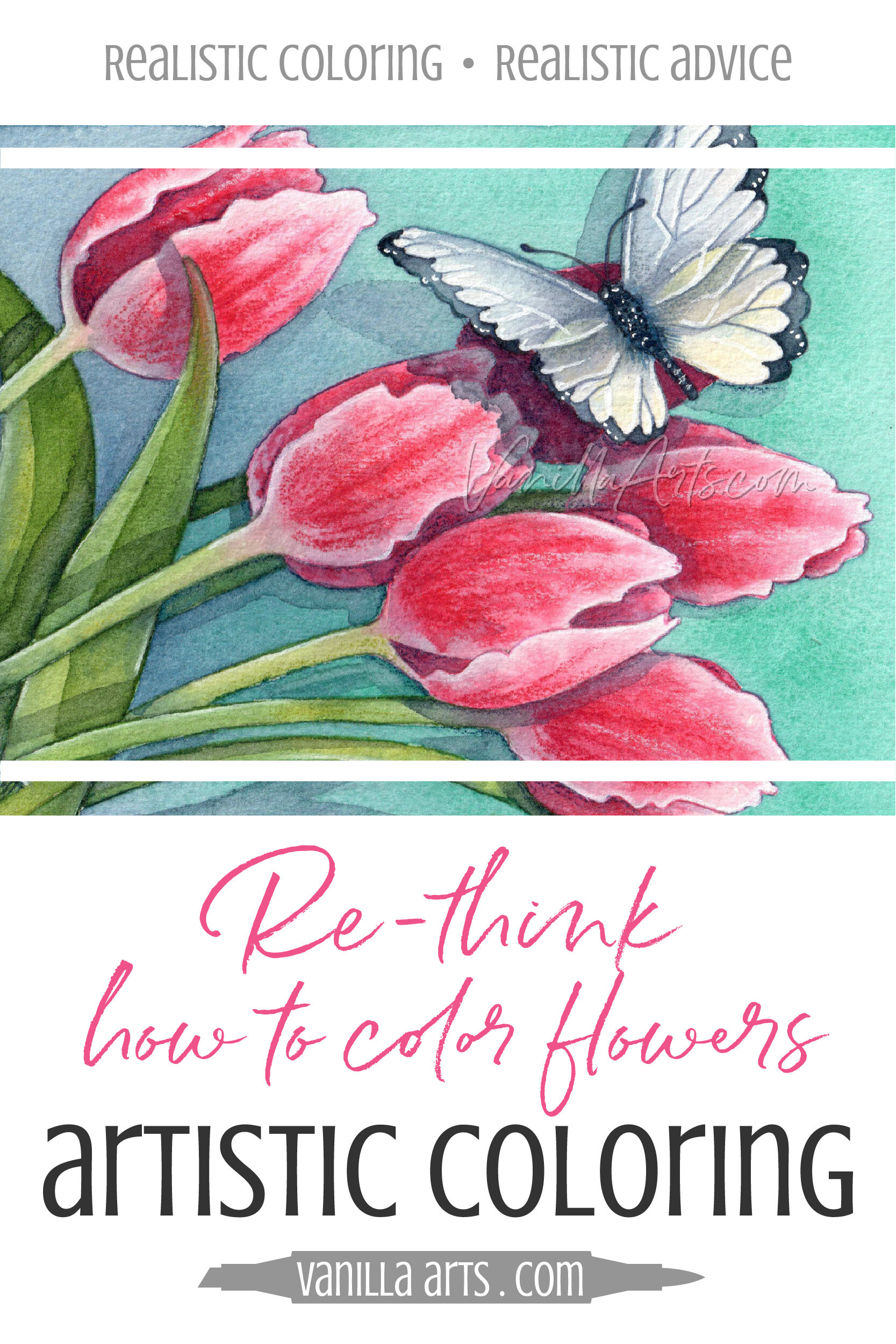
Professional illustrator Amy Shulke shares 6 tips for coloring realistic flowers with Copic Markers, colored pencils, or watercolor. Consult photo references for vein and stem colors, find the sepals and petal veins, look for leakage, and compare back to front. Take your coloring beyond blending.
Realism vs Artistry:
Before we get into the tips, I want to make one point. When I write articles about coloring with realism, I usually get two kinds of reactions:
Oh my gosh, when I first saw your flowers, I thought it was a photograph!
and then those who say:
Really? I found your article because the title said realism. But honestly, your art doesn’t look photographic at all!
I’m good with both comments.
My sweet spot, my personal little artistic goal is to always make something that looks touchably realistic but not so real you can’t tell it’s handmade.
There are many levels of realism in art. Realistic doesn’t mean photographic.
I’ve been doing the whole art thing for more than 35 years now. I’m old enough to know what I like.
What makes me happiest is when people stop and take a second look.
I want to color or paint real enough to slide past your attention but then something draws you back for a second glance— wait, what was that?
So for the most part, I don’t shoot for total, complete realism. I teach these more-realism methods to my students.
More realism is easier than total realism. More just means something beyond what you did yesterday. That’s an easy goal for any student.
But there’s also a hidden reason why I teach students to sit in the semi-realistic zone:
Your artistic personality and style are obvious when you work halfway between a cartoon and a photograph.
If you’re coloring with photorealistic precision, you’re showing us the photograph, not yourself.
And if you’re coloring a cartoon, chances are you’re mimicking a tutorial or some other artist you admire. That ain’t you and that’s not your art.
So as you read through these tips and apply them to future floral projects, just remember, we’re only shooting for more. More than you did before.
More is where you’ll find yourself and your special sweet spot.
Read More:
Click to visit more floral coloring articles here at Vanilla Arts


6 Questions to add realism to your floral projects
Remember, we’re shooting for more-realism. Something more than you did before.
Take baby steps. Add one concept at a time.
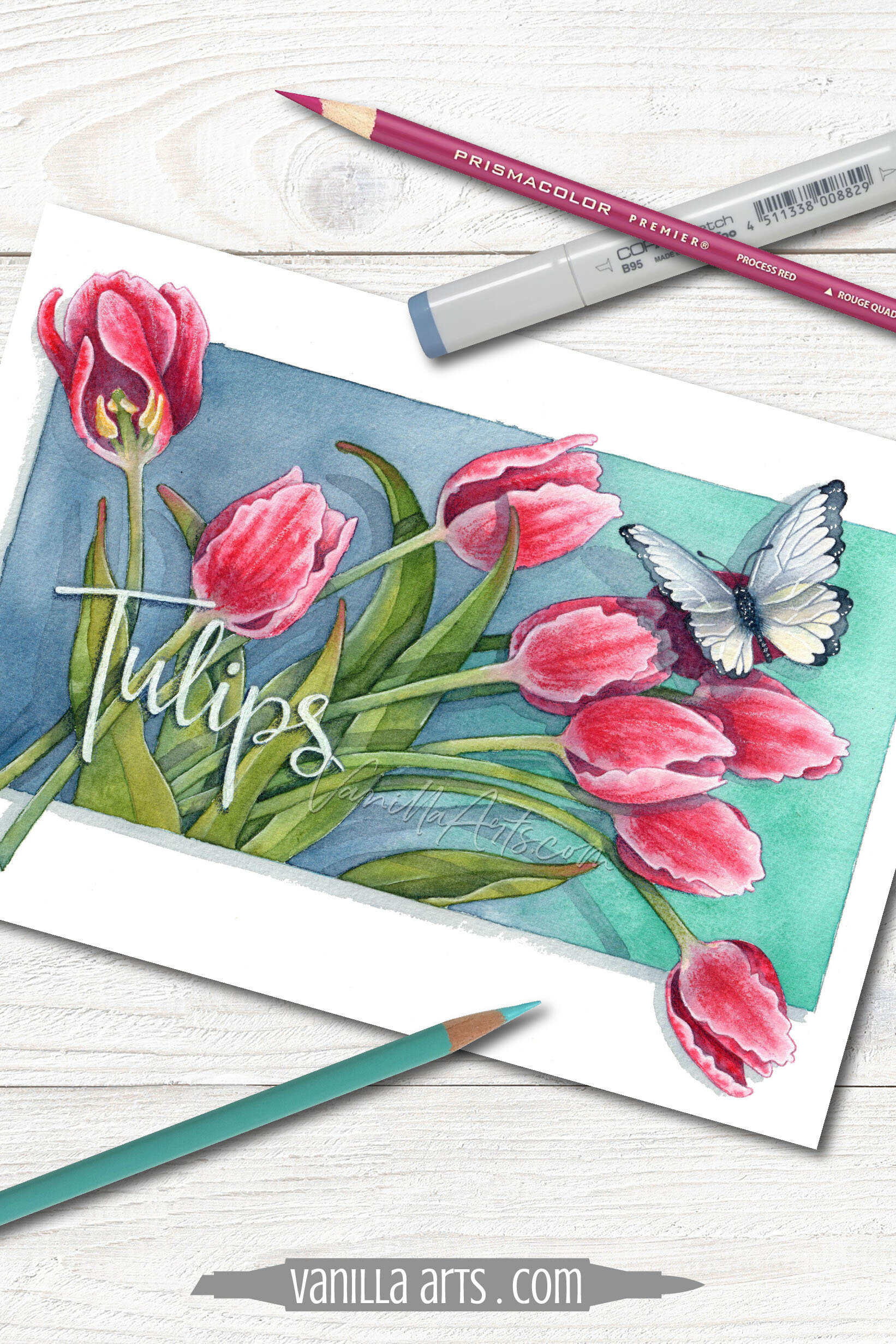
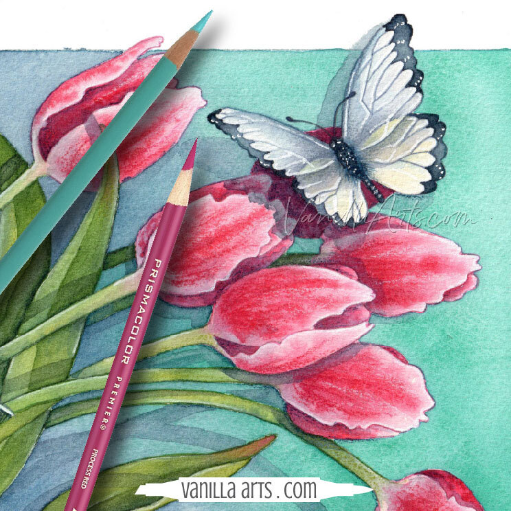
My H2Oh! Tulips project shown here isn’t entirely realistic. Let’s call this semi-realistic. This was a class project for intermediate students in the exact same spot as you, slowly adding more realism to their coloring.
So here are the six questions I ask myself while coloring flowers.
1. Examine the leaves in your photo reference. Are the veins darker or lighter than the leaf?
I know what you usually do. Most people do the same darned thing. You color the leaf medium green, then you grab a darker pen or pencil and draw a bunch of dark green Y shapes all over the leaf.
Then you wonder why it doesn’t look realistic.
Stop. Go find a photo reference.
I’ve done flowers for decades now. At this point, I could draw and color many types of flowers completely from memory. And yet I always work from photo references. ALWAYS. Wonder why?
Because Mother Nature likes to throw curve balls.
There’s always something new in a photo reference— something I’ve forgotten or a detail I’ve never noticed before.
For many colorers, the major detail they’ve never noticed is vein color.

Some veins are darker than the leaf; but more often, the veins are lighter than the leaf.
Which isn’t how you’ve been coloring them, right?
Find a photo reference for your species of flower and then check the veins. While your there, look for other characteristics which make your flower unique and different than you thought.
Half of realism is simply including the real details that everyone else skips.
2. Don’t assume the stem matches the leaves.
This goes right back to my point about veins. Everyone grabs a leaf color and slathers it on the stem.
But did you check?
Hey, go check!
If you remember back to elementary school science class, leaves are full of green chlorophyll. Without rehashing my third grade science fair display, the green junk is how leaves collect sunlight and turn it into plant food.
Stems don’t do that.
Stems serve a totally different function for the plant. They’re not leaves, so why are you coloring them the same as leaves?
I almost always add yellow to my stem color mixtures but at the very least, I dilute the color down so that there’s some distinction between the leaves and the stems.
Look at your photo reference. What color are the stems?
The answer may surprise you.
3. Look closely at the line drawing or stamp image. Which shapes are sepals and which are petals.
I see this mistake all the time.
Seriously, card makers and coloring bookers make this mistake so frequently that when someone gets it right, I want to send them a golden certificate of achievement.
Right now, a lot of you are asking: Sepals? Huh?
Okay, now we’re rehashing my fourth grade science fair display. When a flower is just a bud, the bud has these nice protective green leaf-looking things (called sepals) over the petals. As the flower blooms, the sepals open wider and wider. If you flip a flower blossom upside down, you can usually see the little sepals still hanging around on the underside where the blossom connects to the stem.
Ohhhh yeah, I’ve seen those things before. Sepals.
Sometimes the stamp artist includes sepals in the drawing because on some flowers, the sepals are large or they never fold back.
Sepals are usually green but I’ve seen colorers make them every color of the rainbow. Some people color them the same as the petals but just as many people go wild and make them purple or puce.

Not every flower has obvious sepals and sometimes they really do look like petals. Tulips are a species where the sepals look exactly like petals. (Fun Fact o’ the Day: Tulips have only 3 petals, the other 3 are sepals.)
When you color it wrong— when the sepals should be green and you color them yellow with pink polka-dots? You lose realism.
People who know that flower, know that you don’t know that flower.
The sepals give away the realism game.
Google the name of the flower and “sepals” to do a quick sepal check. It takes ten seconds and the payoff is priceless.
4. How far does the green spread?
I have a short guest post about this concept over on the blog at Power Poppy. You can read it here.
While you’re checking out the stem color and the sepals in your photo reference, take note of what color you see at the base of each petal.
With most flowers, you’ll see green from the stem creeping up into the base of the petal.
And just as frequently, you’ll see petal color spreading down into the stem.
This happens a lot with tulips. The stem is usually an off-green with weird bits of pink or red. And the petals have kisses of green at the bottom. If the petal is pale, the green can sometimes be seen almost halfway up the petal.
Roses are another flower where the colors get all mixed up. Green on the petals, petal colors on the stems, and even petal colors in the veins or leaves!
This kind of color transfer is too gorgeous to ignore.
So even if you’re not shooting for realism, color transfer is a beautiful trait to include in your floral images. Spread your colors around!

5. Do the petals have veins? Are you sure?
We don’t usually think about petals having veins but if you look closely, they do.
Have you ever included petal veins in your floral projects?
The Crocus flower project shown in my article on realistic texture here is a favorite with the students in my Colored Pencil Plus course (12 weeks of nothing but flowers). I think people like the crocus project because when you see it for the first time, there’s a moment of realization. Oh yeah, crocus do have pretty veins…
You want your viewers to have the same reaction to your flowers right?
All petals have a vein system.
Like the veins on a leaf, sometimes the veins are darker than the petal. Sometimes they’re lighter. And frequently the veins are the same exact color but they’re slightly indented so that the vein shows up more as texture, ridges, or pleats rather than color.
And no, the veins will not be a tangle of random Y shapes. At least not usually.

Look for the veins.
Petal veins may be the unique element that boosts your level of realism.
6. Are the petals the same color on the inside as the outside?
Be honest, did you ever think to look?
If you’re coloring a rose, you absolutely must look for this characteristic. Many rose petals are 1-2 steps lighter on the outside than the inside. Some roses are a completely different color outside! I tried to capture this bi-color quality plus dark veins in my beginner’s challenge class, Rosie Gets the Blues.
Gerbera daisies are another species paler on the backside. We don’t see the back view very often but it’s a lovely contrast.
Yes, it’s a little more complicated to look at a flower drawing and decide “is this the front of the petal or the backside showing?” but this detail is worth hunting for.
I recently saw a tulip that was white on the outside but deeply glowing pink on the inside. It was amazing. I can’t wait to re-create the look in a future tulip project!
7. BONUS TIP: Have you added cast shadows yet?
Sometimes your flower project looks pretty darned realistic. You’re doing it right, including accurate details and nailing the depth and dimension.
Except the flower is floating aimlessly in space.
Ground that sucker! Give it a home. Give it a place in space and time.
Cast shadows are not as hard as you think.
All of my class projects include a cast shadow of some kind but I have one class that focuses on shadows and how to use them for realism. Read more about Butterfly Shadows here.
There you go, I use these steps in my own floral illustrations and I encourage you to add a few to your coloring routine.
6 Tips to Color Flowers with More Realism:
Are the veins darker or lighter than the leaf?
What color is the stem?
Where are your sepals? Do they match the petals or the leaves?
How far does the green spread into the petals?
Do the petals have obvious veins?
Are the petals the same color on both sides?
Where are your cast shadows?
Realism doesn’t come from the blending process.
Observe more flowers. Look at photo references and the gardens around you. Include specific traits which make your species of flower different from all the rest.
You don’t have to be a pro to include one or more of these details in your next coloring project. Give it a try!
Vanilla Arts Online Floral Classes:
(Click to visit the class info page)


Vanilla Arts Original Coloring Kits & Line Art:
(click to be taken to the item in the Vanilla Stamp Shop)


Spring is Here!
Big, bold, beautiful blooms and a butterfly too!
H2Oh! Tulips: a line drawing for artistic coloring
Copic Marker, Colored Pencil. Watercolor, Mixed Media
Vanilla digital stamps feature wide open spaces and minimal texture marks. No coloring book outlines to steal the focus from your beautiful coloring!
Let your technique and skills shine
Color with any amount of realism you choose. Perfect for any skill level
The sample project shown here is watercolor with colored pencil details

Select supplies used in H2Oh! Tulips:

Vanilla Arts Company is a participant in the Amazon Services LLC Associates Program, an affiliate advertising program designed to provide a means for use to earn fees by linking to Amazon.com.


