
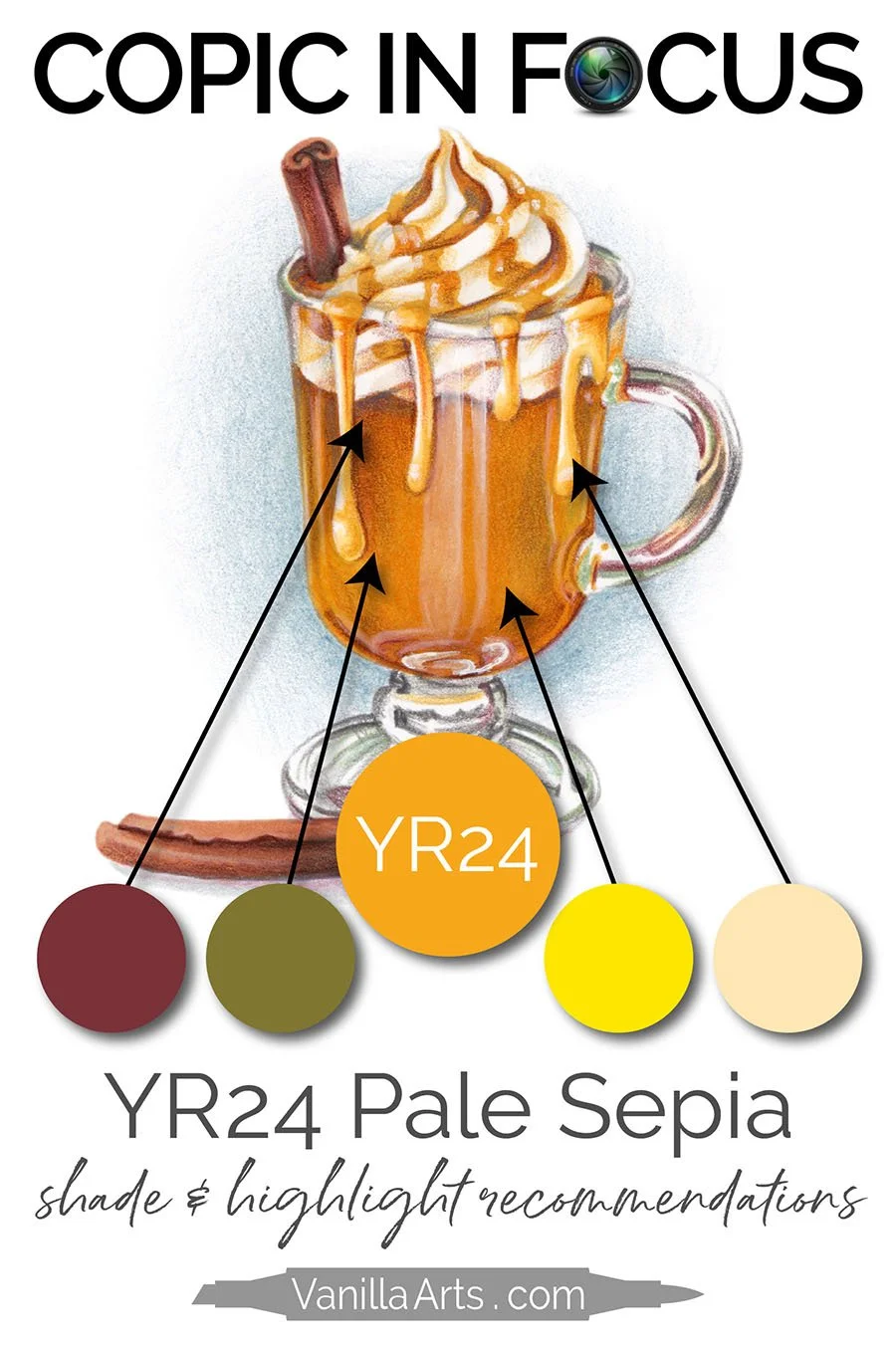
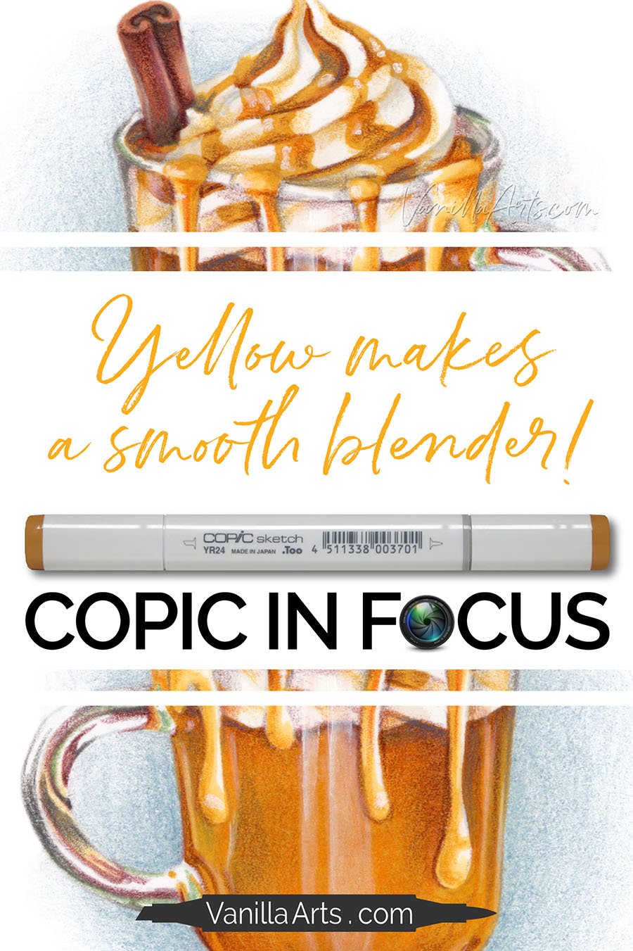
Copic Marker YR24 "Pale Sepia” (Coloring Tips for Golden Yellow)


What’s a Good Blending Combination for Copic YR24?
I’ve used Copic Markers professionally for 30 years and done more than my fair share of blending.
But I’m always a little sad when someone asks for a good blending combination.
There’s more to artistic coloring than pretty Copic blending combinations.
It feels backwards to focus on blending when blending really isn’t a factor for anyone but beginners.
Today, let’s look at Copic YR24 Pale Sepia from the artist’s perspective— how do I use this brassy yellow marker in my classes and in my artwork?
Let’s get past the basic blending and find out how this marker really performs.

Copic YR24 is a Warm, Golden Yellow
You’ve seen YR24 a million times in your everyday life.
YR24 is the color of brass— keys, doorknobs, and hundreds of other faux-golden objects.

YR24 is a dingy and dirty golden yellow. There’s a hidden brown or green ink in the formula, desaturating this color and giving it a worn, mellow tone.
In the YR24 postcard, Hot Cider project shown here, I’ve used YR24 to create the golden color of crisp fall apple cider in a glass mug. The drips of carmel are also created with YR24.
About the Yellow-Red YR Color Family:
With Copic Markers, there is no “orange” family. YR is the color designation for a mixed-ink formula of yellow inks plus red inks, hence the “YR” designation.
When someone tells you “Copic calls all their orange markers YR”, you expect to see a family full of basketball colored markers. And yes, there are a few truly orange markers in the Yellow-Red family… but the family is mostly soft flesh tones and deep brassy ambers than traditional orange markers.
About Copic’s YR-Twenty Ink Group:
YR24 is part of the “Twenty” group of YR markers— the first number in the ID code tells you the group number.
The YR-Zero and YR-Ten groups are traditional oranges. They range from pale to brick orange but both groups are exactly what you’d expect from a Yellow-Red set of markers.
Learn more about the Copic Numbering system in my article at MarkerNovice.com here.
The YR-Twenties are unexpected. They’re a a group brassy yellows without a lot of orange influence in them. In fact, they feel more like Yellow-Browns to me than orange and I would have placed the YR-20’s into the Y family rather than the YRs.
YR20, YR21, YR23, YR24, YR27
About the Color Value:
The second number in the code YR24 is 4 This tells you that YR24 is in the middle of the value scale (0-9) but just off to the lighter end. Copic does not make a YR25 or YR26 so YR24 is often used as the middle marker in a YR-Twenty natural blend.
The value indication “4” is slightly inaccurate. We measured YR24 as slightly darker than promised. YR24 would more accurately be called YR25.5.
Watch me color with YR24 in this FREE video at YouTube
(click below to be taken to the video at YouTube)

Click below for the YR24 Video resource page.

About the Name “Pale Sepia”:
YR24 is named after a dark brown ink called Sepia. Sepia has been used for thousands of years and is still popular with artists today.
Copic color names often seem odd; perhaps they don’t translate well from Japanese to English. It’s frustrating that many Copic colors do not resemble the object or color they’re named after.
In this case, the name Pale Sepia is misleading. Sepia colored art supplies are always either a dark red-brown or a dark blue-brown but I can not think of a single Sepia product which would turn this yellow when diluted. Copic missed a big opportunity to call this color something more accurately descriptive like “Brass”, “Worn Bronze”, or “Old Gold”.
Is Copic YR24 Lightfast?
Does it fade quickly? Can it be erased? Does it shatter? Does the cap color match the ink color?
I’ve tested YR24 ink to help you better predict how this ink will behave during use.
See the test results for:
Lightfastness
Layering
Color Build-up
Dilution
Value
Cap Accuracy
Behavior upon contact with Colorless Blender
MarkerNovice.com is the sister site to VanillaArts.com where I offer reliable information for Copic Marker beginners.


Substitutes for Copic YR24 Pale Sepia:
Keep in mind that similar colors always have different chemical formulas. They may look the same but that’s where the similarities end.
This means that one marker can blend like a dream while a similar color can be stubborn, staining and reluctant to blend.
But if you don’t have YR24 and you’re looking for a similar brassy yellow…
YR23 is one step lighter. These two colors are so similar that I never use them in blends together because there’s just not enough difference between the two colors. YR23 would be the best substitute for YR24.
Y25 is more obviously yellow but it’s about the same mid-value and has a lot of golden undertones. It’s not brassy like YR24 but it may actually blend better than YR24 in blending combinations.
How do I use Copic YR24 Pale Sepia in classes and projects?

YR24 is one of my most used markers. I don’t use it daily or even weekly but Pale Sepia is definitely in my top 50 colors and I wouldn’t consider any Copic collection complete with it.
This is the “Doughnut Stack” class project, one of my advanced level classes for Copic Marker with Colored Pencil.
YR24 gives a warm golden glow to the doughnut recipe.
Here, I’ve paired YR24 with E99 and YR31 to color every doughnut.
You’ll also see YR24 scattered across many other class projects ranging from beginner to advanced. Anytime we’re coloring a gold or brass object, the marker recipe almost always contains either YR23 or YR24.
Read More:
Click to visit more orange coloring articles here at Vanilla Arts

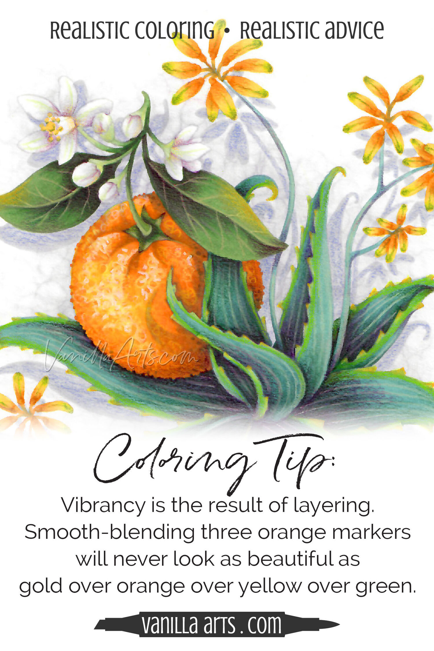

Blending Combinations using Copic YR24 Pale Sepia
Here are a few sample blends using YR24.

In the Self Blending swatch, I’ve created 3 layers of YR24. The darker left side is three coats of ink, the middle mid-tone is two layers, and the far right is one layer of ink.
You can tell it’s only one coat on the right because of the streaks. One layer of ink rarely looks smooth!
People don’t often think about blending a marker with itself but self-blending always creates the easiest gradient possible. Markers always blend well with themself!
Next is a natural blending combination using YR24 as the darkest marker.
A natural blending combination is two to four markers which all share the same first number.
Natural blends are popular because they’re easy to blend smoothly. Whether you’re using YR24 as the lightest, darkest, or middle color in a natural blend, even beginners shouldn’t find much to struggle with.
The Darker Blend uses YR24 as the lightest color. I added an E brown as the darkest color because Copic does not make a YR29. E99 has strong reddish undertones and felt like a logical step darker than YR27.
The last swatch is my favorite and this is the blend I used in the Hot Cider project featured in this article. B93 is a denim blue color, which sounds strange but when you consider that blue desaturates orange, isn’t a surprising choice of underpaint. I used blue underpaint where the cinnamon stick sits in the cider casting a bit of a shadow. There’s also some blue up where the surface of the cider touches the whipped cream.
Tips for Blending YR16:
Note: YR16 is a staining marker which means it will never blend as easily as a non-staining color like B32 or Y04.
Work fast— Don’t let YR16 dry on the paper before trying to blend it out. The longer it sits, the more firmly it grips the paper. Your best blends with YR16 will always be wet on wet.
Be generous with your blending inks— No blend works well when you skimp on ink but stubborn colors require extra juice to blend smoothly.
If you can, use YR16 as the darkest marker in the blending combination. Lighter colors have more solvent in the formula and solvent is what allows inks to blend smoothly. Partnering YR16 with lighter markers gives you a bit of extra solvent muscle!
Red ink is the reason why YR colors are staining. Red latches onto paper fibers and doesn’t want to budge. And yes— there is a red component to YR16. I like to tame orange markers by adding at least one Y yellow marker to the blending combination. Yellow always carries a lot of solvent in the mixture, so Y38 can blend YR16 smoother than YR14 or YR12. This doesn’t work if you want the orange to stay pure orange but if you don’t mind a hint of yellow, you’ll get a better blend with the addition of Y markers.


The most important tip for coloring with orange markers:
I don’t know if it’s because beginners have only a few markers to choose from or if there’s something odd going on with how people see color…
But I see a lot of people using red markers to shade orange objects.

Red is not “dark orange”.
Orange is a weird color.
True orange is also pretty rare in nature.
The fruit we call “an orange” is actually yellow. They’re breeding oranger oranges now but organic and heirloom oranges are yellow.
Add to this, cameras don’t see orange correctly. So for years, professional photographers have been photo-shopping orange items to make them oranger.
When they do this, it makes orange shadows look red.
Real shaded orange is a murky, almost brown color.
I know it’s tempting to grab a red marker to shade a pumpkin or carrot but shade only looks realistic when you use de-saturated colors.
Think about it, shade is an area with less light, right?
So you need an orange that’s less orange to create realistic looking shade.
Red is more color, not less.
Red is red, not dark orange. They’re not in the same color family.
Shade and Highlight Suggestions for YR16 Apricot:
If you’ve read color articles here at VanillaArts.com or taken any of my classes, you know I teach an underpainting method.
In underpainting, we choose opposite colors on the color wheel to add the realistic murkiness found in real-life shade. We “desaturate” with complementary colors. Read more in my article series here.
After I underpaint and blend with Copics, I come back with colored pencils to boost the shade and add highlights.
My underpaint colors and my pencil colors rarely match the Copics.
Shade suggestions for YR16 Apricot:
Copic Underpaint— B21, B32, BV00, BV20, BV31, V01, V12, or V20. You can also experiment with pale BGs like BG93, BG11, or BG000. Green also works but it’s an acquired taste. Try G42 or G12.
Prismacolor Pencil Overpaint: PC931 Dark Purple, PC1008 Parma Violet, PC937 Tuscan Red, or PC1033 Mineral Orange. In the pumpkin shown here, I used PC1097 Moss Green.
Highlight suggestions for YR16 Apricot:
As the lightest color in a YR16 bending combination: YR12, YR61, or Y38
Prismacolor Pencil Overpaint: PC914 Cream, PC940 Sand, PC917 Sunburst Yellow
Is YR16 a good orange marker for beginners?
Uhmmmm… maybe.
I teach beginner classes with YR07 because it blends easier than YR16.
Remember, no orange is an easy-blender—they’re all stubborn by nature.
So it’s not like YR07 is super-easy to blend, it’s just the easiest of all the traditional oranges.
I’d say if you like the look of YR16 and the YR-Teen family better than YR-Zeros, then use the colors you like more! The Teens are not that much harder to blend.
Go ahead and give YR16 a try!
Read more about my starter set with tips for building your marker collection in my article here.

Color Theory Resources


Classes, Kits, and Line Art
(Click for more info)


Copic Postcard Kit
Lets learn to color with YR16 plus a full fall color palette.
Copic Postcard Kit
Perfect for every skill level
Six easy-print PDF postcards + swatch cards
The Colors of Autumn: Gold, Orange, Vermilion, Brown, Sage, and Lavender
Perfect for Copic Markers with or without colored pencils
Class Printable Pack Includes:
SIX digital stamps, one for every color- YR16 Pumpkin (shown here), YR24 Mulled Cider, E29 Pinecone, BV31 Dried Hydrangea, YG93 Chestnut, and R08 Red Capped Mushrooms
SIX easy-print PDF swatch cards for every color. One card includes Amy’s color suggestions, the second is blank for your experiments
Cards are sized 5x7” with margin room for binding into a color reference booklet

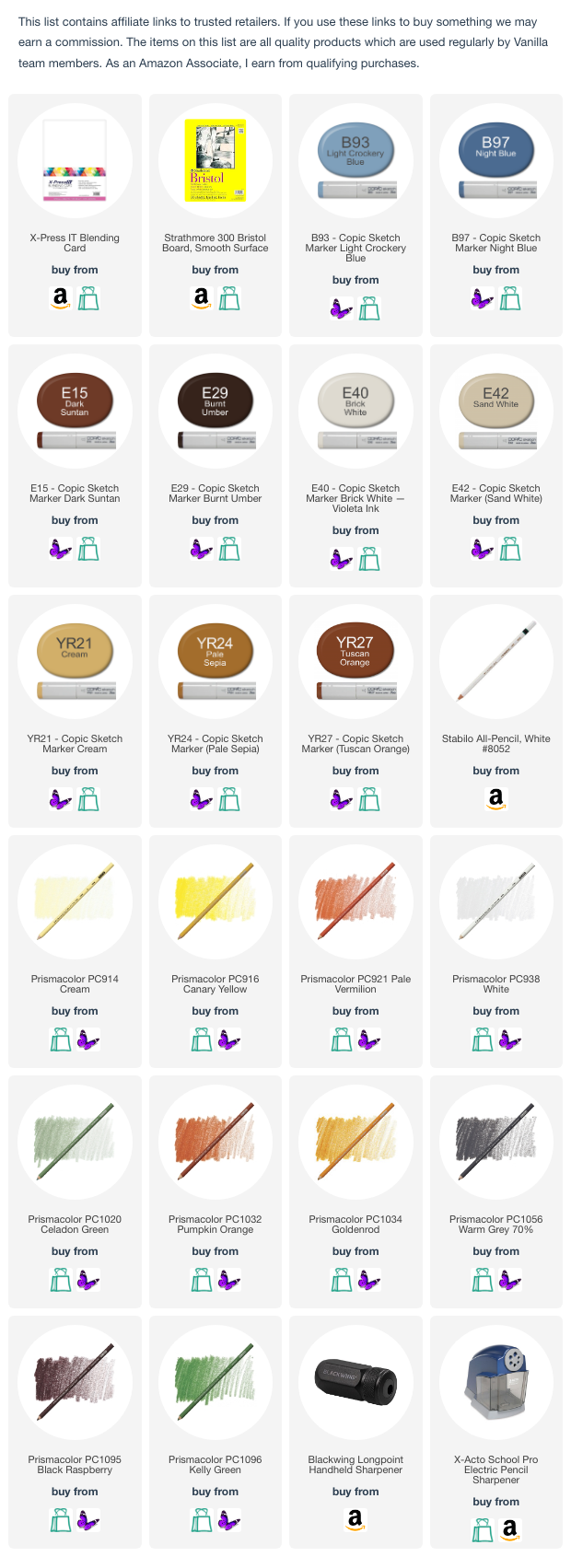
Supplies used in YR24 Postcard
Vanilla Arts Company is a participant in the Amazon Services LLC Associates Program, an affiliate advertising program designed to provide a means for use to earn fees by linking to Amazon.com.


